Project
PP Gymnasium
Agency
Bleed
Bleed Design studio
Year
2019
Award
Bronze
PP Gymnasium
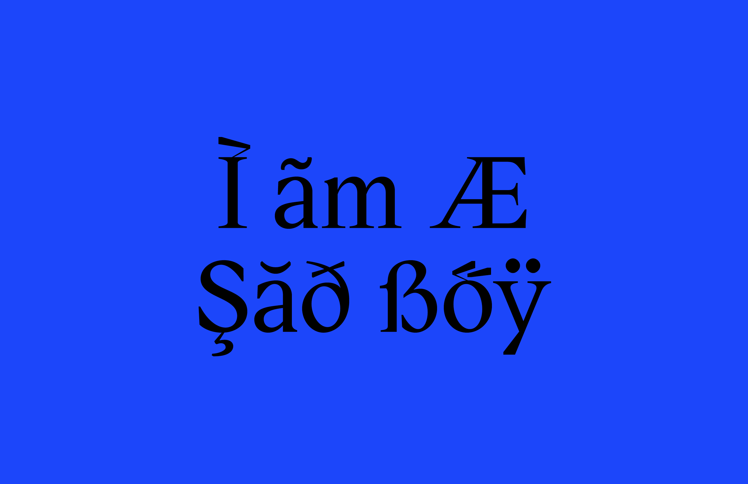
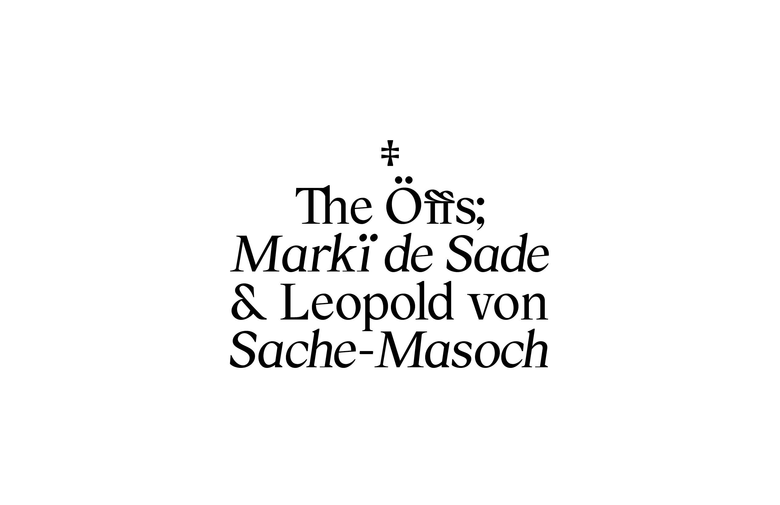
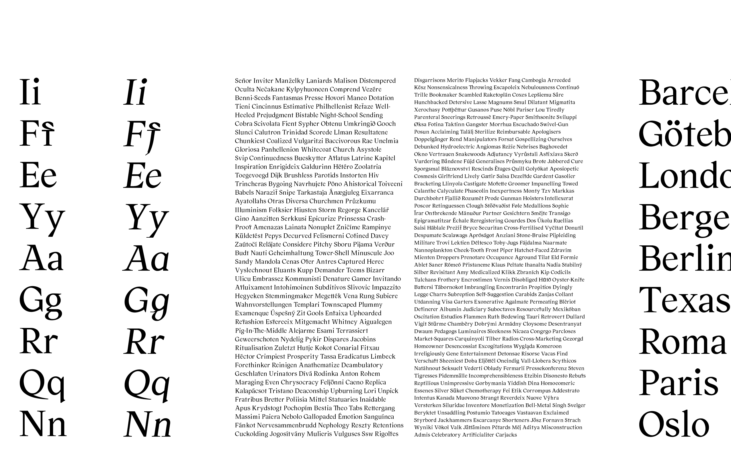
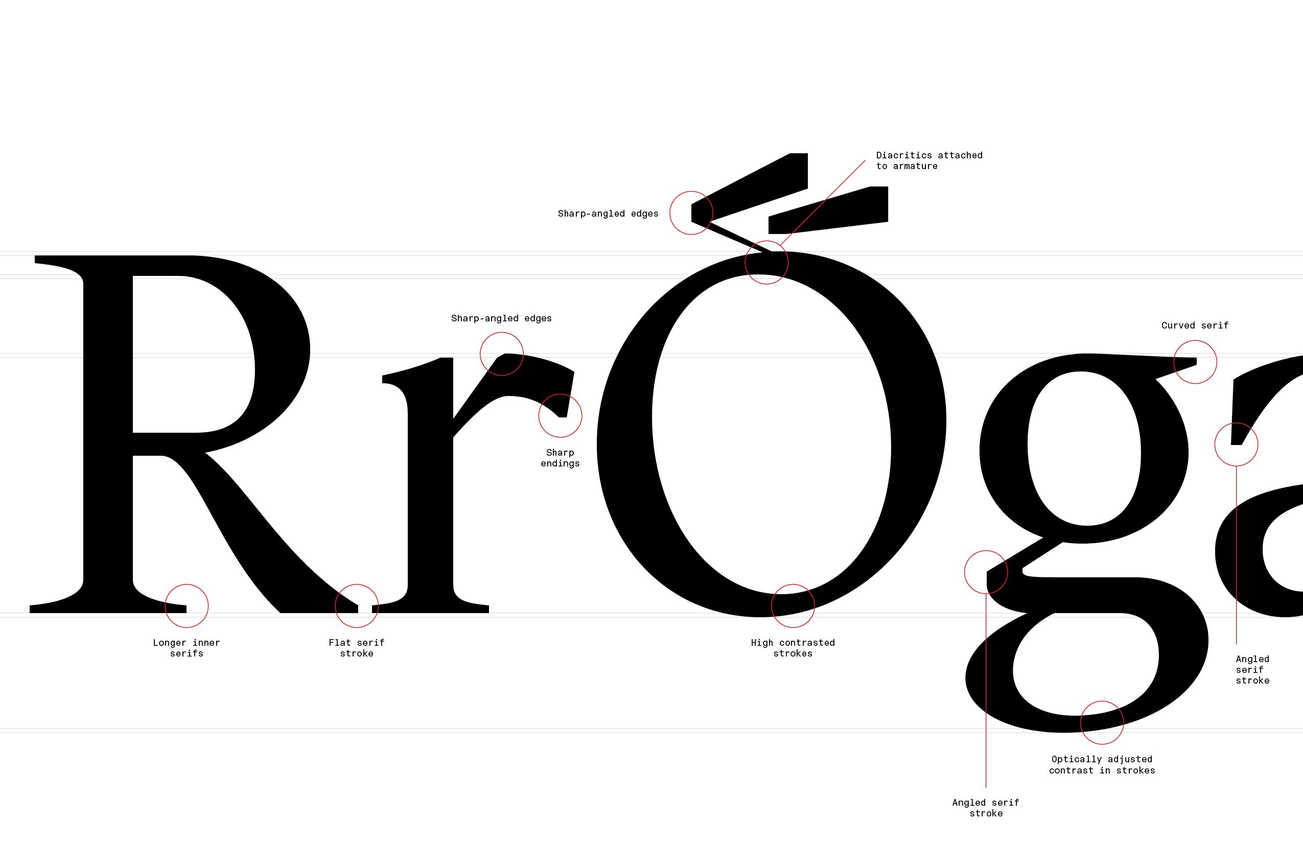
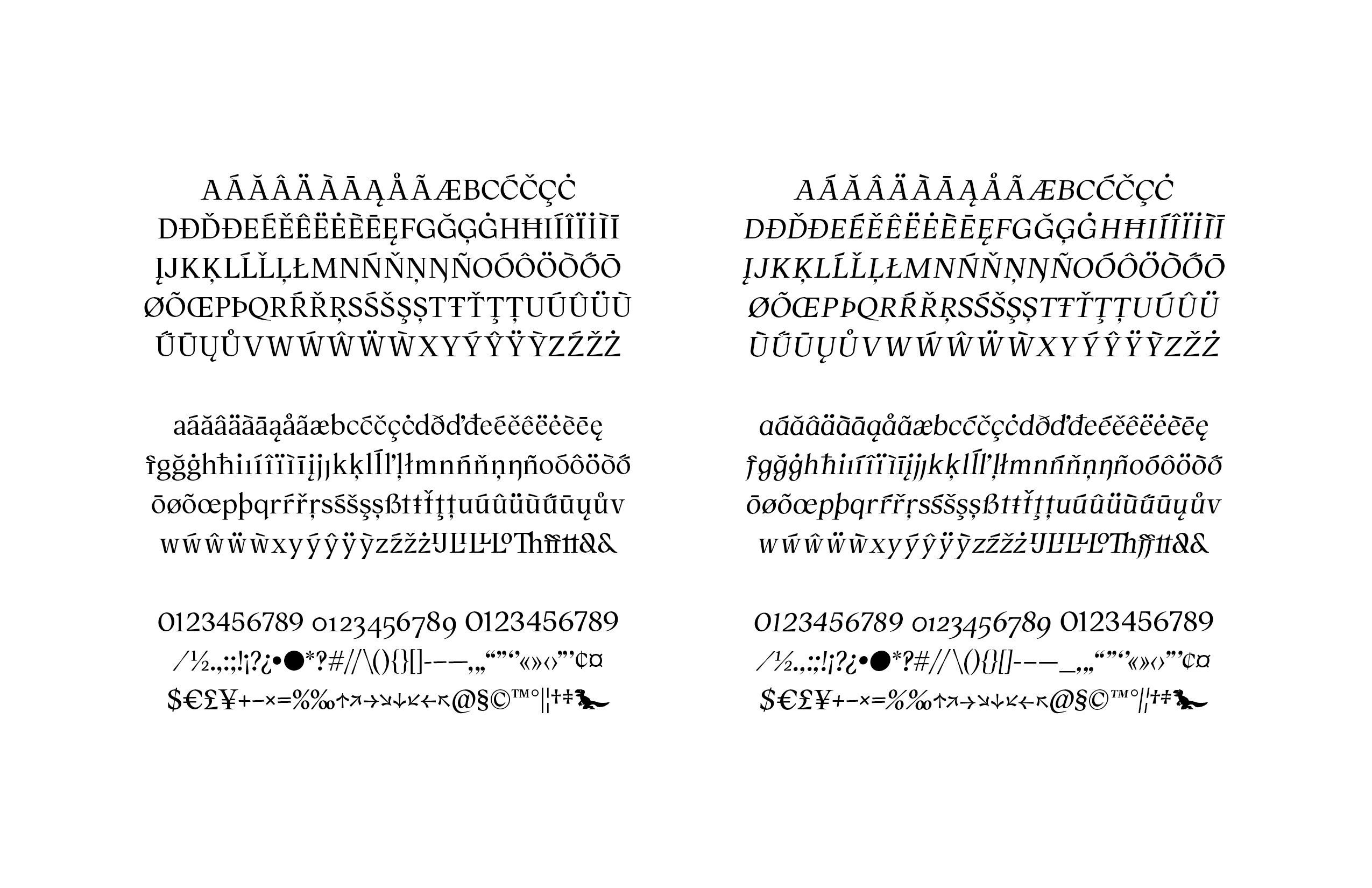
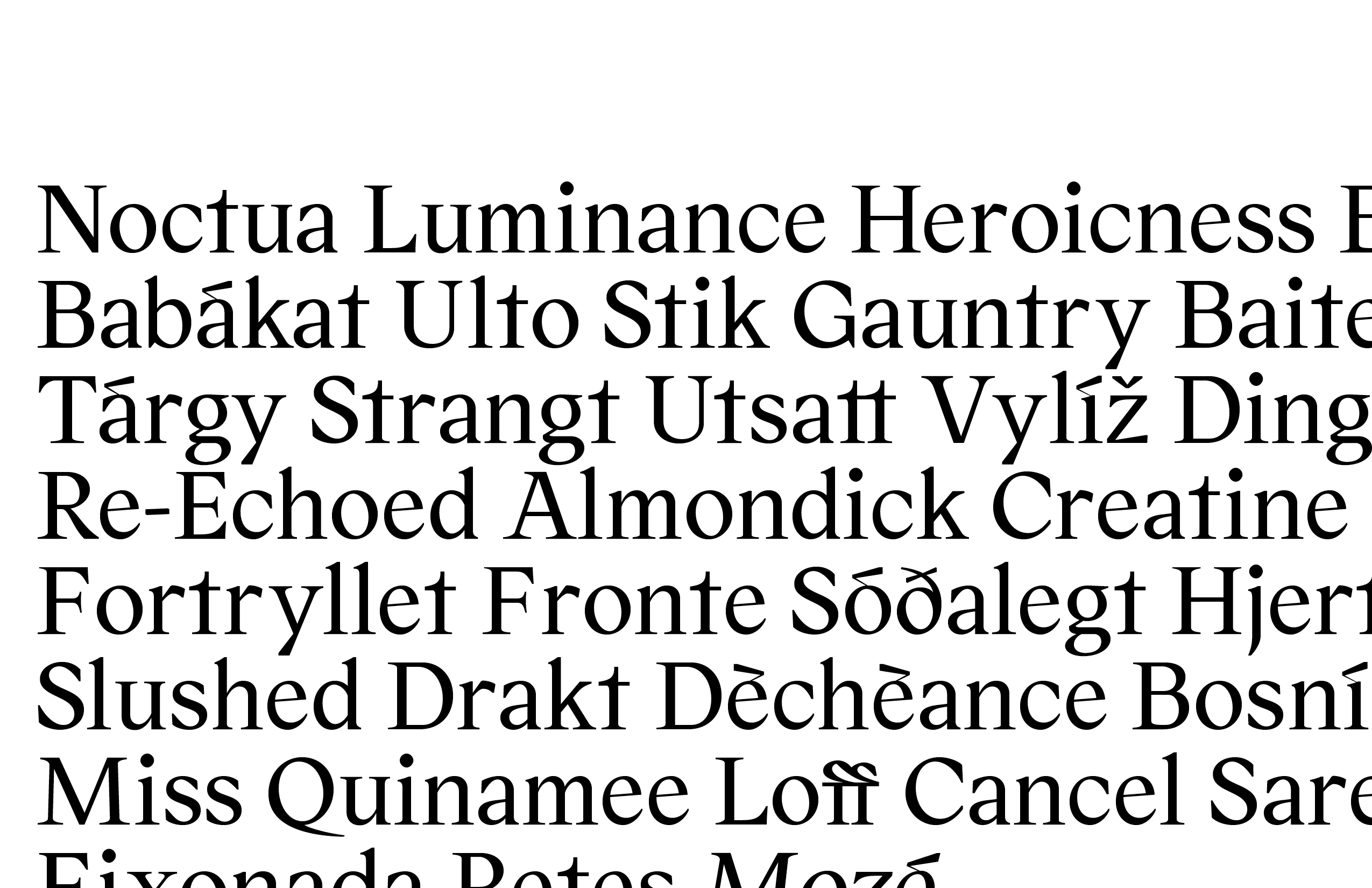
PP Gymnasium is to reckon as an experiment, hard to define because its premiss and defining characters have been dictated during its process of creation. It’s a shaggy serif typeface with over 700 characters in two styles, including stylistic alternates, optical sizes, old-style numbers and wide language support. A typeface that has been in the making over a two-year period, where newly acquired knowledge and technique has been applied during the process, hence the name – Gymnasium. Seeing that most of its personality and quirkiness comes from a naive approach and a lack of knowledge, blended together with an increasing respect and insight into the classic principles. The result is a typeface, schooled by its own process.
Credits
Designer
William Stormdal
Category
501 Original Typeface – Text
Client
Pseudonym Publishing
Country
Norway