Project
Neudoerfler
Agency
Bleed
Bleed Design studio
Year
2019
Award
Silver
Neudoerfler
https://mymotion.neudoerfler.com/mymotion
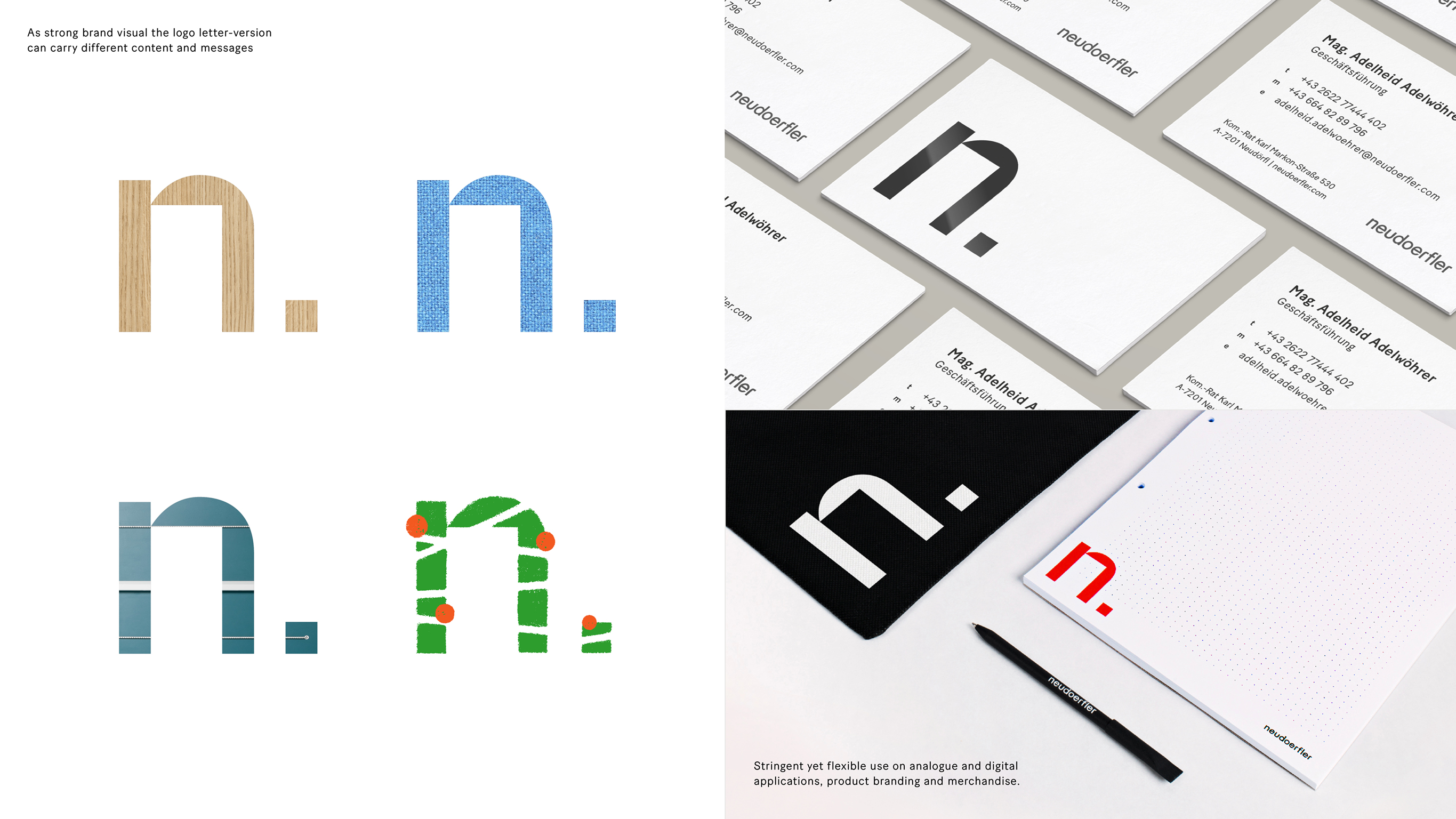
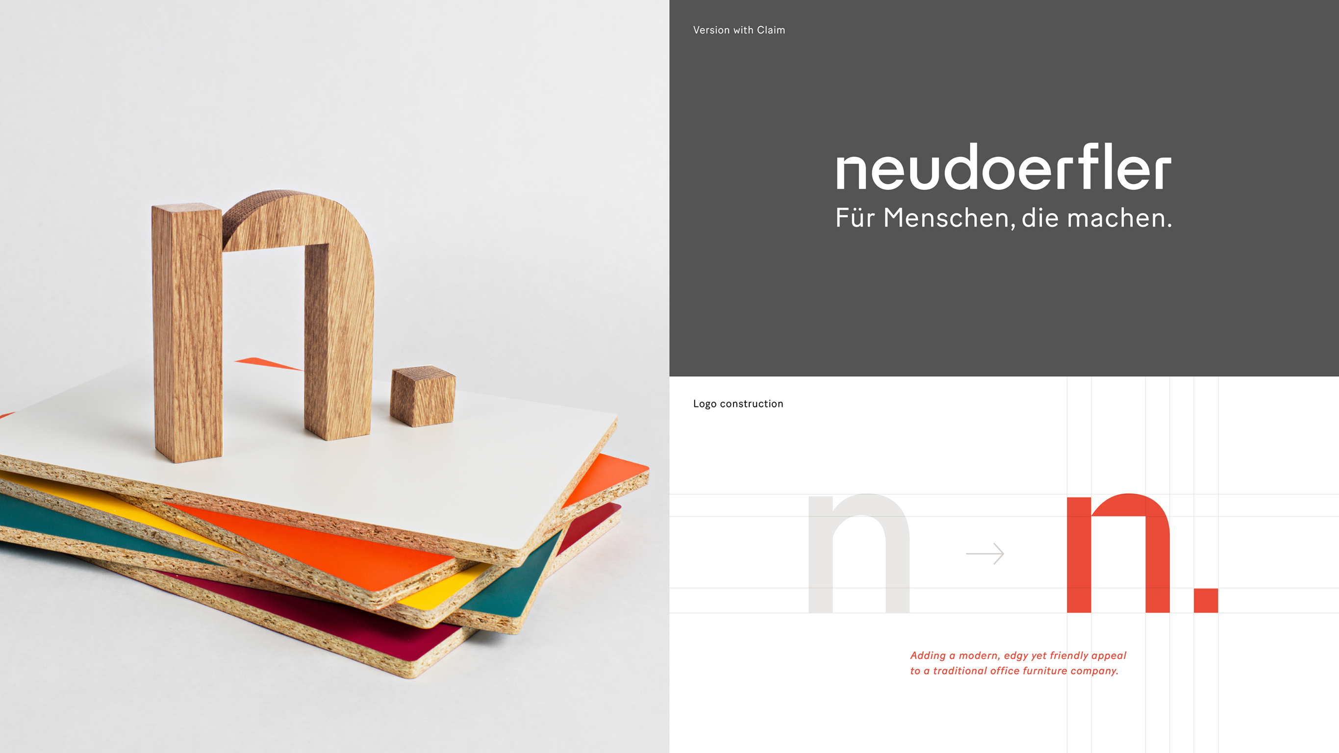
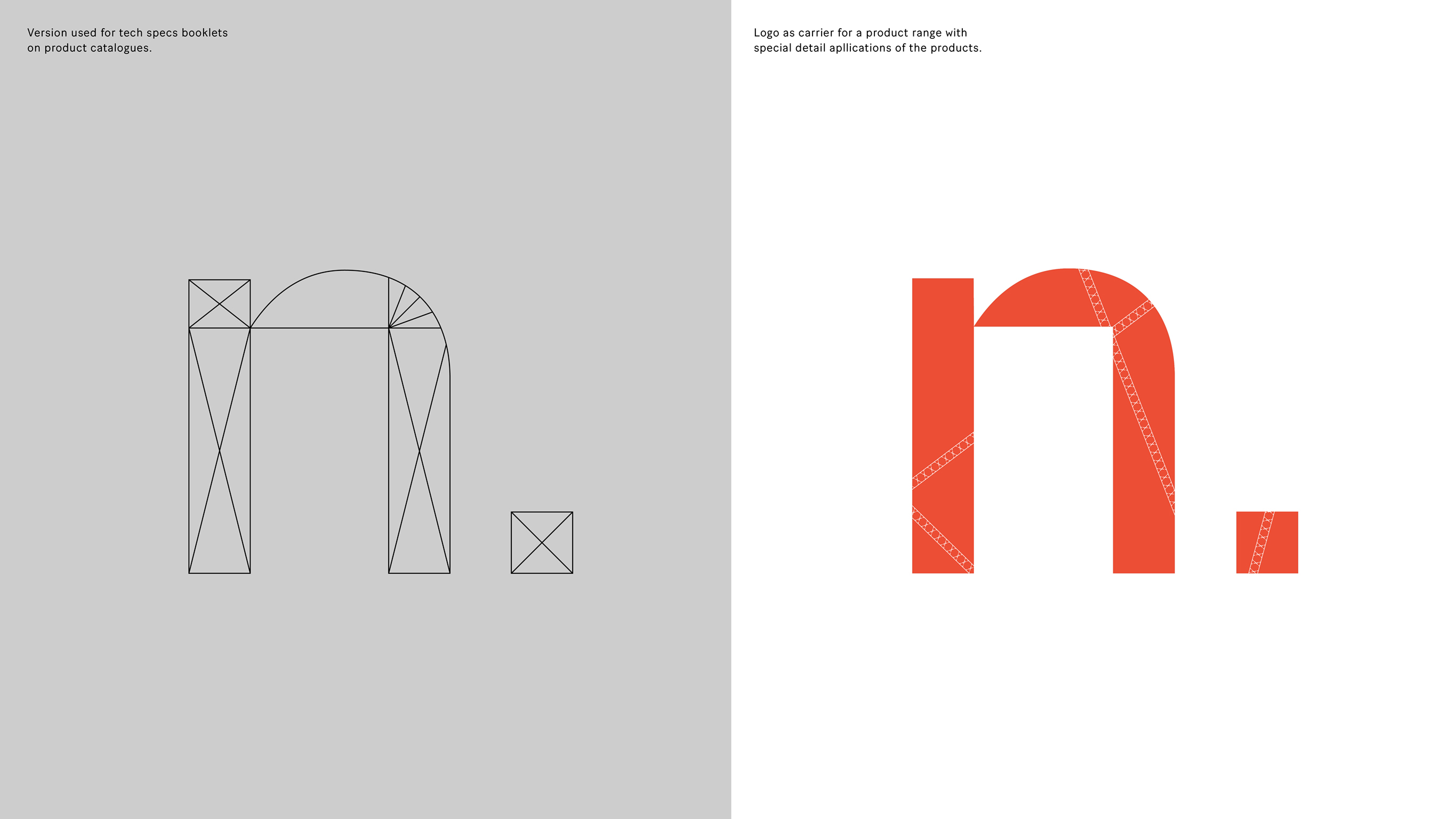
The Austrian office furniture company Neudoerfler is one of the oldest and most successful players in the national sector. The logo is part of a a general redesign of the Visual Identity. The brand clearly needed to freshen up, remove the dust and modernize. By reducing the brand name Neudoerfler to a strong and simple typographic figure with an edge, the »n.« becomes the brands new sender in its general communication. The edgy cuts also inspired a newly drawn logotype which breathes life into the brand. On its own and especially in combination, the two parts of the logoset work as strong visual framing on all analogue and digital applications.
Credits
Creative Director
Astrid Feldner
Designer
Marc Damm


Category
101 Company Logo
Client
Neudoerfler Office Systems
Country
Norway