Holland Festival 2019
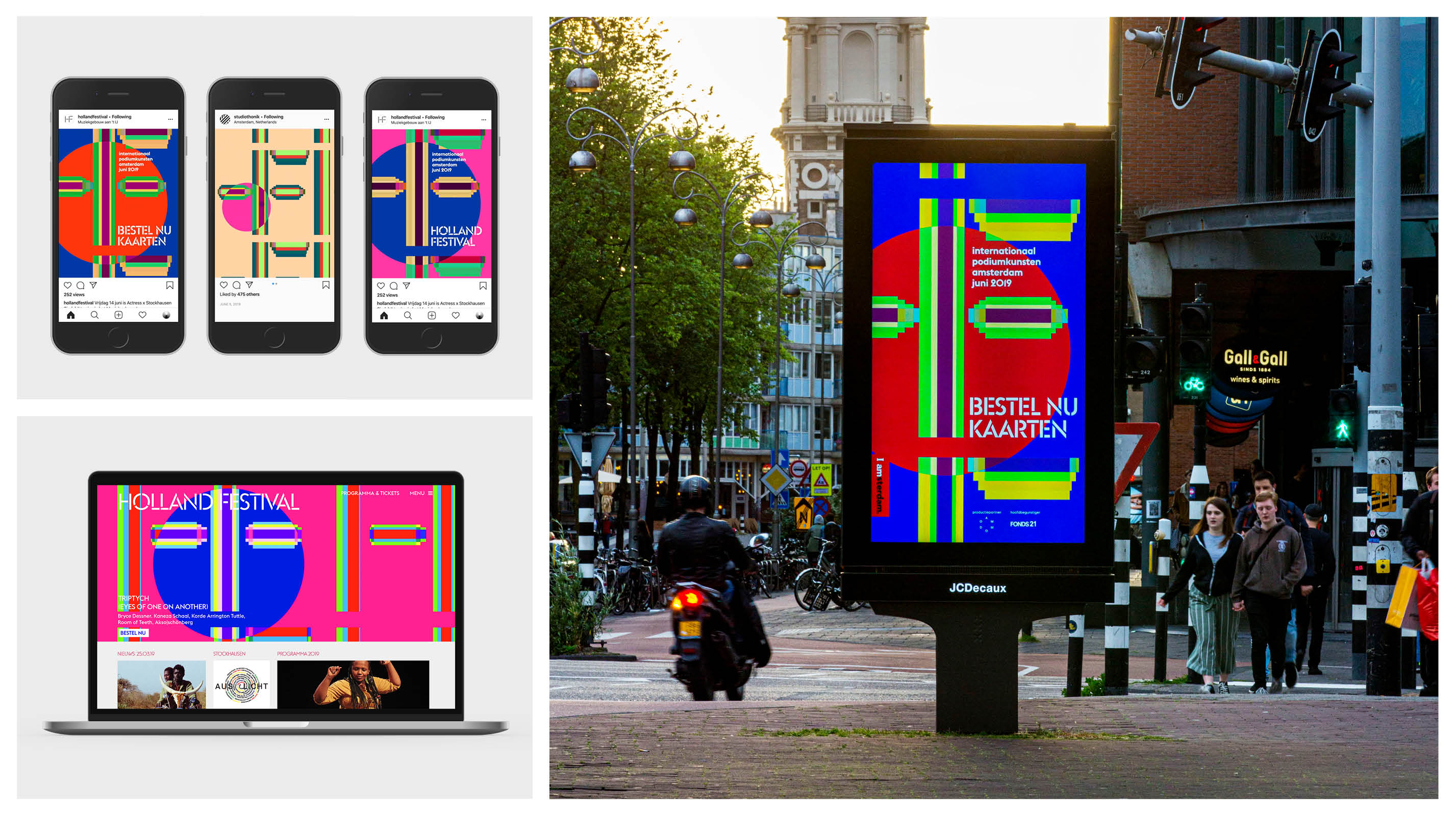
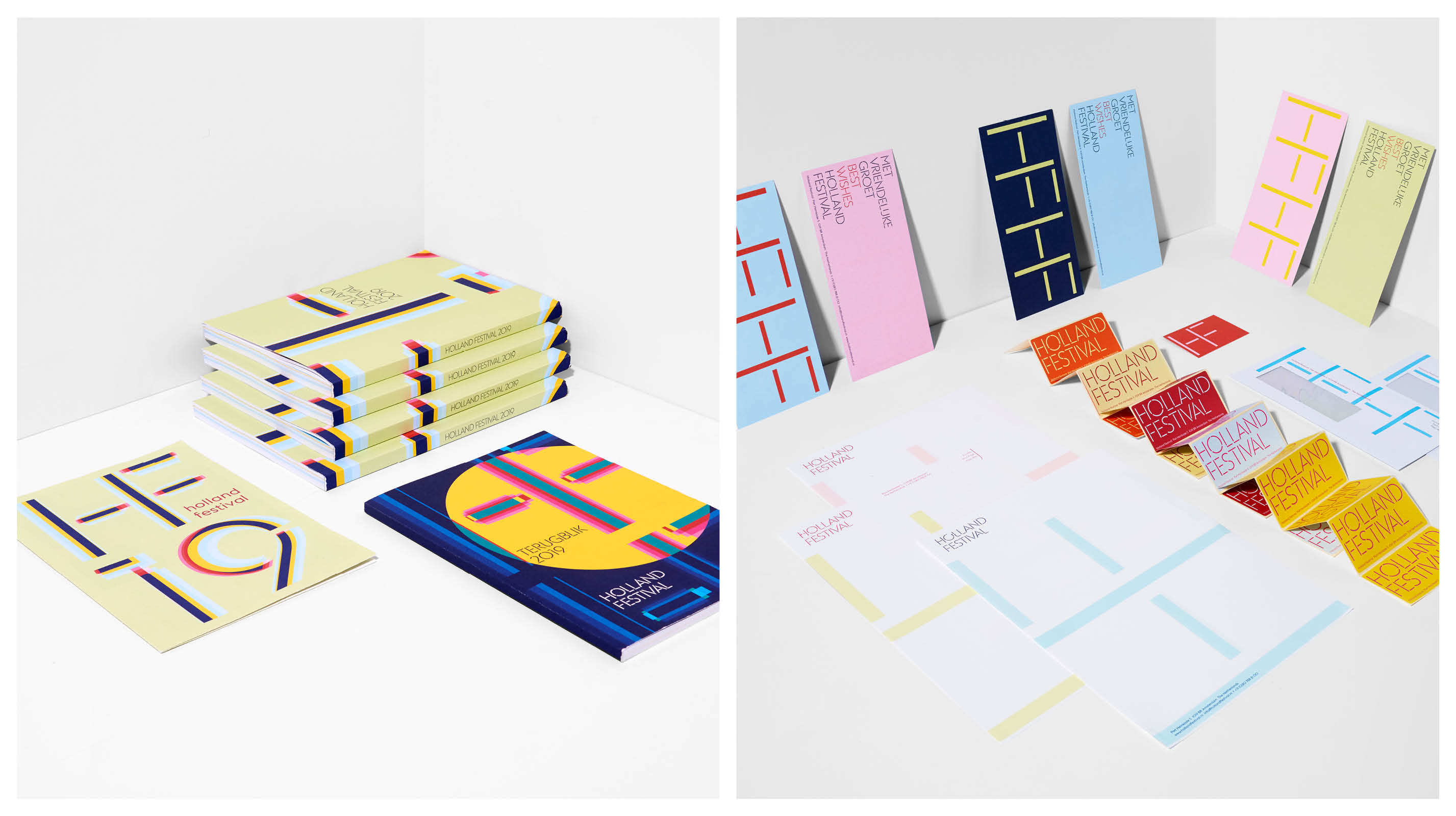
Since 2015 the visual identity and campaigns for the Holland Festival have been designed by thonik.
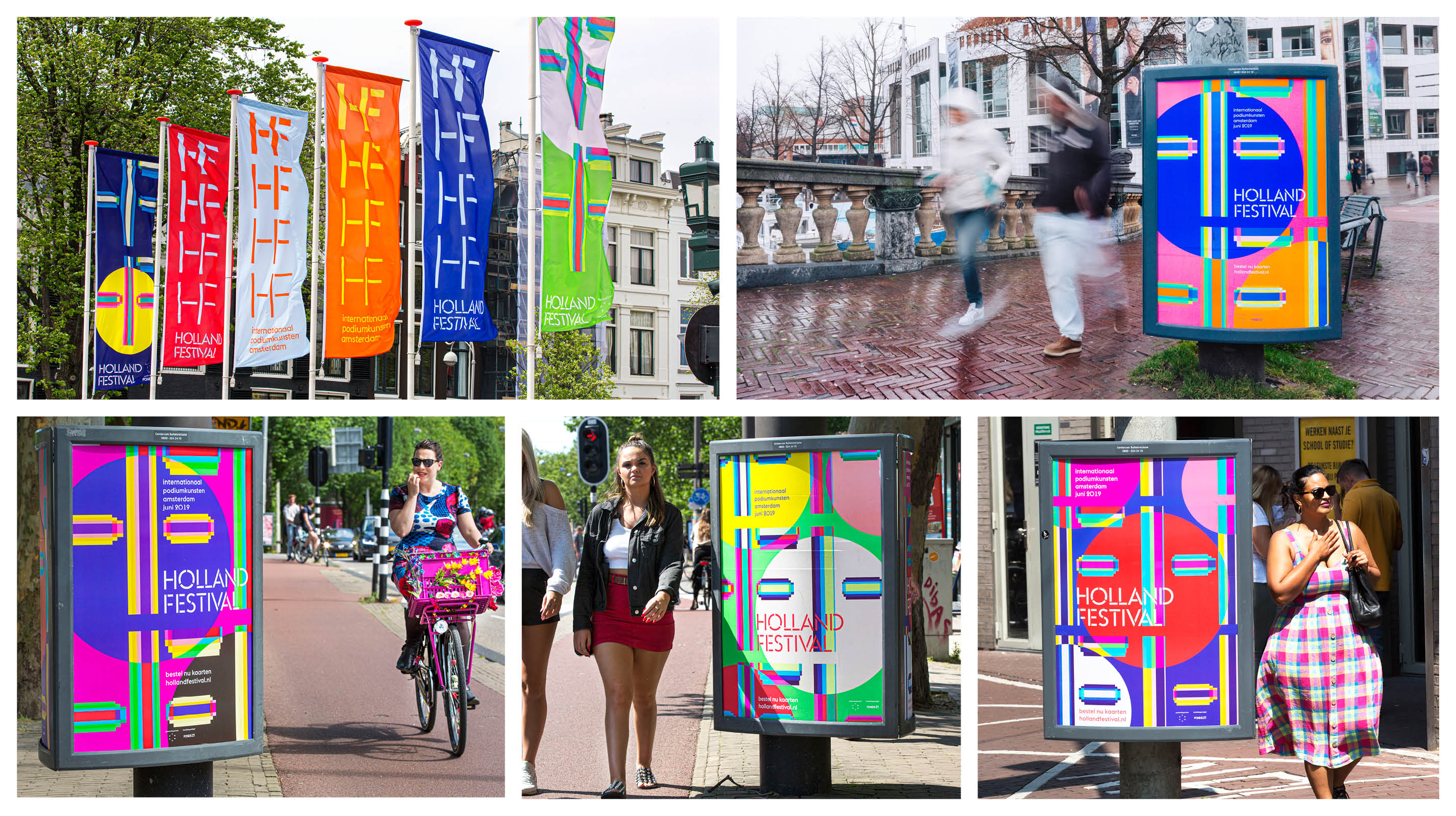
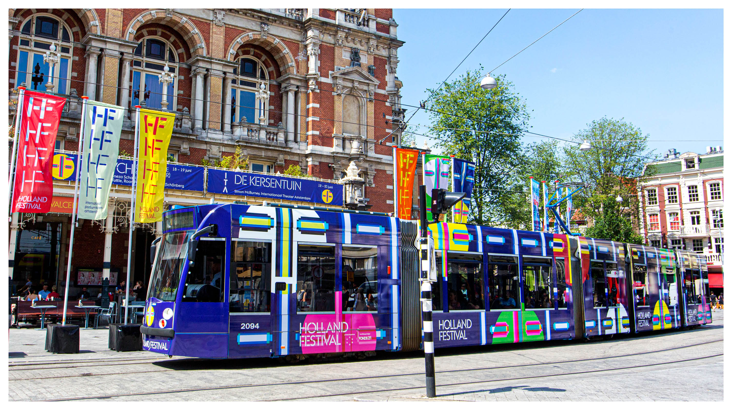
Each year the studio conceives a new storyline, that is expressed in strong graphic images.
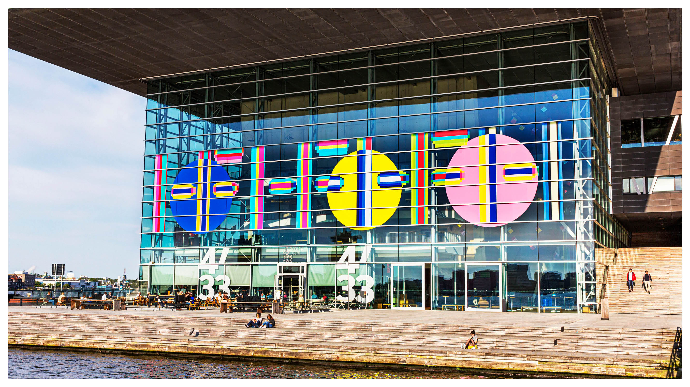
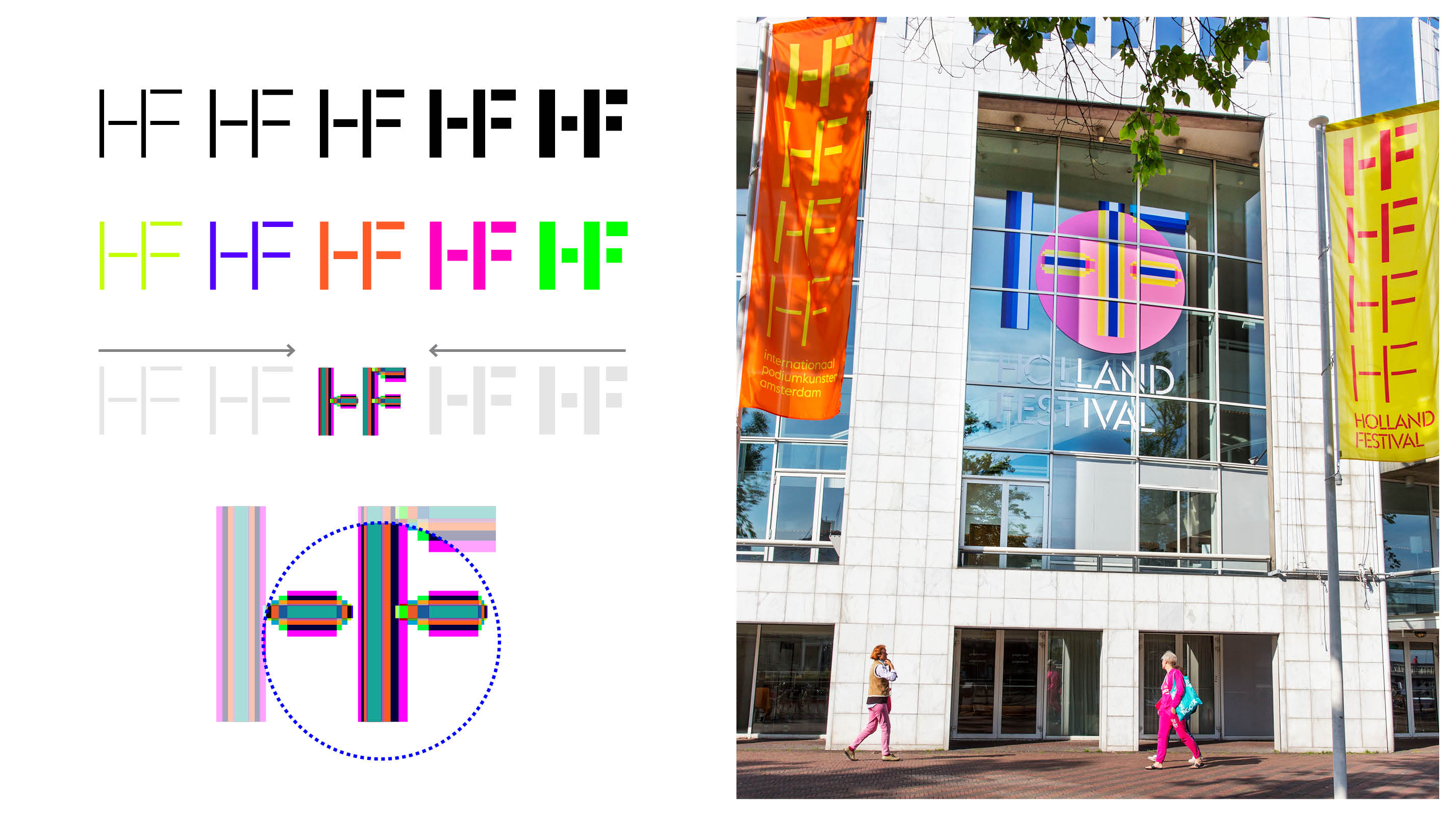
At the basis is a bespoke typeface that combines a stencil font with ligatures.For the 2019 edition the typeface was expanded with four weights.
In the campaign an overlay of all type weights was used to maximize the mesmerizing effect of bright and contrasting colors that express the multitude of voices and cultures that make up today’s society.
Circles turned the logomark into masks to communicate the general theme of identities and identity politics.
The design explores the translation of bright colors across different media. Online in RGB, in print in pantone and CMYK.
The Holland Festival 2019 was a successful 72nd edition, in which a large national and international audience was reached, on the cultural stages and at unexpected locations all over Amsterdam. 36 companies played 119 performances in 26 days. The festival welcomed more than 76,000 visitors. In addition, hundreds of thousands of people were reached via television and radio.
Credits