Warehouse Ten
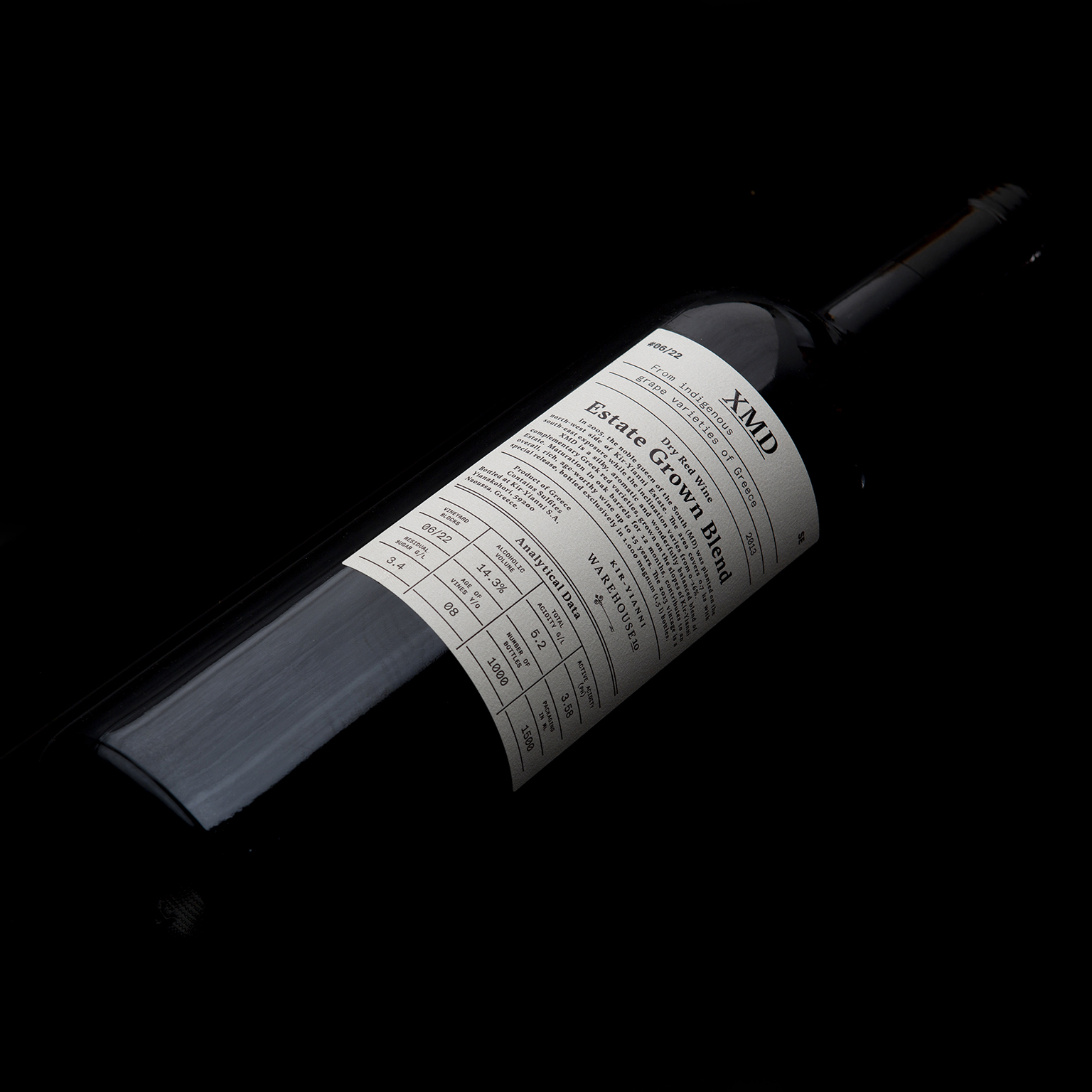
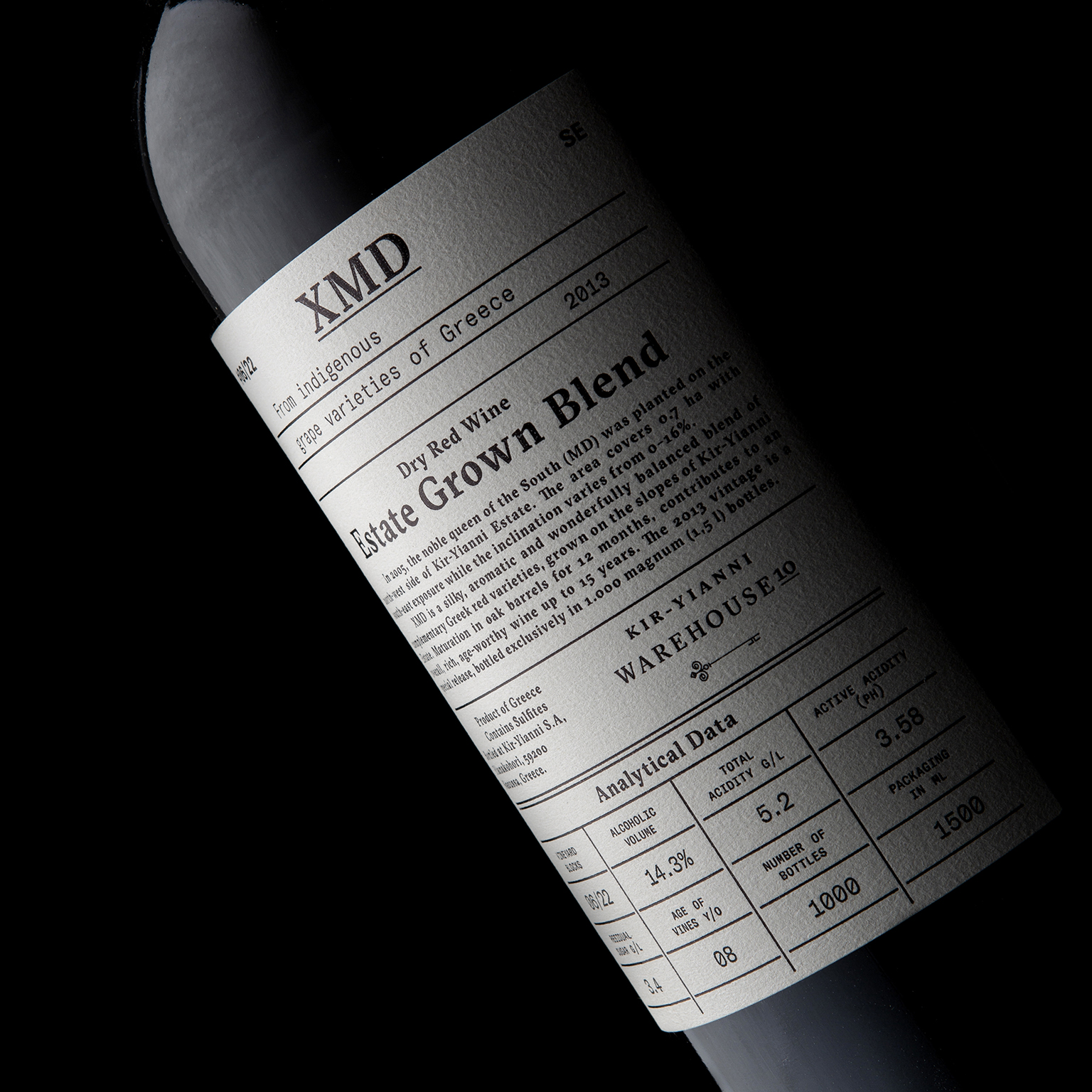
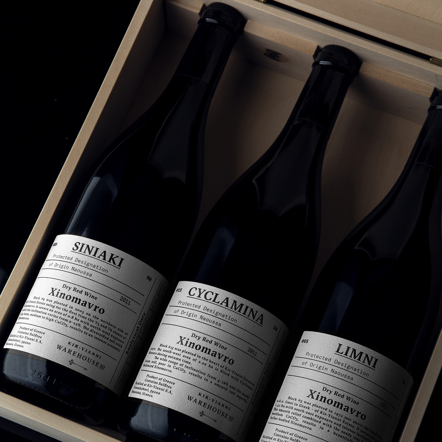
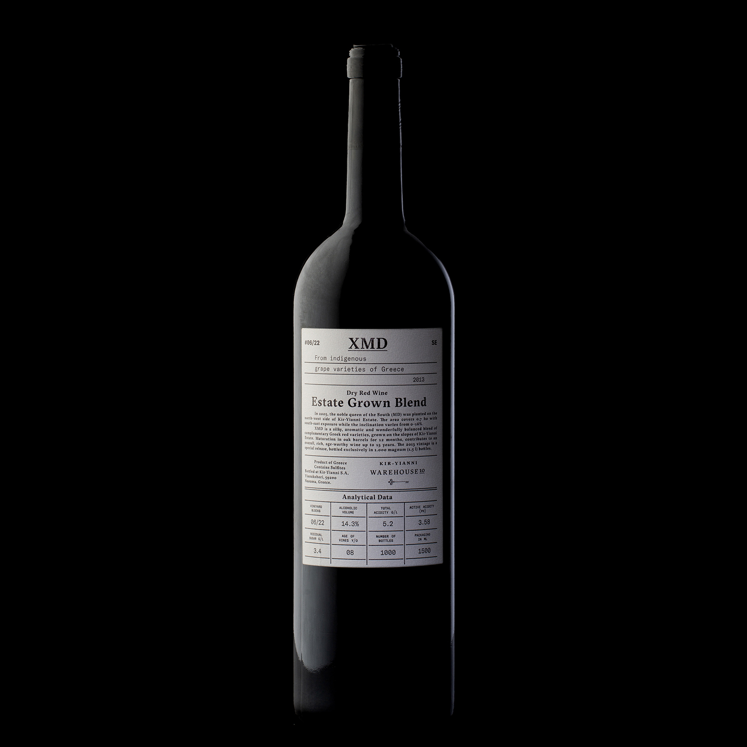
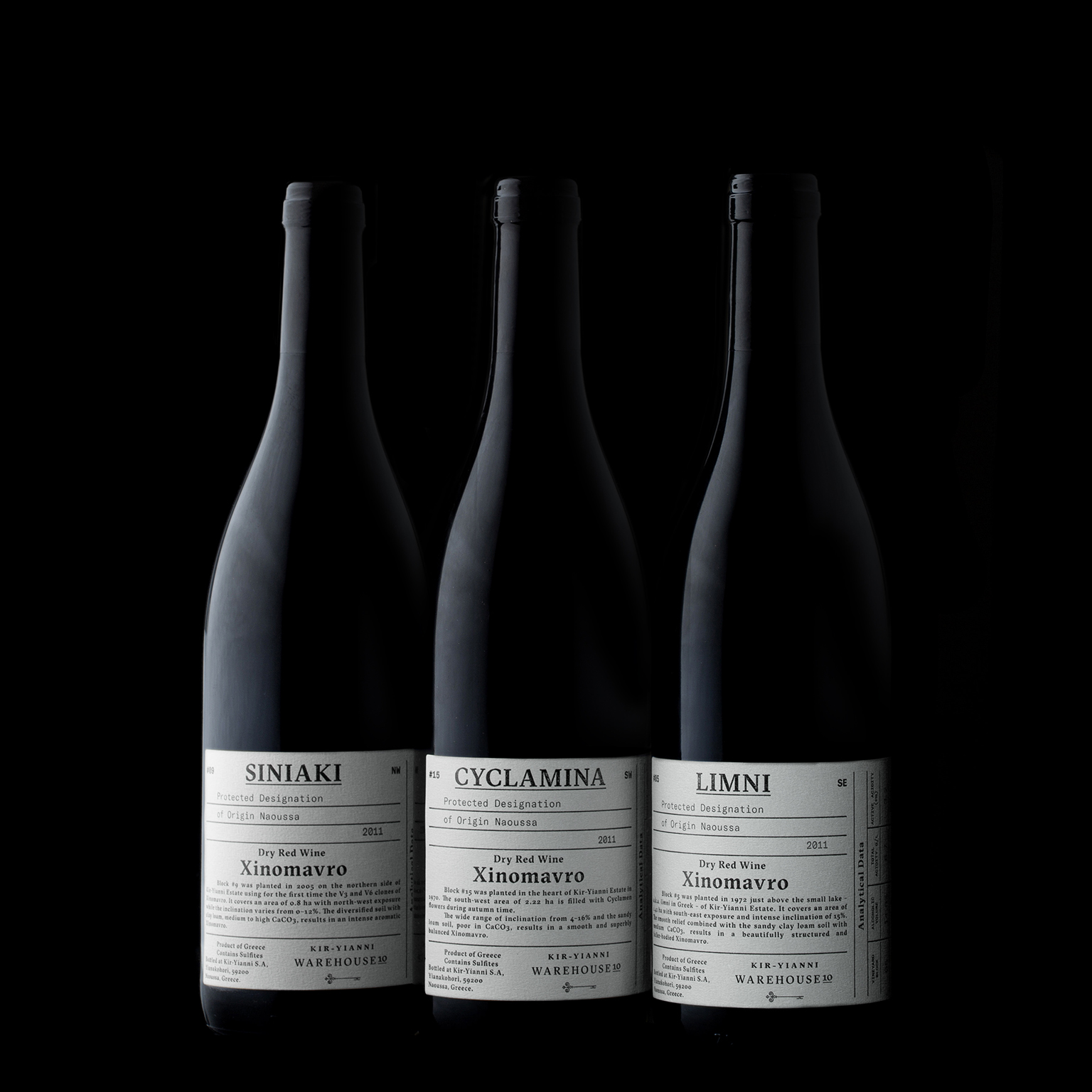
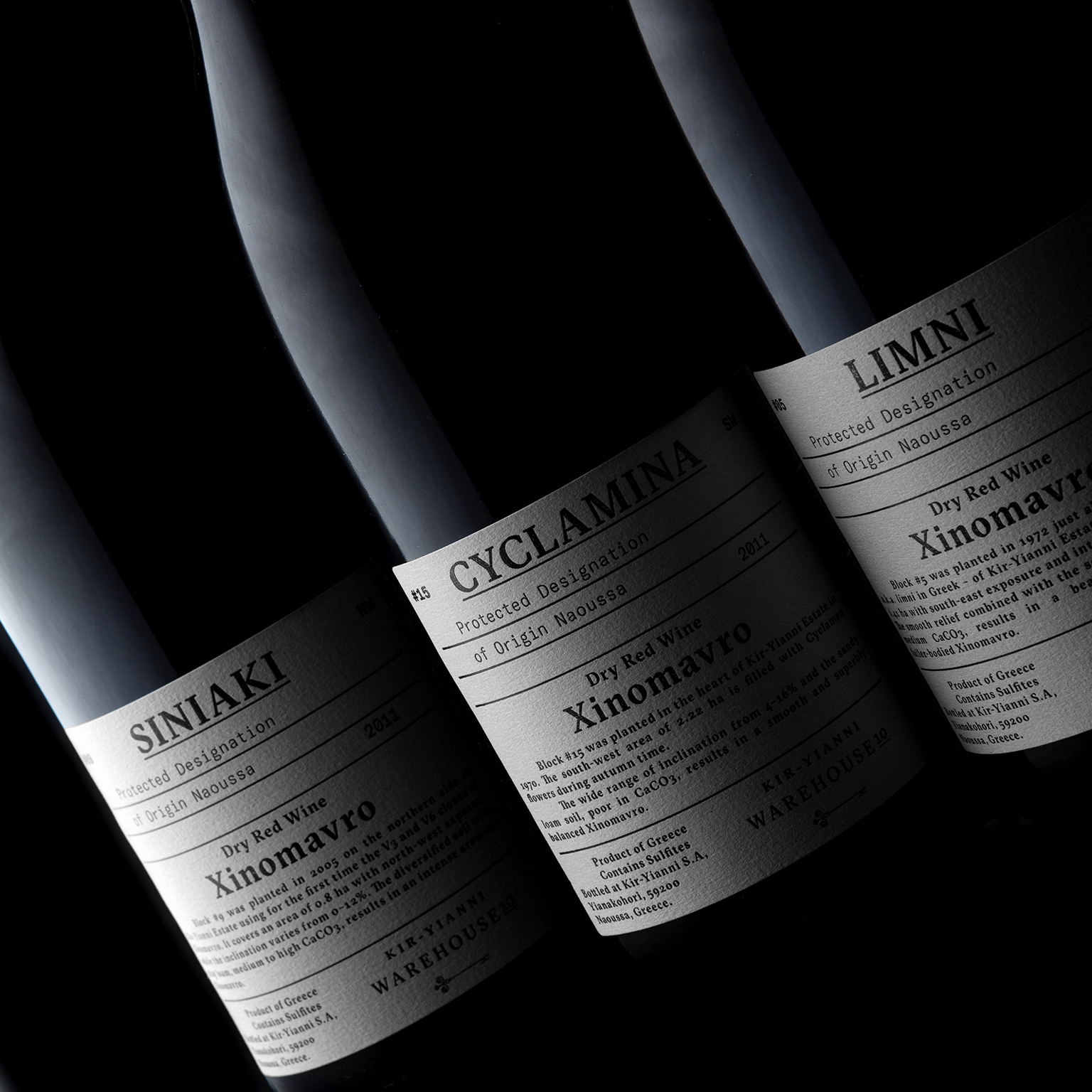
Creating a label as an index of vintages for all wine lovers and collectors. The series depict the analytical data of the wine including all essential factors such as the age of vines, the soil and the clones.
An imprint of value and aftertaste. Communicating quality and recording all unique features in a systemic way.
The printing technique used is traditional letterpress.
For the typeface we used a contemporary serif font combining the calligraphy of the broad nip pen with the sharpness of the scalpel.
All data are depicted with a monospace typeface, GT America.
Τhe missing bridge between 19th century American Gothics and 20th century European Neo-Grotesk typefaces. It uses the best design features from both traditions in the widths and weights where they function optimally.
Credits