Annual Report for Fremtind
https://sdg.no/work/fremtind-annual-report
Fremtind was founded in 2019 when Norway’s two largest banks, DNB and Sparebank1 merged their insurance businesses. We were given the opportunity to design their new visual identity, and 2020 was the first time they were to present their annual report, all dressed up in their new design.
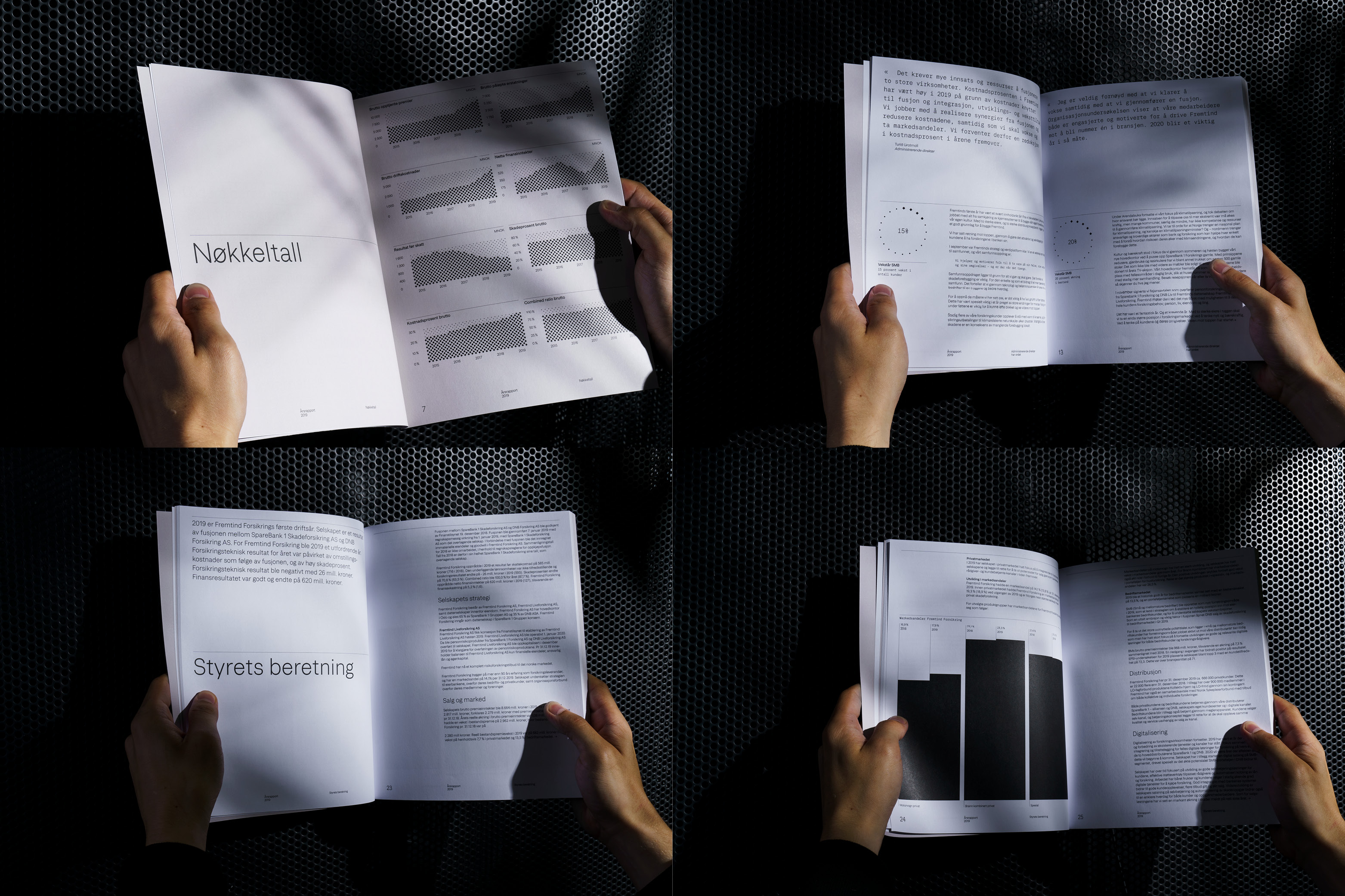
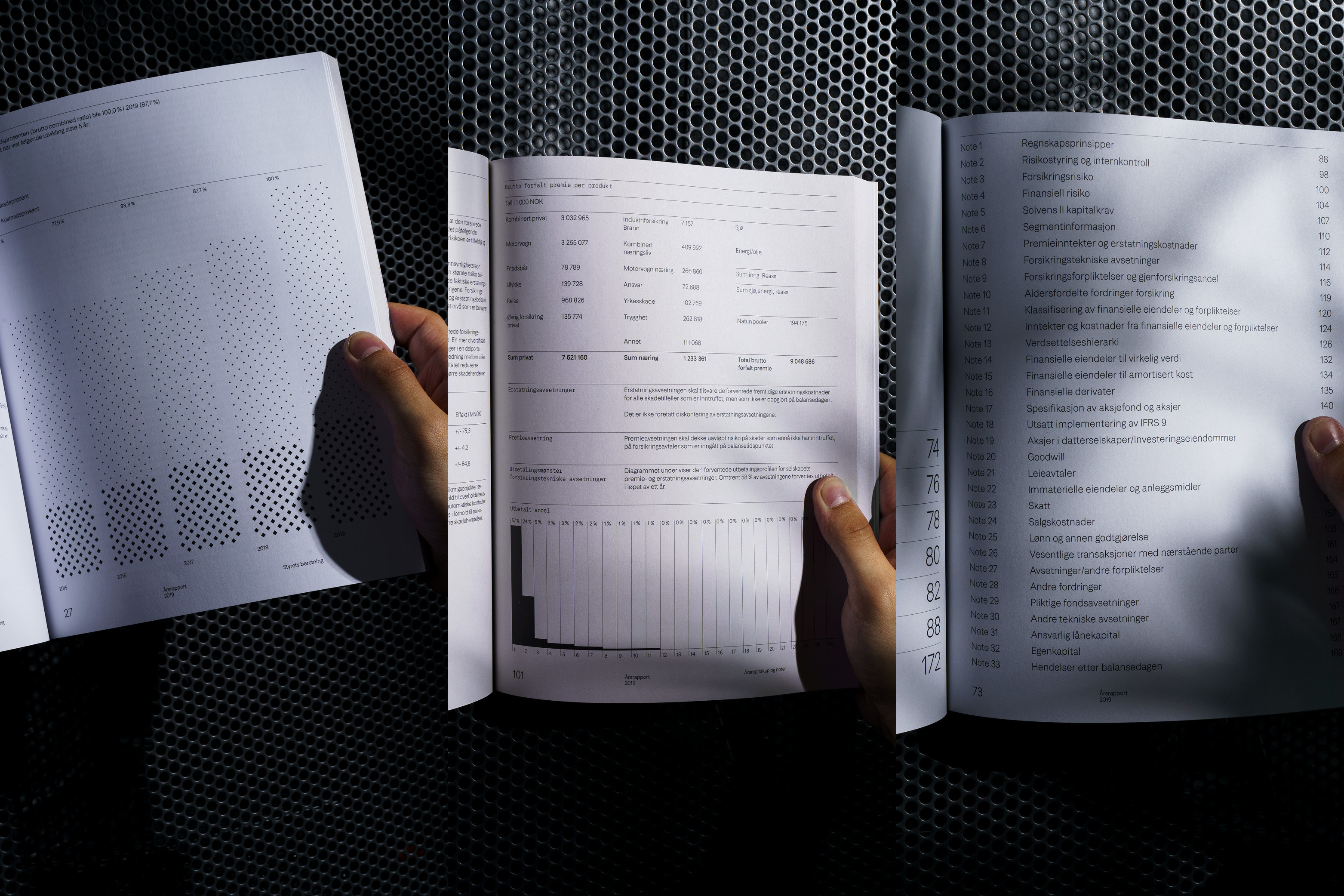
Typographically the aunual report embodies Fremtind’s identity attributes -striving to reach ‘the pinnacle of clarity’.
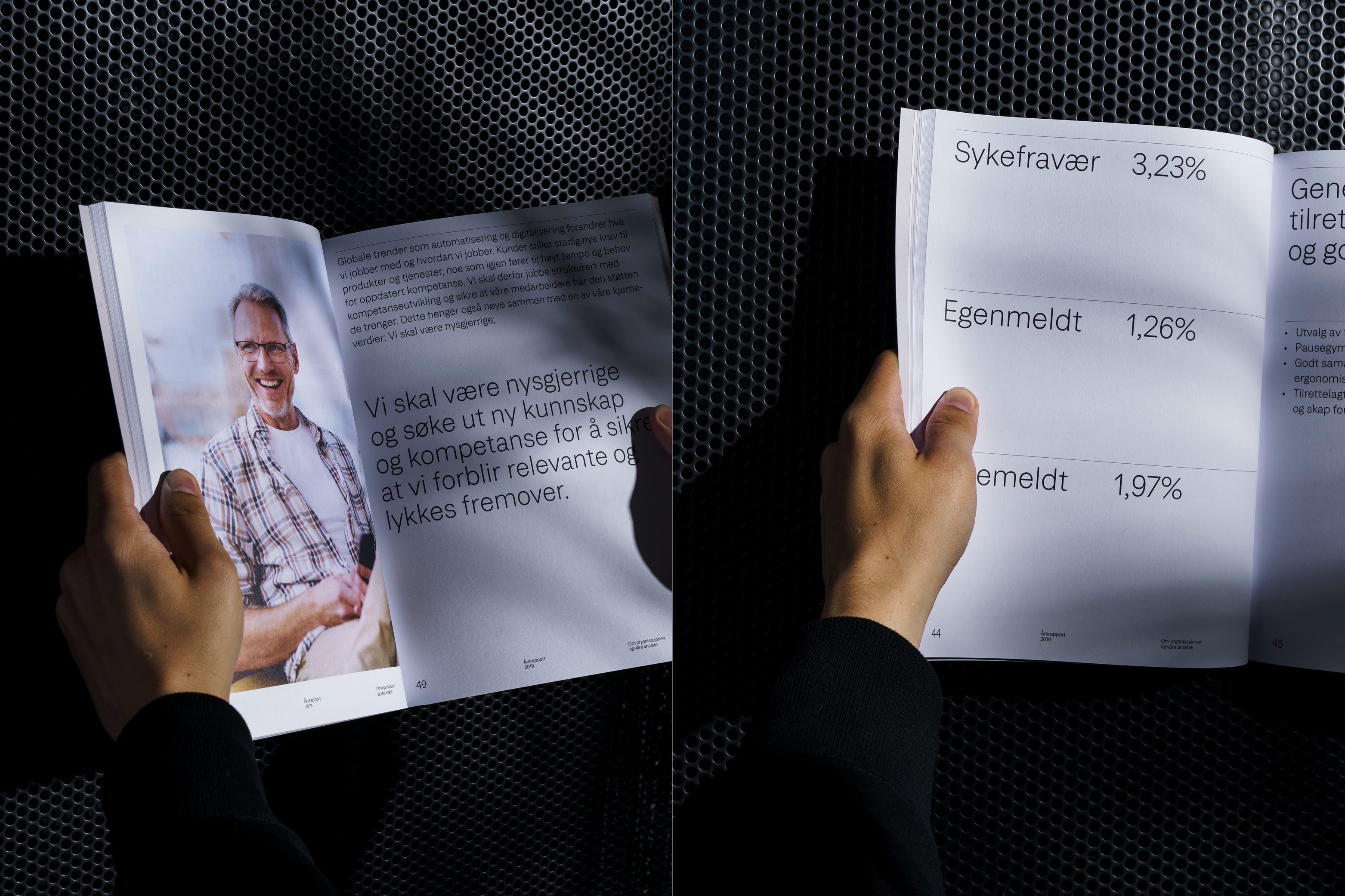
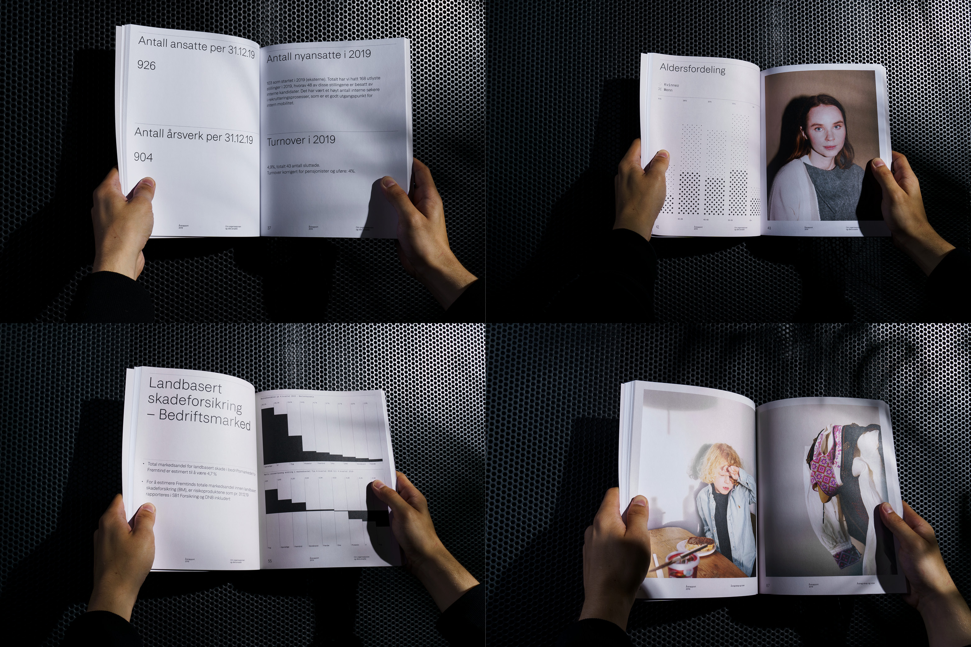
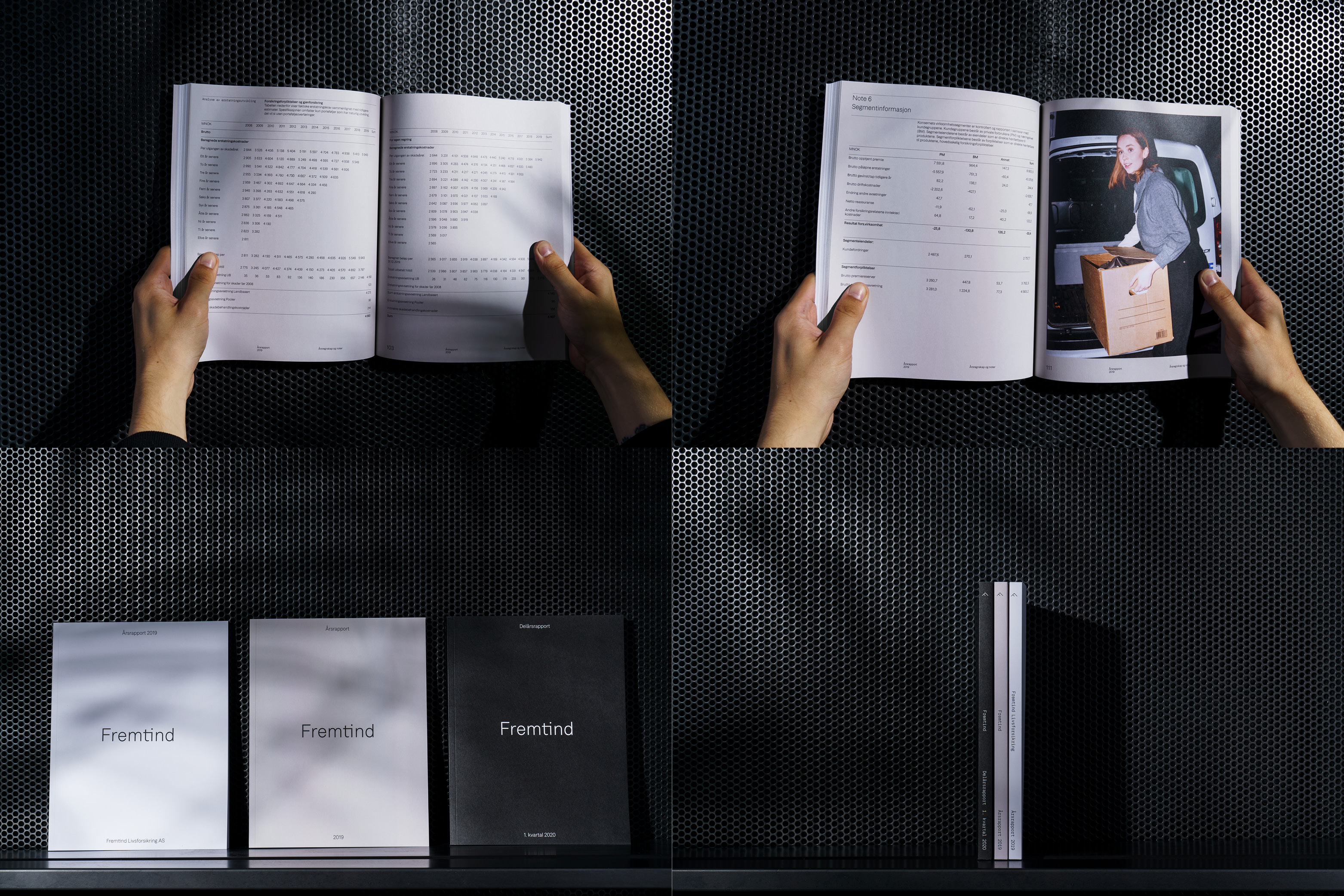
The report is set in Fremtind Grotesk, a type family containing six weights, drawn especially for Fremtind. The type is accompanied by earthly, identity photography, providing lively breaks to the pragmatic typographic approach. The layout is rigid and restrained, yet with room for flexibility. It ensures a consistent layout of text, numbers, photography and infographics. Typographic craftsmanship was key. We wanted the reader to be left with a sense of quality and solidity.
The infographic program is quite different from how insurance companies usually present their numbers. It strives for simplicity and clearity, without unnecessary decoration. The report is printed on high-quality, recycled, FSC-certified (Forest Stewardship Council), uncoated paper stock.
Fremtind’s annual report is color-coded with white, grey and cairn (light beige). This ensures clear sectioning and makes for a better editorial experience for the reader. Furthermore, our design for the annual report was developed into a design system, which is now used for all other reports produced and distributed by Fremtind.
Thank you for your consideration.
Credits