M+ annual review
M+ is Hong Kong’s new Museum on visual culture, focusing on 20th and 21st century art, design, architecture and moving image. It will open in 2021. Thonik is developing a visual identity that works across the institution’s physical and digital platforms. The first result is out: the annual review.
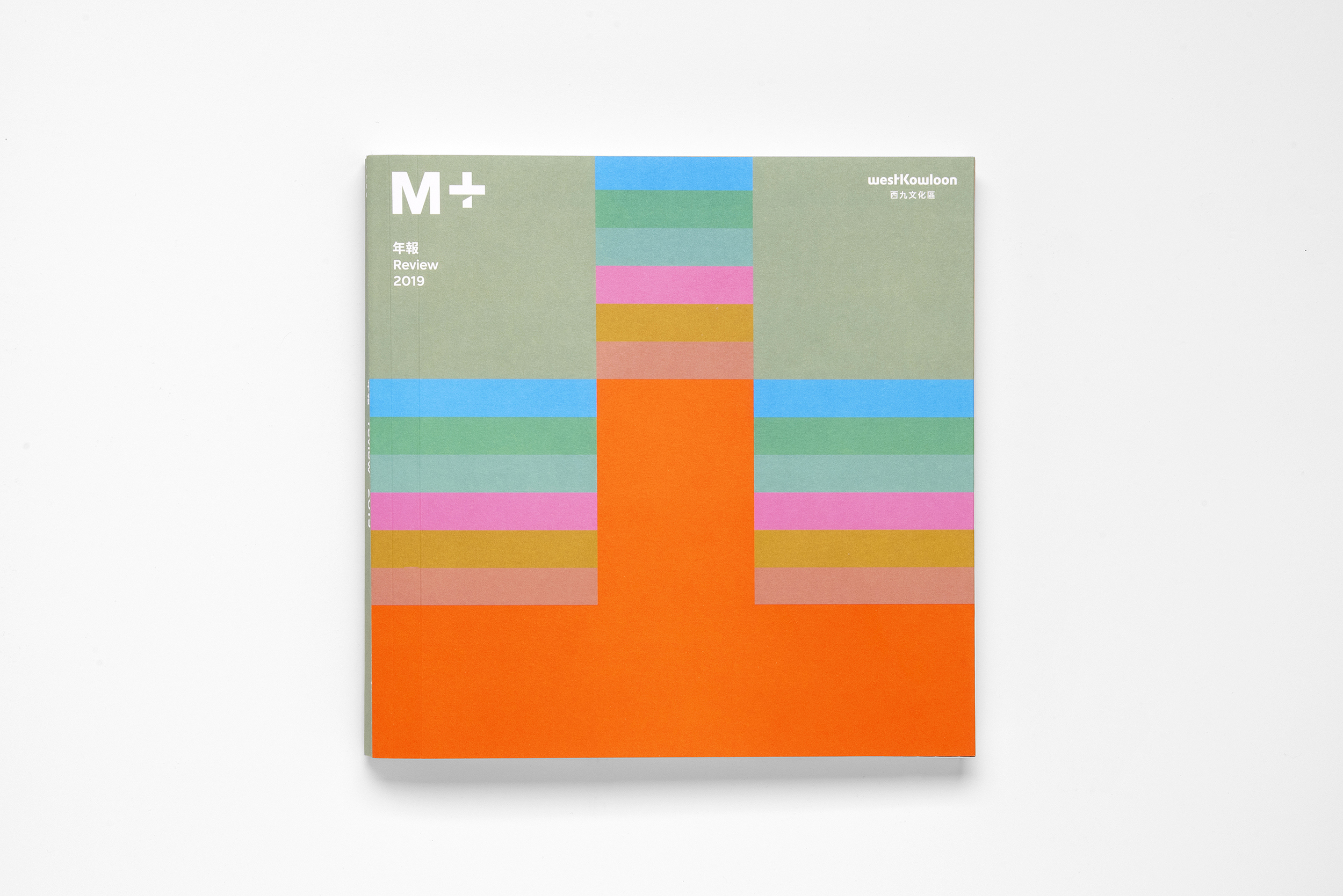
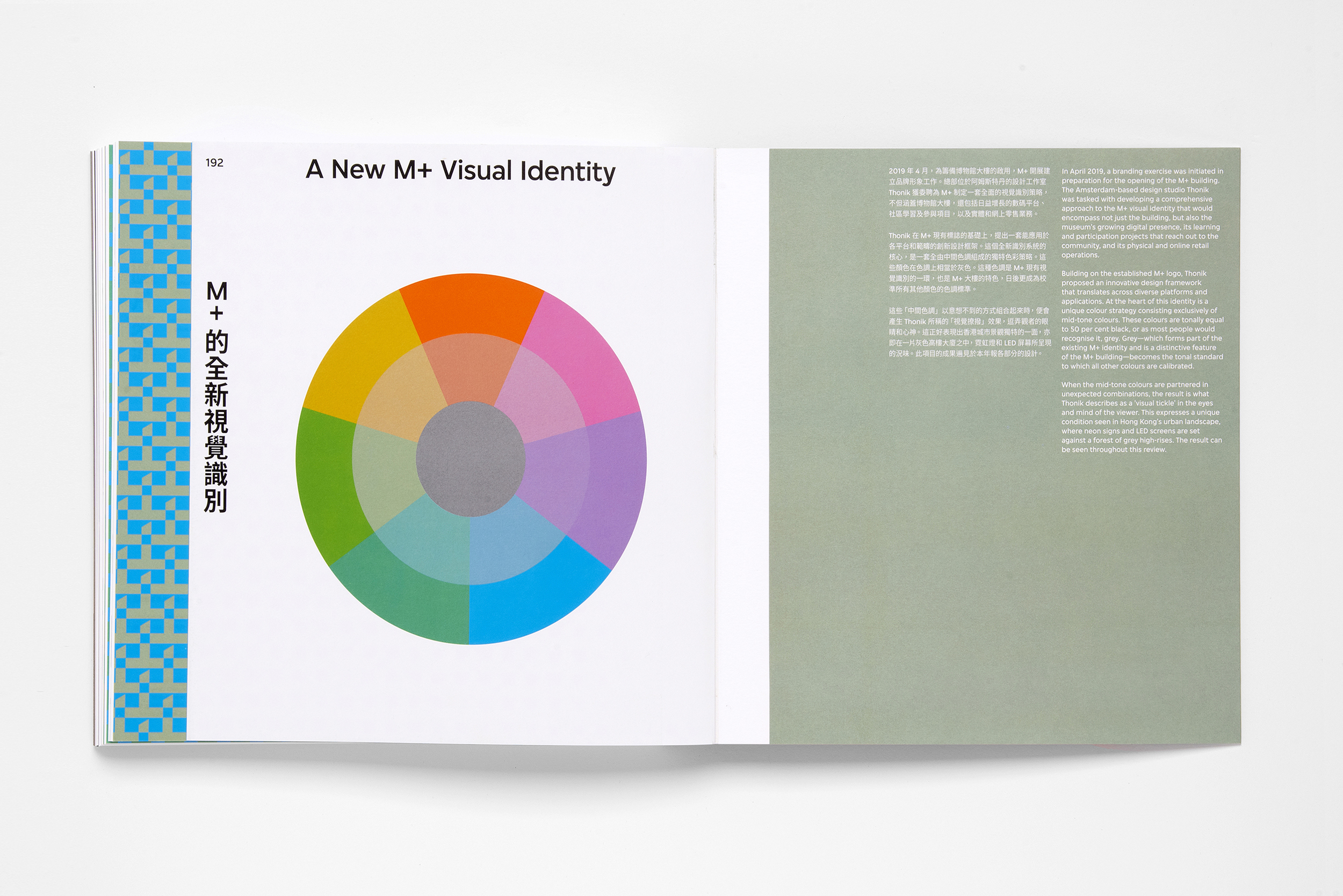
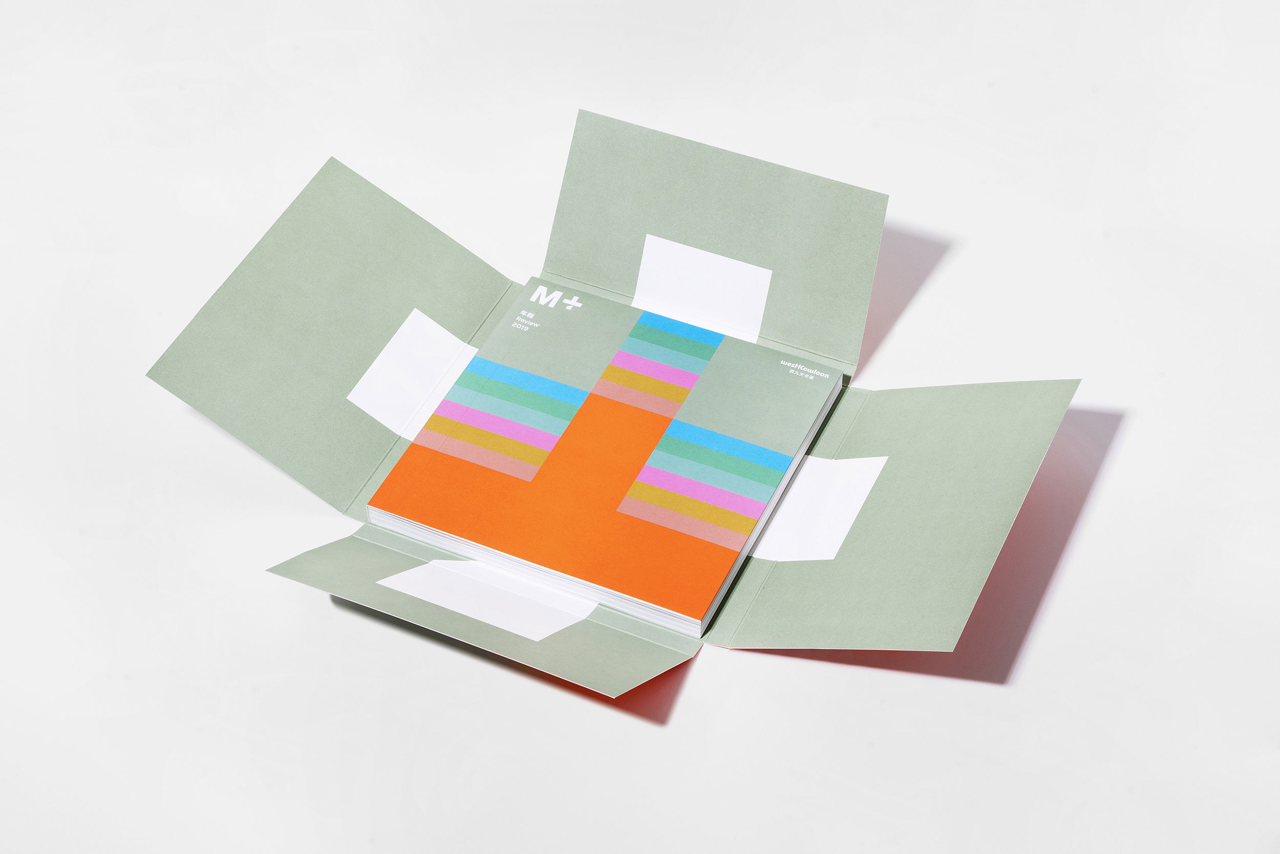
All colors in the M+ chromatic range are tonally the equivalent of 50% black. And when this palette of mid-tones is used in unexpected combinations, the result is a “visual tickle” in the eyes and minds of the viewers. The vibrant, arresting use of color creates a varied and memorable brand identity for a progressive and design conscious institution.
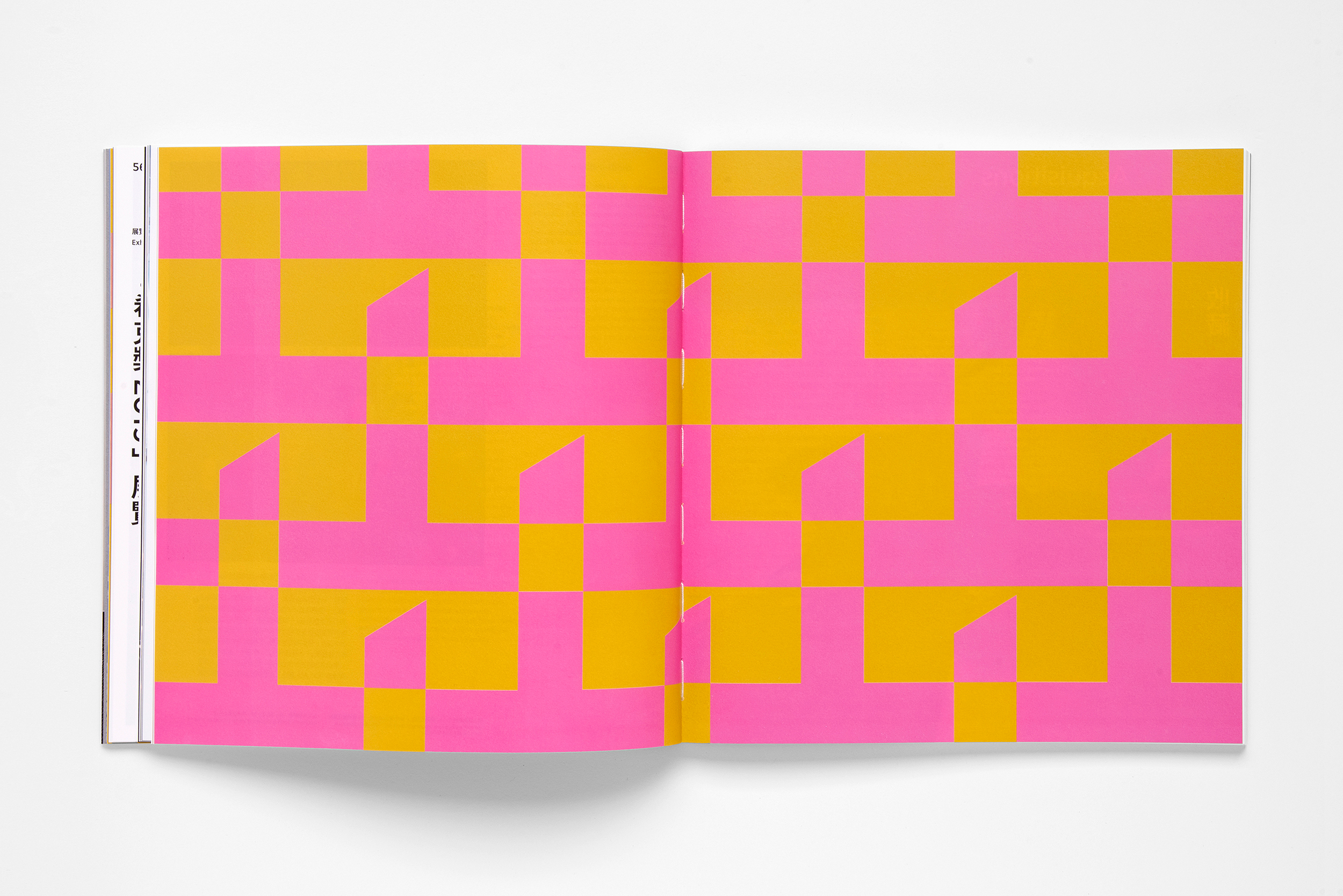
On the cover a part of the logo is used to mimic the iconic architecture of Herzog and the Meuron. Inside the plus of M+ is used in patterns.
Credits