Project
Food Society
Agency
Bleed
Bleed Design studio
Year
2021
Award
Silver
Food Society
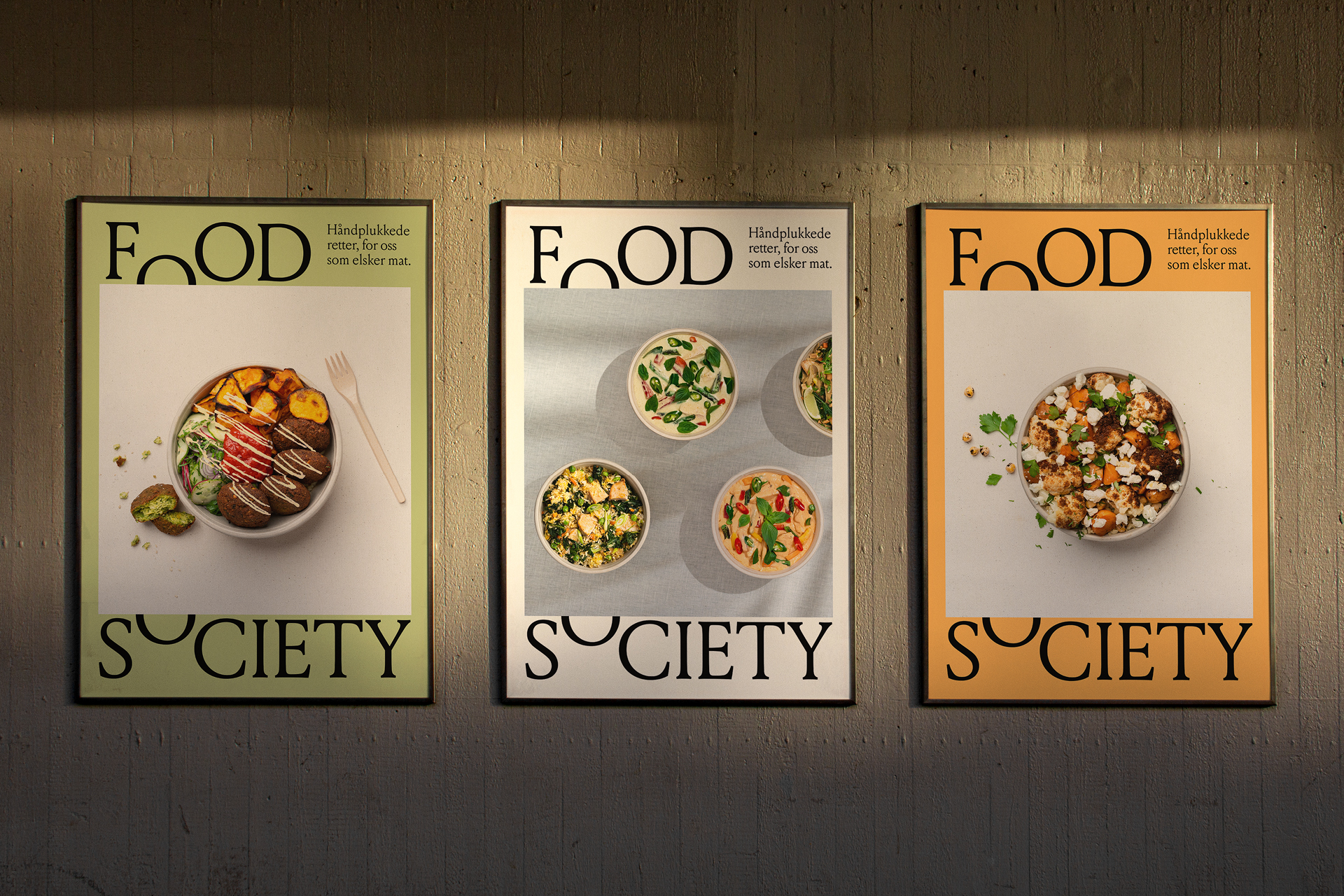
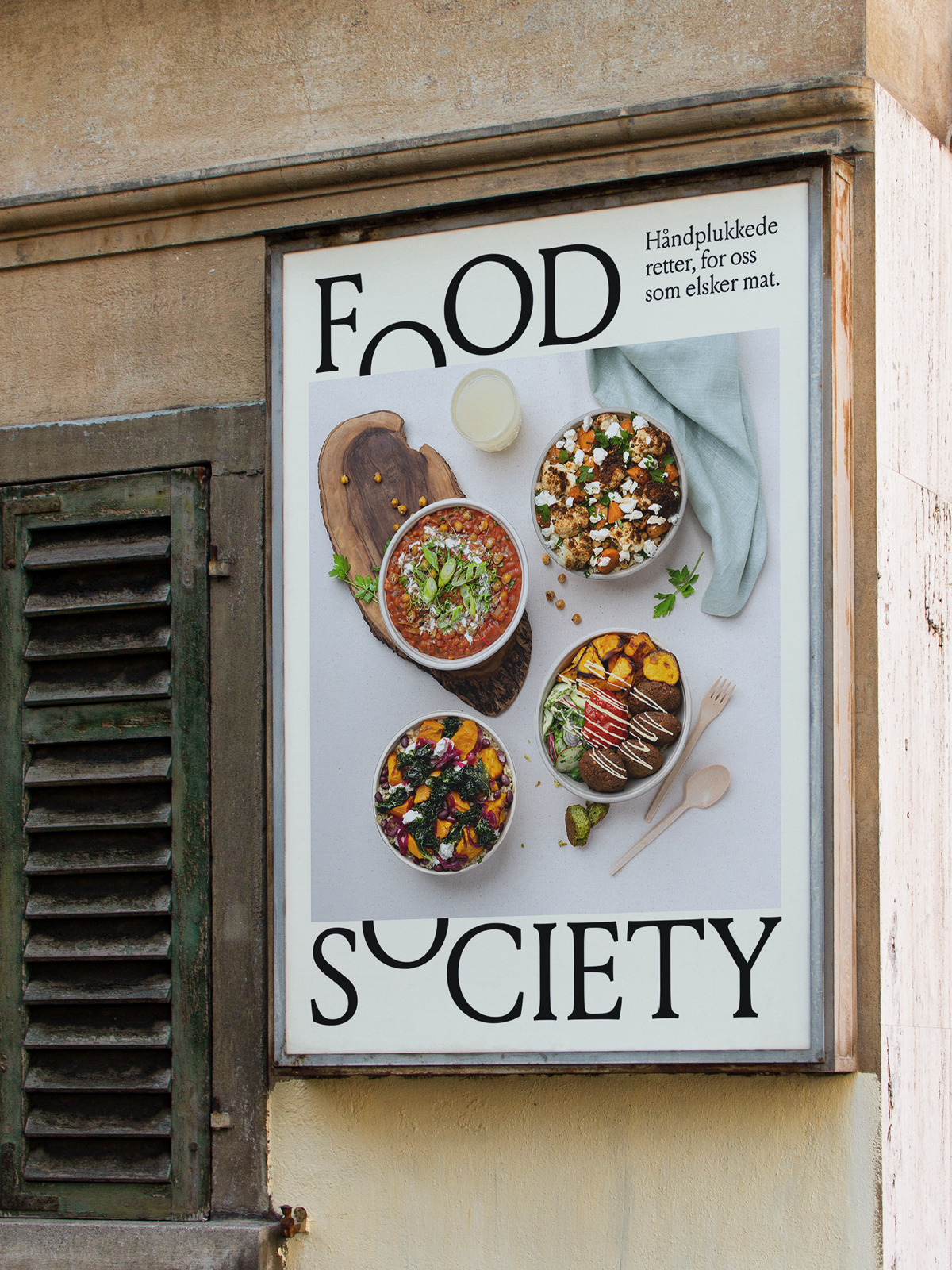
Following several launches in a variety of consumer-facing industries, Askeladden & Co moved into the food world with a one-stop takeaway shop. Whereas many chefs specialise in one cuisine, Food Society sees the world as their playground, uniting some of the world's best kitchens by exploring a wider array of flavours.
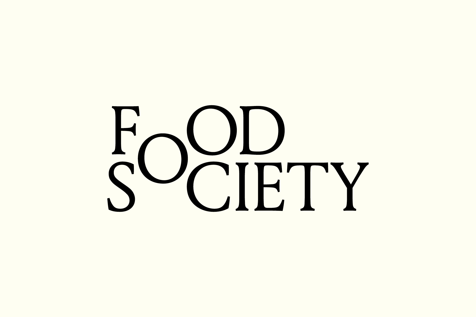
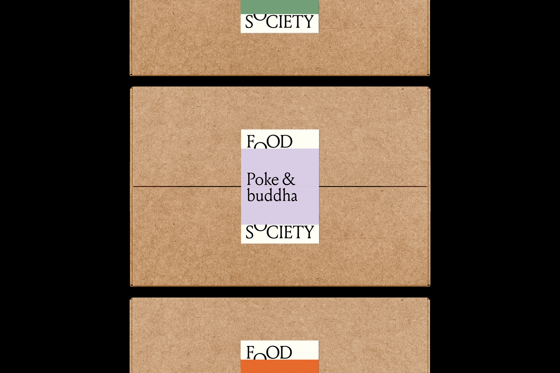
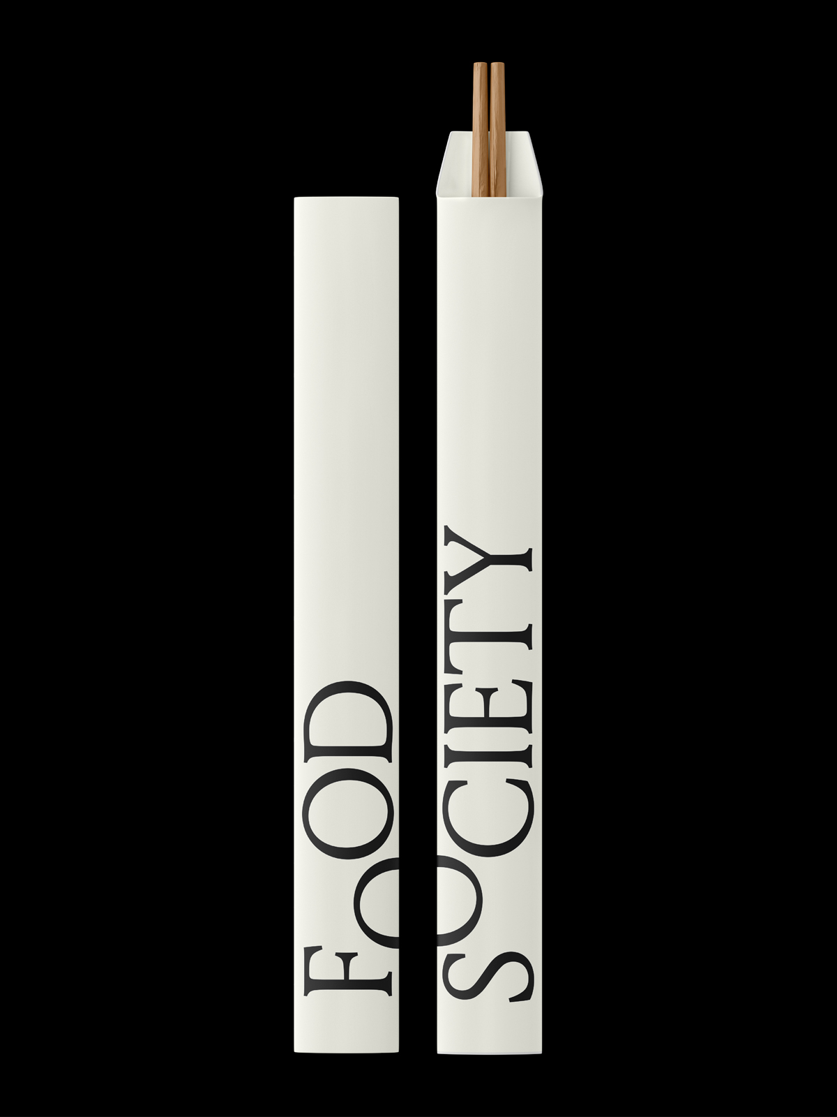
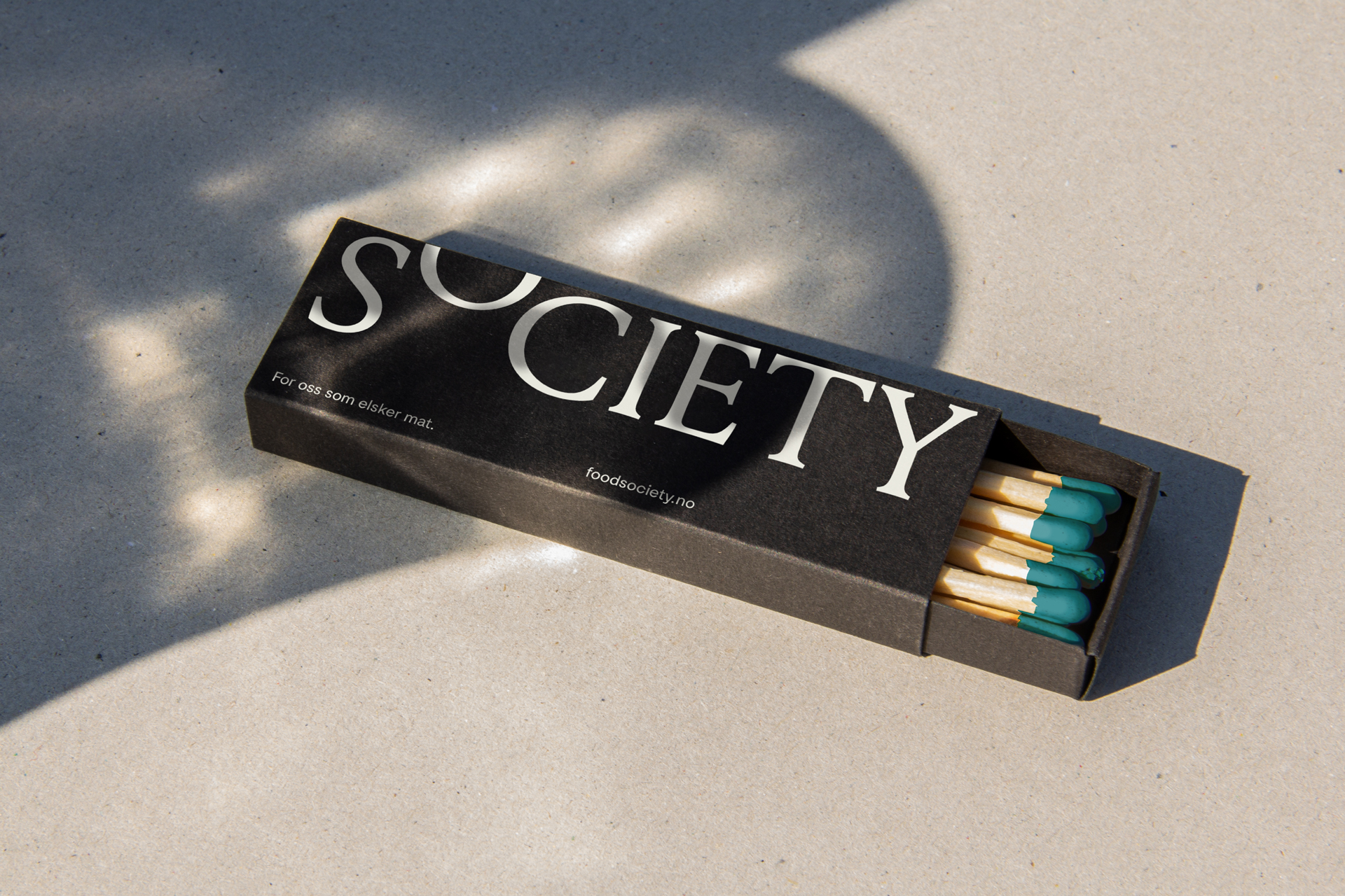
The logo embodies the idea of community, using the shared ’O’ to represent the point where the different kitchens come together. As the focal point of the identity, the ’O’ is consistently used as a key visual gesture across the different applications and has the flexibility to open up, allowing the different cuisines to live within the main brand.
Credits
Creative Director
Svein Haakon Lia
Designer
Camille M. Sauvé
Category
102 Brand Logo
Client
Askeladden & co.
Country
Norway