Project
BC Eric Machat
Agency
Briefcase Type Foundry
Petra-D
Typo9010
Year
2022
Award
Silver
BC Eric Machat
https://www.briefcasetype.com/fonts/bc-eric-machat/
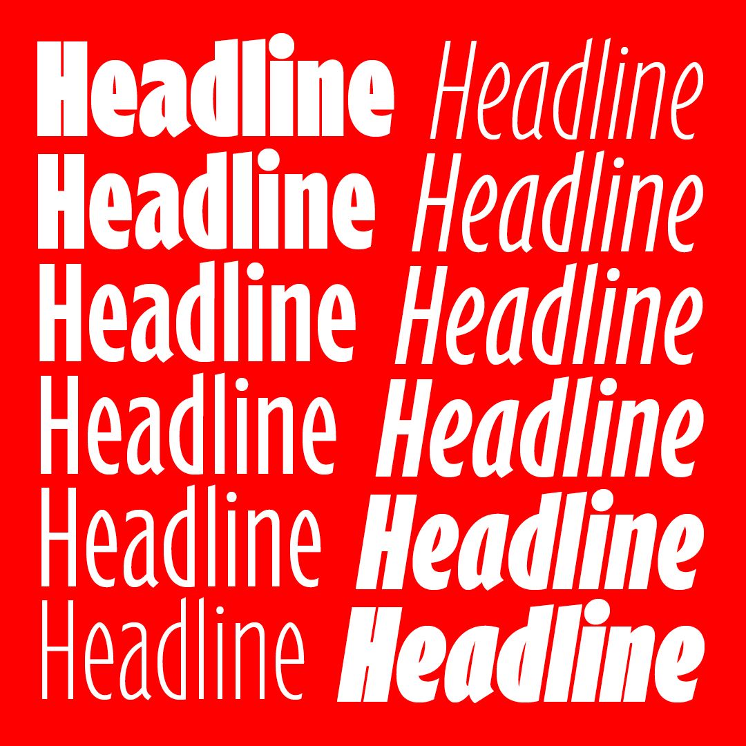
The young Czech typographer Matyáš Machat proceeded differently than Monotype when he decided on his own interpretation of Gill’s typeface. He did not undertake it to simply iron out the typeface to his own liking, but by looking into Gill’s variants of individual glyphs. He decided to confirm the typeface’s calligraphic conception, its expressive unification, inner organic nature and suppress overly irritating features.
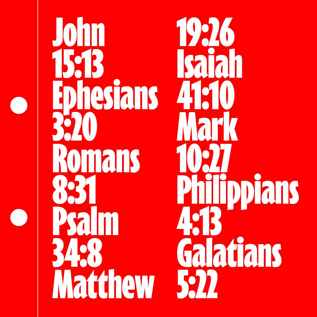
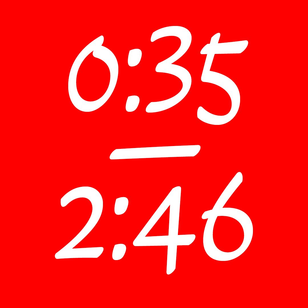
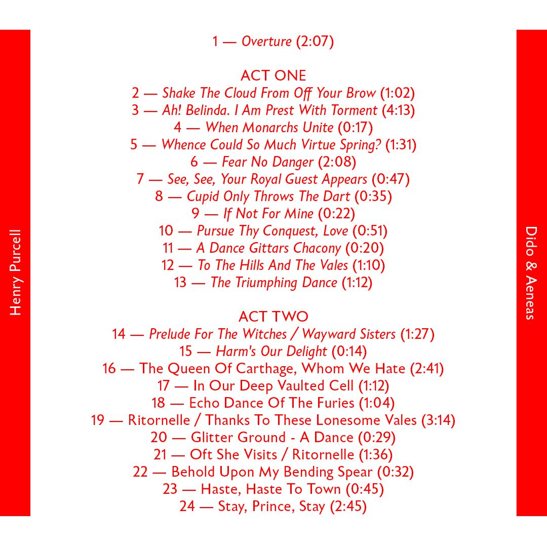
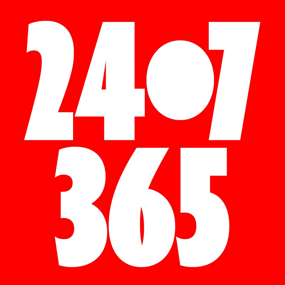
In short, the Eric Machat typeface is artistically balanced, organic, calligraphic, uniform, a little sharp. In any case, the Eric Machat typeface has an open metrics, and it’s suited for better readability for longer texts, where it reads excellently at smaller sizes, does not strain the eyes and holds up even with very long novel reading. Eric Machat is a new take of Gill Sans – the Times New Roman of sans-serifs, a typeface as commonly used as the immortal Times and just as inconspicuous in the eyes of the user. It no longer suffers from ostentatious novelty. But it does remain unsurpassed in its original beauty.
Credits
Creative Director
Briefcase Type Foundry
Art Director
Briefcase Type Foundry
Designer
Matyas Machat
Illustrator
Matyas Machat
Specimen Designer
Marius Corradini
Category
501 Original Typeface – Text
Client
Briefcase Type Foundry
Country
Czechia