Project
Courage
Agency
Identitätsstiftung
Year
2022
Award
Gold
Courage
Our Challenge:
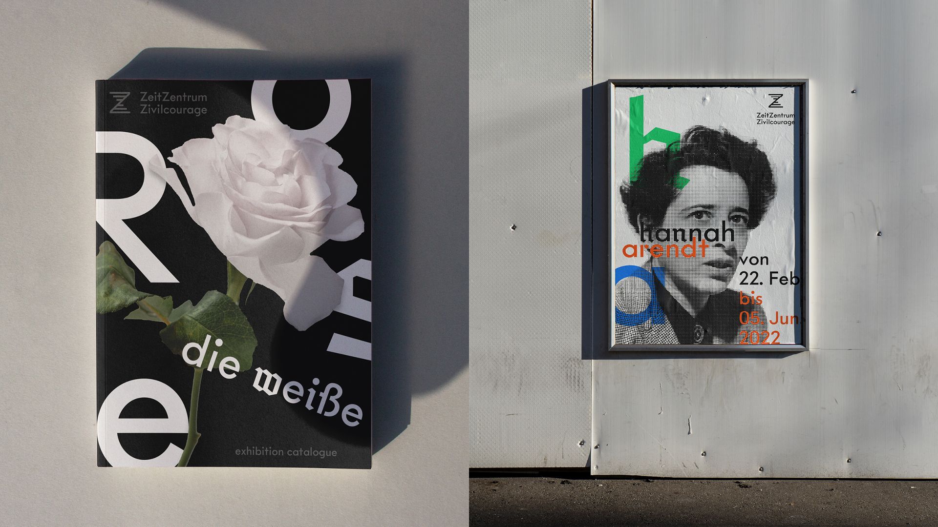
The ZeitZentrum Zivilcourage is an interactive place of learning about Hannover’s urban society during National Socialism and an open discussion space for civil courage. To manifest an open and flexible design system, the visual identity is not bound to strict rules of space and layout. It’s core design takes place in the typeface development which is distributed as a corporate font – a democratic tool to create and communicate the core values of ZeitZentrum Zivilcourages identity.
The Solution:
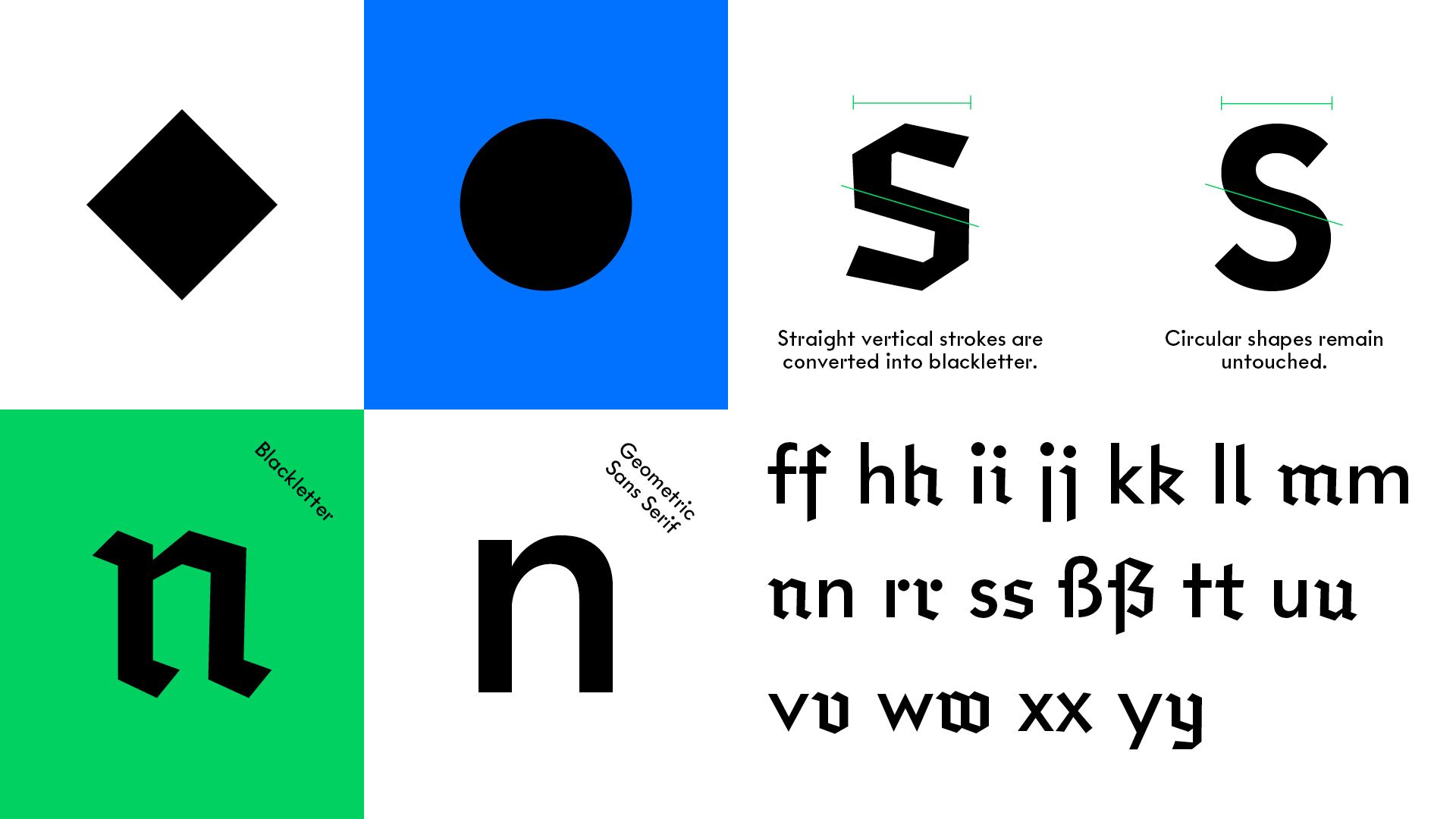
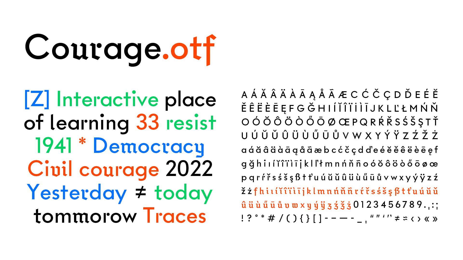
Courage was developed as a display typeface for the Zeitzentrum Zivilcourage. An exciting headline dynamic is created by the selective combination of Sans-Serif and Blackletter shapes. This basic idea of tension through stimuli and traces of the past was the conceptual basis for developing the type. The font can be used to start up a discourse. The corporate font combines a geometric Sans-Serif structure with Blackletter script. A reference of historical German typefaces. In their basic form, they are oriented towards a circle (sans serif) and a rectangle (Gothic) - two opposing forms in one type.
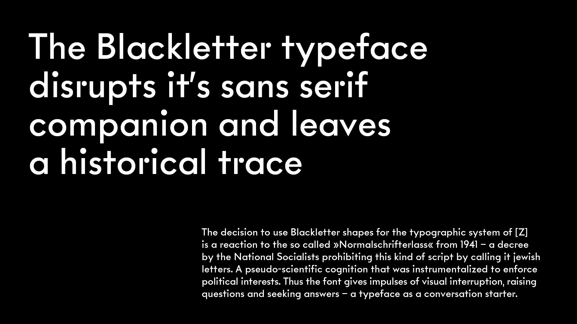
The Blackletter typeface disrupts it’s sans serif companion and leaves a historical trace:
The decision to use Blackletter shapes for the typographic system of [Z] is a reaction to the so called »Normalschrifterlass« from 1941 – a decree by the National Socialists prohibiting this kind of script by calling it jewish letters. A pseudo-scientific cognition that was instrumentalized to enforce political interests. Thus the font gives impulses of visual interruption, raising questions and seeking answers – a typeface as a conversation starter.
Credits
Creative Director
Johanna Worbs
Art Director
Miriam Kraus
Designer
Sascha Bente
Category
502 Original Typeface - Display
Client
ZeitZentrum Zivilcourage (City of Hannover)
Country
Germany