Project
Visual identity Scandinavian University Press
Agency
Anti
Year
2022
Award
Gold
Visual identity Scandinavian University Press
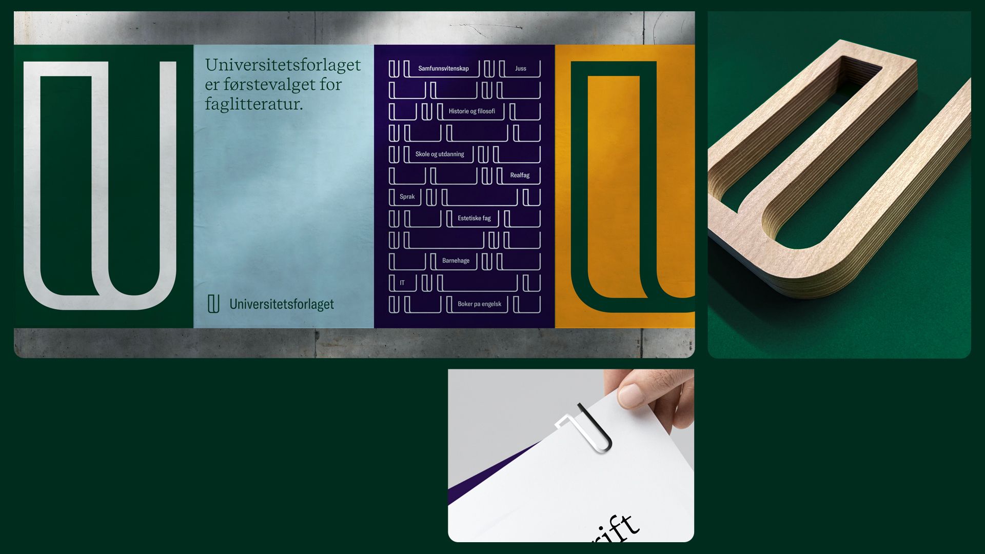
One of Norways oldest academic publisher developing and publishing high quality academic literature. With their new identity, they will continue to leave a lasting impression on the knowledge society.
Knowledge is one of society's building blocks, and the book is the very symbol of this. Knowledge helps us to put things in order, be flexible, adapt and communicate in a better way. Knowledge gives us a solid platform and can strengthen our own voice and identity.
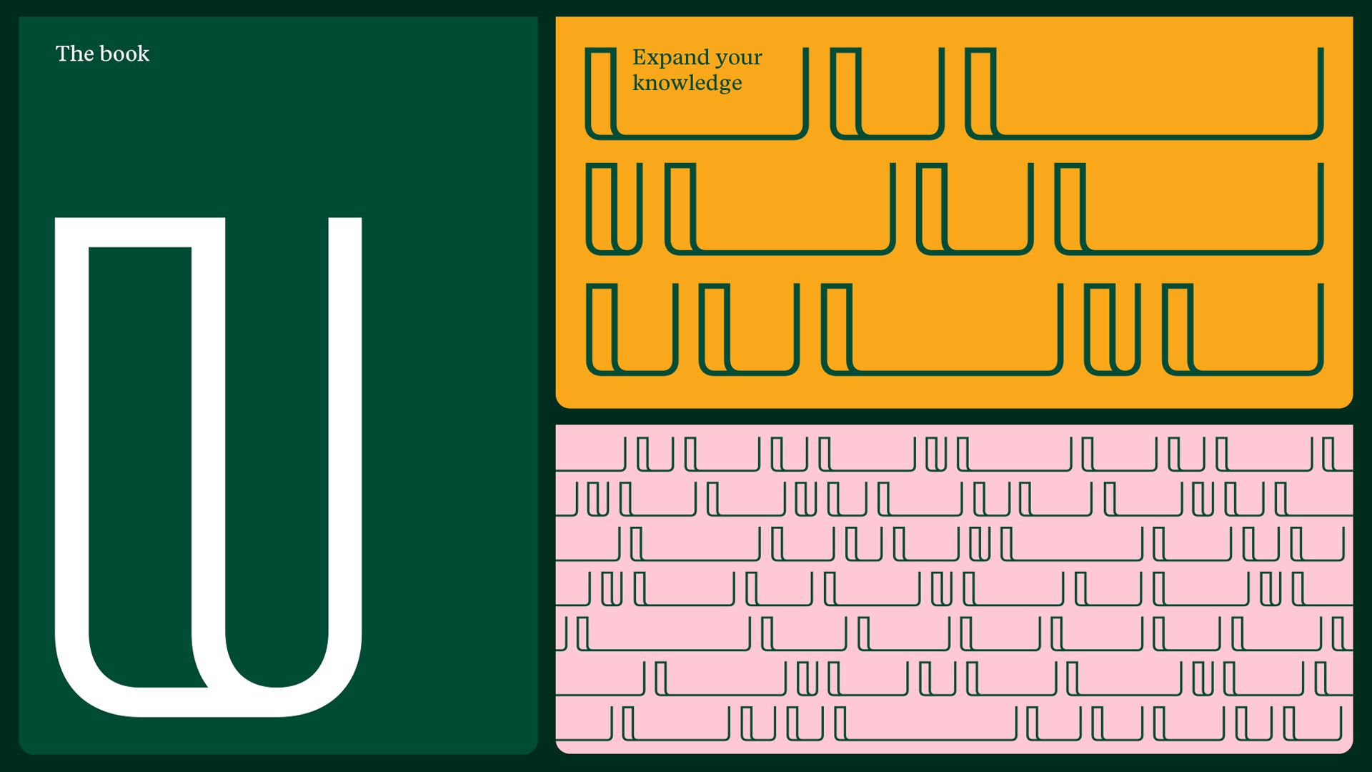
A book gives us the opportunity to expand our knowledge and opens up for a greater understanding of the society we live in. The understanding we gain allows us to be more open, playful, and brave.
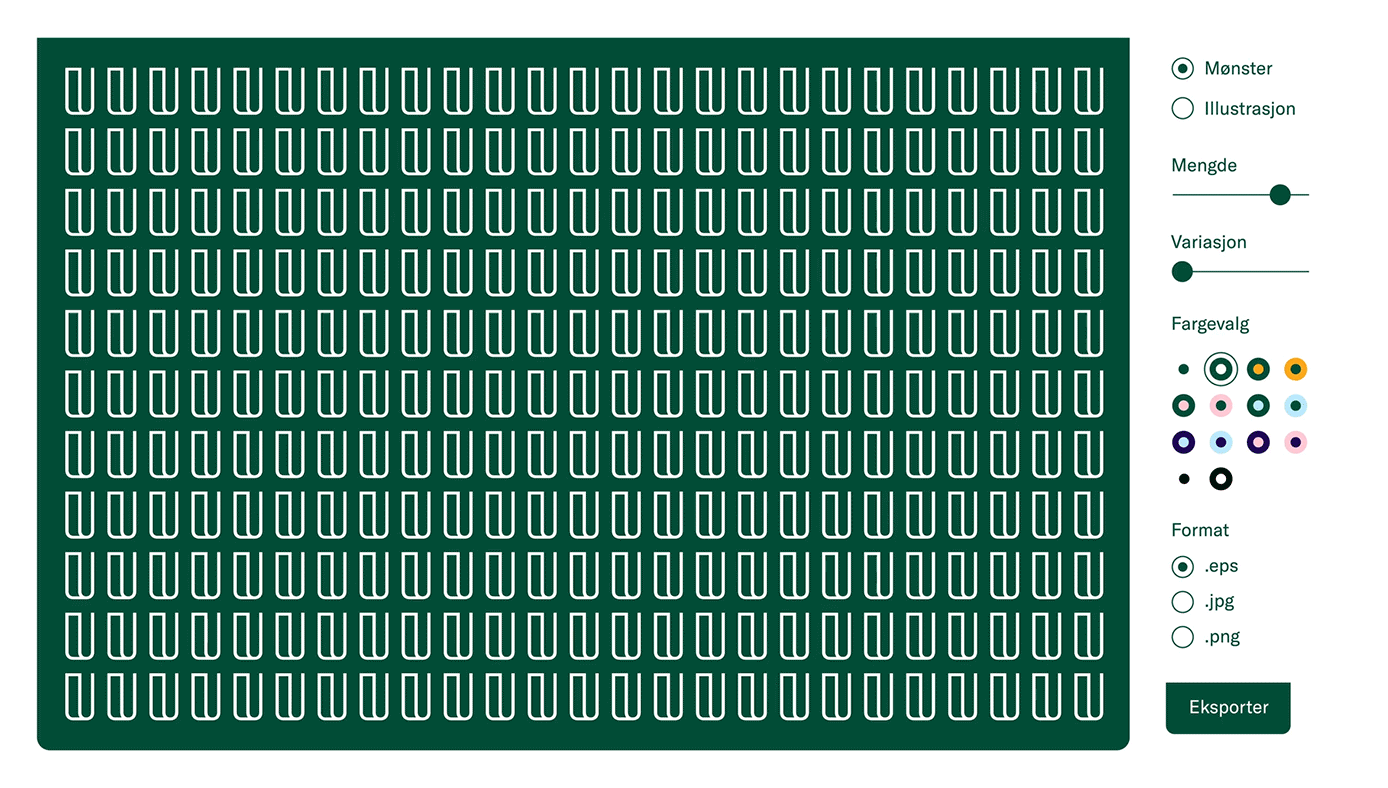
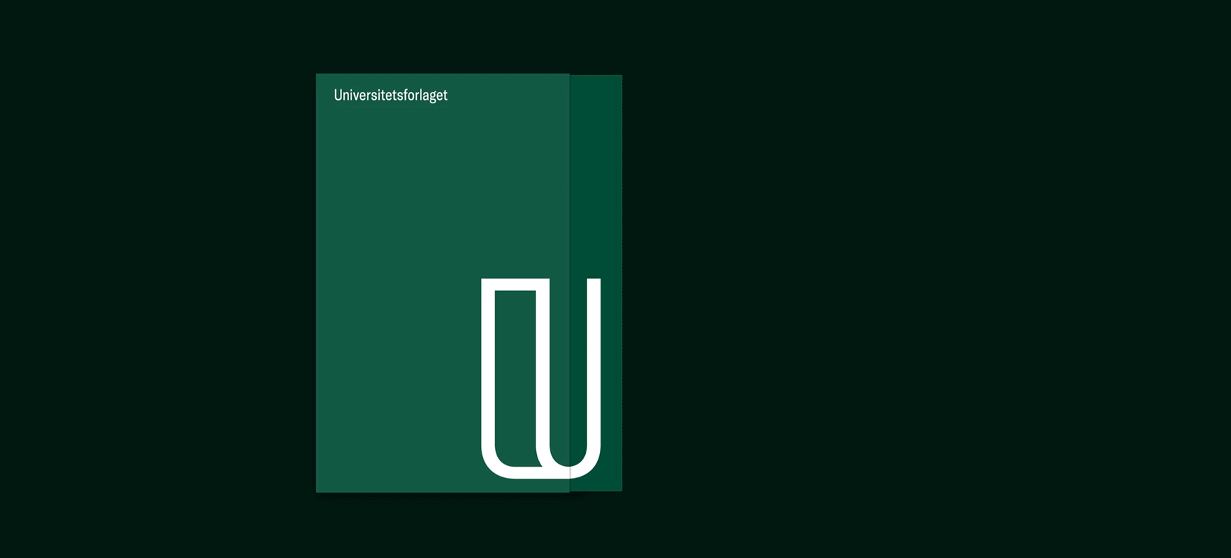
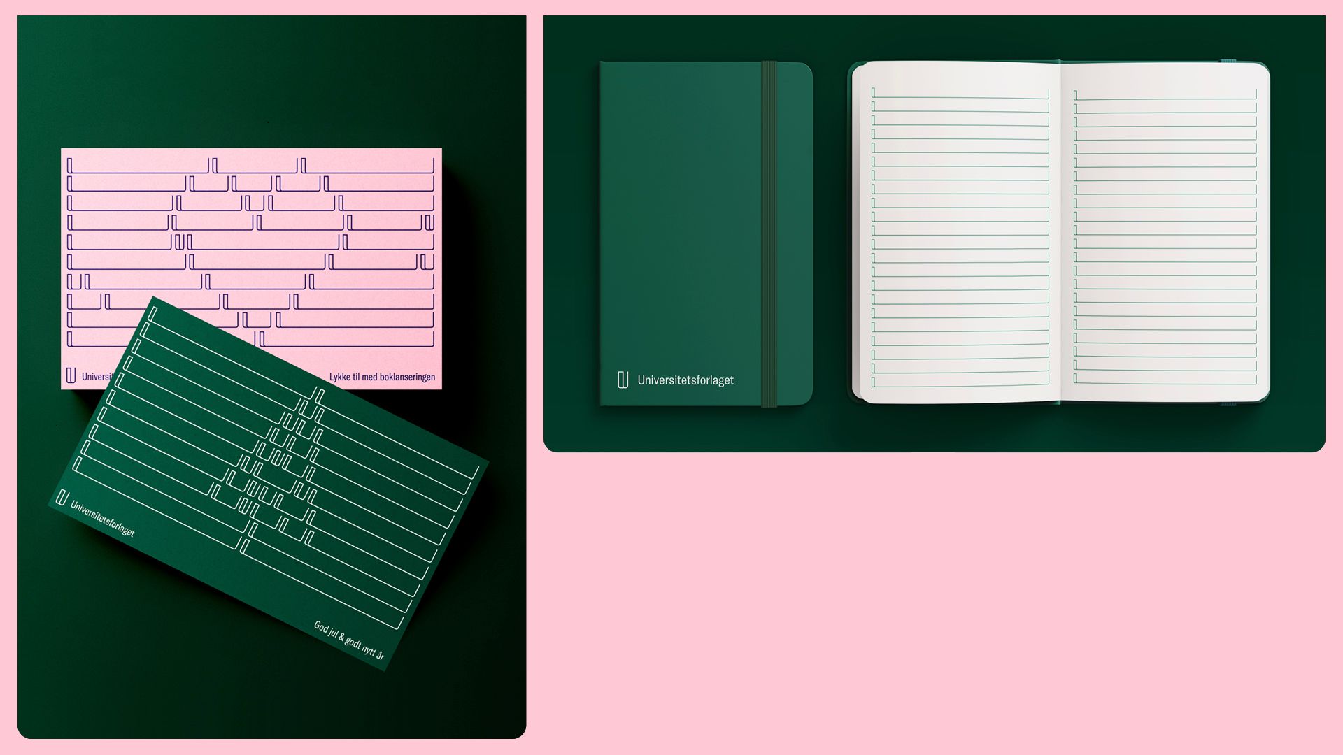
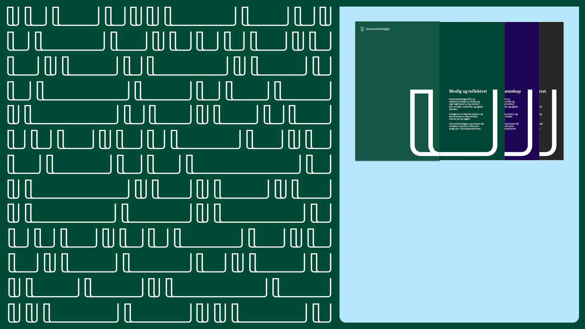
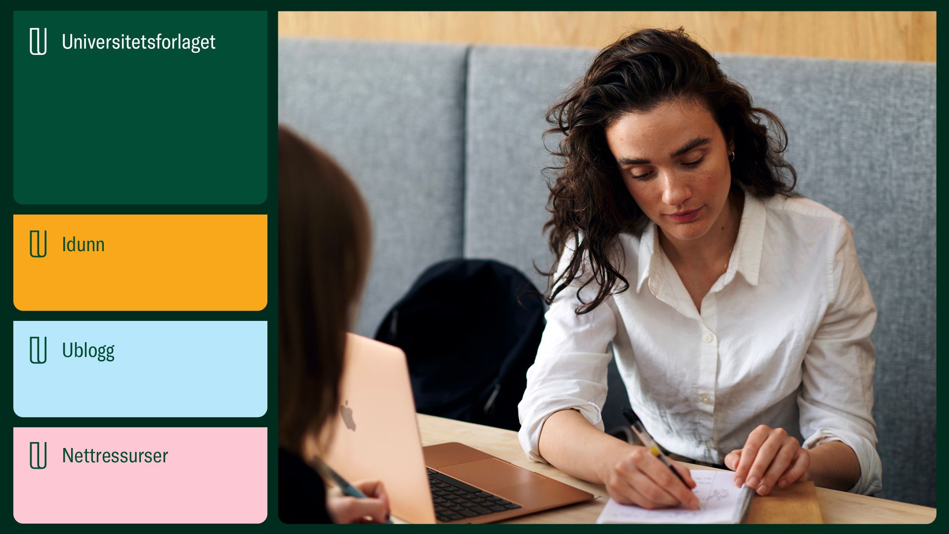
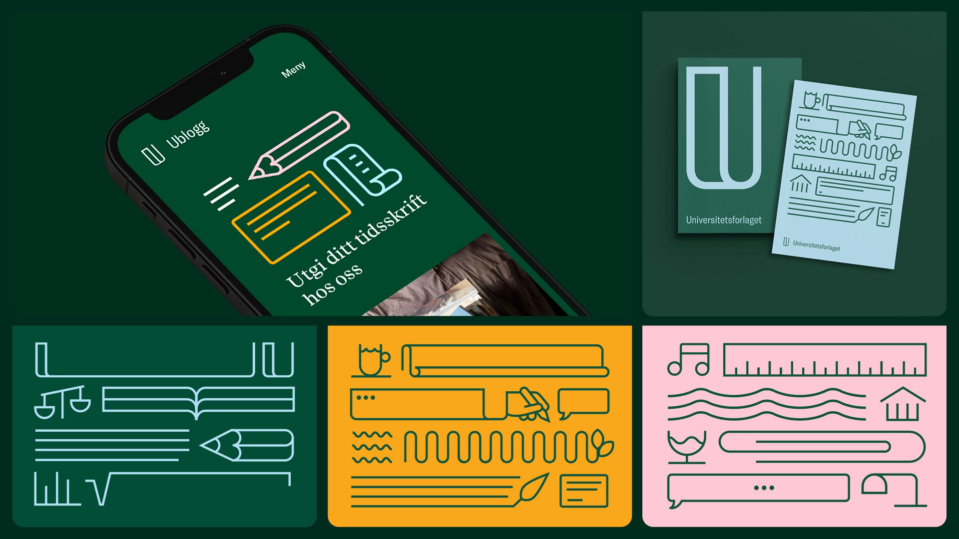
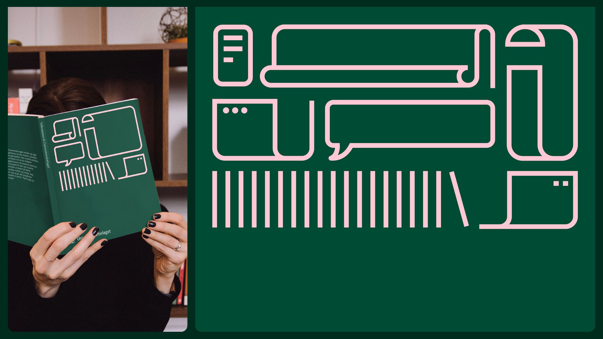
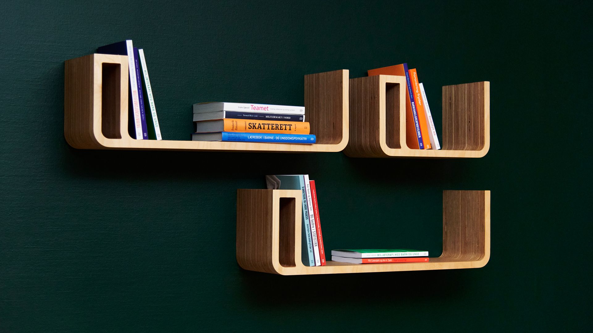
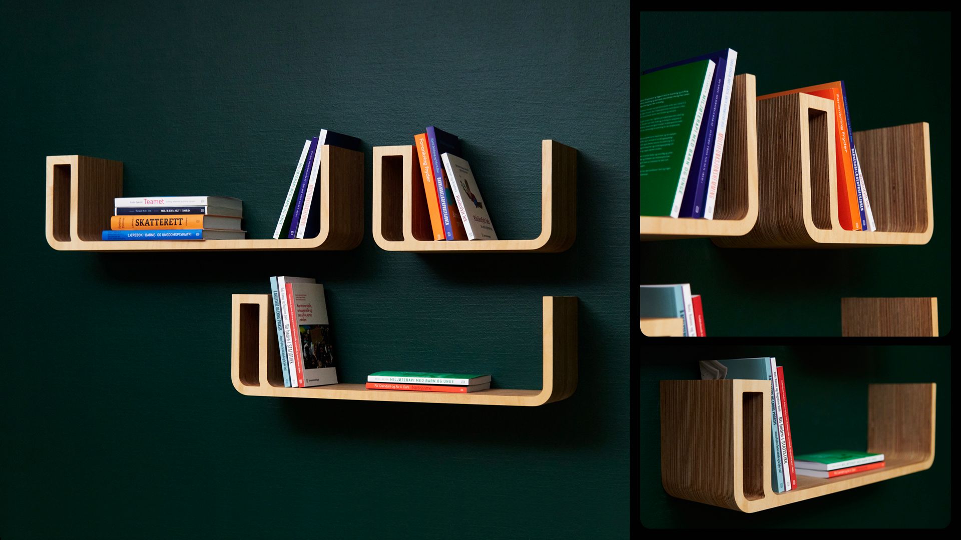
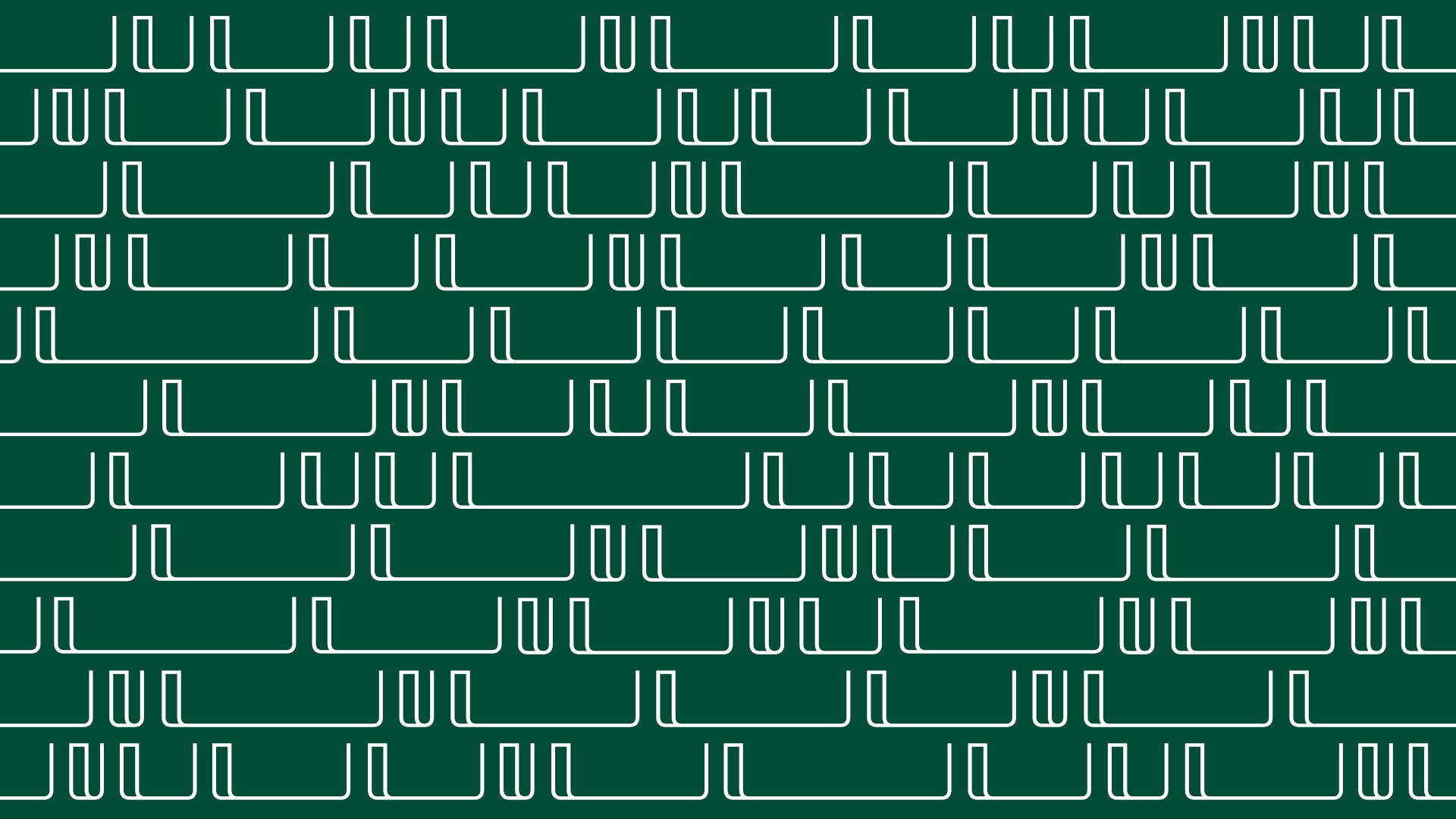
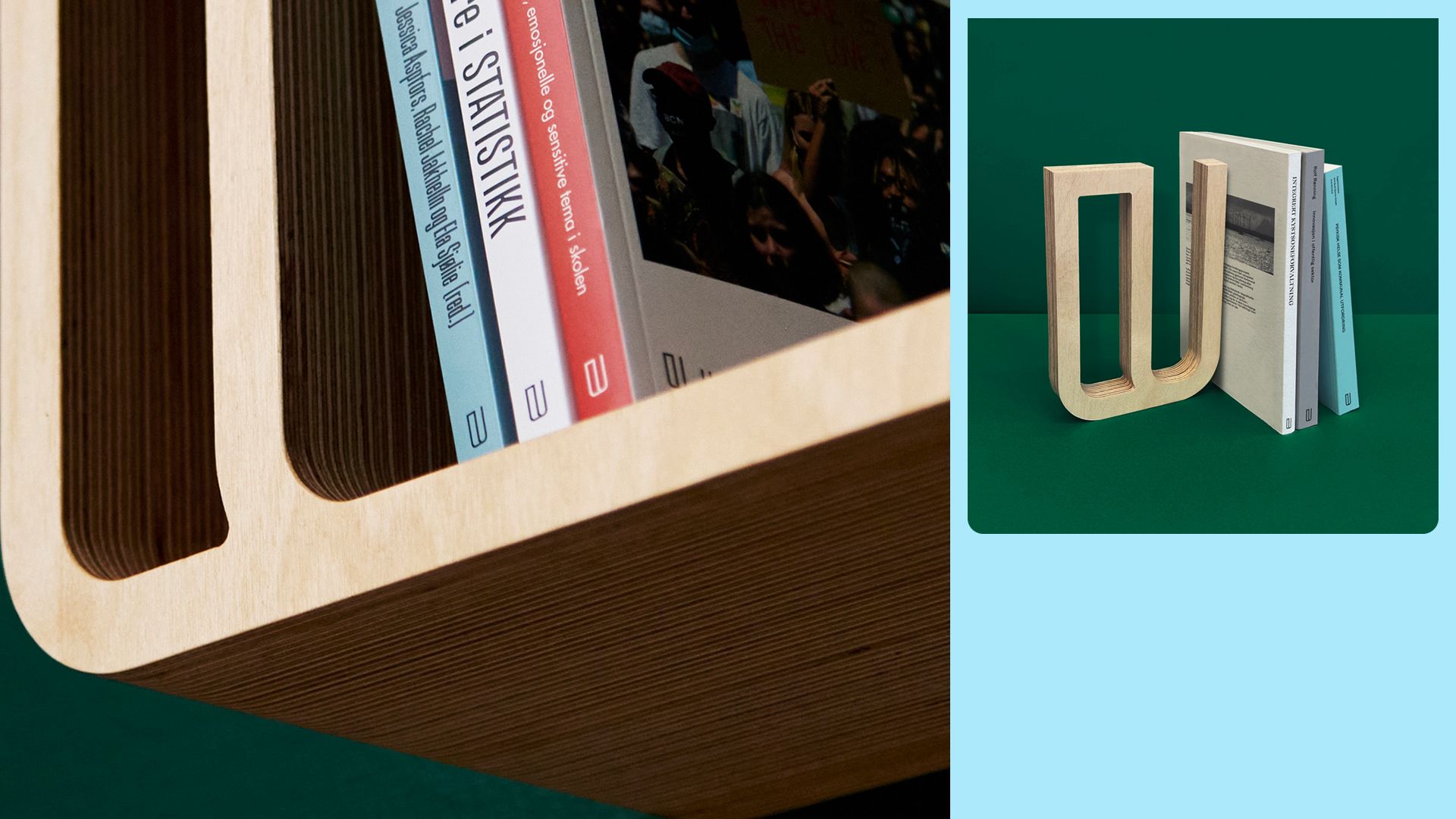
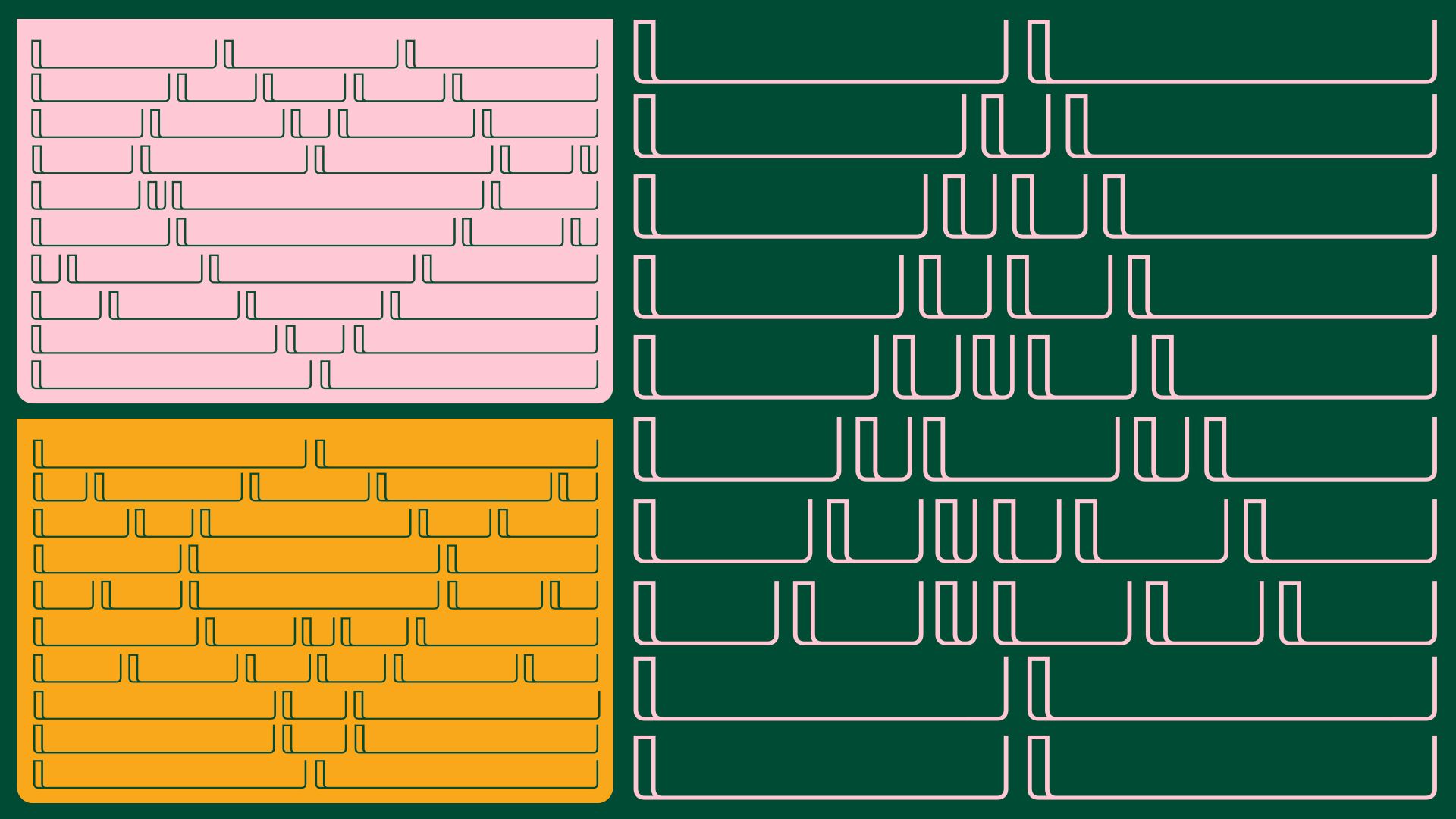
The new U-logo of the publisher has naturally become a book. This book can be opened up and "expand knowledge". This concept and approach has given us a tool to create a clear identity that is applicable to many tools, such as pattern, illustration, picture frames, movement and grid system. This is supported by a limited but distinct colour palette and a typographic system that ensures distinctiveness and consistency on all surfaces.
Credits
Creative Director
Mats Ottdal
Designer
Morten Johansen
Illustrator
Mats Ottdal
Senior Designer
Erik Johan Worsøe Eriksen
Designer
Magnus August Storsveen
Hege Skraastad
Client Director
Kjersti Brinch Lund
Project Manager
Nora Gauslaa
Project Manager
Photographer
Andris Søndrol Visdal
Category
103 Motion Logo
Client
Scandinavian University Press (Universitetsforlaget)
Country
Norway