Project
Bikeshop Visual Identity
Agency
Anti
Year
2022
Award
Bronze
Bikeshop Visual Identity
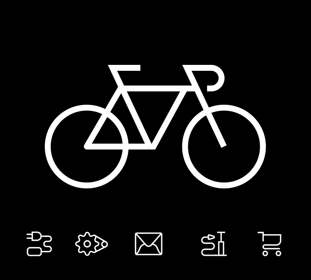
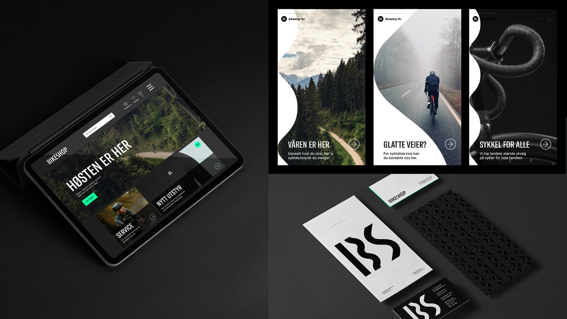
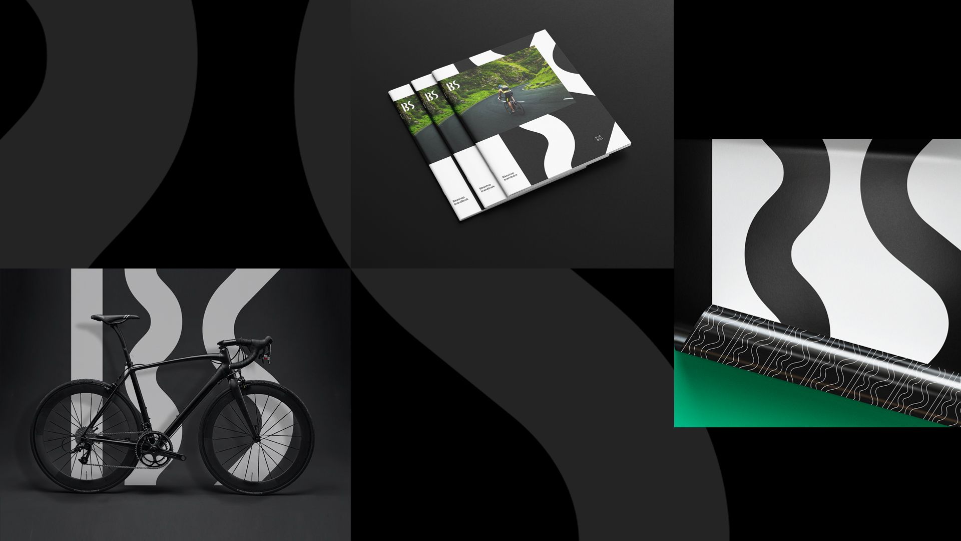
Visual identity for Norway's largest specialist shop for cyclists, Bikeshop.
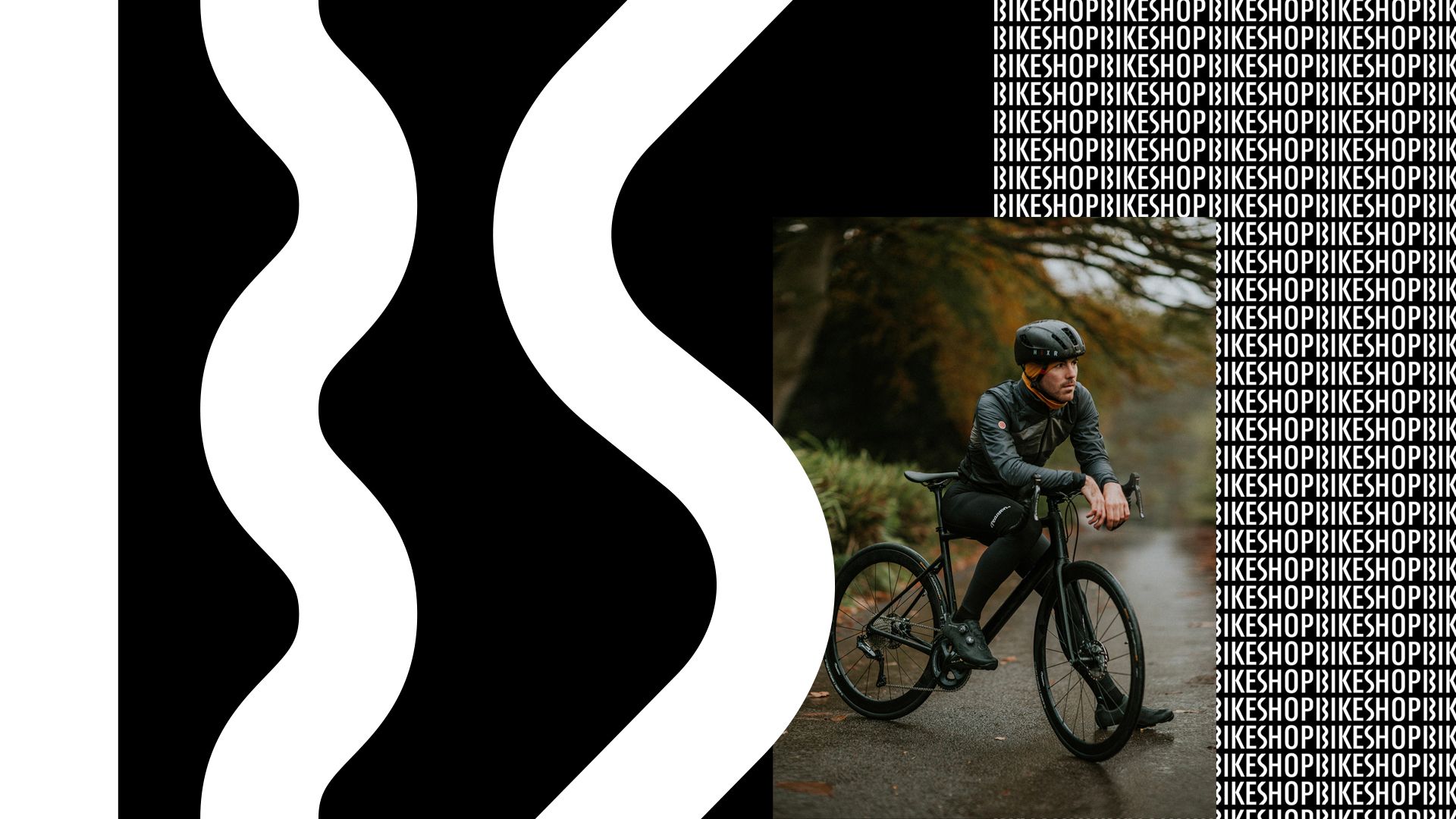
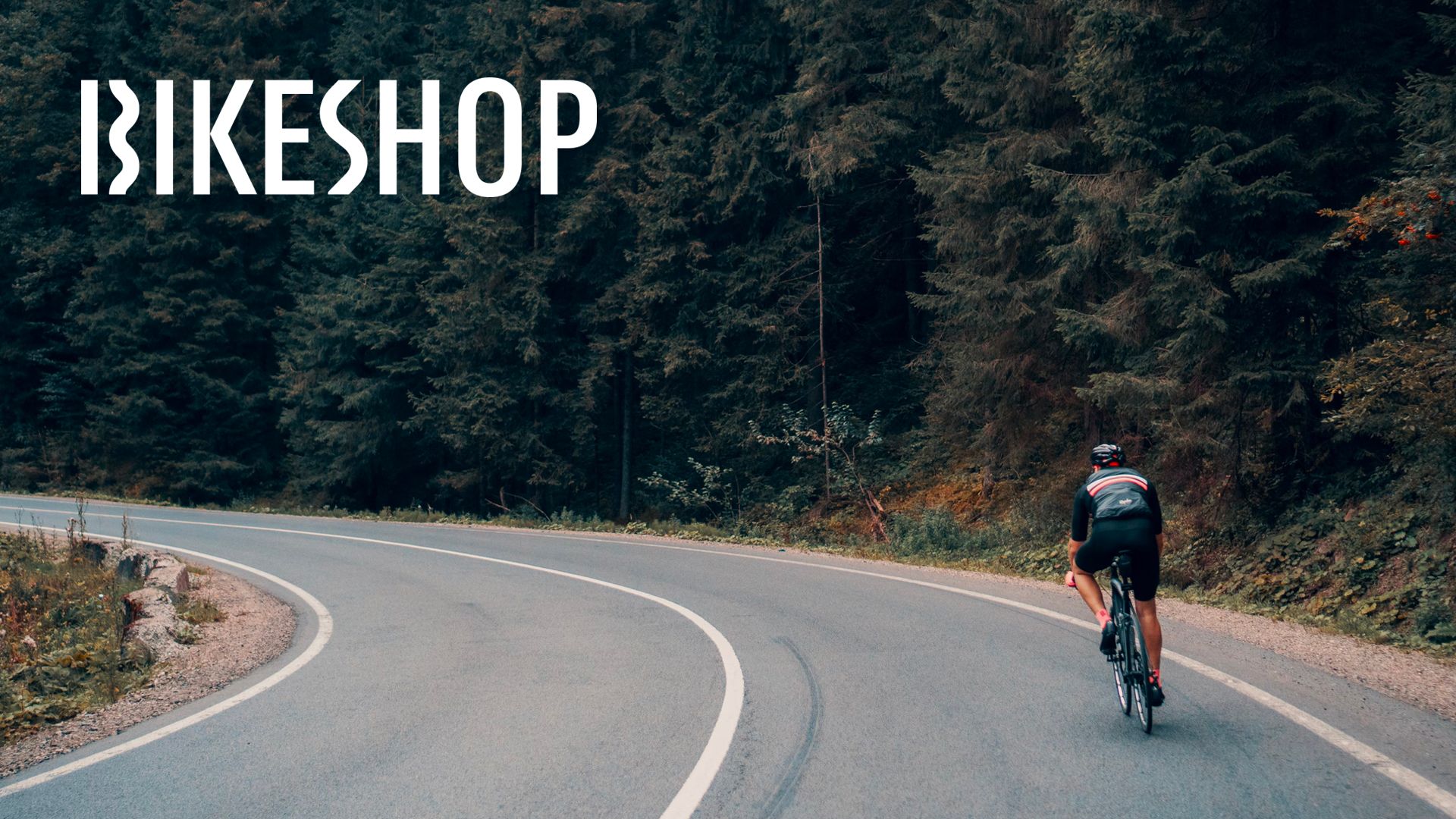
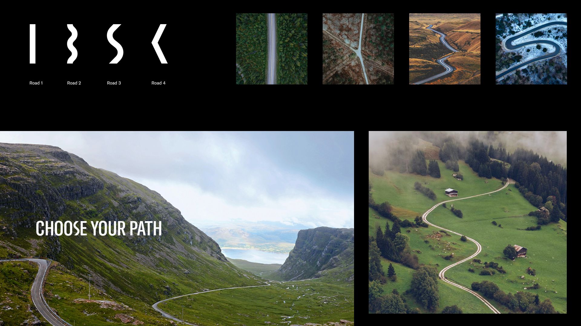
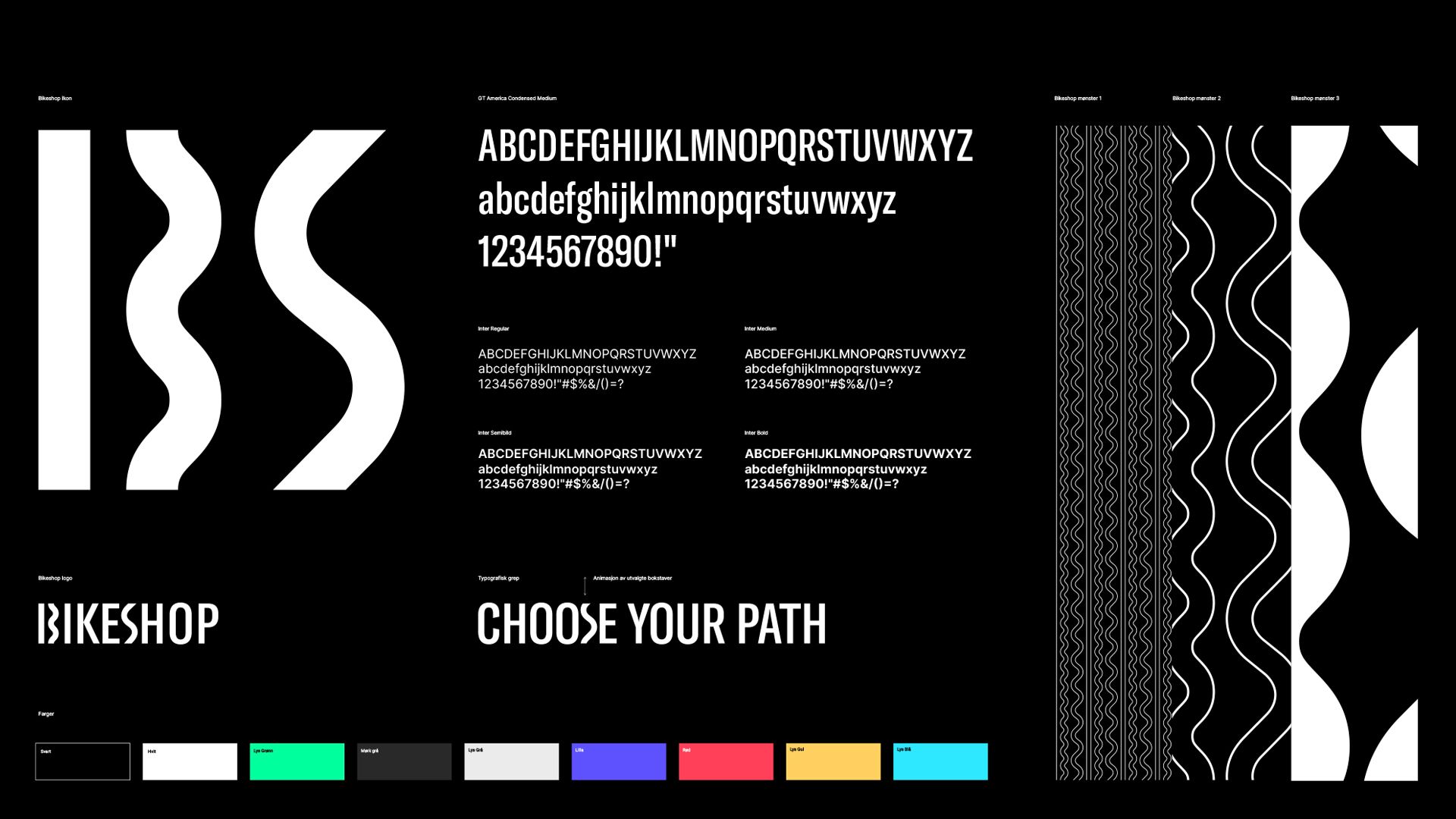
The concept is based on the large selection of products. It should give association to a freedom to choose one's own path. The concept is based on this. Different paths are integrated in the logo. The roads tell us that whether you are in the city, on a country road or on a mountain trail, Bikeshop can offer you all kinds of cycling equipment. Wherever you go cycling. These roads also form the "initials" B and S which become the icon for Bikeshop.
The solution consists of simple tools, but a clear typographic animation that converts letters into different types of roads. This also gives us a pattern system that can be used on design and communication surfaces to strengthen the brand signature. The vertical movement pattern is also an important tool for creating a vibrant and dynamic visual identity.
Credits
Creative Director
Mats Ottdal
Designer
Martine Hage
Illustrator
Mats Ottdal
Creative Director
Kjell Ekhorn
Creative Director
Jon Forss
Kenneth Pedersen
Project Manager
Category
103 Motion Logo
Client
Bikeshop
Country
Norway