Monitoring the North-South Line
https://nzlijn.cleverfranke.com/
Background of the project
On July 22, 2018, the new Amsterdam North/South metro line opened. Delayed by several decades, and repeatedly exceeding the set budget, the construction of the line has been criticized over the years. To assess the impact of the new line on the city and its commuters, AMS Institute, a research and education body, set up a four-year study: Monitoring the North/South line.
Commissioned by the AMS institute at the request of the Amsterdam Municipality, we created a microsite highlighting the outcome of the research and visualised its results to showcase the impact of the North/South line on the Amsterdam metropolitan region. The visualisation shows how the new public transport network is structured and highlights the effect it had on the timetable and travel time.
Data visualisation
Making complex research data easy to comprehend is a challenging task. With our design of the microsite, we strive to transform academic data into intelligible information that drives decision-making and ensures an informative digital visualisation experience.
Visualisations in the microsite are based on commuter data. Mirroring the physical metro line, the microsite reveals information as the visitor scrolls down the page, from north to south.
The microsite starts with an introduction to the study. It sets the scope and shows systemic change towards improving commuting beyond the North-South line.
Change in public transport
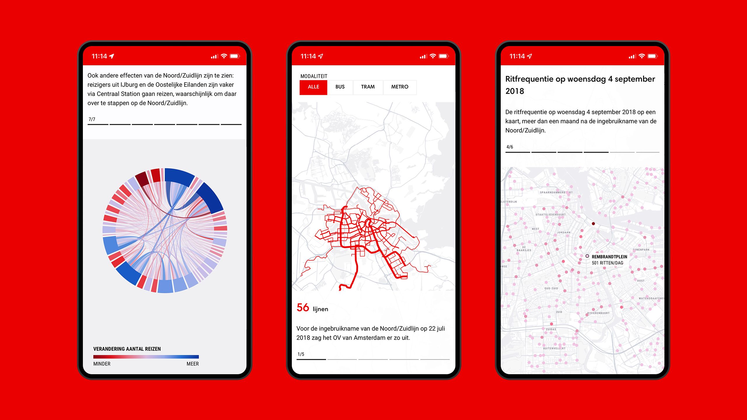
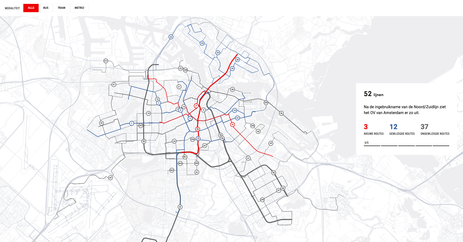
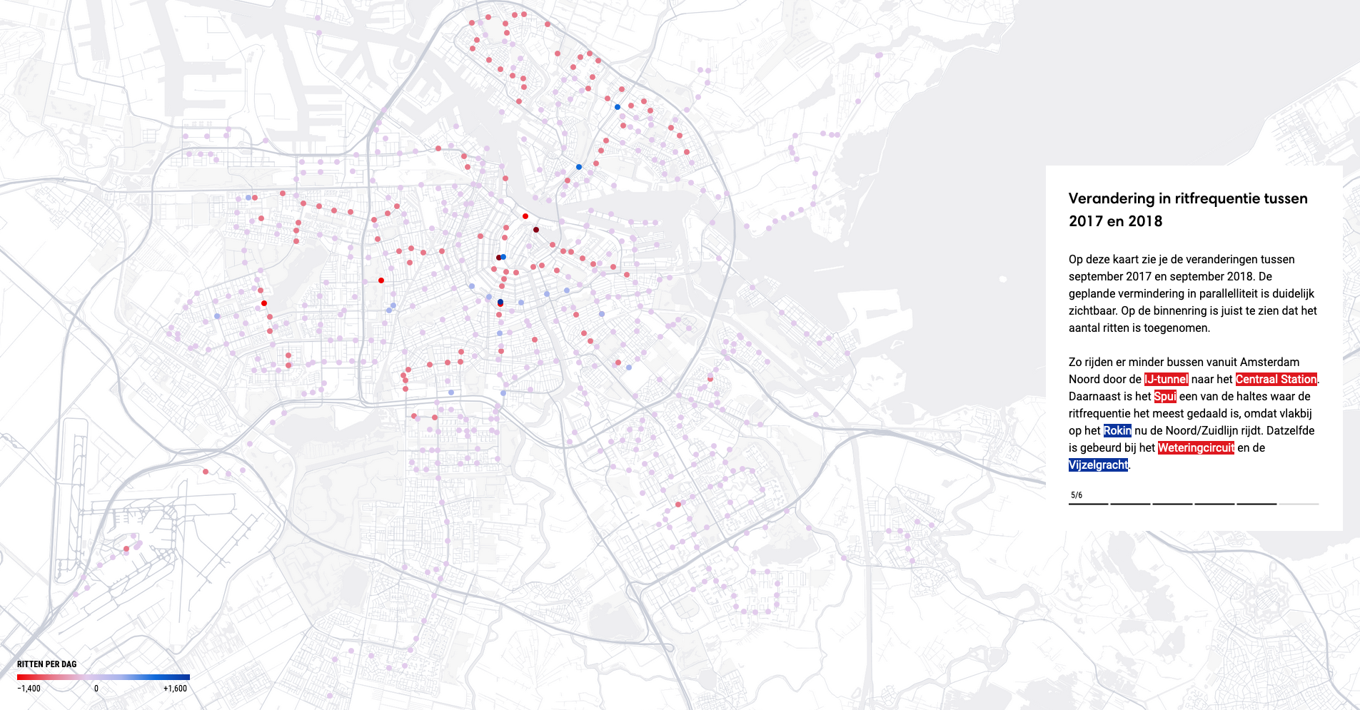
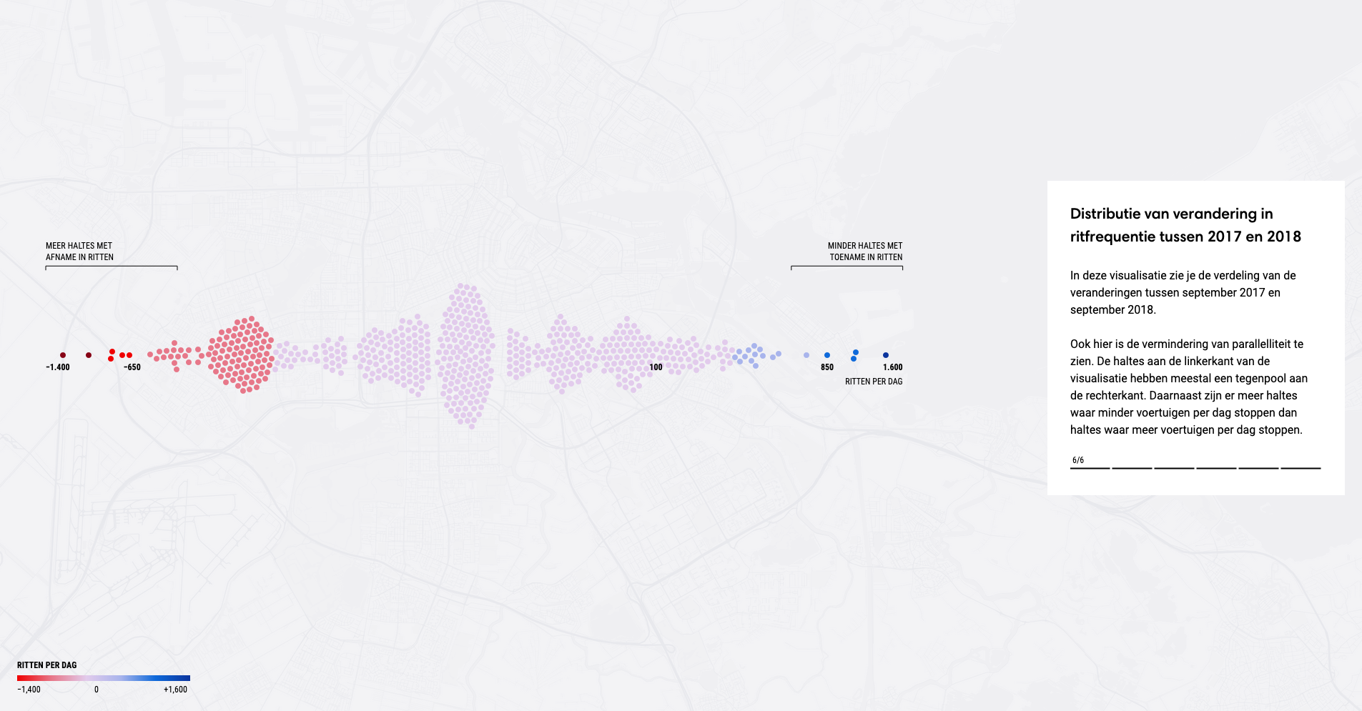
The second section reveals changes in the network: how the opening of the line affected Amsterdam’s public transport and timetable. The visualisation is a map, where dots represent locations (stops). Scrolling down, the map transitions into aggregate visualisations showing the overall performance and from abstract turns into tangible. Different colours of the dots represent changes in stop frequency.
Change for a traveler
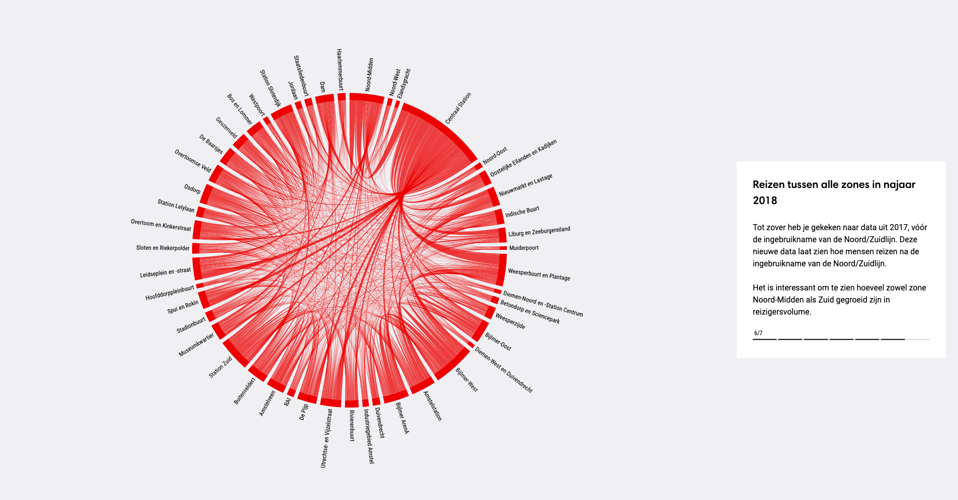
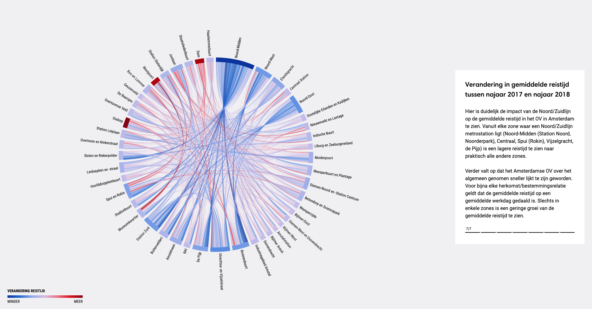
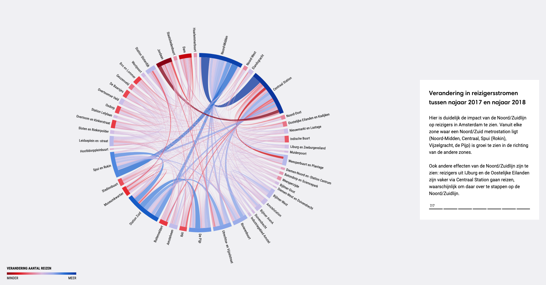
Changes in commute from a traveler's perspective since the opening of the line are illustrated in the third section. It reveals how it altered the passenger flow and shortened travel time. The visualisation is a circle, which includes every location, and lines, which represent a journey from A to B. Using a circle and lines makes complex information easier to comprehend as these symbols are close to a mental representation of a journey in the user’s mind. As in the previous section, passenger flow and time changes are shown using different colours.
Relevance
An interactive and engaging data visualisation that informs the public about the main changes in the transportation network since the introduction of the new line. It also supports the municipalities decision to push forward with the new line, despite mounting criticism, and highlights how it has eased the burden to the city transport.
The visualisation reveals patterns that otherwise would have remained unseen. It allows policymakers to make informed decisions and solve operational inefficiencies. With this microsite, we illustrate that even heavy research data can be presented in an appealing and understandable way to the general public.
The findings of the study are valuable not only for Amsterdam, but for other cities worldwide looking to improve their public transport networks.
Credits