Lnett
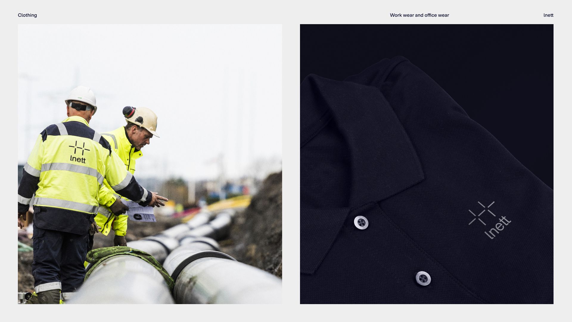
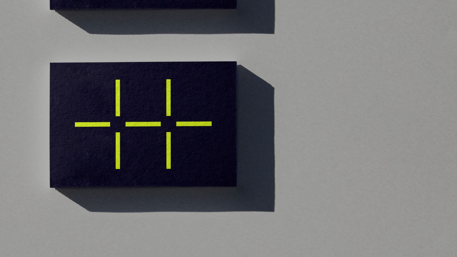
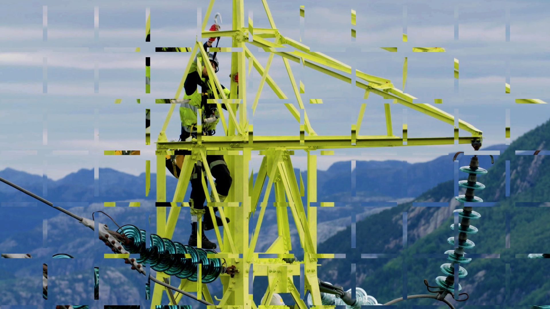
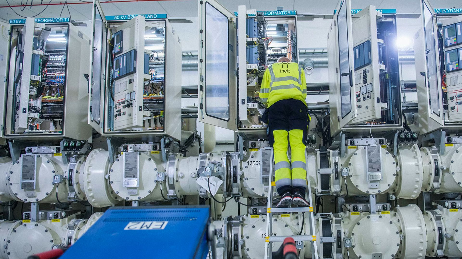
Lnett is the grid company and a part of the electricity and energy supplier Lyse (responsible for the operation and development of the electricity grid to close to 160,000 customers) and due to a national regulation that requires a separation between grid companies and other activities within power production / electricity sales the company had to change its name from Lyse Tele to Lnett. In addition to a new name, Lnett also had to get a new visual identity in order to differentiate Lnett from the Lyse Group and establish an own, independent identity. Lnett’s mission is to secure, operate and maintain a stable power grid, combined with a strong focus on innovation and development within the energy sector. The new logo was developed with symbolic inspiration from power grids, systems and grids - and positive and negative charges: the tension that arises between plus and minus voltages. The color palette is inspired by everyday work and life in the company: Reflective vests and work in the field. Power mast and safety. Quality and technology, industry and maintenance, digitization and office. All printed material and templates had a common grid system that gives the templates and material a common look and flexibility. Regardless of the amount of text and graphics or image use, it could be entered into the template / grid system in a clear and uniform way. The style is a modern "sans serif" with friendly edges and roundness that reflects Lnett's personality; the fierce, familiar, accessible. The font is specially made for Lnett and based on Modern Gothic from All Caps, but in a slightly rounder and friendlier variant, tailored to Lnett's needs and name.
Credits