Project
The Norwegian Chess Federation
Agency
Metric
Year
2022
Award
Silver
The Norwegian Chess Federation
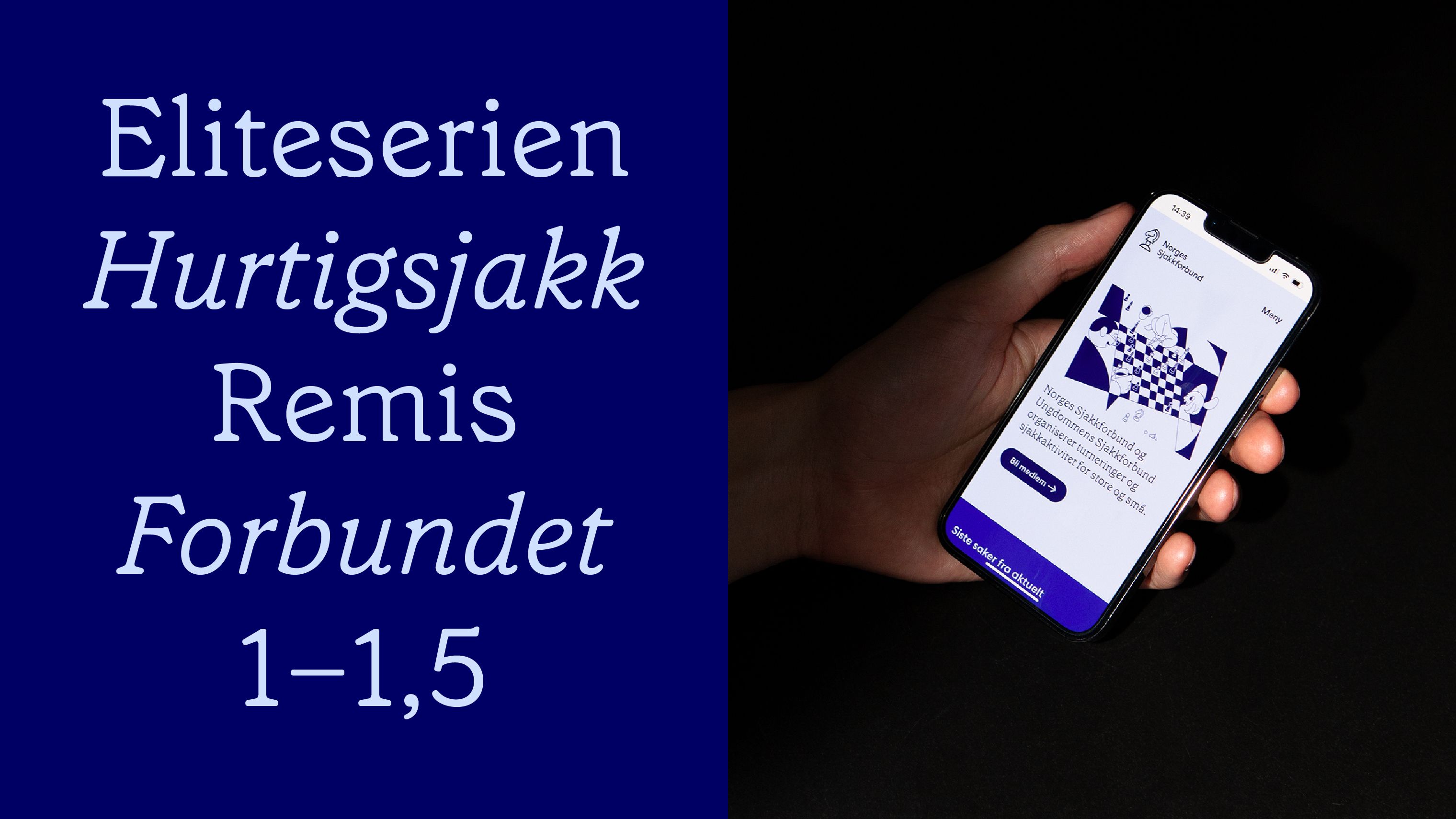
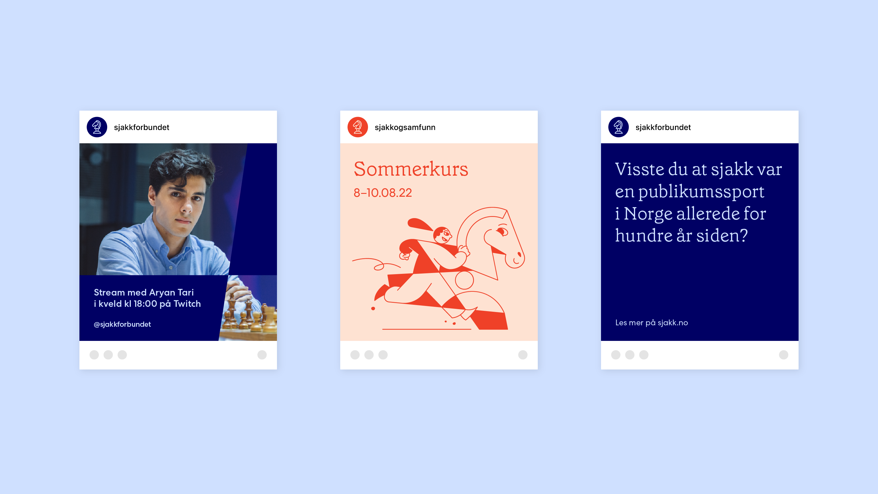
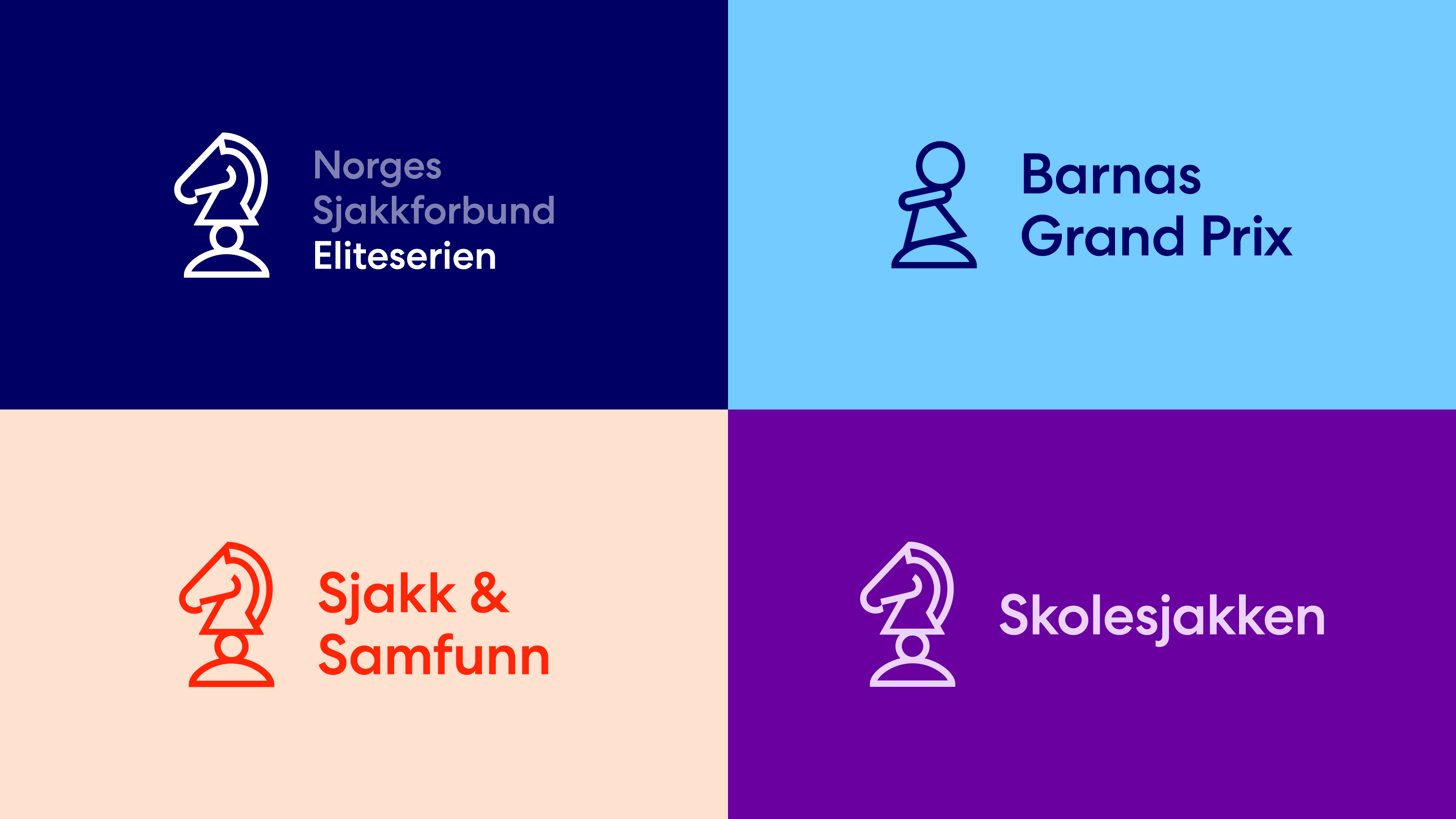
Since 1914, the Norwegian Chess Federation has been the governing body of organized chess in Norway. The interest in chess in Norway and internationally is at a historical peak, and the increase in the number of online chess players is explosive. Metric has led the Norwegian Chess Federation through a branding process and developed a new visual identity that meets the new interest and unites Norwegian chess activity under a holistic brand. This meant creating an identity that housed the Norwegian Chess Association, the Youth Chess Association and the associations' activities, tournaments and initiatives (such as School Chess, Chess & Society, etc.). The new identity needs to represent Norwegian top players in international tournaments and at the same time be suitable for inclusive activities at libraries and senior centers. It communicates to all Norwegians interested in chess, across age, background and level of ambition. The project is part of a larger collaboration with Feed, and Feed has designed and developed the association's new website.
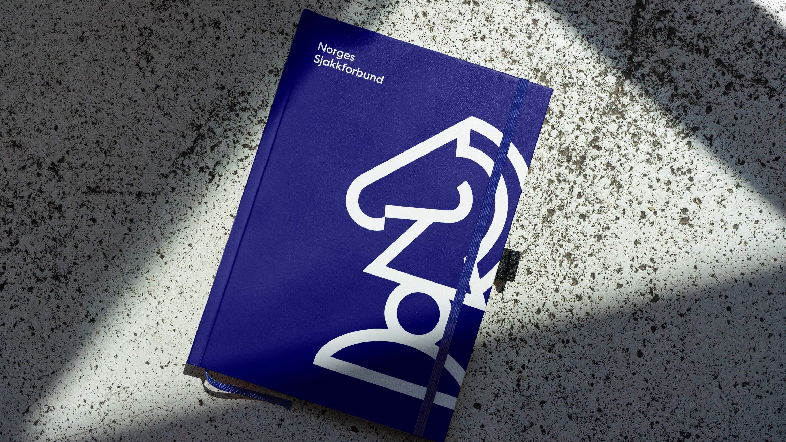
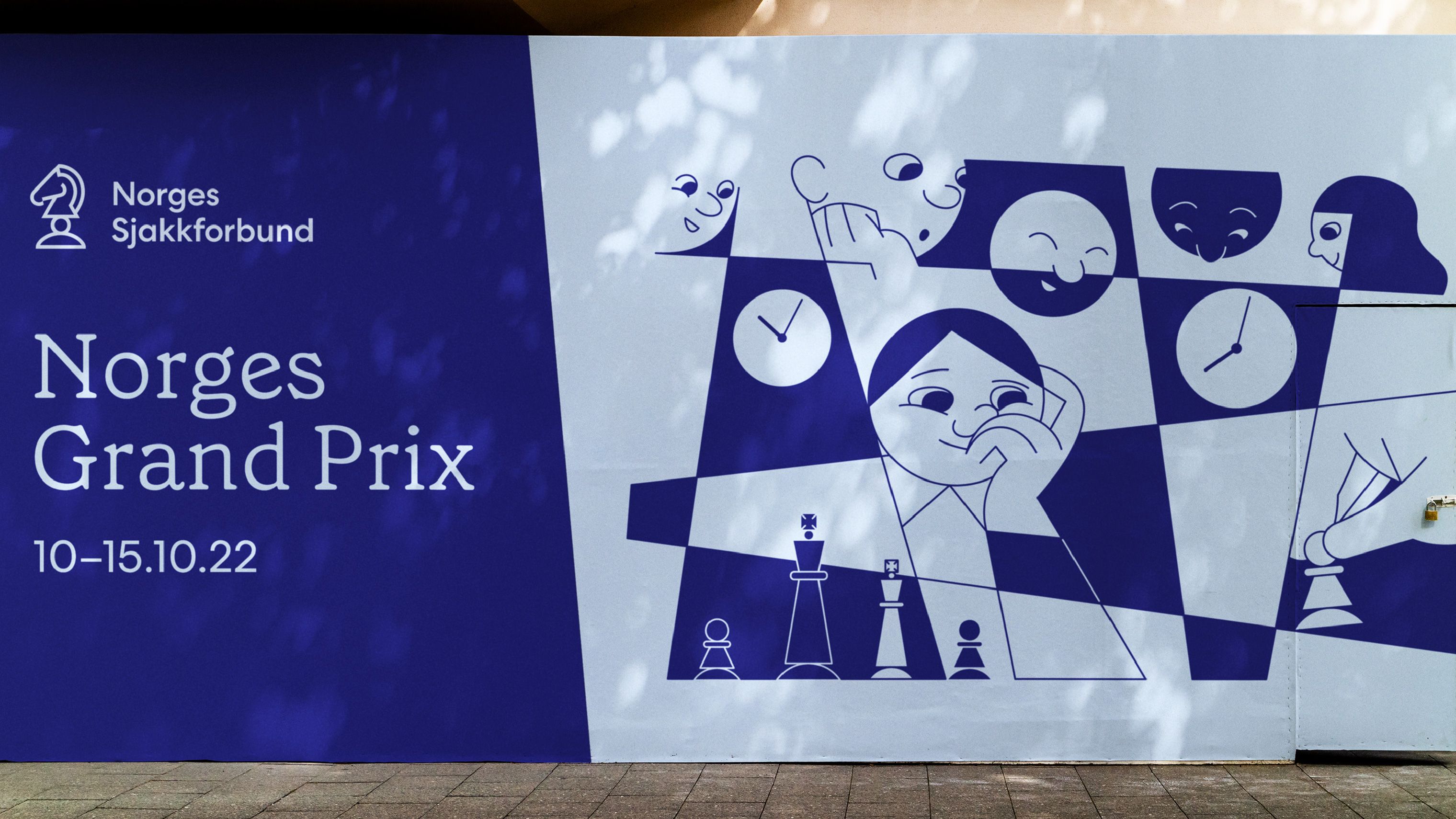
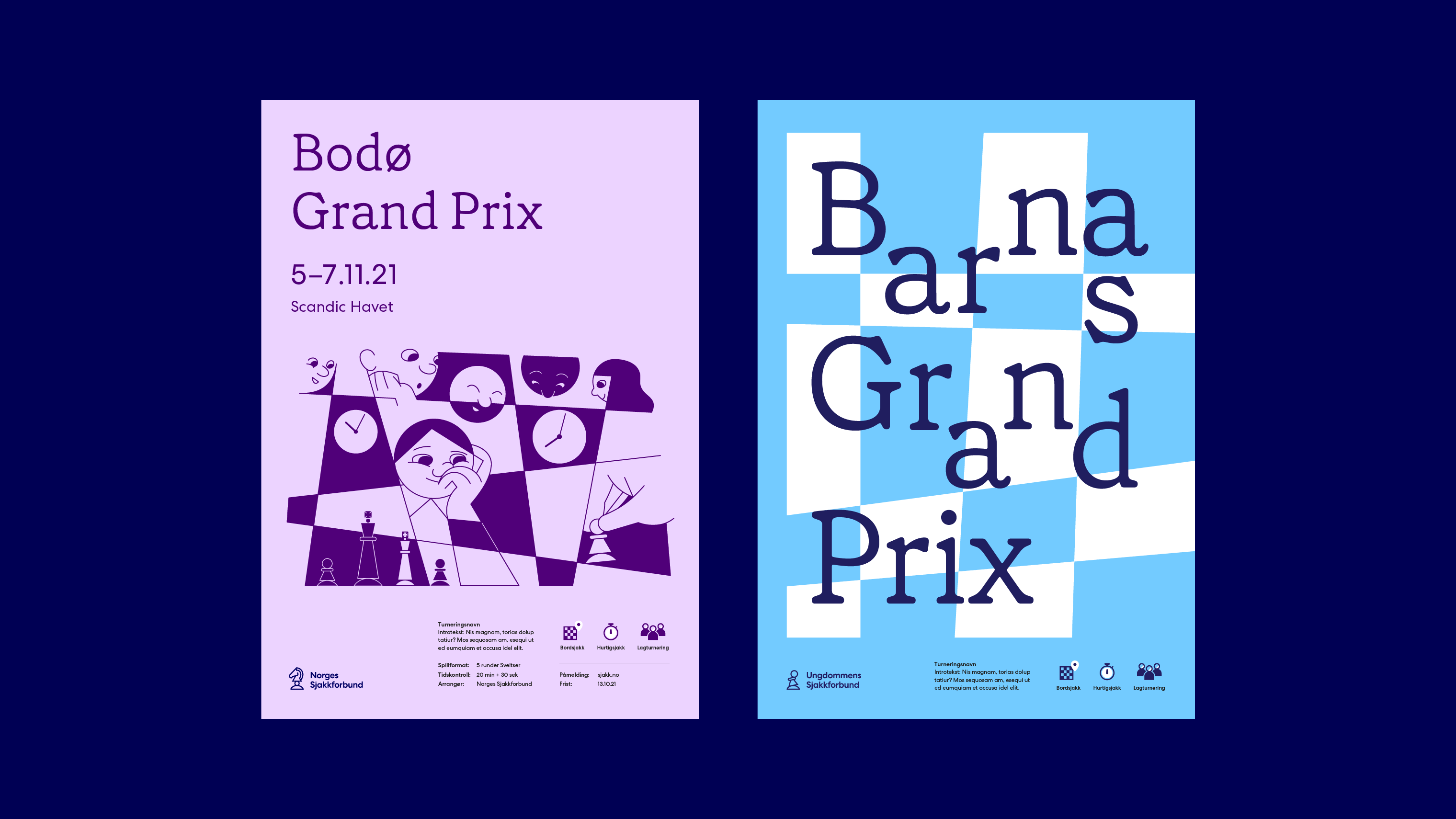
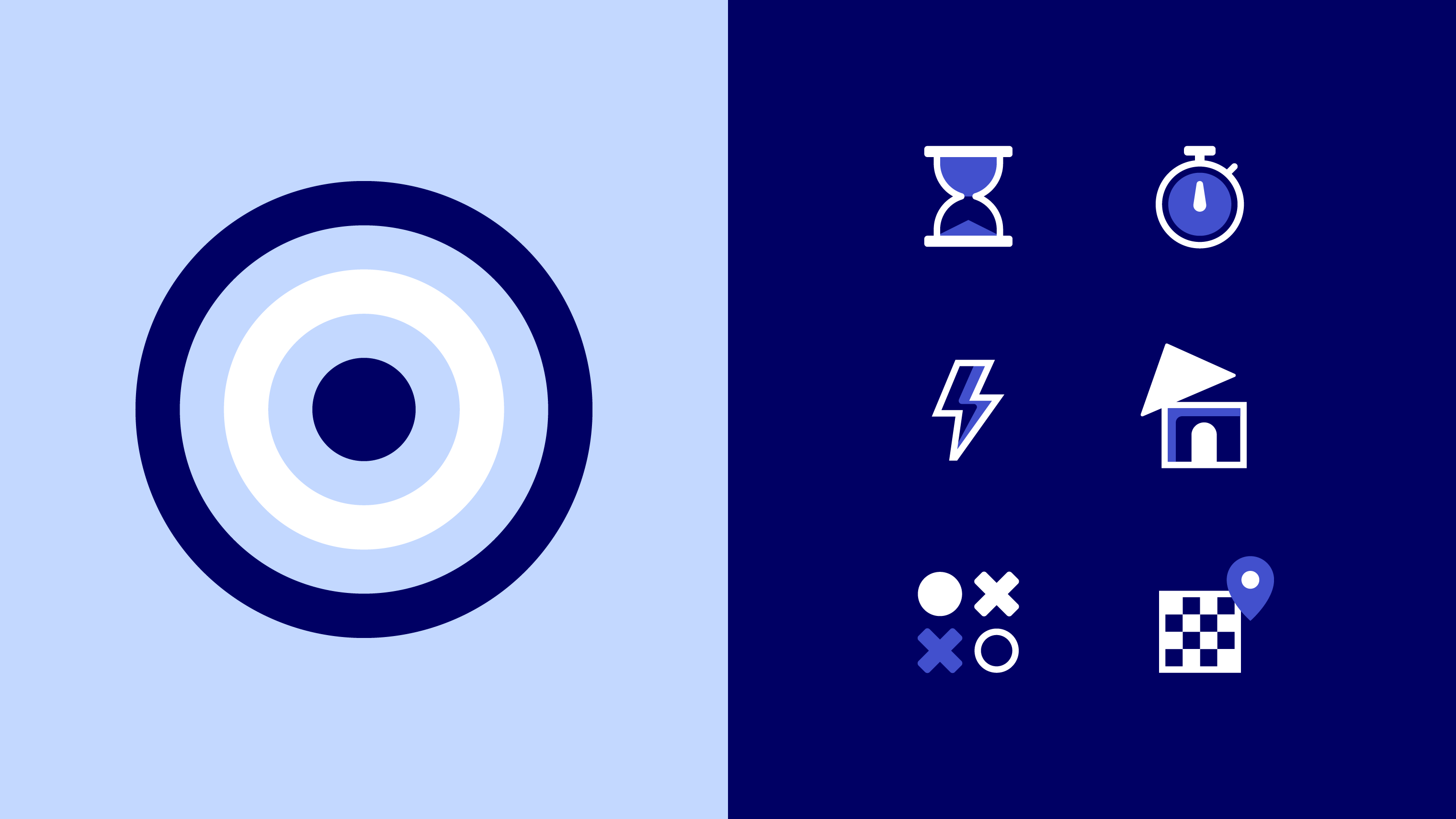
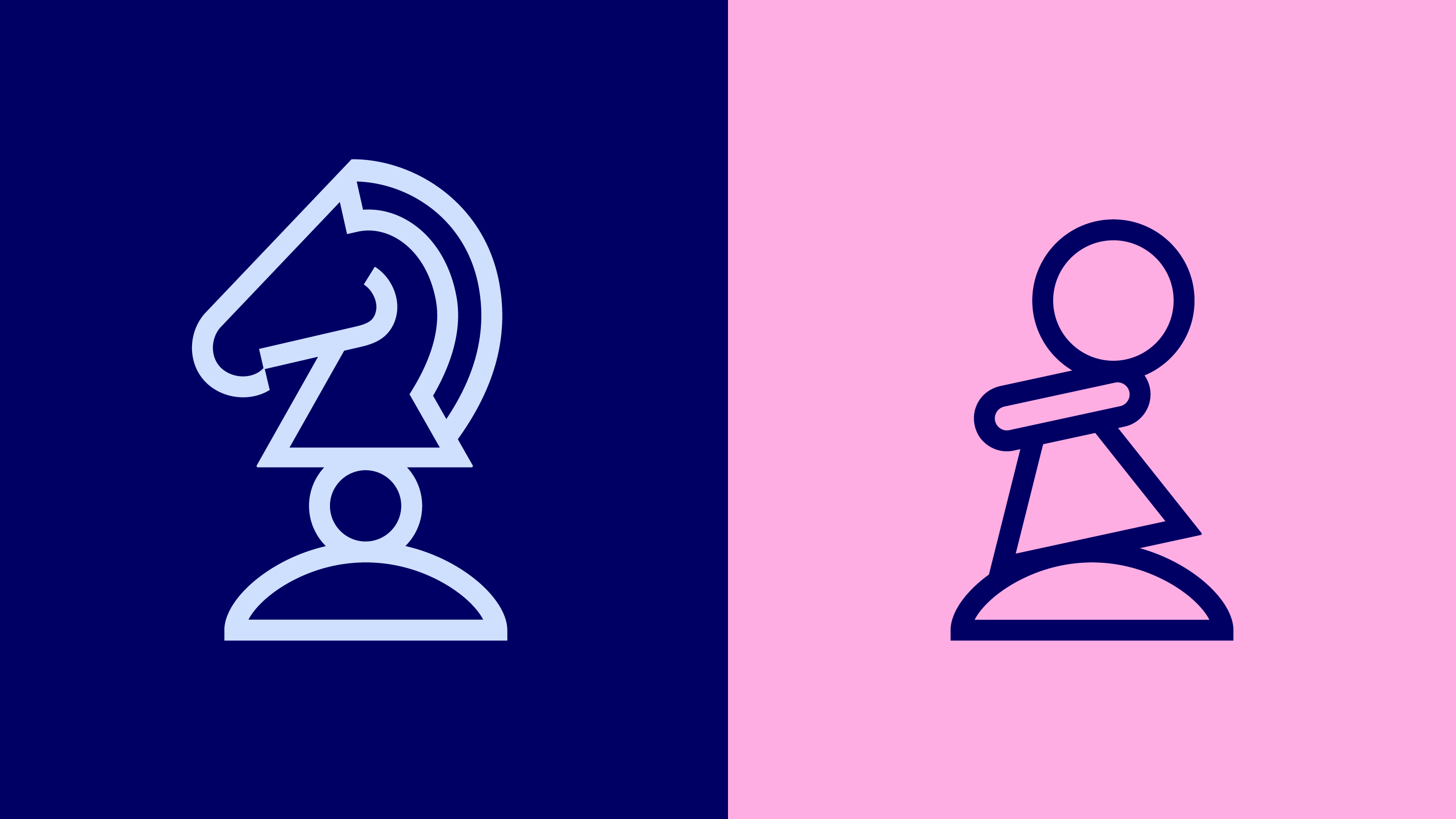
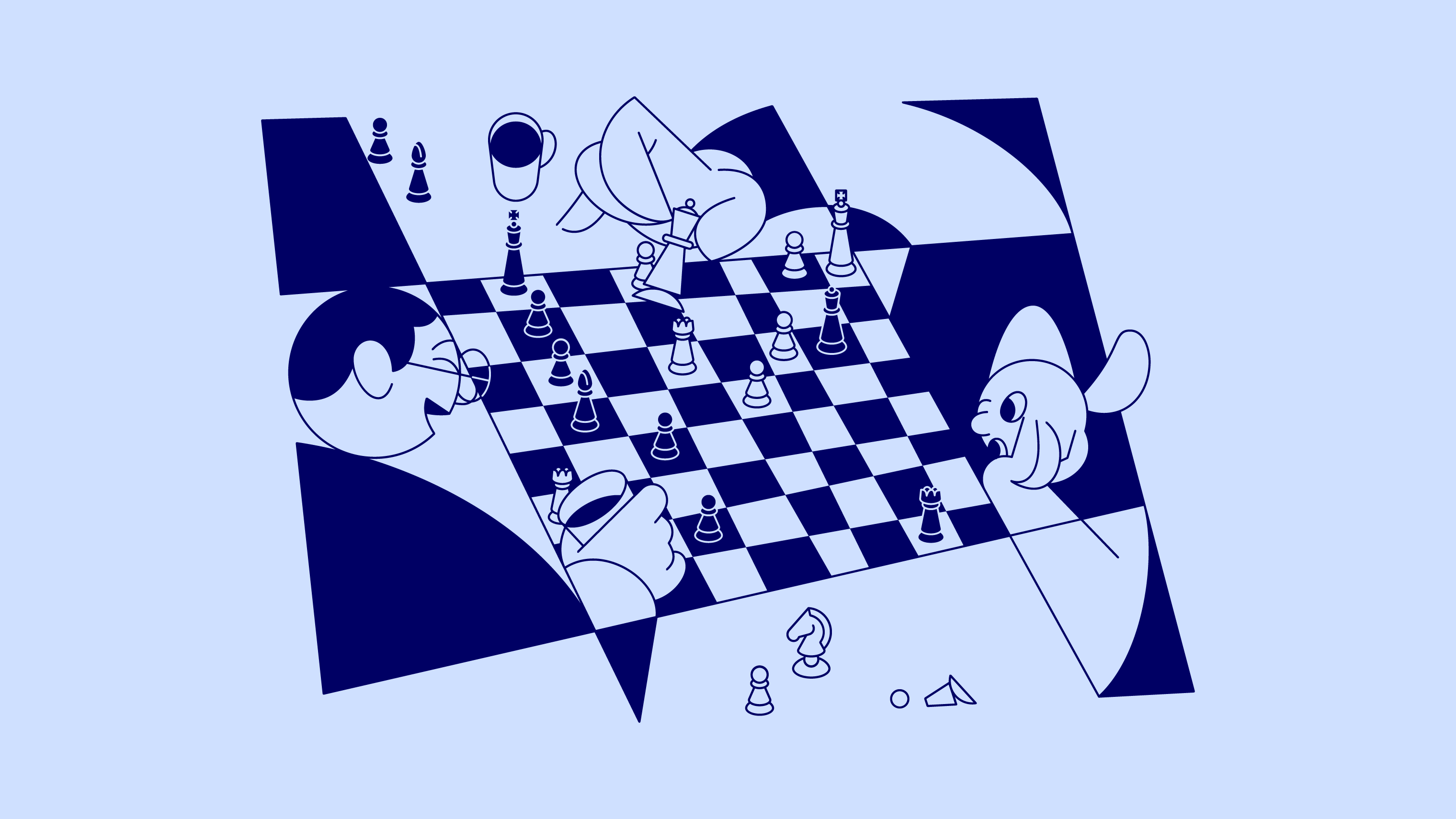
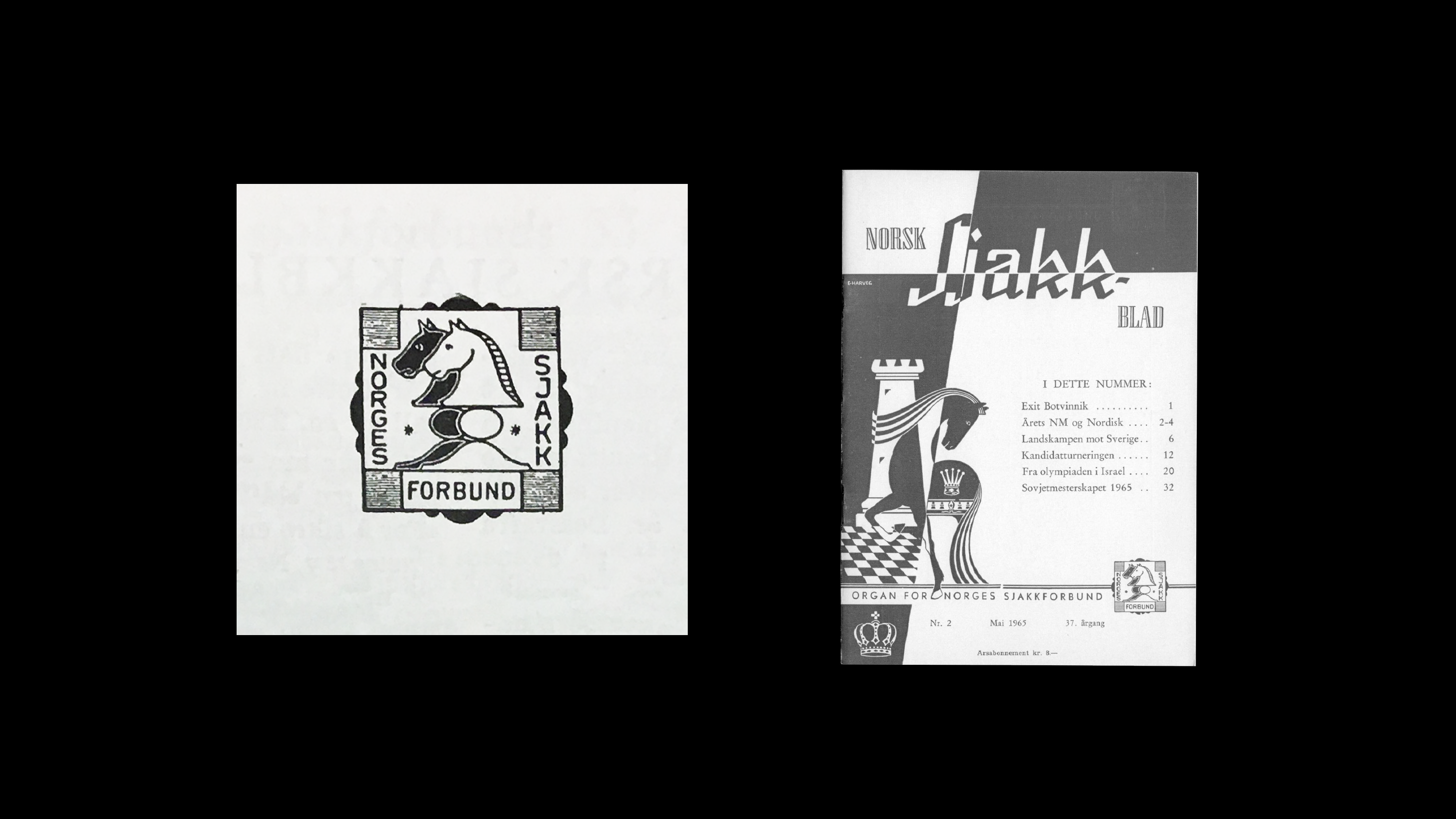
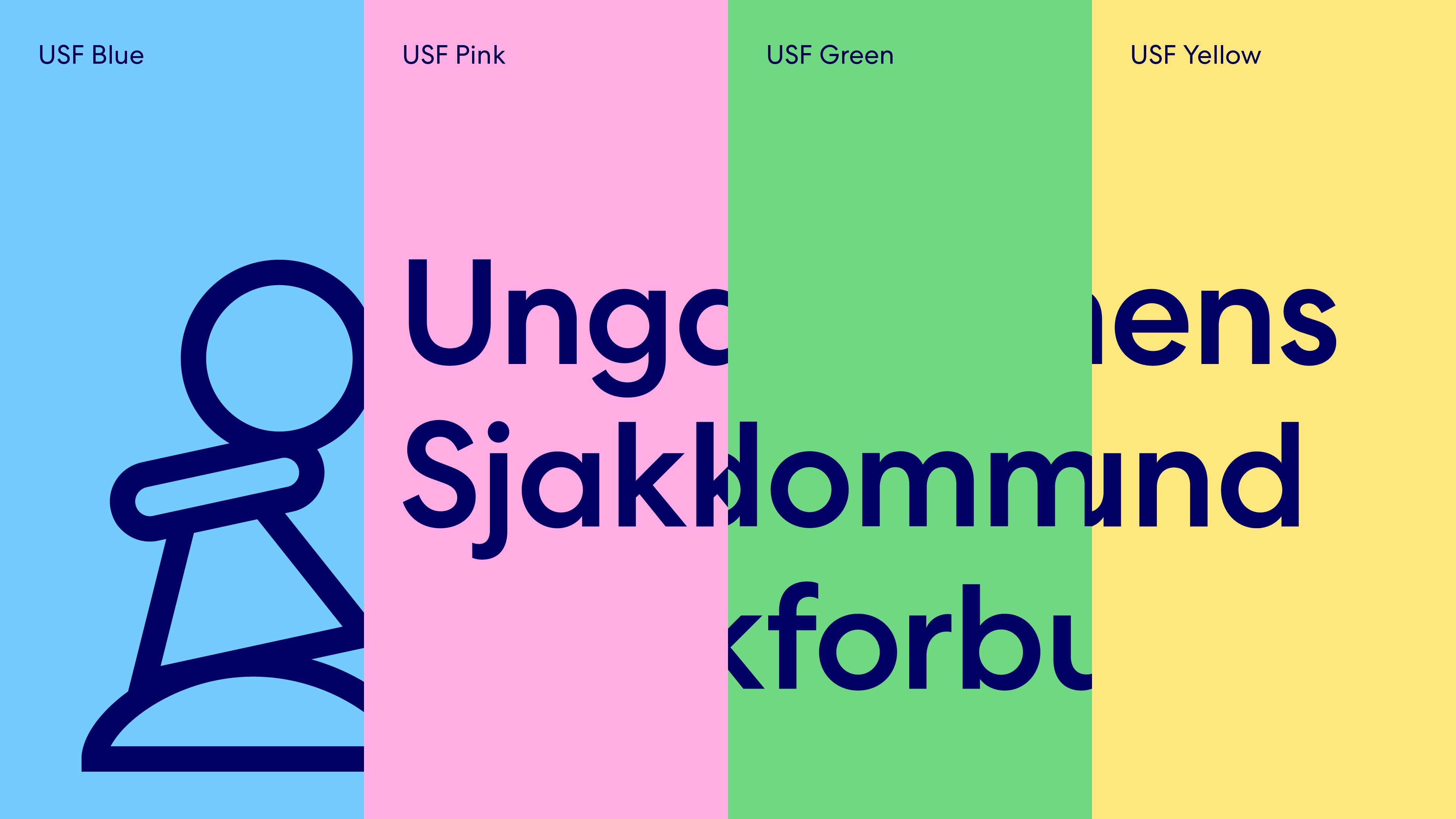
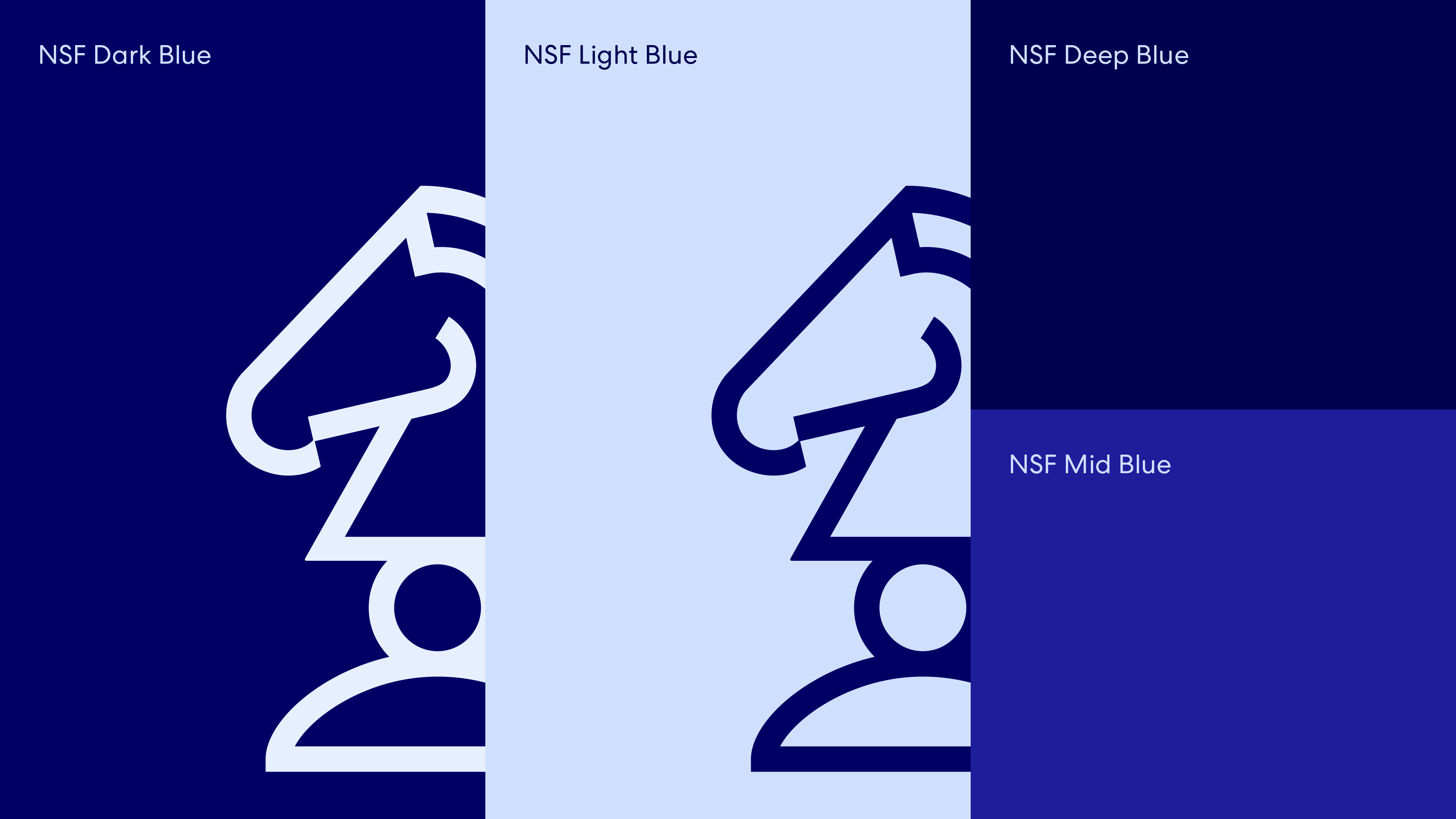
The new visual identity carries with it graphic elements from the association's long history. The intersections between the squares on a chessboard is a key element in the visual identity, especially the contrast you find in those intersections. The diagonal lines of the board move freely to emphasize the playful and dynamic parts of chess, rather than the rigid. This principle is used in the design of the logo symbol, graphic elements and in the color palette, which plays on the contrasts between light and dark. The colors are actively used to categorize all the different activities organizes by the federation, and at the same time creates an approachable and playful expression that highlights the joy of chess. The new logo system does not break the link to the association's 100-year-old logo, but builds on it and is a more flexible system that allows for logo variants and stronger logo symbols that can stand alone.
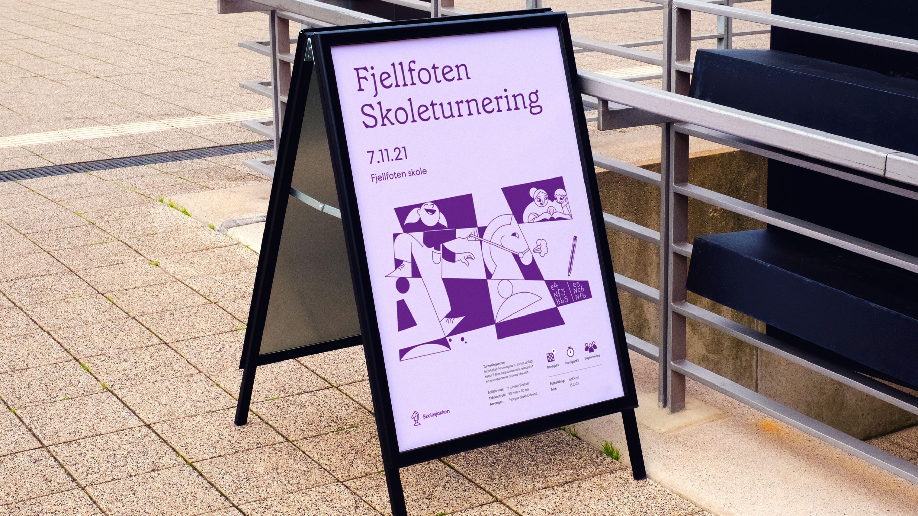
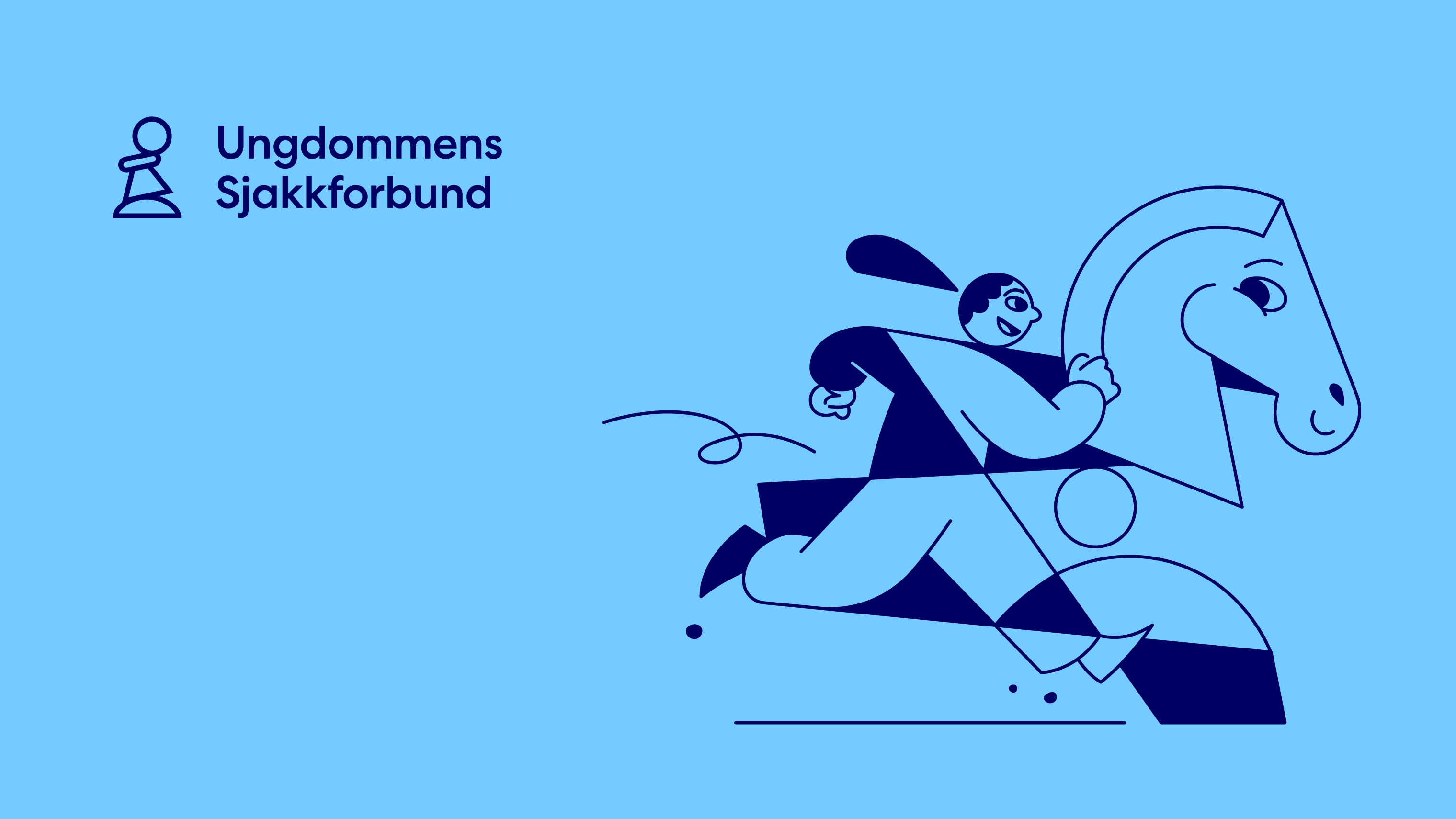
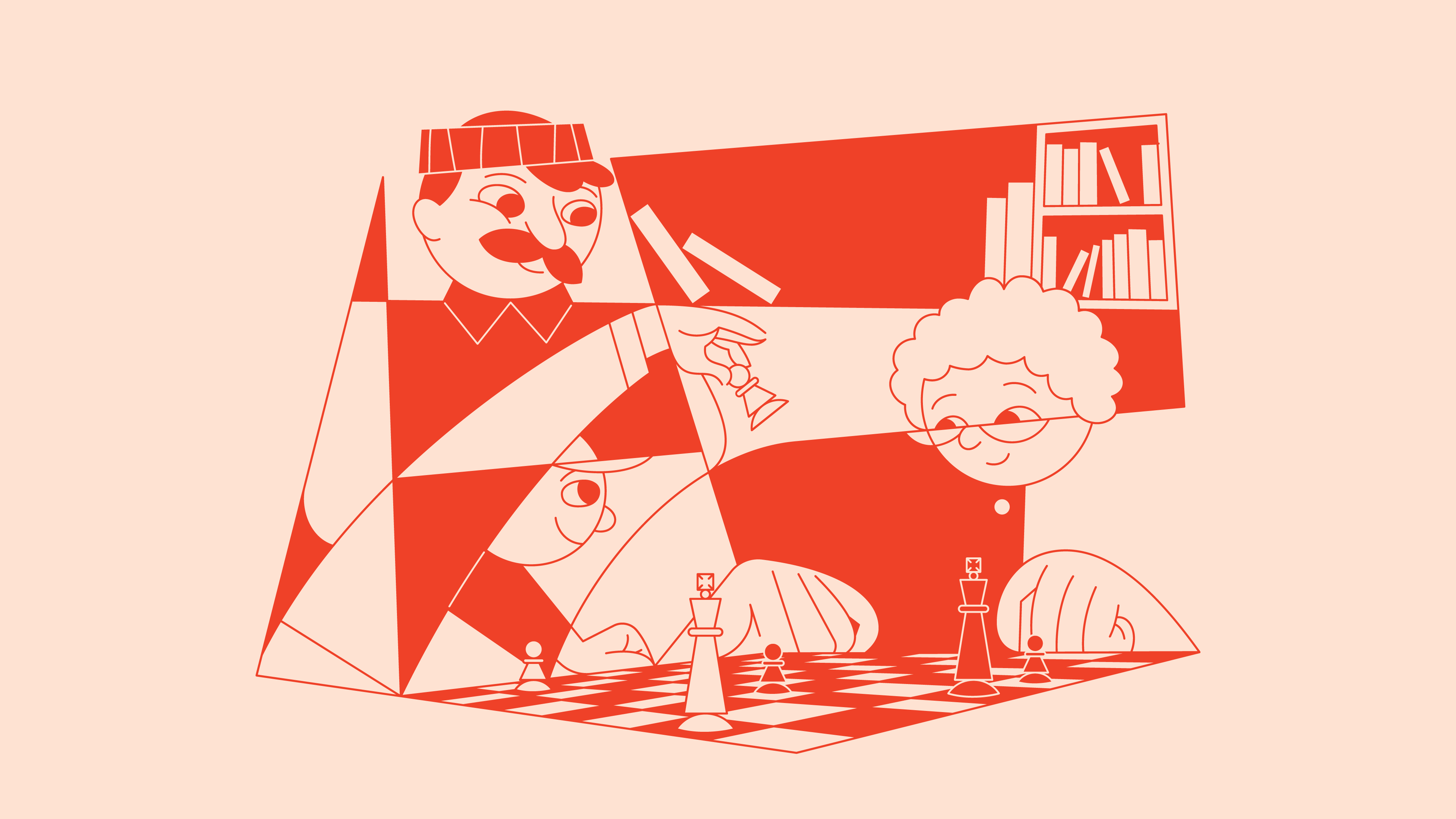
The illustrations capture the different people in chess, and the joy you can share together at all levels. The irregular grid says "chess" in a simple and immediate way. The typeography and typefaces also follow the concept of contrasts: Classic and warm, against geometric and functional.
Credits
Creative Director
Metric
Art Director
Metric
Designer
Metric
Illustrator
Jon Arne Berg (ByHands)
UI/UX
Feed
Category
106 Brand Identity – Complete Systems
Client
The Norwegian Chess Federation
Country
Norway