Project
HiQ
Agency
Great Apes
Year
2023
Award
Silver
HiQ
https://www.greatapes.studio/entry/hiq/
Stockholm based HiQ was founded in 1995. From early on the HiQ brand had a distinct look and feel to it - more colourful, analogue and free-spirited than it’s contemporaries. By 2020s though the identity had grown stale and dated even though it still stood out - just not in a positive way anymore.
We wanted it to remain loyal to the freewheeling spirit of HiQ as a brand and a workplace and create an identity that was still truly unique - and not just within it’s category.
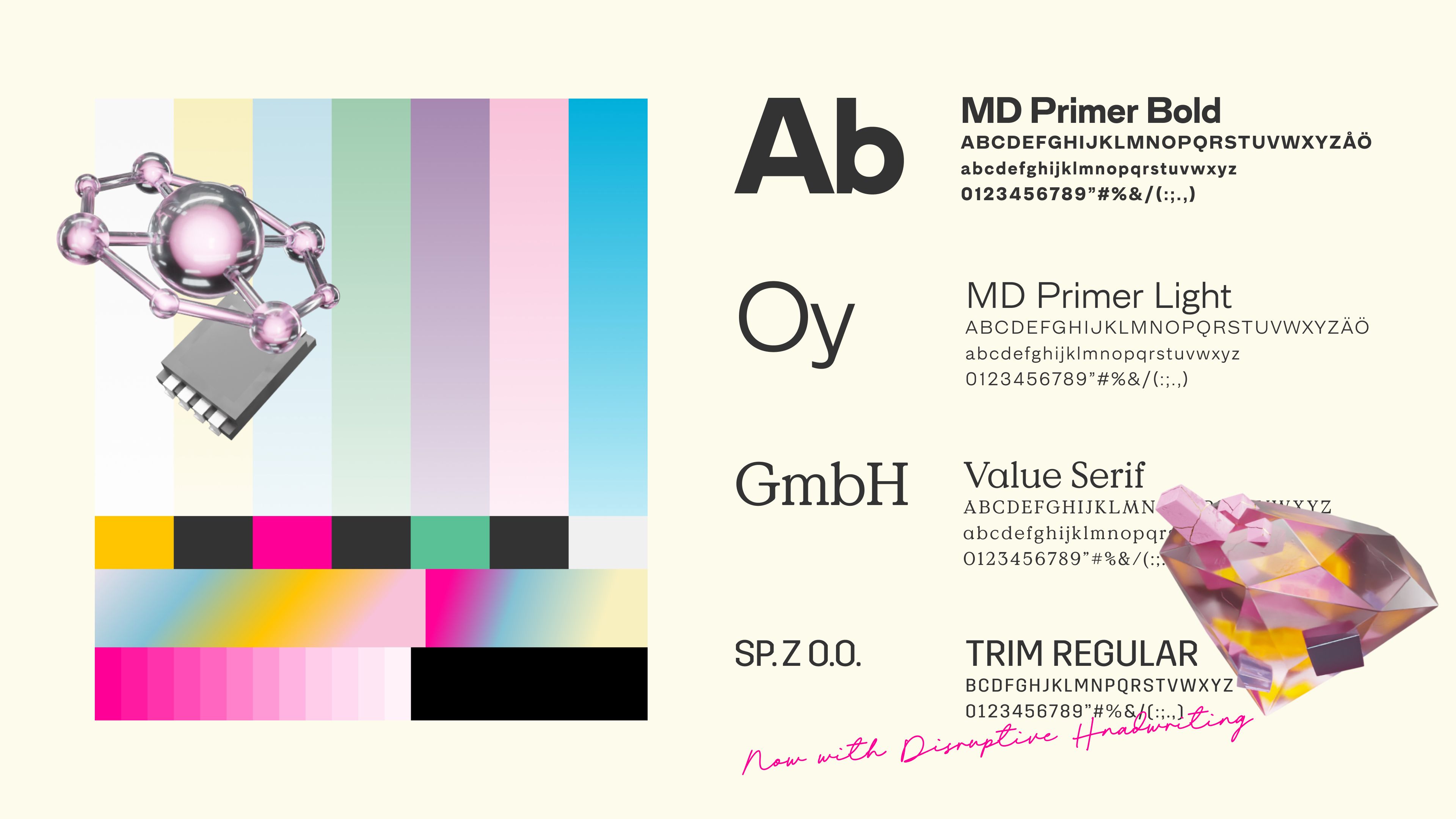
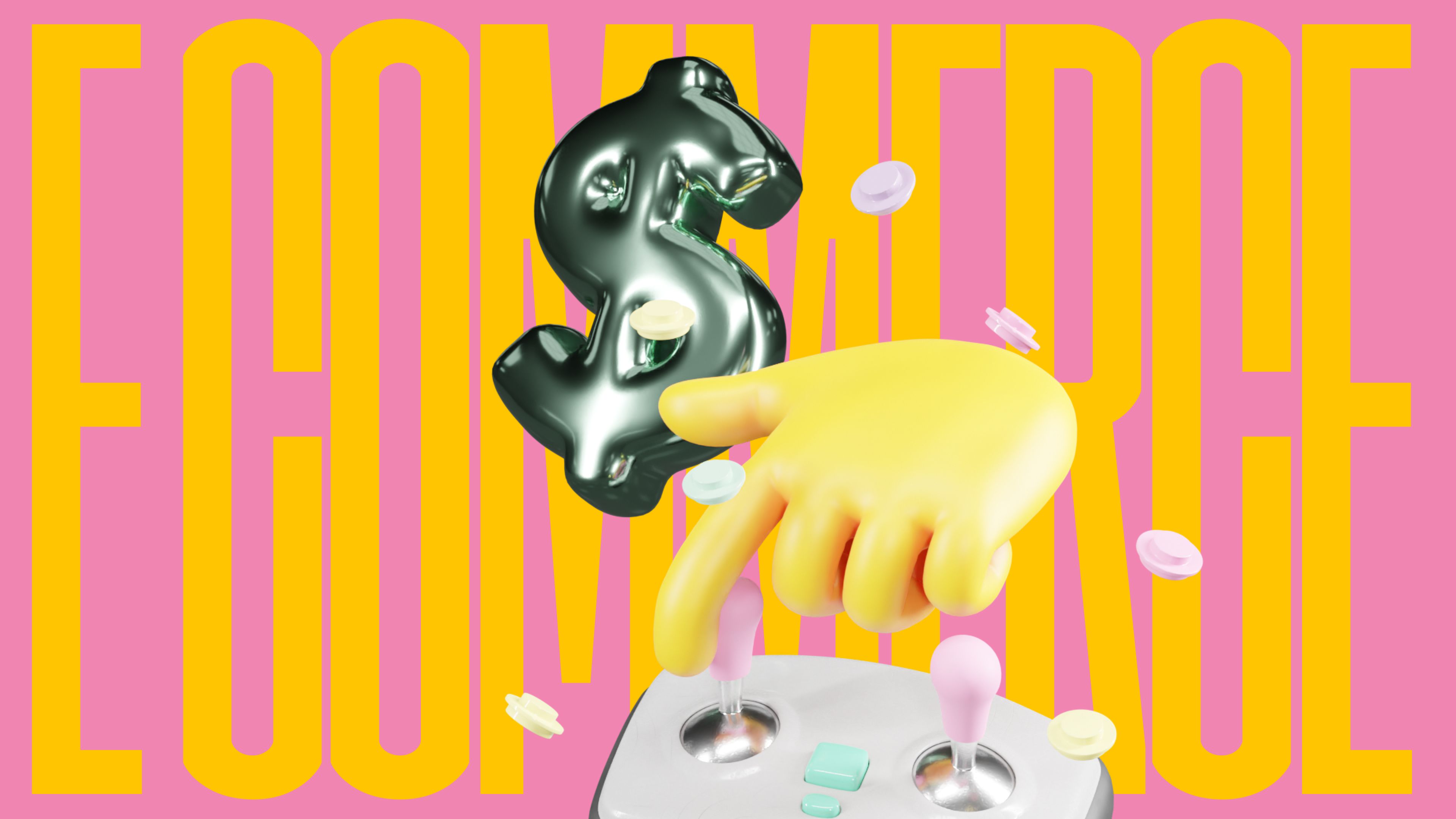
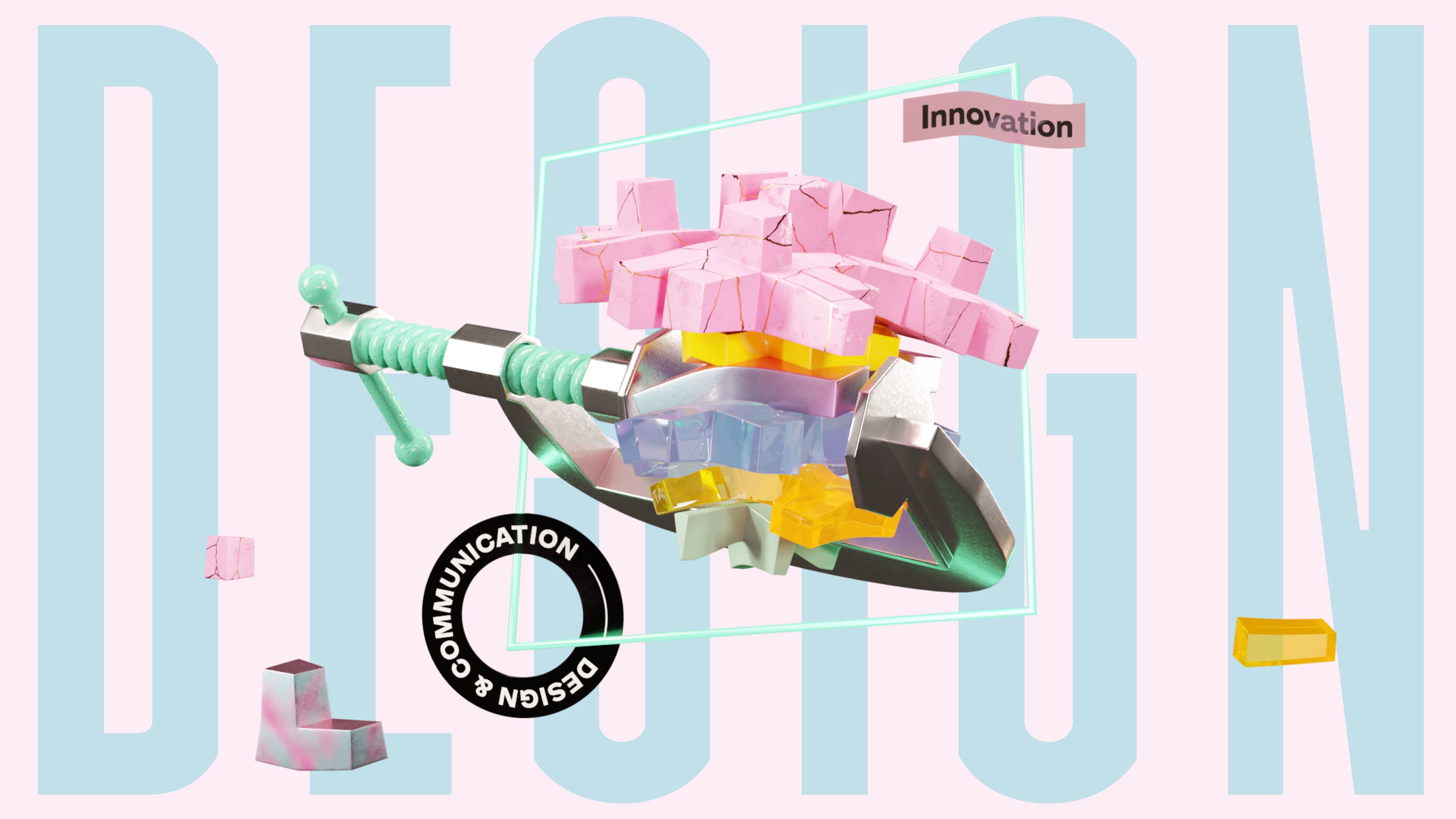
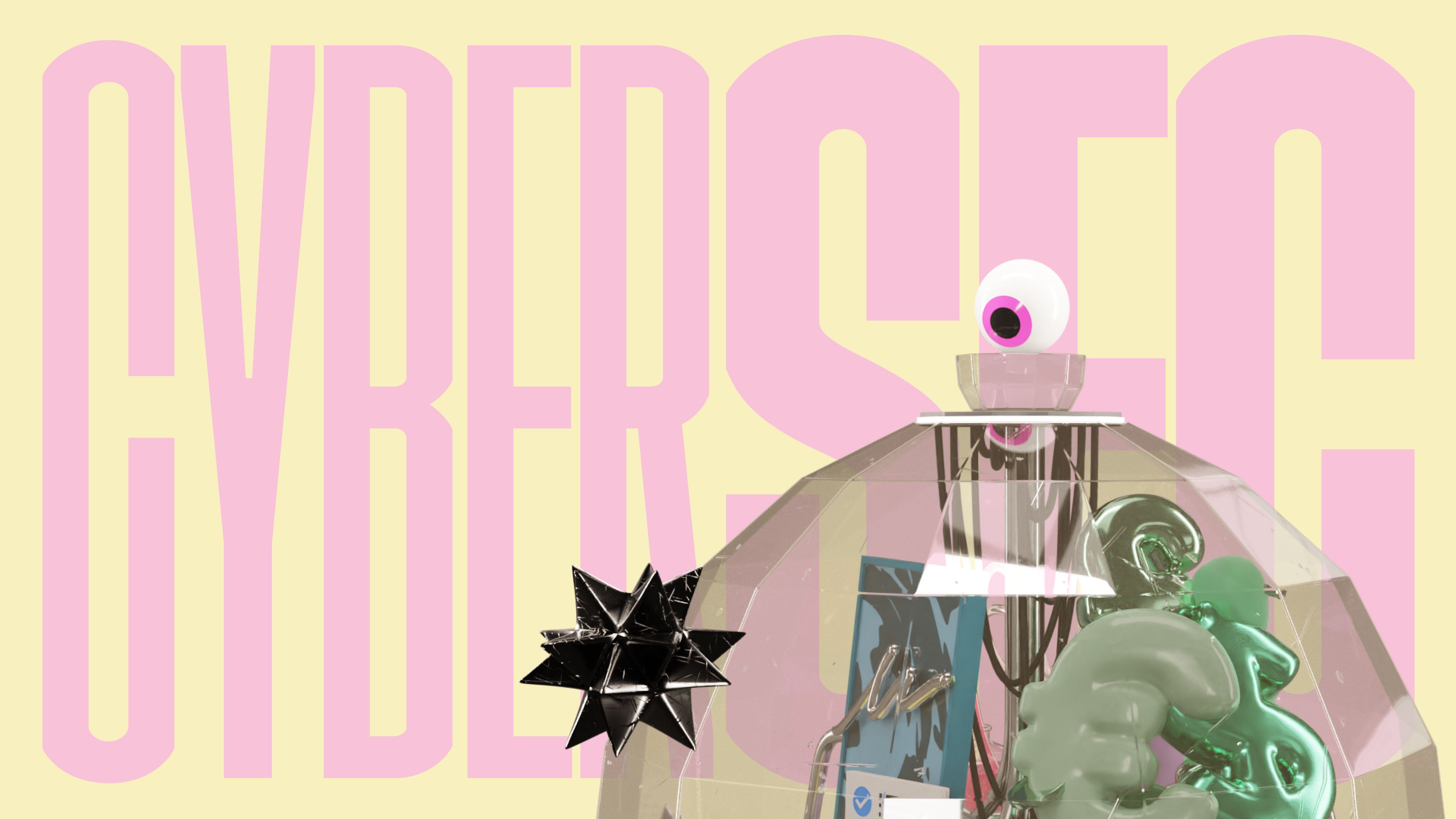
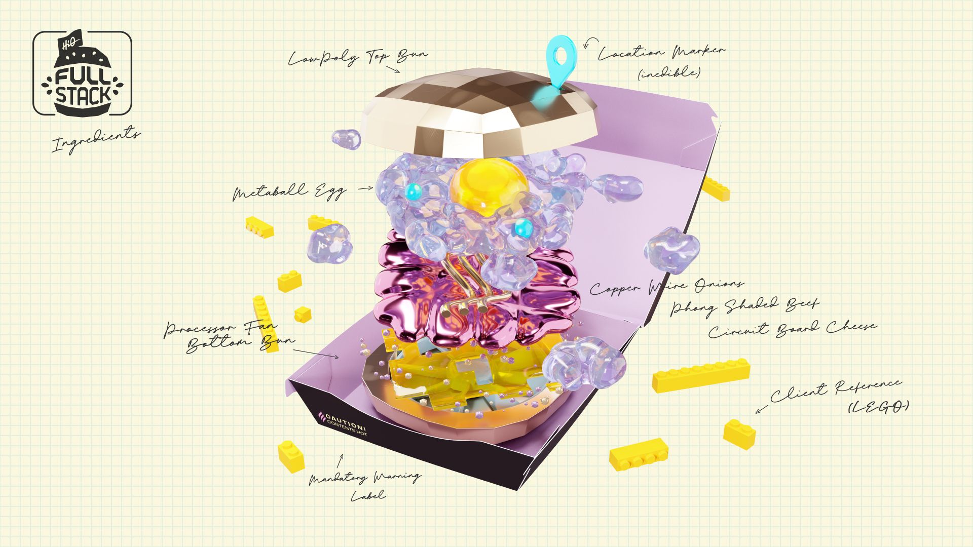
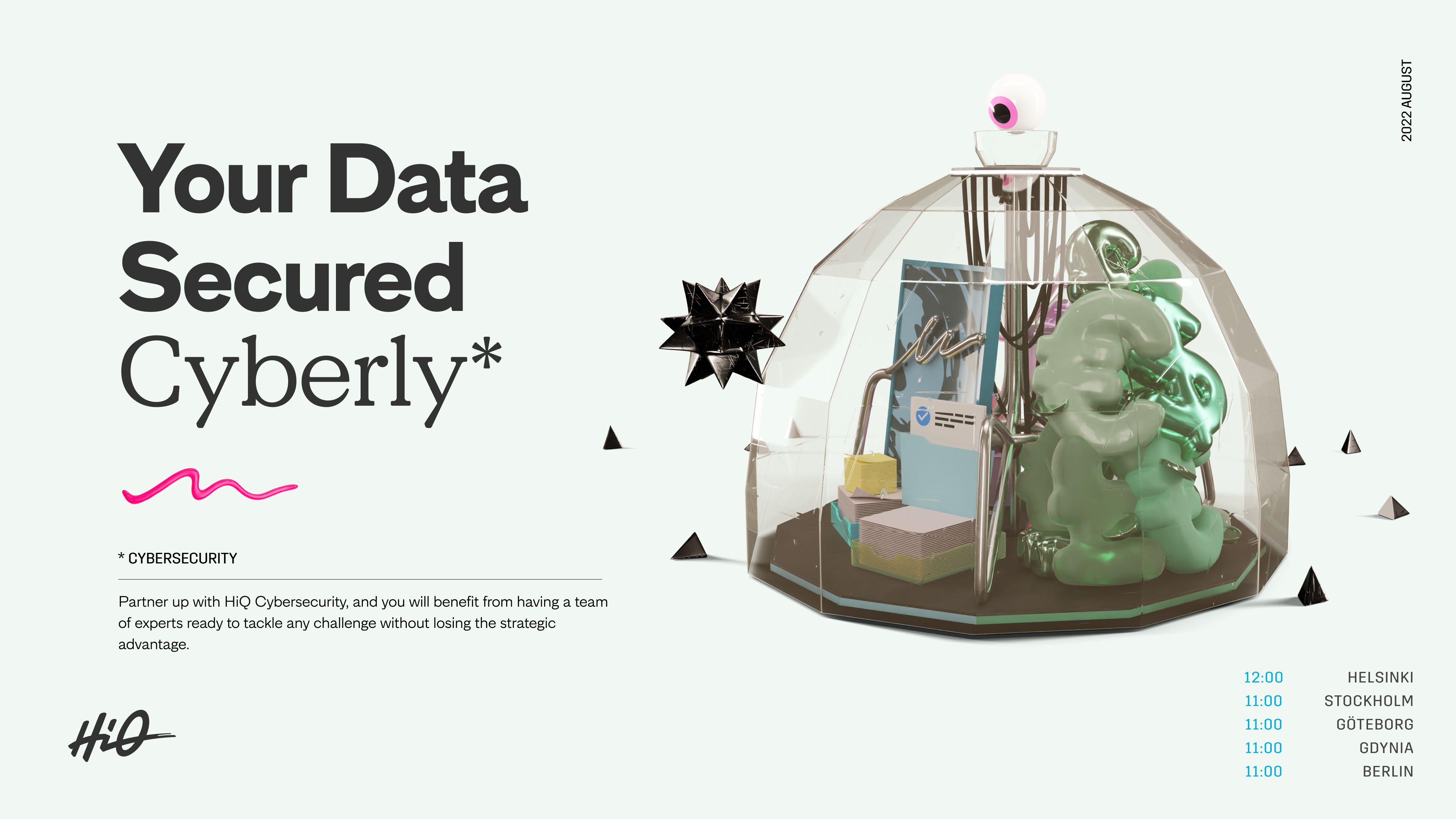
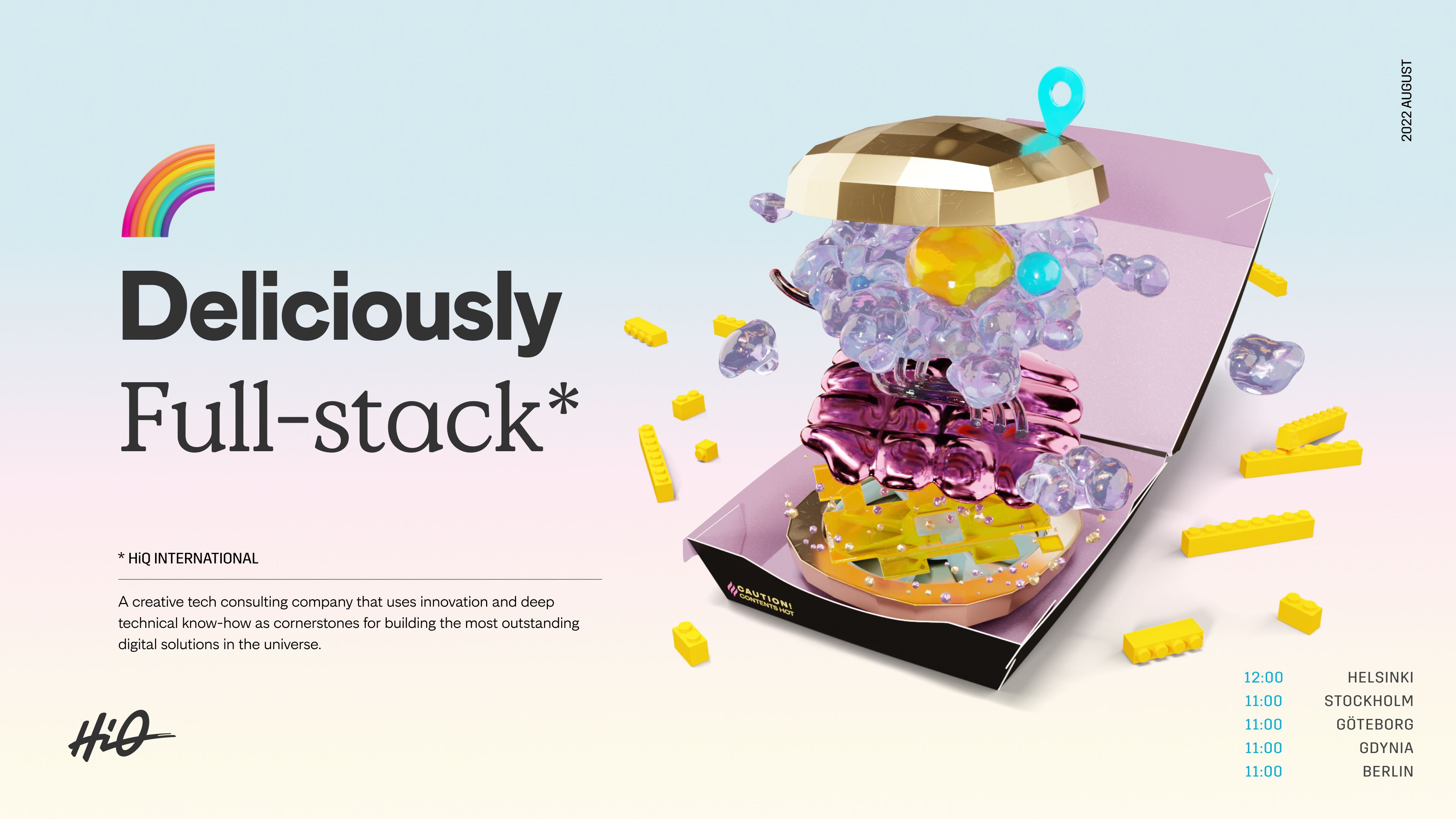
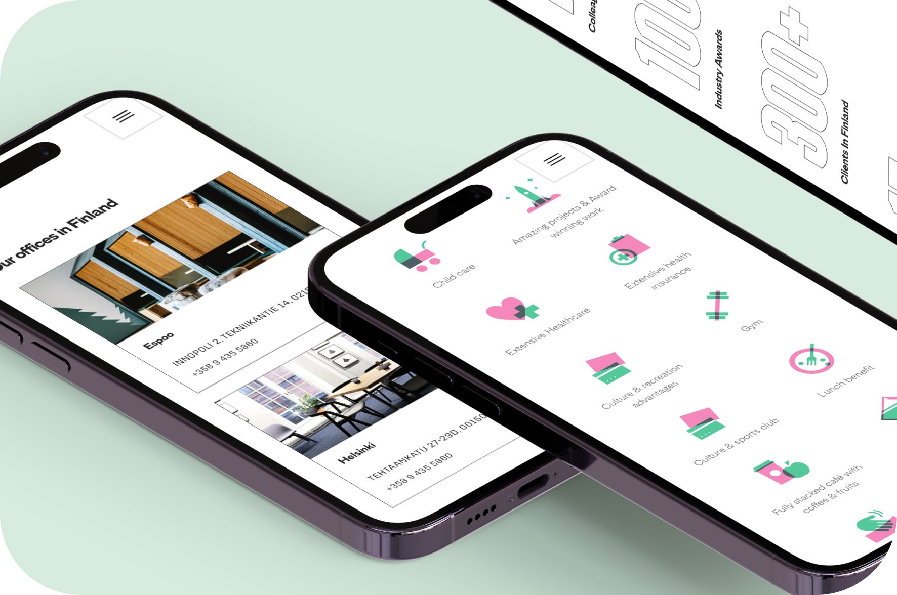
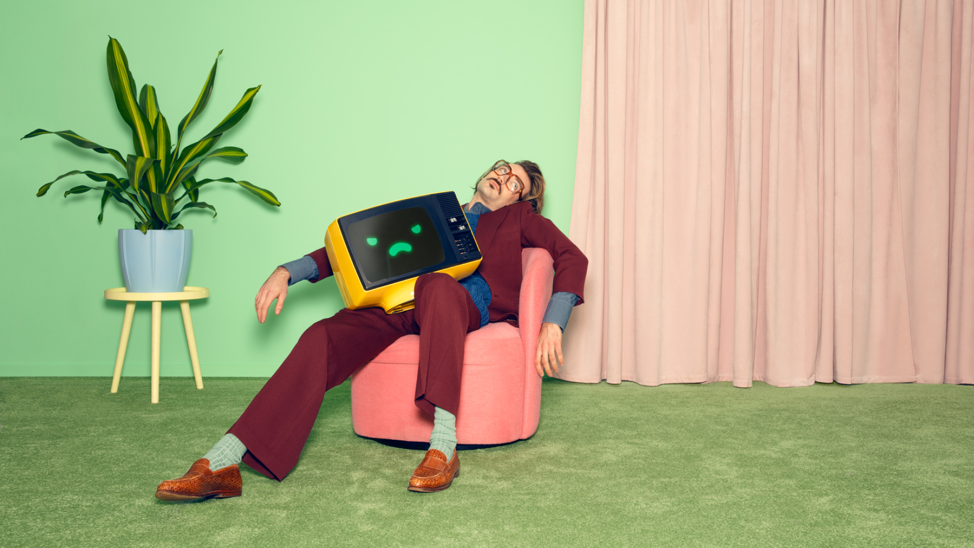
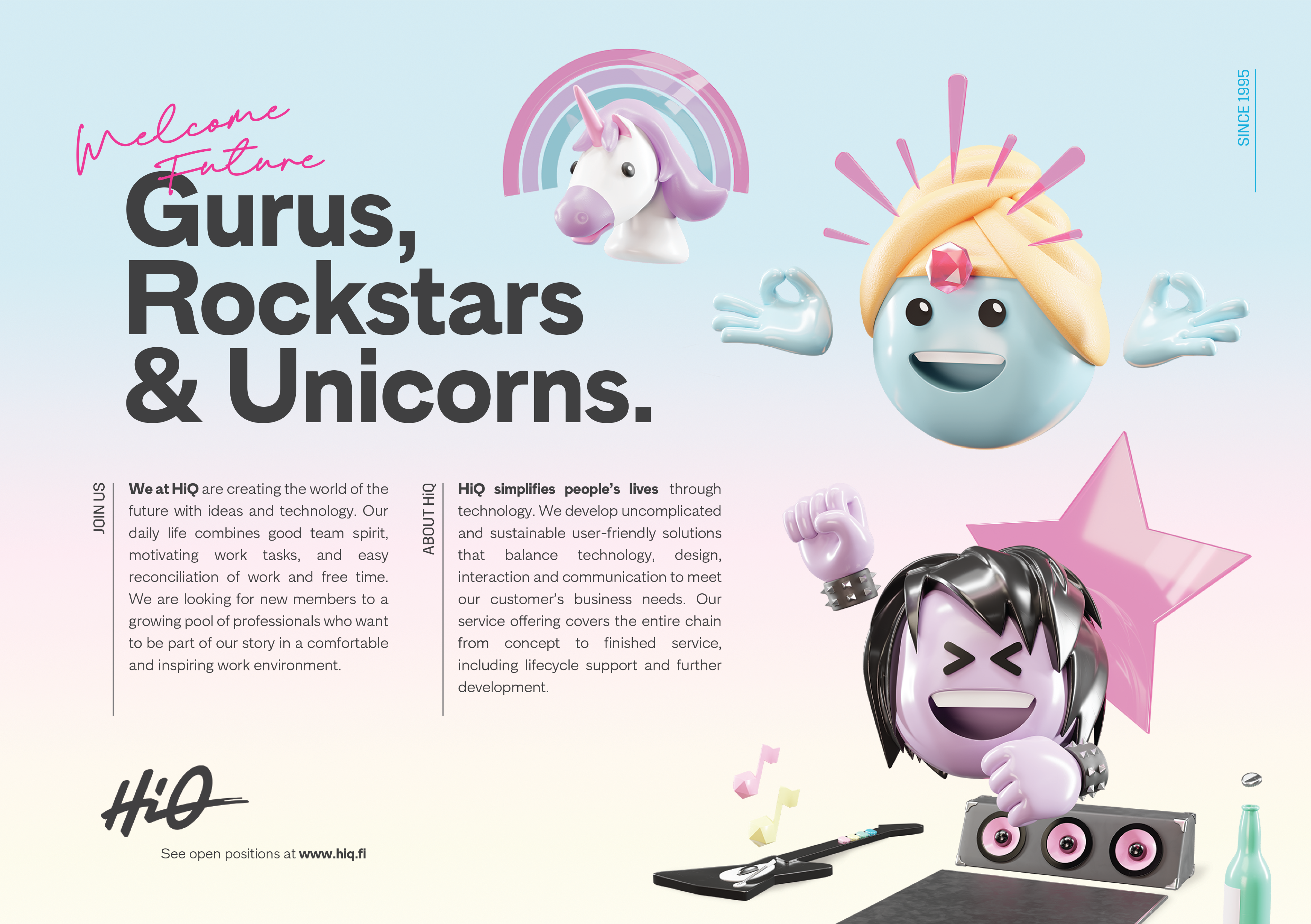
The new identity is best described as little mischievous. Instead of anchoring it into a rigid palette of 2 to 3 colors and the generic almost stock photo like imagery of IT consultancies it consists of almost surrealistic bespoke illustrations and expressive typography.
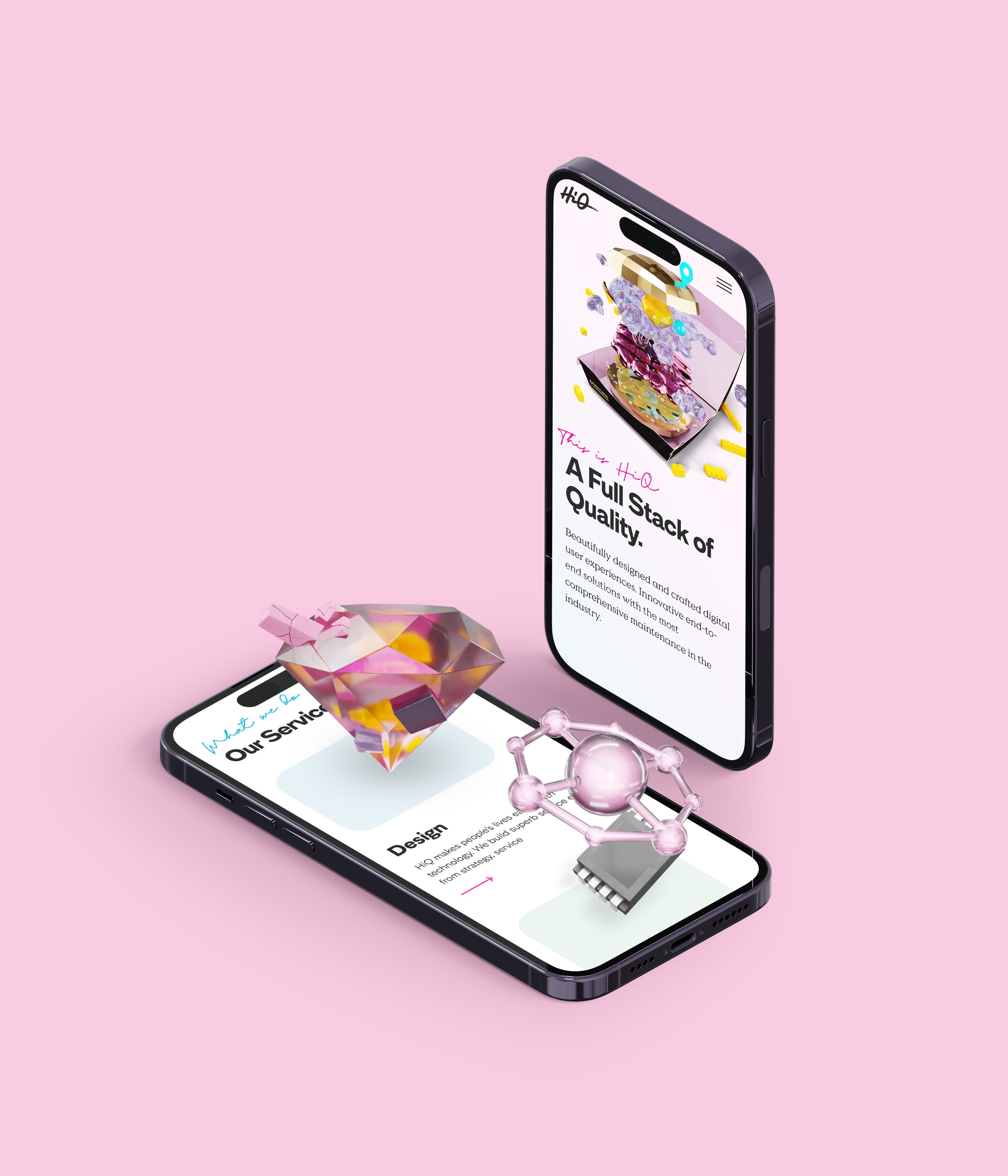
The identity’s visual building blocks are the trinity of Angular (low polygon elements in illustrations, buttons, underlying grids), Rounded (backdrops, image mask - mobile aesthetic) and Organic (analogue elements in illustrations, handwriting, logo)
These elements provide a vast amount of needed variety in the usage of the brand. It can easily be toned down for a respectable contract template or be turned to 11 for a recruitment event.
Credits
Creative Director
Niko Sipilä
Art Director
Niko Sipilä
Designer
Constantin Freche, Niko Sipilä, Andreas Carlson, Lukasz Geratowski
Illustrator
Andreas Carlson, Johanna Tyrkkö
Copywriter
Niko Sipilä, Erik Ridman, Isa Sjösten, Aino Yrjänä
Developers
Mikko Saario, Jesse Taina, Juho Sillanpää
Project Management
Erik Ridman, Isa Sjosten, Sandra Siljestedt, Aino Yrjänä, Tiina Laaksonen, Mikko Sairio


Category
105 Brand Identity – Digital Applications
Client
HiQ International
Country
Finland