Swee Kombucha – 100% Natural
OVERVIEW
Swee is a kombucha born in the Georgian capital of Tbilisi, a city with a rich culinary and cultural heritage in its own right, deepened by a myriad different influences over the centuries. Swee brews its probiotic ferments from a careful selection of local, all-natural ingredients to create a range of refreshing drinks that are delicious and good for the gut.
INSIGHT
Georgia has a sophisticated and world-renowned culinary sector, celebrated for its use of fresh, home-grown ingredients and for its pioneering work in natural wines. But the non-alcoholic beverage market is less well-developed, and kombucha is not yet a popular drink. Swee needed a packaging design that would be sophisticated enough to appeal to the tastes of Georgia’s discerning drinkers and make it stand out from sugary sodas on supermarket shelves.
CONCEPT
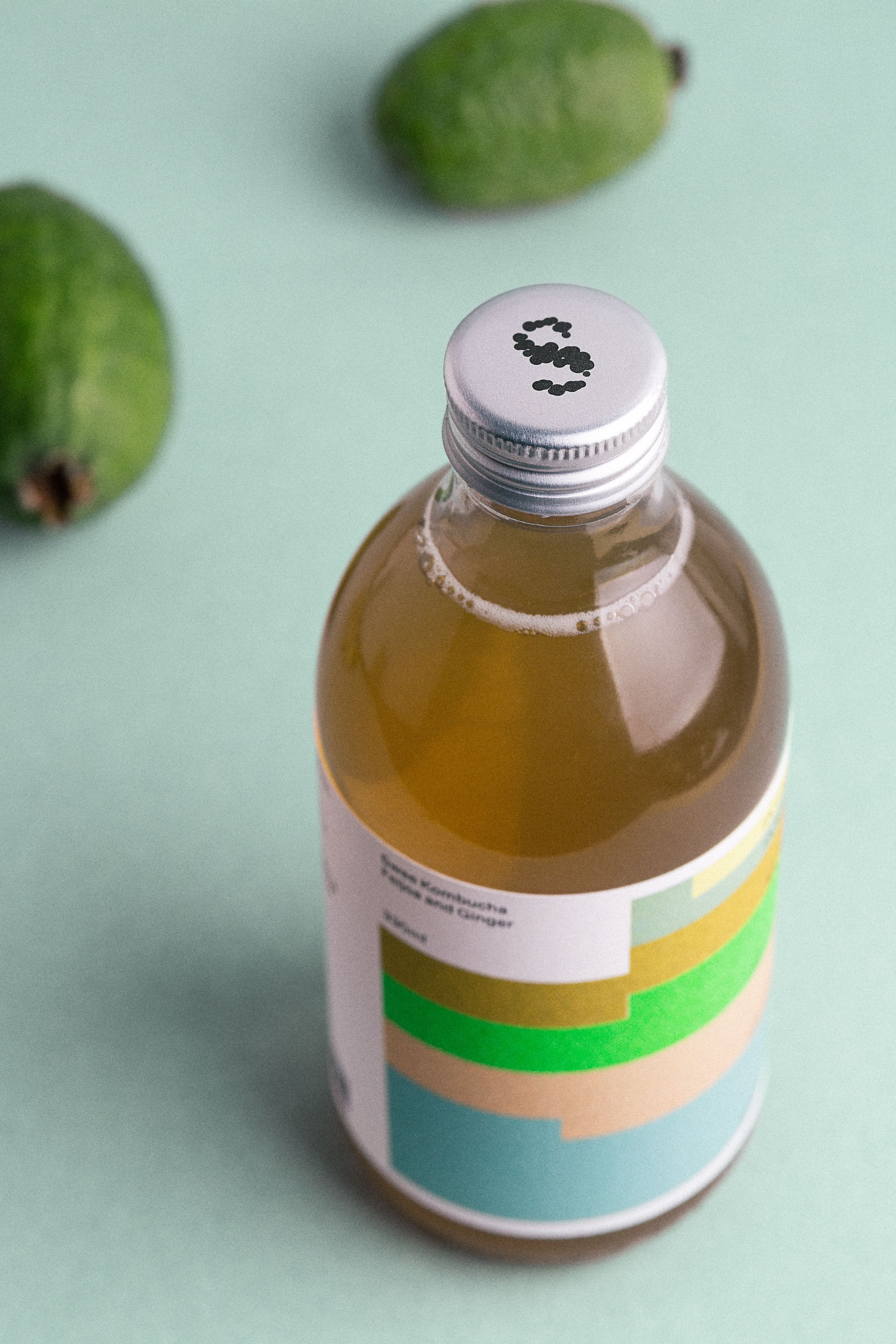
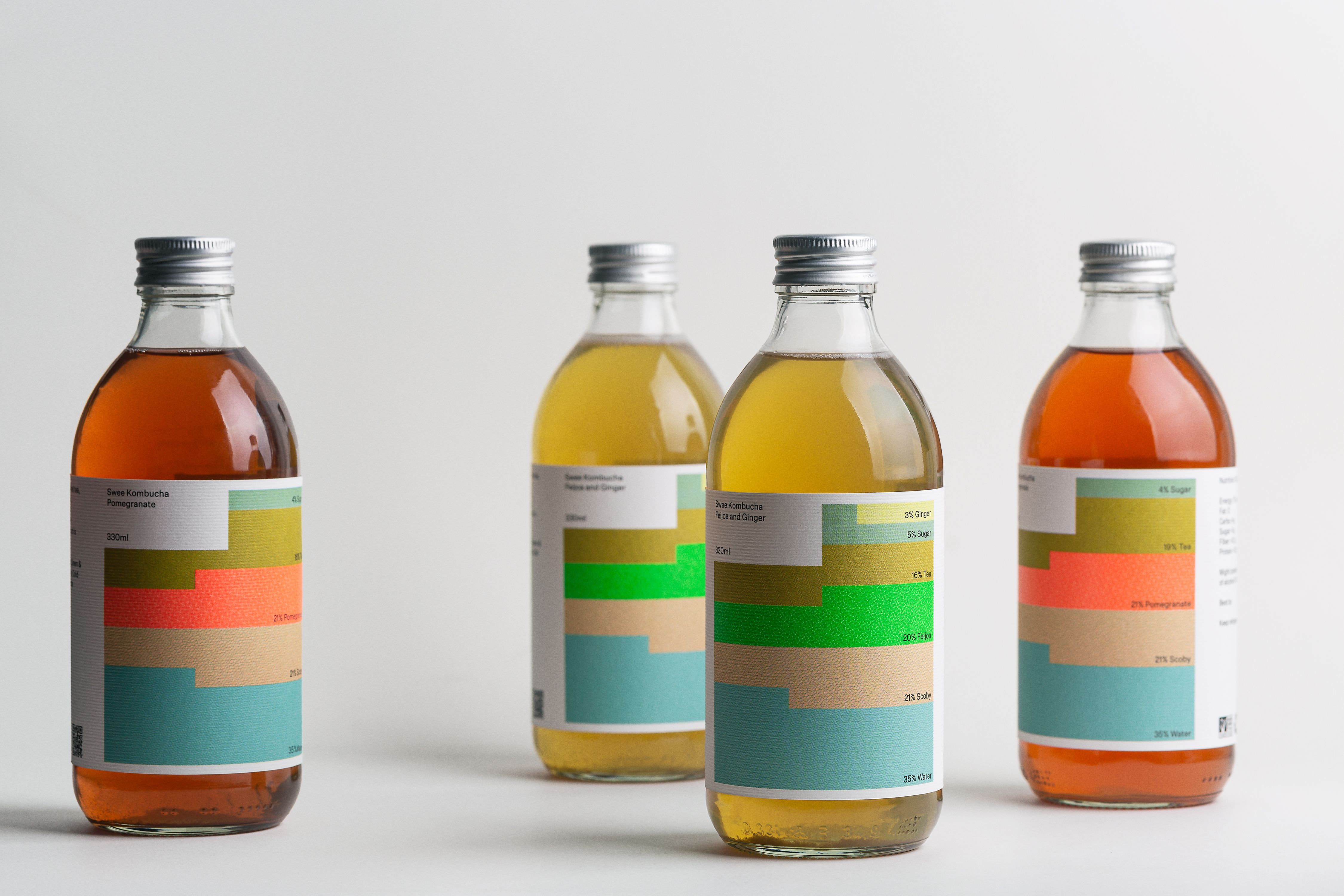
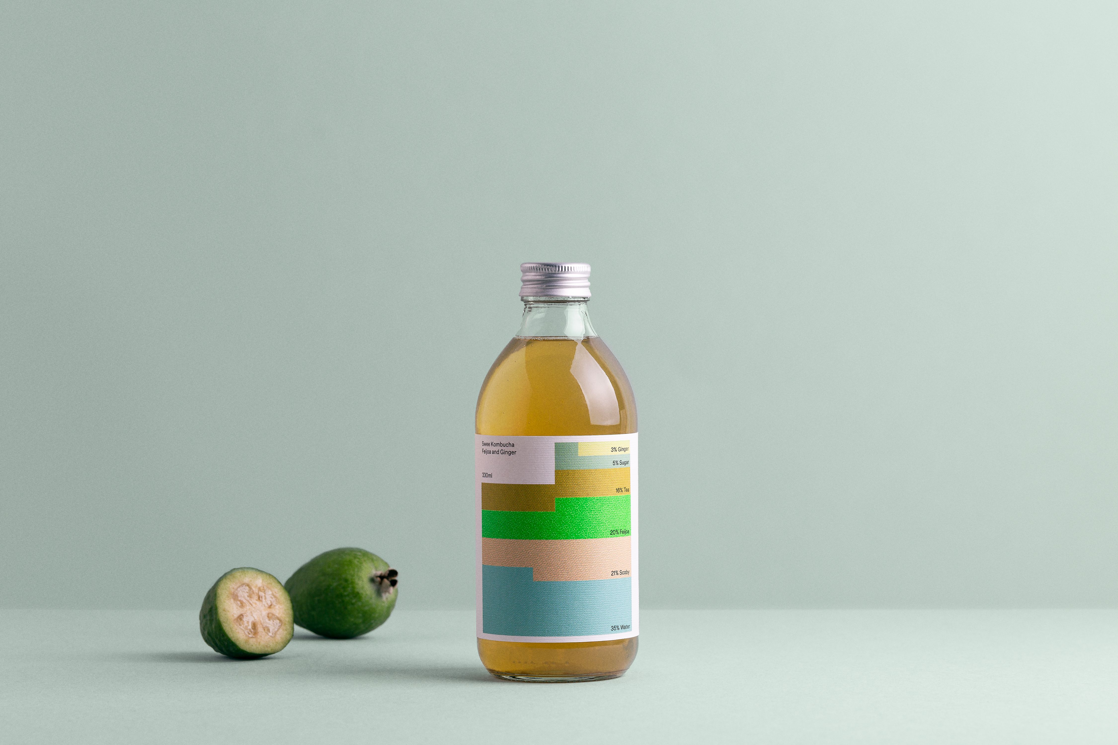
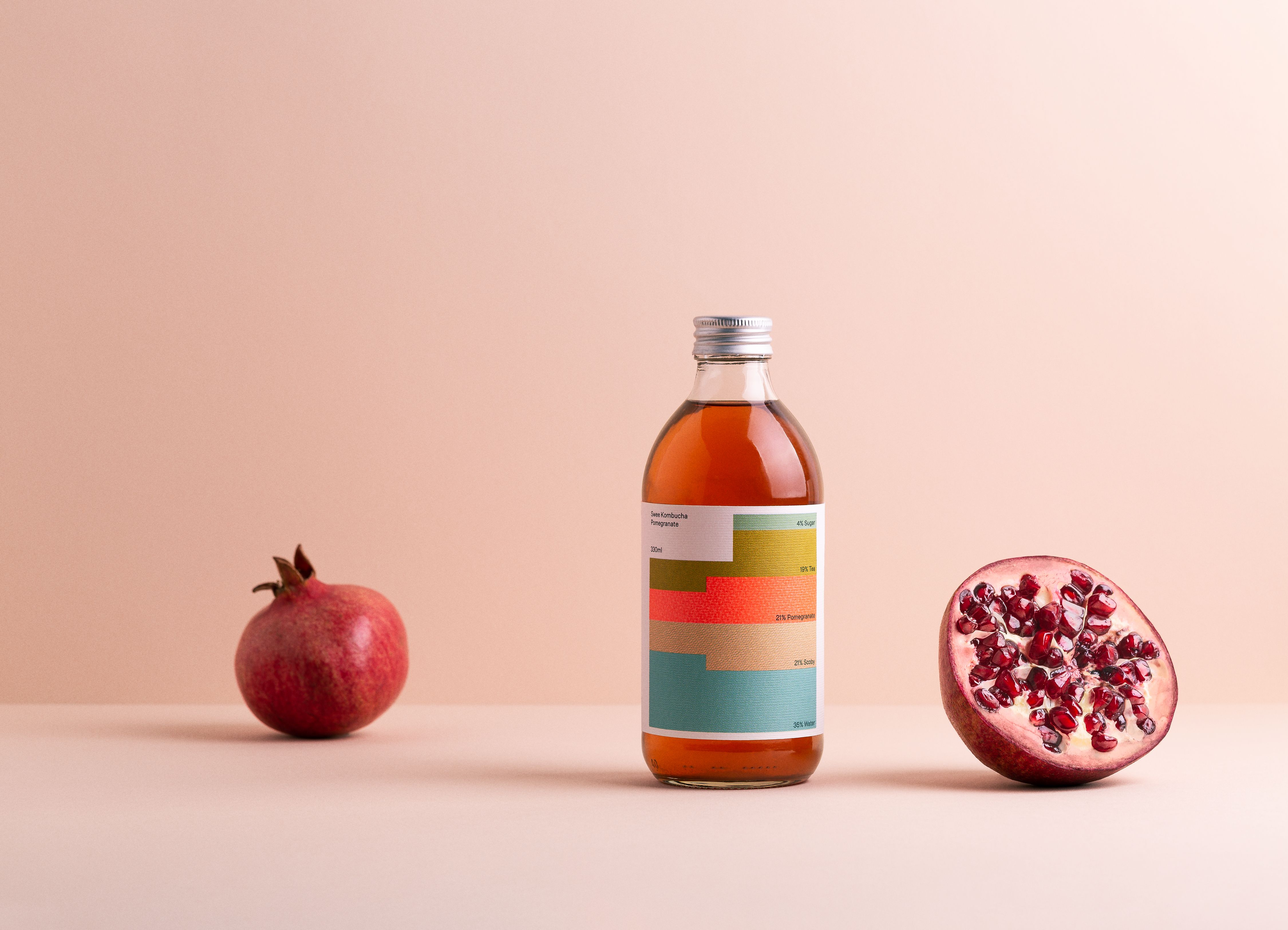
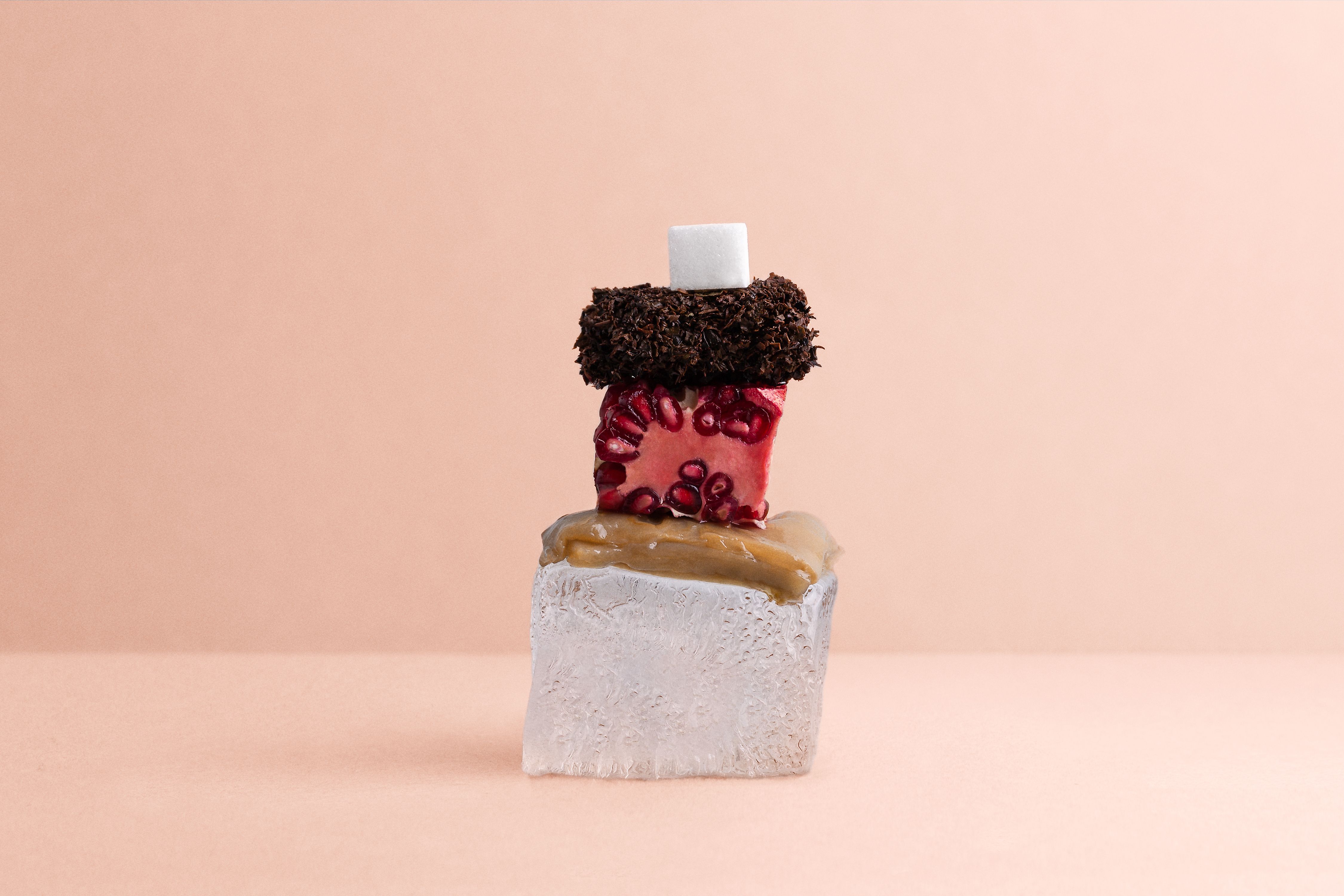
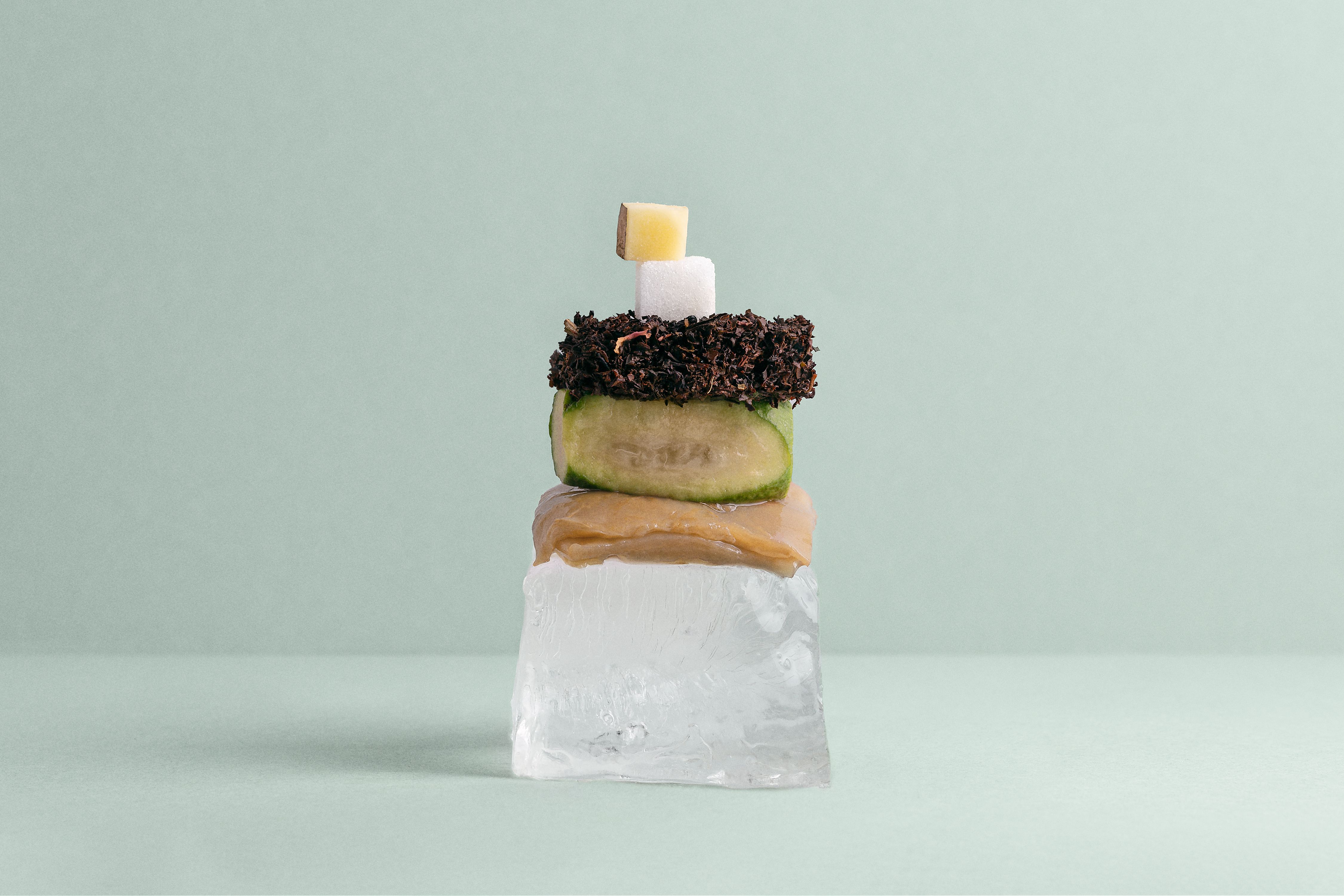
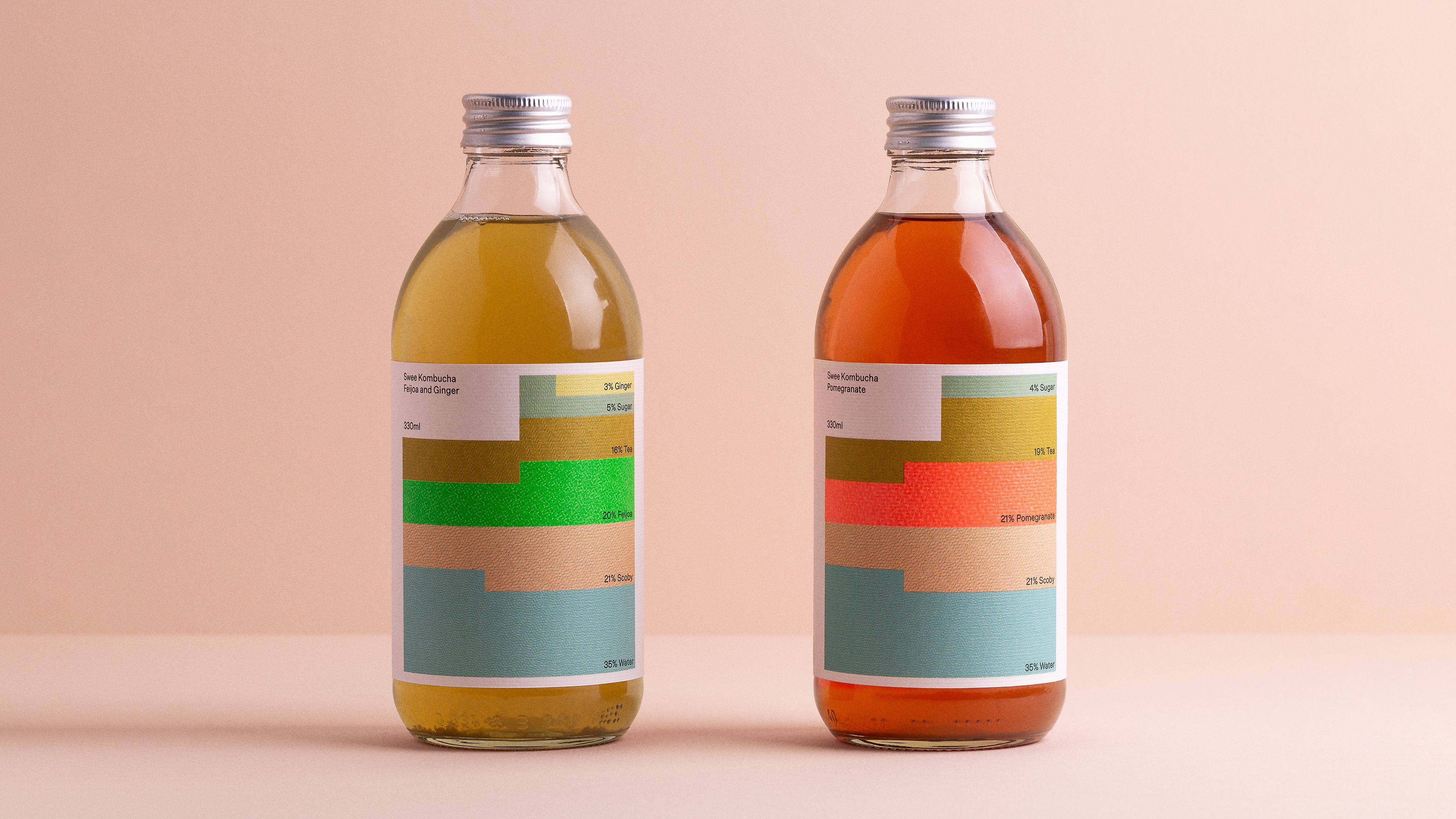
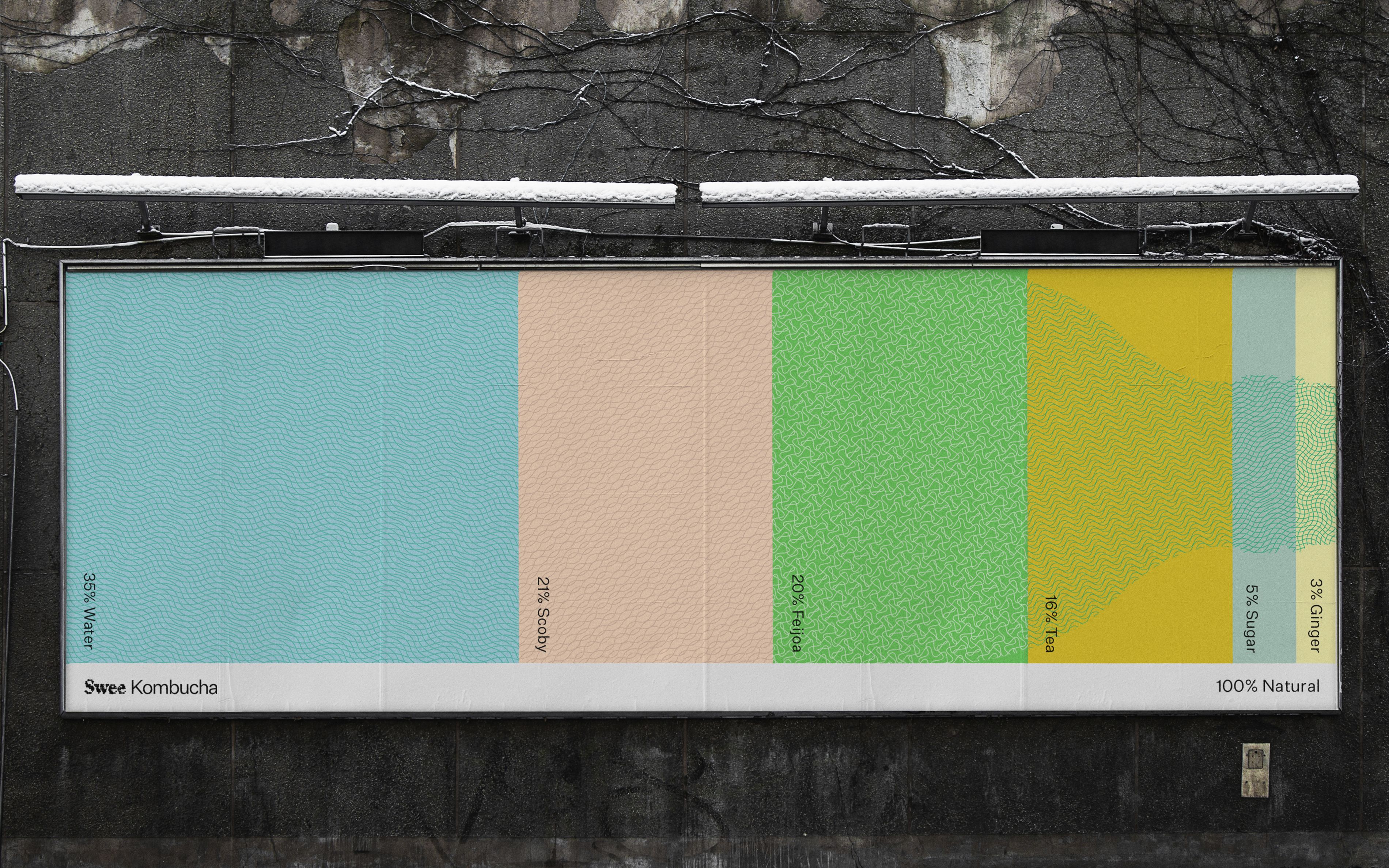
Swee’s packaging design is built around the narrative “100% natural”, to reflect the brand’s commitment to using all-natural ingredients. Visually, this is communicated through a modular system which focuses on the drink’s unique list of ingredients.
SOLUTION
The ingredient list forms the basis of its packaging identity, taking what is typically functional and boring information and turning it into a visually rich infographic system. Each ingredient is represented by a bespoke colour and pattern which combine to create unique chromatic graphics, representing the percentage value of each ingredient. The solution offers limitless potential for variation as the brand grows its offering and clearly embodies the brand’s narrative.
SUSTAINABILITY
Sustainability is of most importance for a company working with all-natural ingredients. Only recyclable material was used for the packaging design: glass, aluminium and paper. The glass bottle design has a straight silhouette and a short neck to avoid transportation of unnecessary space between the bottles.
Credits