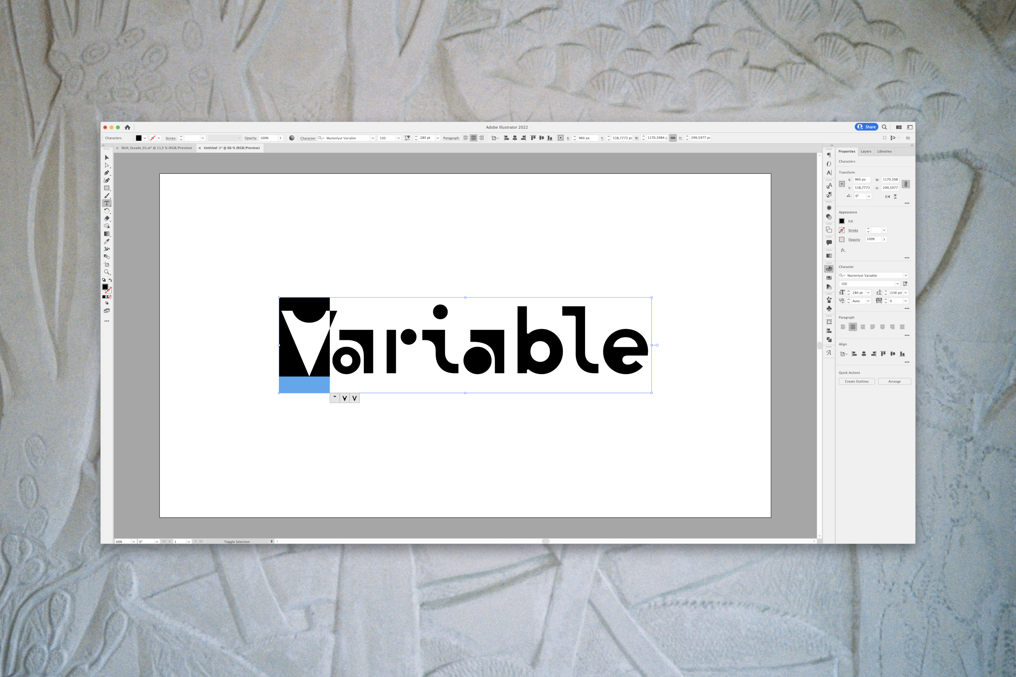
Marienlyst Display
https://marienlyst.ferdeiendom.no/
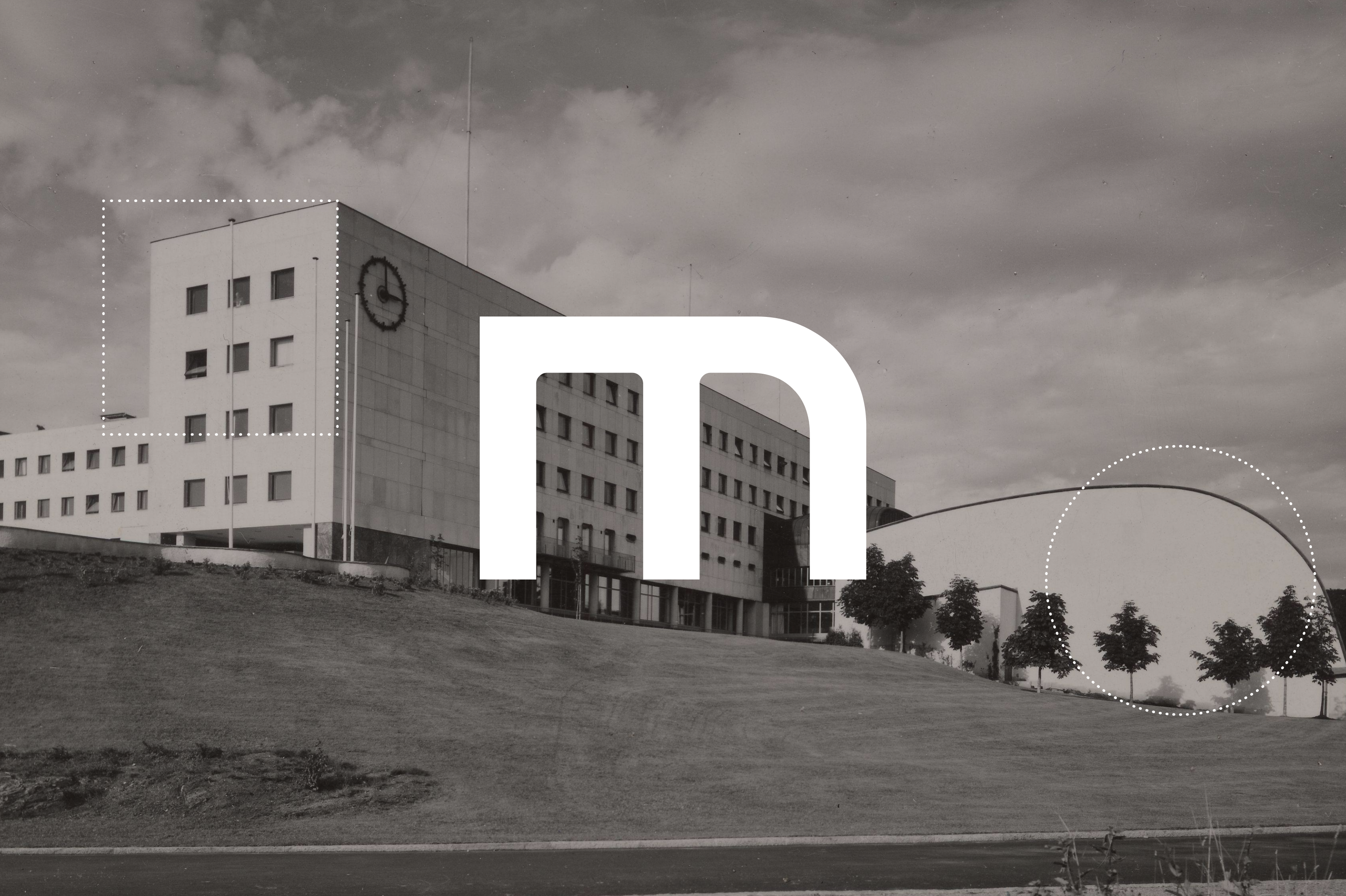
Background: The Norwegian public broadcaster, NRK, is to leave its building at Marienlyst in Oslo after more than 80 years. This opens up 107,000 square meters of new housing and business in central Oslo. The buildings are built on historic grounds and several of them are protected by the authorities. Now NRK has decided to move, and the same area will be developed into a creative, vibrant cultural hub, where people can come and stay, live, work and experience art, music, food, drink and everything in between. According to the plan, NRK will not move until ten years from now, and the visual identity for Marienlyst therefore functions as a vision carrier for the area as much as an identity - Marienlyst will become a district that unites NRK's history with Oslo's need to become a greener, more creative and inclusive city.
The essence of Oslo is change. With a nod to NRK's history, Marienlyst will open up and become an extroverted and unpolished area that everyone in Oslo can call their own. Continuous input and involvement in various forms will ensure that the area reflects Oslo and is in constant transformation. On the city floor, there will be unexpected experiences among colorful architecture, quality, niche and Norway's most innovative cultural hub. As an urban development project with potentially massive national interest and a wide range of stakeholders, it is important to bring flexibility to the identity and show respect for the heritage.
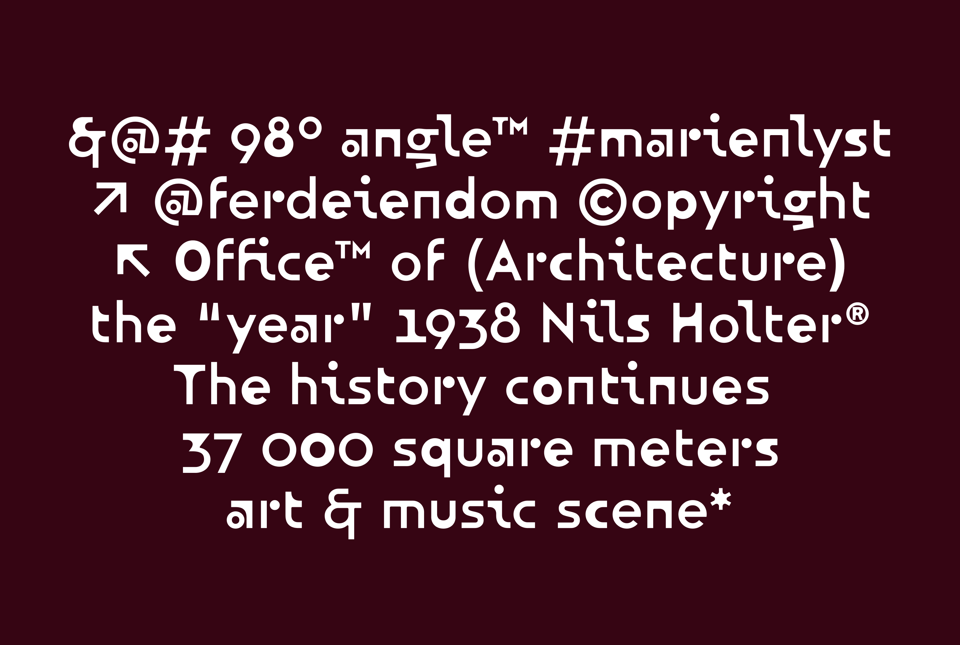
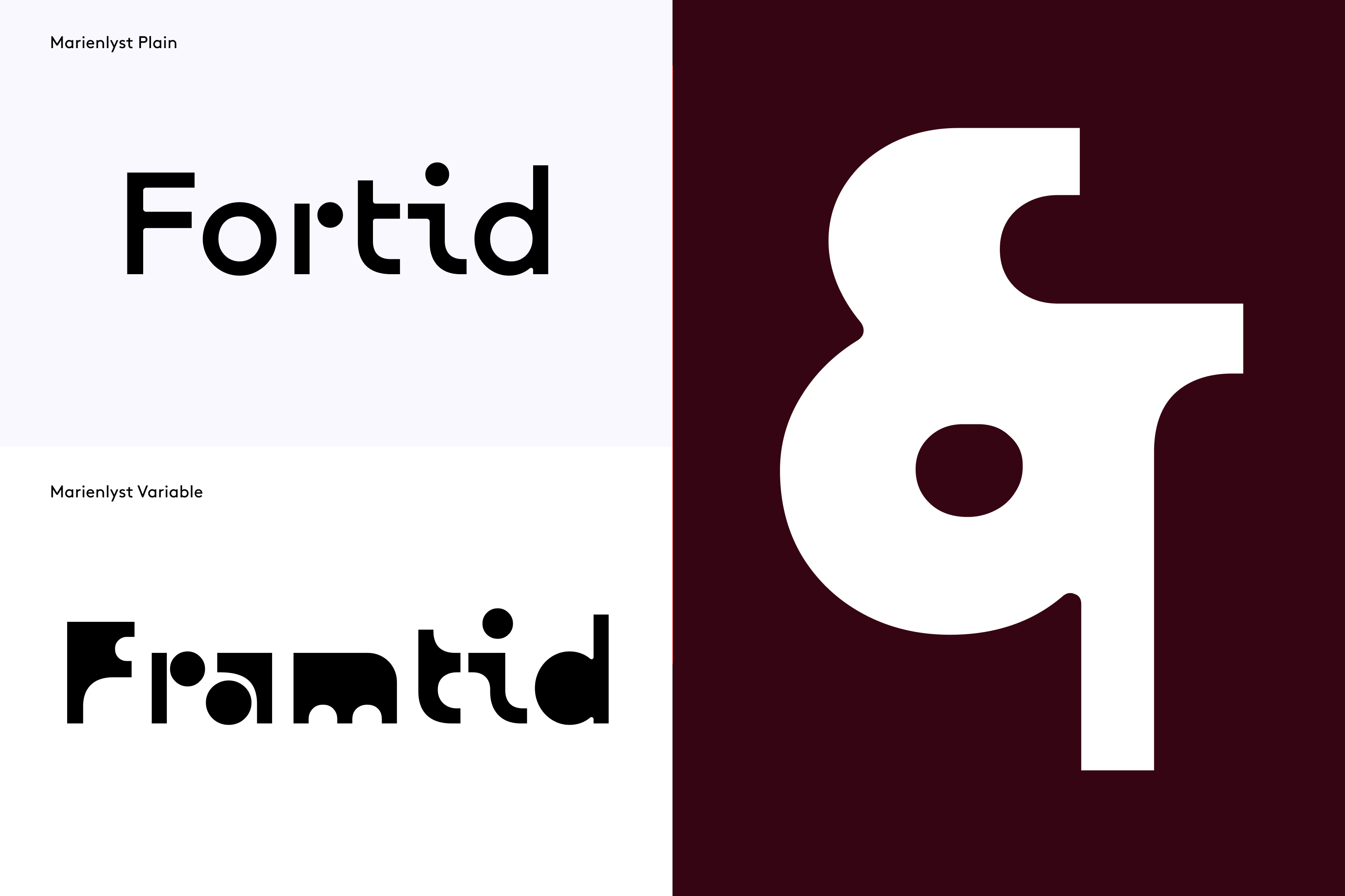
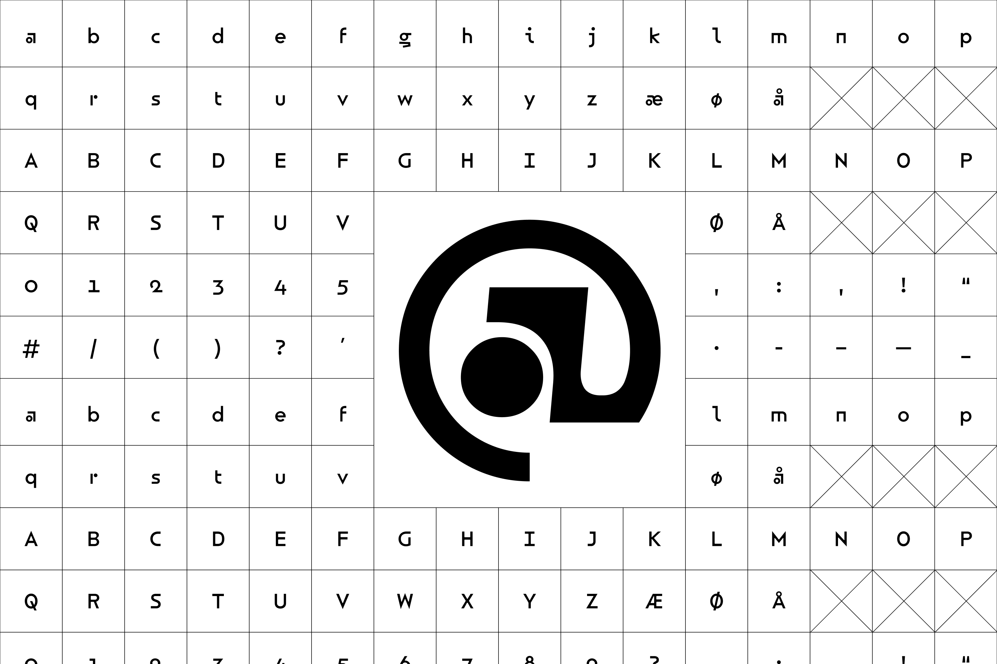
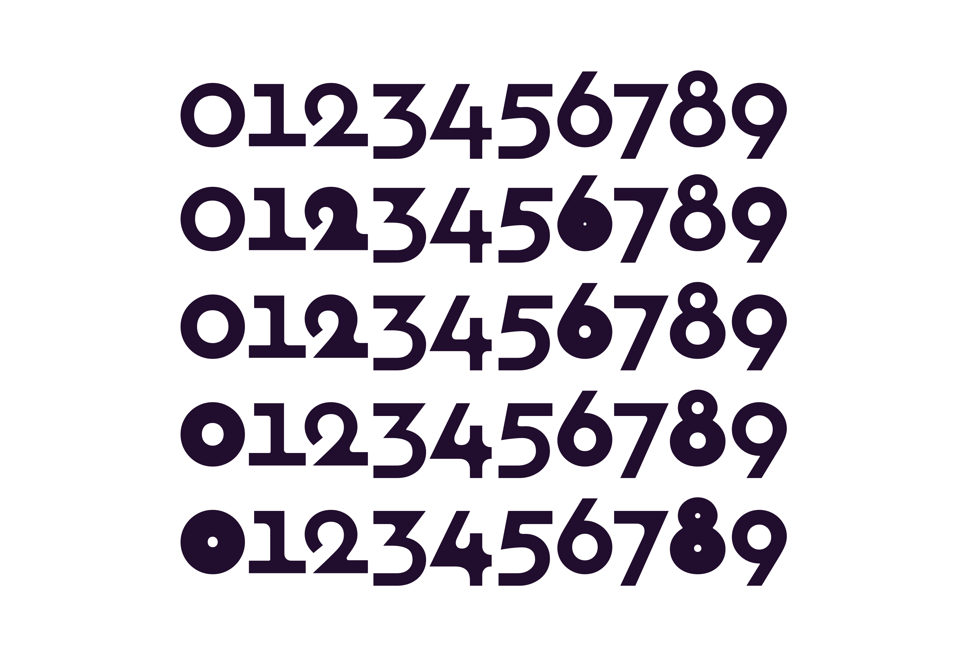
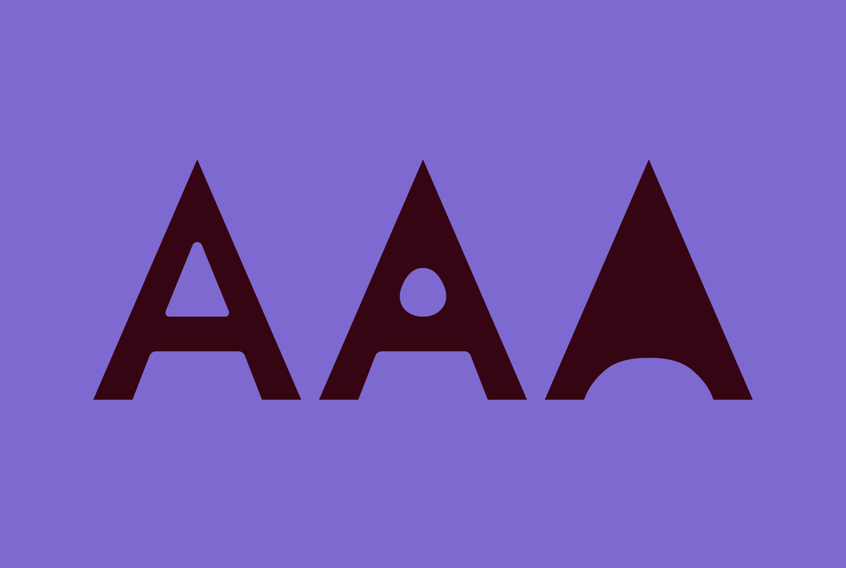
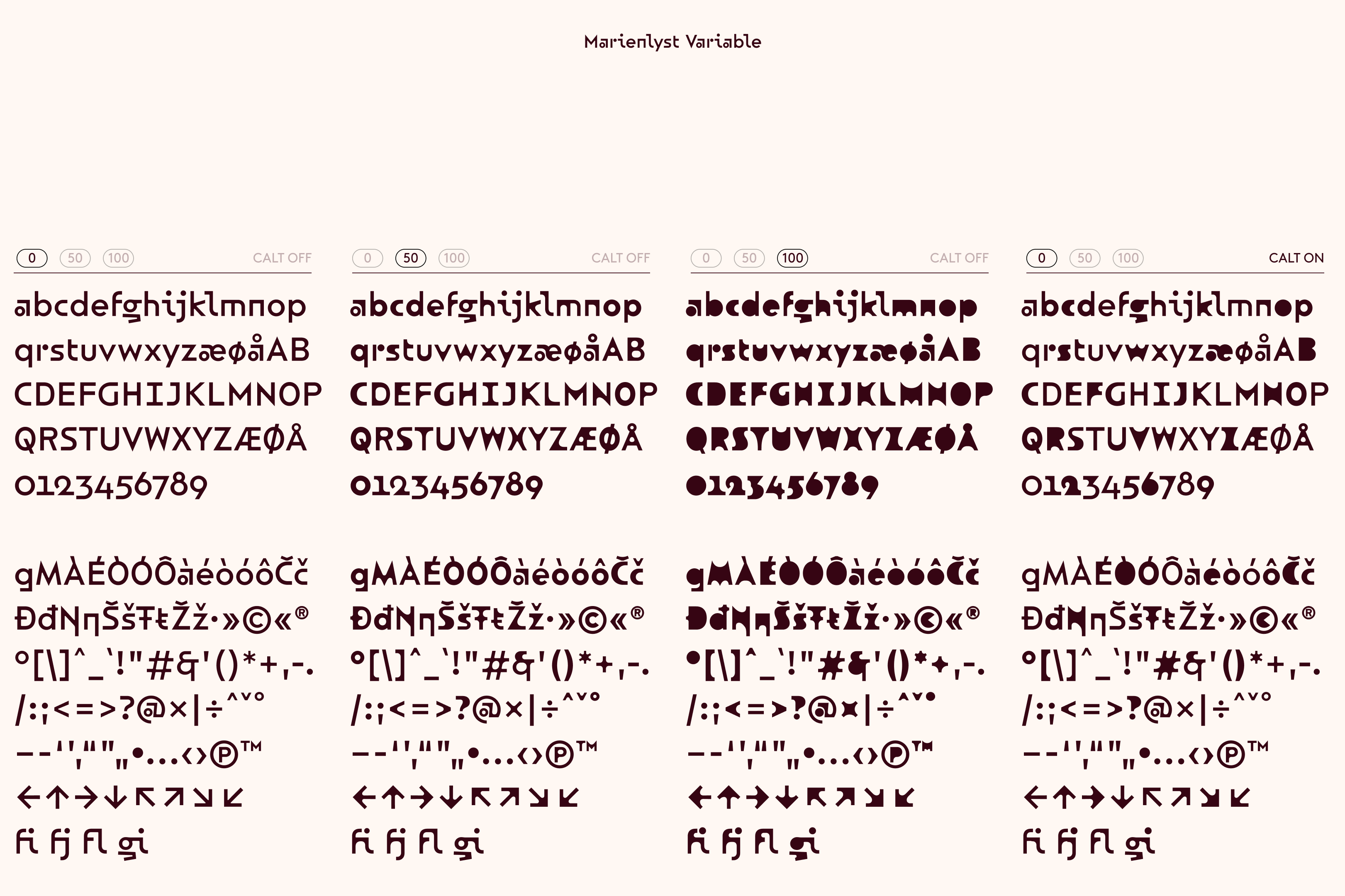
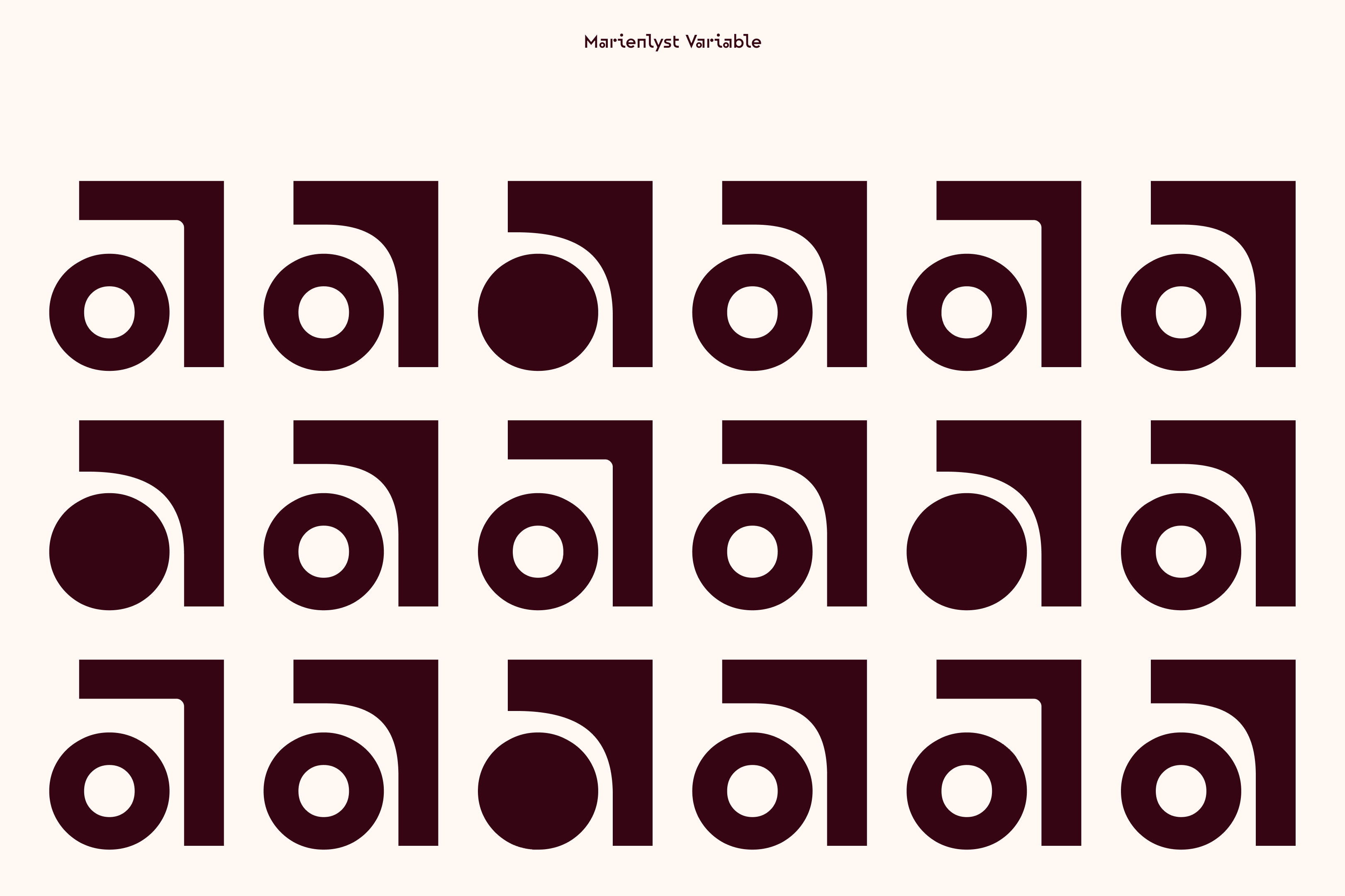
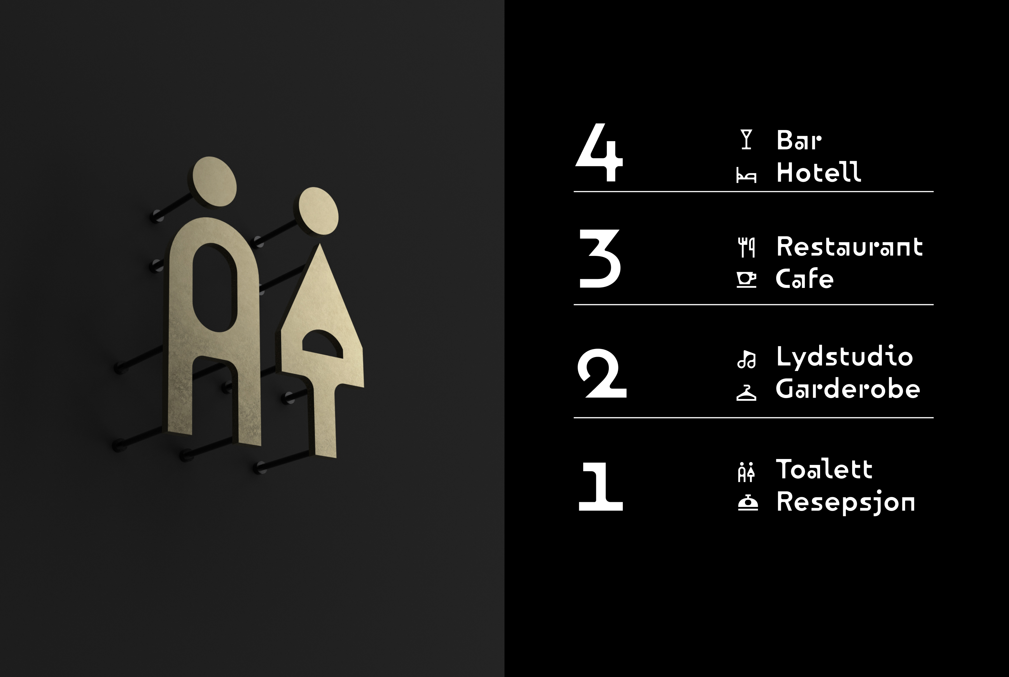
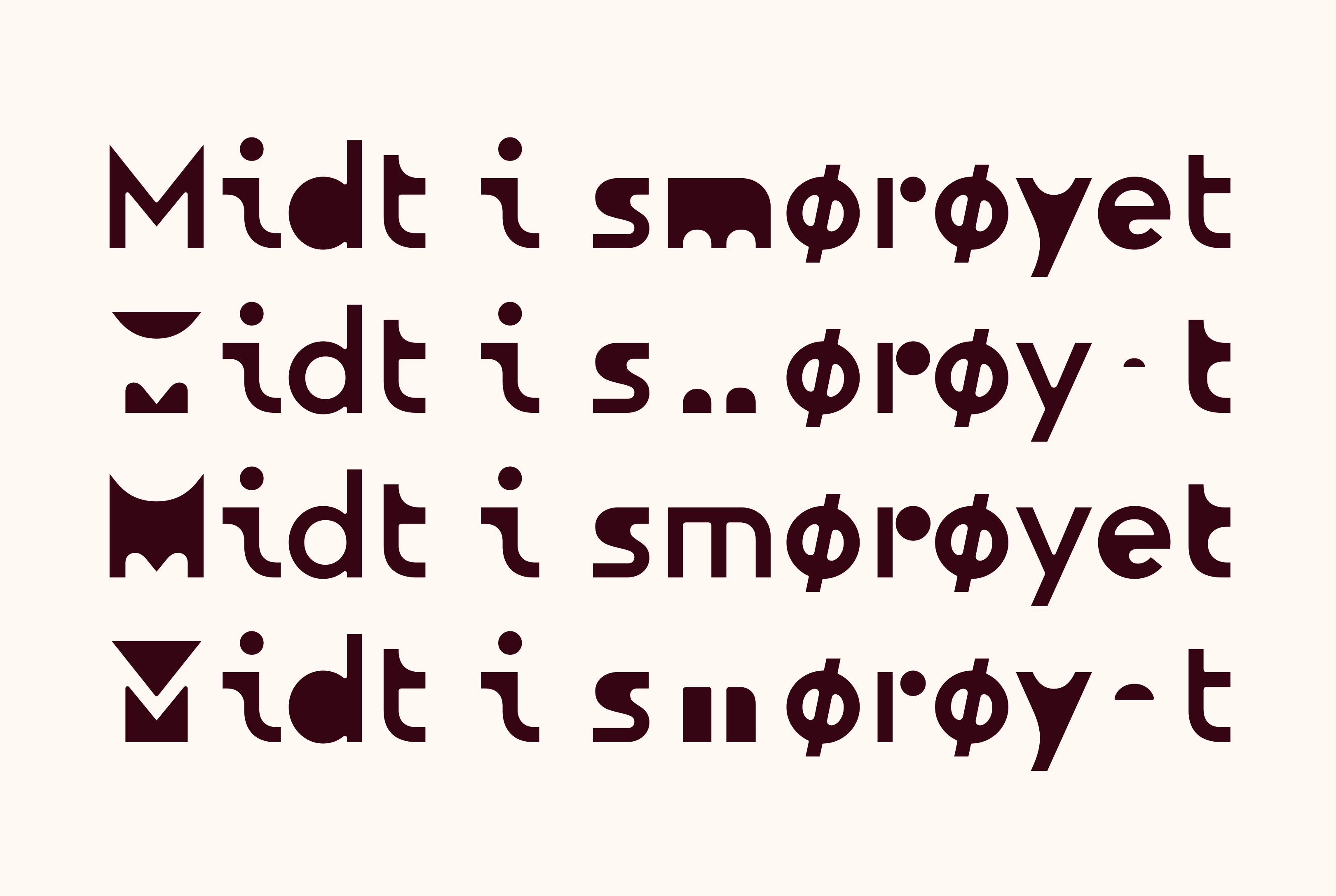
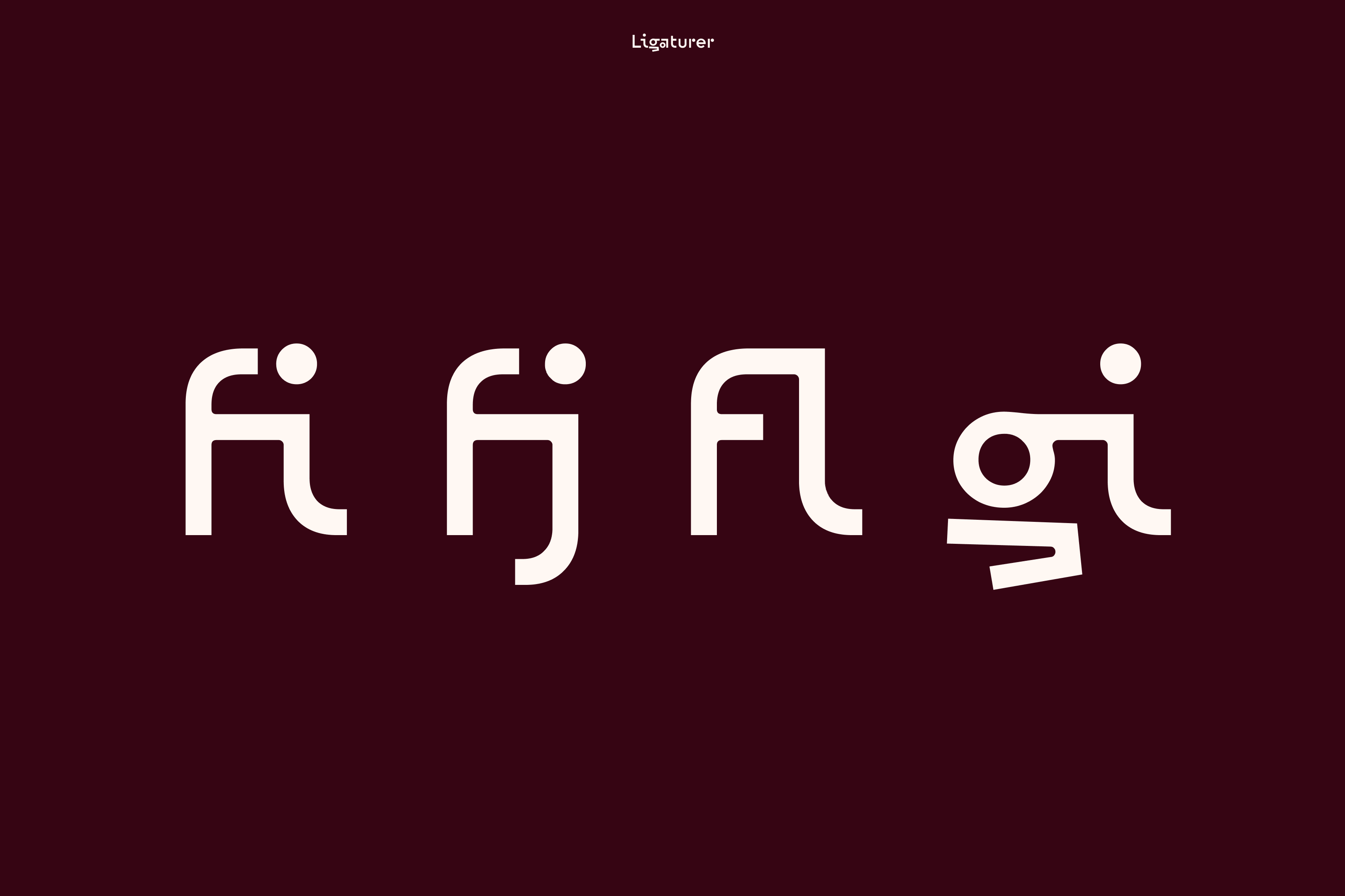
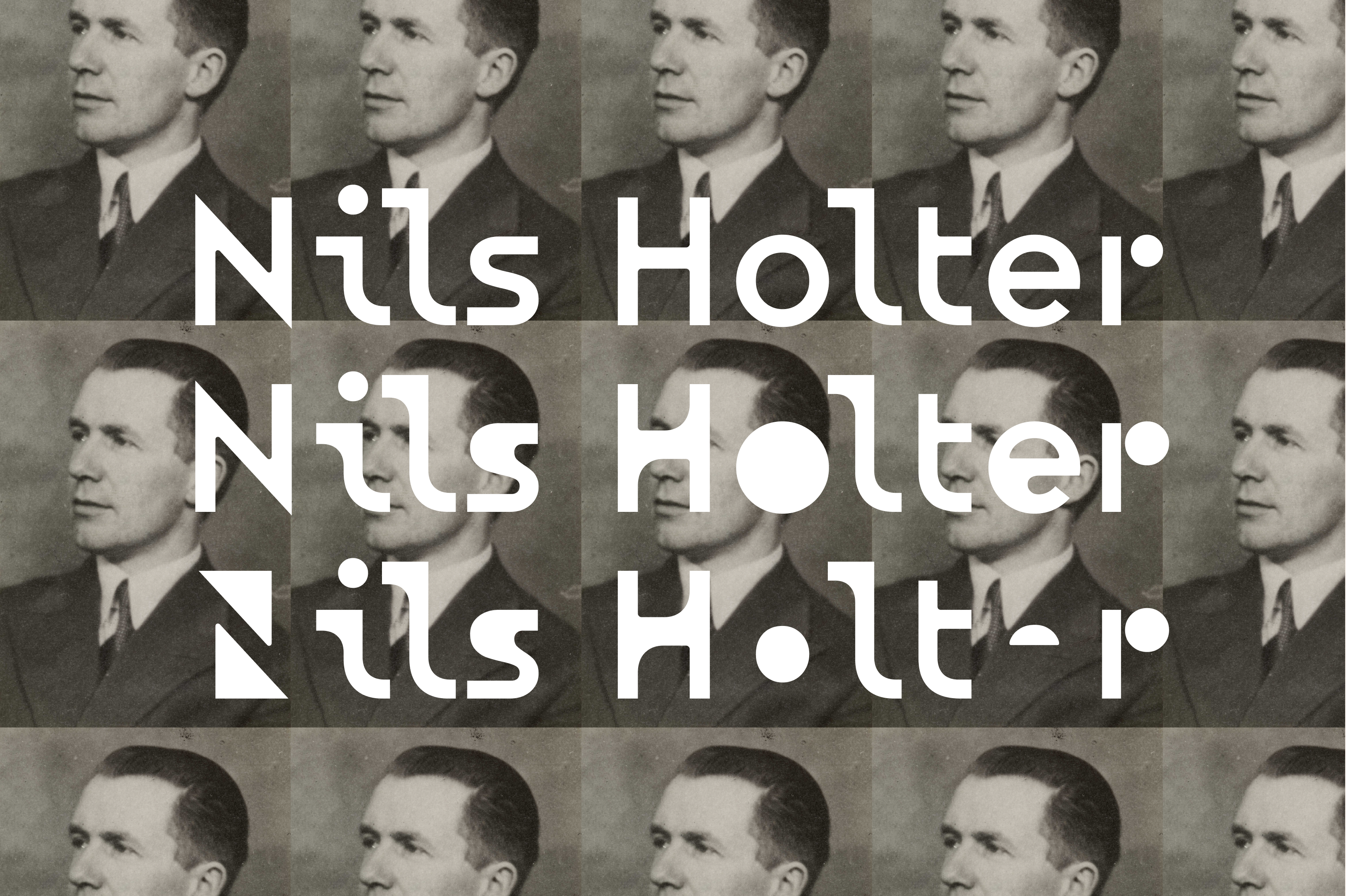
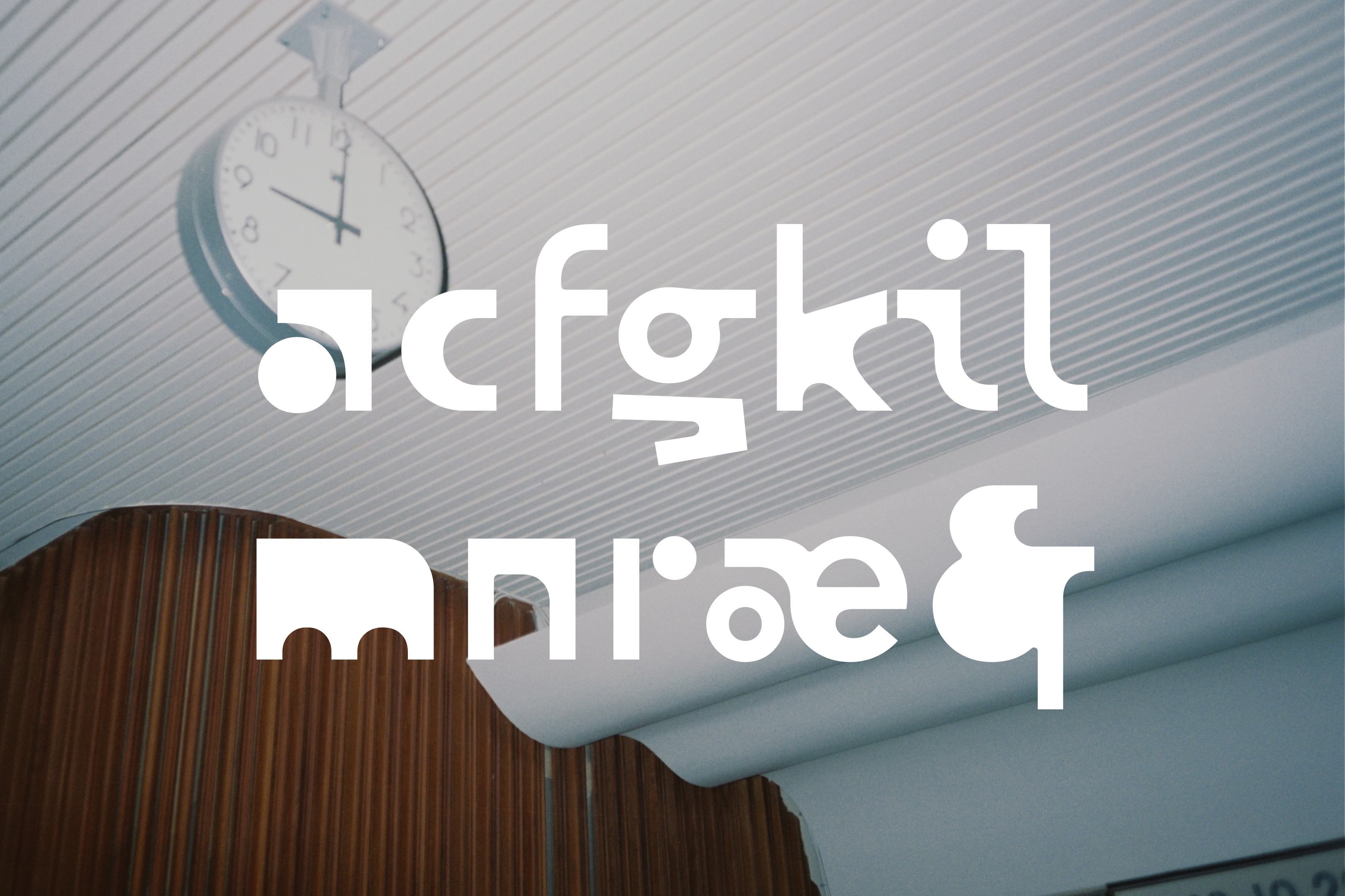
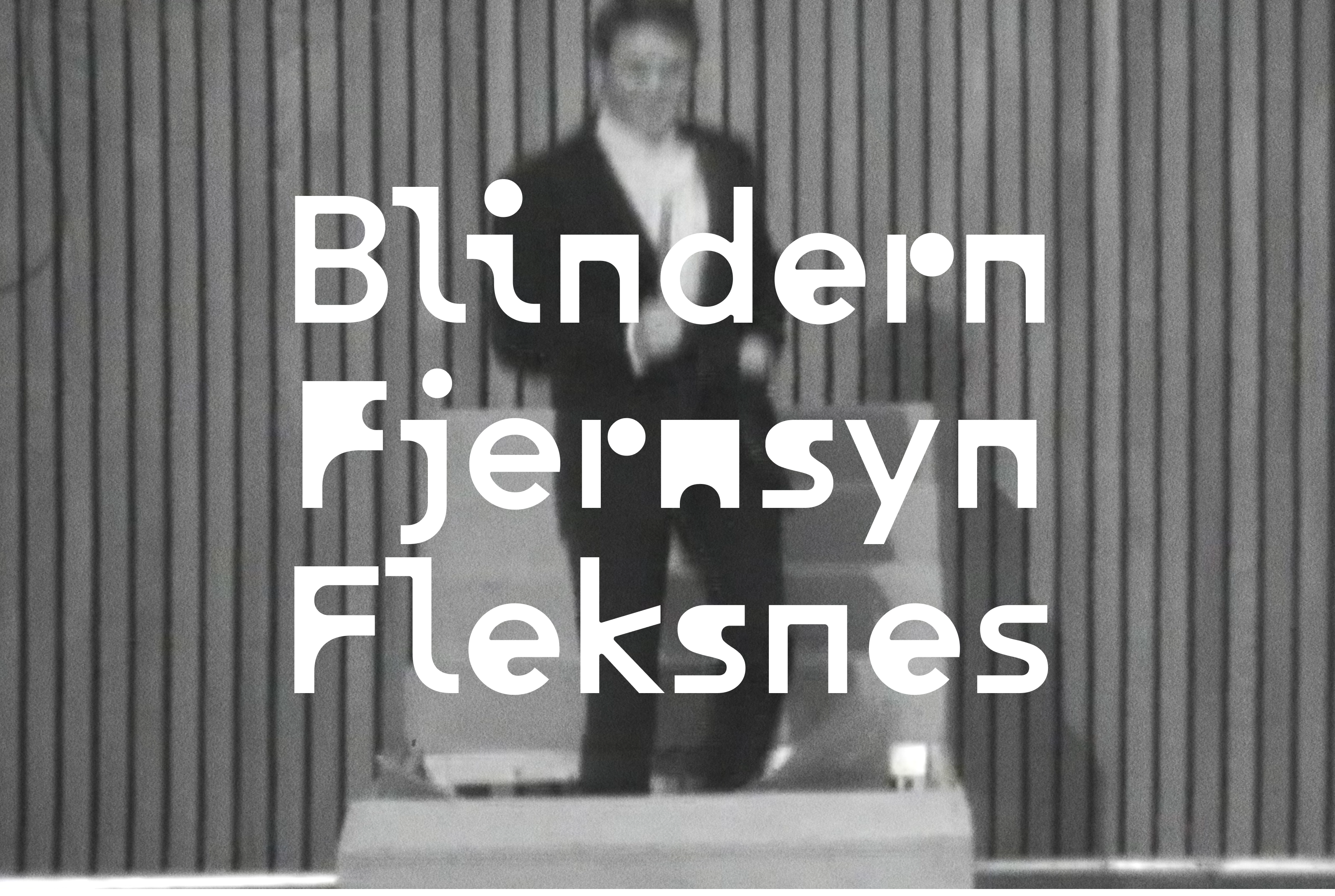
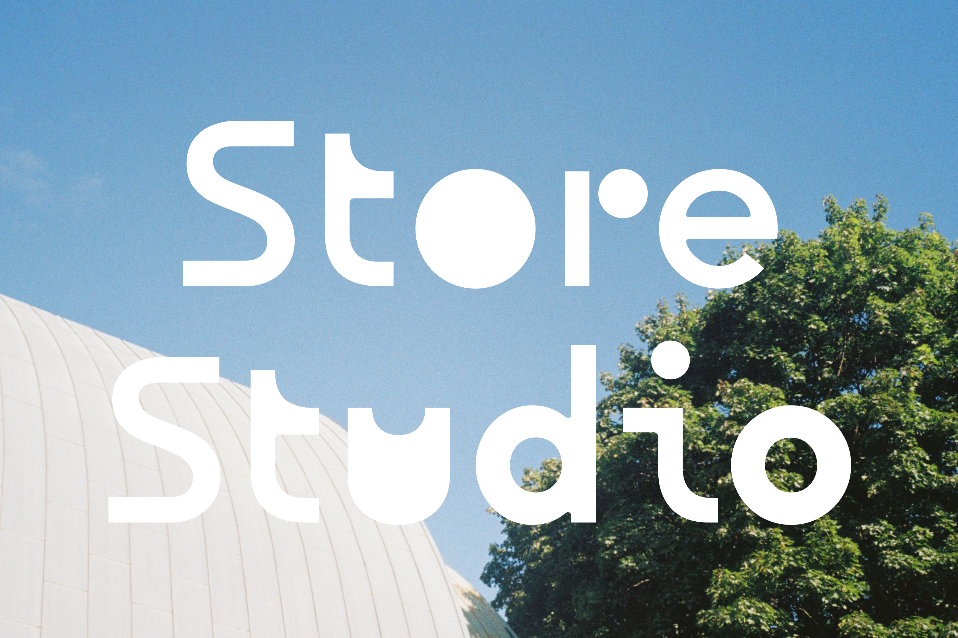
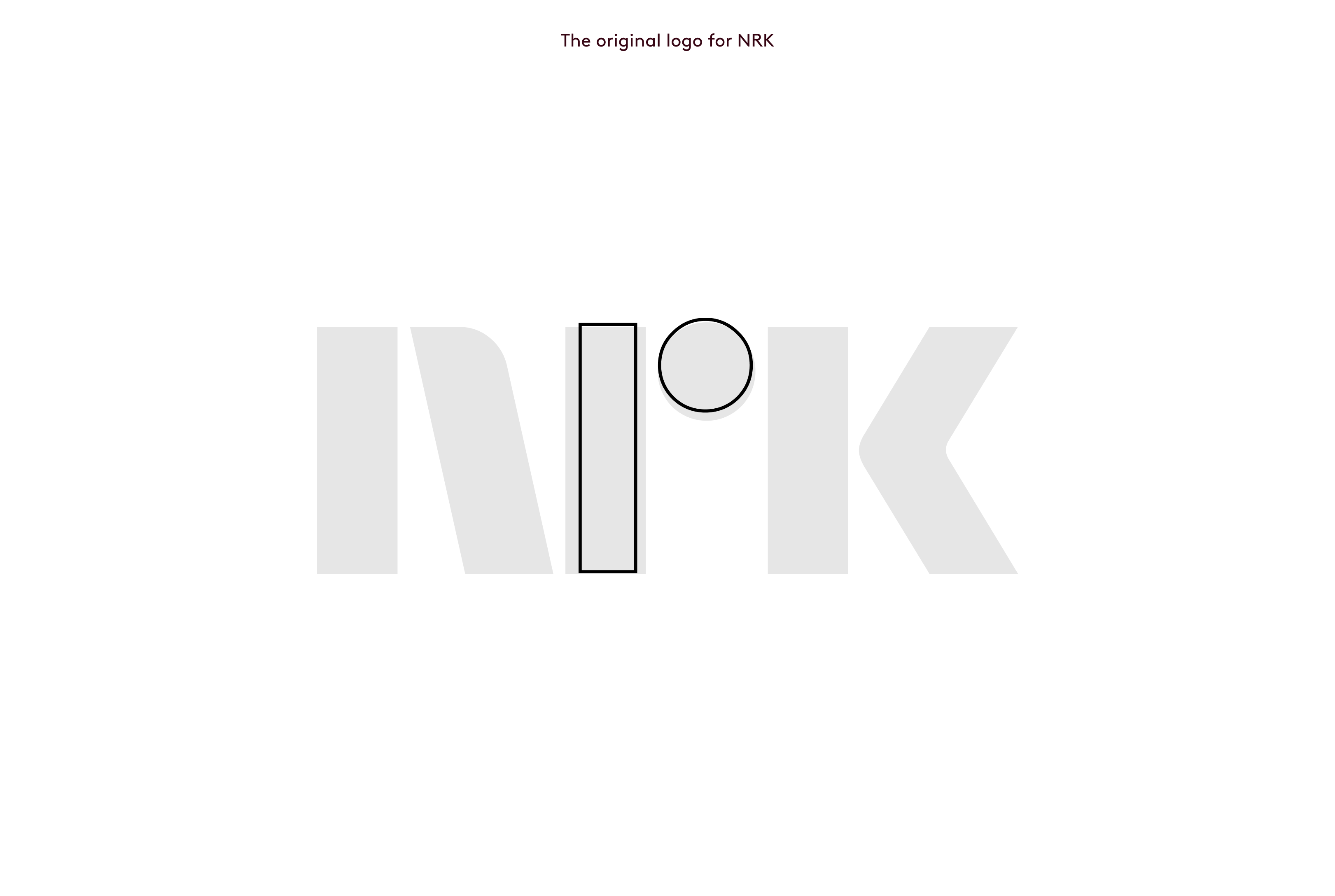
Concept: Marienlyst Display will be a focal point with references from NRK's architecture and distinctive visual qualities. The variable typeface is rooted in the concept - The Story continues - and represents transformation and movement between history and the future. The basic shape is inspired by the architecture of Kringkastingshuset (KKH) and Store Studio – the listed building next door. The contrast between the KKH's brutal square shape and Store Studio's organic asymmetry is reflected in letter forms. A nod to NRK is shown in minuscule r, which is also found in the original drawings of Paul Renner's Futura from 1927, made in the period when architect Nils Holter designed the winning entry for KKH. The listed facade is reflected in how the outer shape of the letters is preserved, while the inner shape undergoes a transformation symbolizing that the building will soon be filled with new life. The font is designed with flexible animation in mind. It also has its own style sets with negative shapes to make Marienlyst Display a solid display with surprising qualities.
Credits