Project
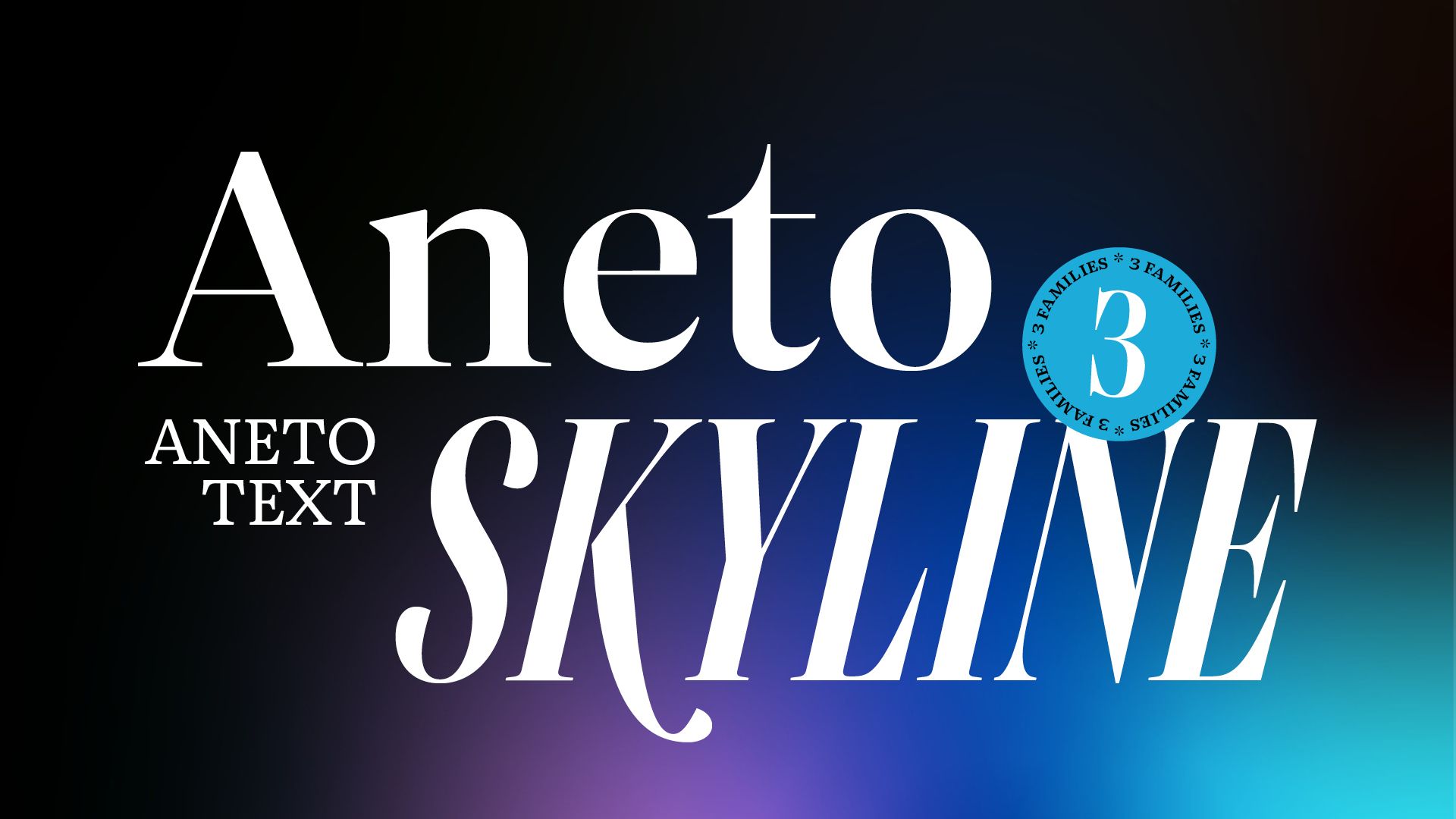
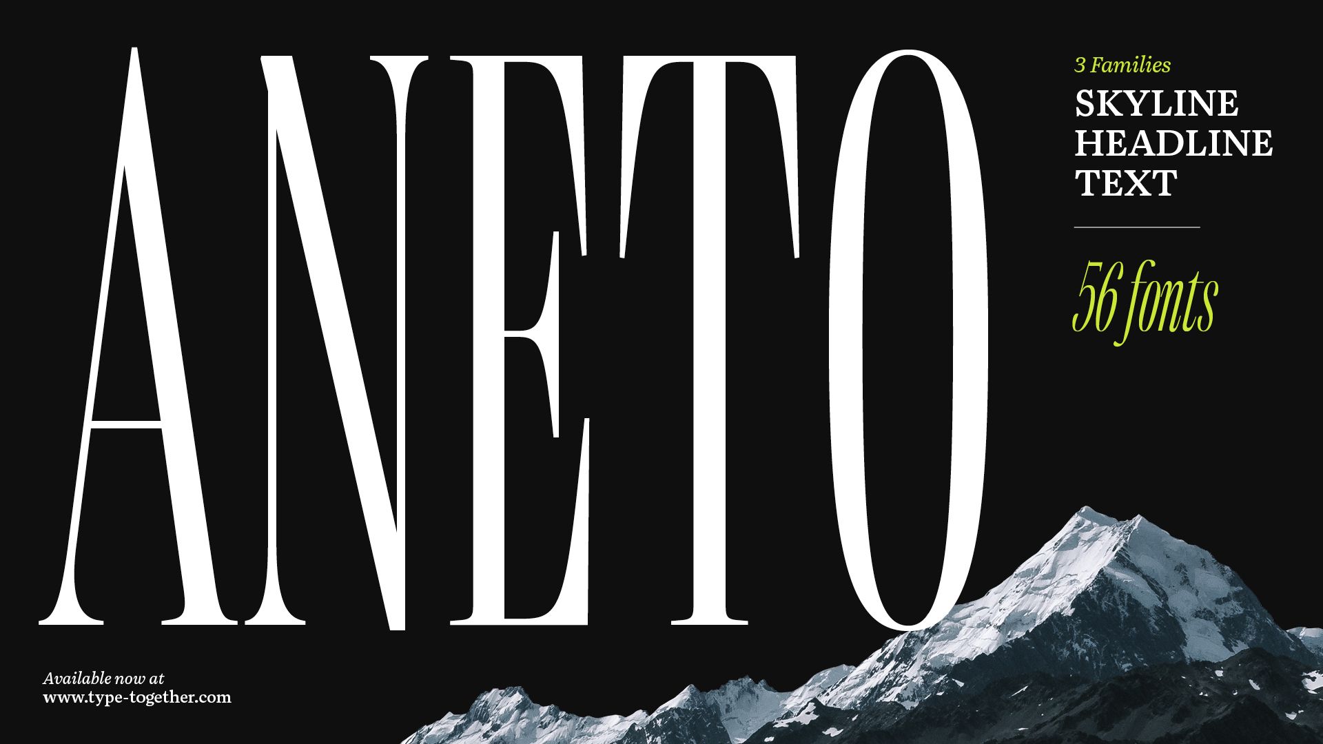
Aneto
Agency
TypeTogether
Year
2023
Award
Bronze
Aneto
https://www.type-together.com/new-release-aneto
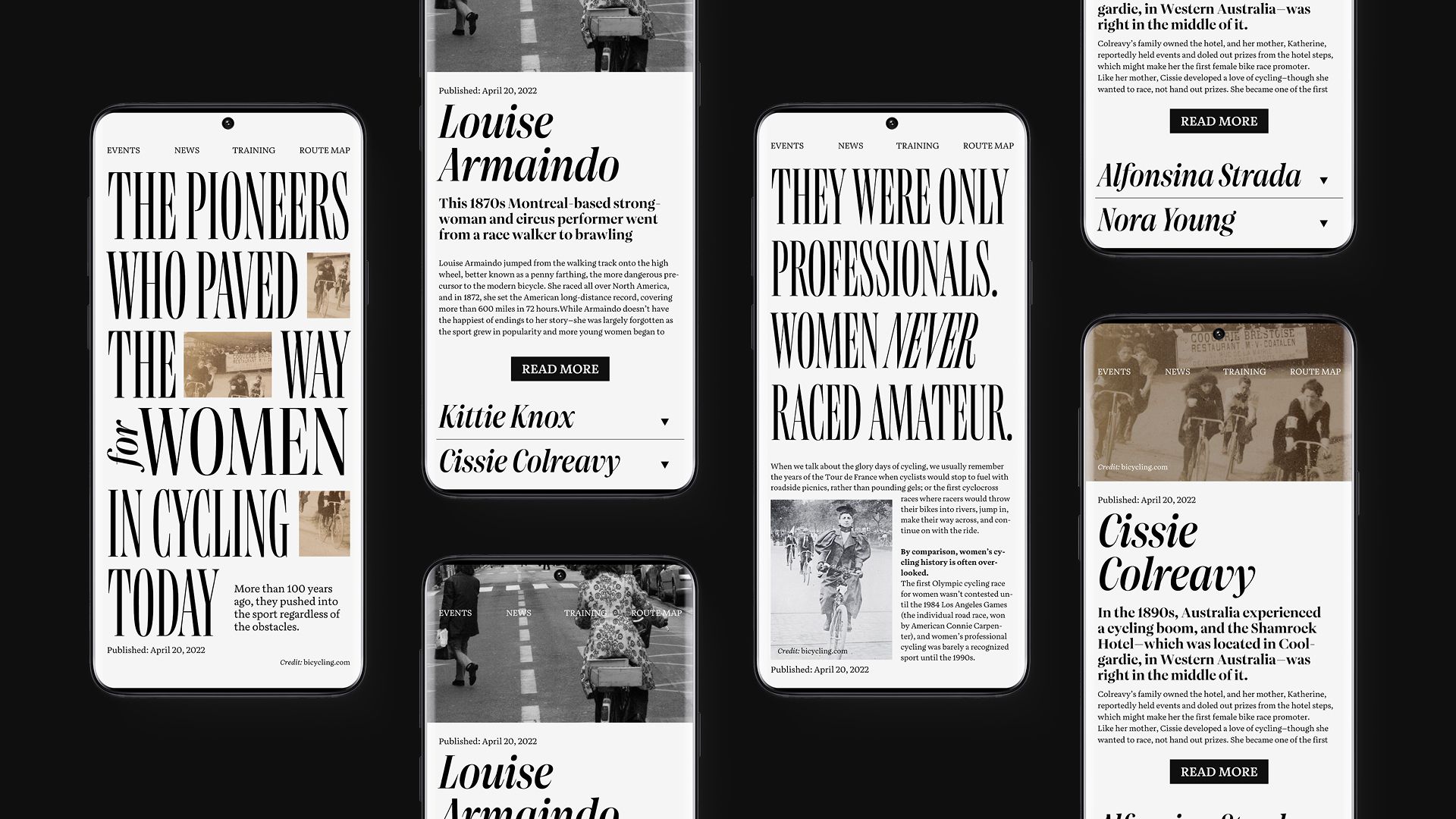
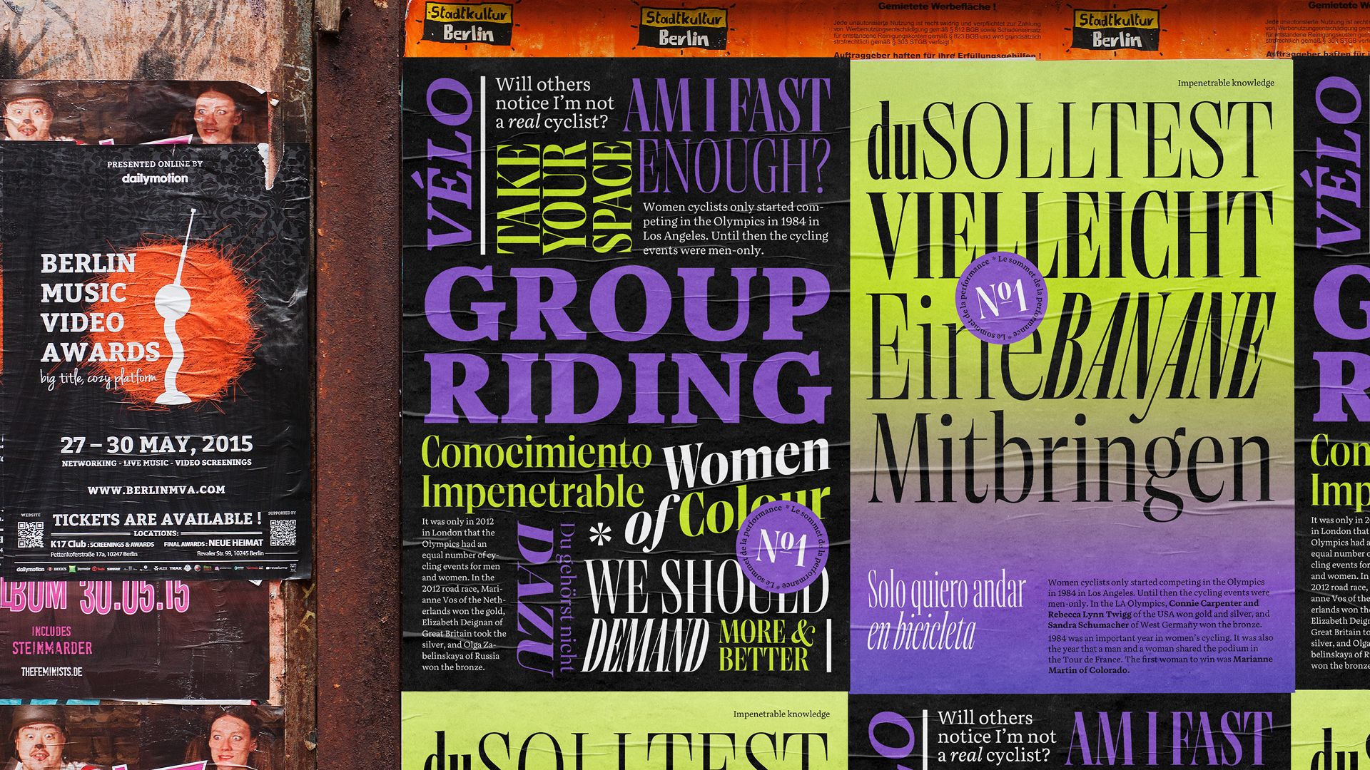
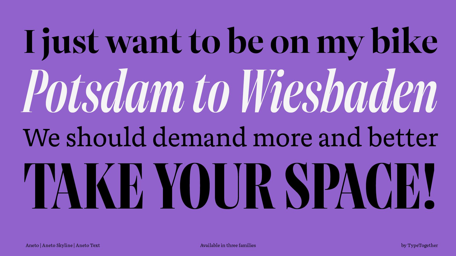
As one of the most widely applicable creations from José Scaglione and Veronika Burian, the Aneto and Aneto Text font families are long-awaited editorial polymaths, able to quell the territory of thought and page design with a peaceful force. This memorable serif results in flawless screen rendering, warm print production, and smooth readability.
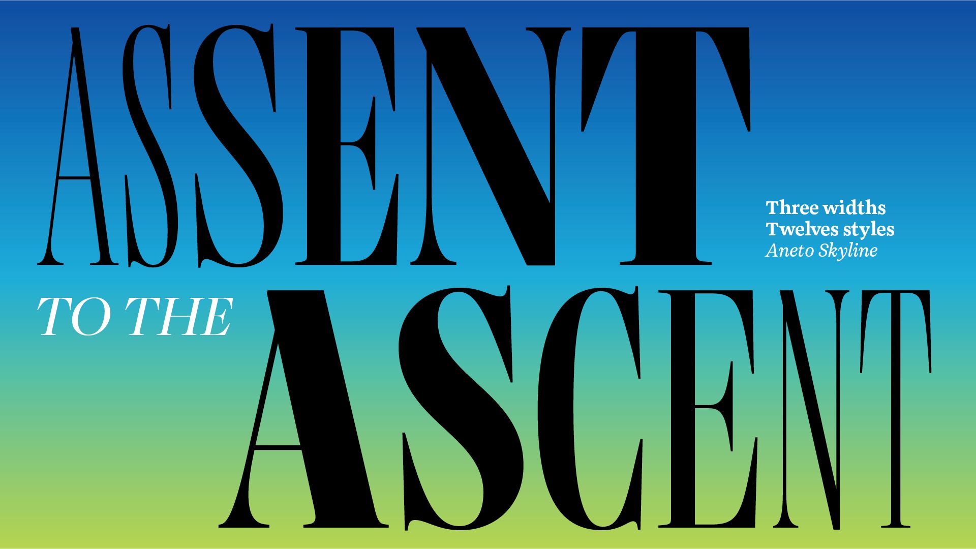
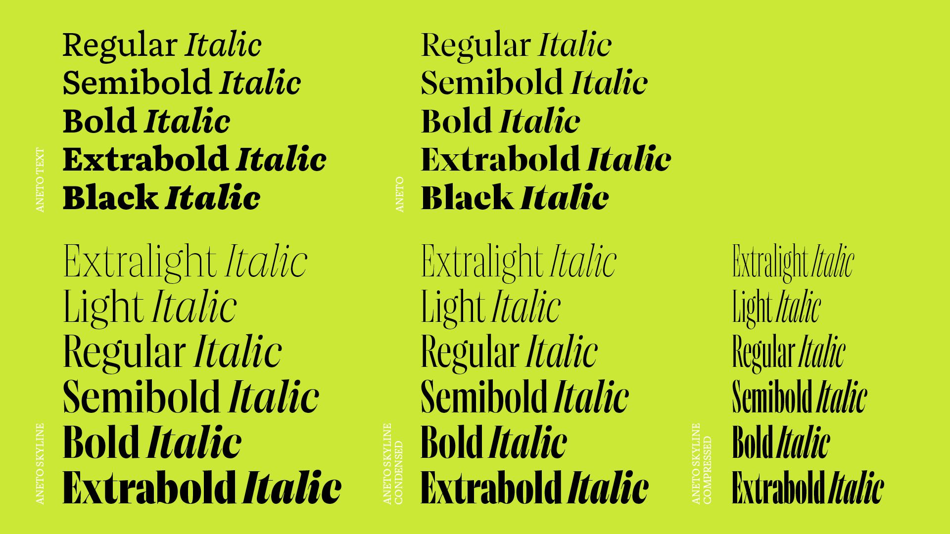
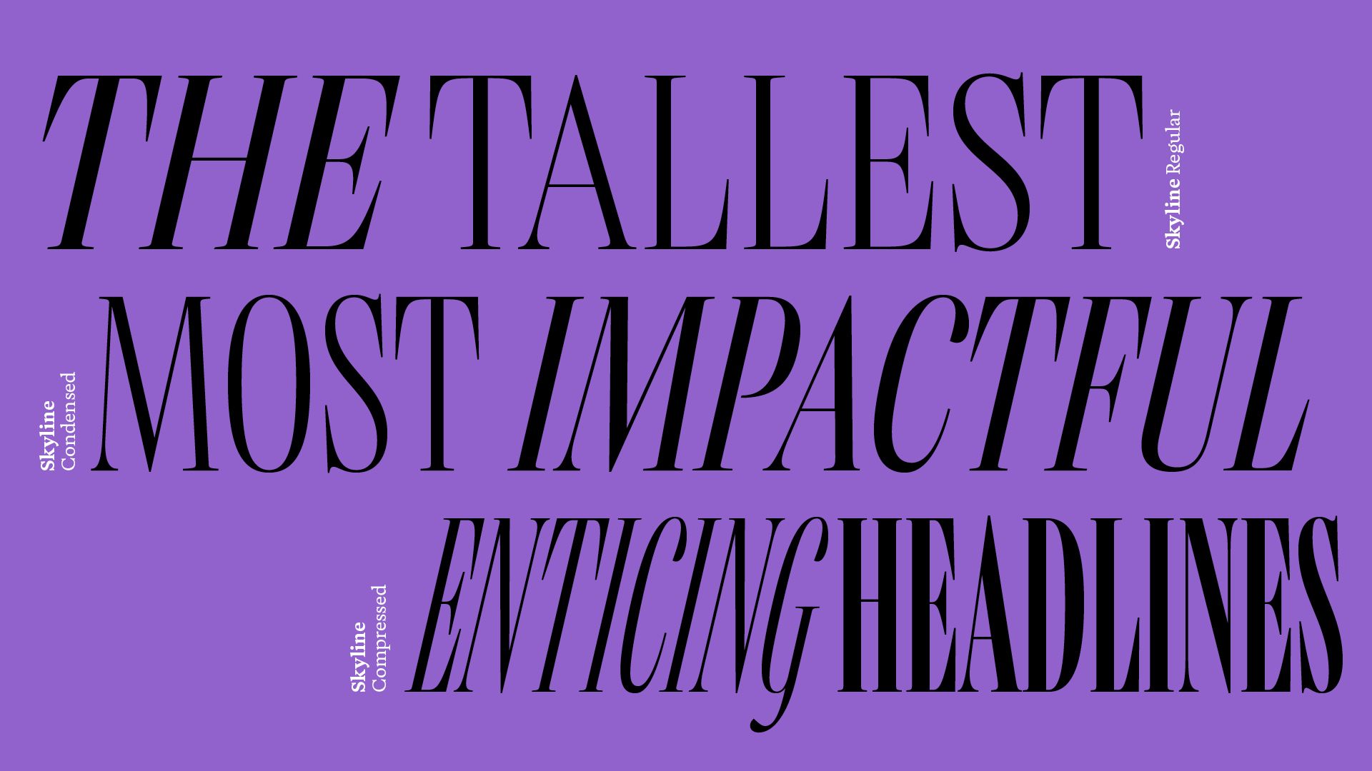
Because of its myriad intended uses, the three pillars of the Aneto family took over three years to complete. Aneto and Aneto text were created to set an entire digital magazine, book, or newspaper. Aneto escorts the reader through the page’s structure of midrange headings, callouts, and subheads. Aneto Text carries the weight of the page, from the thesis of each paragraph to the smallest of captions and honorific colophon. Aneto Skyline was specifically created to set the tallest, most impactful headlines in the compressed spaces of magazines, posters, and newspapers. Its height, contrast, and sheer presence commands attention and ensures a headline that reverberates with news harrowing or hopeful.
Displaying lessons learned from several hundred years of pedigree, the Aneto family has a taller x-height and enlarged counters for better readability, but shortened ascenders and descenders to pack in more letters per line. Aneto Text and Aneto are two families built upon the same skeleton and distinguished by their letter contrast to guide their appropriate use. The variable font versions reinforce correct usage with their two axes: character weight and optical size.
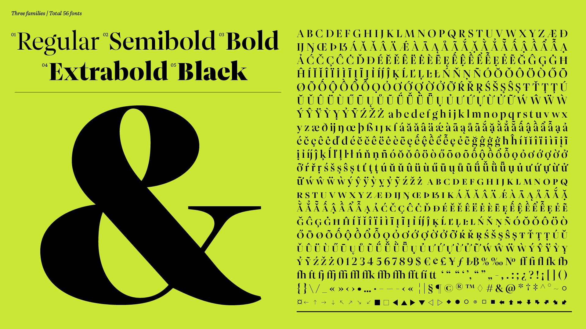
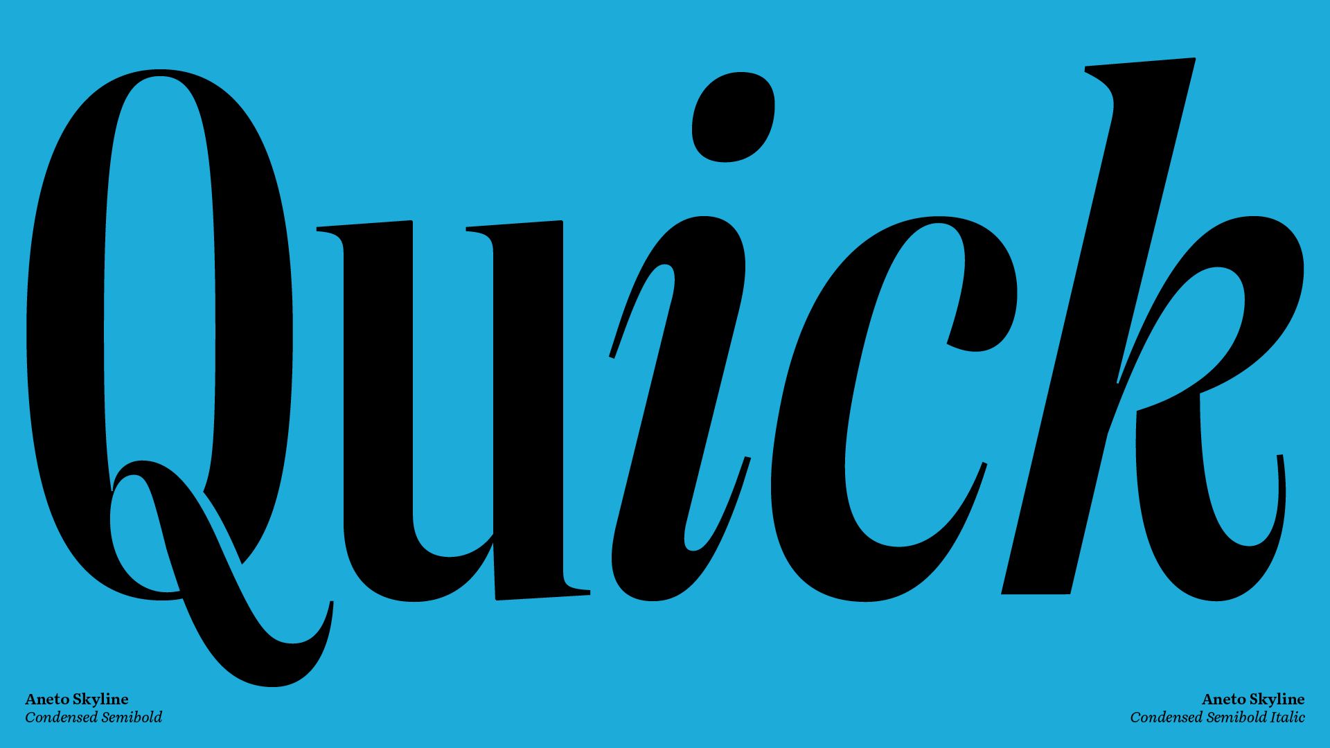
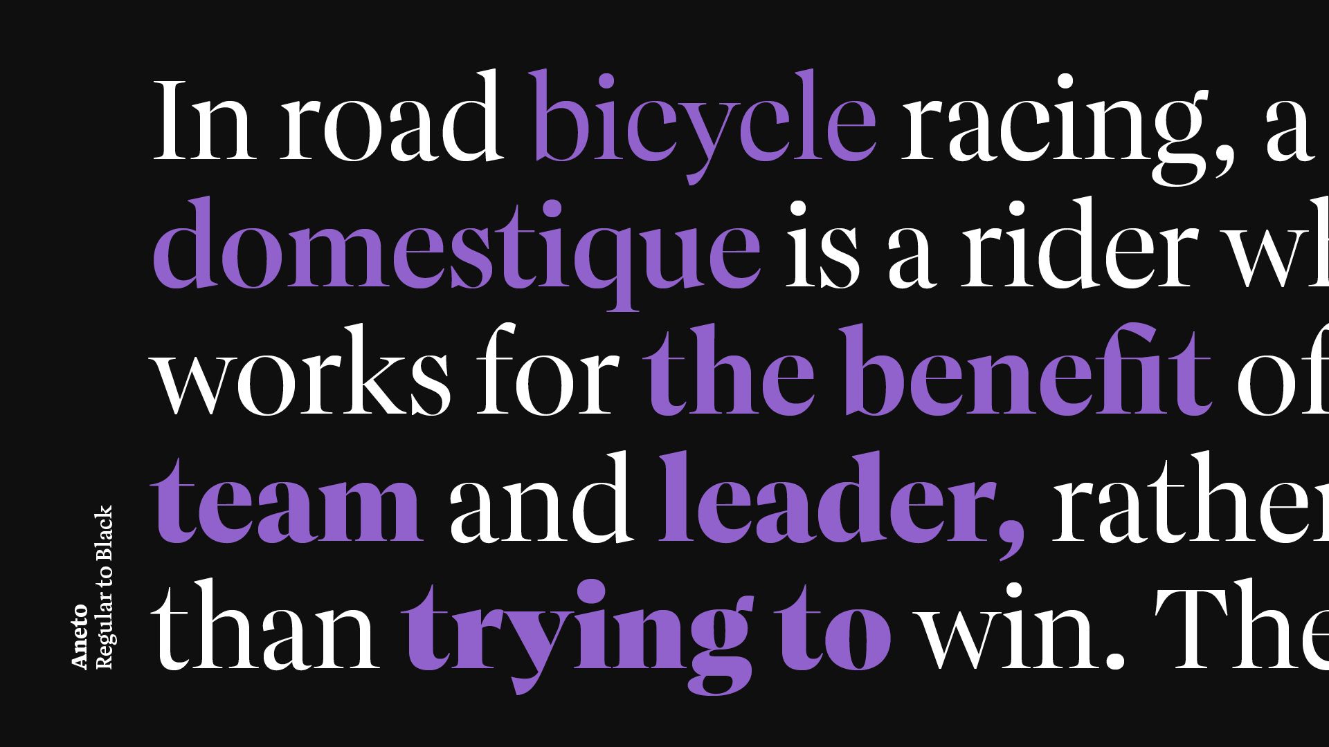
Exquisite page design used to be accomplished with as little as four styles, and, though rare, a single style in expert hands has sufficed. But both Aneto and Aneto Text are decked out with five upright and five italic styles (Regular to Black) for a total of 20. The lower contrast, hardy shapes, and archetypical familiarity of Aneto Text sets a solid foundation for any design. Comparatively, Aneto doesn’t fade away, it makes a sharp statement — an intentional interjection to guide the reader to the next starting point or next important phrase. It accomplishes this by measured shape differences such as the wedged oblique connection on the ‘R’ or internal curve of the lowercase ‘f’. And the italic shapes of both families maintain balance between optical sturdiness and brush calligraphy-inspired serifs.
The two main typographic design problems begging to be solved are reducing file size and adding style options. So Aneto and Aneto Text optionally group all 20 static styles into just two variable fonts, using only a fraction of the space. The future is variable and TypeTogether has been producing variable fonts since 2017.
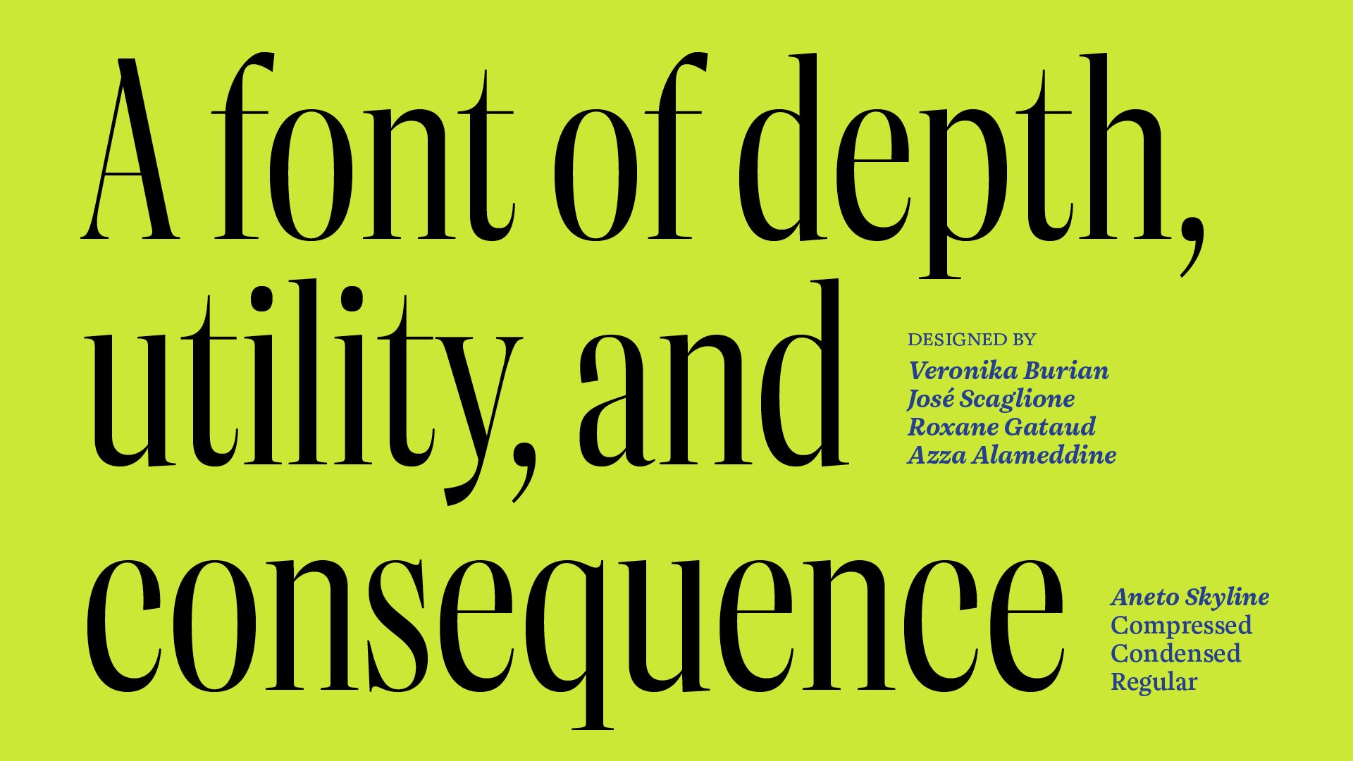
The entire Aneto family is the third within a trilogy, with Catalpa being the first and Belarius the second. Each of the three have a distinct purpose and their own look, but they serve a common goal as a combinatory suite covering an editorial’s wide array of needs. Seen as a piece of textual architecture such as a mansion, Catalpa is the oversized, impressive, and illuminated profile; Belarius is the primary material undergirding the structure; and Aneto, with its three subfamilies, governs everything from the flow and use of space to the details seen within this mansion. It’s a rare thing to have one font family that can do it all, and Aneto is a type family of depth, utility, and consequence.
Credits
Creative Director
Veronika Burian, José Scaglione
Designer
Veronika Burian, José Scaglione, Roxane Gataud
Assistant designer
Azza Alameddine
Category
501 Original Typeface – Text
Client
TypeTogether
Country
Czechia