From Left to Right
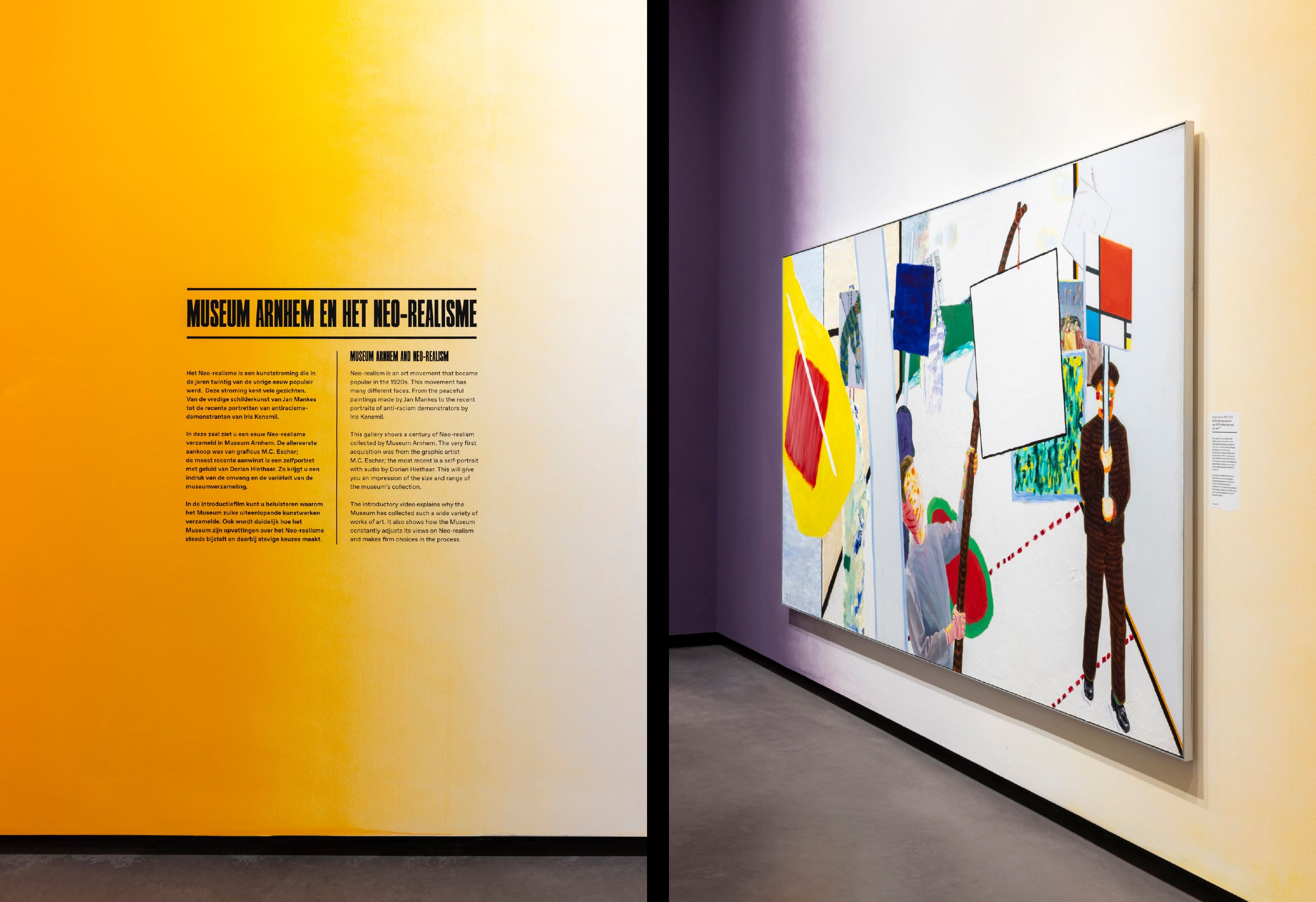
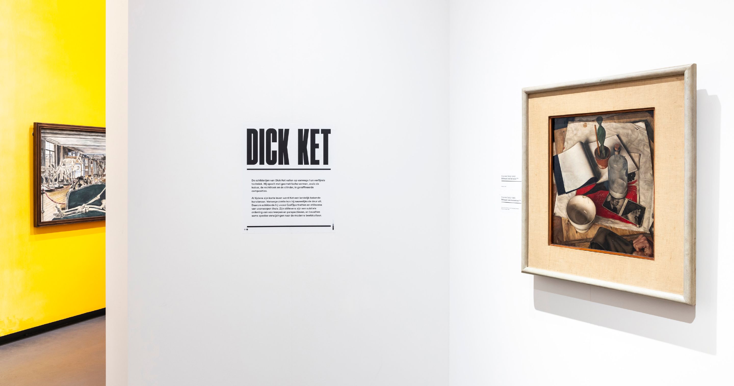
How is it that within an art movement, one artist has been forgotten while another has not? Museum Arnhem is known for its collection of Neo-realism, with works by artists such as Dick Ket, Carel Willink and Pyke Koch. The exhibition From Left To Right (May 13 – November 20, 2022) offers a new perspective on a century of Neo-realism, highlighting the influence of political tensions in the interwar period. The economic crisis of 1929 and Hitler's rise to power in Germany in 1933 also affected art and artists in the Netherlands. Whether they explicitly took a stand or not, social polarization had consequences for their work, their personal lives and careers, and for museum collections.
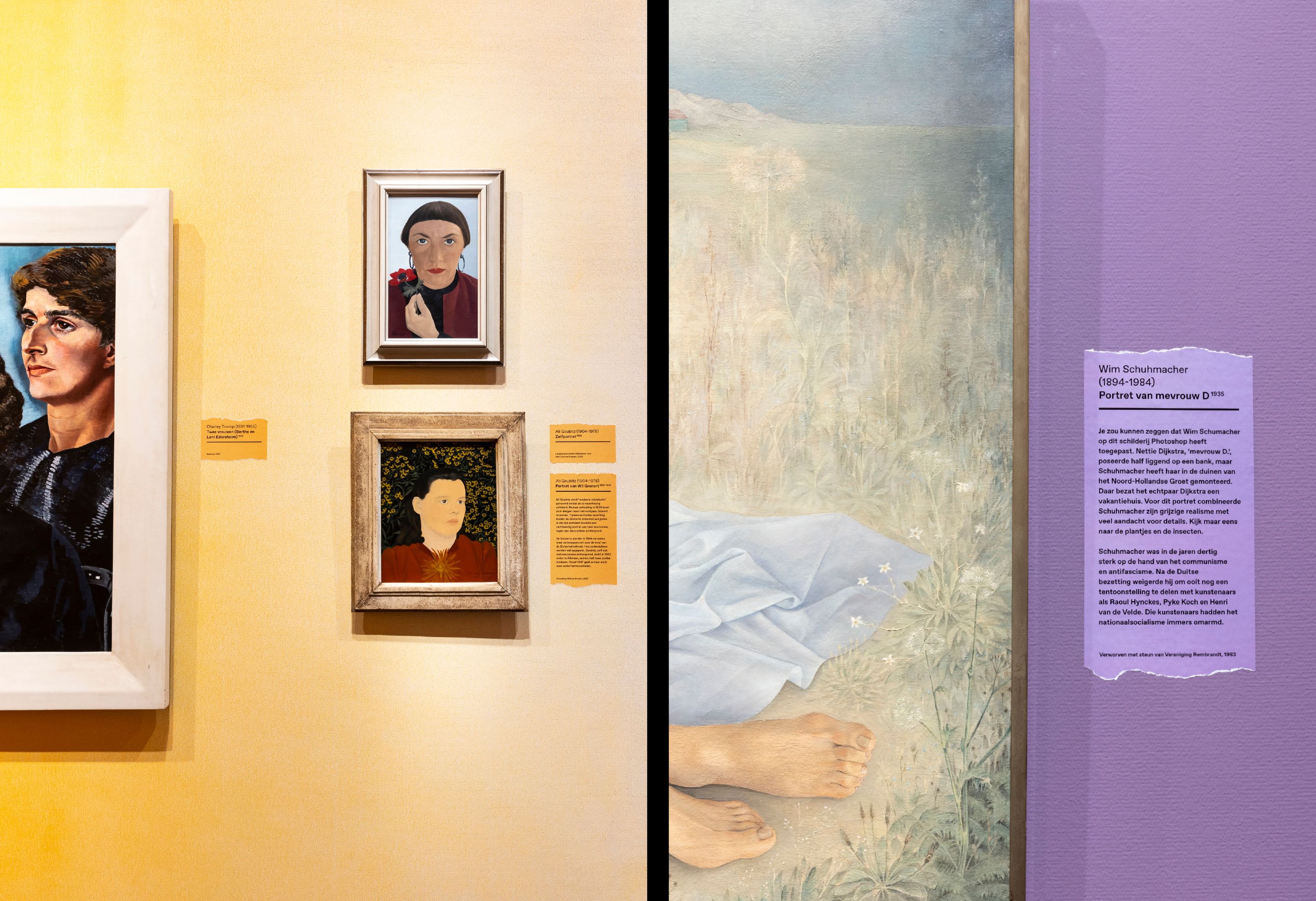
Due to this period of political polarization, socially committed and activist artists in particular disappeared from art history for a long time. With From Left To Right Museum Arnhem presents a more inclusive account of the Interbellum than before. Rediscovered progressive artists such as Berthe Edersheim, Harmen Meurs and Nola Hatterman, who were previously disregarded in every sense of the word, are shown opposite well-known names such as Carel Willink, Raoul Hynckes and Pyke Koch.
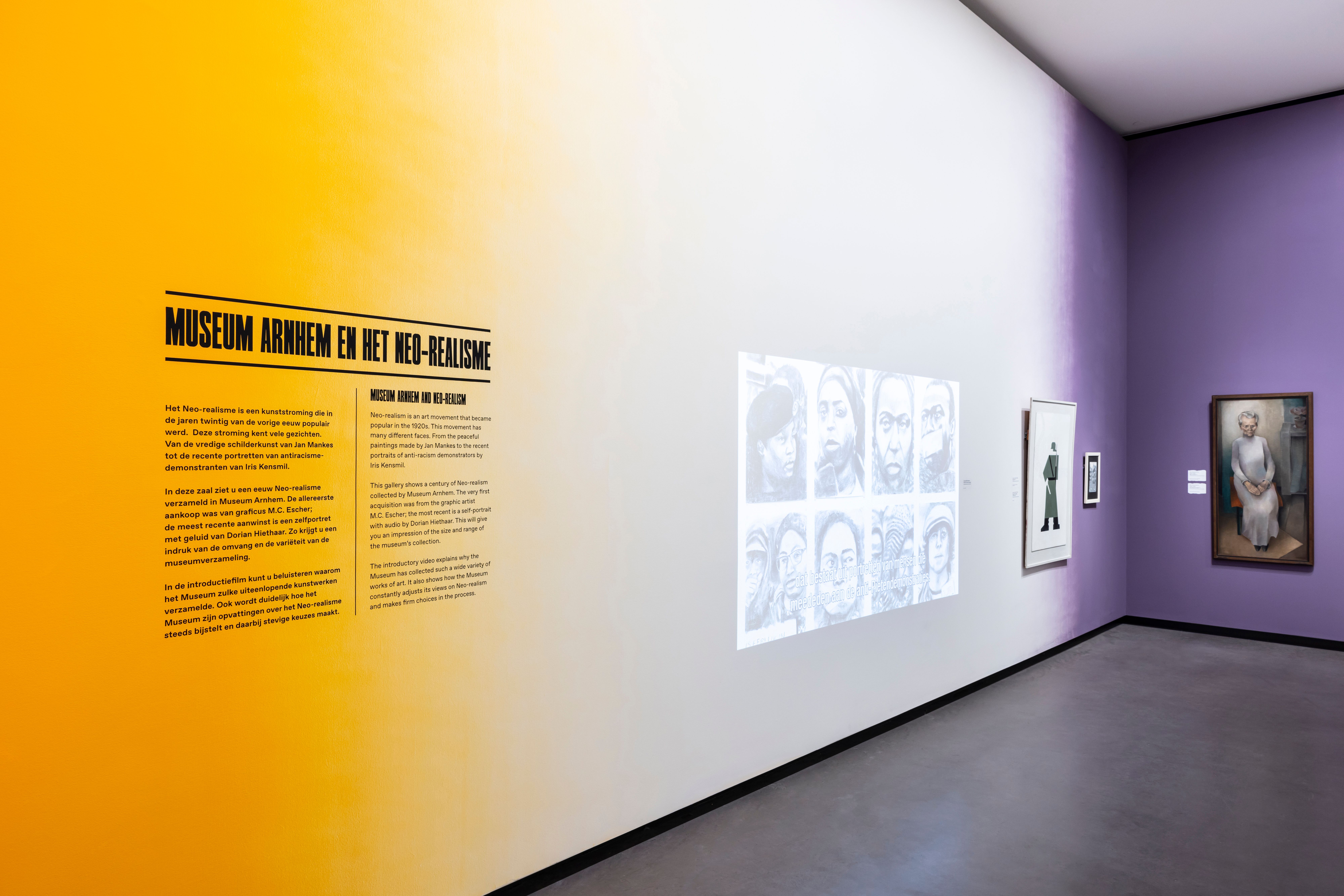
Inspired by the political polarization as an important element in the exhibition, graphic designer Dana Dijkgraaf created a bold graphic design that literally shows these two sides of the story. She used a typography that refers to big headlines in old newspapers and activist signs. These media were important in this period of political polarization. She literally ripped the title in two parts, to really enhance the two groups of artists that are opposed. The smaller texts in the exhibition have a ripped edge, and typical printer's marks to create a subtle link to the newspapers and the title of the exhibition.The decision to work with these associations also work really well with the content of the artworks. In the world of Neorealism, artists depict daily objects and draw their inspiration from their daily life. What can be more daily than the news?
The political polarization can also be felt in the exhibition design, especially in the second space. One side is purple and the other side is orange. In the first exhibition space the selected artworks are before that period, that space has only small corners of colored walls - the polarization was on its way. The purple has been spray painted on the walls - which gives it a very interesting, authentic and a bit rough effect. The colors of the exhibition - purple and orange - are inspired on a political poster from the same period the artworks are made (1944). This beautiful handmade poster is made by the artist Arend Meijer.
Credits