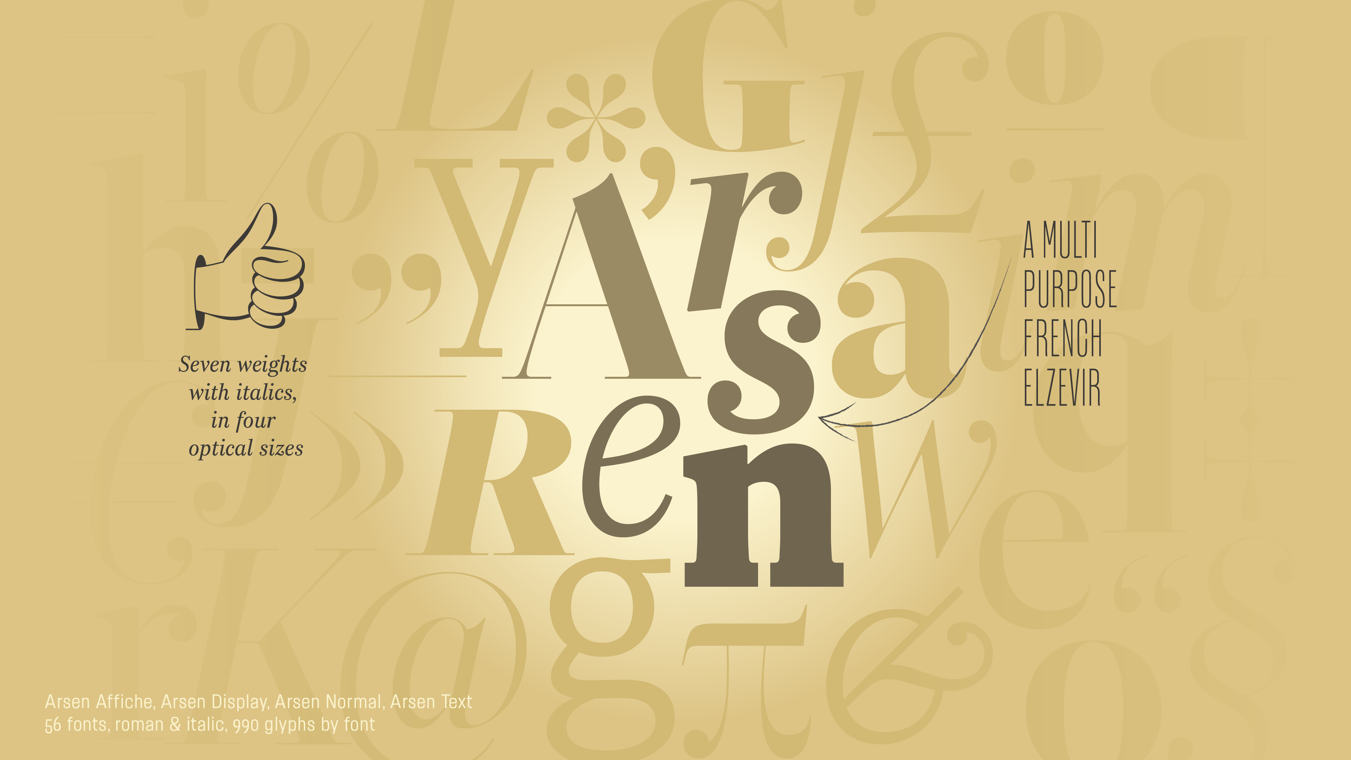
Arsen
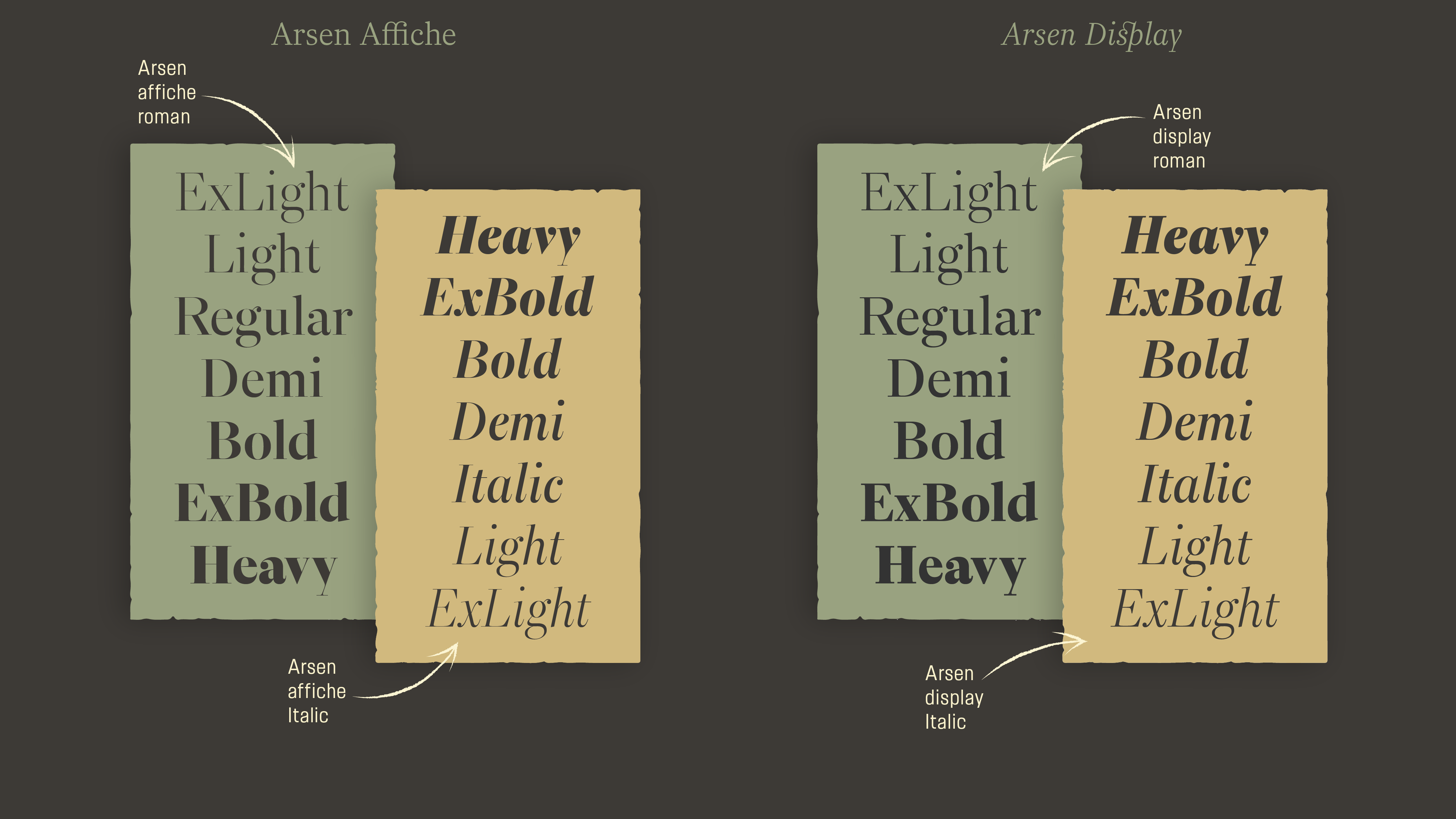
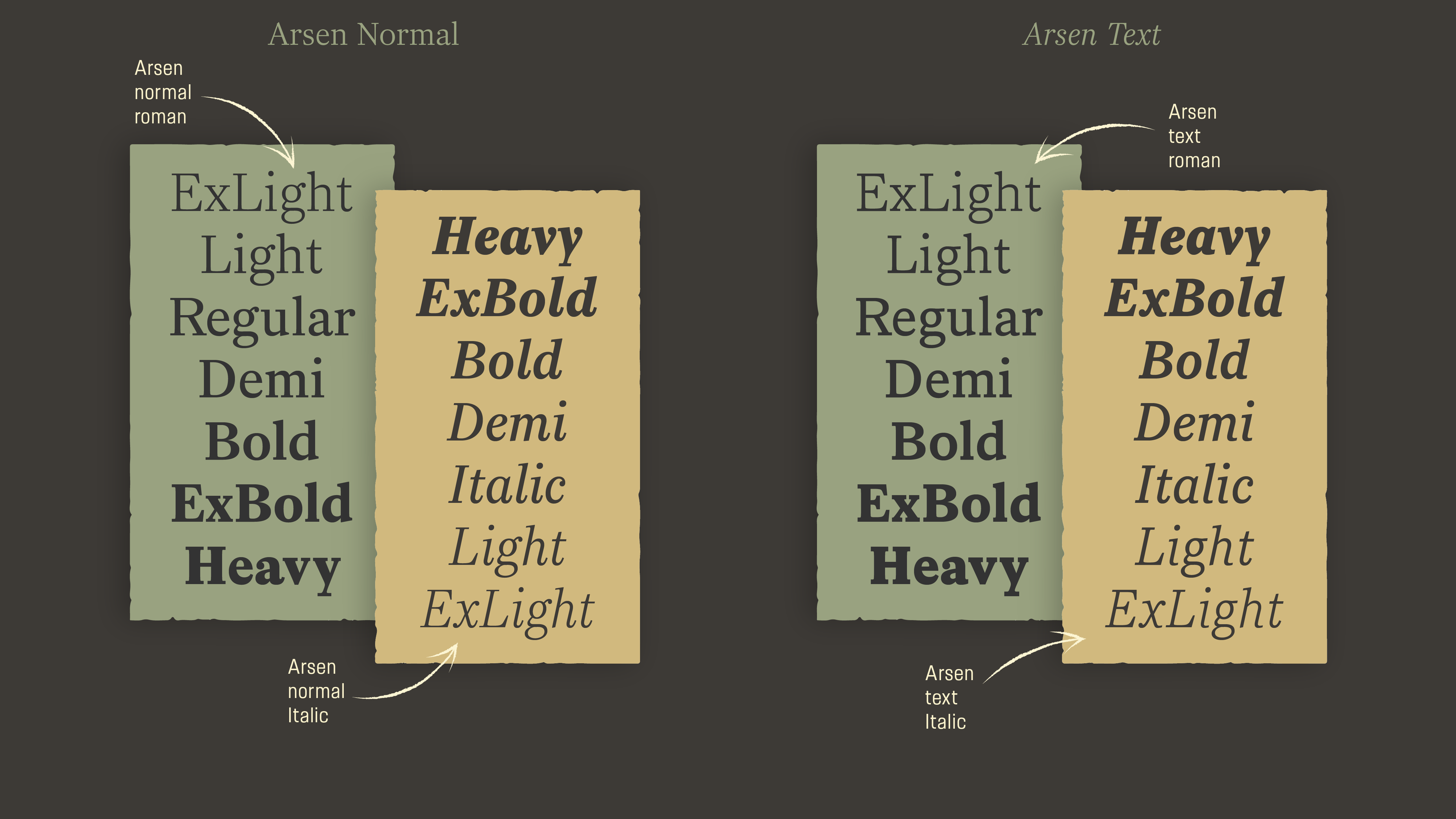
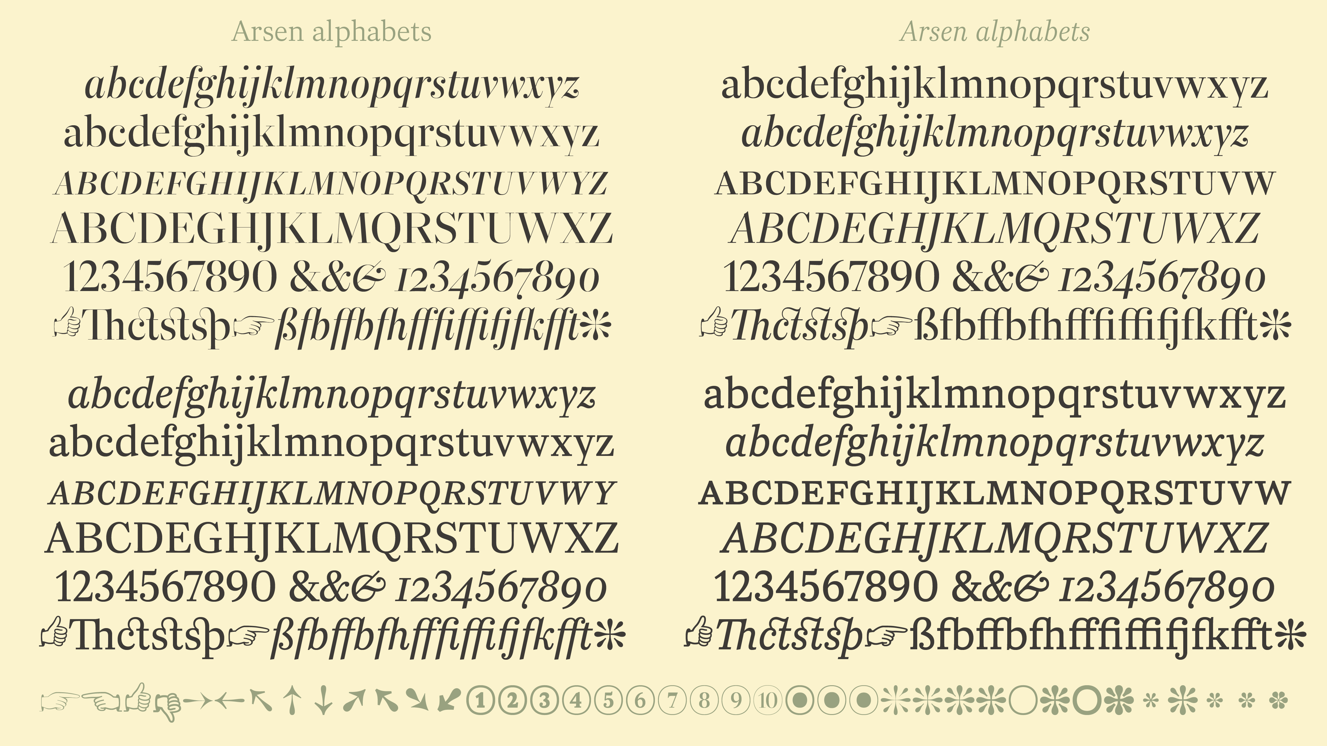
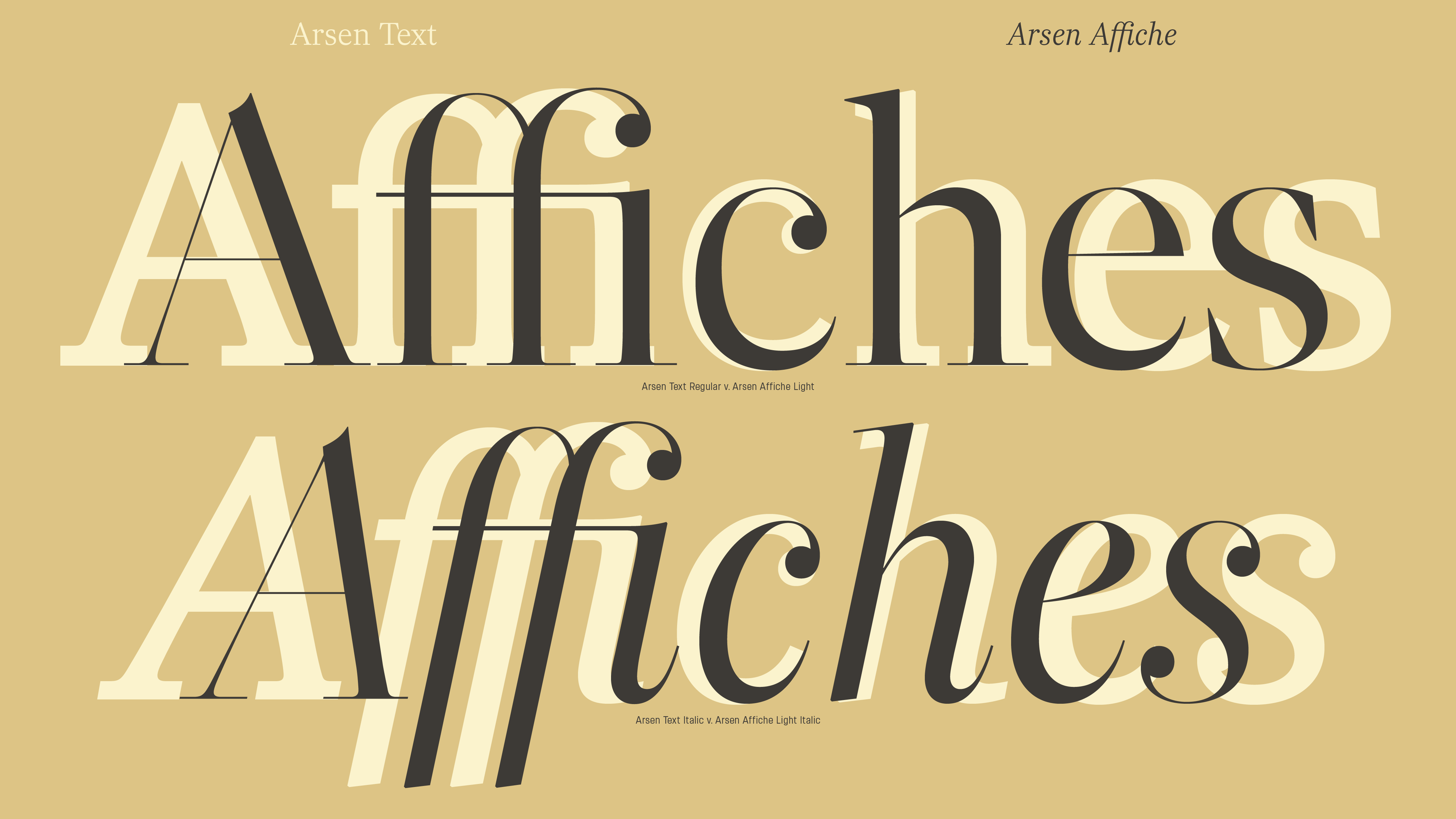
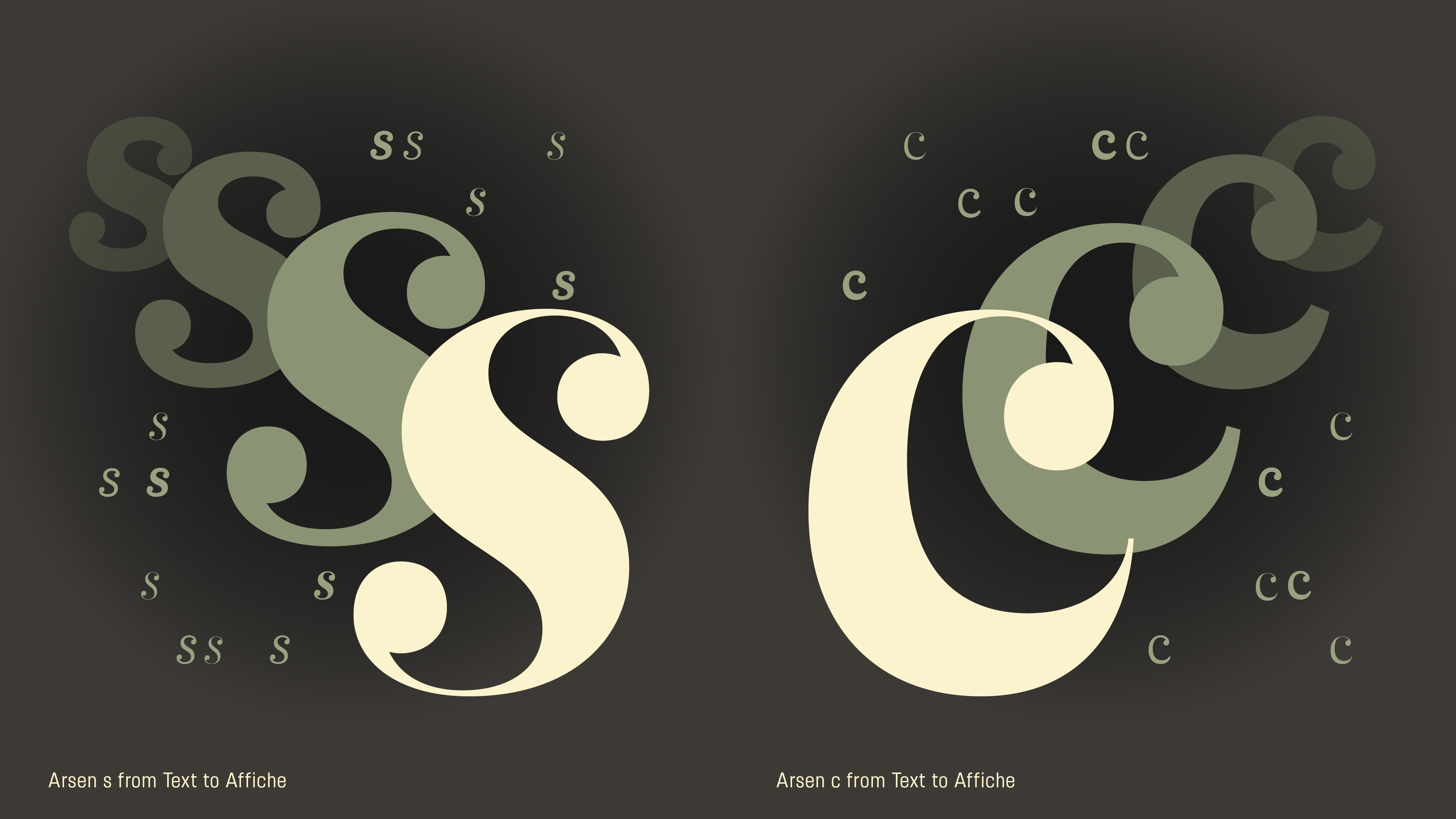
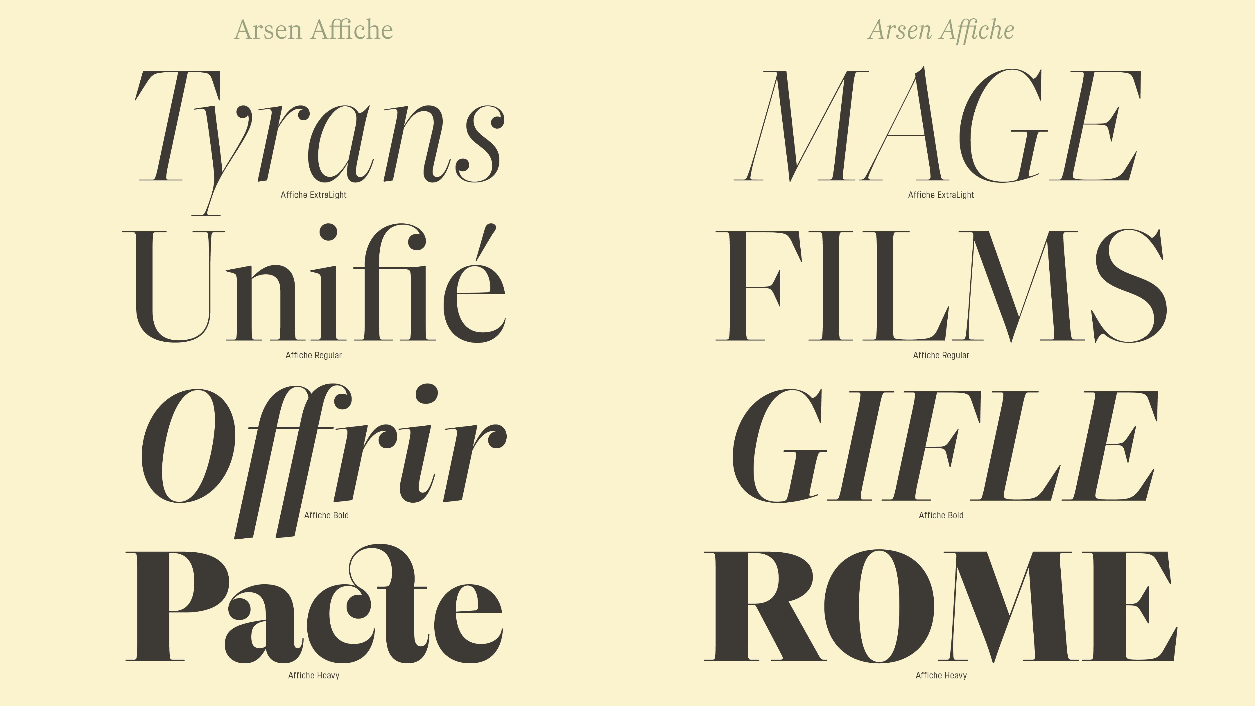
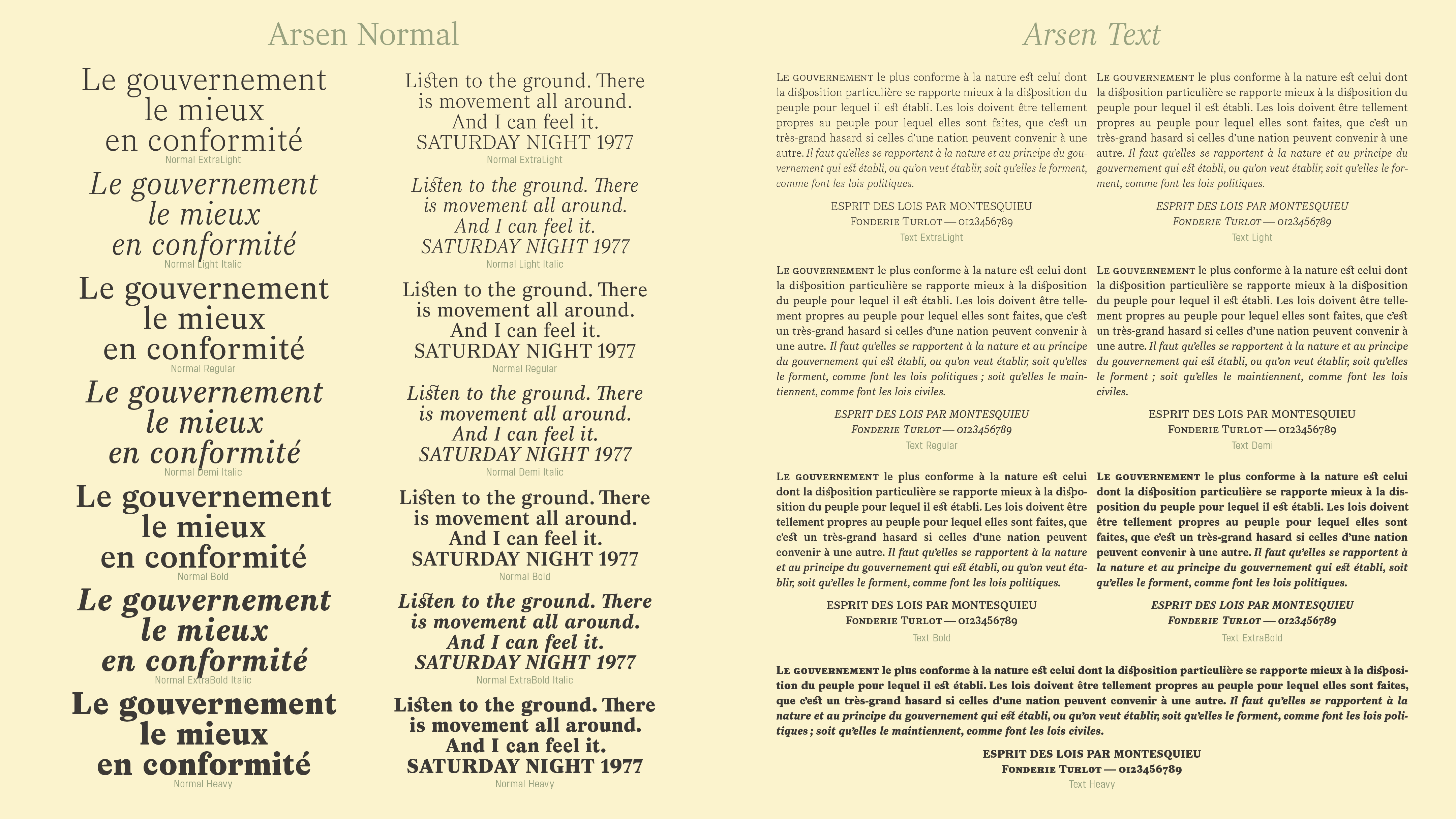
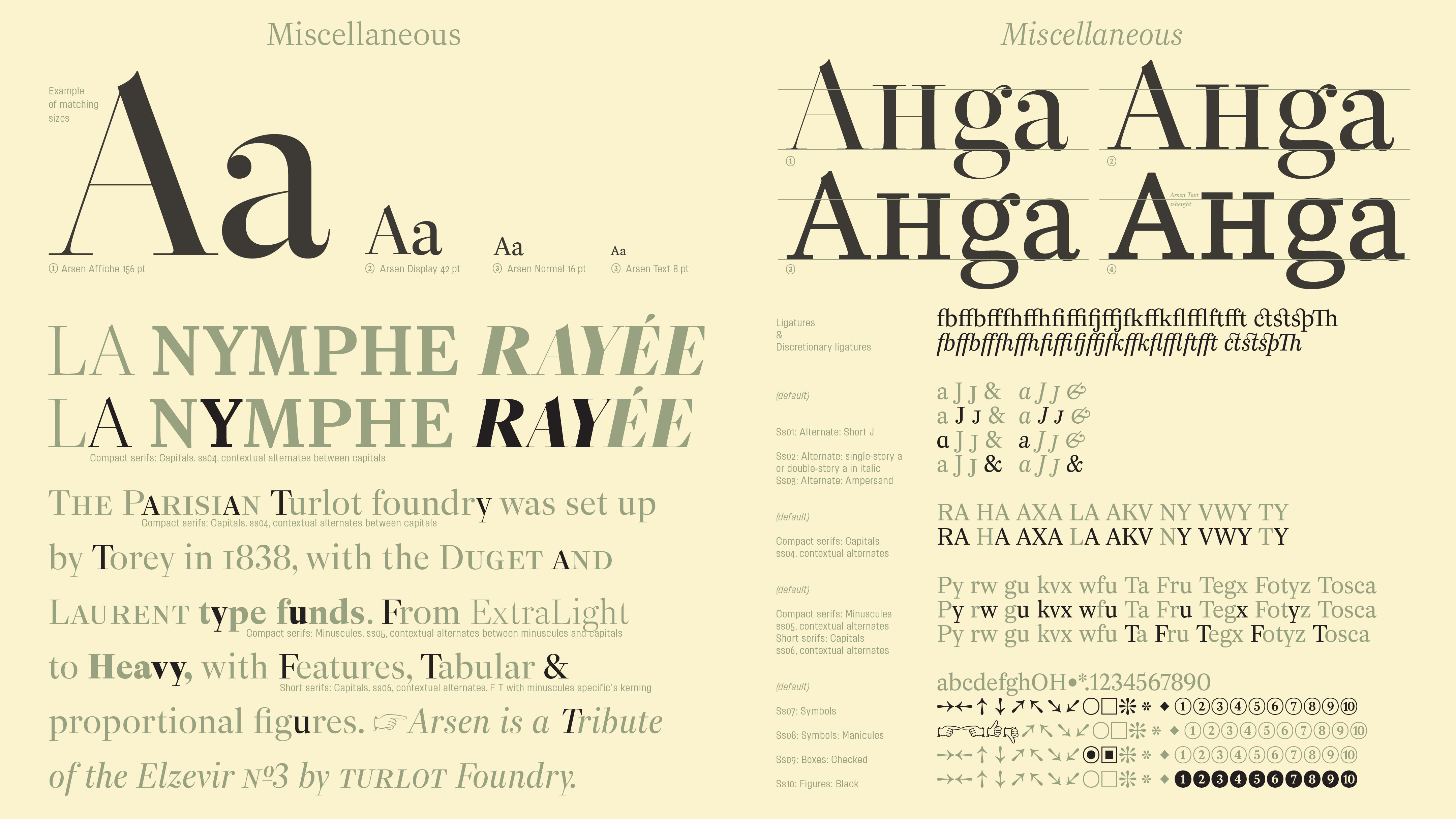
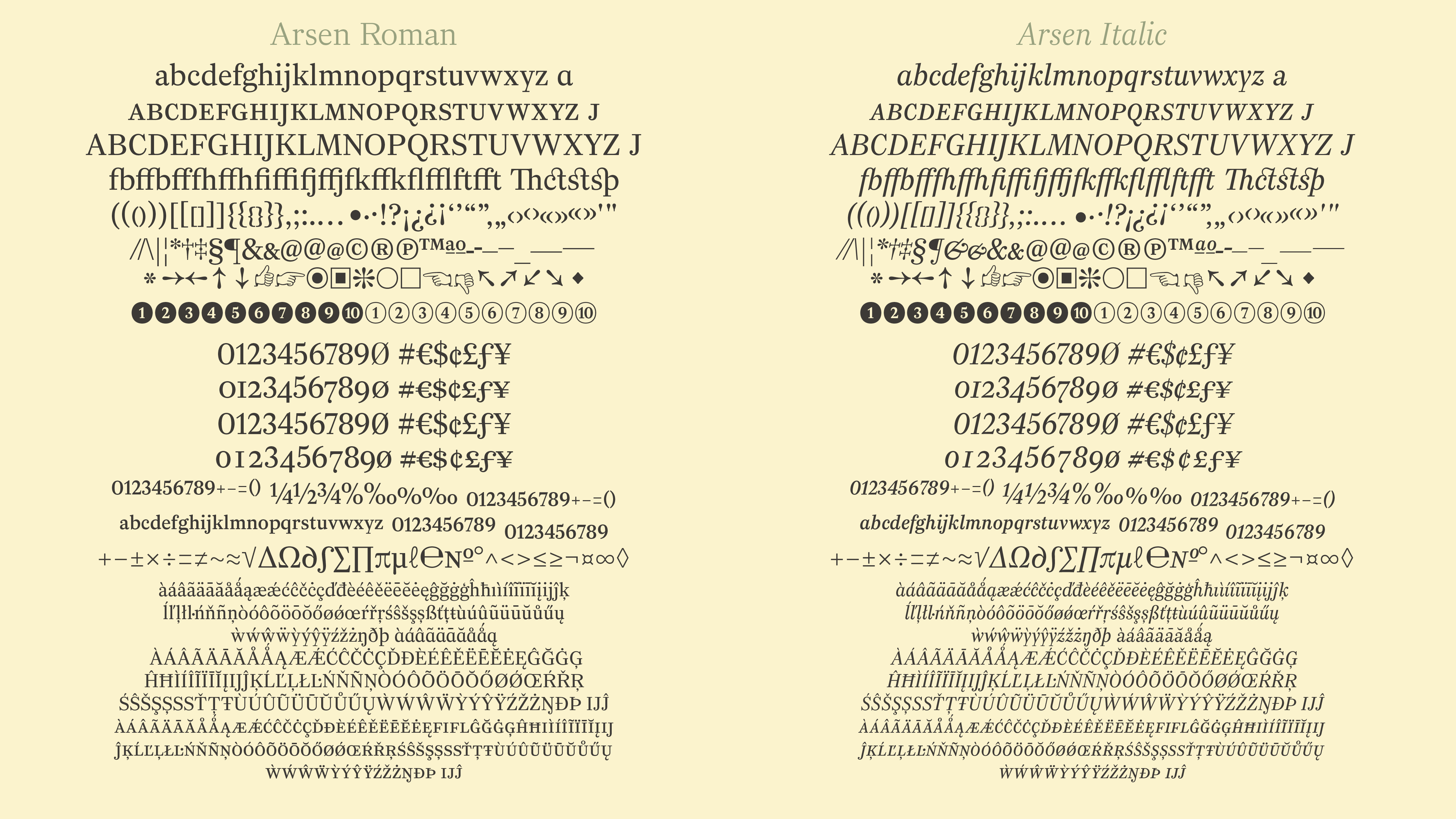
Arsen, influenced by typefaces from the Parisian foundry Turlot published around 1895, is neither a Didot, nor a genre of Garamond, nor Caslon, nor Baskerville, nor even Fournier. This is why it will bring this unique style to your publication, design, that you are looking for. Arsen is built around four optical sizes, two intended for large display, Arsen Affiche and Arsen Display, then Arsen Normal adapted to all uses and Arsen Text dedicated to small sizes. The relatively narrow capitals follow uniform proportions. The numerals align like some Didot. In the Text version, romans, and even more so the italics are different from other optical sizes, drawn more open, with endings closer to the horizontals.
The principles of Arsen design are based on a few bodies presented as the Elzevir Nº3 by the Turlot Foundry in 1895. Even if certain typeface characteristics of this Elzevir Nº3 are found in Arsen, it is not a strict revival, rather the result of a major influence of this Elzevir Nº3, which will have made it possible to understand one of the aspects of the ”Elzevirien” style.
Read more about it https://typofonderie.com/fonts/arsen-normal/details
Credits