Project
Ensemble Modern Magazine 01.24
Agency
Jäger & Jäger
Year
2024
Award
Bronze
Ensemble Modern Magazine 01.24
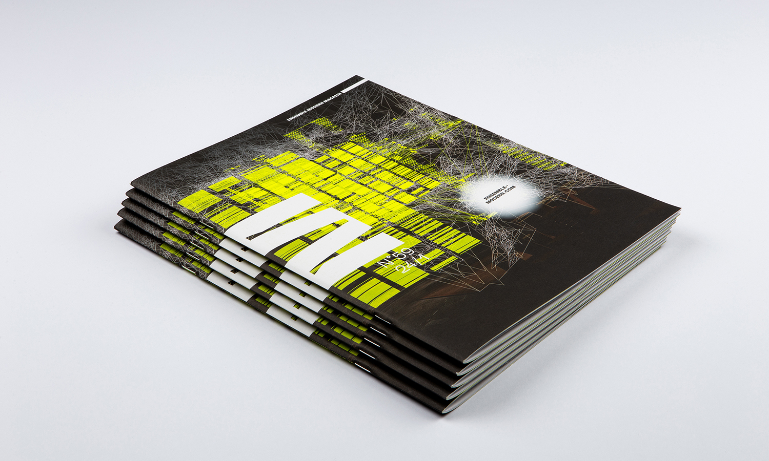
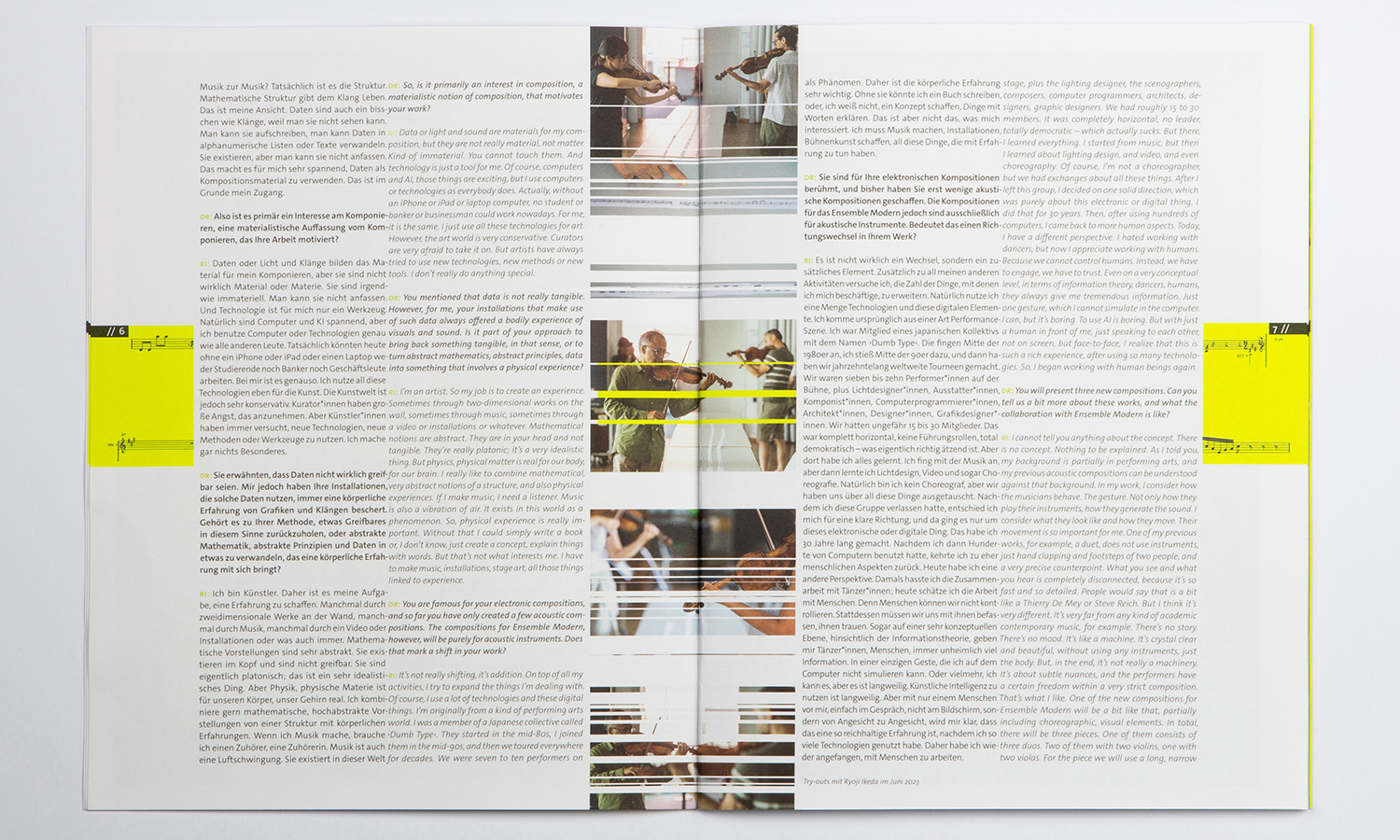
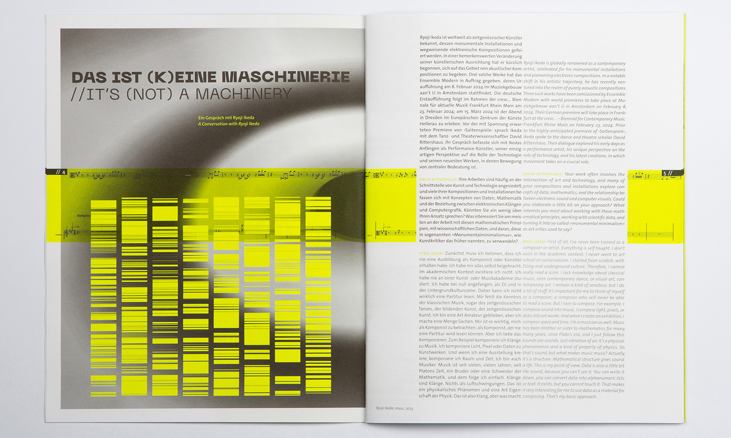
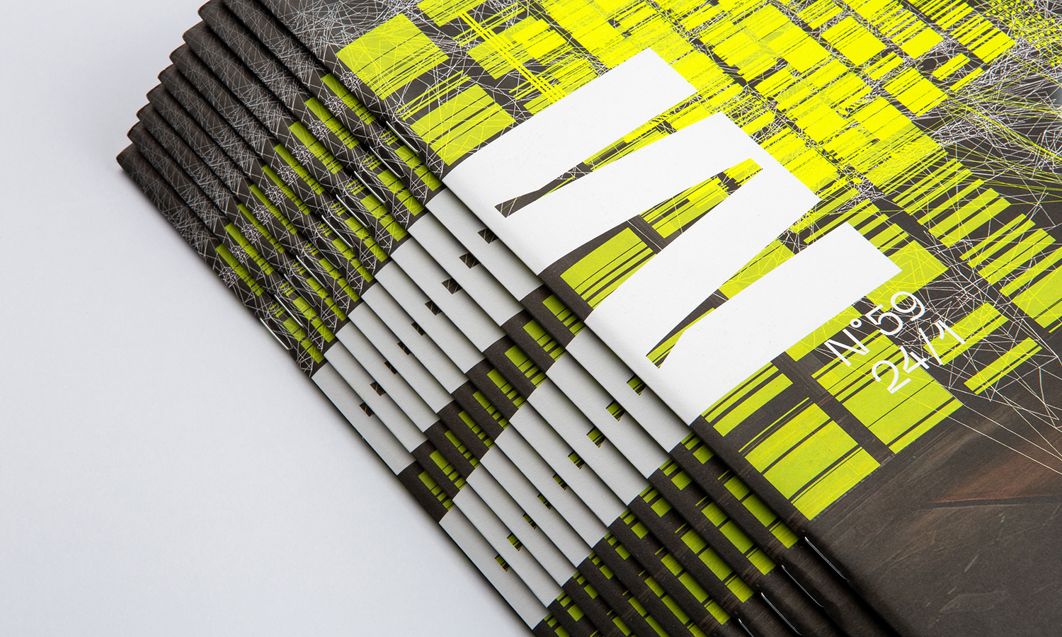
E or M? M or E? Ensemble Modern Magazine!
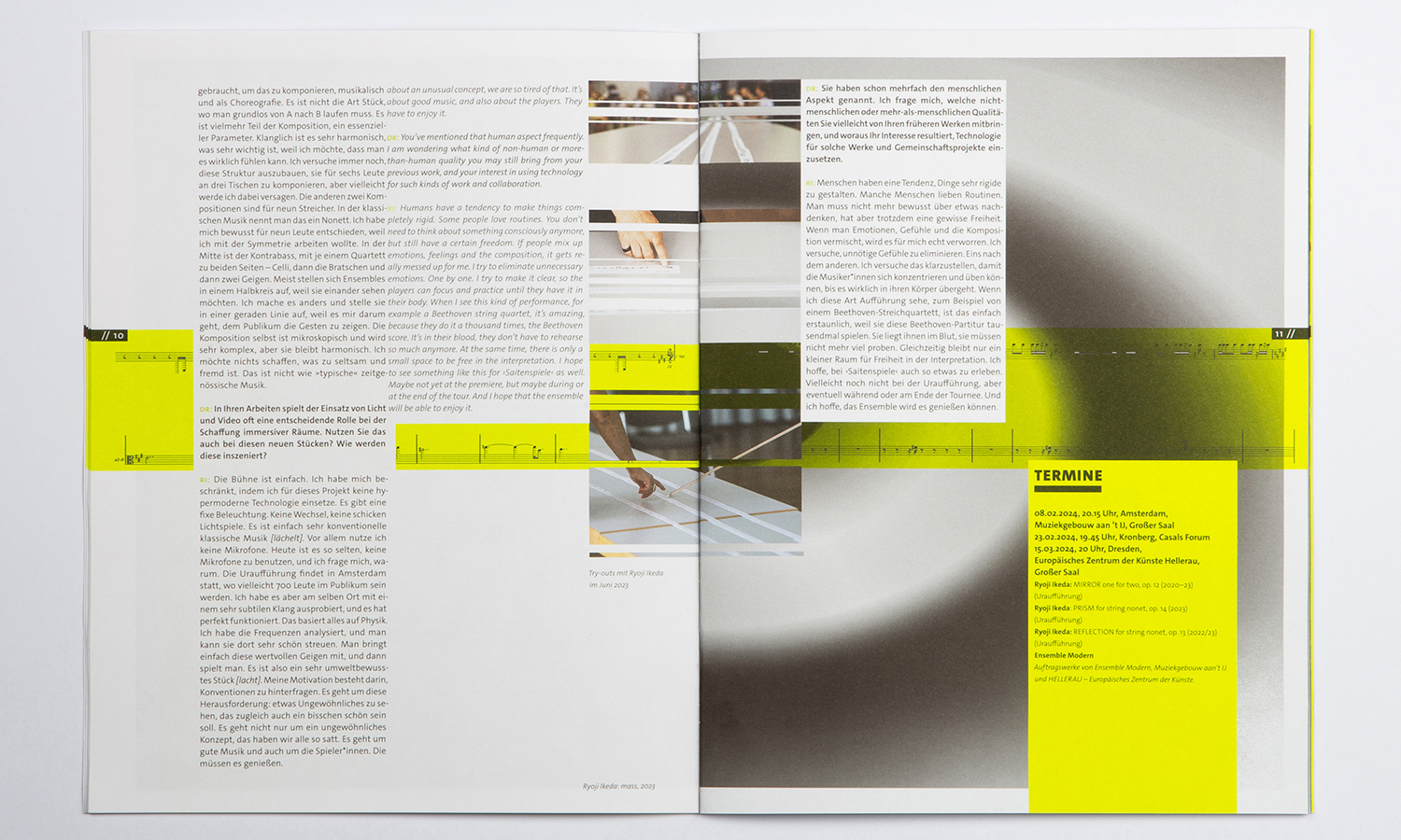
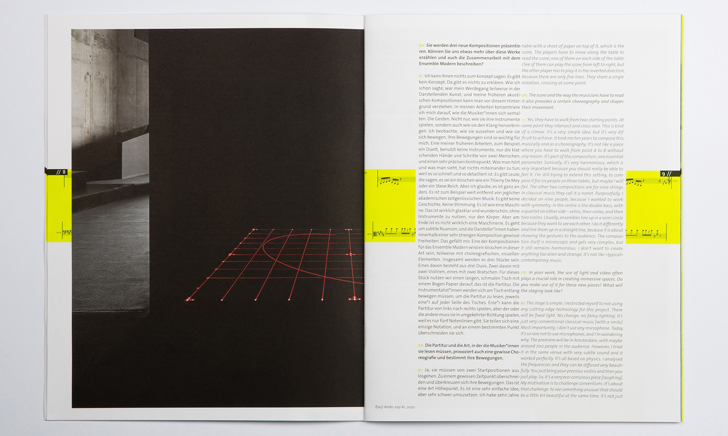
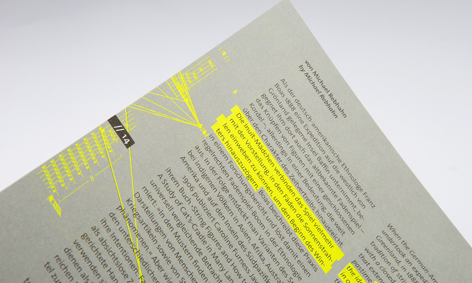
The M of the new distinctive typeface, with its idiosyncratic design of the vertices, is tilted at 90 degrees to form an E and is placed in the centre of the gutter to form the new title of the magazine. The typeface is also used in the inner section in headlines and individually placed large numbers and keywords.
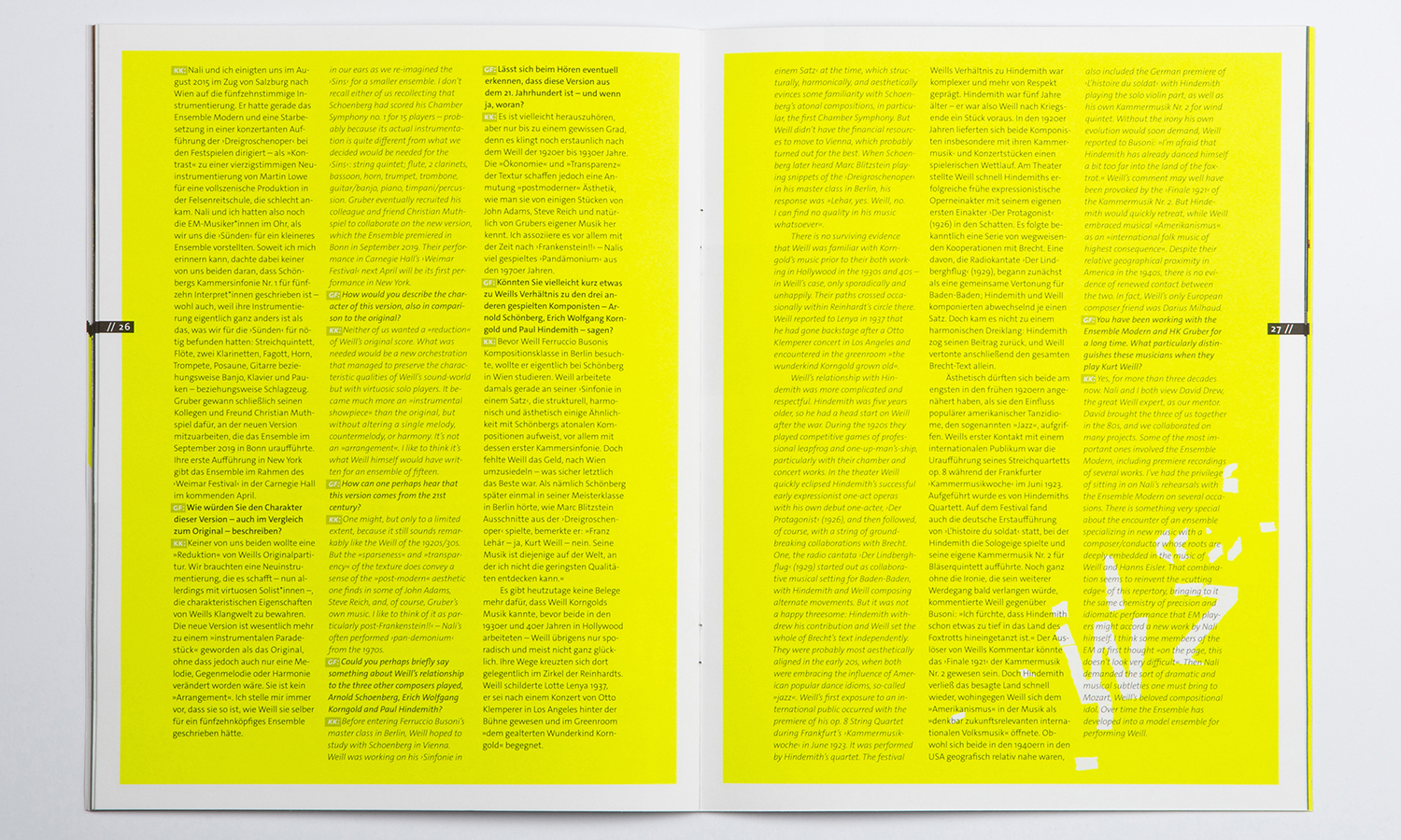
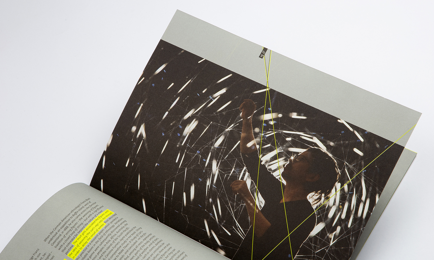
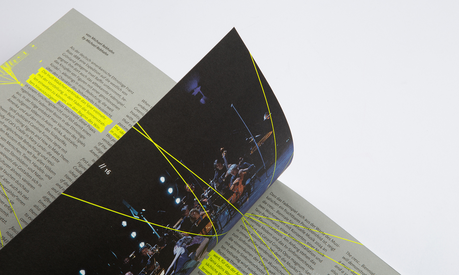
The changing accent colours, which give the communication media a new face again and again, are continued. The new edition uses a bright neon green and sets bright accents. The image level, text level and typographic level interweave with each other to create an exciting and dense overall expression
of New Music.
Credits
Art Director
Tanja Weich
DTP
Nico Nolle
Category
405 Magazine & Periodical Design
Client
Ensemble Modern GbR
Country
Germany