Manifiesto del Agua
About the project:
Following the course of potable water on the tropical island, ‘Manifiesto del Agua’ gives a profound insight in contemporary socialist Cuba.
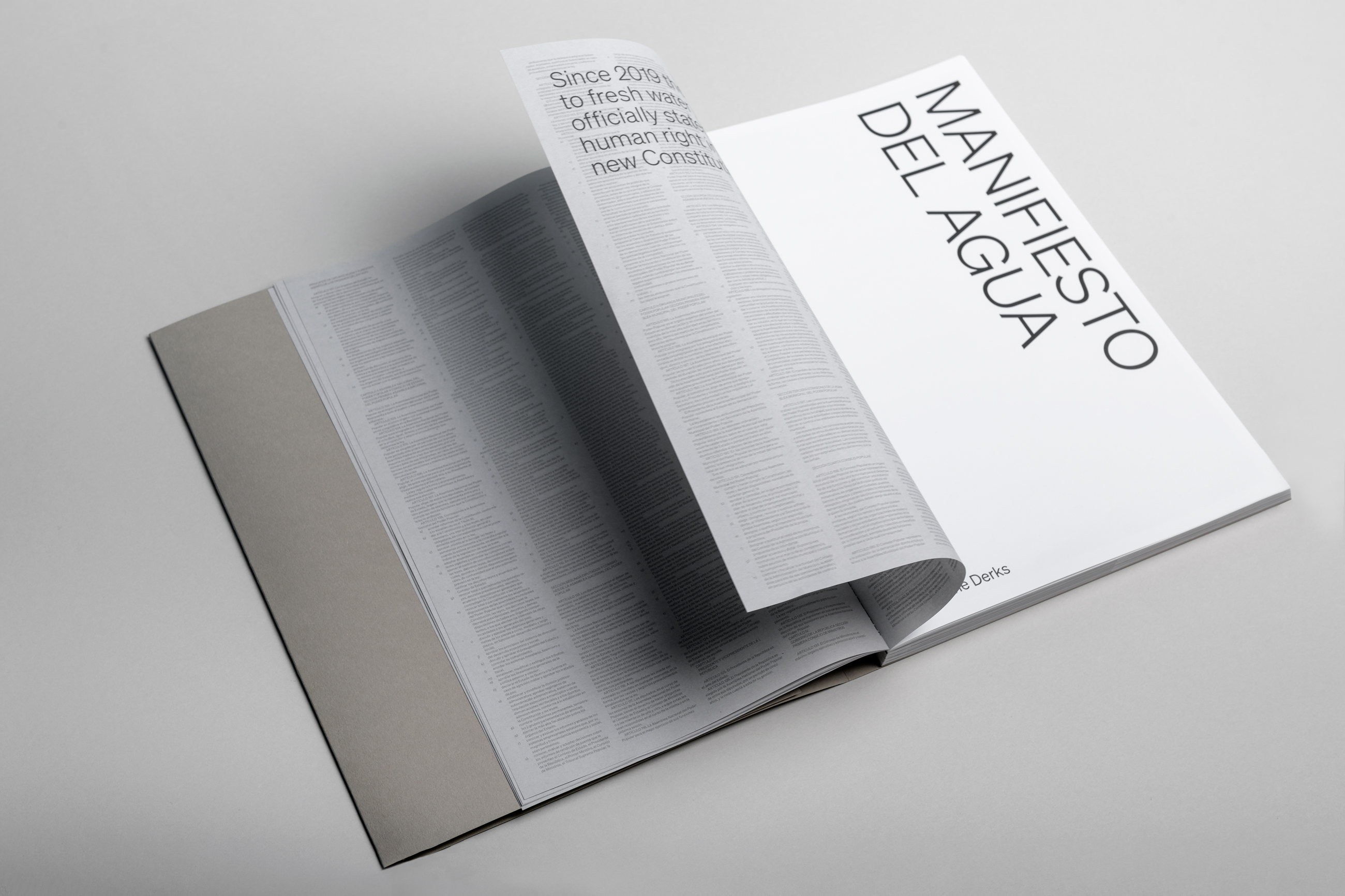
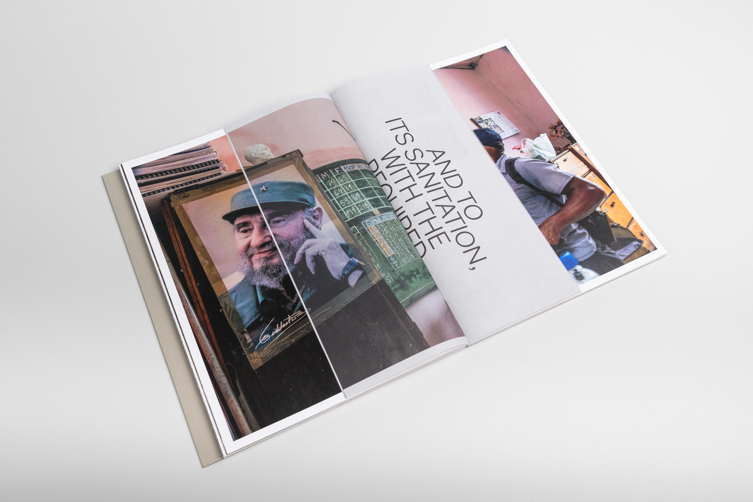
Cuba: tropical island and socialist state. Surrounded by salt water, the access to fresh water is a daily challenge for the residents of the Caribbean ‘Workers’ Paradise’. To emphasise the importance of fresh water access, it was officially declared a human right in Cuba’s 2019 constitution. Article 76 reads:
“All people have the right to water. The State works to guarantee access to potable water and to its sanitation, with the required compensation and rational use.”
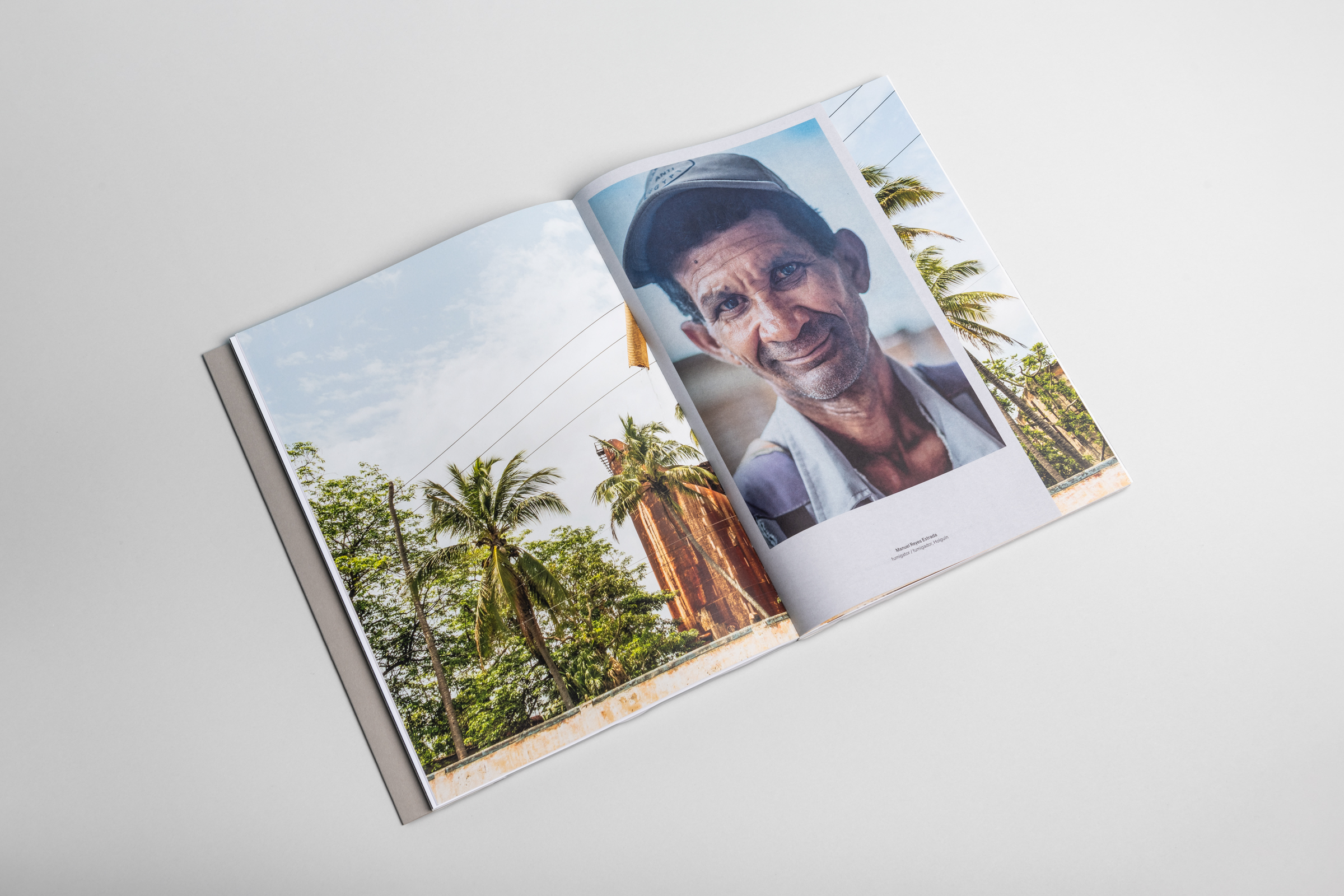
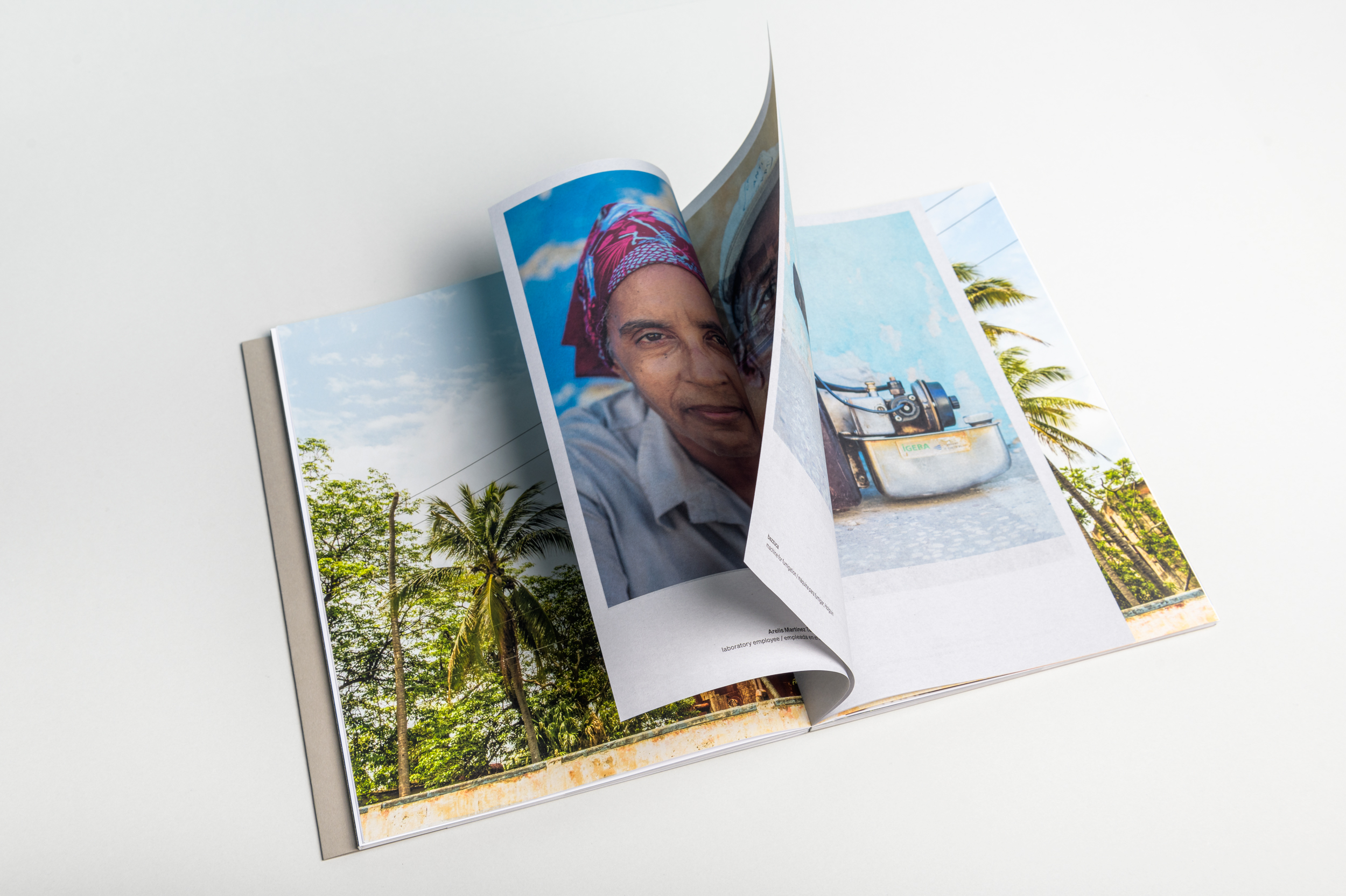
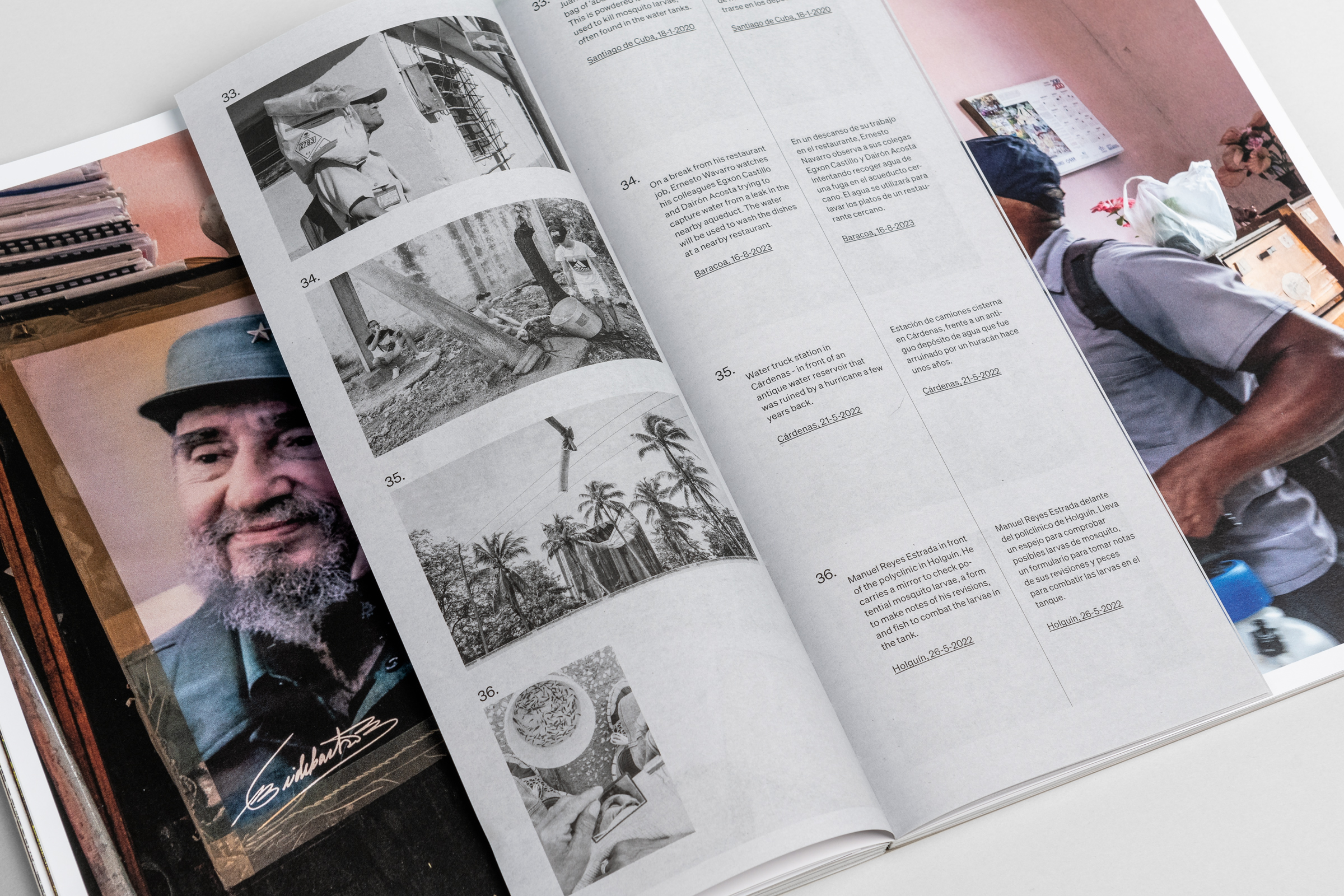
This project focuses on the daily problems and solutions of the workers in a non-automated, non-digitized socialist society. Water truck drivers distribute the water to households and districts that lack reliable sources. Brigades of health inspectors check the hygiene of water tanks, and fumigators exterminate mosquitoes and other insects, attempting to prevent the transmission of vector-borne diseases. Together they work hard to live up to their constitution and provide clean water for everyone.
Design:
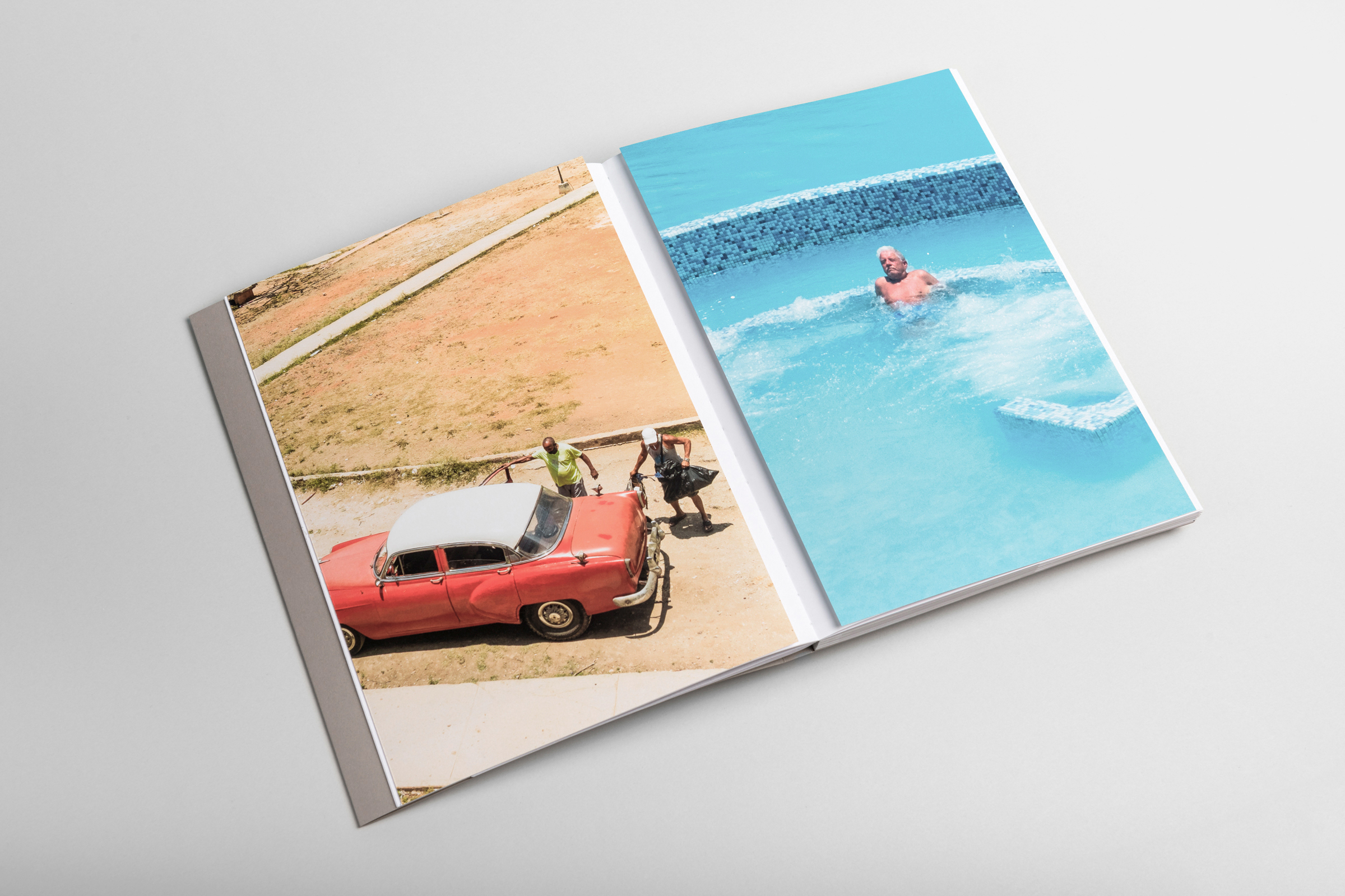
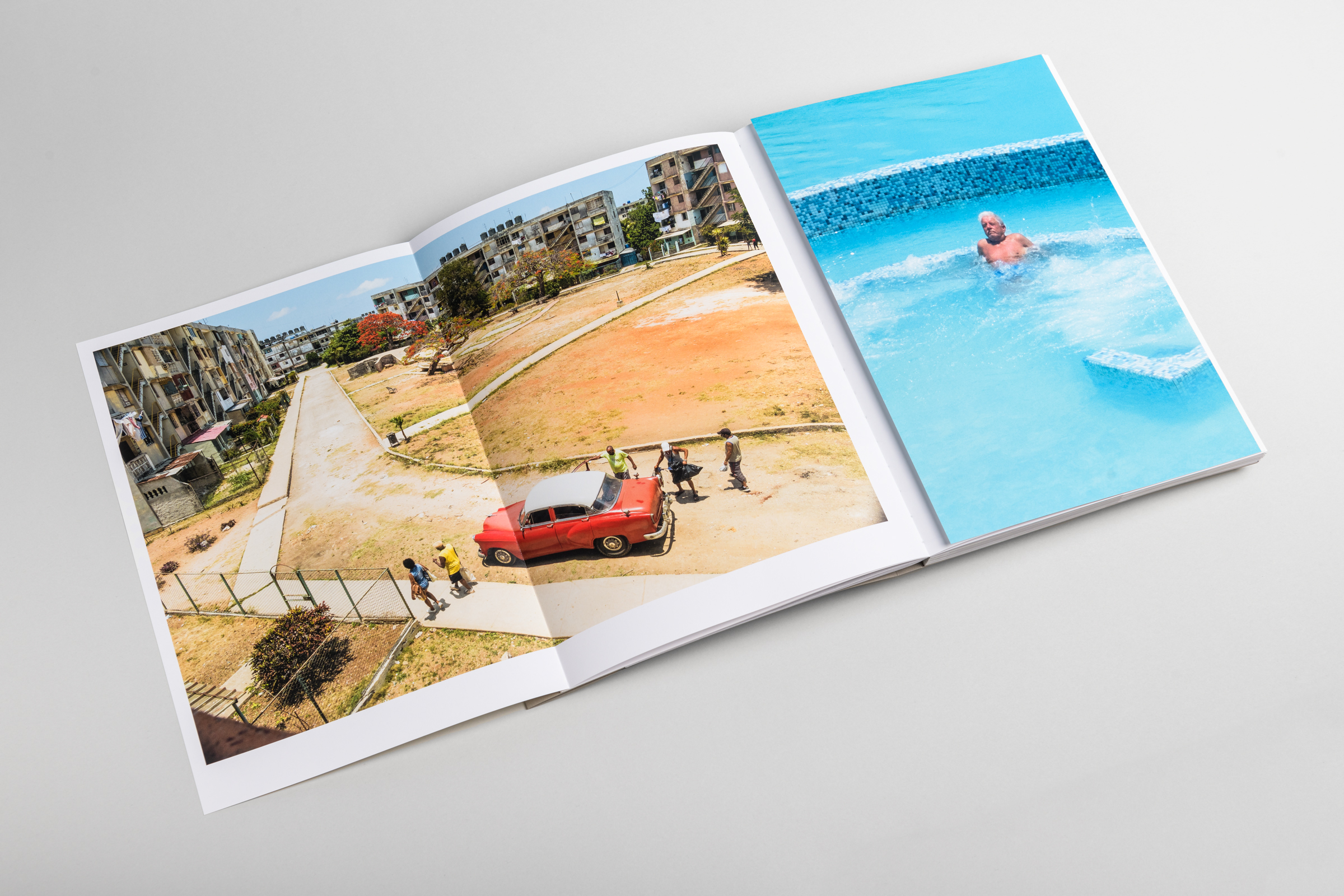
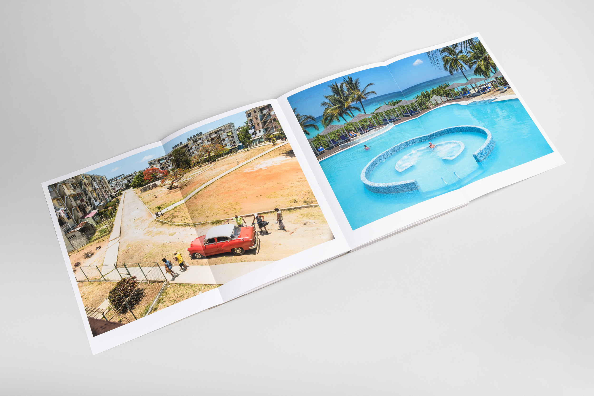
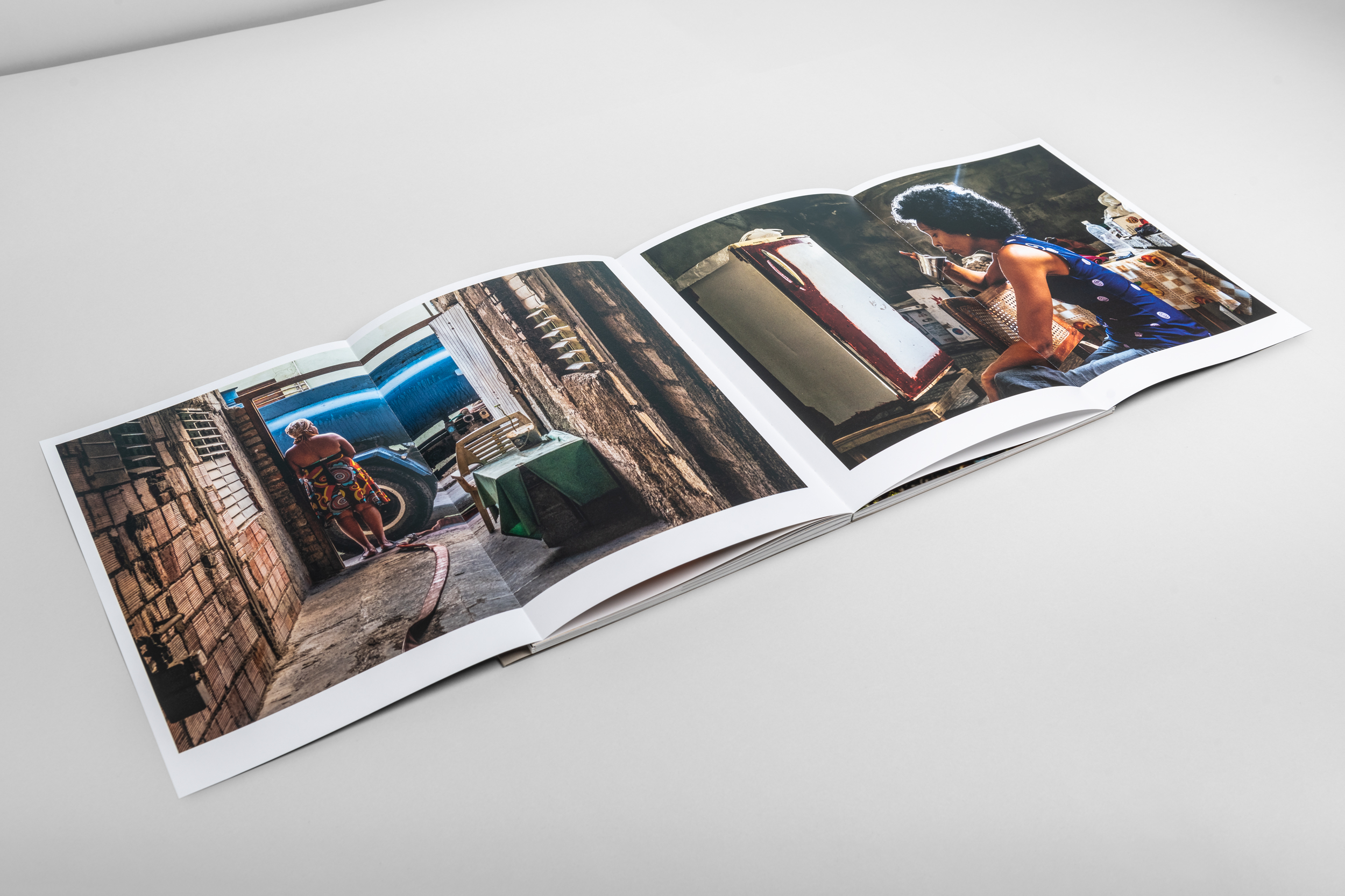
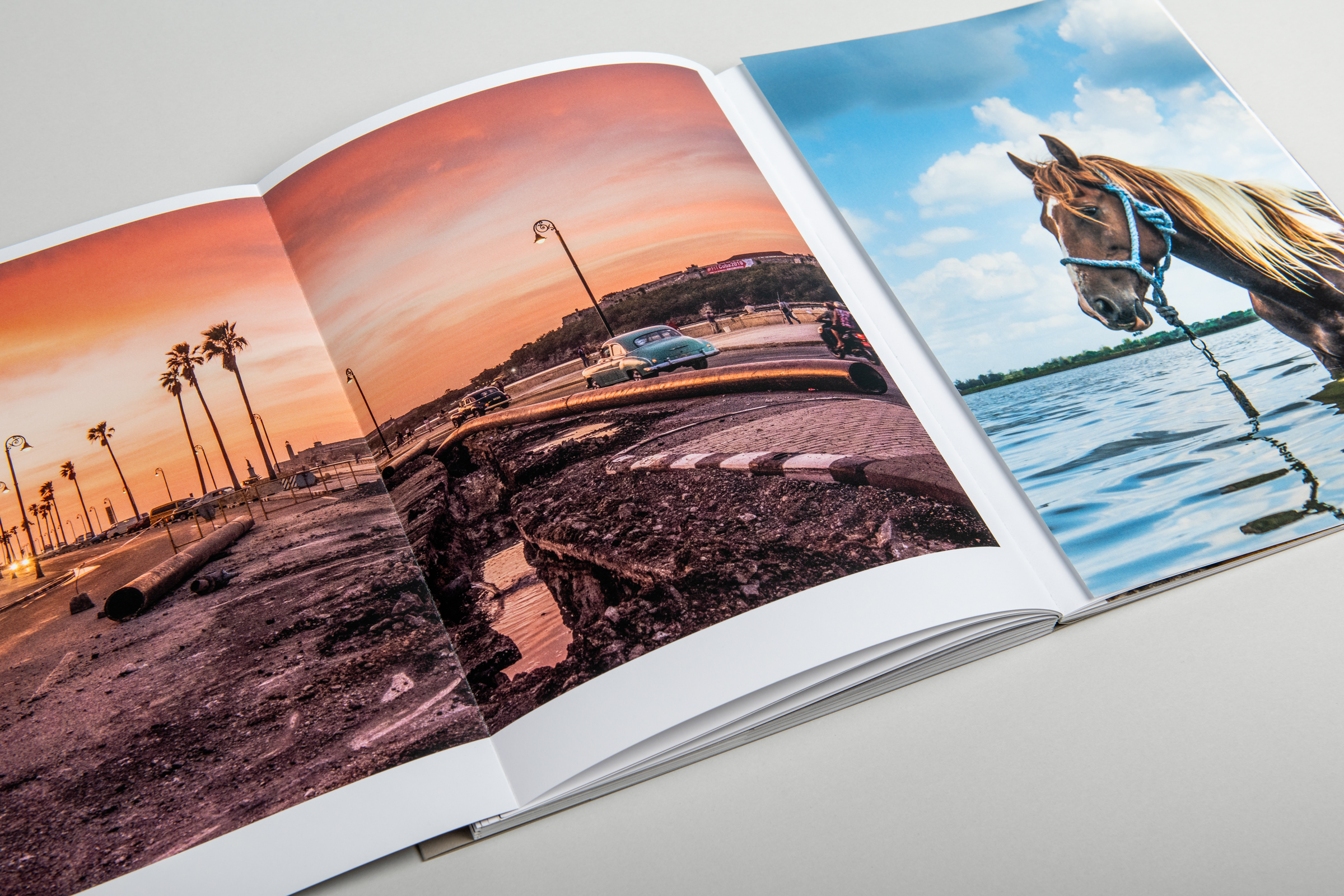
The first challenge was to make a sharp edit from the dozens of photo's that were made throughout multiple trips to Cuba from 2017-2023. We wanted the selection to be a mixture of photos that represent the water problem in Cuba, the workers involved in providing fresh drinking water, the culture around drinking water and how communist Cuba is ignoring the problem.
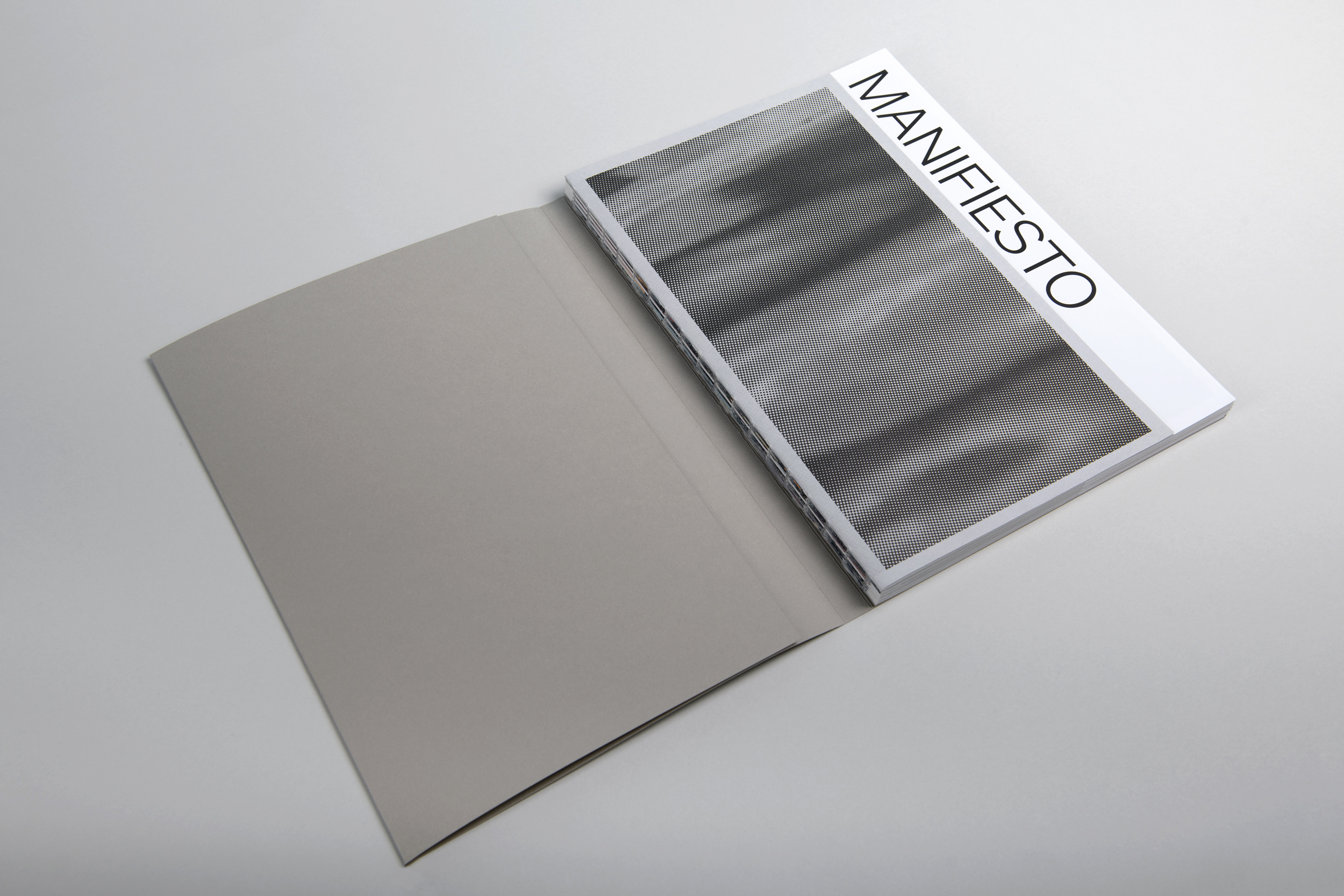
At first glance when holding the book, you experience the drought because of the course paper of the cover. We wanted the overall appearance to reflect the absence of water, instead of water itself, to really emphasise the problem. We worked with various paper stocks and formats to show how layered the problem in Cuba are and on how many levels it affects the country.
When you open the book, you start with a soft intro where you zoom out from the water to the sky, to symbolize the evaporation of water. After that, you can find the whole constitution of Cuba. The part where the acces to clean drinking water is stated, is highlighted. This part of the constitution also can be find in fragments throughout the book, but in a way where they almost pass by unnoted. By doing this we want the reader to experience the suppression of the Cuban government.
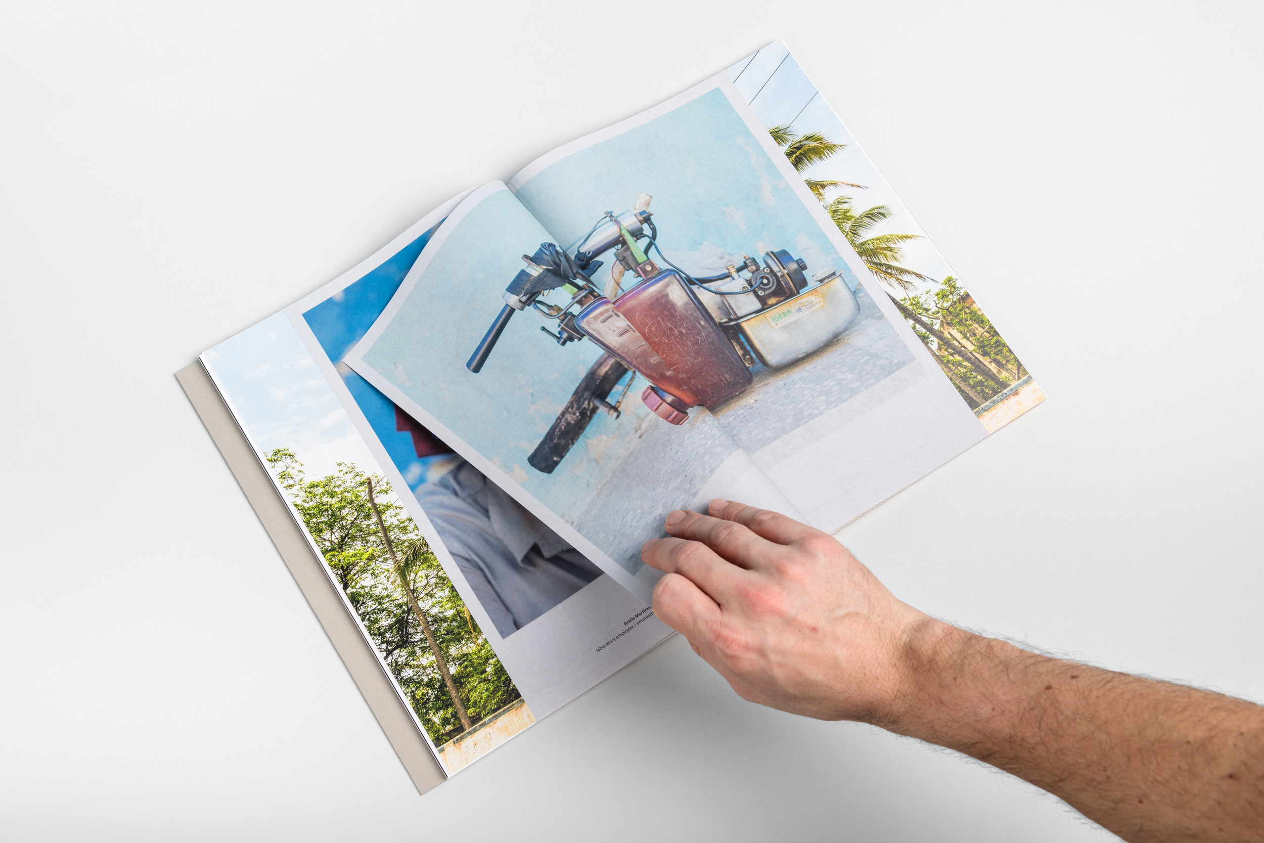
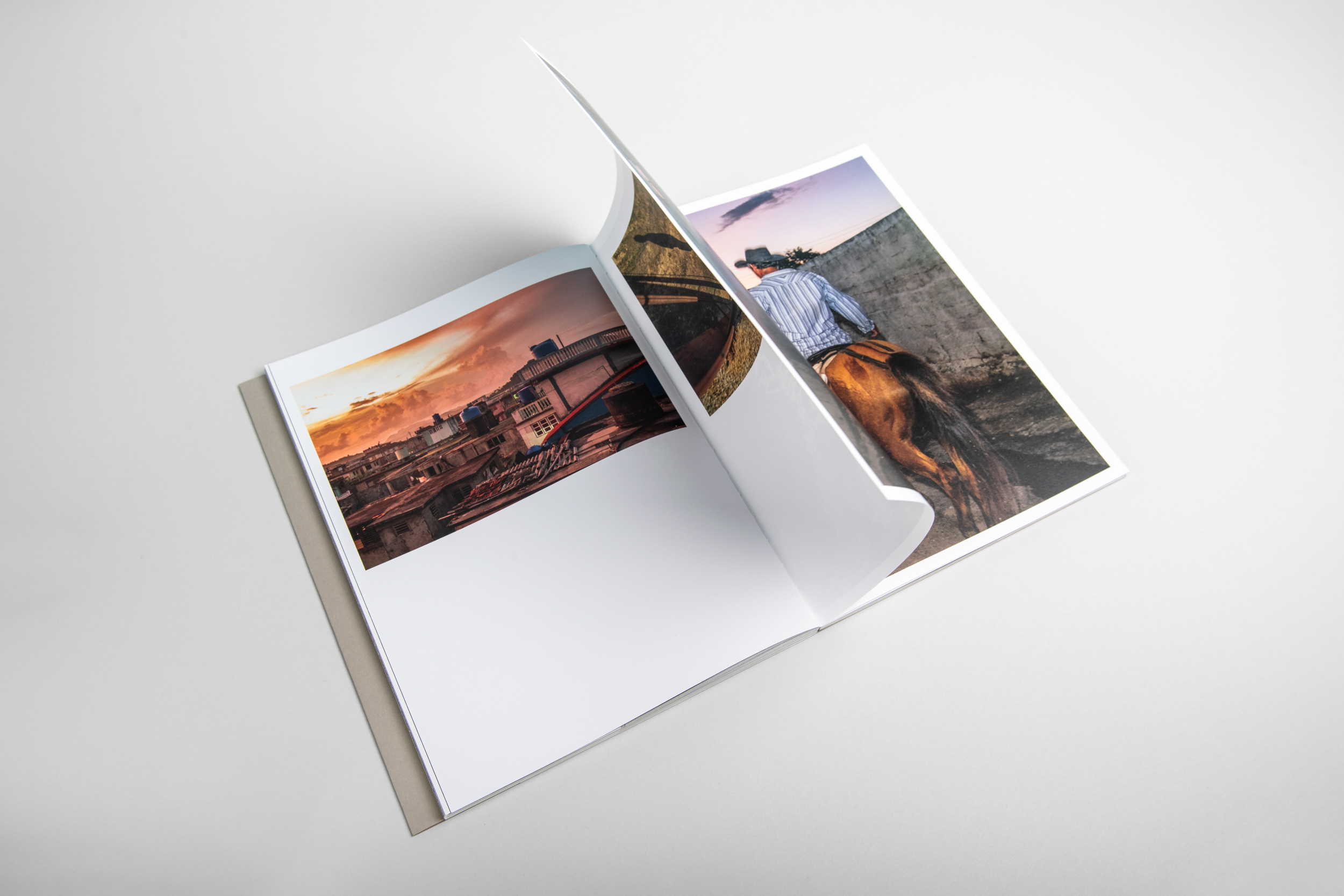
In the book you can find several fold out pages. On these pages you will find photos that represent an important part of the edit and which deserve to be presented on a large scale. By blowing up the photos, it also enlarges the impact of them.
Throughout the book you can find smaller booklets, printed on thin newsprint paper. The thin newsprint paper provides a nice contrast with the thick and semi-gloss Magno Volume paper on which the photos are printed. This reflects the big gap between rich and poor in Cuba. The booklets are almost invisible within the underlying photo, which reflects the way Cubans have to deal with several problems which are not always visible at the surface. Also, by letting these smaller booklets merge with the underlying photo, we didn't break with the flow of the edit. Within these smaller booklets you find artefacts, collected by Sanne, of Cuban culture, which are in some way related to the water problem in Cuba. The more you dive into the book and the hidden stories, the more you understand about the problems the citizens have to face in every day life.
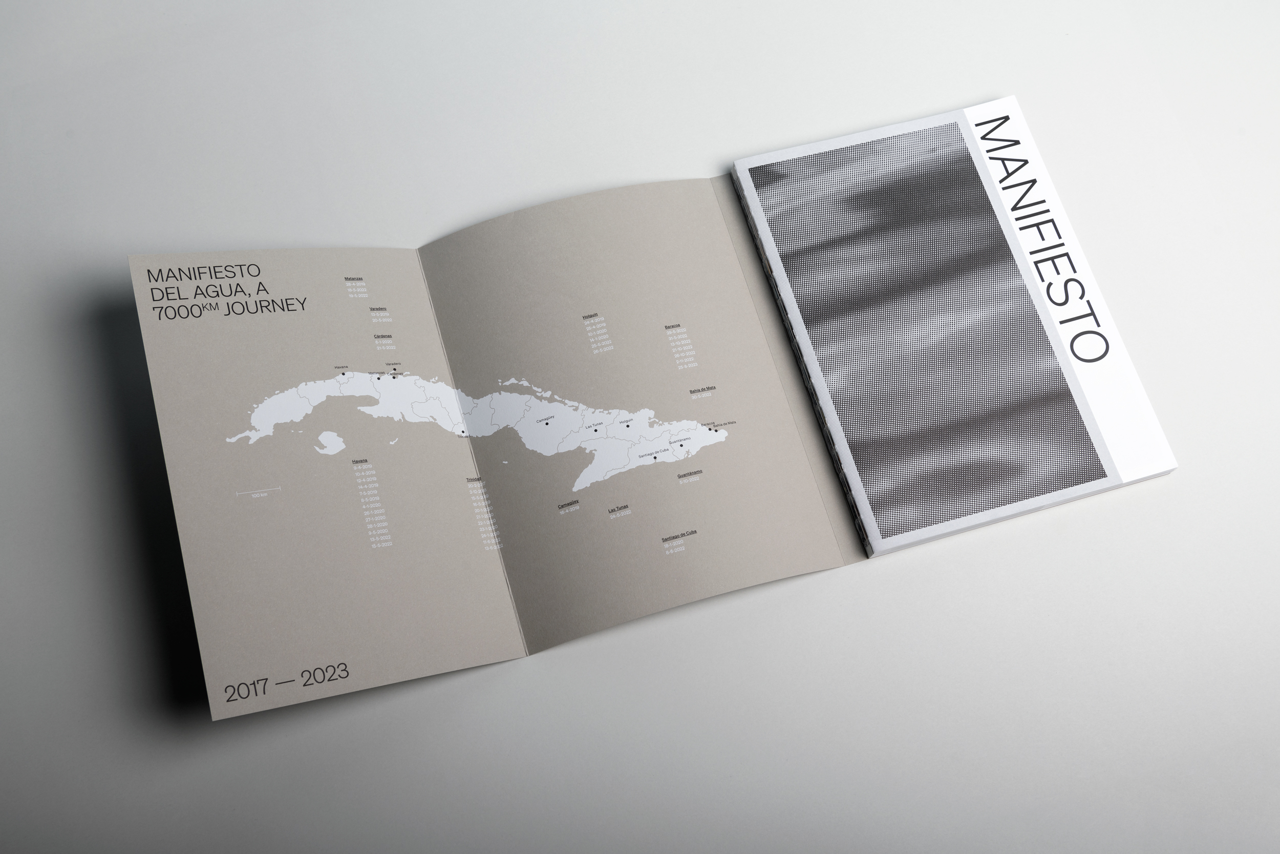
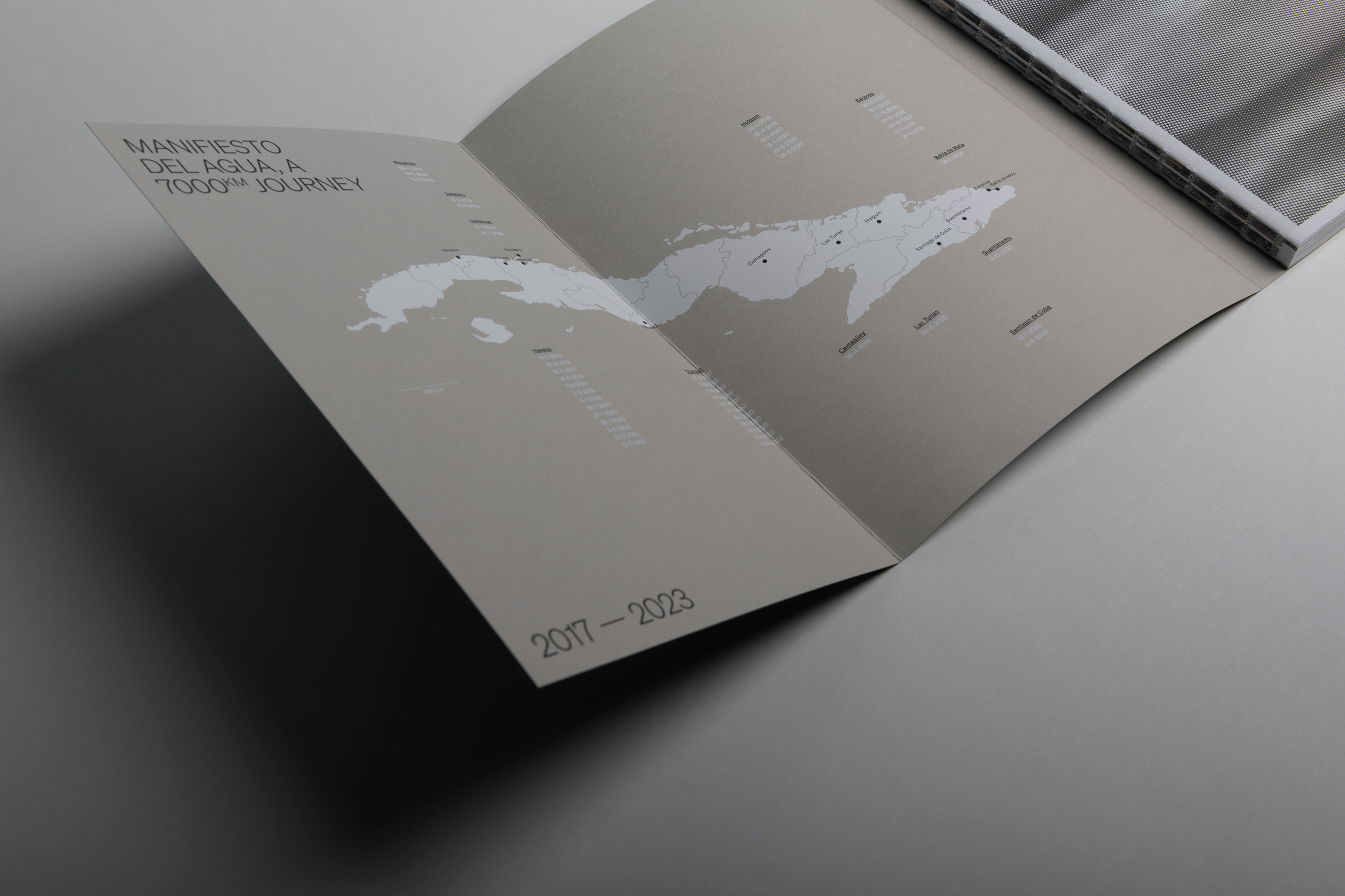
The cover is digitally printed with black and white ink. On the inside of the cover a map of Cuba can be found along with data from the different journeys that Sanne took to Cuba and the places where the photo's have been made. To complete the book, the cover also contains a folded poster, with an artwork about the Cuban water problem, painted by a local artist.
The binder Patist faced a lot of difficulties with the different paper sizes and paper stocks. Therefore, the binding had to be partly done by hand and partly done by machine. We had a great team of professionals working on this project to translate all the idea's into a beautiful book. The design added value tot the initial project trough new layers of storytelling without overshadowing the project. This story, that needs to be told to a larger public, now has a book that tells it.
Credits