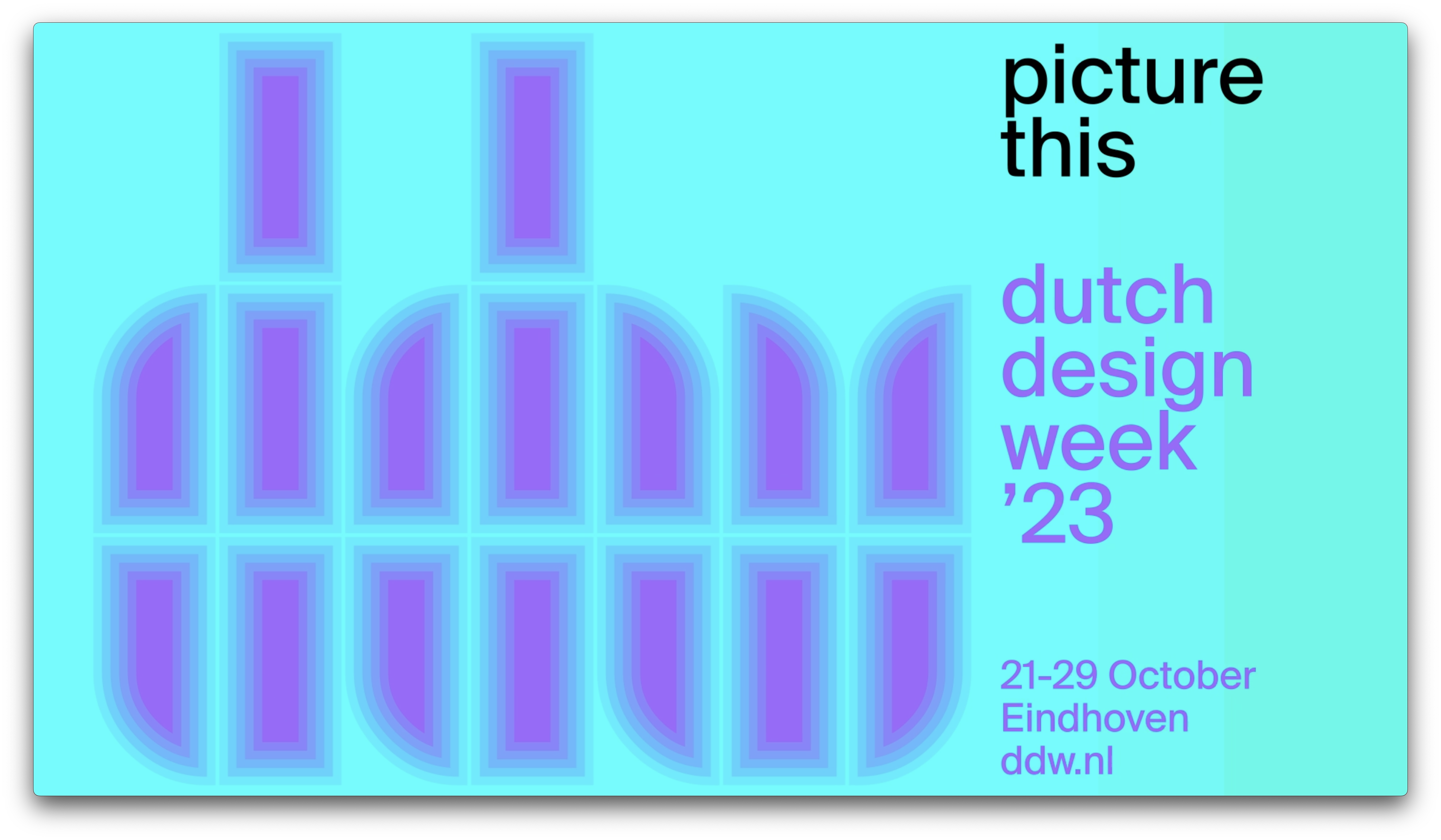
Dutch Design Week 2023
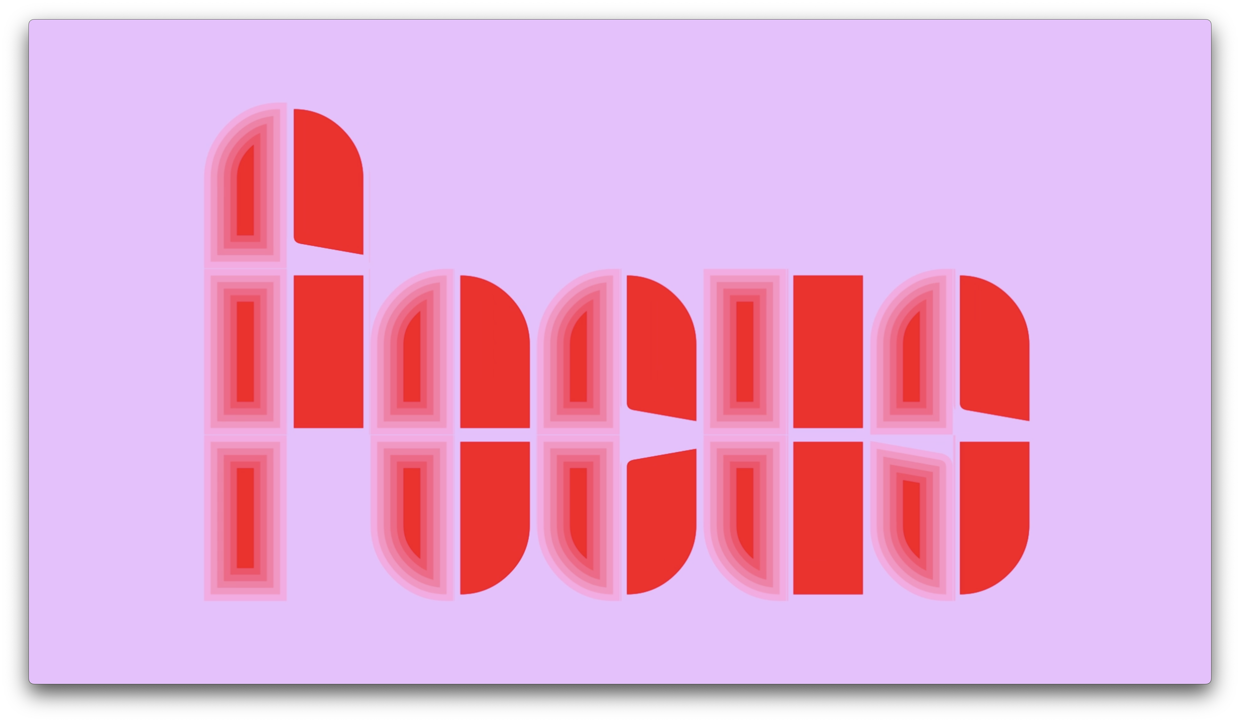
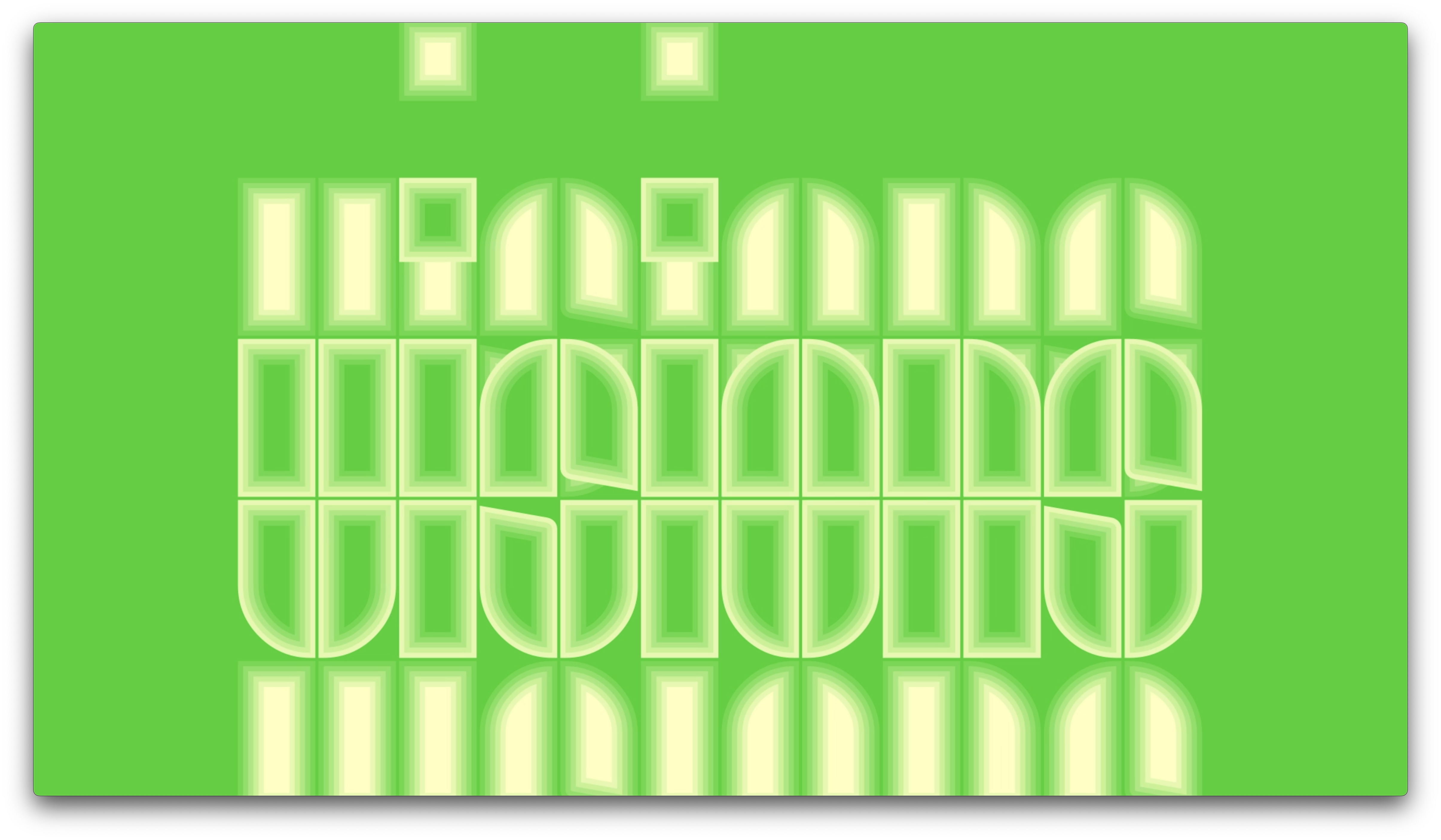
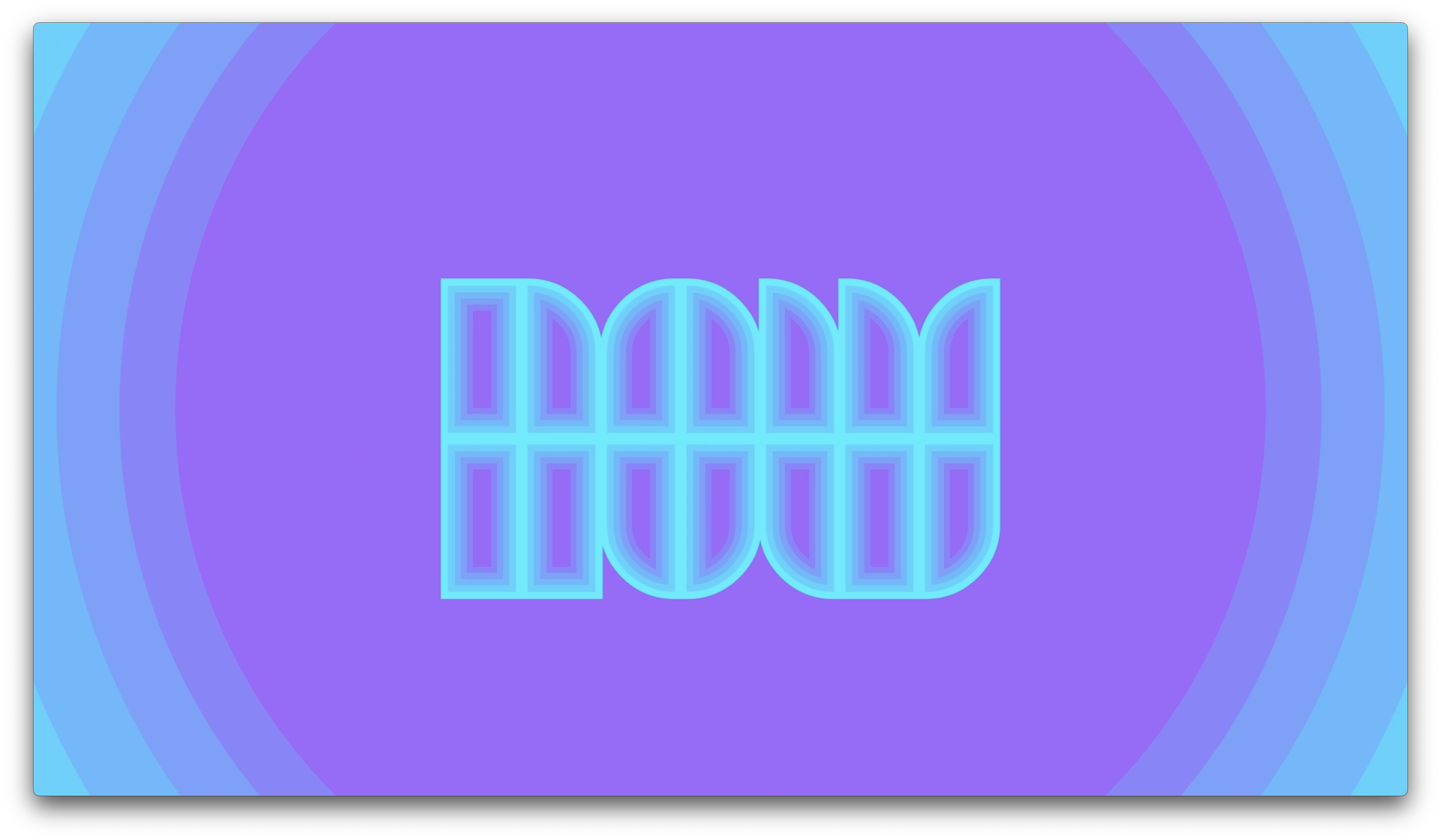
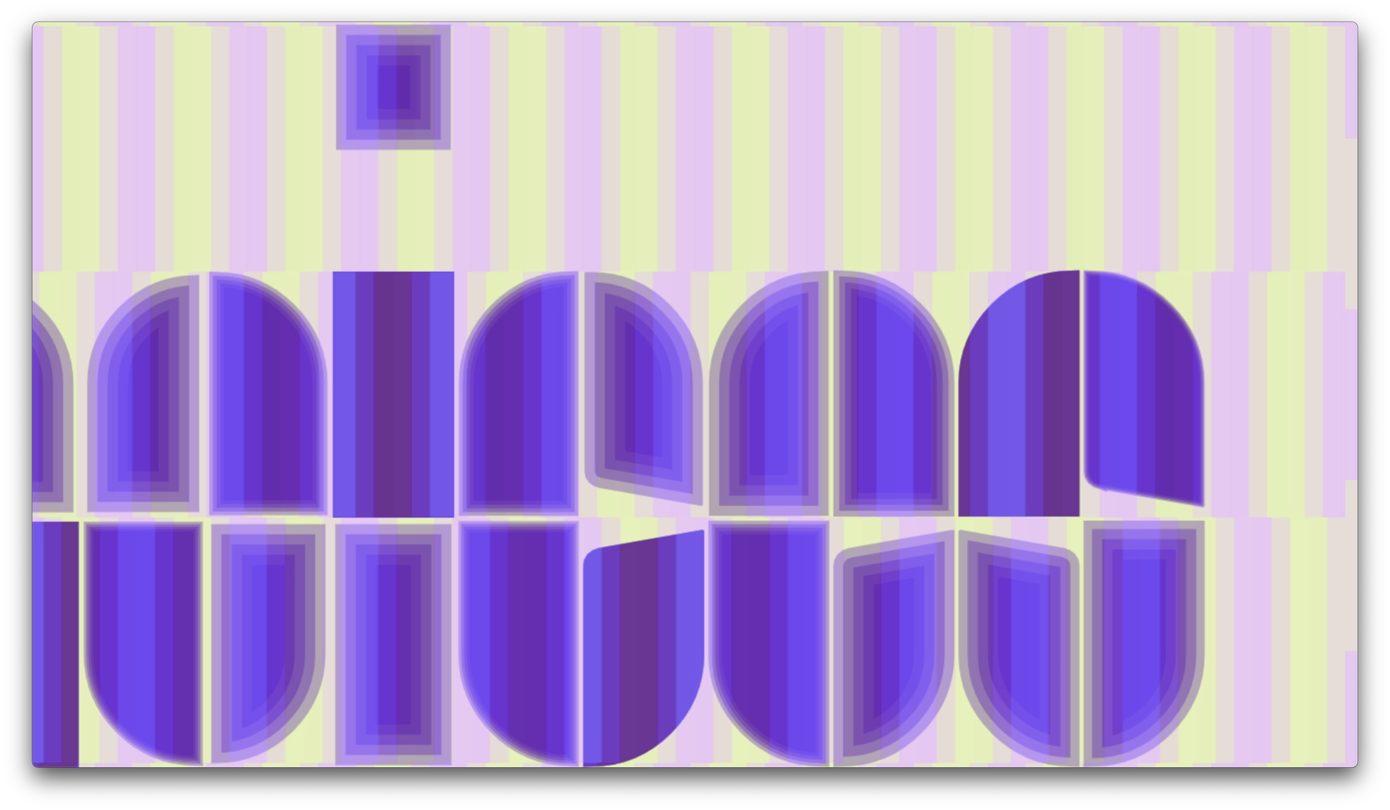
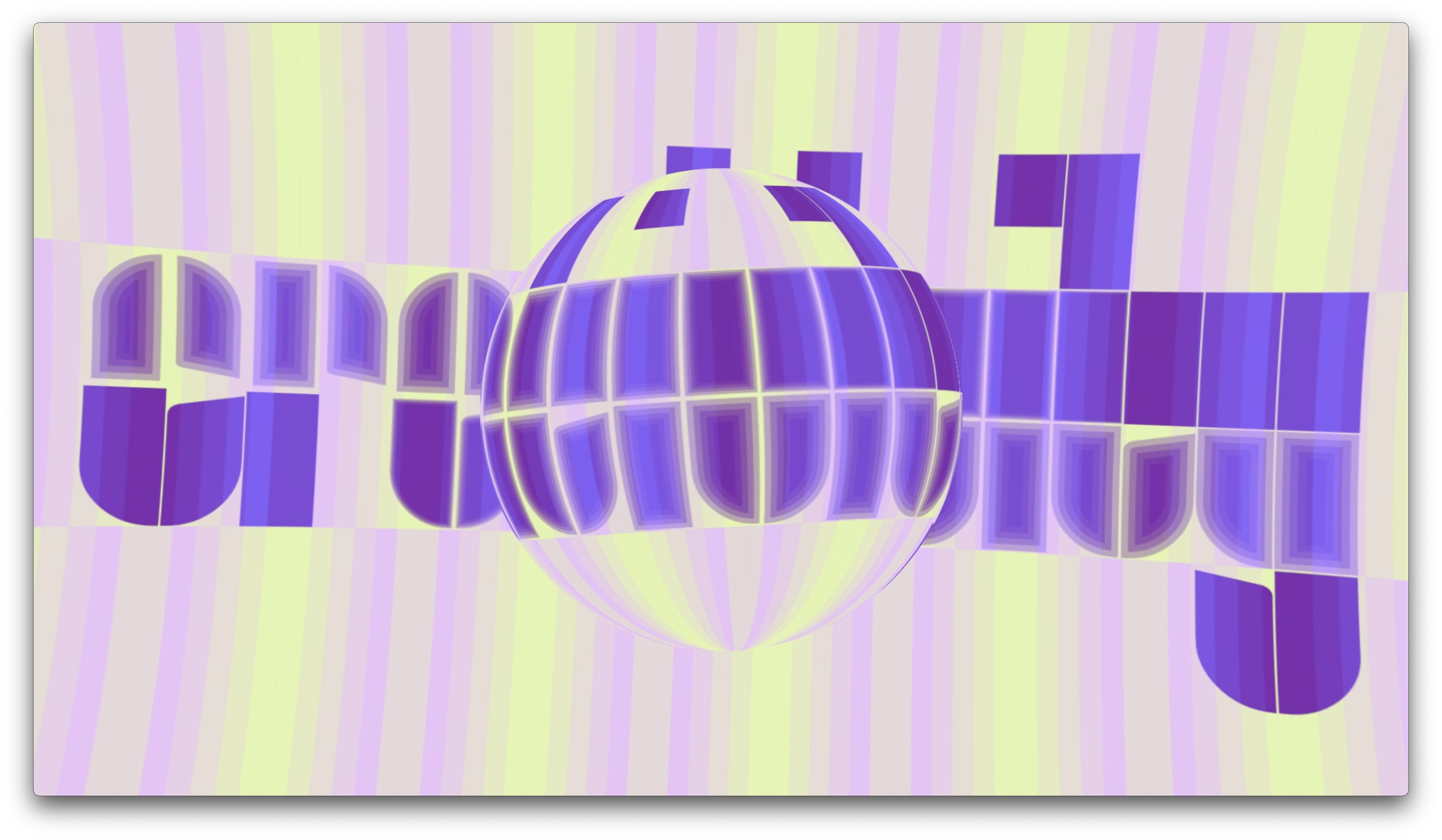
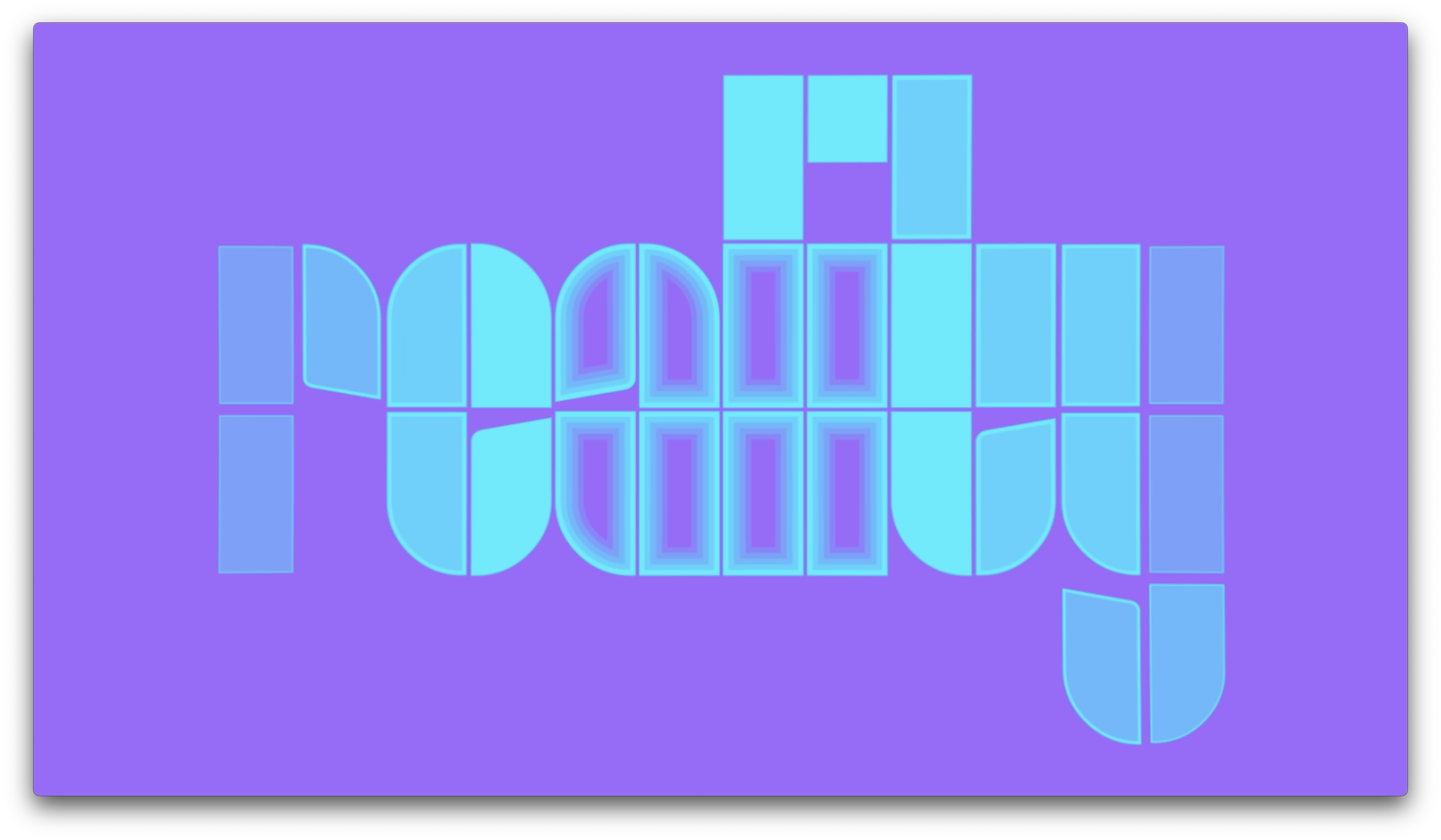
For the new Dutch Design Week brand identity we gave the almost 20-year-old logo, DDW’s tulip, a second life by styling it as the W in the event name. DDW’s tulip is a constellation of rectangles and quarter circles. These elements were also used in typographic experiments from the 1920s that were revised in 1963 by the late Wim Crouwel for the poster he created for painter Edgar Fernhout. It is this poster that our studio took as inspiration for the new Dutch Design Week brand identity. We expanded the 13 letters on the poster to produce an entire font.
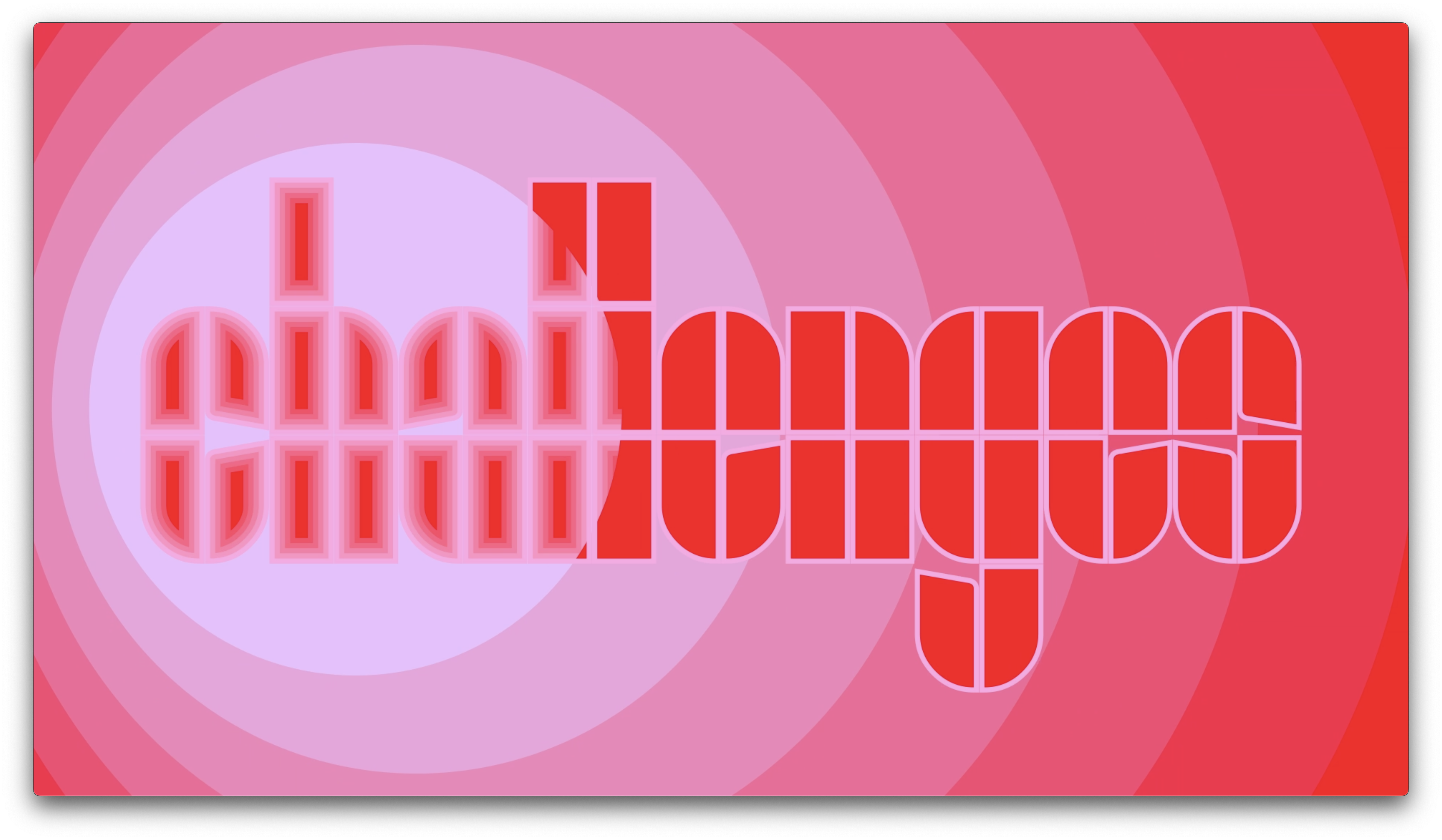
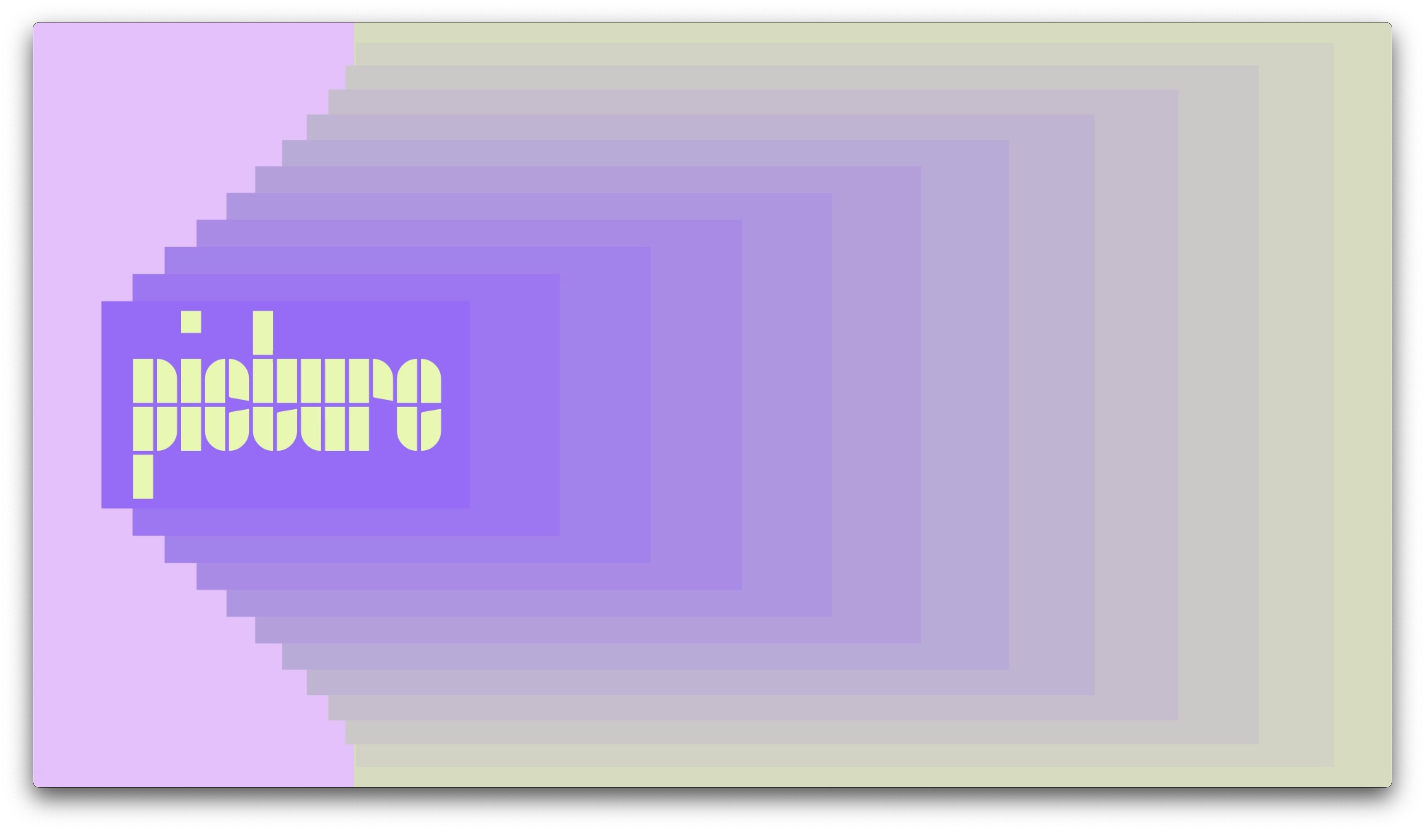
For the 2023 Dutch Design Week, themed "Picture This," we refreshed the visual identity to reflect the intricacies and multifaceted nature of design thinking.
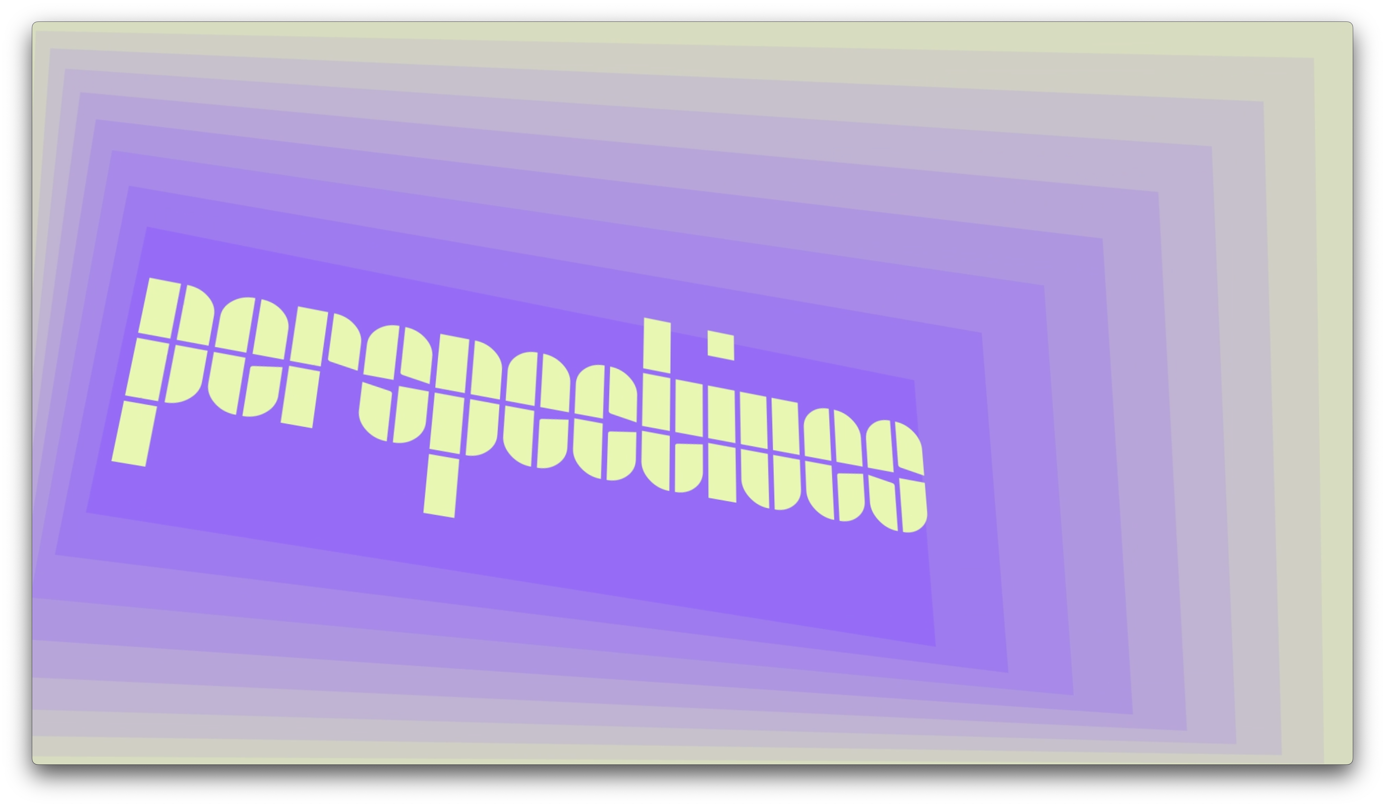
Our introduction of a "visual echo" concept represents the layers inherent in design – from concept to creation. In the identity, colors aren’t isolated entities; they overlap, blend, and stand in contrast, showing the fluid nature of design and how designers interact with their surroundings. In this adaptable and fluid identity, we envisioned this visual echo as a dynamic language that can be incorporated into the forms of the typeface. From that point, the echoed blocks and shades provided the flexibility to craft a variety of creative interpretations."
Credits