Imperia
With 90 years of experience, Imperia is one of the leading Italian players in the fresh pasta machines production, both for domestic and professional segments. After decades of undiscussed brand love, Imperia faced a need for repositioning. The aim is to refresh its image, redefine the meaning of Italianness, get closer to consumers, establish emotional engagement, and identify new potential audiences.
Imperia needed to shift from the 'nonna's brand' to a creative and experimental brand, fit to sell its products worldwide, with the most significant markets being Italy and the United States.
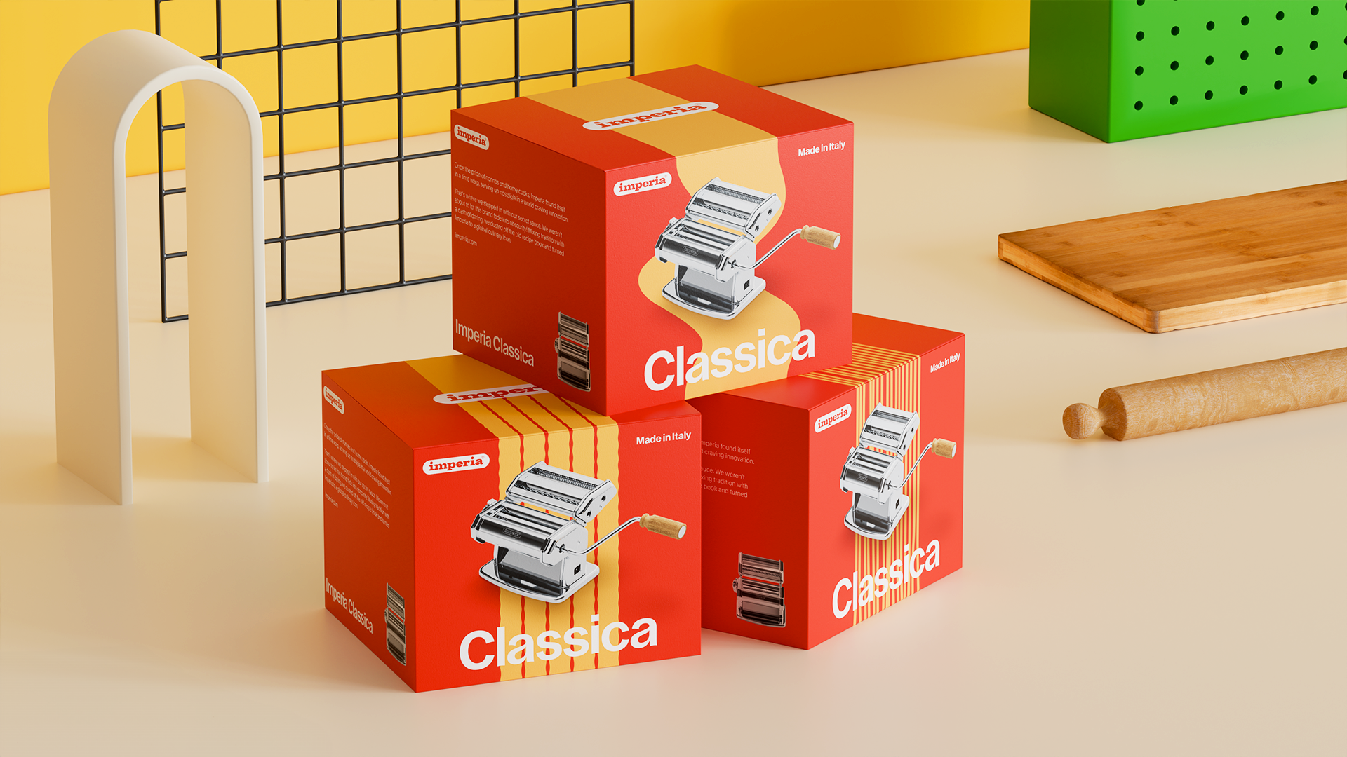
Aiming for a light rather than radical transformation that reflects the brand's heritage, the objective is the rebranding of the Imperia brand, maintaining it iconic, leveraging on its historical relevance, but bringing it to a contemporary context and making it relevant for new audiences.
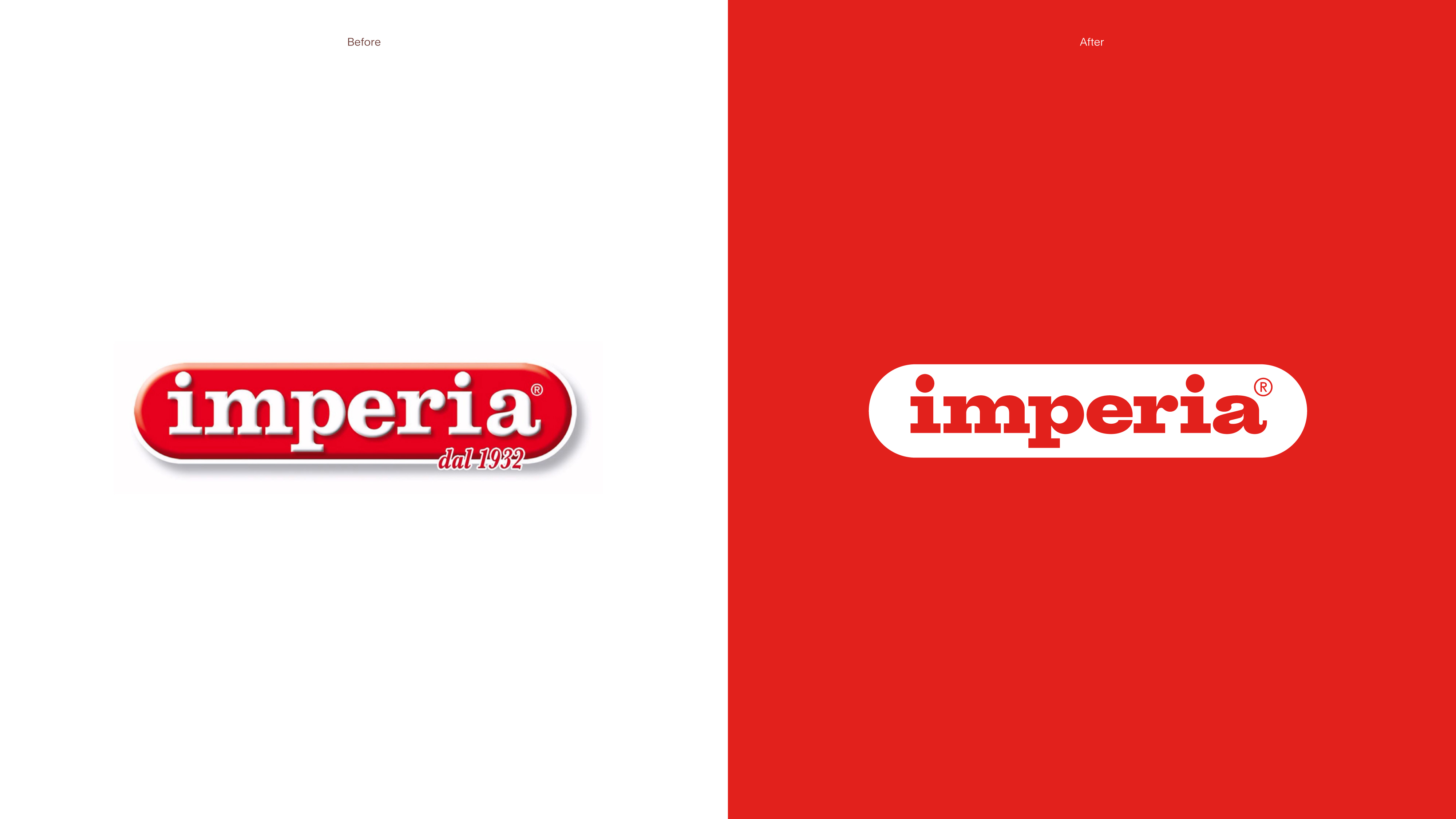
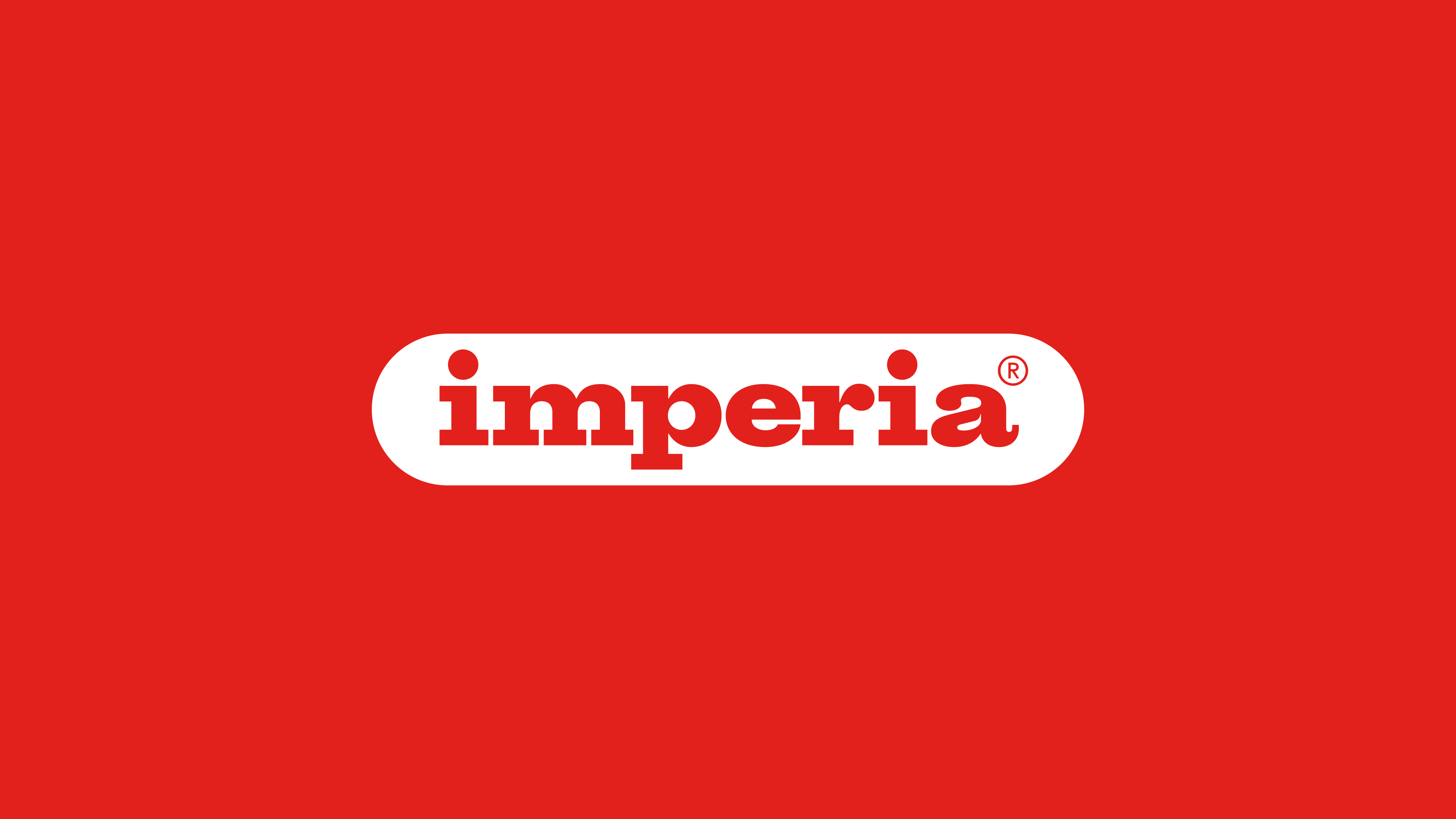
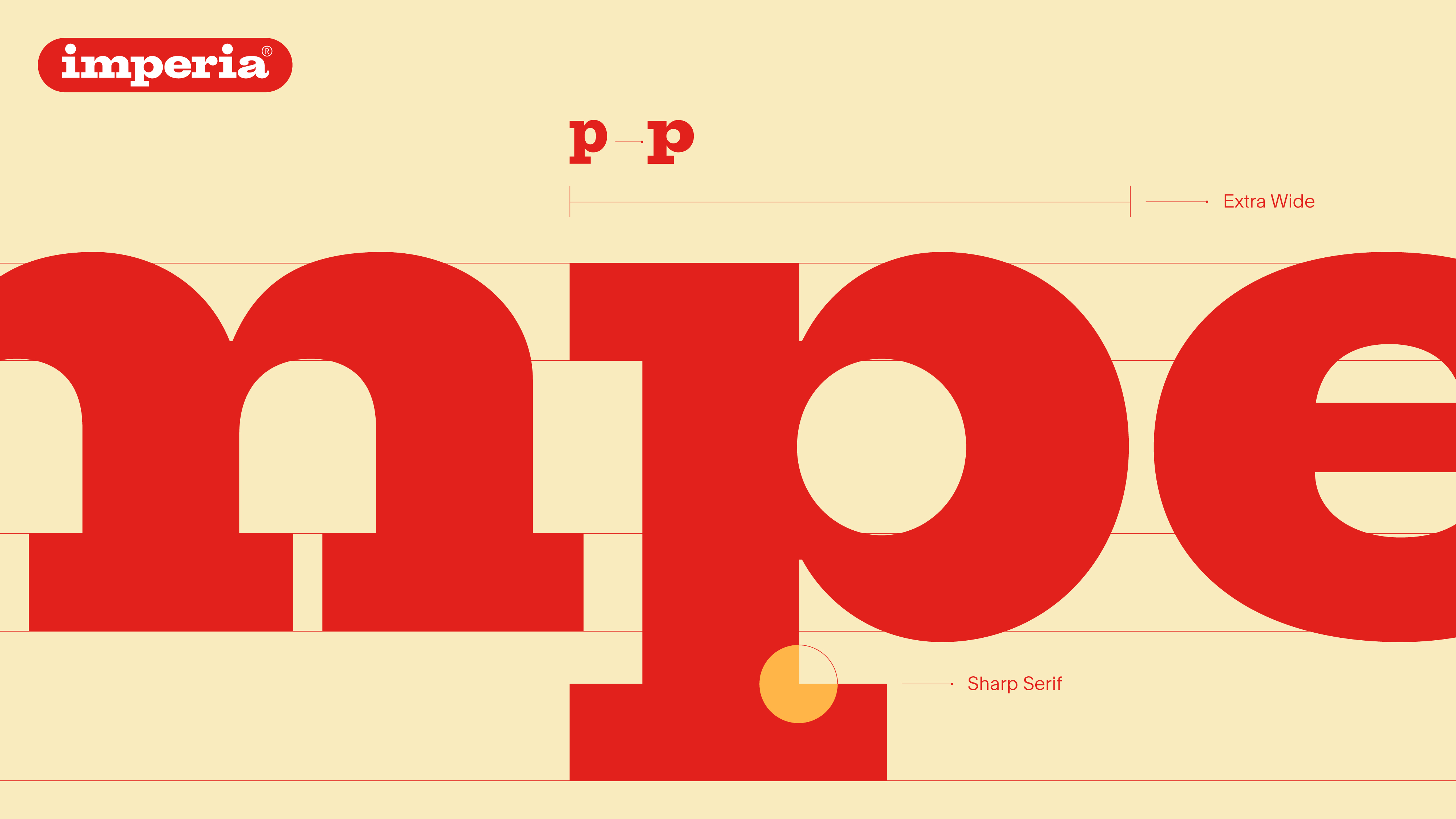
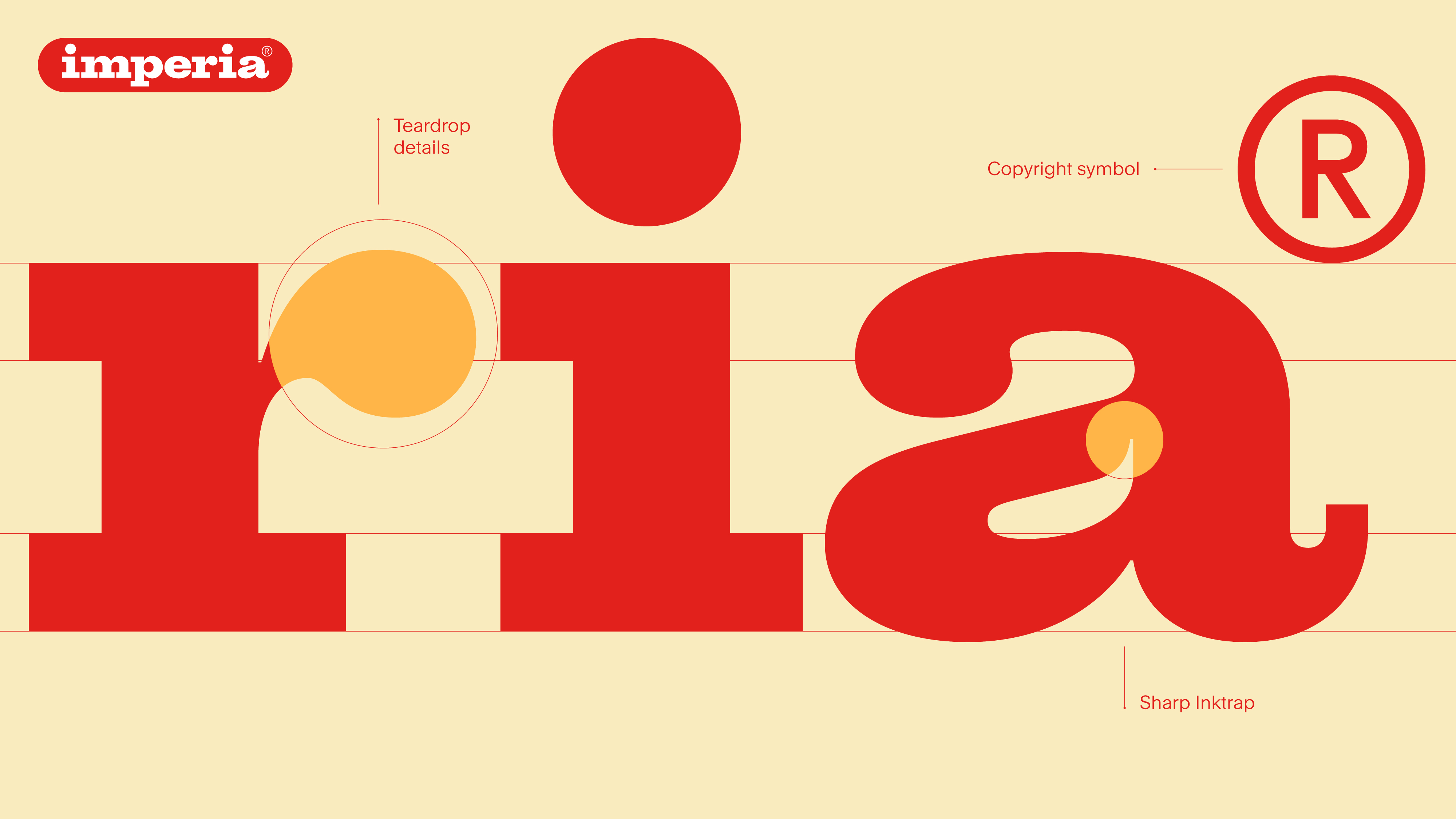
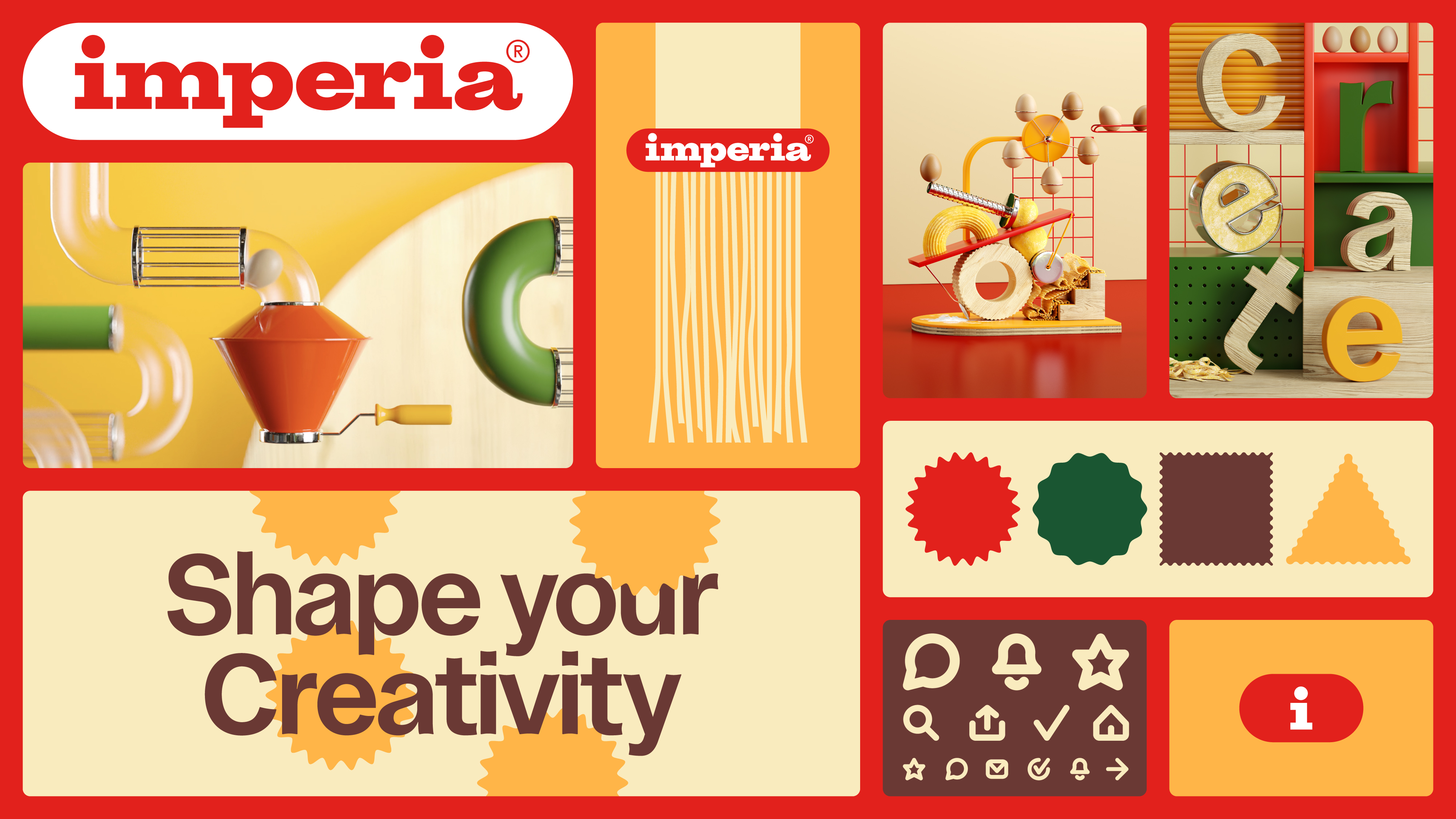
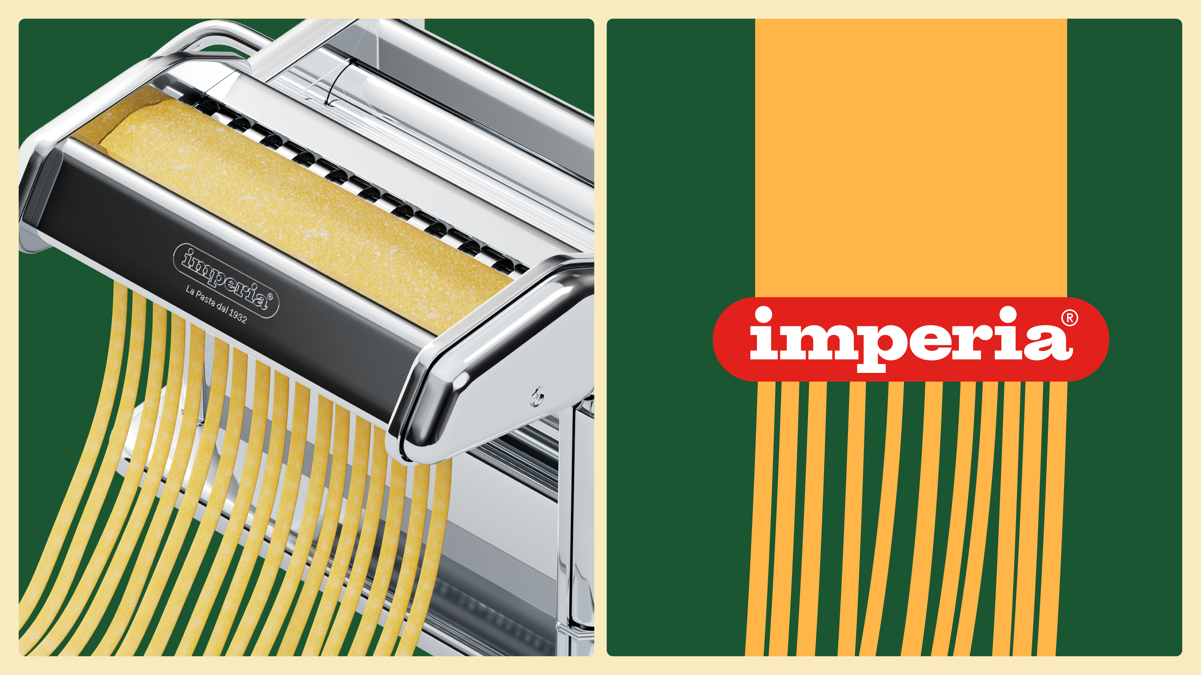
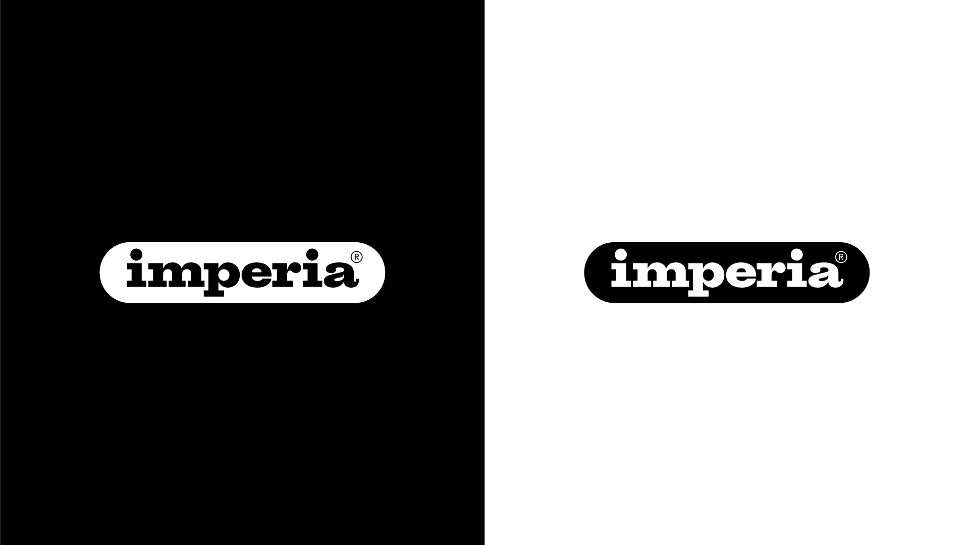
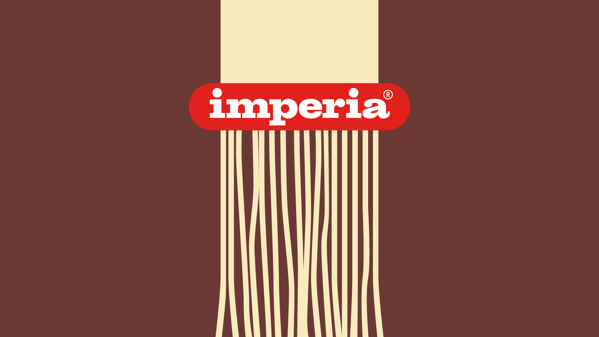
Landor crafted a logo that leverages heavily on the brand heritage; it is the result of extensive research into the brand's history and evolution. The iconic logo has been reworked bringing back its background shape, originally created in the 60s and iconic ever since and reintroducing the use of an extended typography, commonly found in ADV pieces from the 40s onwards, but made contemporary and functional. Moreover, in the brand look&feel the new logo becomes a key activator of experiences, a device that transforms matter into creativity, literally shaping every idea in the kitchen.
Credits