Music venue IDUNA
Iduna has been a household name in Drachten and beyond since the 1980s. As a music venue with a rich history in the pop, rock, and metal scene, it provides a space where passion, adventure, and self-reliance come together. The new visual identity and the unique typeface we designed are a direct translation of these core values.
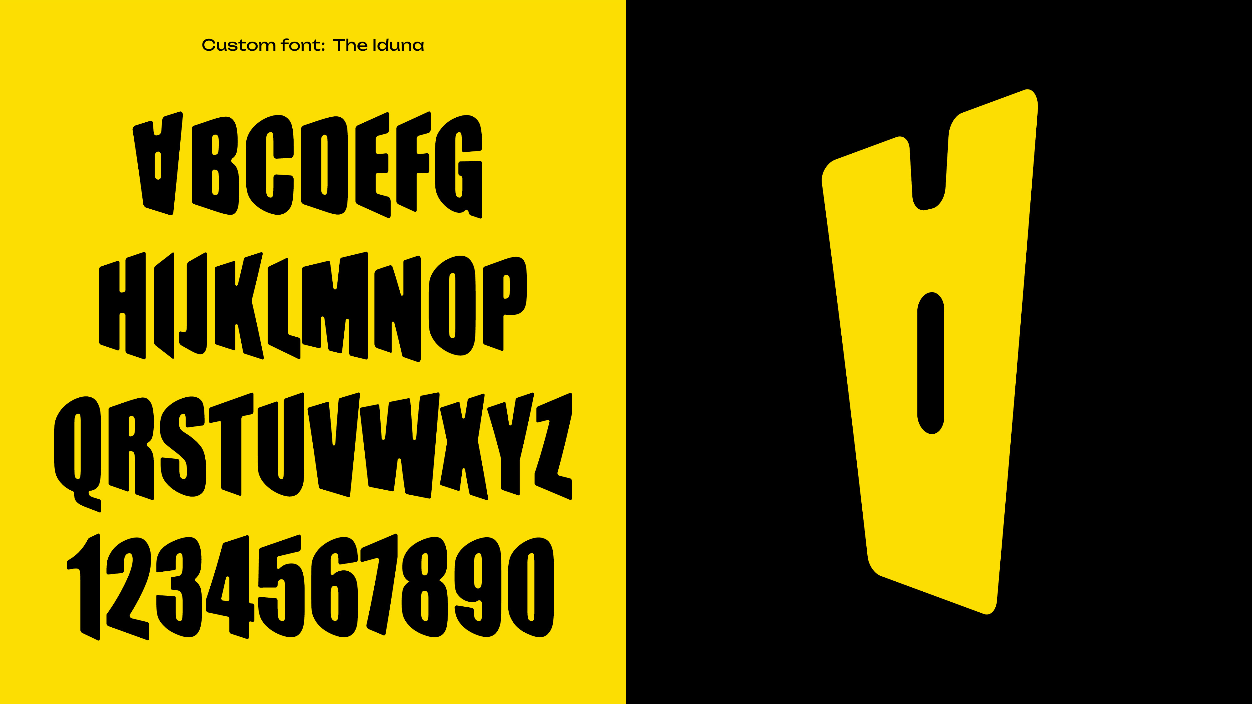
A Typeface with a Statement
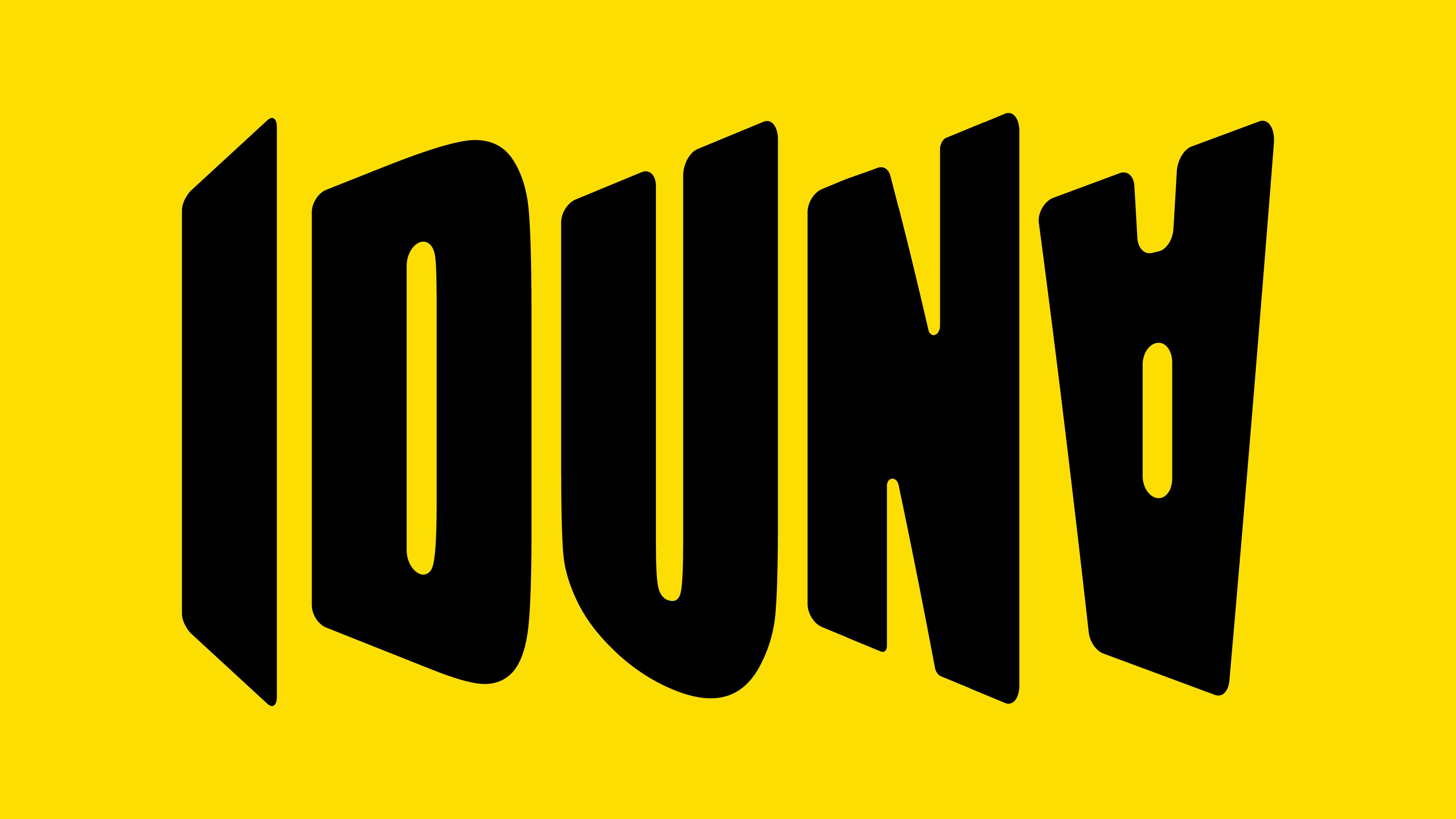
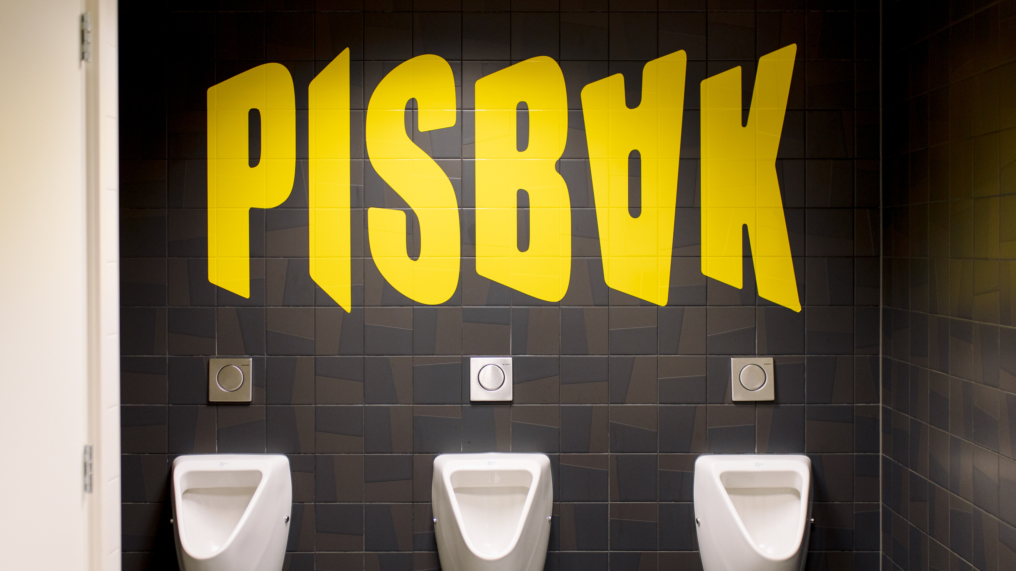
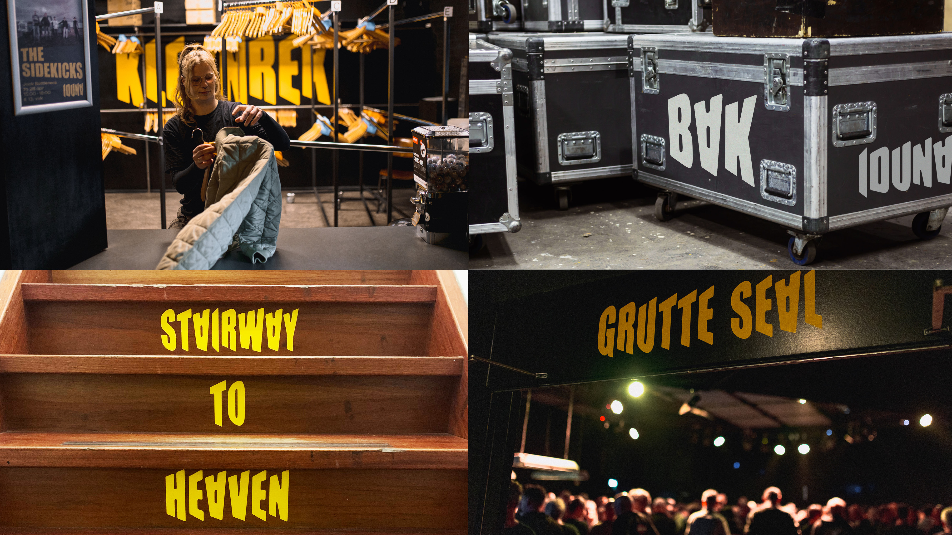
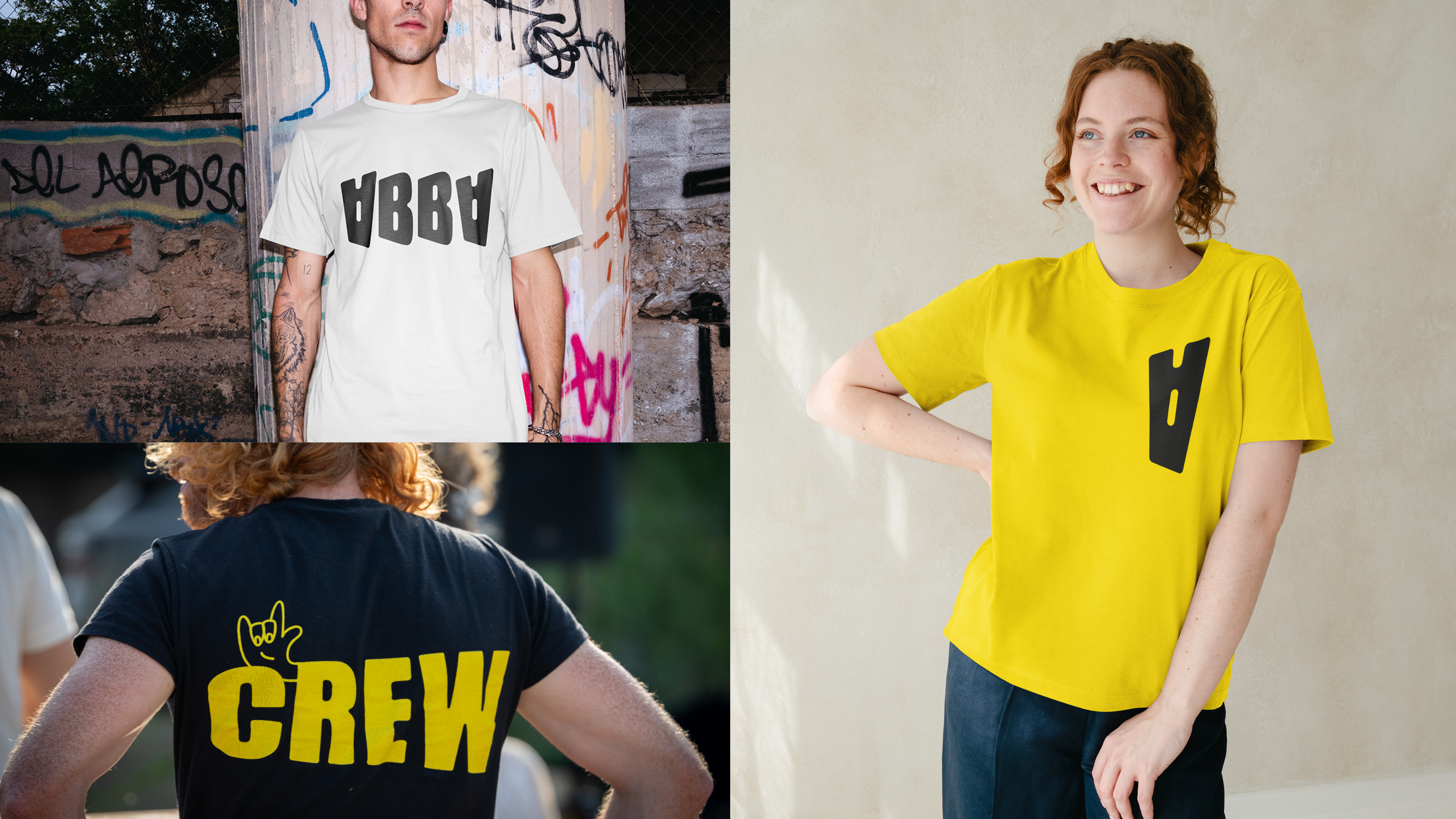
The Iduna typeface was created to shout from the rooftops, both literally and figuratively. It is a tribute to Iduna’s rebellious past, dynamic and distinctive—just like the venue itself. The most striking feature is the inverted ‘A’—a deliberate choice that holds multiple layers of meaning.
The Inverted ‘A’ and the Frisian Language
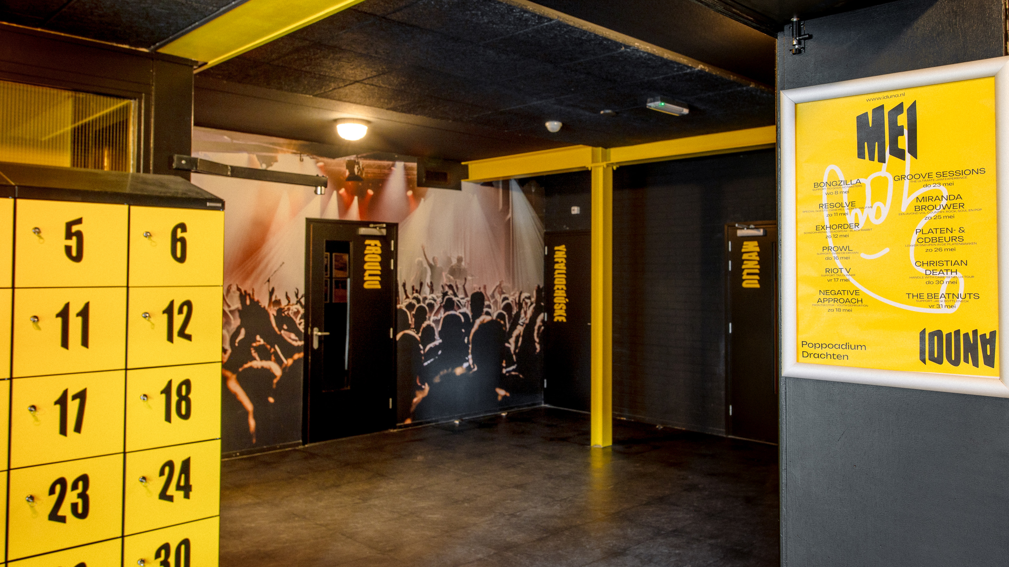
The inverted 'A' represents a crucial linguistic distinction between Dutch and Frisian. While the Dutch word for music venue is "poppodium," in Frisian—a minority language spoken by approximately 425,000 people in the Northern Netherlands—it's "poppoadium." By prominently featuring this inverted 'A', we celebrate Iduna's Frisian heritage and make the region's linguistic identity visible in all communications. This aligns perfectly with governmental efforts to protect and promote the Frisian language, earning us an honorary mention from the Council of the Frisian Movement for our contribution to Frisian visibility in public spaces.
A Bold and Recognizable Style
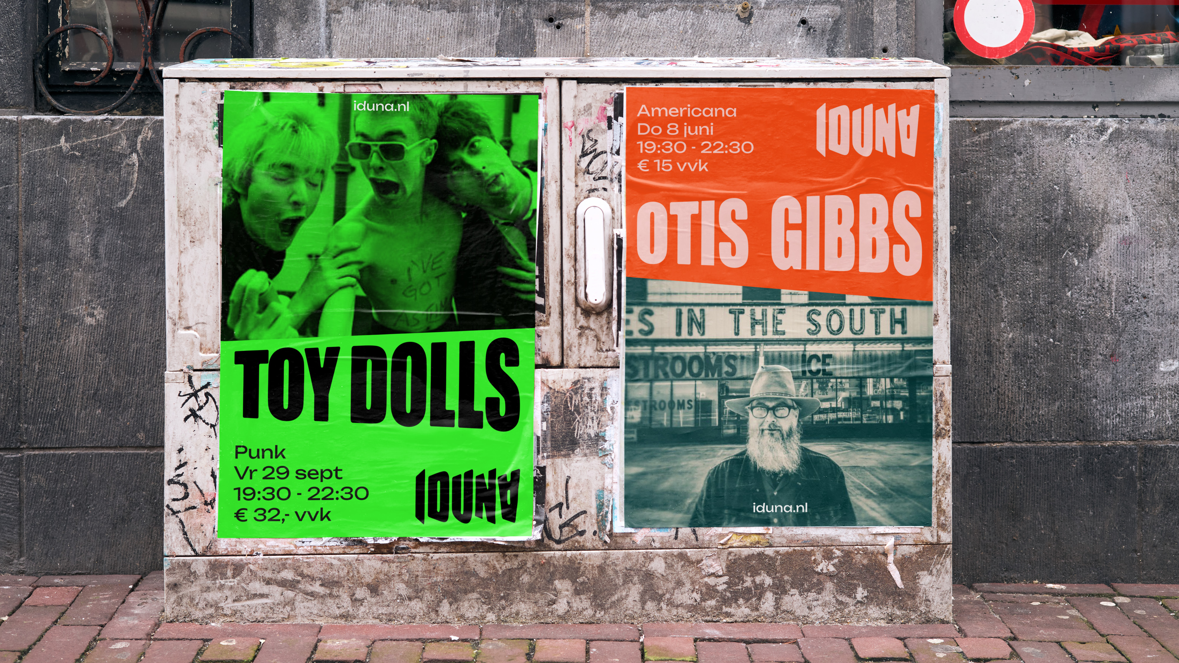
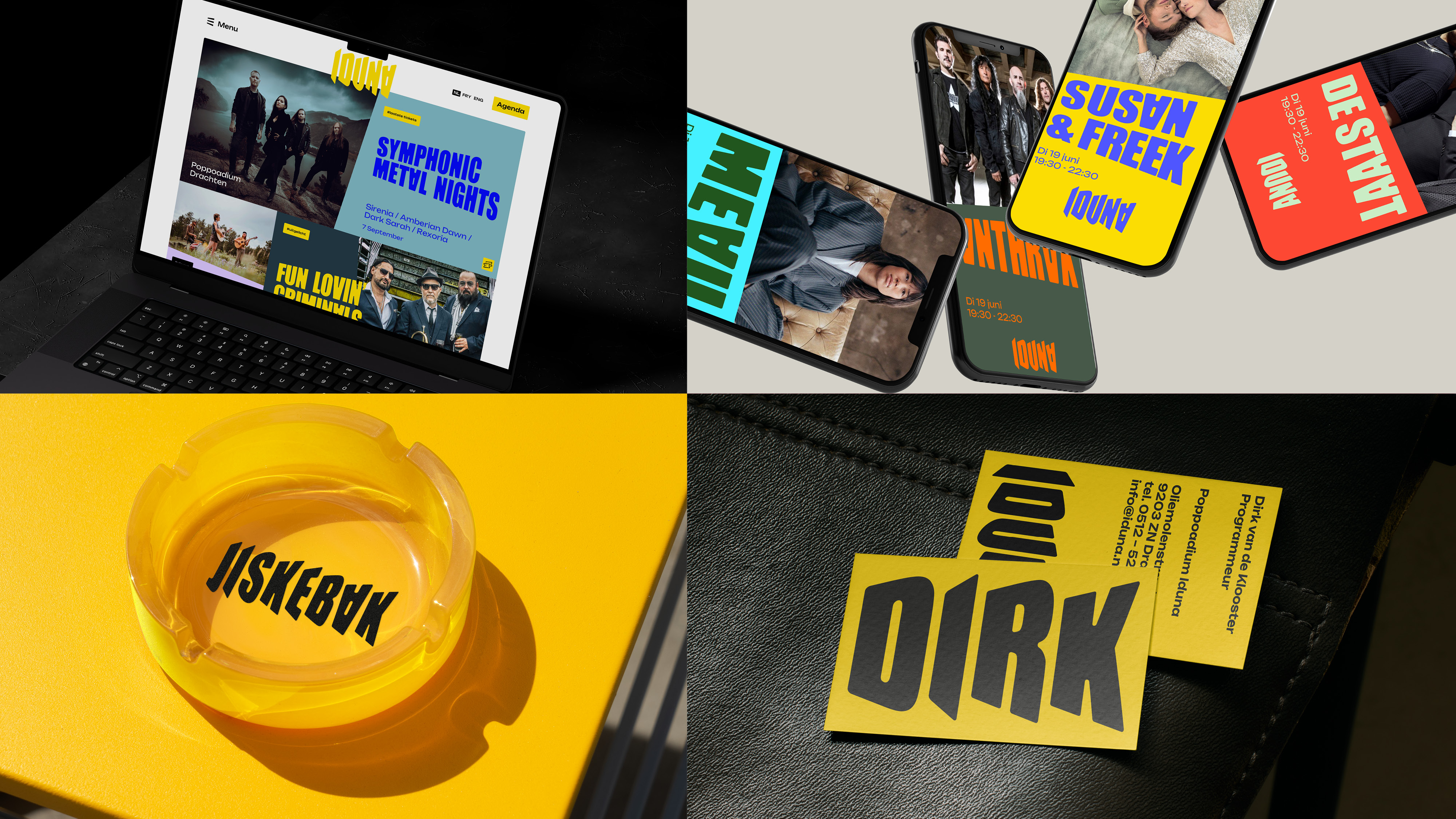
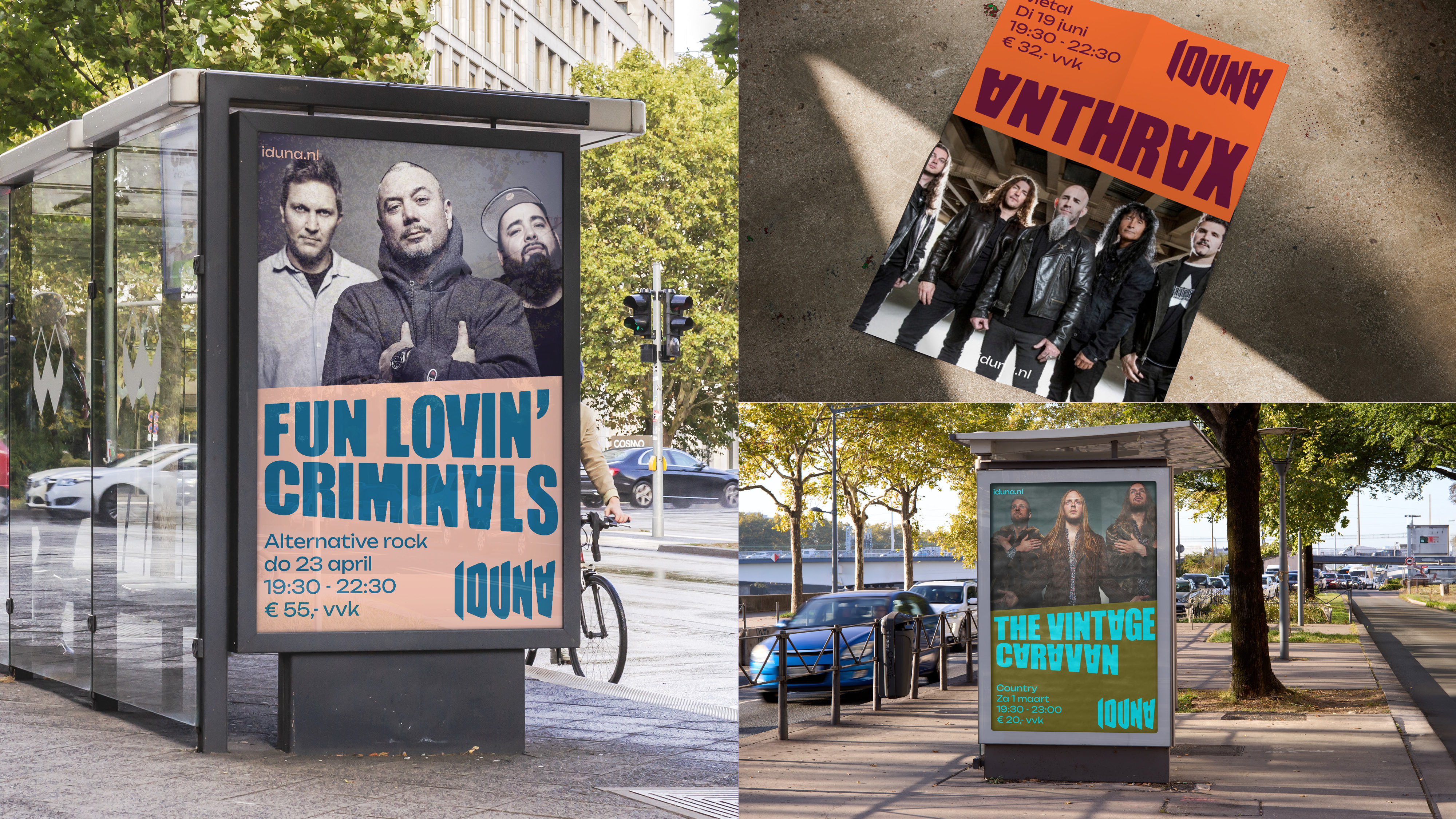
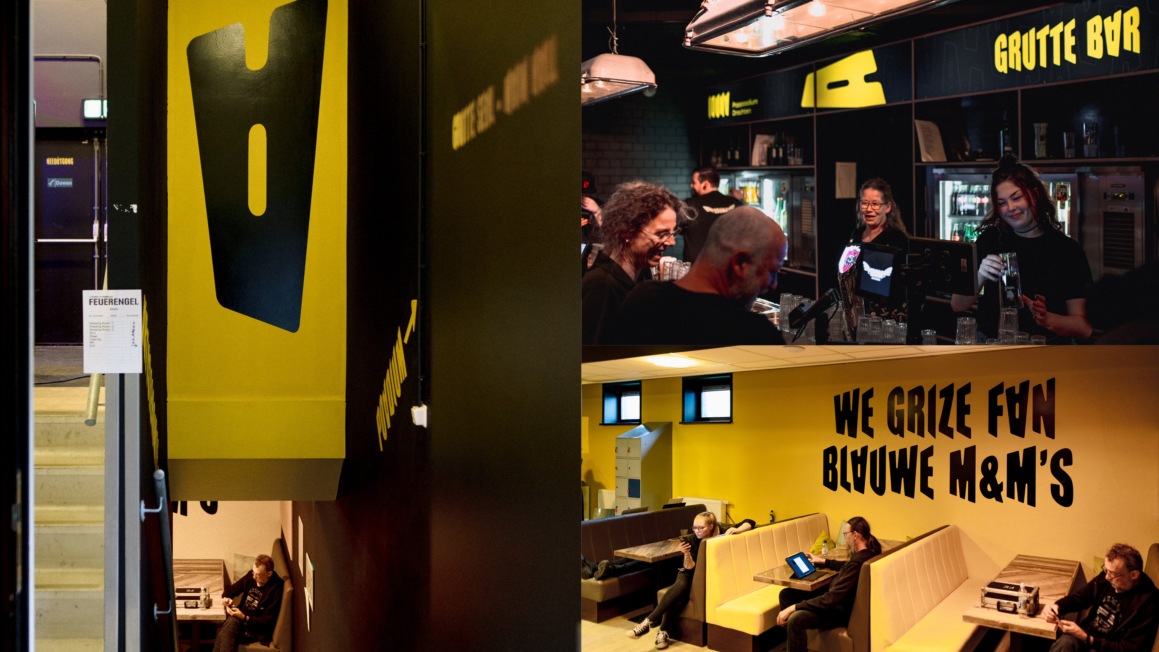
The Iduna font is more than just a typographic choice; it is a tool that sets Iduna apart from other music venues. Since 90% of a music venue’s communication revolves around conveying program information, creating a unique identity can be challenging. With our custom typeface—where band names become part of Iduna’s visual style—the venue now has a distinctive and recognizable aesthetic consistently applied across posters, signage, and digital communication.
A Self-Made Typeface for a Self-Made Venue
The Iduna typeface reflects the venue itself: self-made, passionate, adventurous, and with a nod to its past. It delivers a visual identity that not only strengthens Iduna’s external presence but also highlights its role as an accessible venue for a wide range of acts and genres.
Iduna remains a vibrant hub of creativity and music. And with this unique typeface, that energy becomes tangible, perceptible, and, above all, visible.
Credits