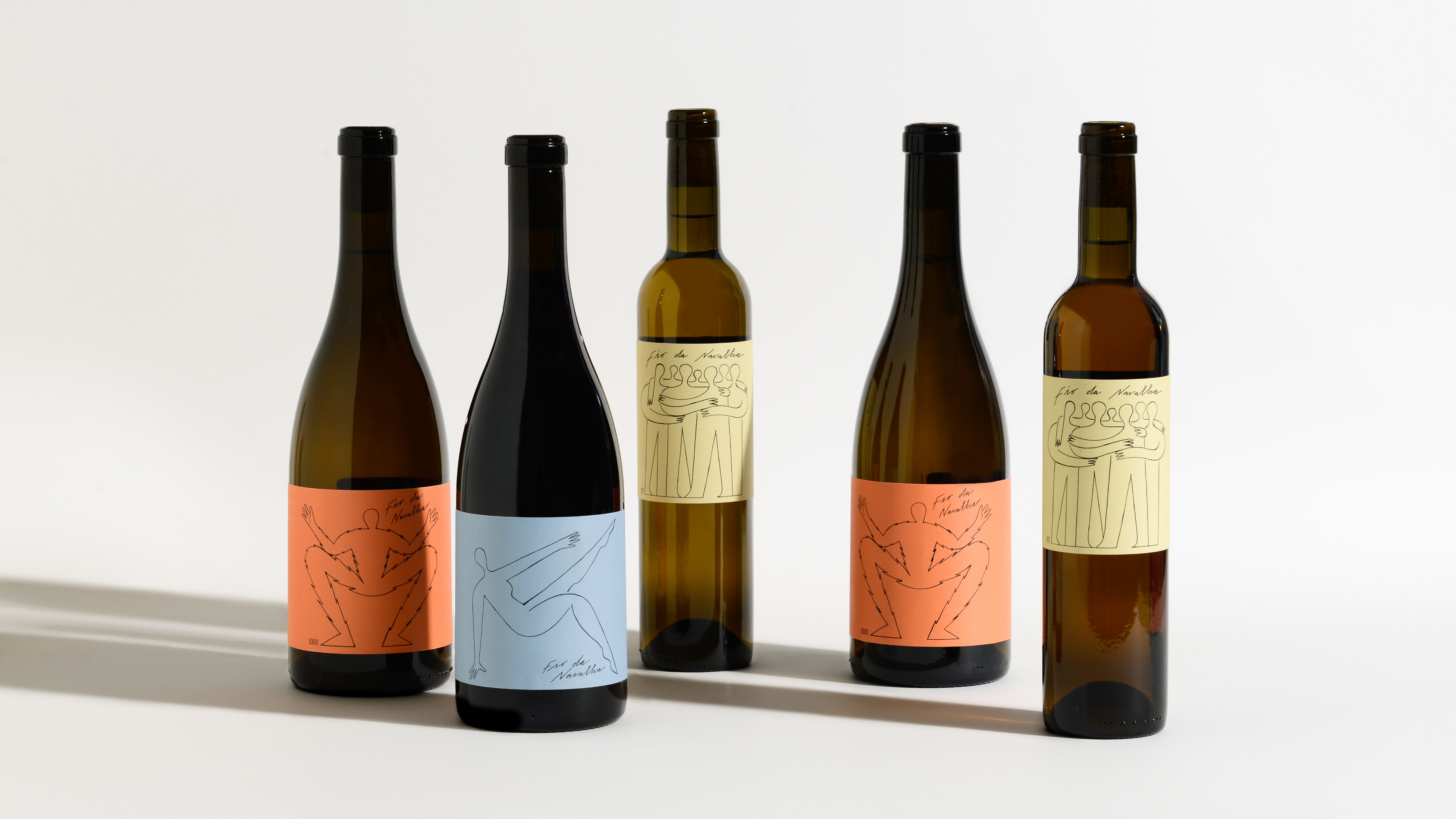
Fio da Navalha
FIO DA NAVALHA is a recent portfolio of wines from Esporão, a wine estate located in Alentejo, south of Portugal. The geographical boundaries of Herdade do Esporão (originally Defesa do Esporão) were established in 1267, and have remained practically unchanged. The Esporão brand was created in 1985, and since then the company holds a solid position in the wine and olive oil market.
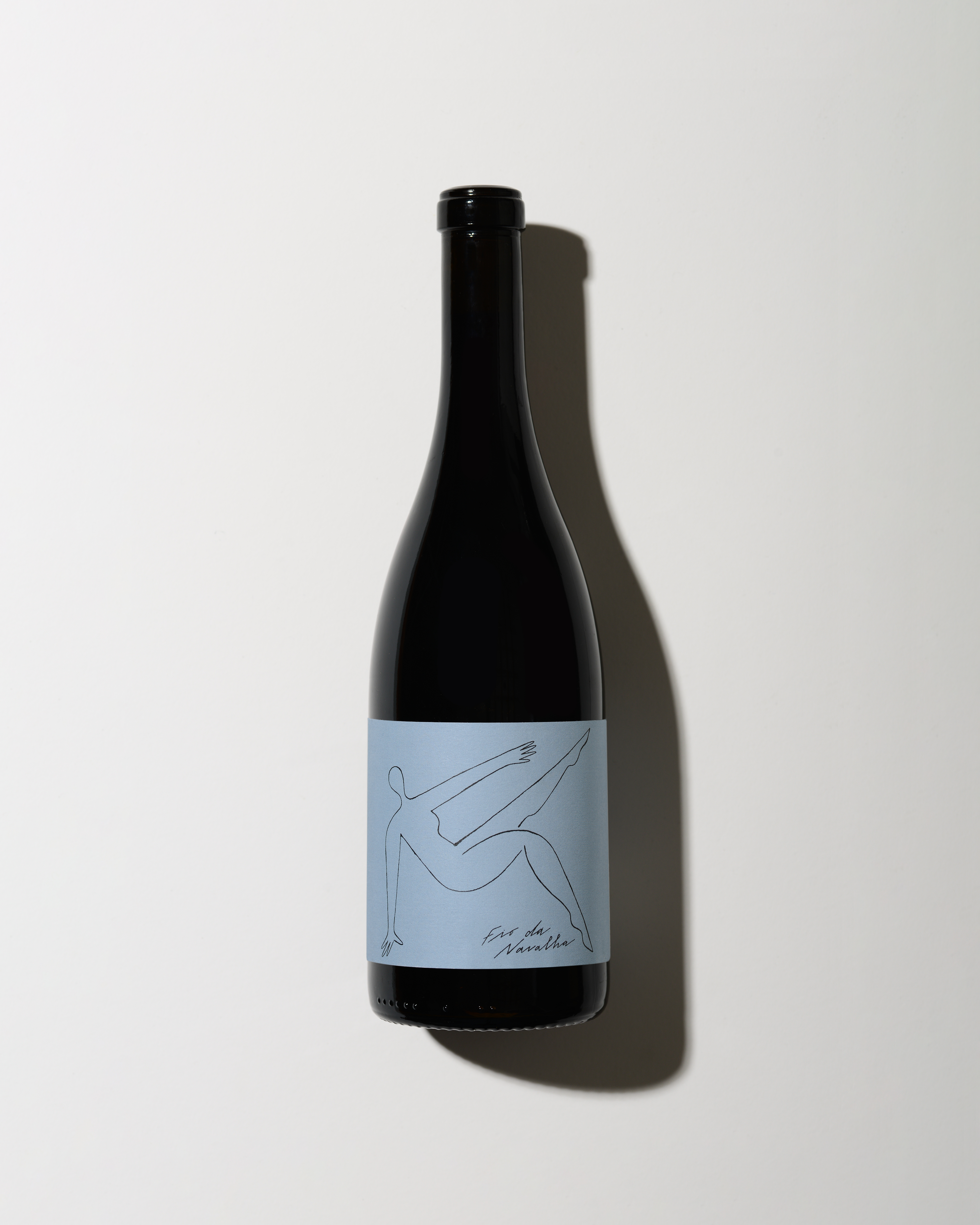
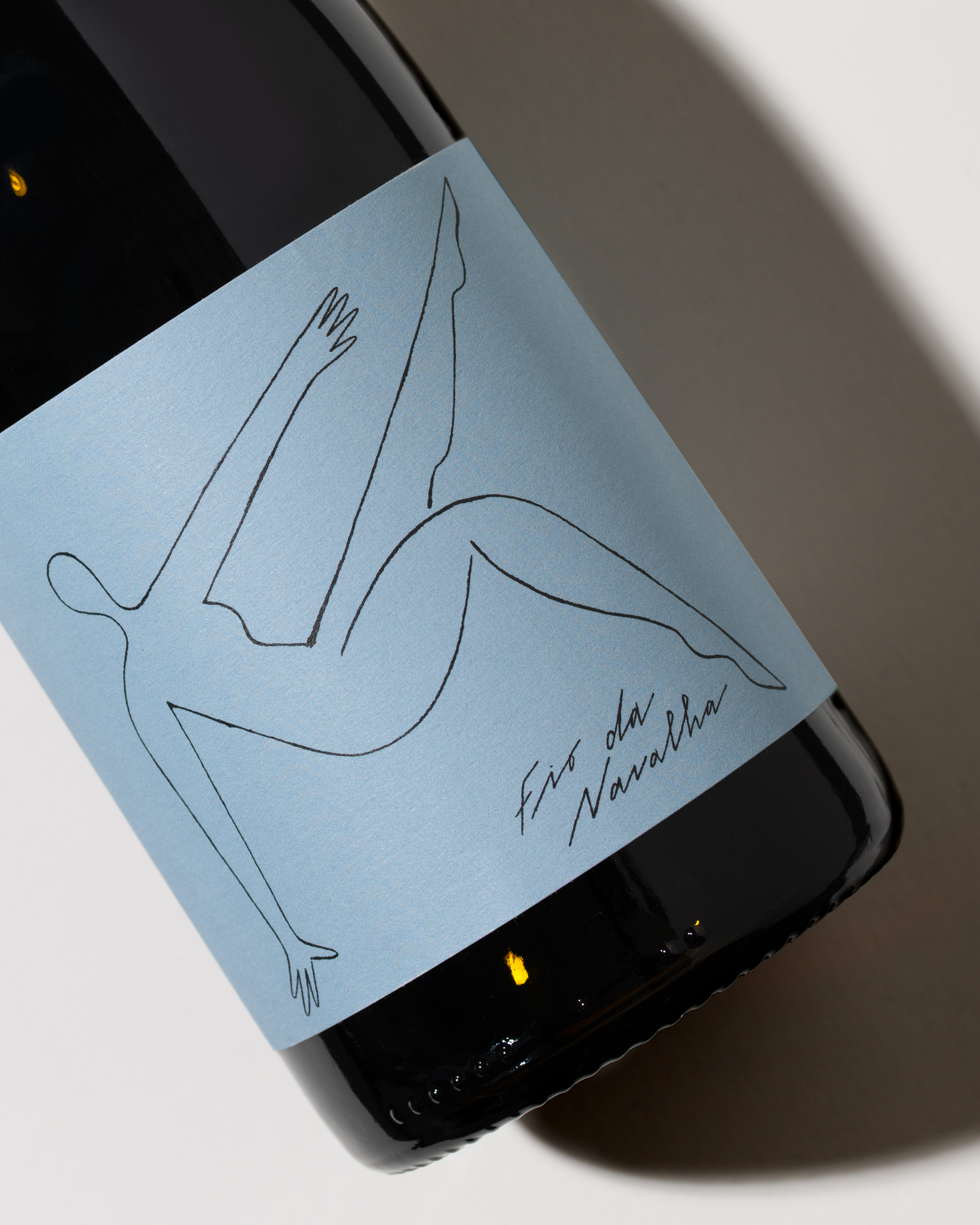
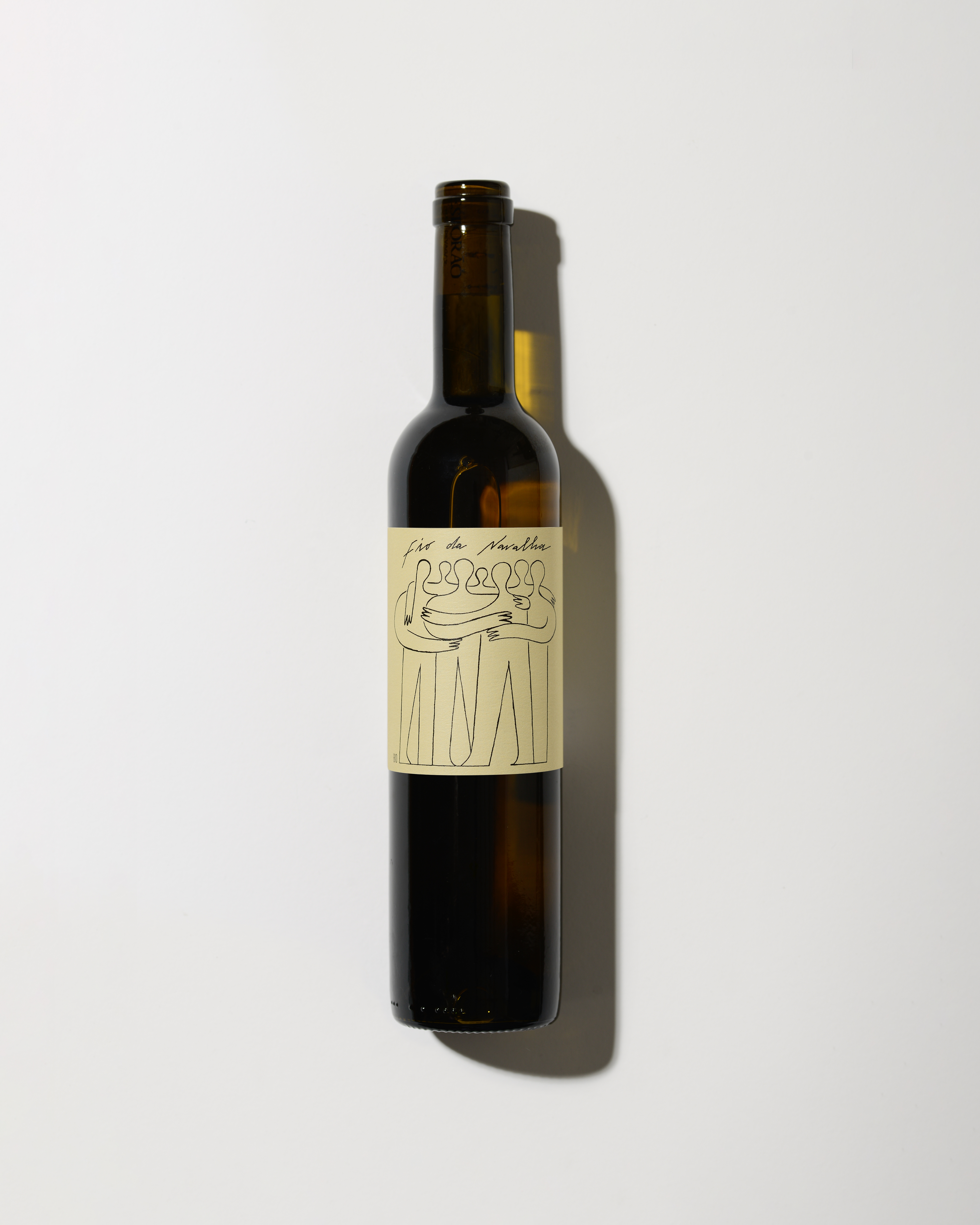
FIO DA NAVALHA means ‘razor’s edge’ and refers to taking risks and trying new, different things. Mixing different geographies, altitudes and sun exposures, different attitudes, people and methods, different soil types, varieties and climates. It walks the fine line between error and success, embracing the mistakes along the way. It’s a new philosophy for Esporão, a long-established brand, so it had to be met with a new approach to label design. For this project, Studio Eduardo Aires commissioned and art directed illustrator Lourenço Providência to illustrate the 3 different labels: No Campo, Curtido e Primário. The result is a contemporary approach to wine label design, distant from it’s most classical grammar and canons, with aery illustrations, handwritten lettering and an unusual use of colour.
Credits