Alles außer flach
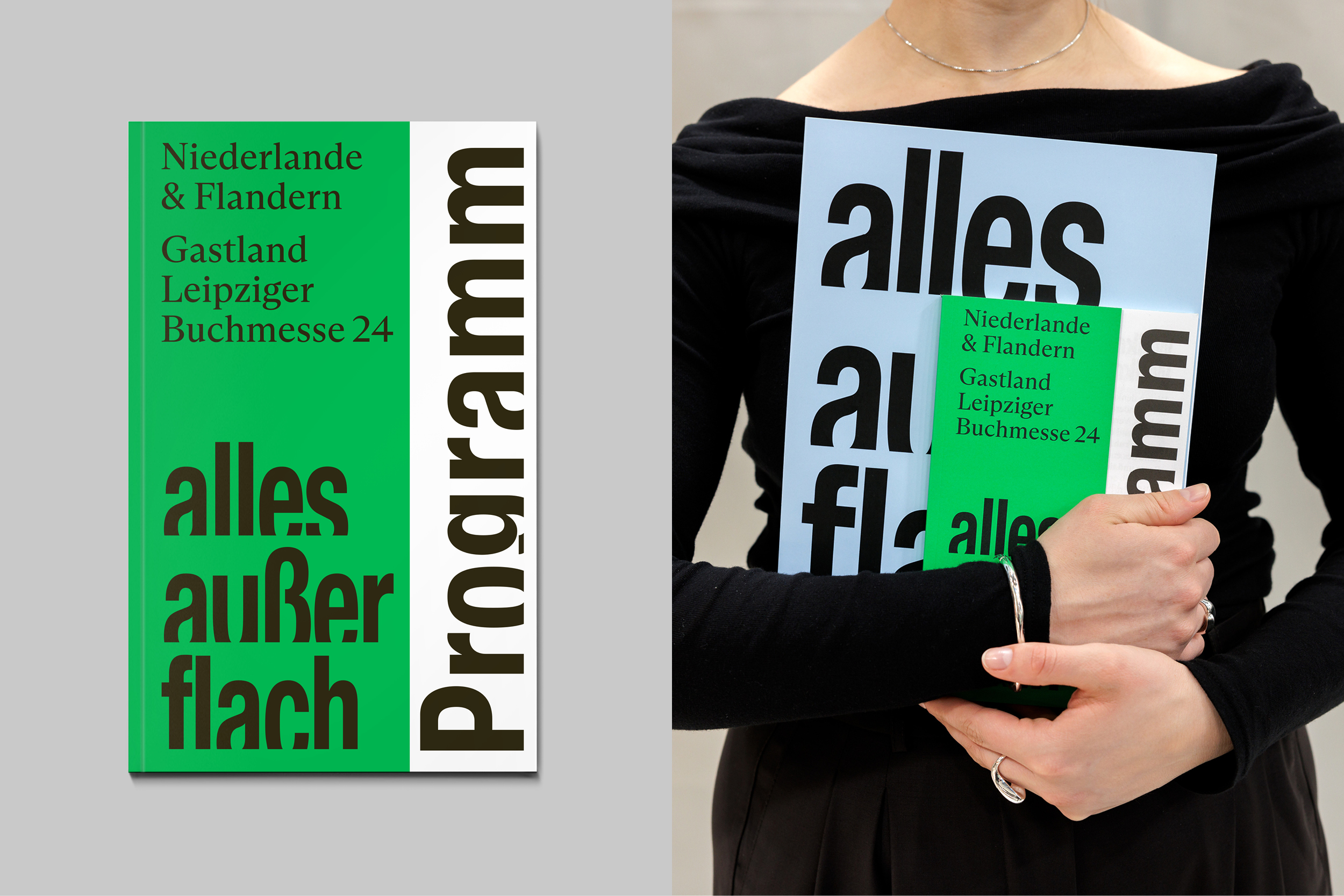
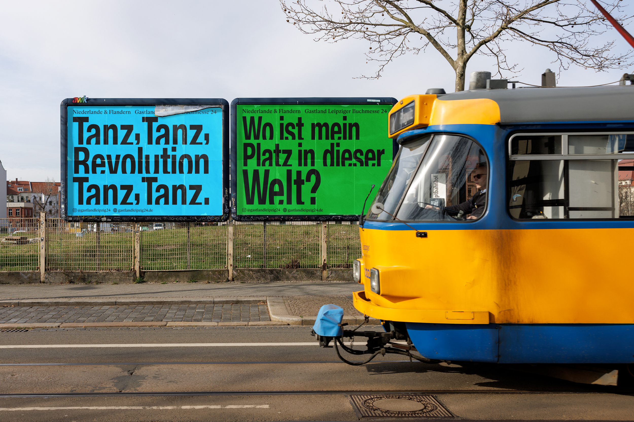
The Alles außer flach campaign for the Dutch-Flemish Guest of Honour at Leipziger Buchmesse 2024 is a bold exploration of typographic design, showcasing the versatility and power of a custom-made typeface, creating a unique visual identity. The campaign's typographic application centers around a custom-designed typeface—Alles außer flach—which embodies the rising prominence of Dutch and Flemish literature within the German cultural landscape.
Designed specifically for this campaign, the typeface is a visual metaphor for the increasing visibility of Dutch and Flemish voices in Germany. Alles außer flach is a dynamic, strong typeface that rises from the horizon, symbolizing the flourishing of a new generation of authors and the cultural exchange between the Low Countries and Germany. The typeface was carefully constructed to balance both legibility and character, ensuring that the design never compromises readability. Each letter form is rooted in a grounded, organic feel while evoking a sense of movement and energy.
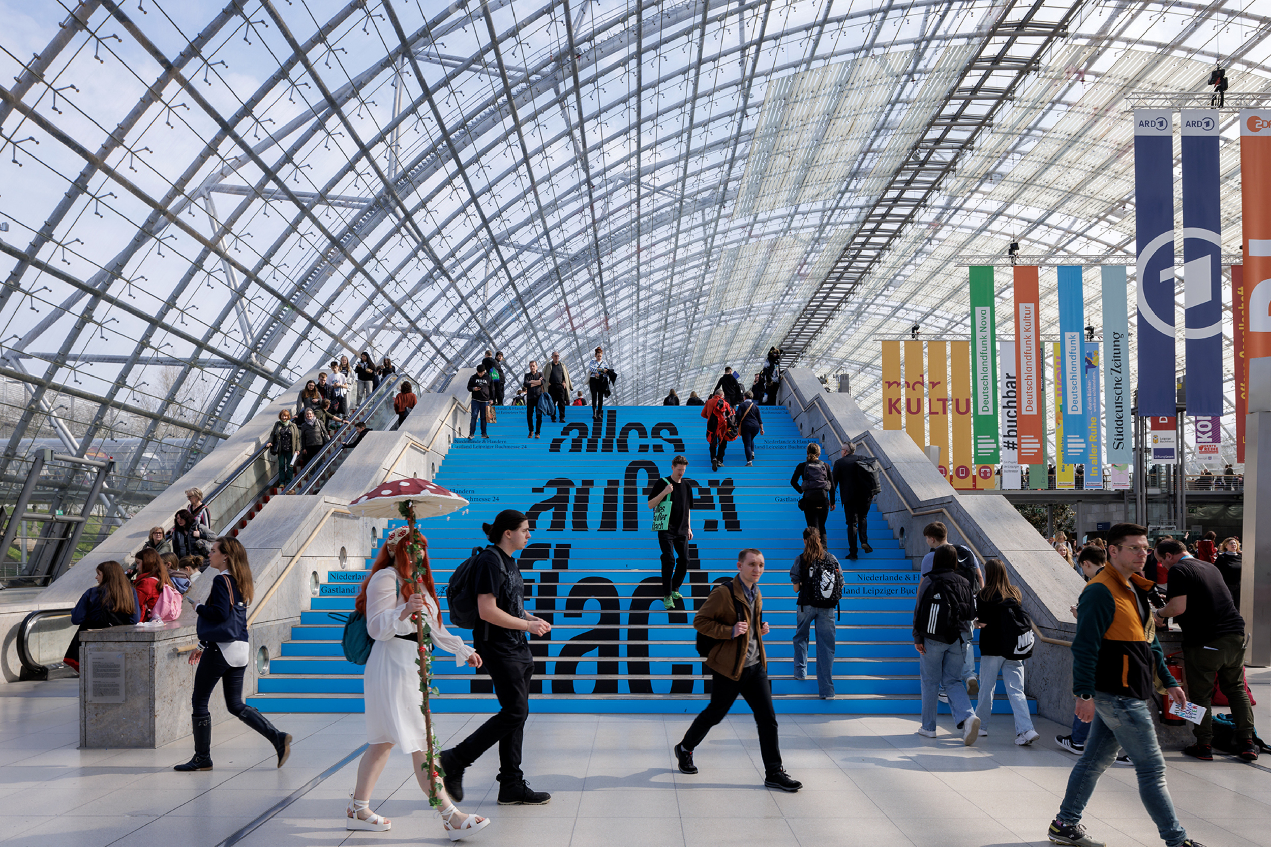
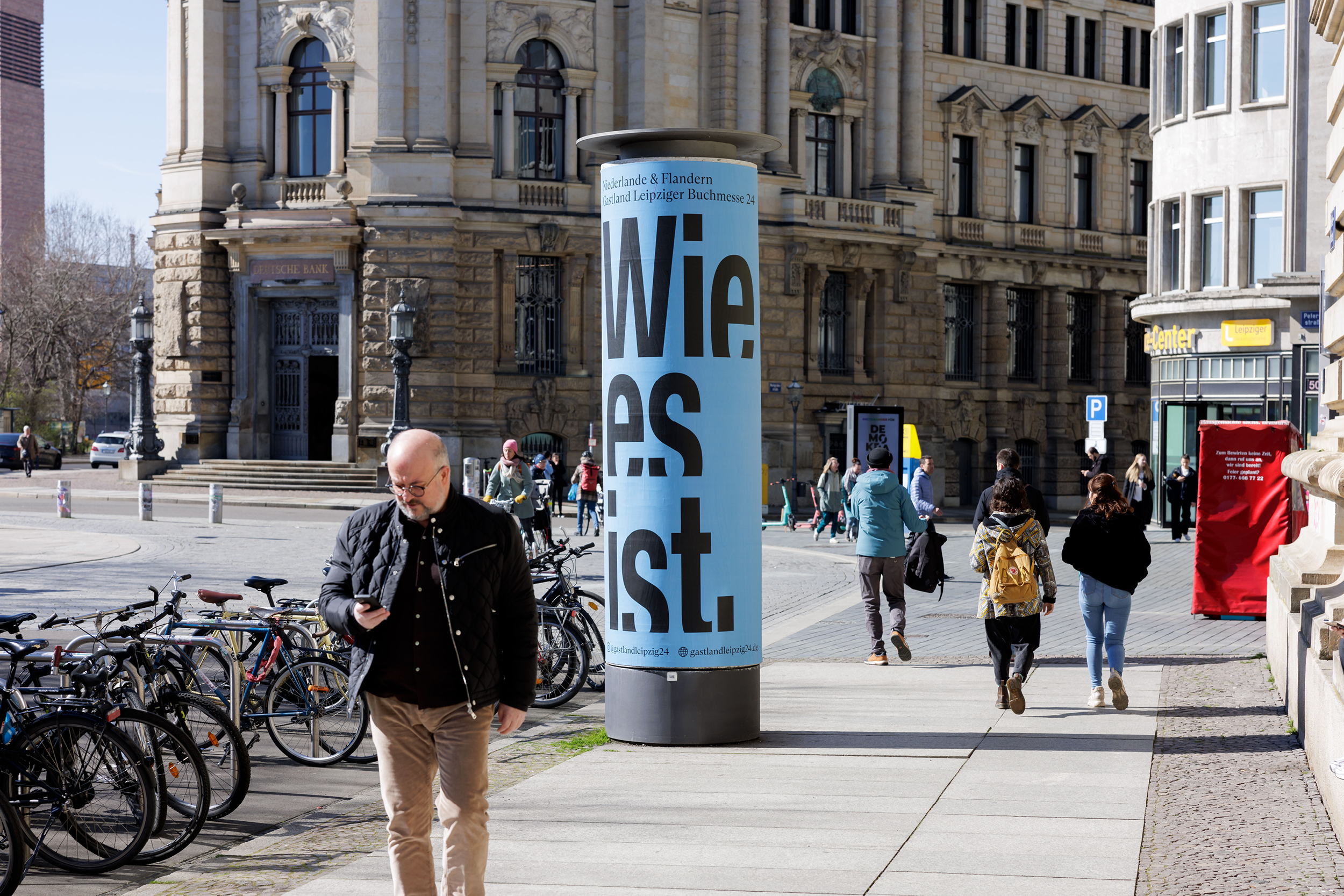
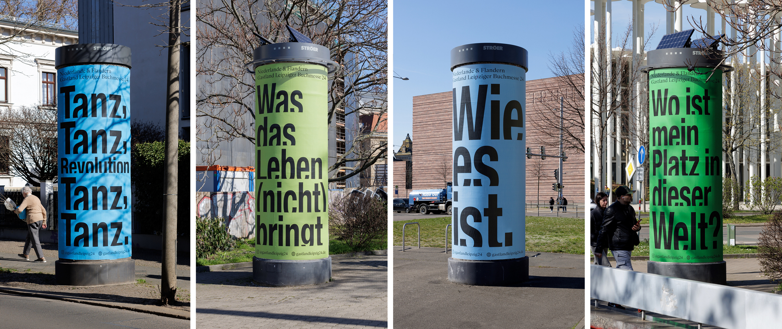
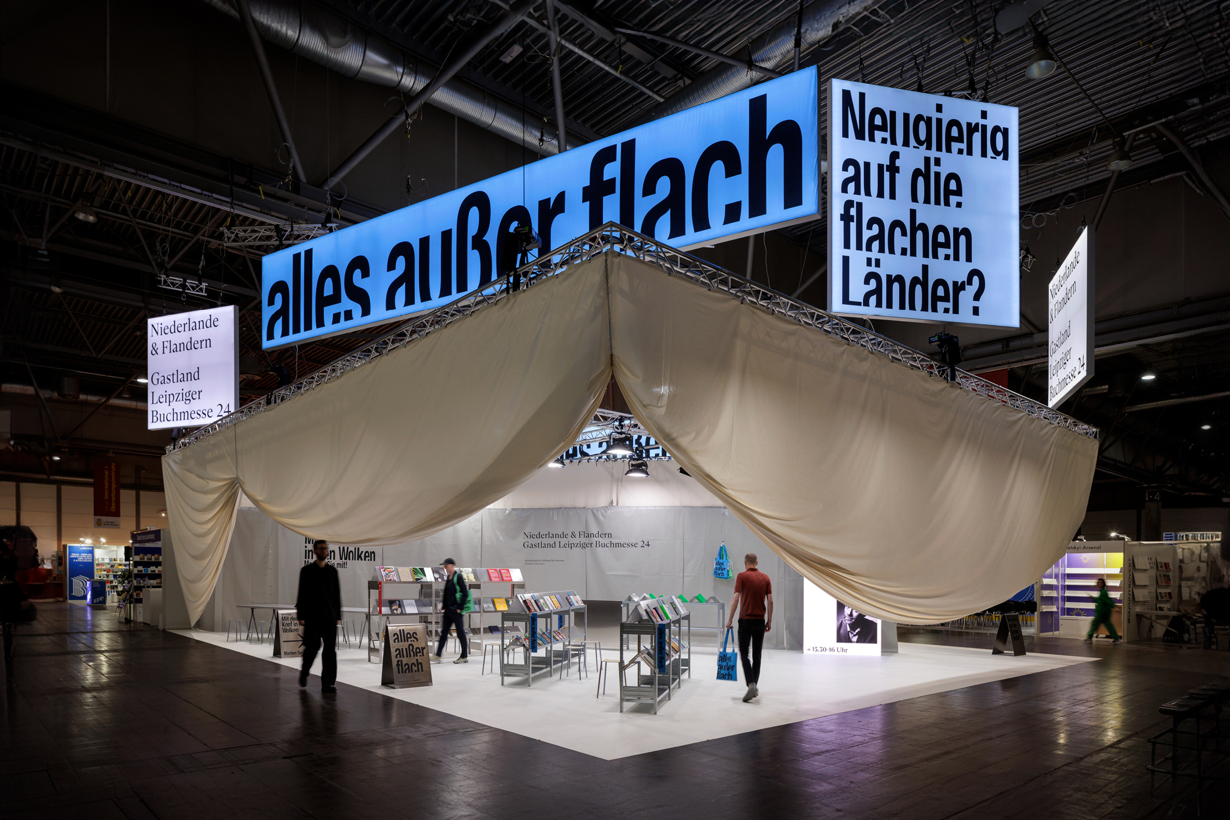
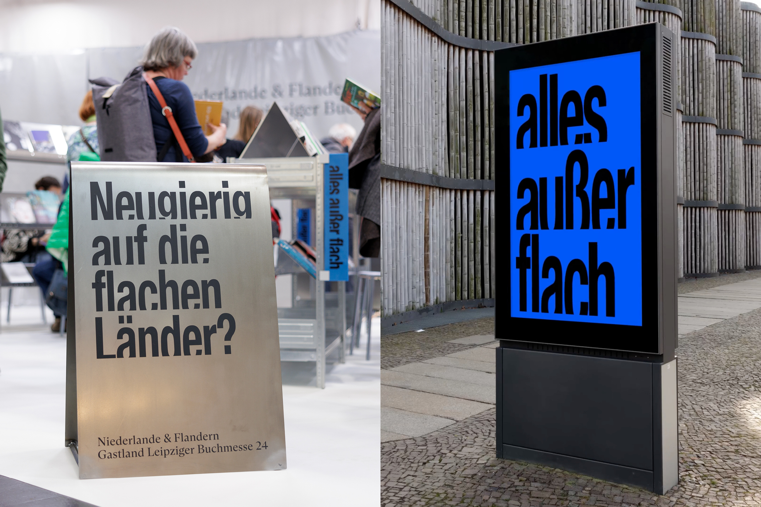
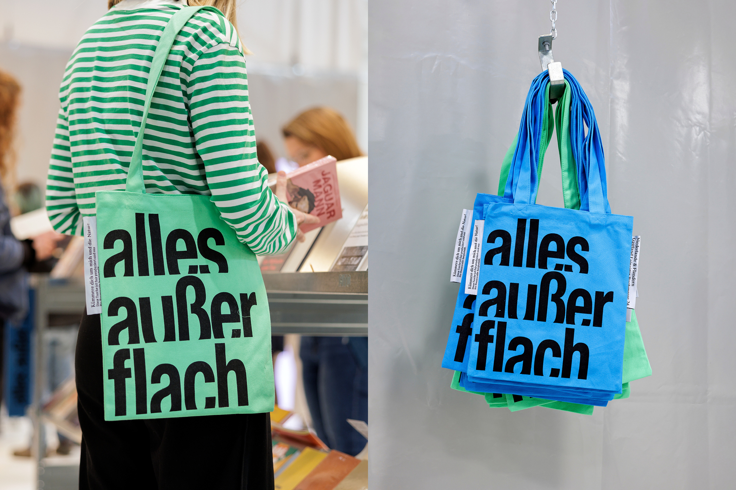
The campaign's typographic applications went beyond simple communication, creating a visual dialogue between print, digital, and physical spaces. City dress such as billboards, poster pillars, trams, sustainable merchandise, and digital platforms all carried the Alles außer flach typeface, transforming it from a static element into an active, dynamic force within the public sphere. The typeface was used not only for legible text but also as a graphic element in itself, often displayed in large, dramatic formats that allowed the form to dominate the visual landscape.
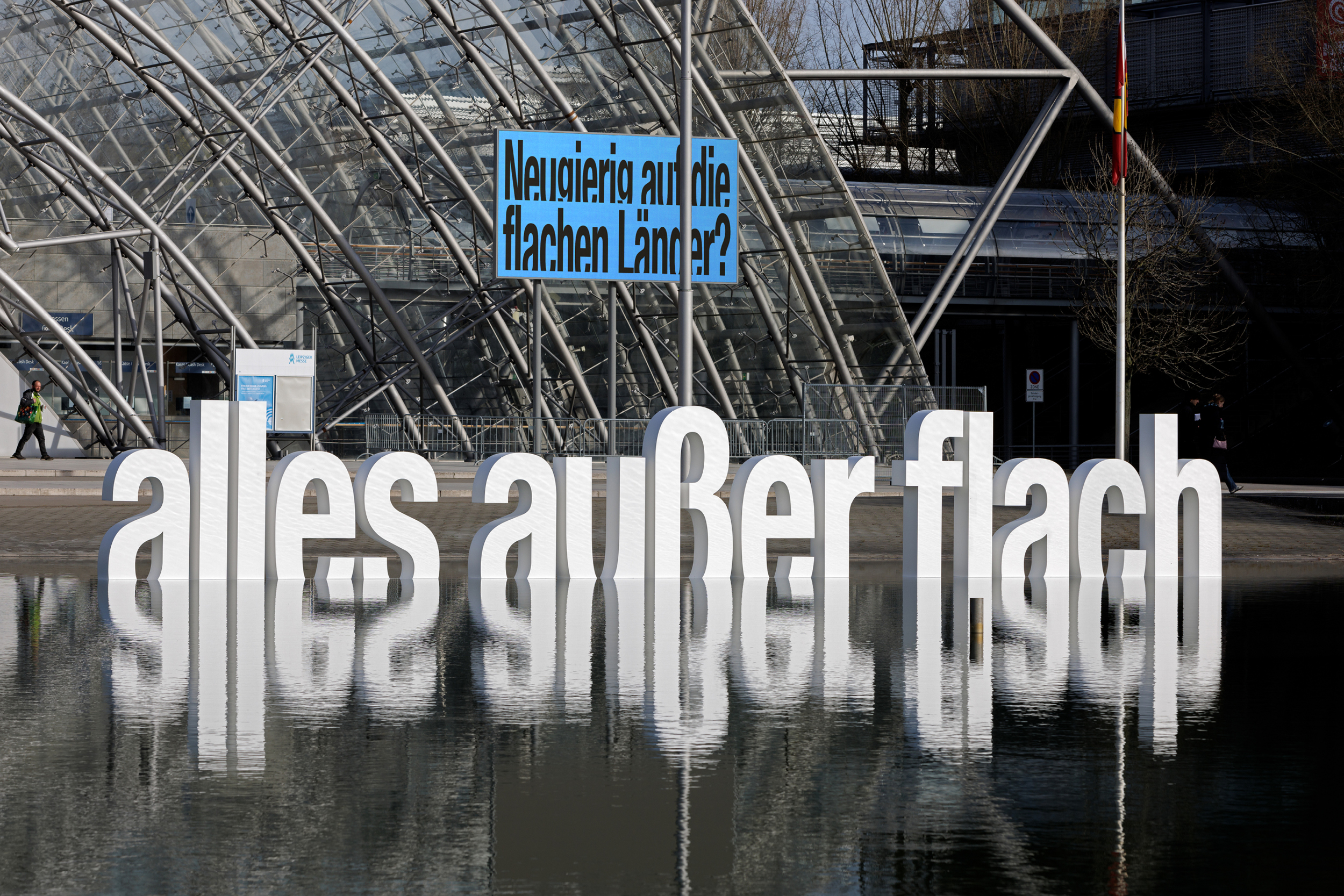
In front of the Buchmesse, the letters were positioned to appear as if they were rising from the ponds at the entrance, reinforcing the campaign’s connection to the landscape. The design of the pavilion, also an extension of the Alles außer flach identity, integrated the typeface into its architecture, where panels bearing key literary quotes and words from Dutch and Flemish literature served as visual anchors throughout the space. The word clouds—large, typographic installations—were strategically placed to draw visitors into the experience. By translating the typographic identity into a physical space, the design blurred the lines between type as communication and type as art.
In addition to its graphic presence, the campaign’s typographic approach underscores the conceptual integrity of Alles außer flach, allowing typography to transcend its traditional role as a mere tool of communication. It becomes an integral part of the experience, evoking curiosity, excitement, and a deeper connection with the literature it represents.
Credits