Lidl Hellas 25 Reasons
The brief called for label design for two special edition wines, one white and one red, issued as part of the 25-year anniversary celebration of Lidl Hellas. An unexpected, engaging creative approach, in line with Lidl's motto "Simply more joy in life", intended to attract consumers not just as a product, but as a visually appealing object that tells a story. The target audience was all LIDL shoppers, so the product had to be perceived as special but not prohibitively expensive. The proposed solution created an engaging narrative, friendly and approachable, unique and affordable.
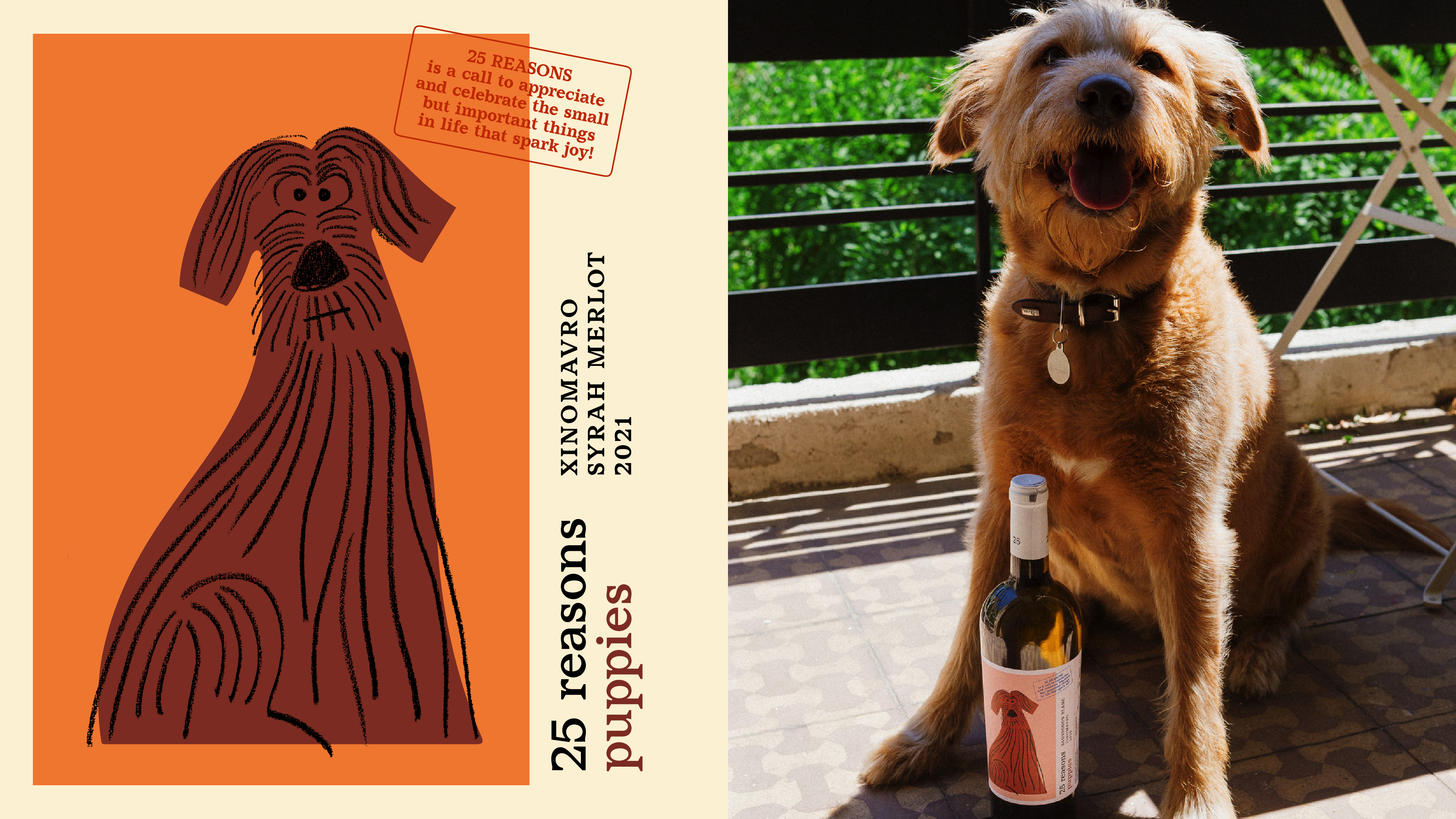
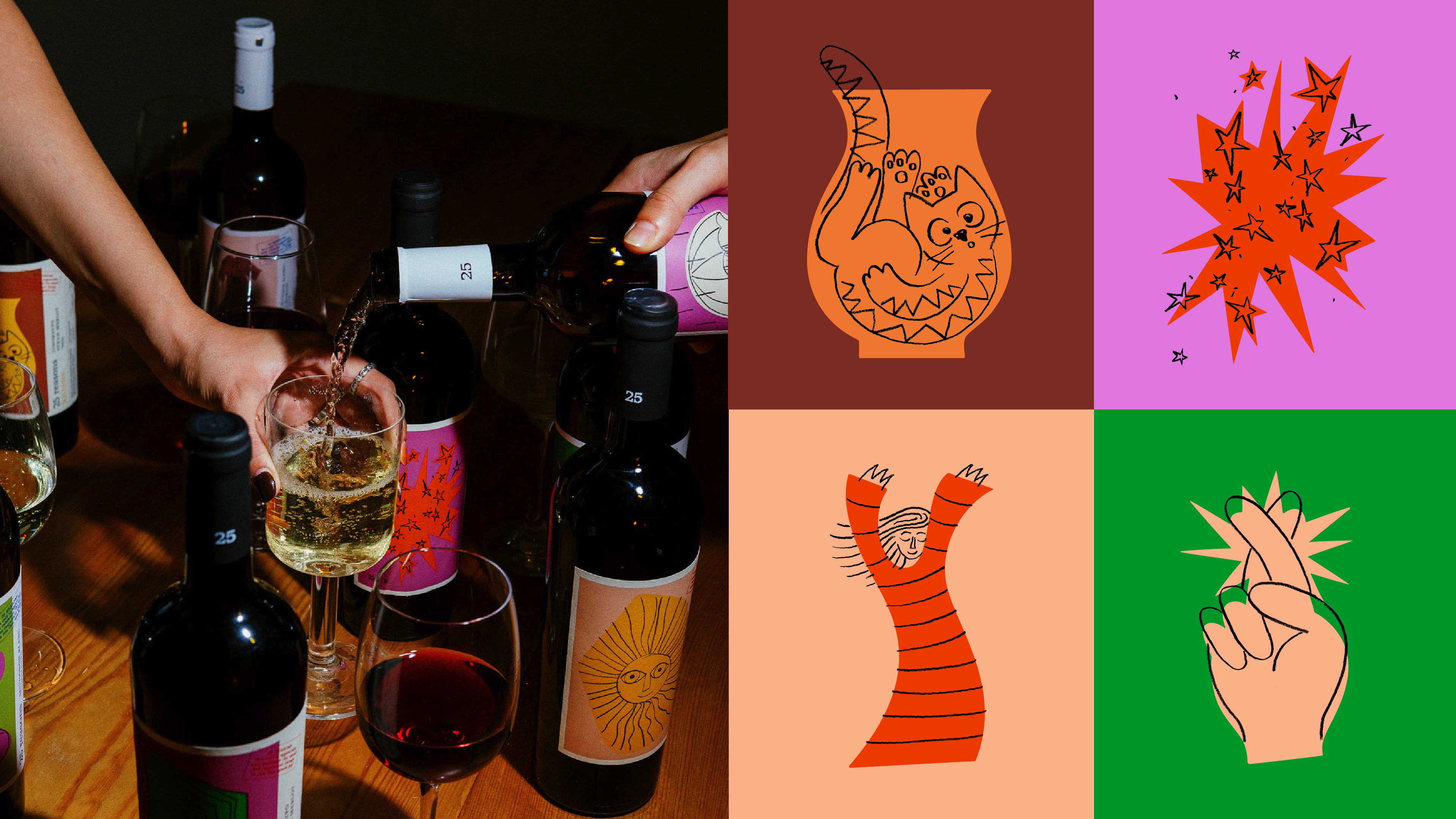
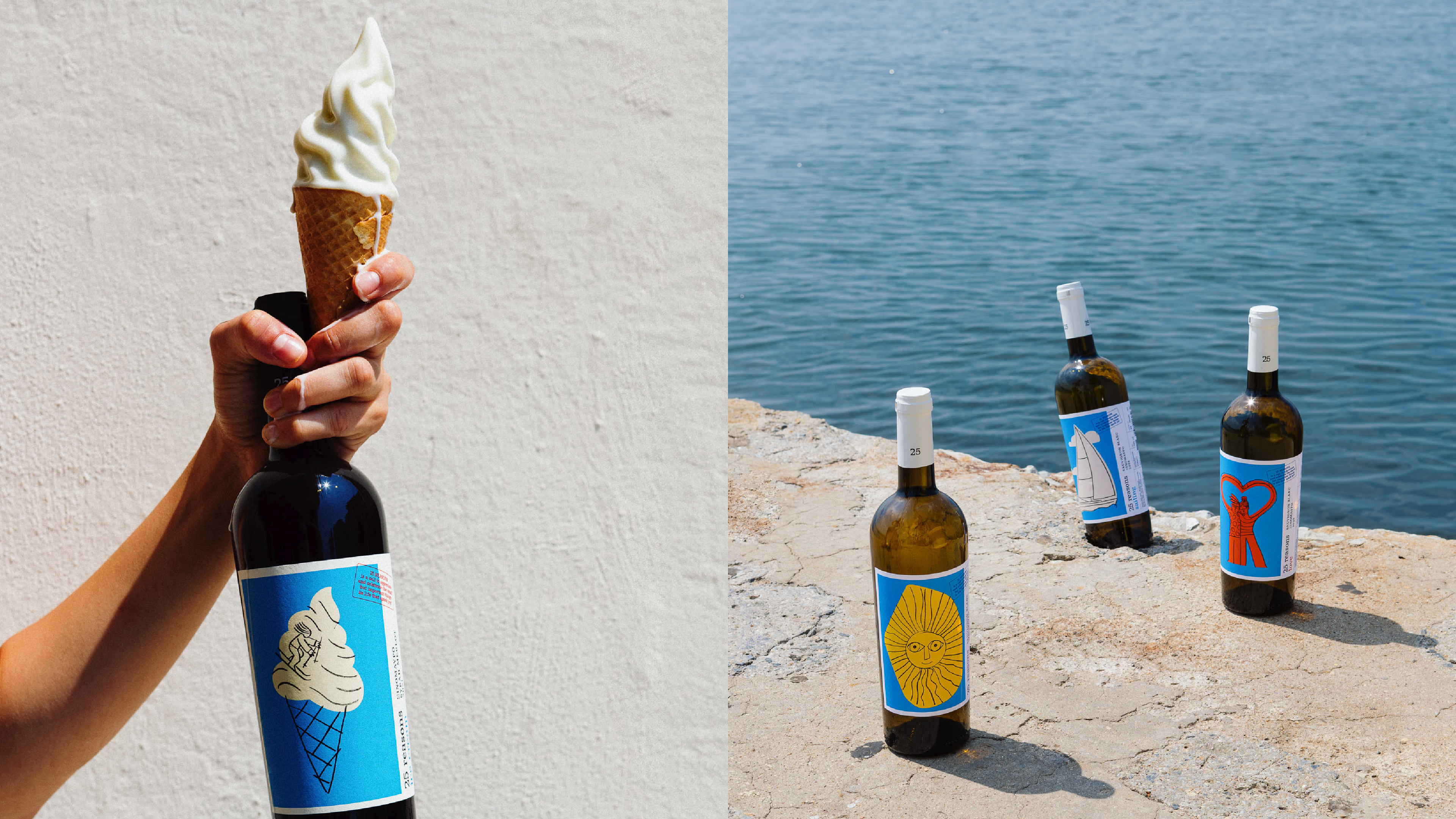
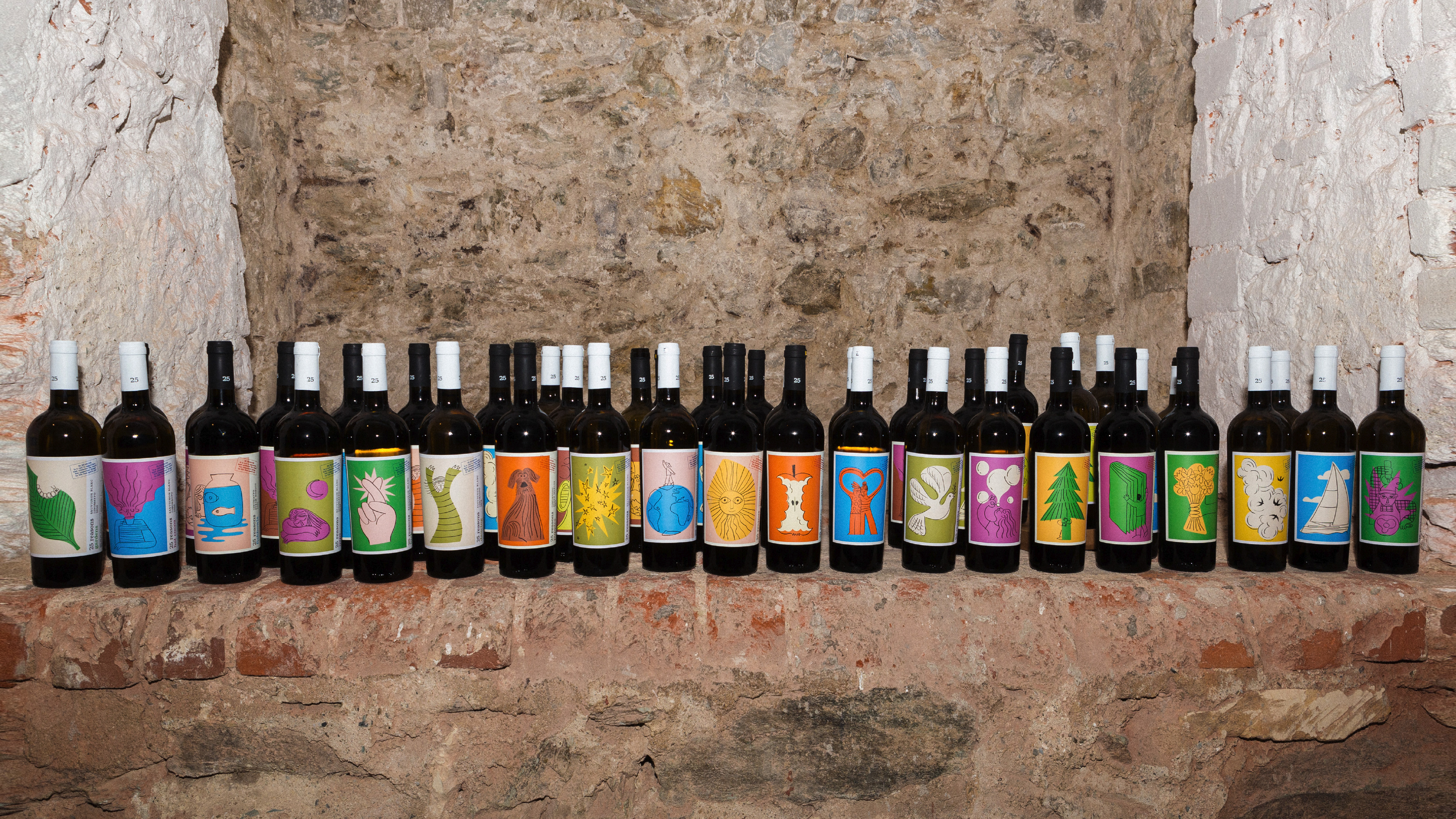
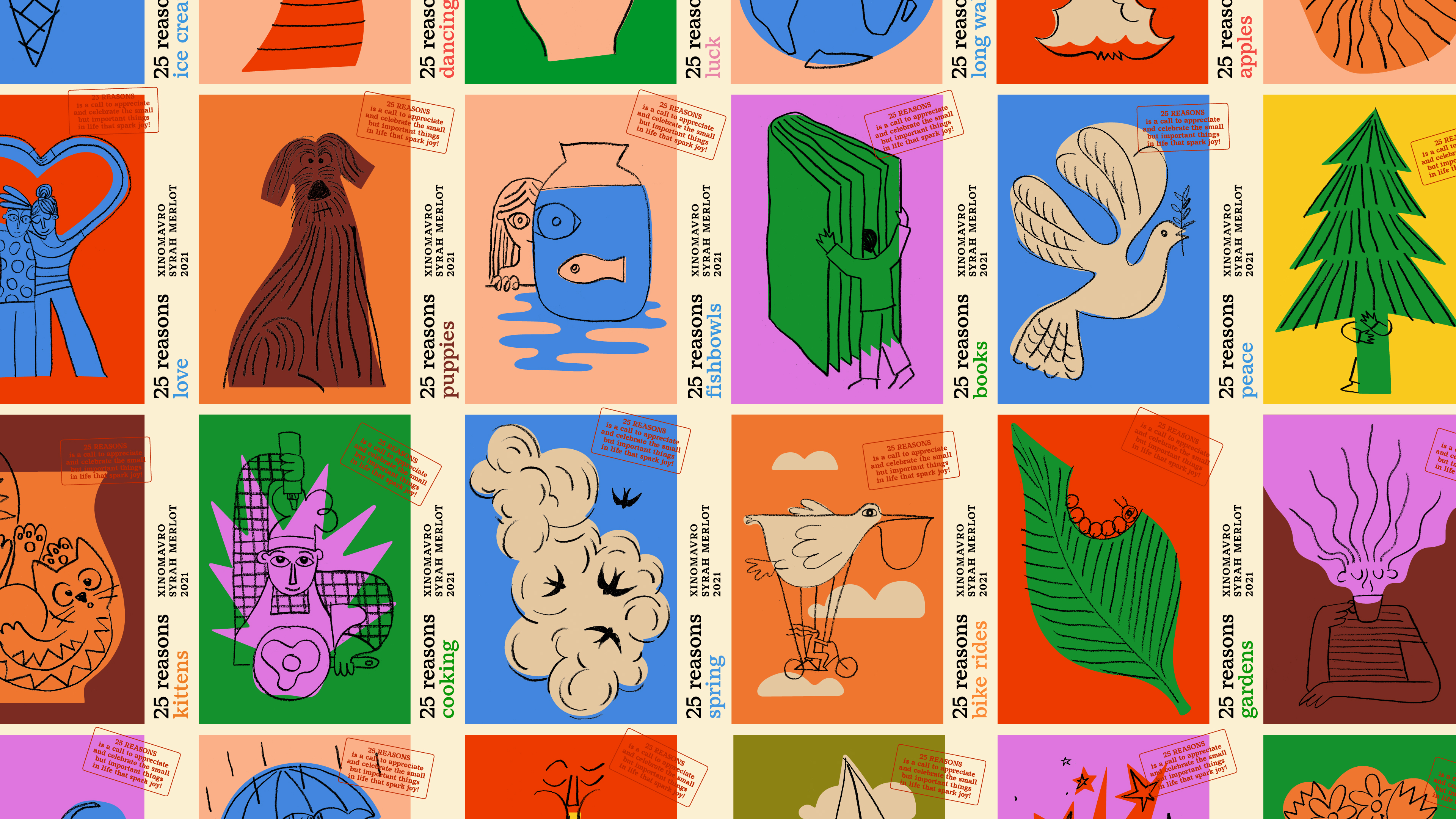
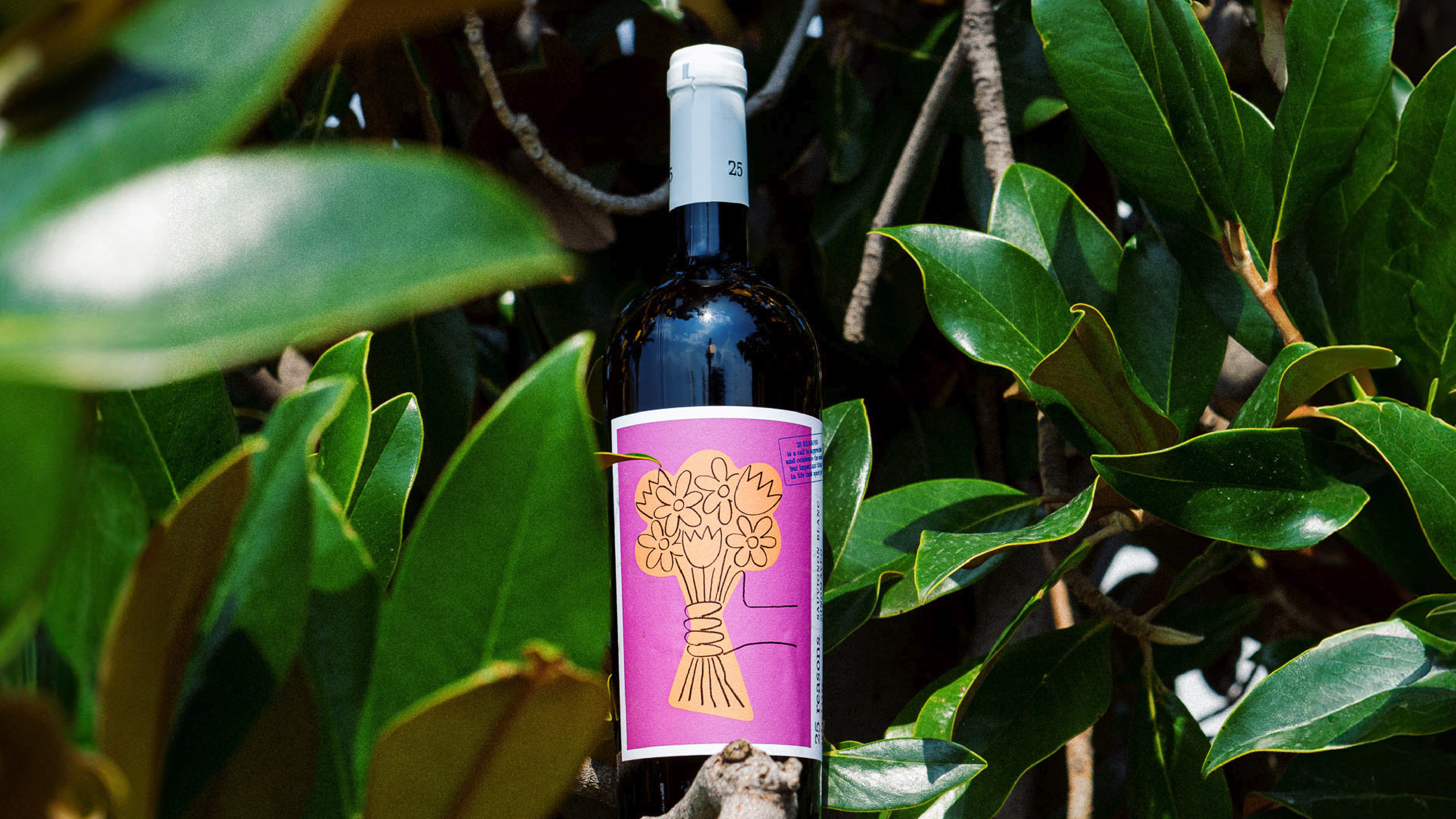
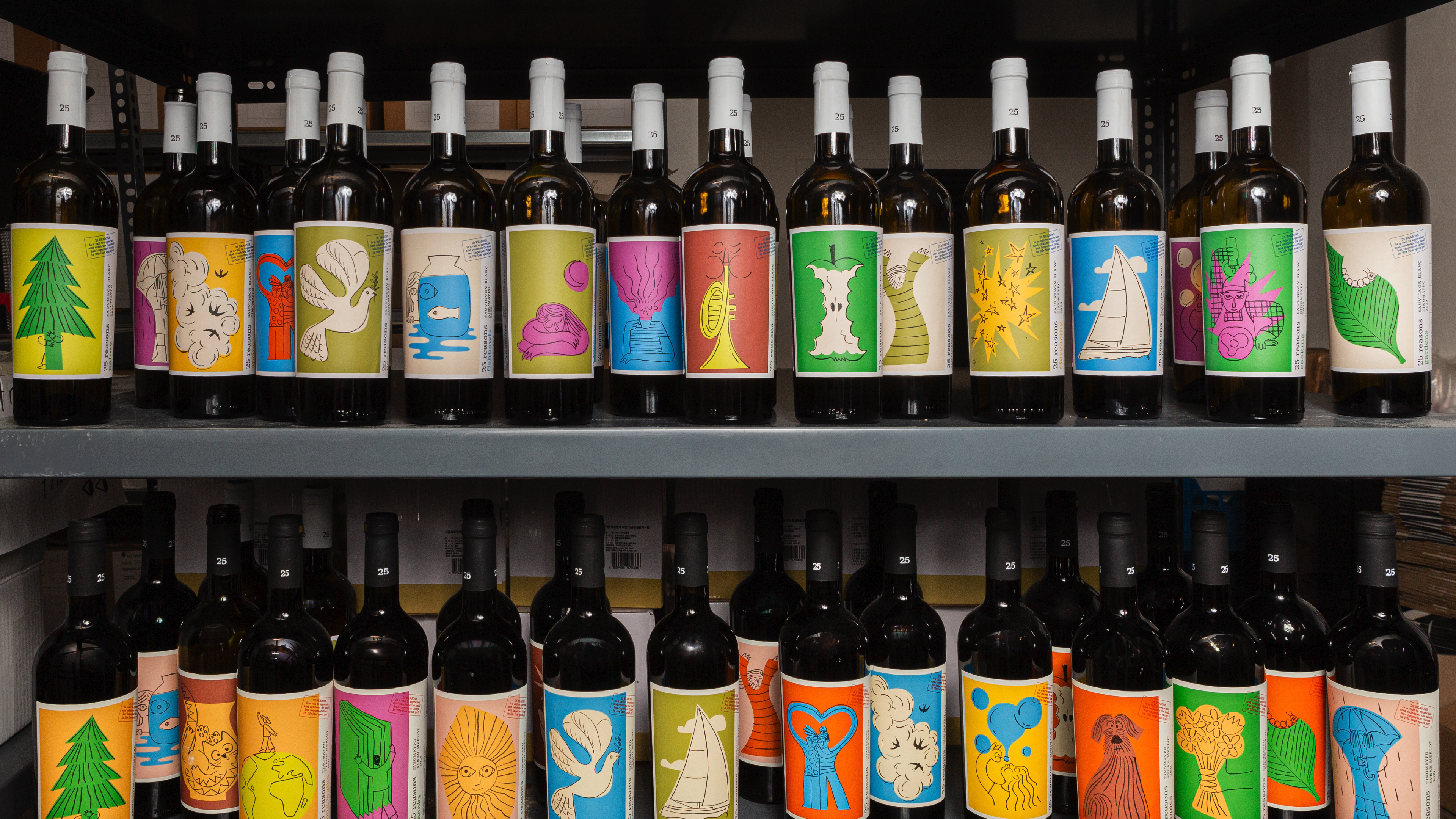
What makes us joyful? A walk in nature, the sun on our face, a cute puppy, a delicious ice cream – simple yet exceptional moments that become reasons for everyday joy. “25 reasons for joy” illustrates these everyday reasons for enjoyment in a friendly, simple but emotionally impactful way. We created 25 illustrations depicting 25 reasons. Each illustration was adapted for the red and white wine labels, so that consumers could purchase a matching pair. The total of 50 different bottles also serves for distinctive in-store placement and promotions, supporting the “special edition” designation.
Although the 25-year anniversary refers specifically to LIDL’s presence in Greece, the brief did not call for an approach specific to local culture. On the contrary, as a multinational supermarket brand, LIDL often adapts concepts from one national market to others, so a more universal approach was welcomed. That “25 reasons for joy” concept can be adapted, by adding new illustrations or changing the names of existing ones, to become more or less culturally specific for distribution in different markets.
The bottles were pre-selected by the client, so the design project included the labels and heat shrink capsules. The labels were printed on textured paper, in a distinctly darker shade of off-white for red wine labels. The capsules were white for the white wine and black for the red, and on both the number 25 was printed in gold three times, so that it is visible regardless of how the bottle is facing. The slight variations in paper, capsule and label colors between the white and red wines created matched but not identical “pairs” and helped shoppers distinguish between the two on the shelf.
Credits