Norwegian Logo
COVID's impact and digital meetings transformed the aviation industry, causing business travel to plummet. Major airlines shifted toward low-cost positions, while budget carriers became ultra-low-cost. Norwegian Airlines needed to redefine its position, transitioning from a primarily Norwegian to an international audience.
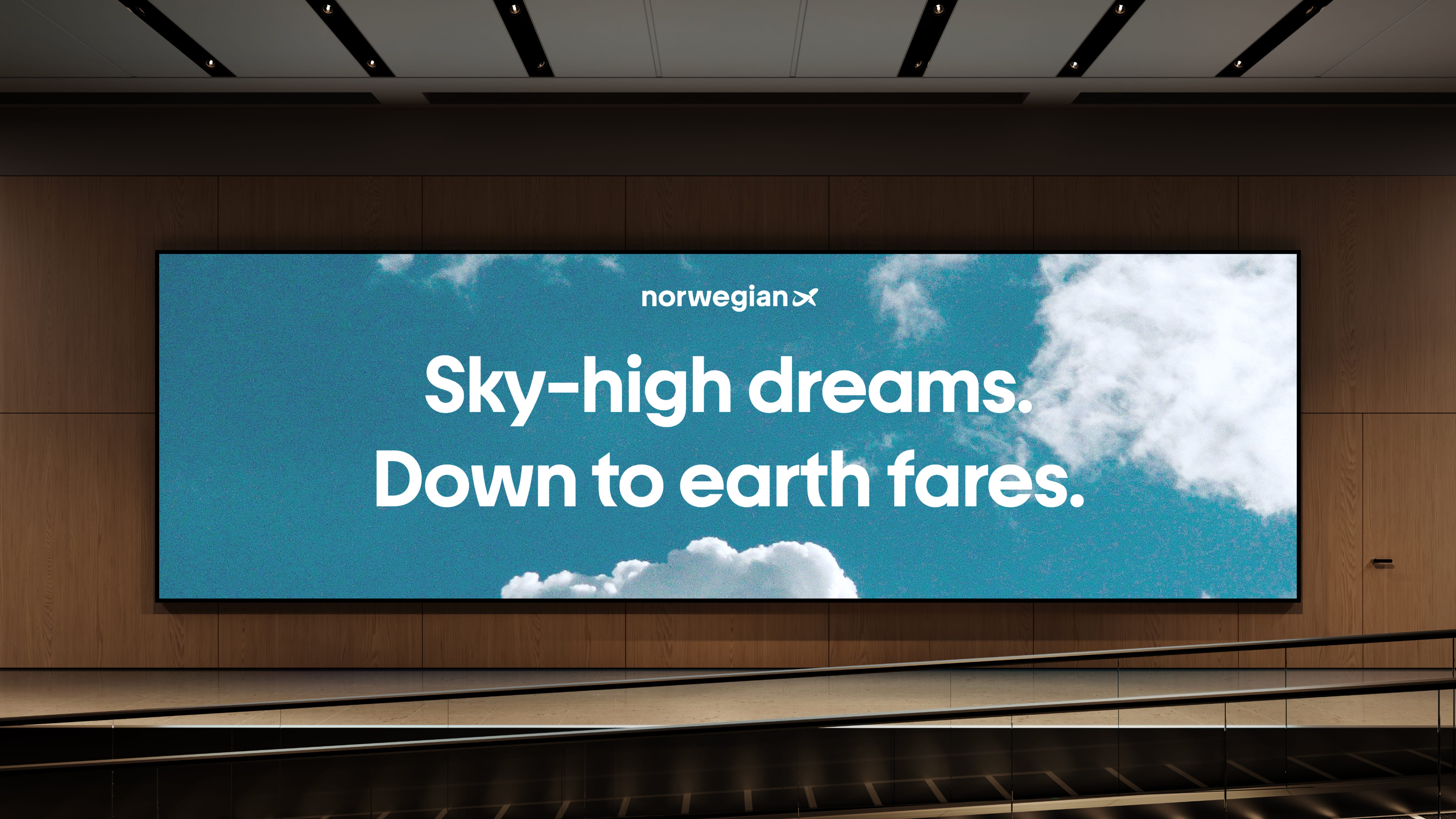
The outdated identity was replaced with one based on "A Fair Price Airline" and "The Norwegian Way" - a modern interpretation of Norwegian values.
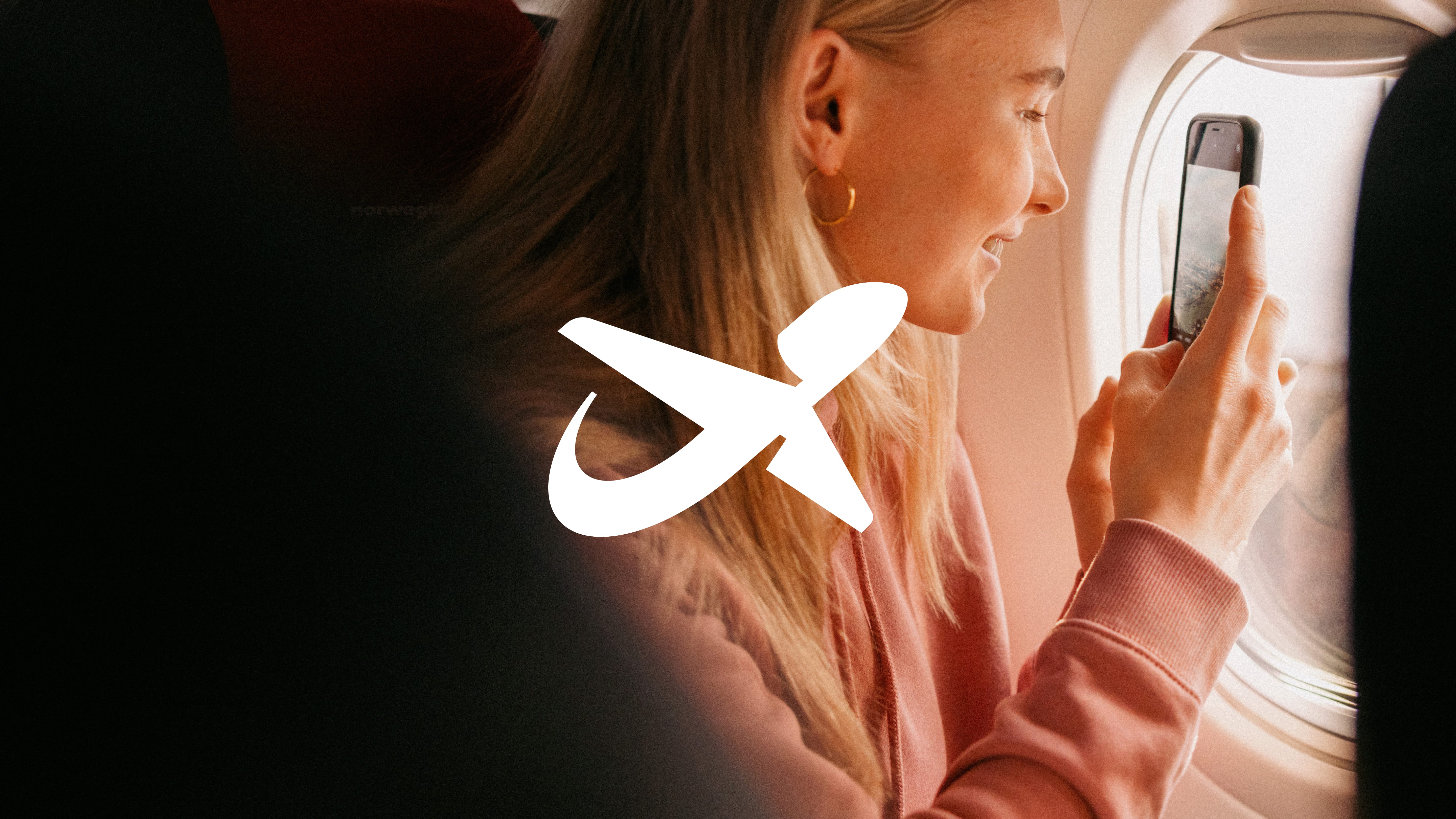
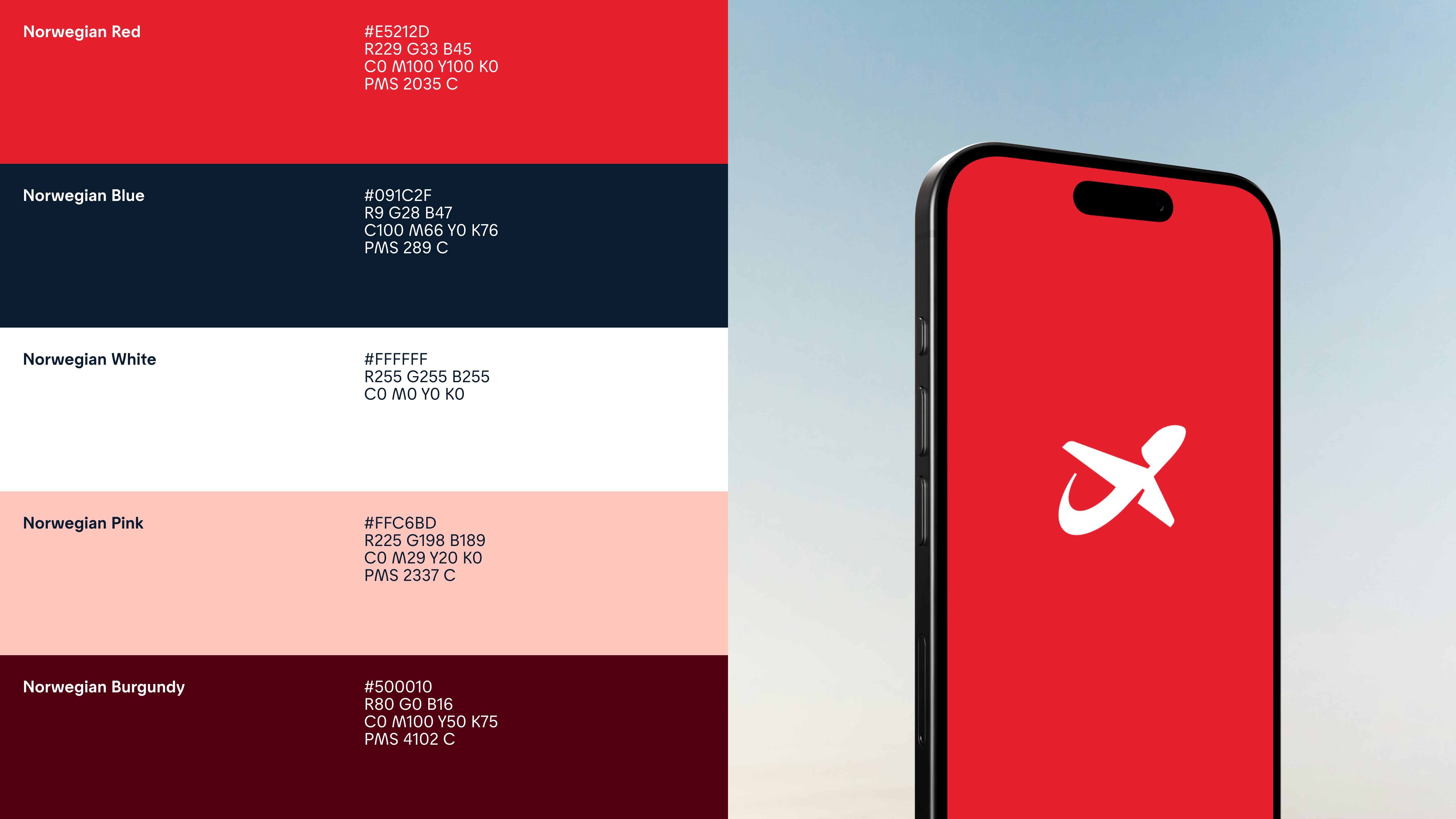
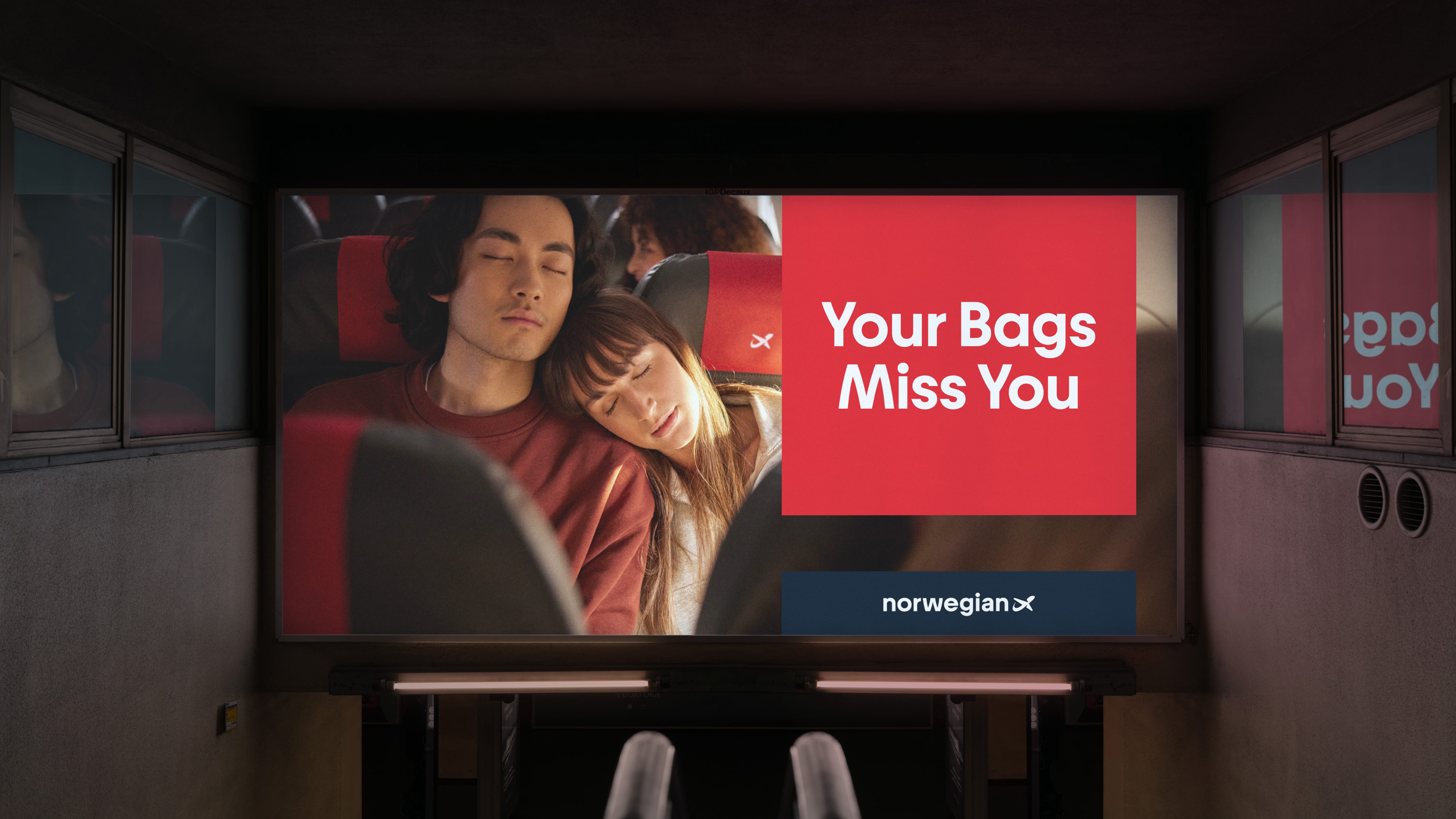
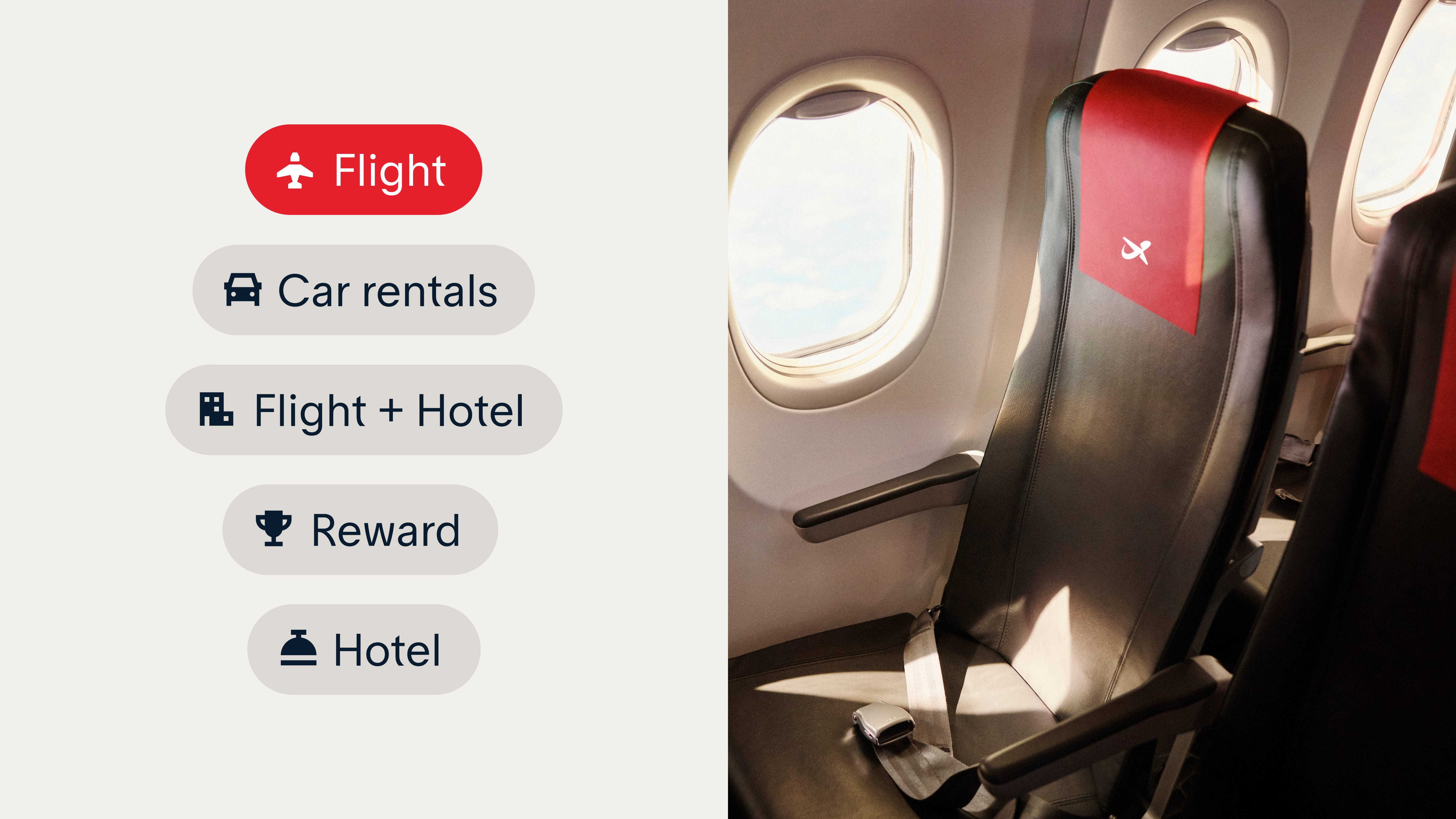
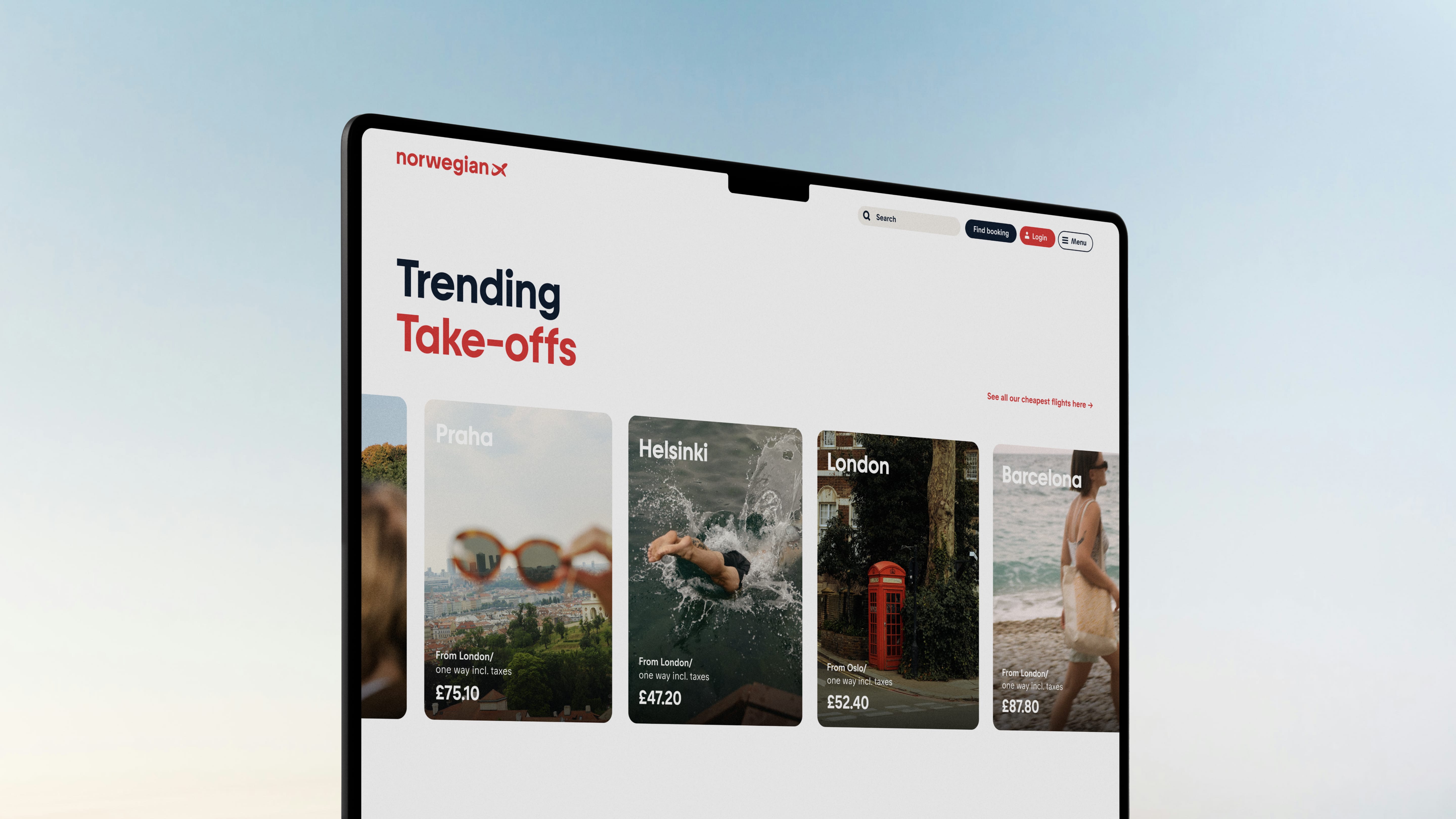
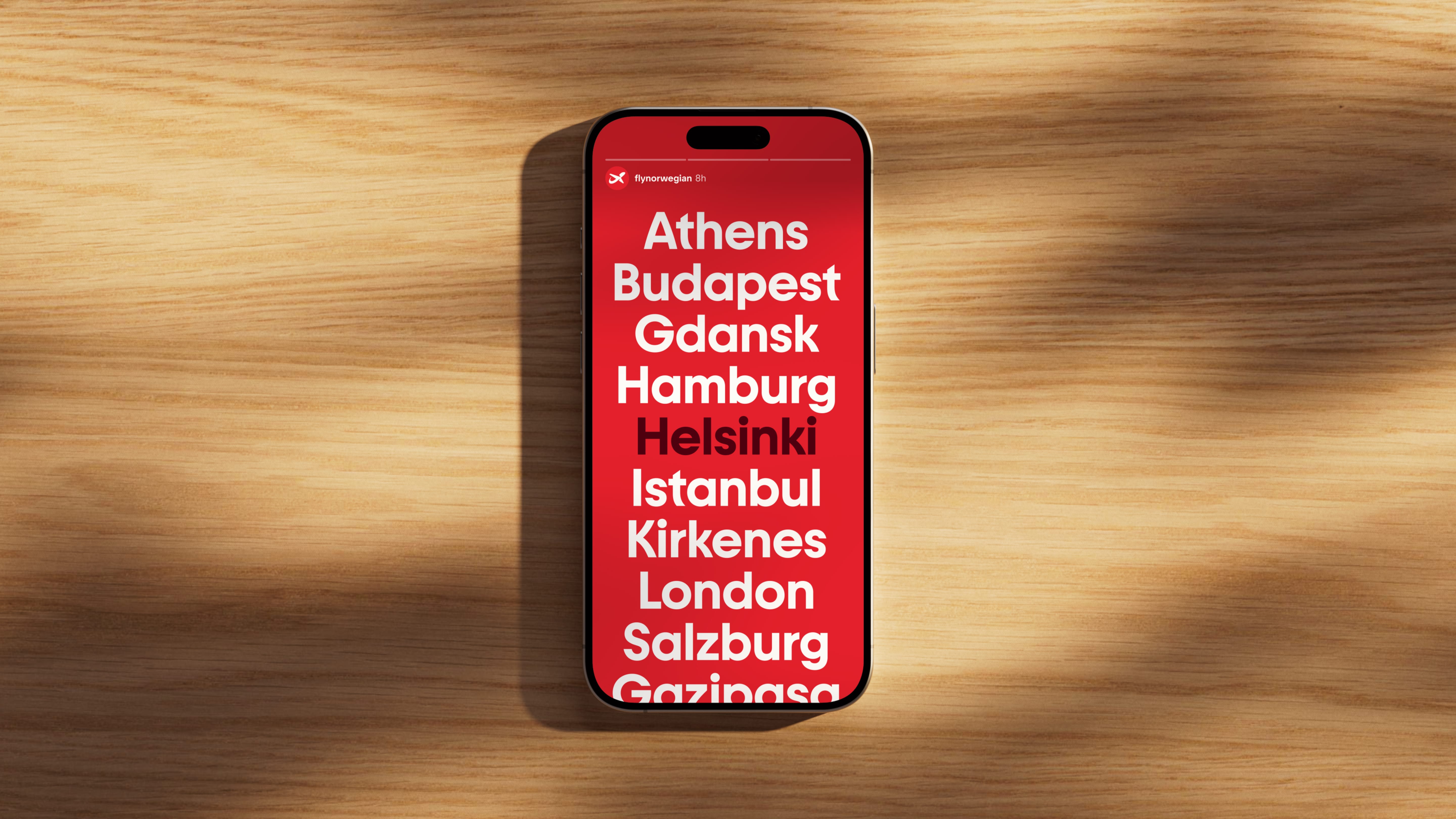
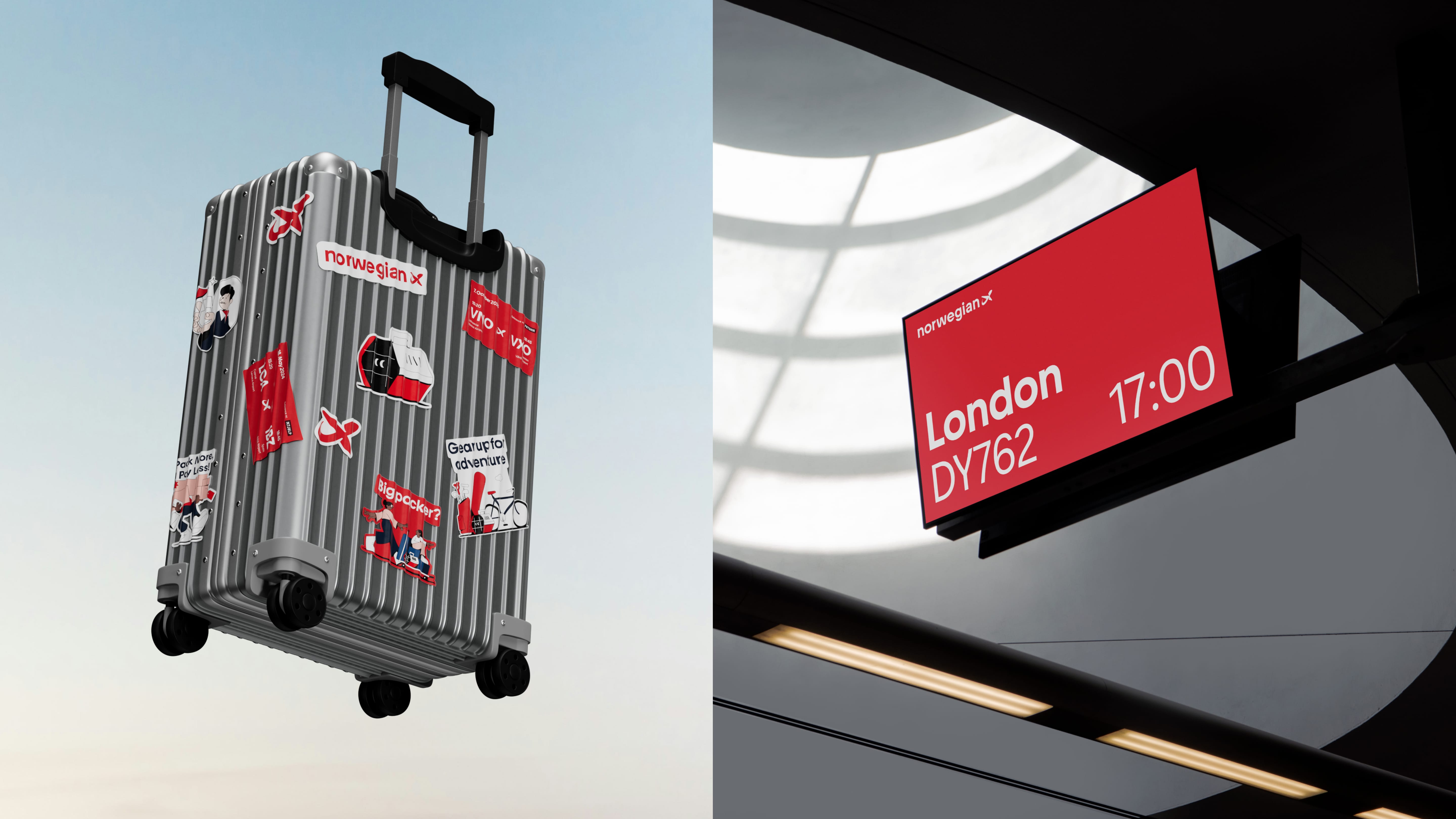
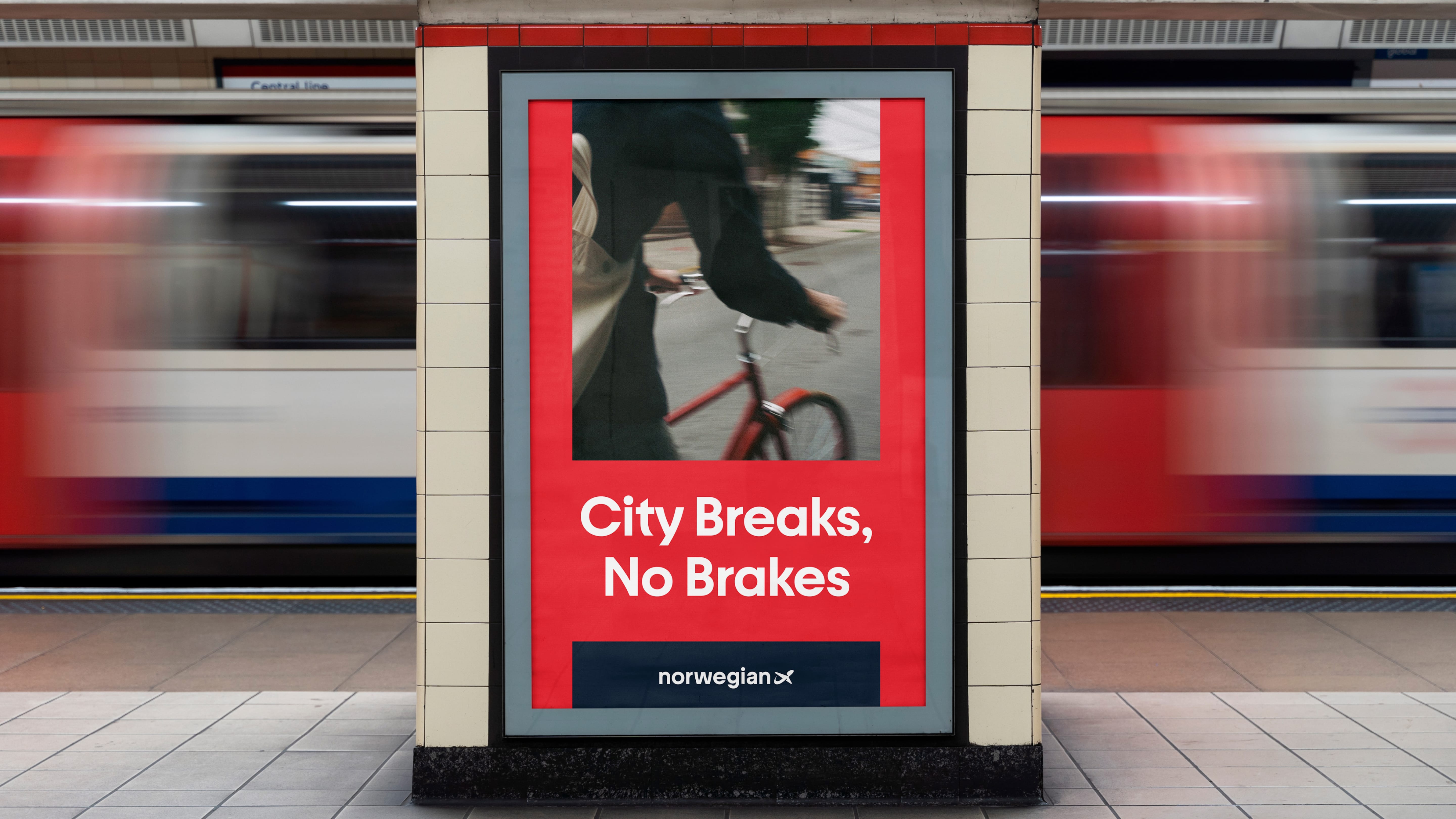
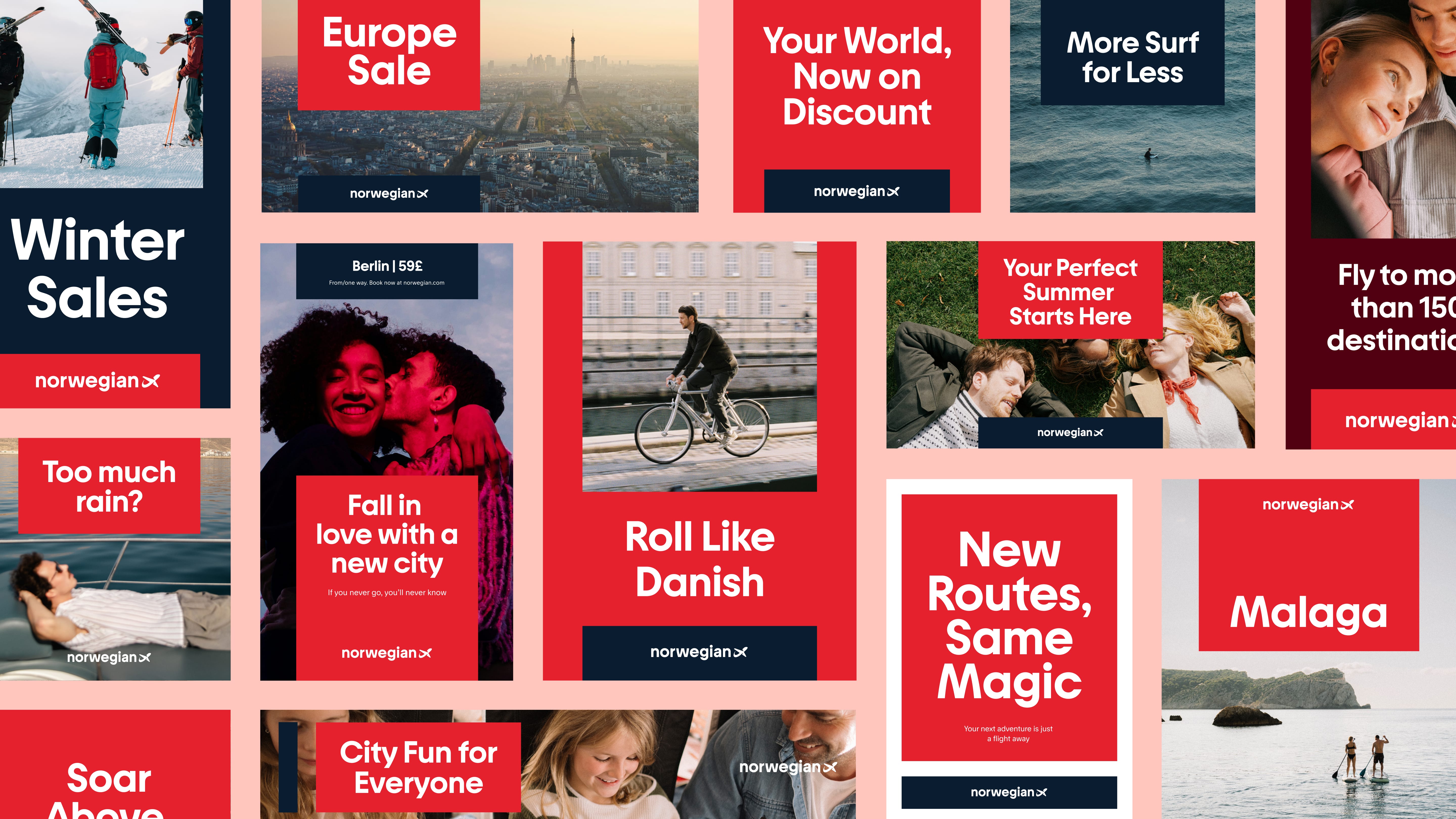
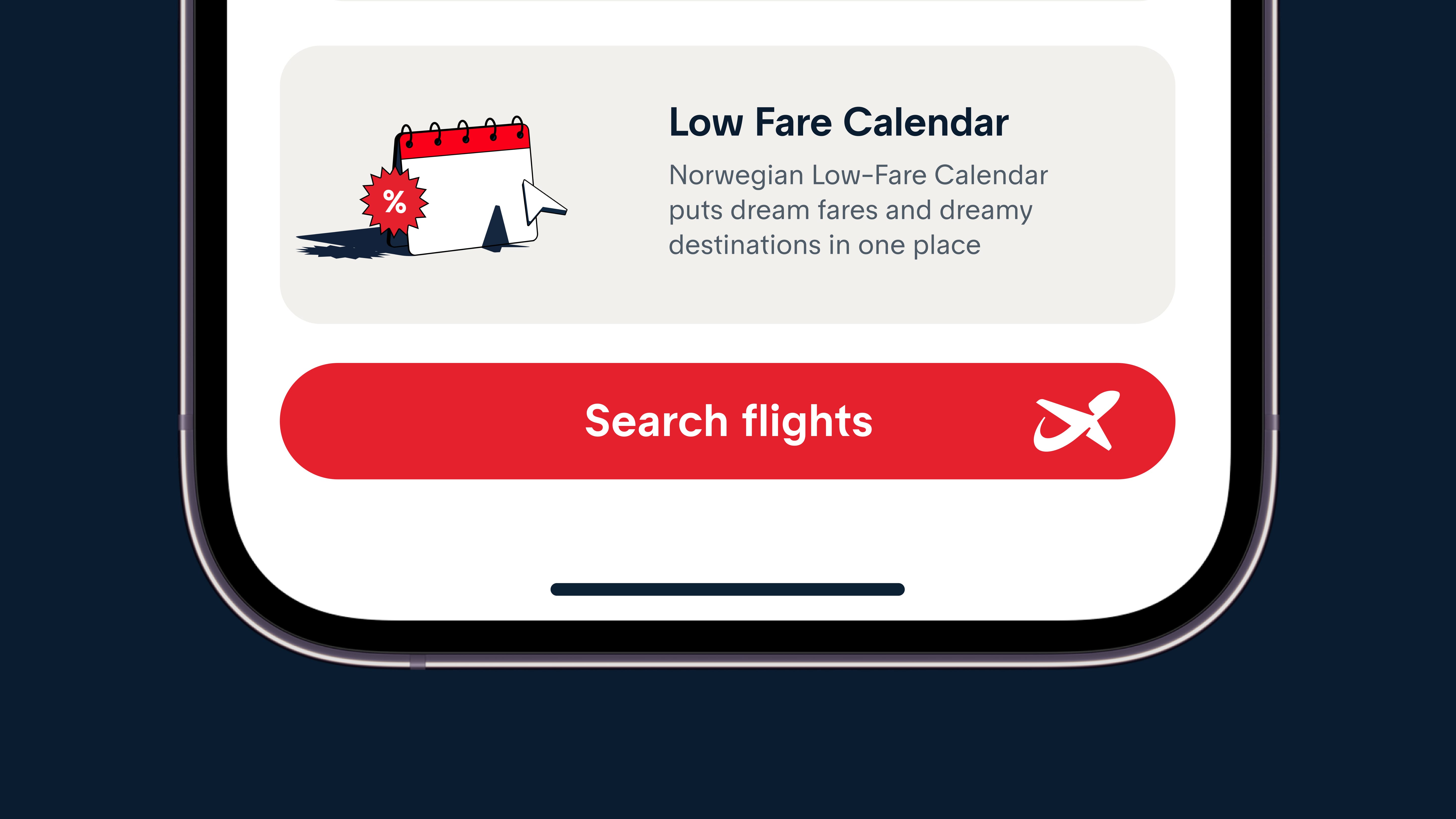
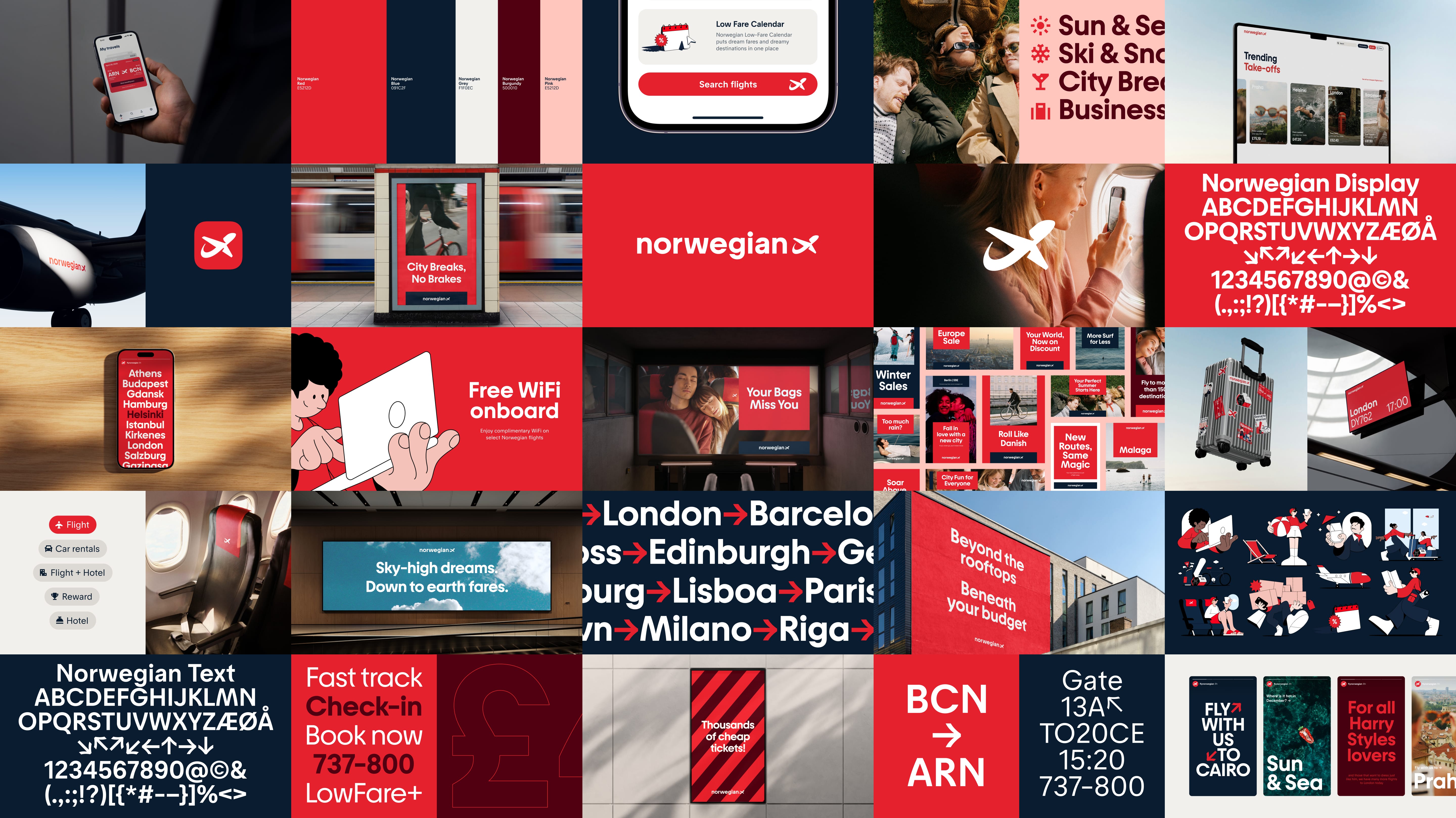
The new visual identity features an unpretentious design language with a custom font reflecting Norwegian clarity and simplicity. The Norwegian flag's colors remain core elements, while the illustration style conveys a "down to earth rebel" personality: informal yet professional, accessible yet quality-conscious.
Rather than using traditional Norwegian clichés, the identity presents a modern, progressive Norway that balances heritage with international appeal. This has positioned Norwegian as a responsible player in a polarized market.
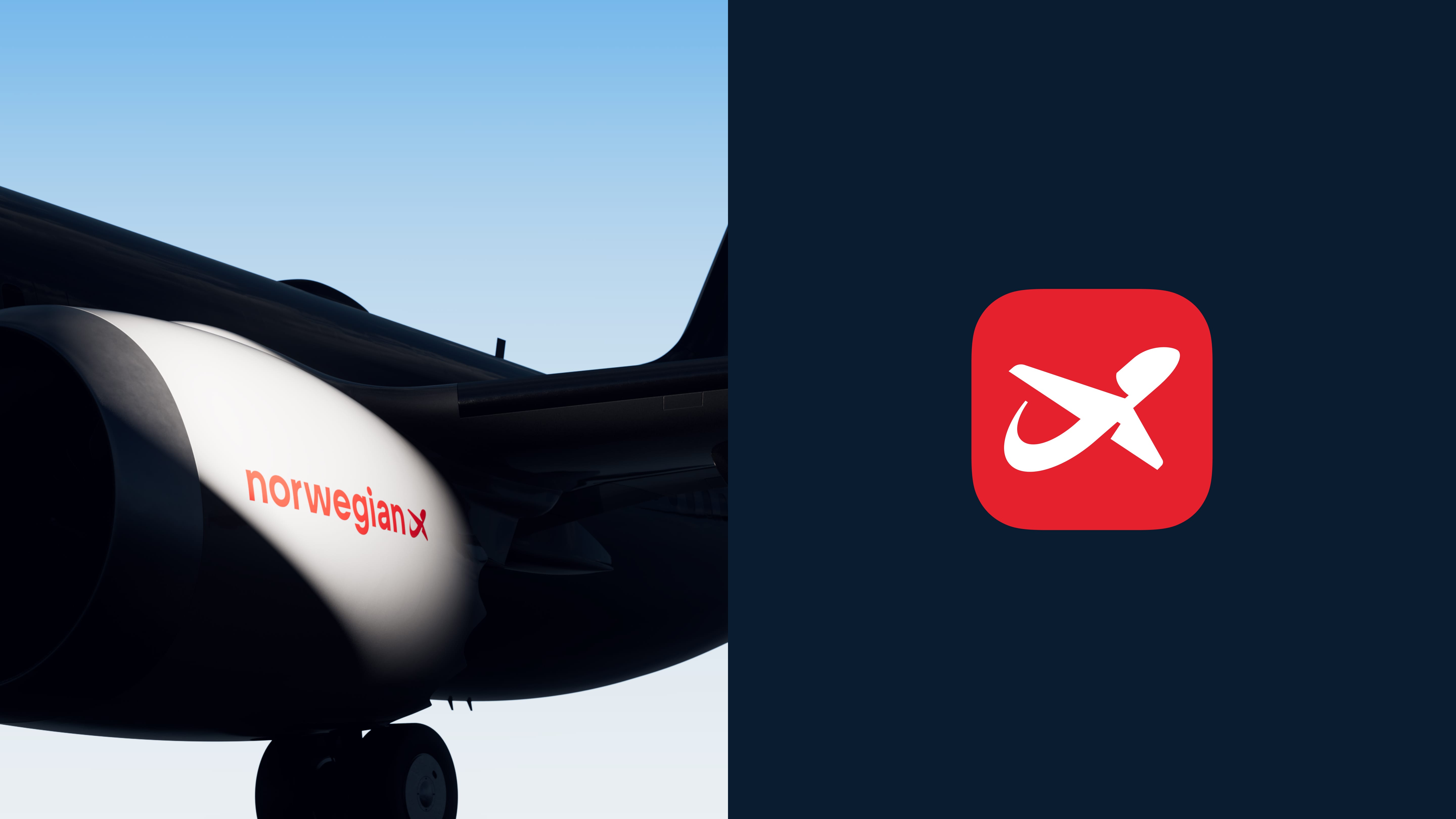
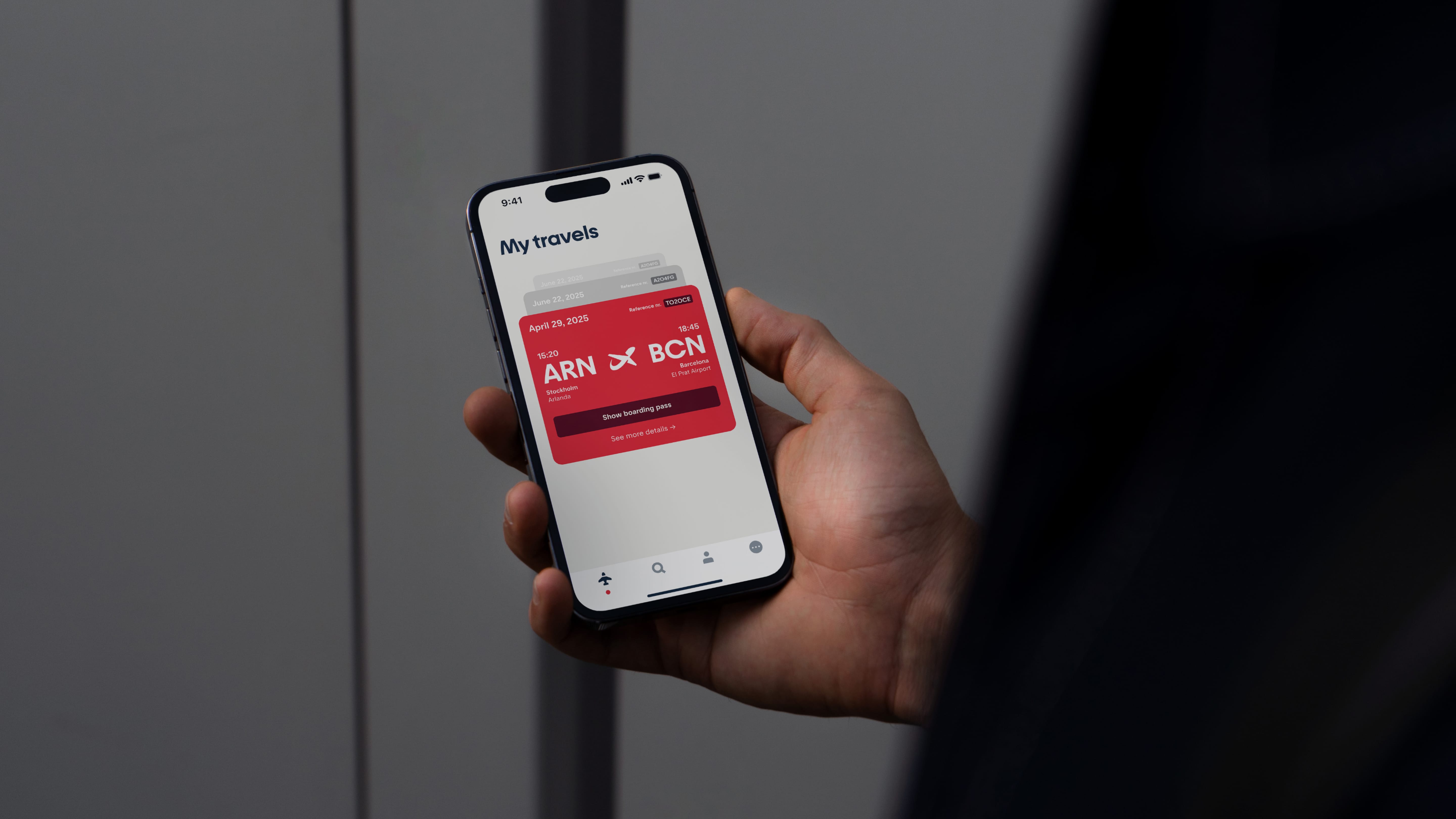
The flexible design system works seamlessly across all touchpoints and coexists with existing identity elements on surfaces like aircraft livery, while meeting strict functionality and universal design requirements.
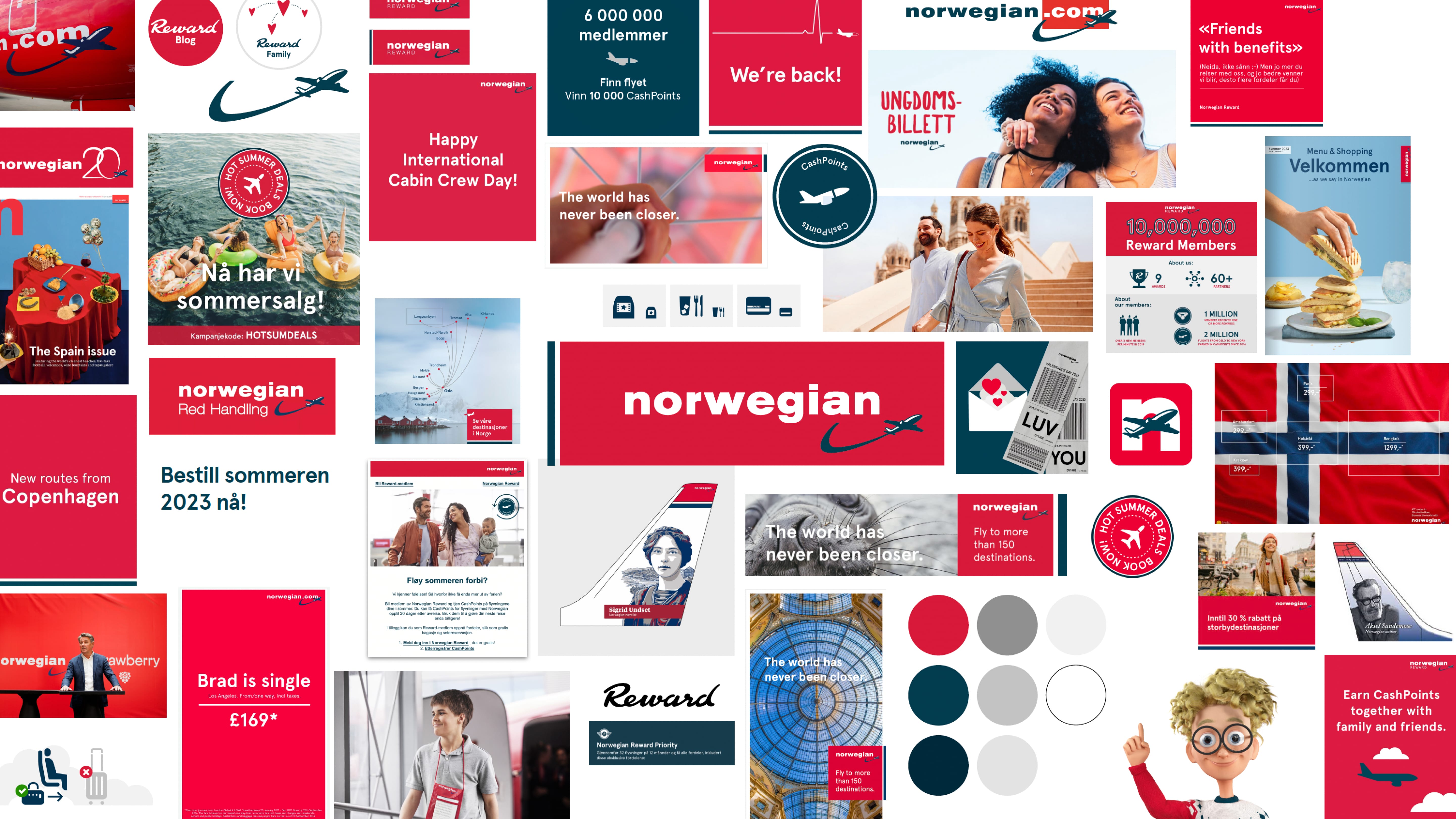
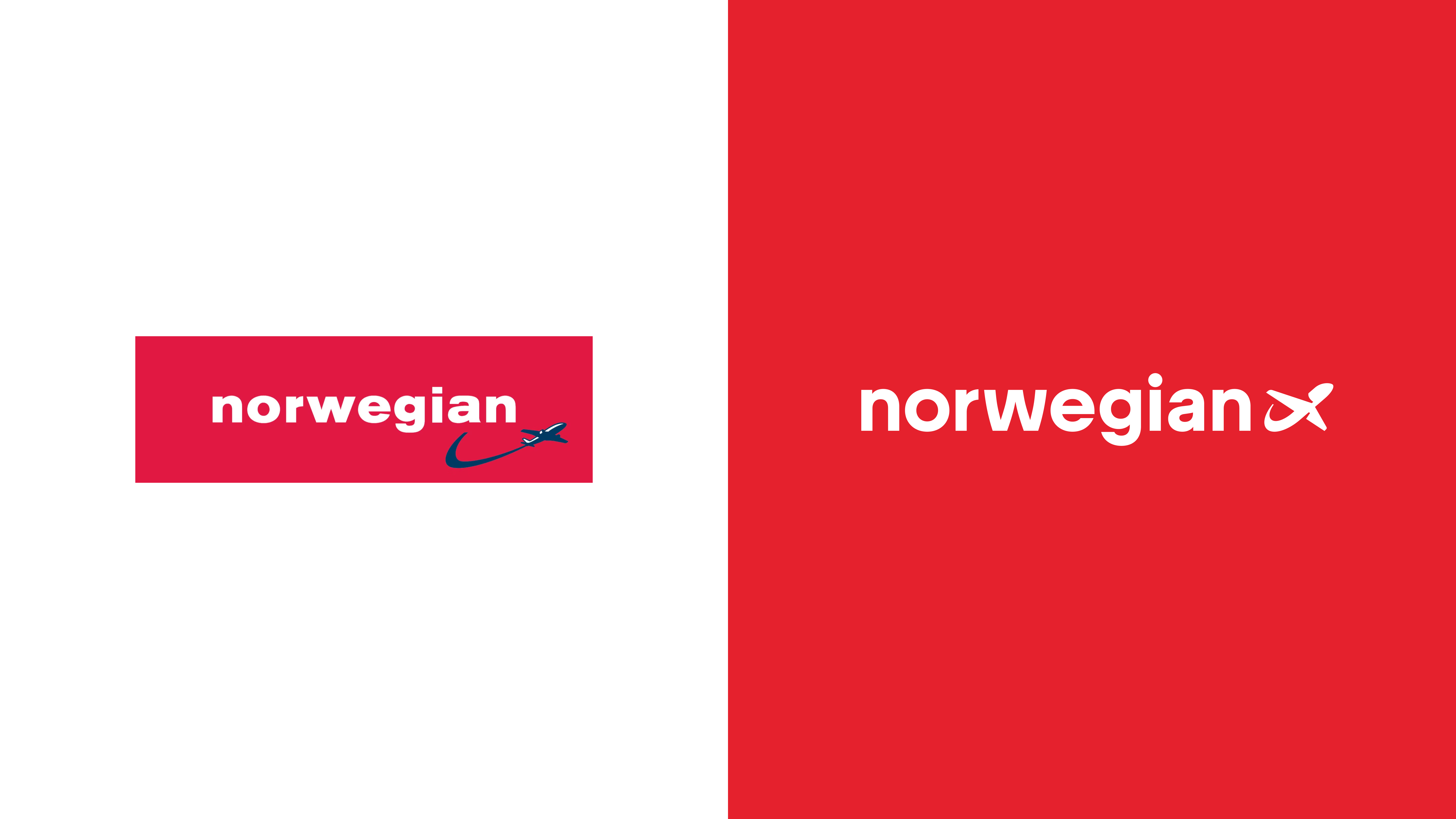
The previous Norwegian visual identity included a logo that, like other elements from that era, felt dated and overly technical in its expression. As part of the comprehensive brand refresh that introduced more human, warm, and down-to-earth elements across all touchpoints, the logo underwent a thoughtful modernization. While maintaining the core recognition and heritage of the brand, the updated logo was refined to align with Norwegian's new positioning as a more approachable, rebel-spirited airline. The modernization focused on streamlining the design while preserving the essential elements that made it distinctly Norwegian. This updated logo now works harmoniously with the new custom typeface and illustration system, creating a cohesive identity that balances professionalism with personality. The result is a logo that feels both contemporary and timeless, effectively representing Norwegian's evolution from a purely technical, corporate airline to a more human-centered brand with strong cultural roots.
Credits