Ruke Gin
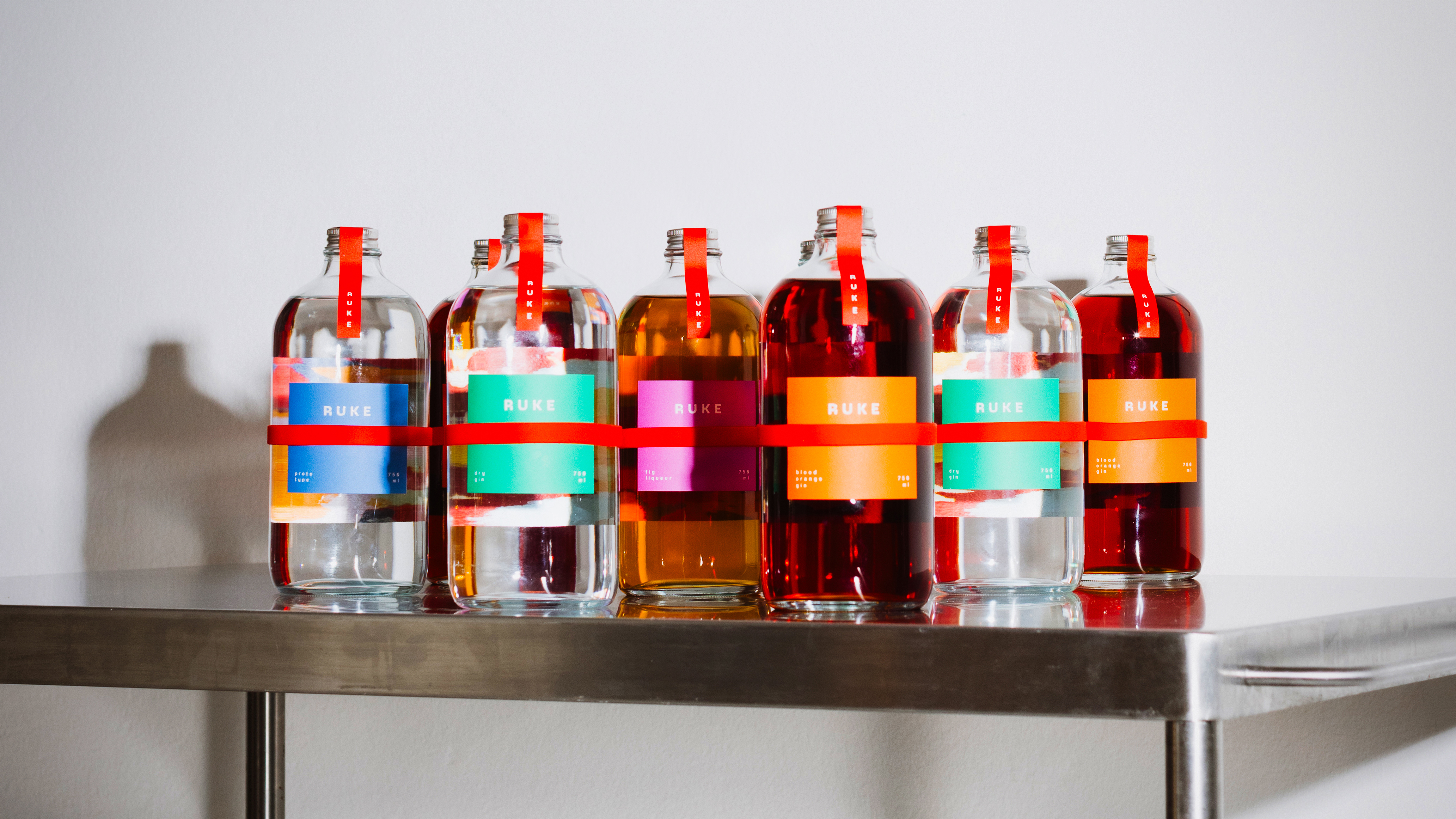
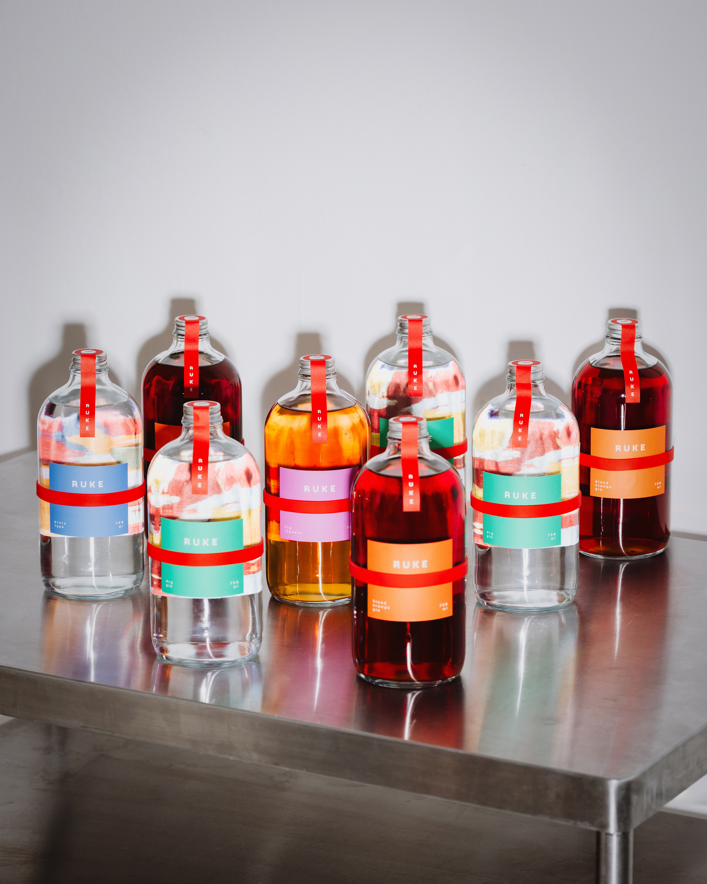
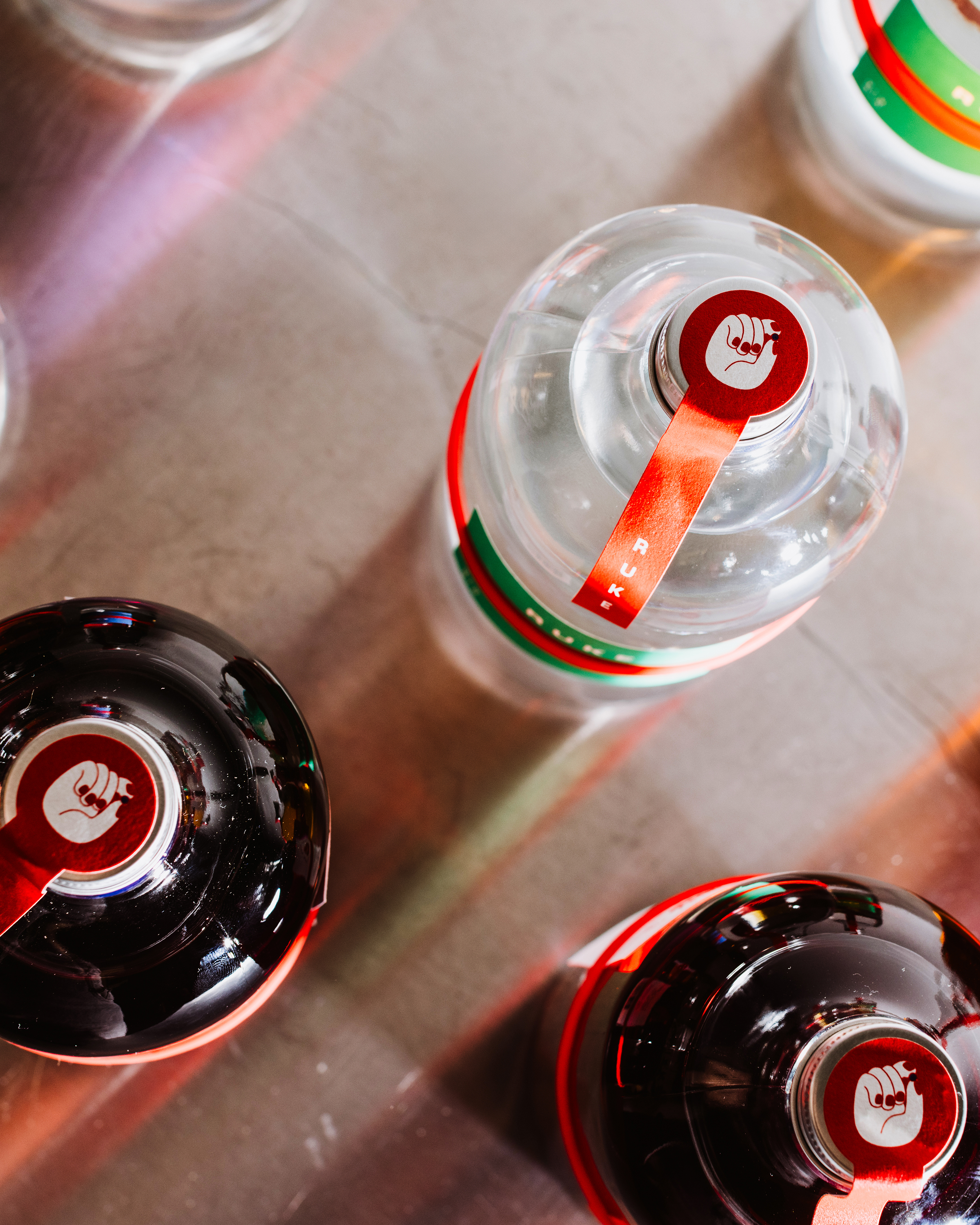
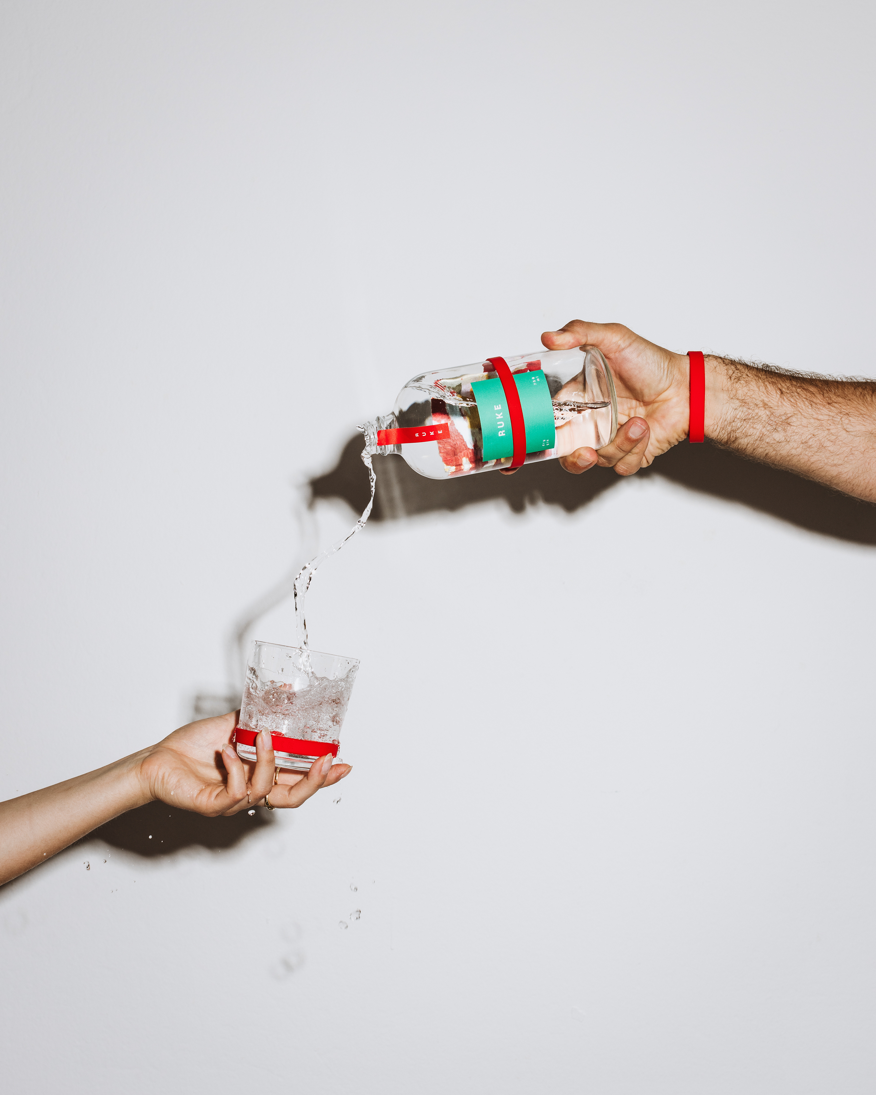
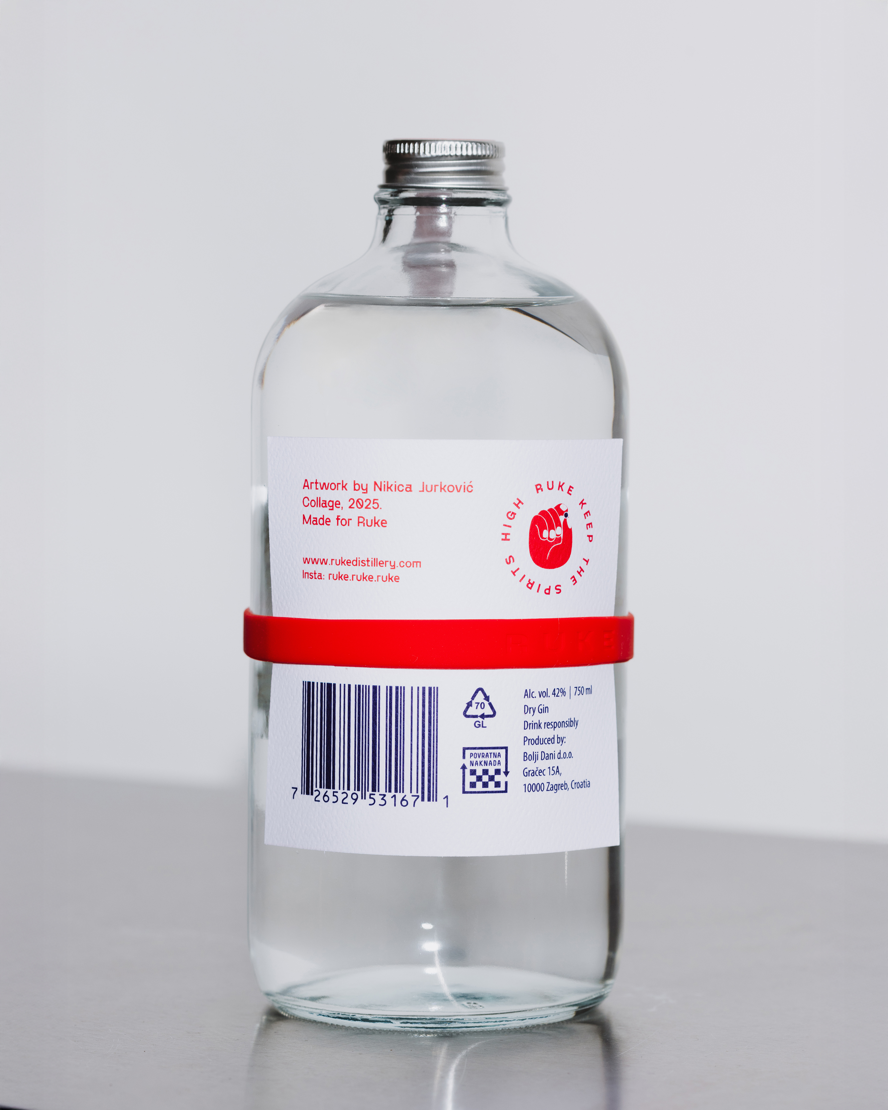
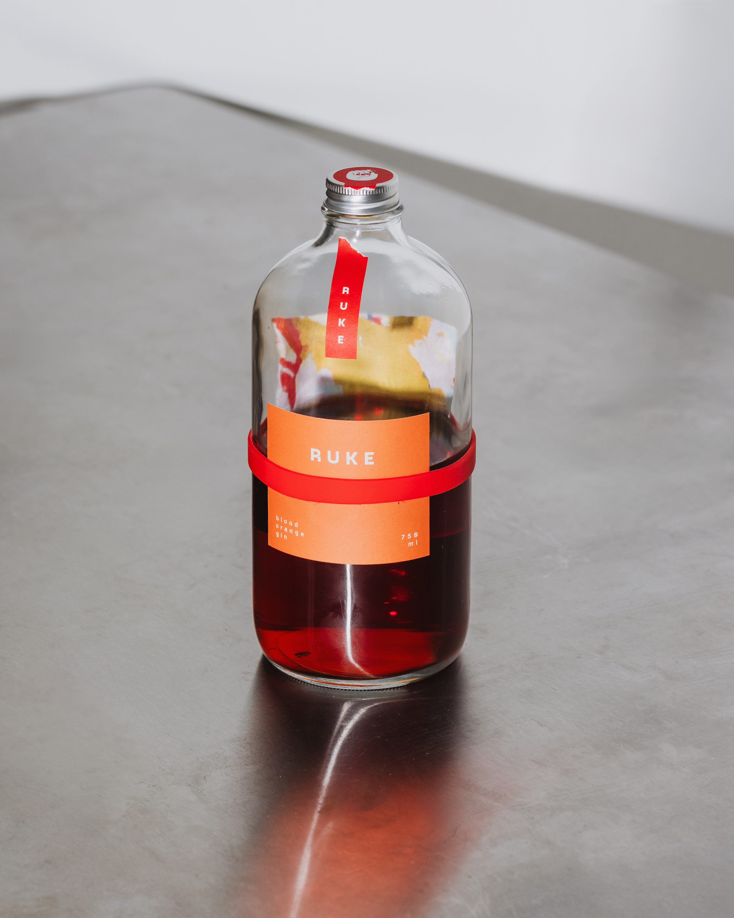
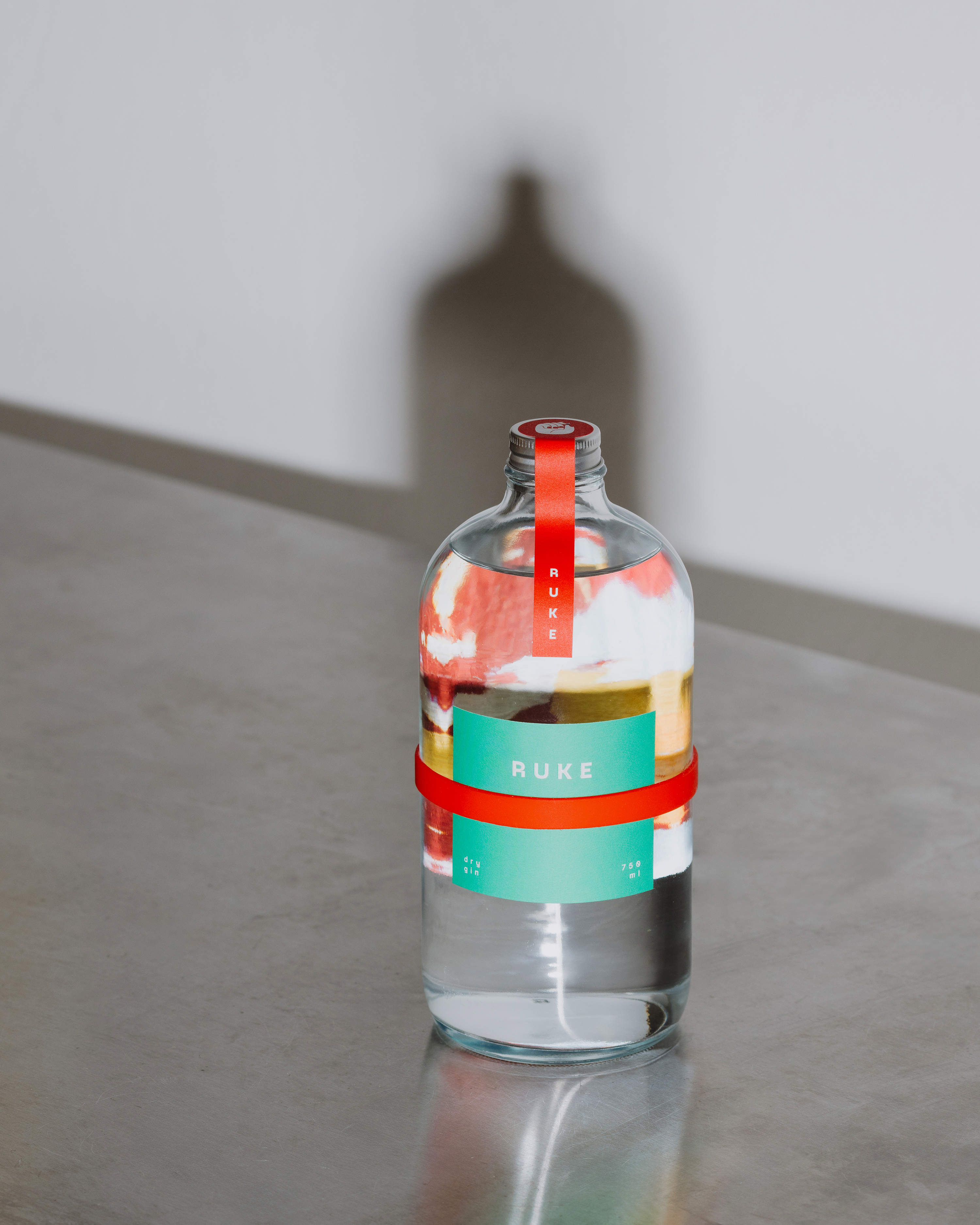
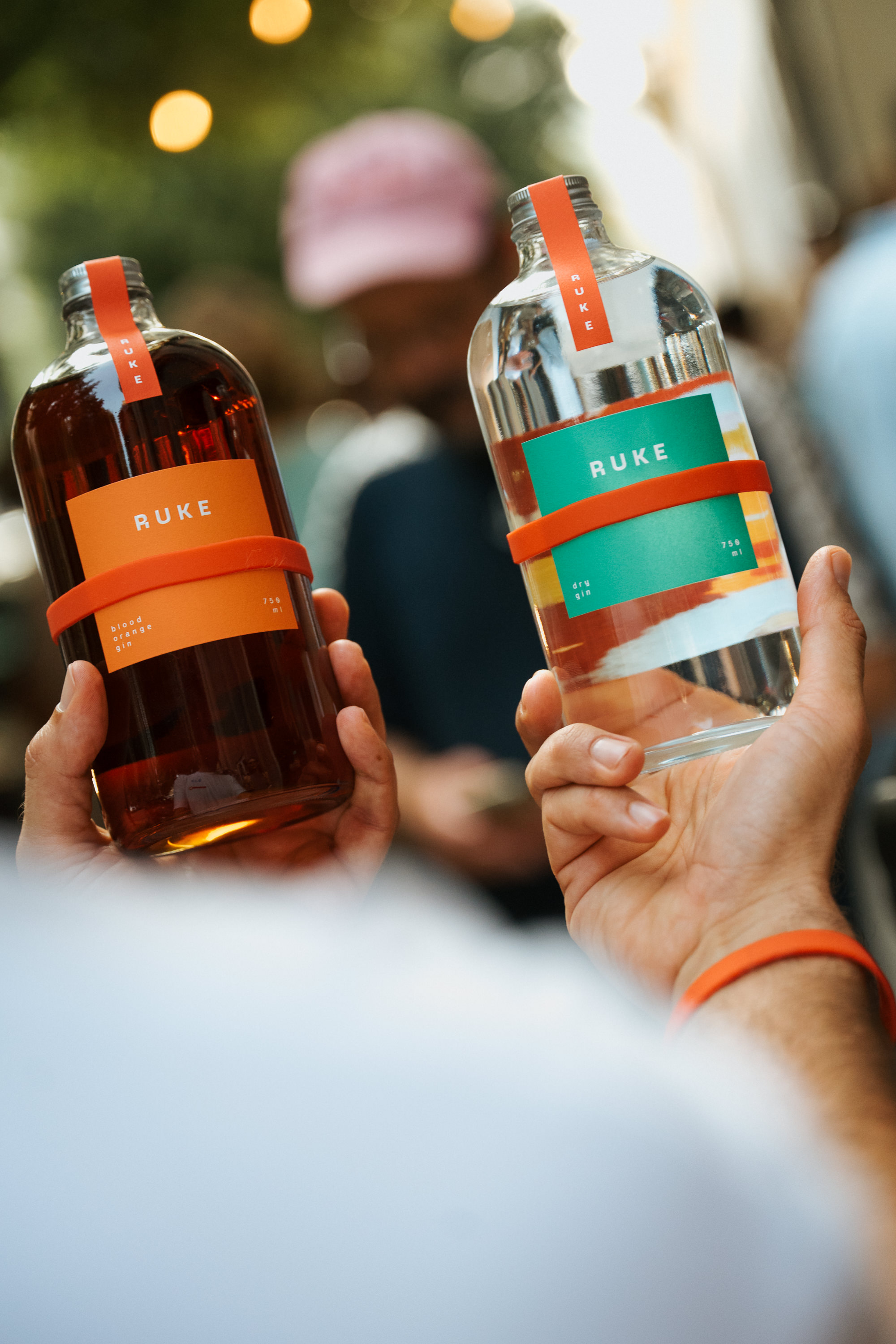
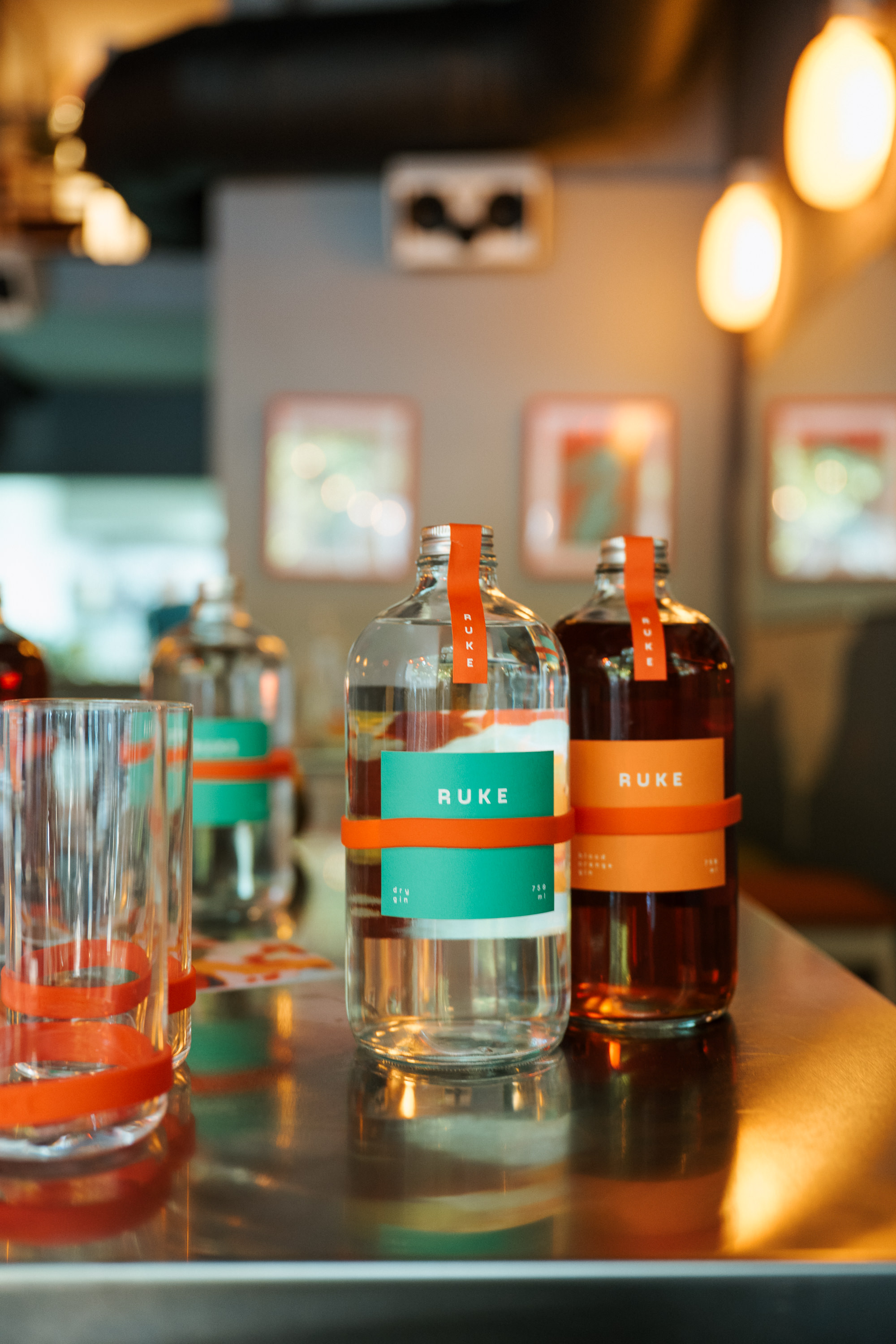
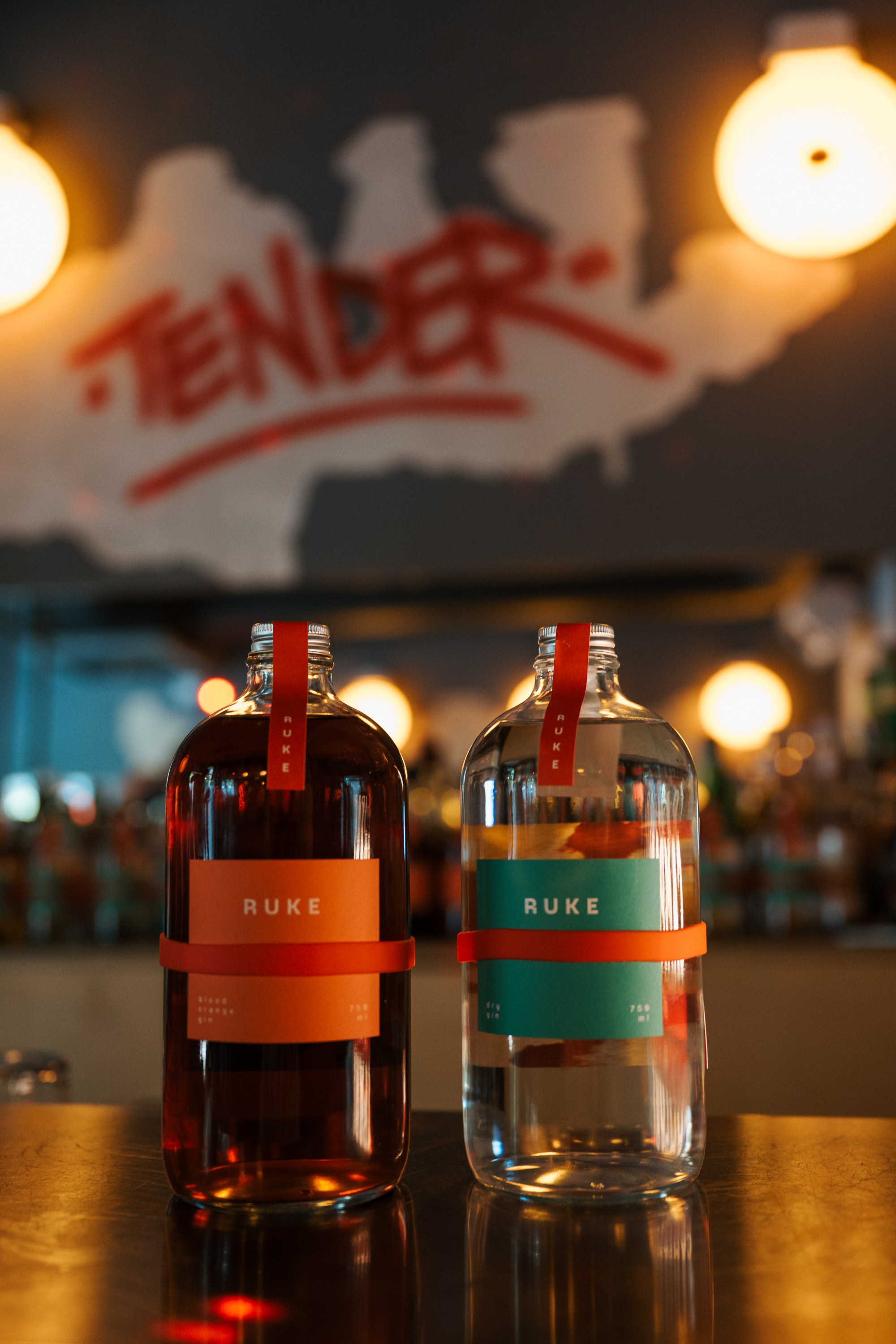
Packaging design & branding for the Ruke distillery is based on the concepts of community, collaboration, and visual clarity. The front label is minimalist, focused on essential information and the product’s identity. The part of the back label that is facing the bottle carries graphic content – it is variable, removable, and functionally designed as a collectible art object. It is held in place by a red silicone wristband, which also serves as the brand’s signature feature. For the first series of labels, artist Nikica Jurković created a collage used for the back labels of different products (dry gin, blood orange gin, fig liqueur). Viewed through the liquid in the bottle, the illustration becomes distorted, adding an extra visual dimension. Through its modularity and potential for collaboration, the label design enables a dynamic visual identity that evolves and grows with the brand.
Credits