A+ Magazine
Introduction
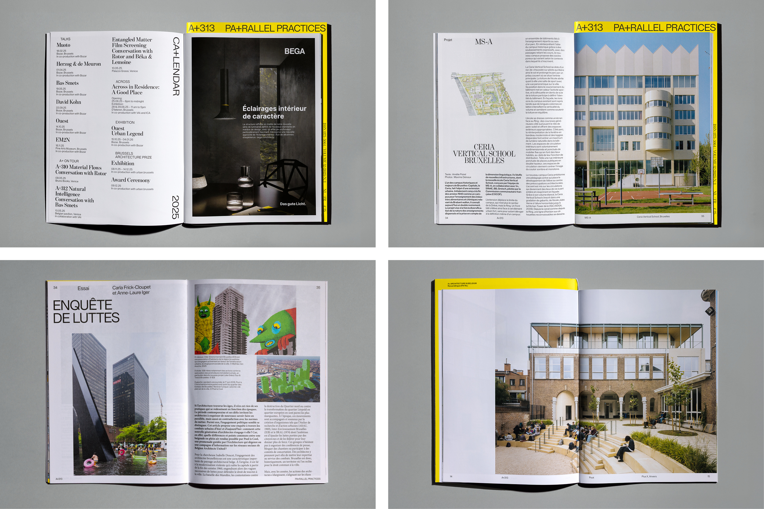
Since 1973, A+ has been Belgium’s leading magazine on architecture and urbanism. With intellectual independence and critical depth, it examines the built environment and its societal impact. Published five times a year in French and Dutch — including two English supplements — A+ combines project reviews, essays and interviews around a central theme.
More than a magazine, A+ is a cultural reference within the Belgian architectural field.
Brief
Reposition A+ to strengthen its community and make the subscription model relevant again.
The redesign needed to be formally distinctive yet restrained — serving architecture rather than competing with it — while introducing a clearer thematic structure and renewed editorial focus.
Concept
We asked a simple but radical question: Can the structure of a magazine embody its editorial thinking?
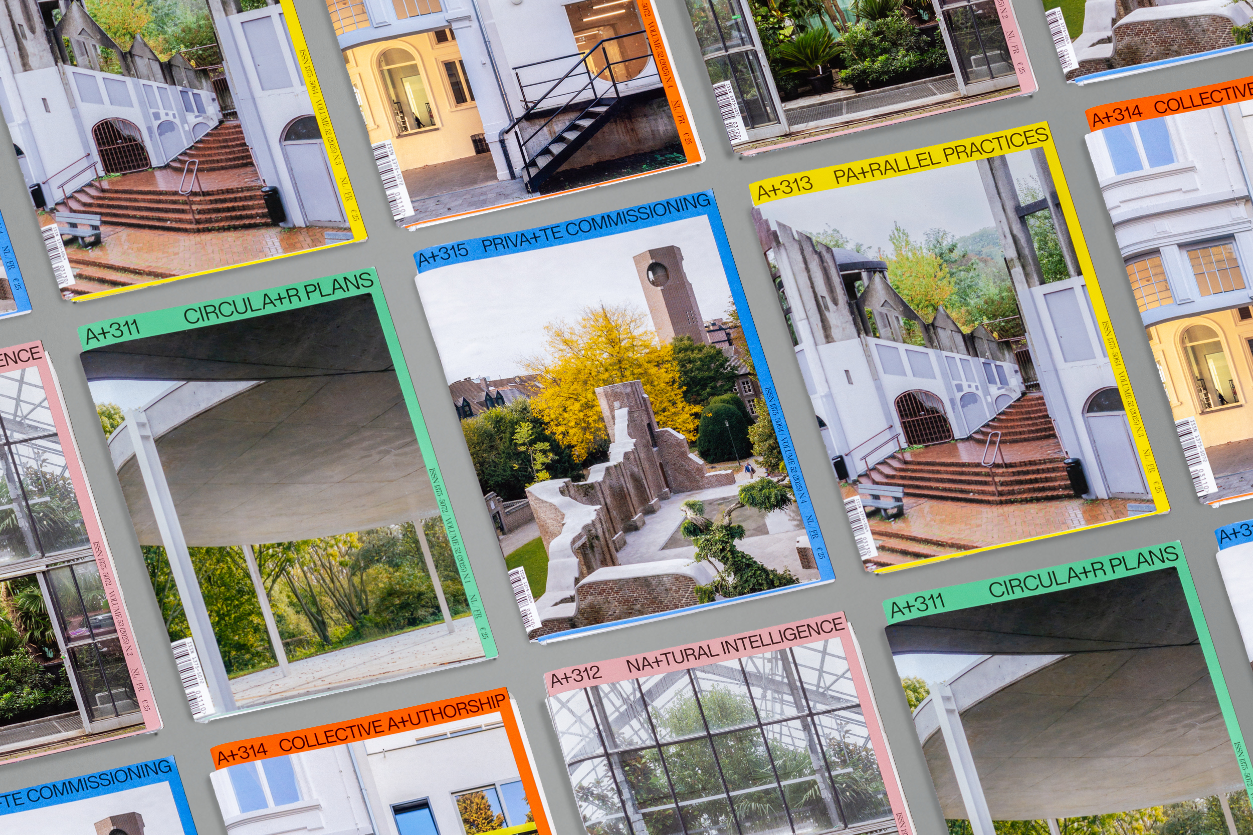
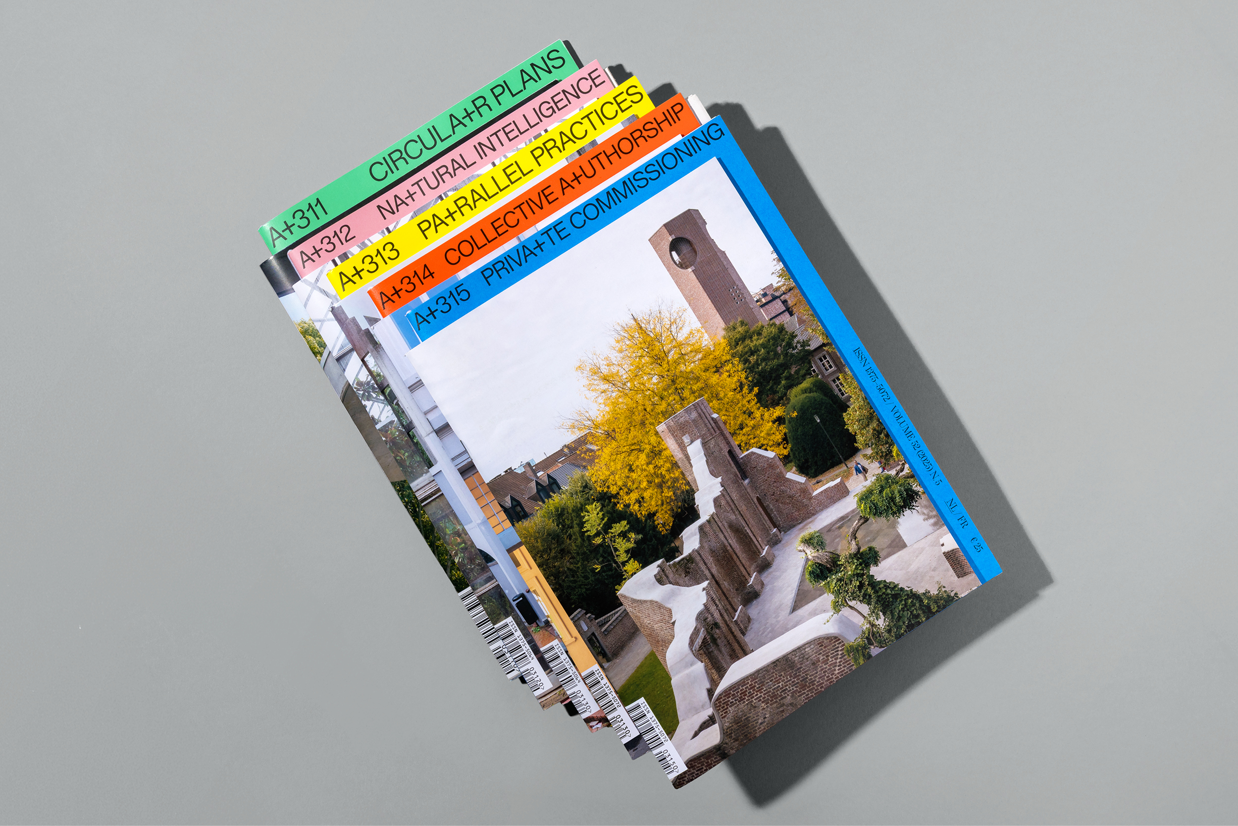
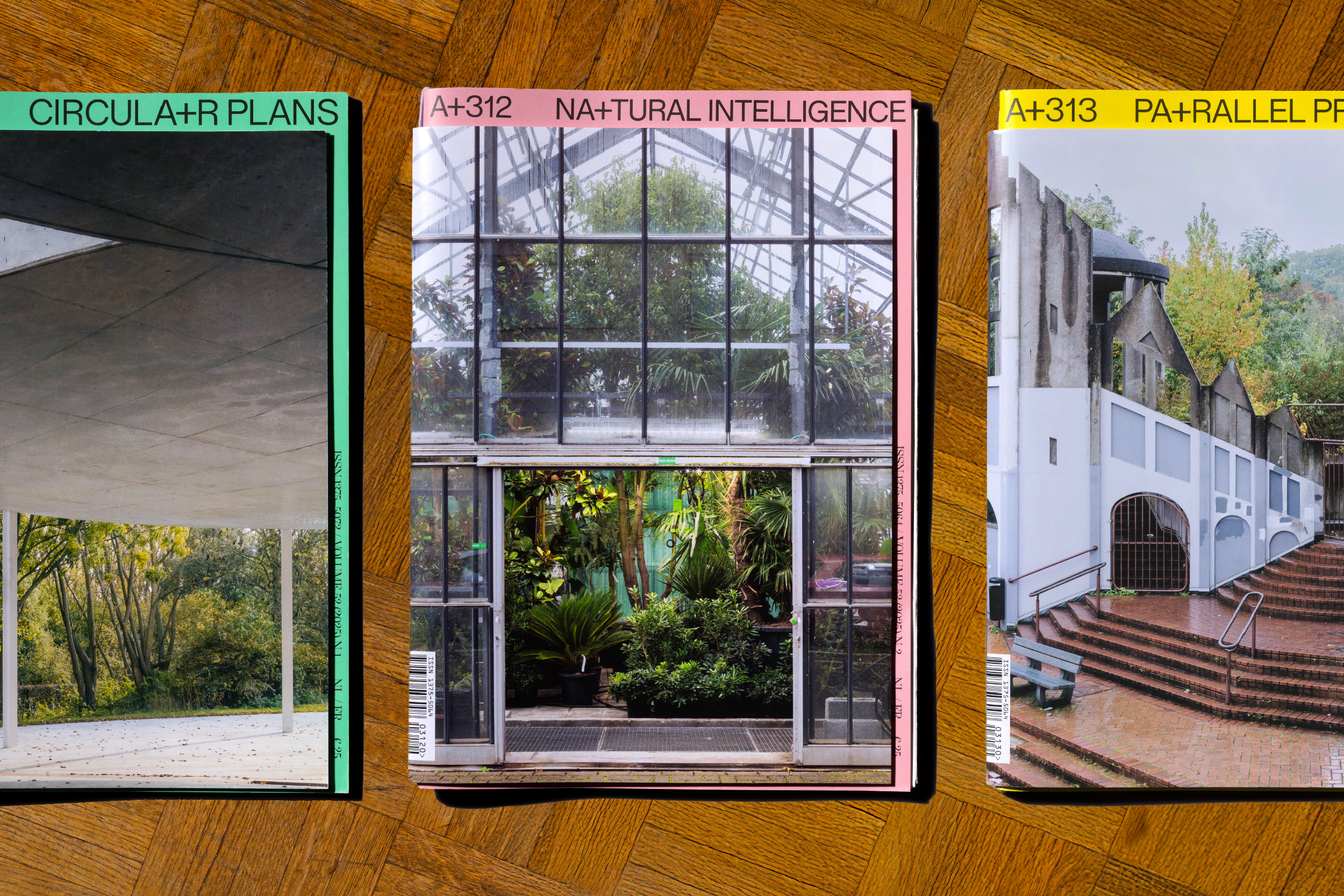
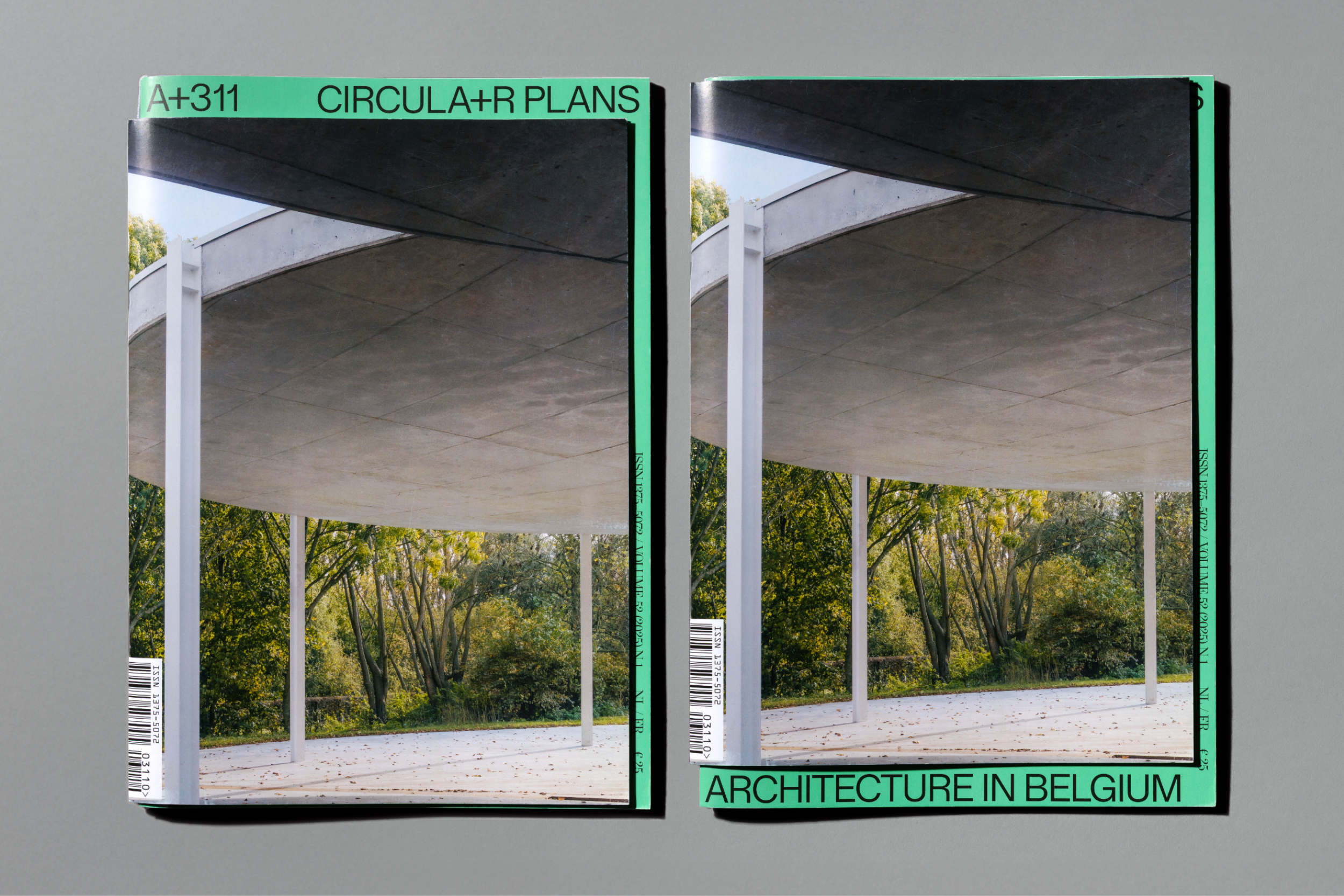
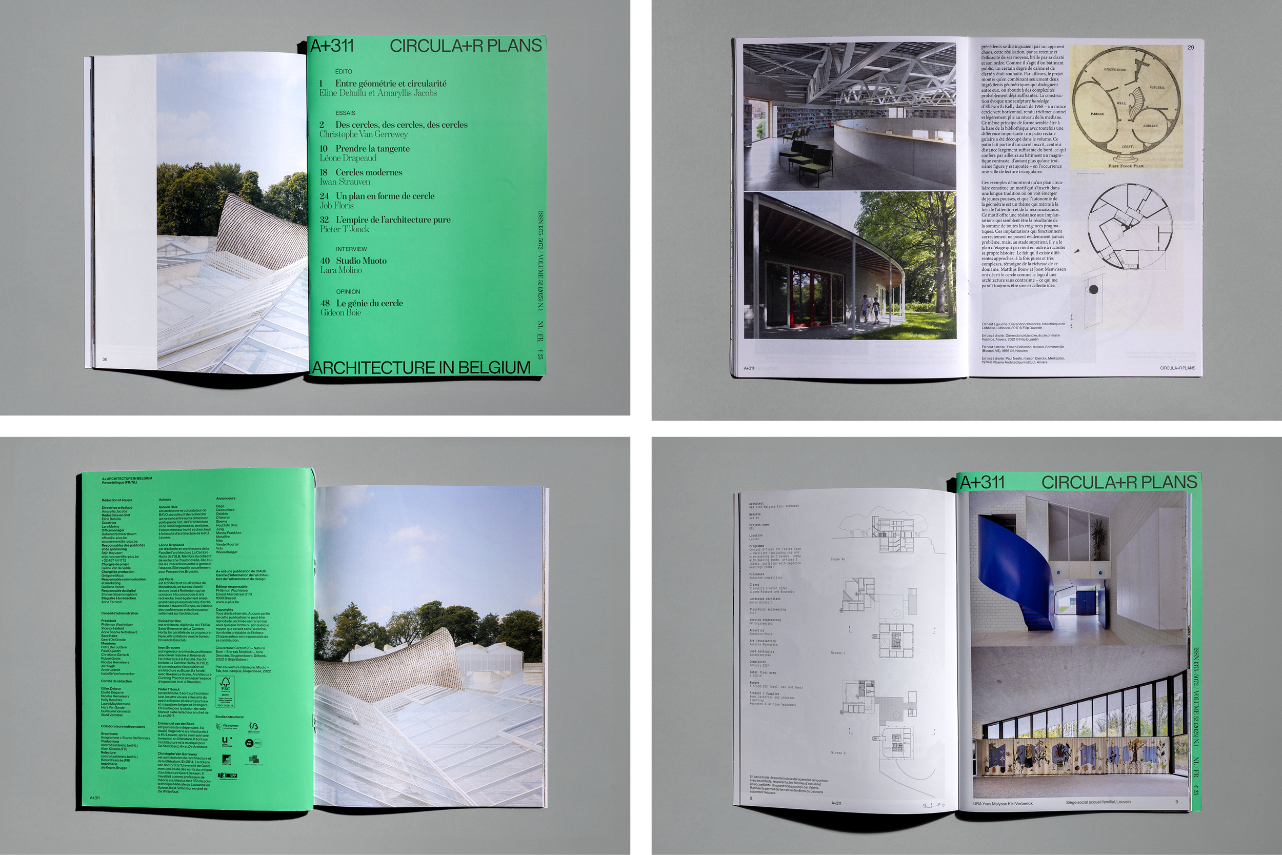
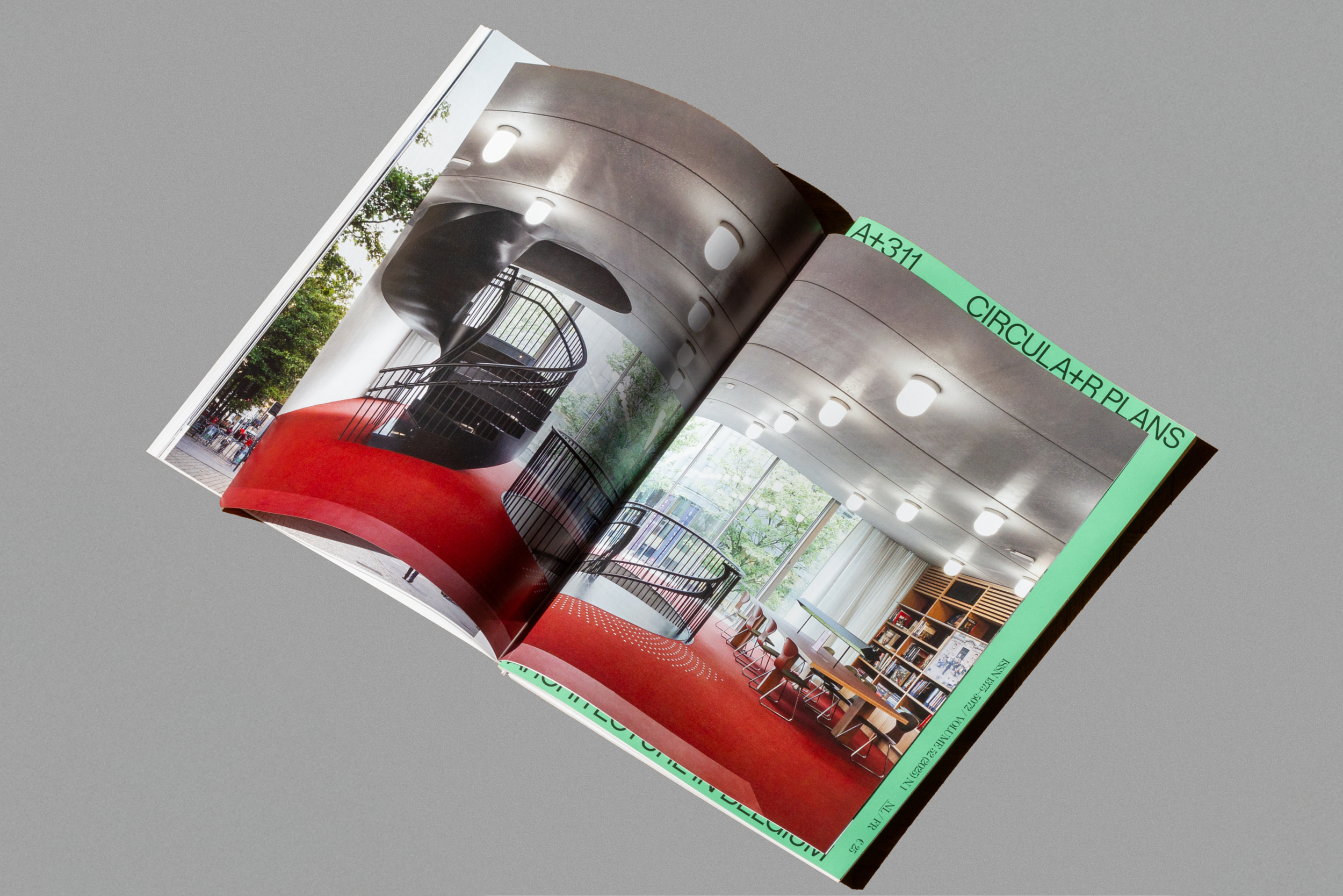
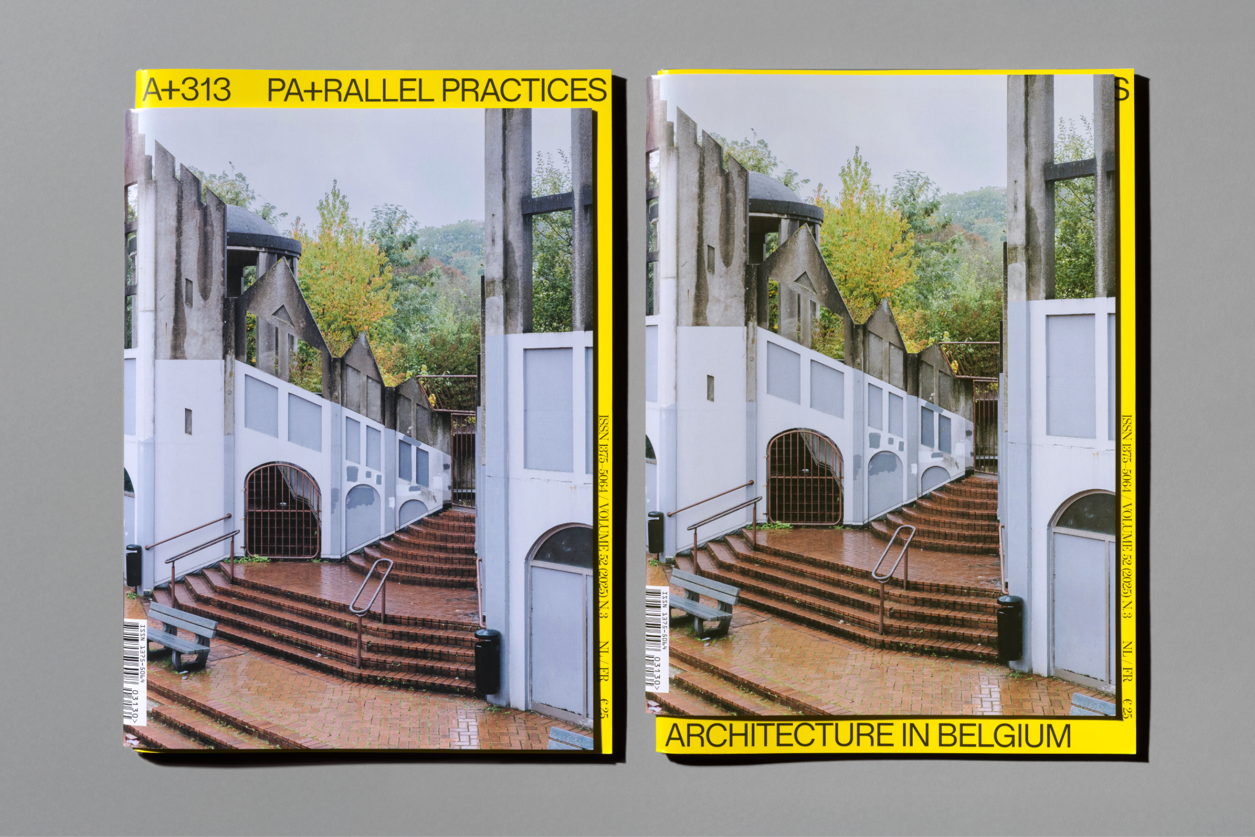
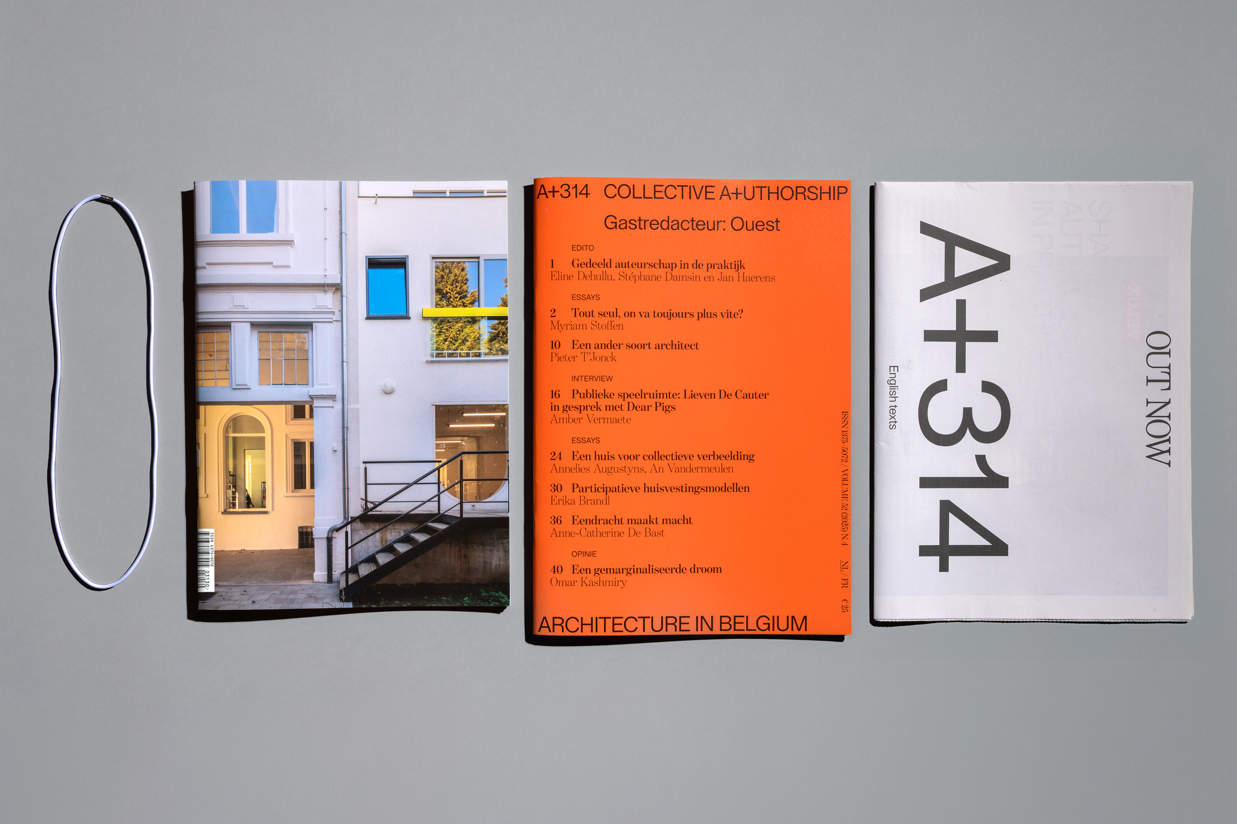
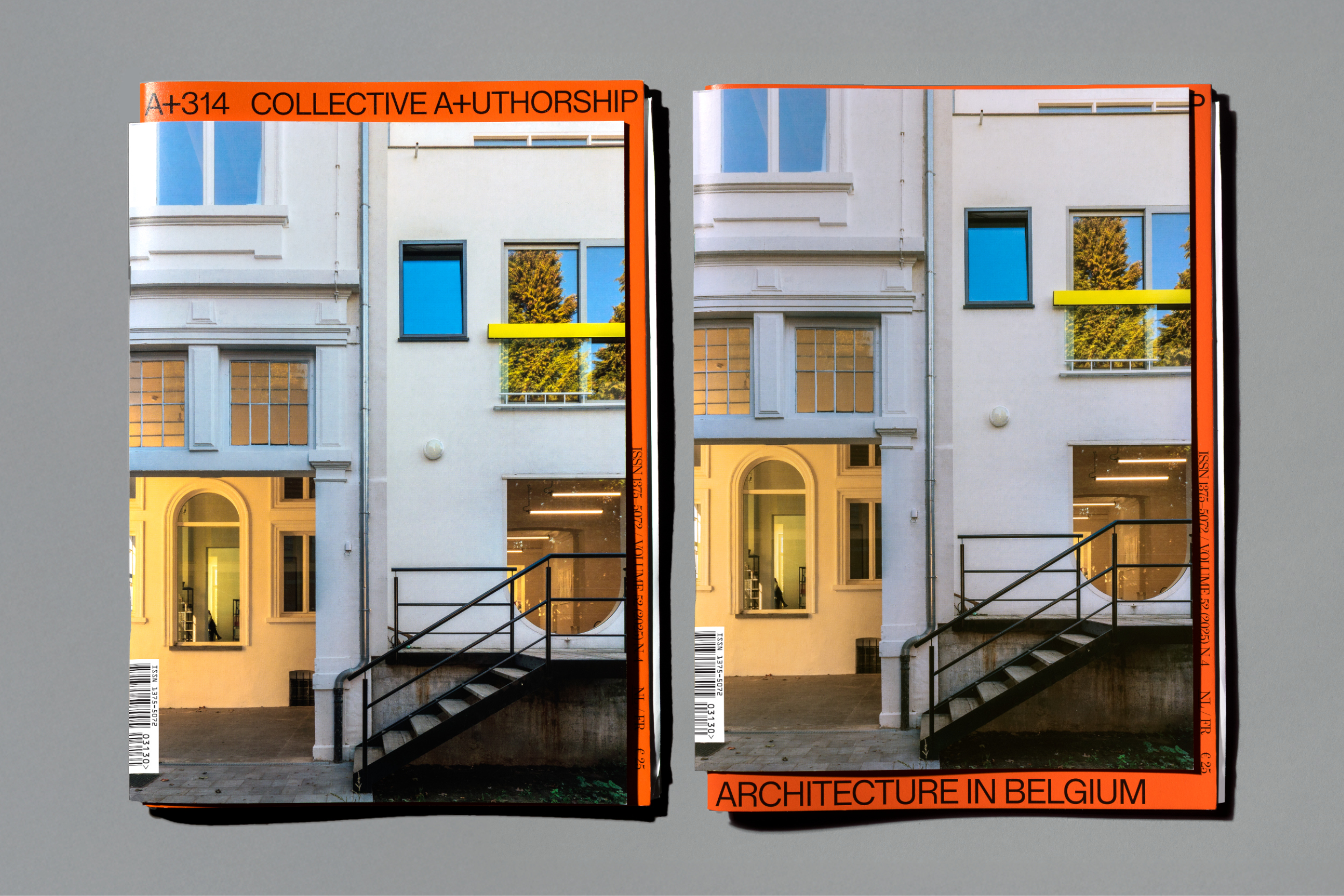
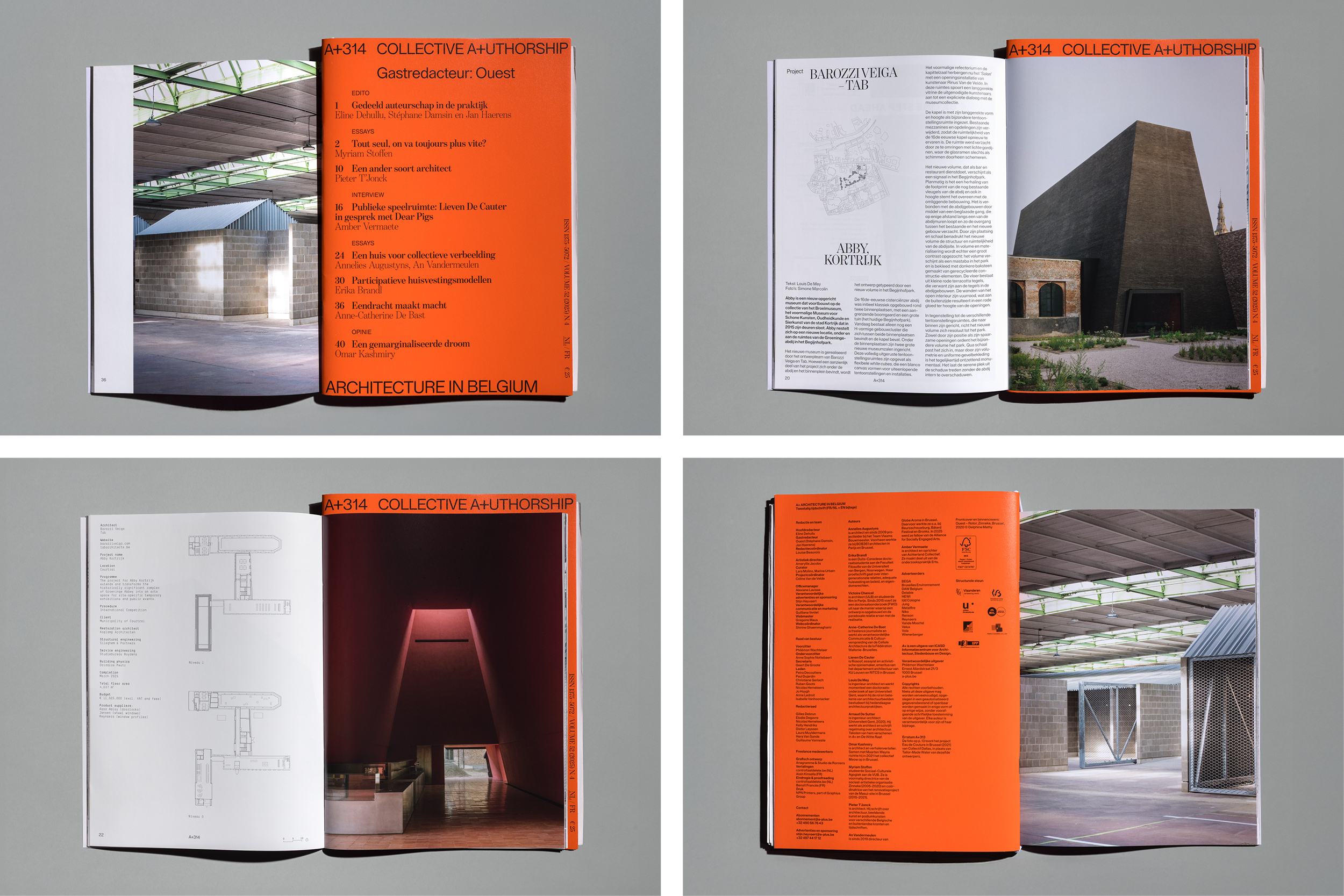
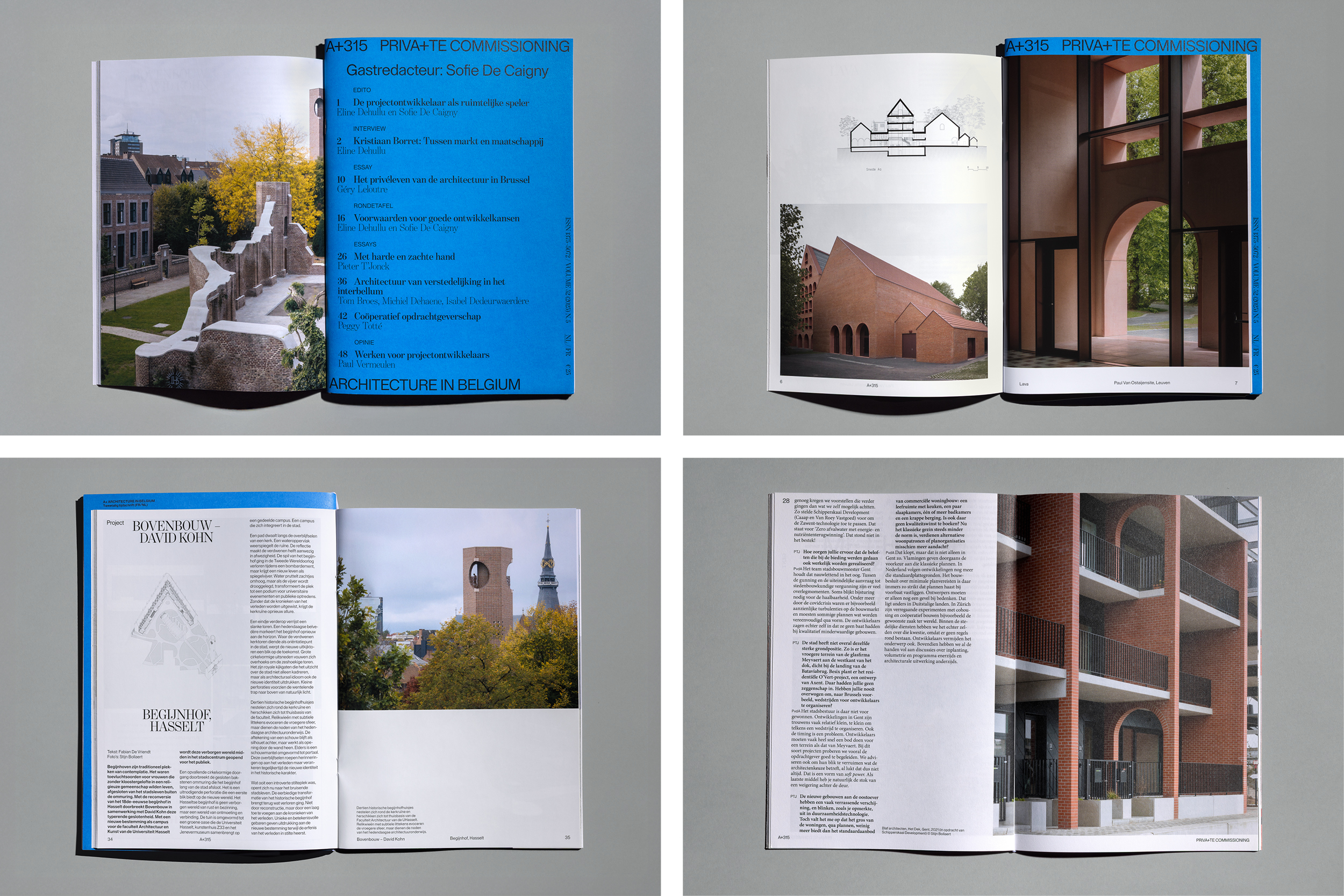
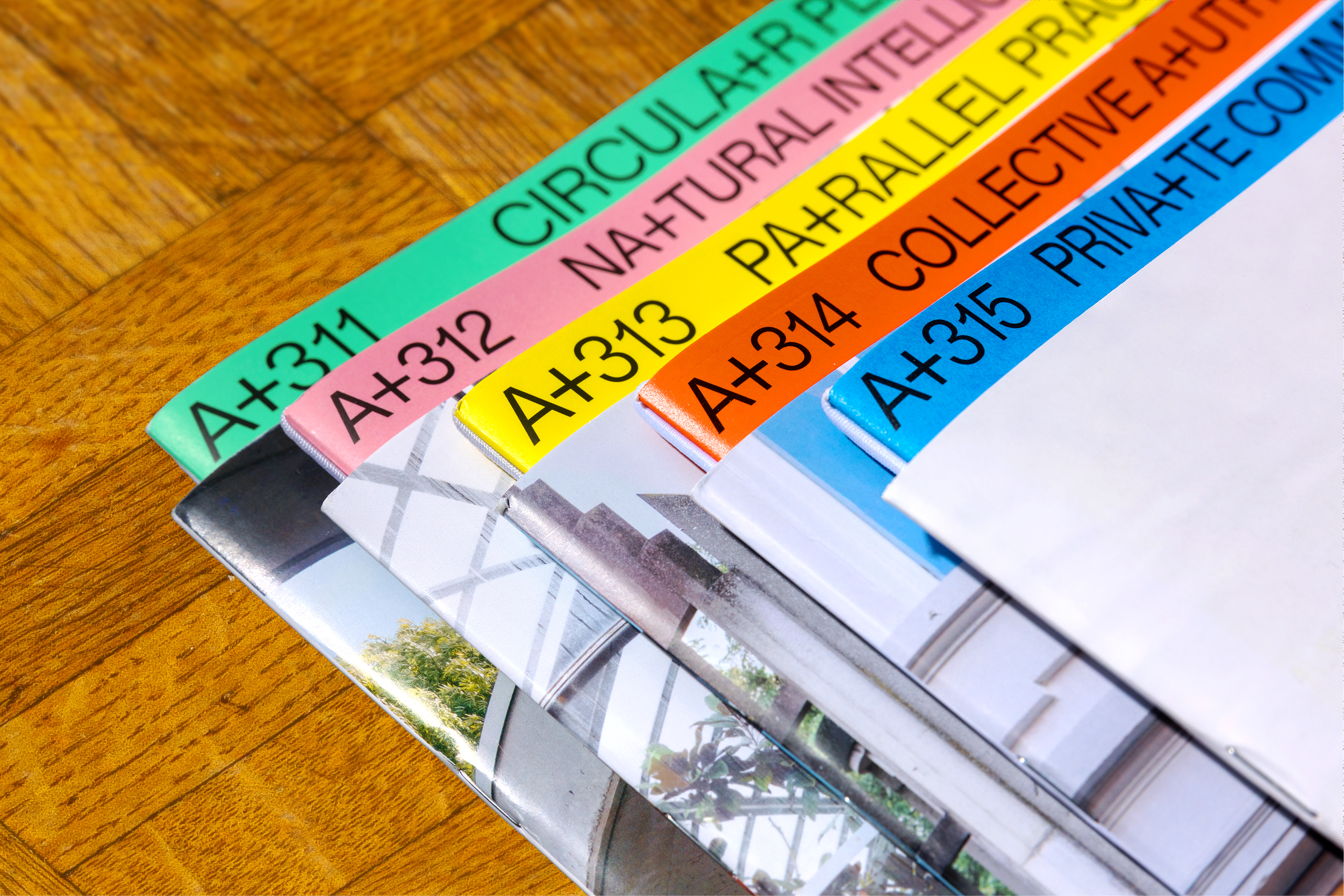
Instead of redesigning the layout, we redefined the object. A+ was physically split into two autonomous parts: a project section and a thematic section. Held together by an elastic band, the publication becomes flexible, expandable and open to intervention. Inserts and additional booklets can be added without disturbing the system.
The binding is not decorative — it is conceptual. Architecture is not linear; it is layered, contextual and continuously reassembled. The reader actively navigates between perspectives.
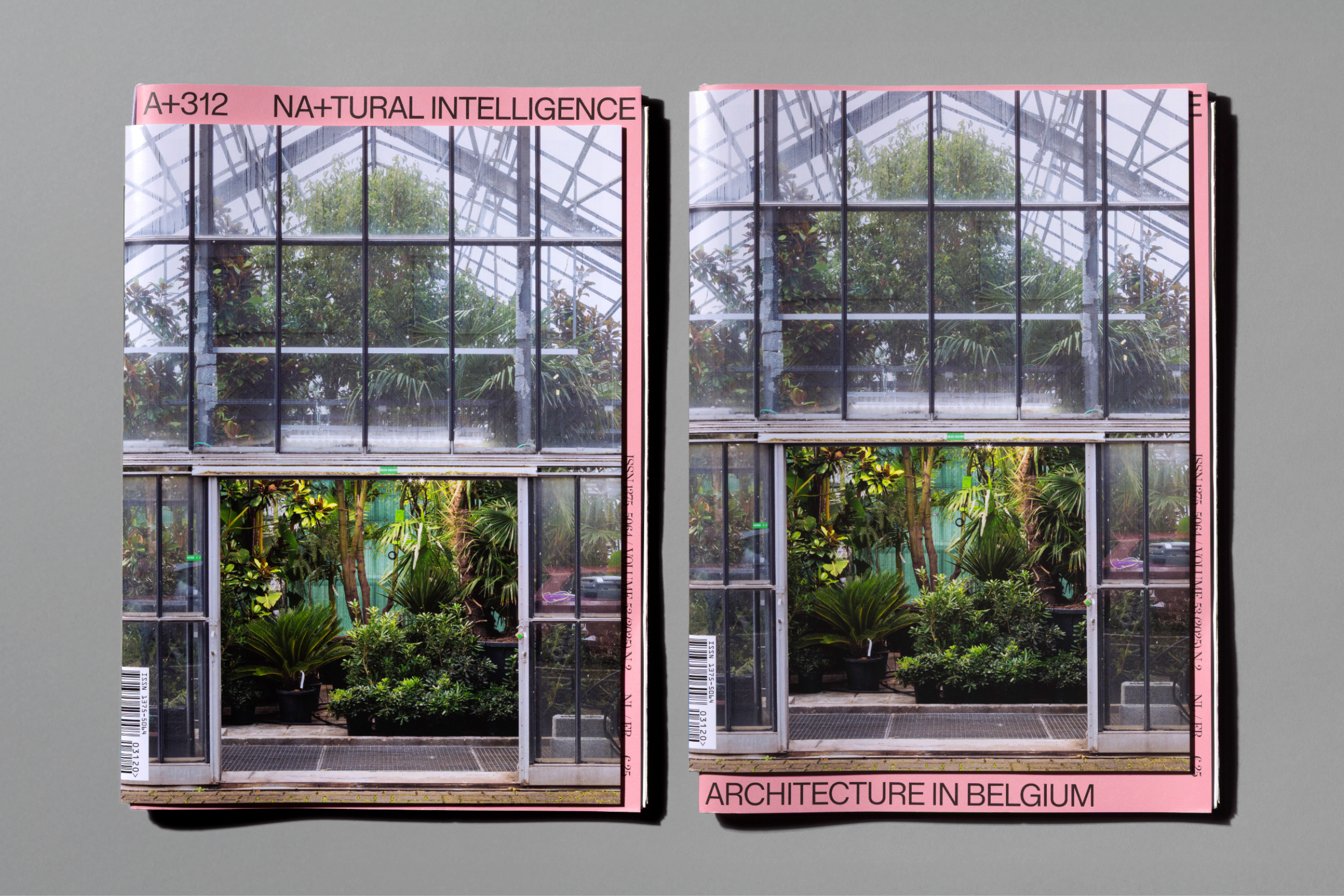
The cover was reduced to its essence. Architecture takes full visual priority. The A+ logo and theme appear as a minimal tab and the thematic section literally protruding from the project section. Each issue receives its own distinct color accent, creating collectability within a coherent system.
In a landscape of overdesigned cultural magazines, A+ stands out through clarity, reduction and precision.
Impact
The redesign was embraced by a highly critical audience of architects, where form and content are inseparable.
The decline in subscriptions was halted and A+ regained cultural momentum. The magazine re-established itself as a sharp, relevant voice within contemporary architectural discourse.
Relevance
The project extended beyond print. A+ was repositioned as a cultural brand with long-term value and authority.
The new identity system now informs print, digital platforms and physical programming, transforming A+ from a publication into a platform — a community anchored in architecture.
Credits