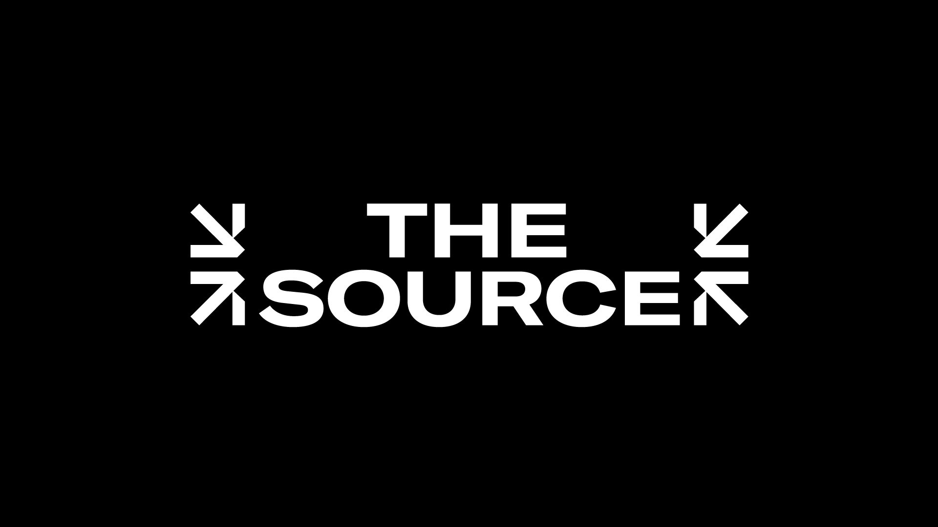
The Source
The Concept: The Ultimate Destination
The visual identity was designed to interpret the brand's core essence: a central origin of curated materials for interior designers and architects. The identity positions the company as the definitive destination, the starting point where ideas, materials, and expertise meet.
Spatial Grid & Typography
The design language functions as a spatial grid, integrating the brand into the built environment.
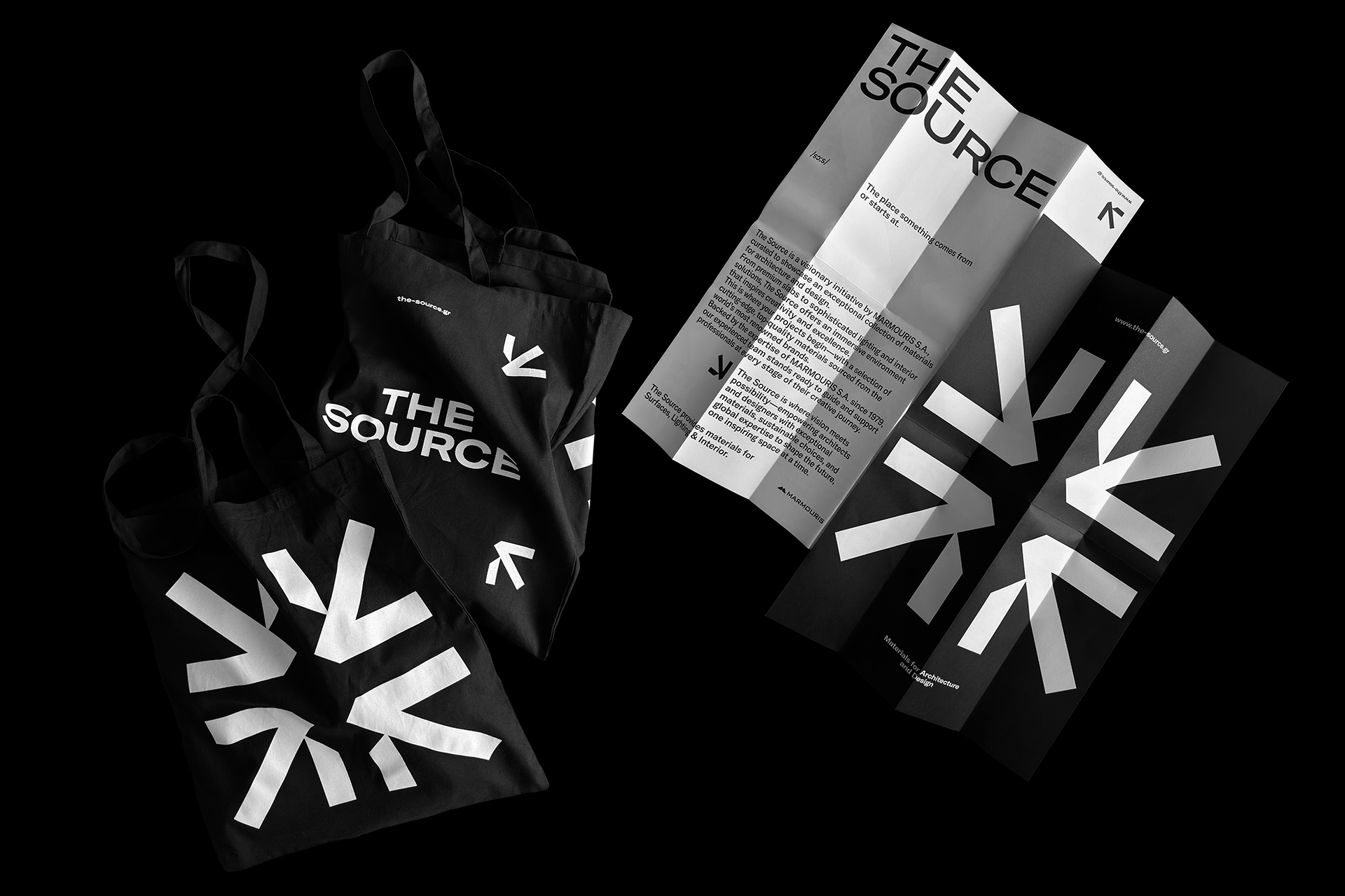
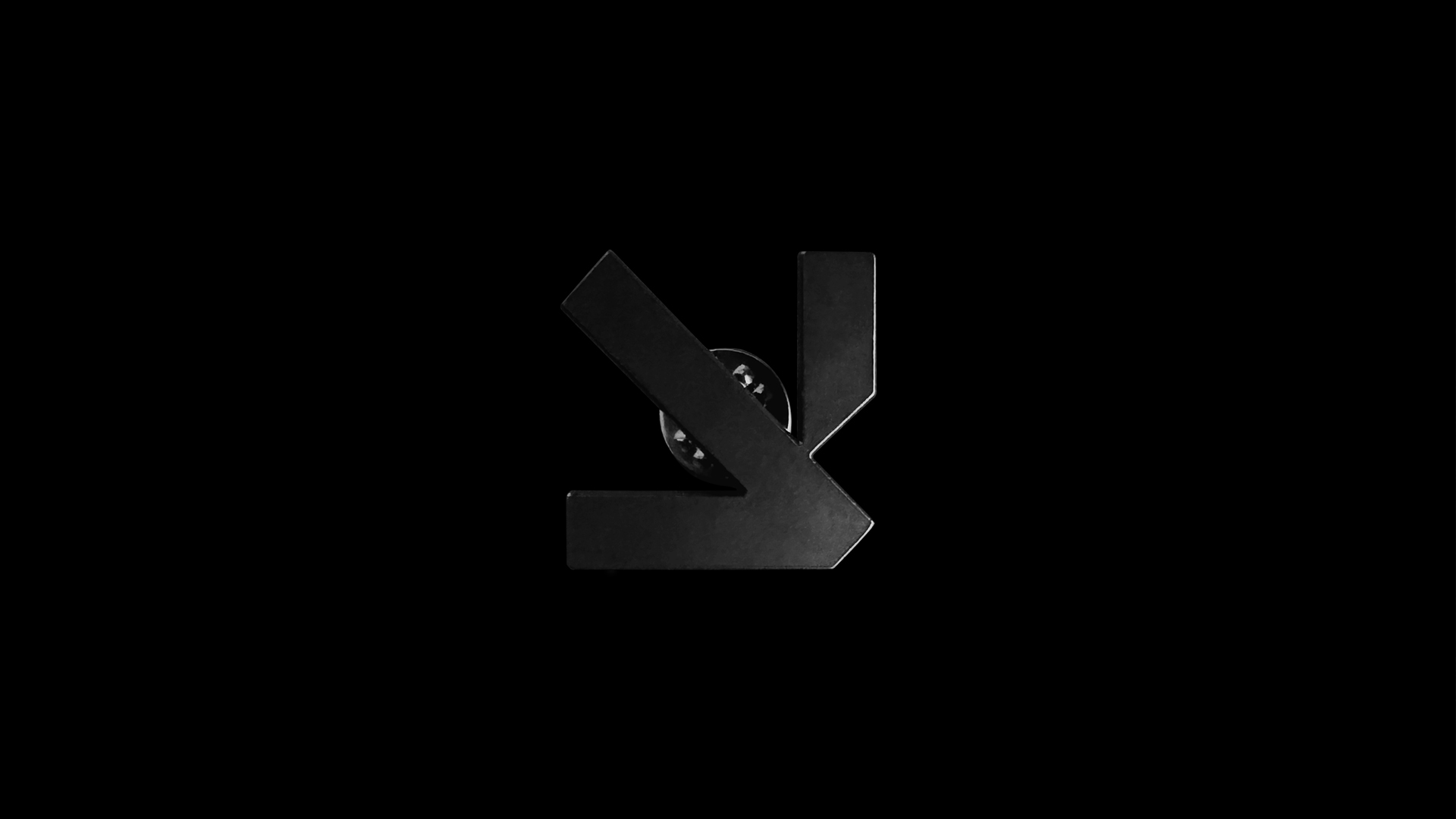
The Arrow as an Anchor
The four arrows do not merely point; they anchor the brand within the architectural space, effectively framing the environment. With a rigorous geometry reminiscent of technical drawings, they visually signify that The Source is the singular wellspring for the most compelling architectural materials.
The Arrow as an Active Guide
Beyond its role in framing, the arrow functions as a dynamic visual prompt. It does not merely point; it suggests and prescribes, guiding the creator toward the ideal selection. It embodies the brand's expertise, acting as a curated recommendation that highlights exactly what and where to choose within the vast world of architectural materials.
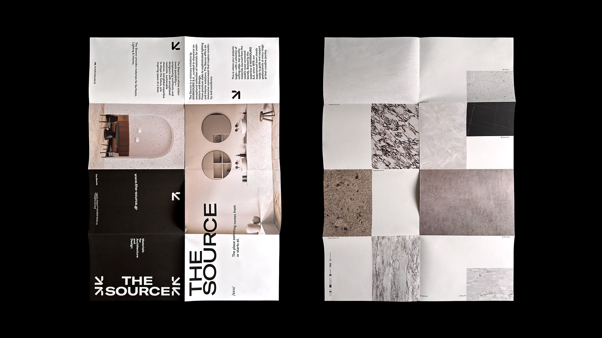
Wide Typography
The selection of a wide typeface is a deliberate reference to large-scale architectural surfaces. Its expansive letterforms convey stability, authority, and horizontal clarity, echoing the structural weight of the brand's offerings.
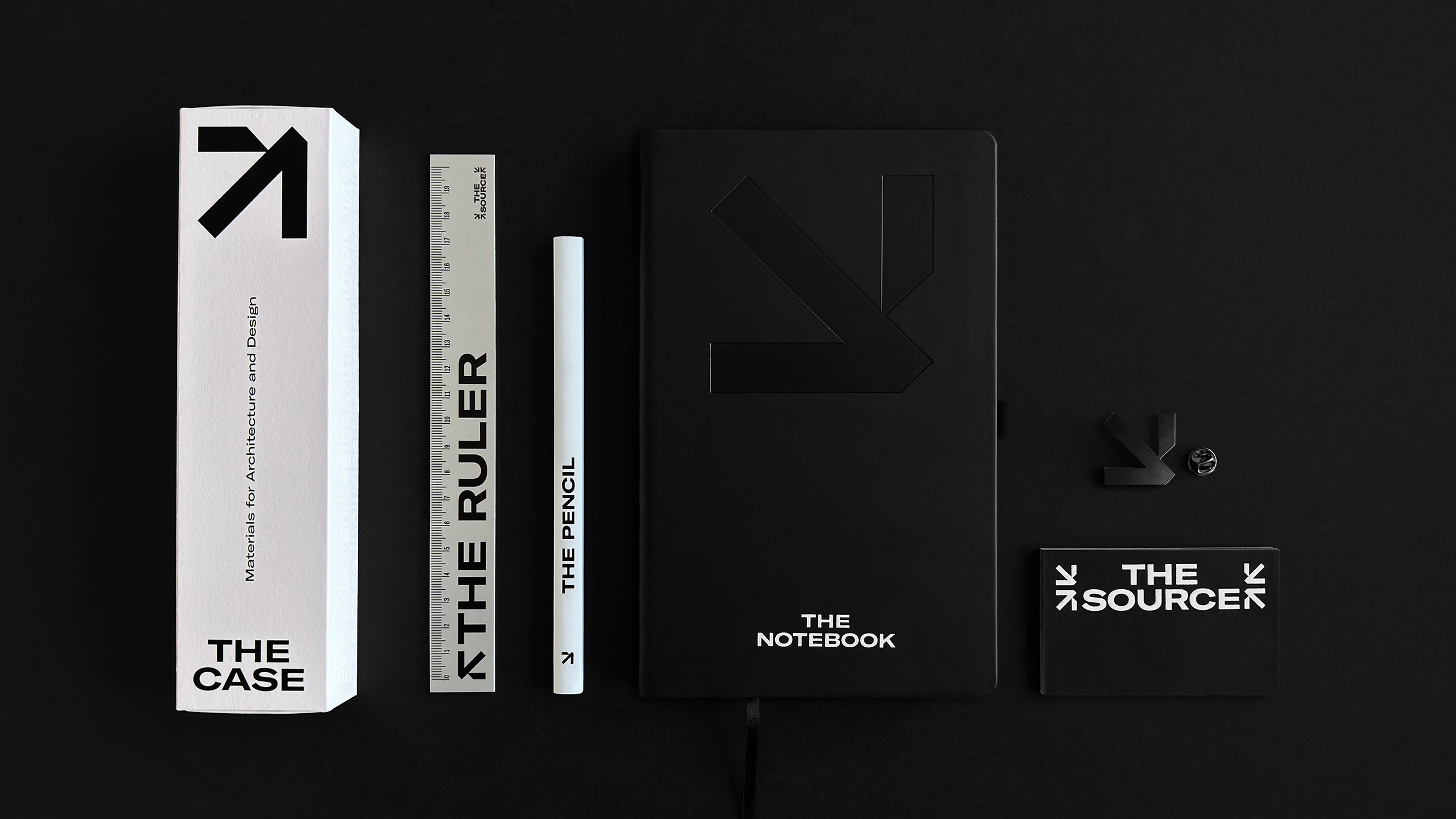
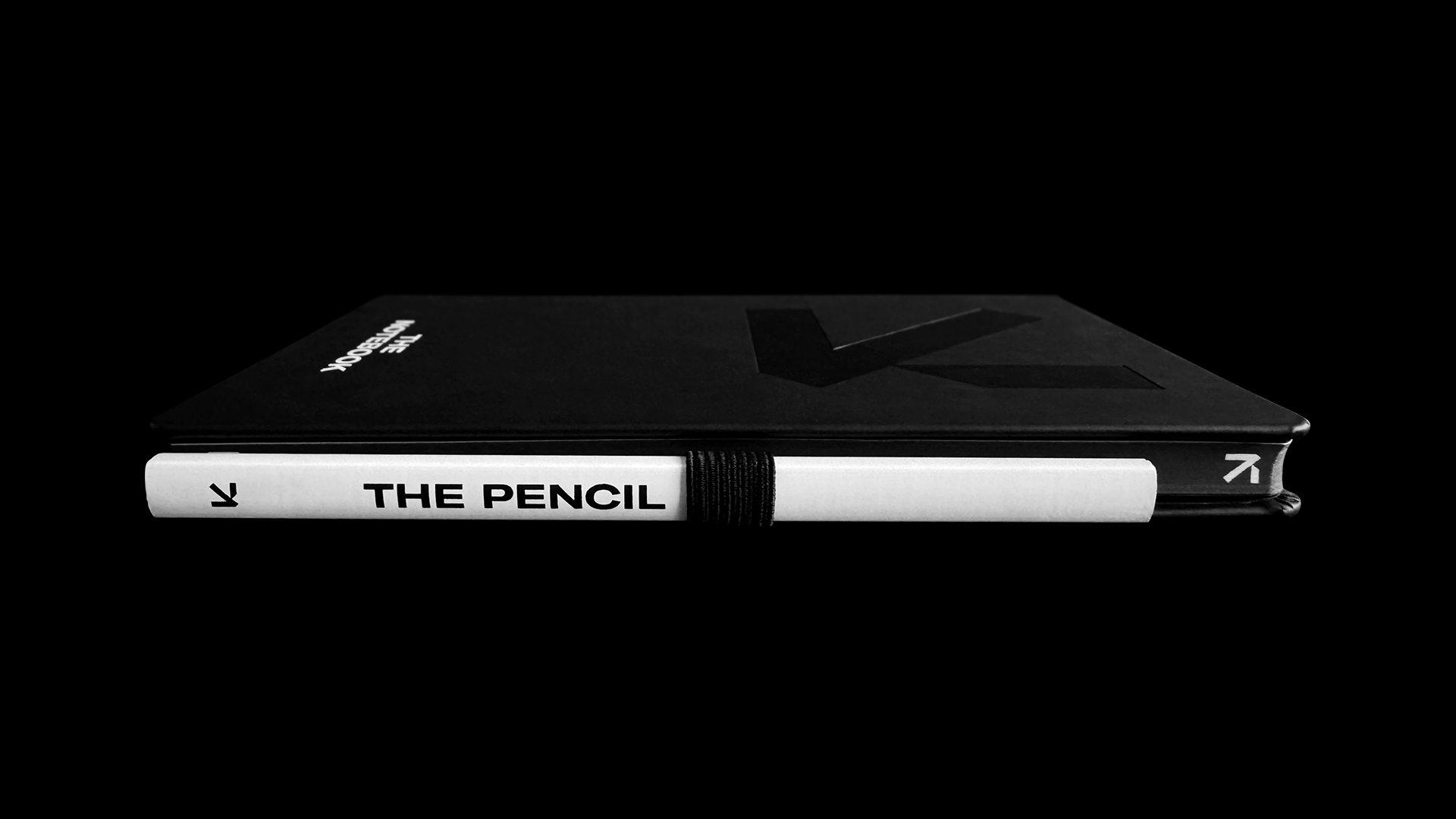
THE as a System:
The Communication Kit The identity introduces "THE" as a unifying, absolute language across all brand applications. Rather than merely naming objects, the brand defines them, transforming every element of the communication kit into a definitive statement.
Every item, from The Case and The Ruler to The Pencil and The Notebook, is presented as the absolute version of its function, reduced to its essence and stripped of excess. This system allows every application, from physical tools and containers to the broader spatial experience, to belong to the same origin regardless of scale or medium. By shifting from mere products to architectural references, the prefix "THE" becomes the marker of intention, authority, and clarity. It reinforces the brand’s ultimate promise: that The Source is exactly where every creation begins.
Credits