Parole al muro
Parole al muro is an editorial and typographic project that explores the fundamental value of italian language: words as tools of transformation, memory, and identity. The calendar brings together twelve words selected in collaboration with Treccani Institut as conceptual focal points: each word becomes a visual device, capable of generating cultural content and graphic form.
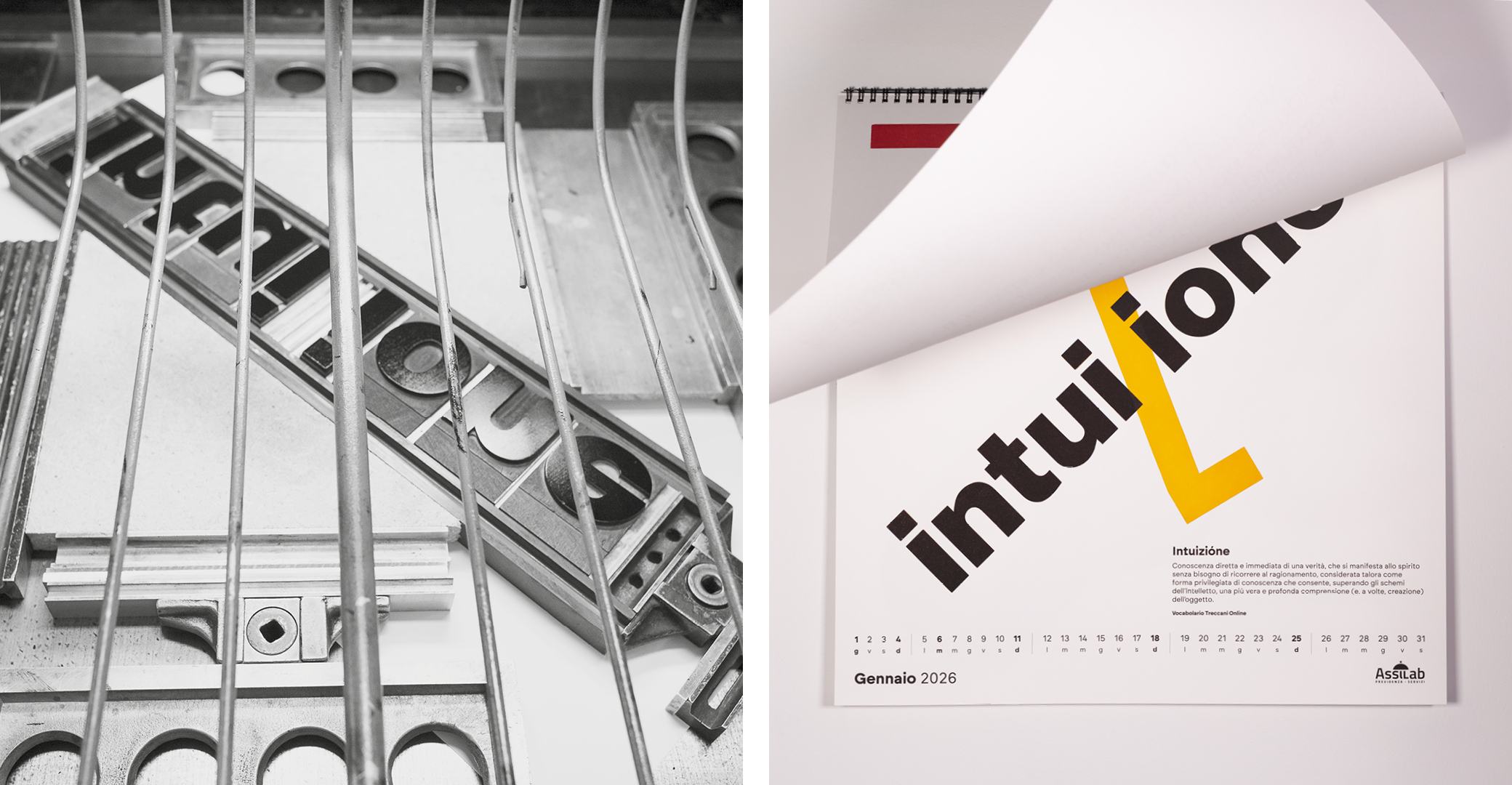
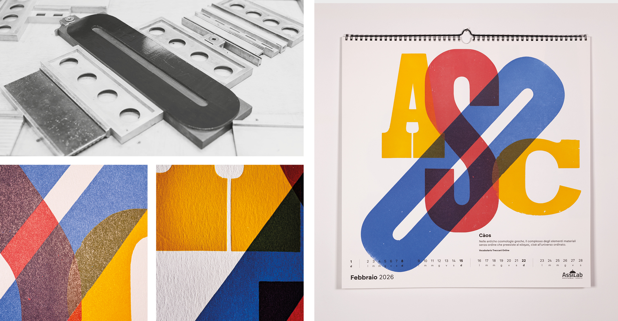
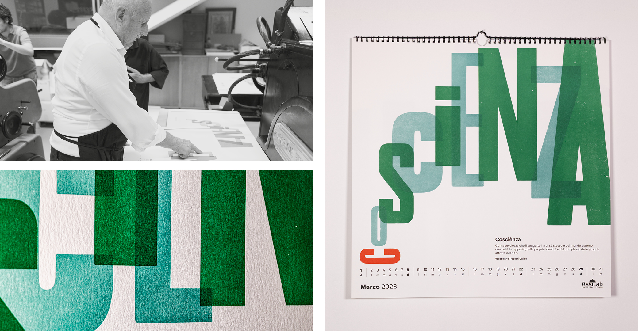
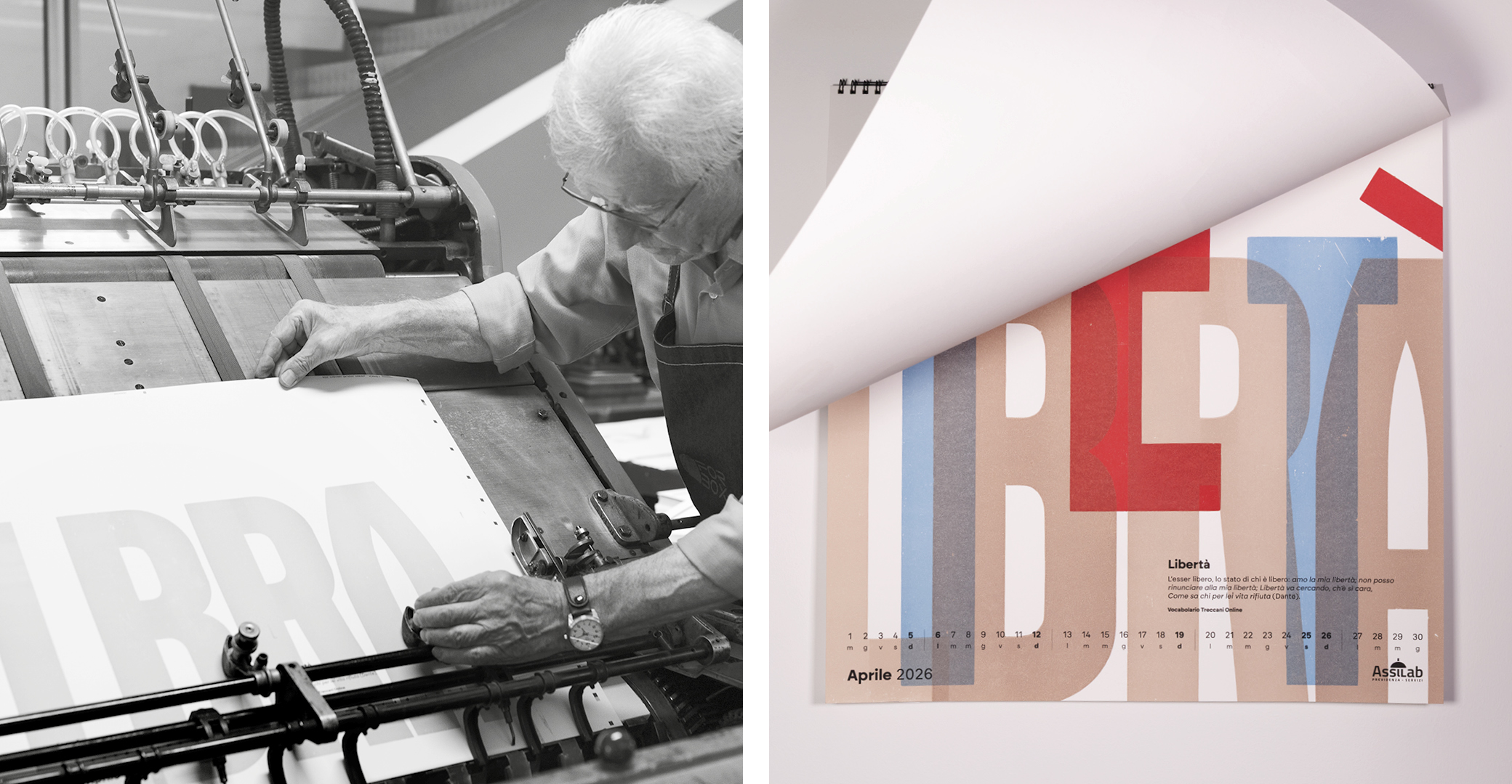
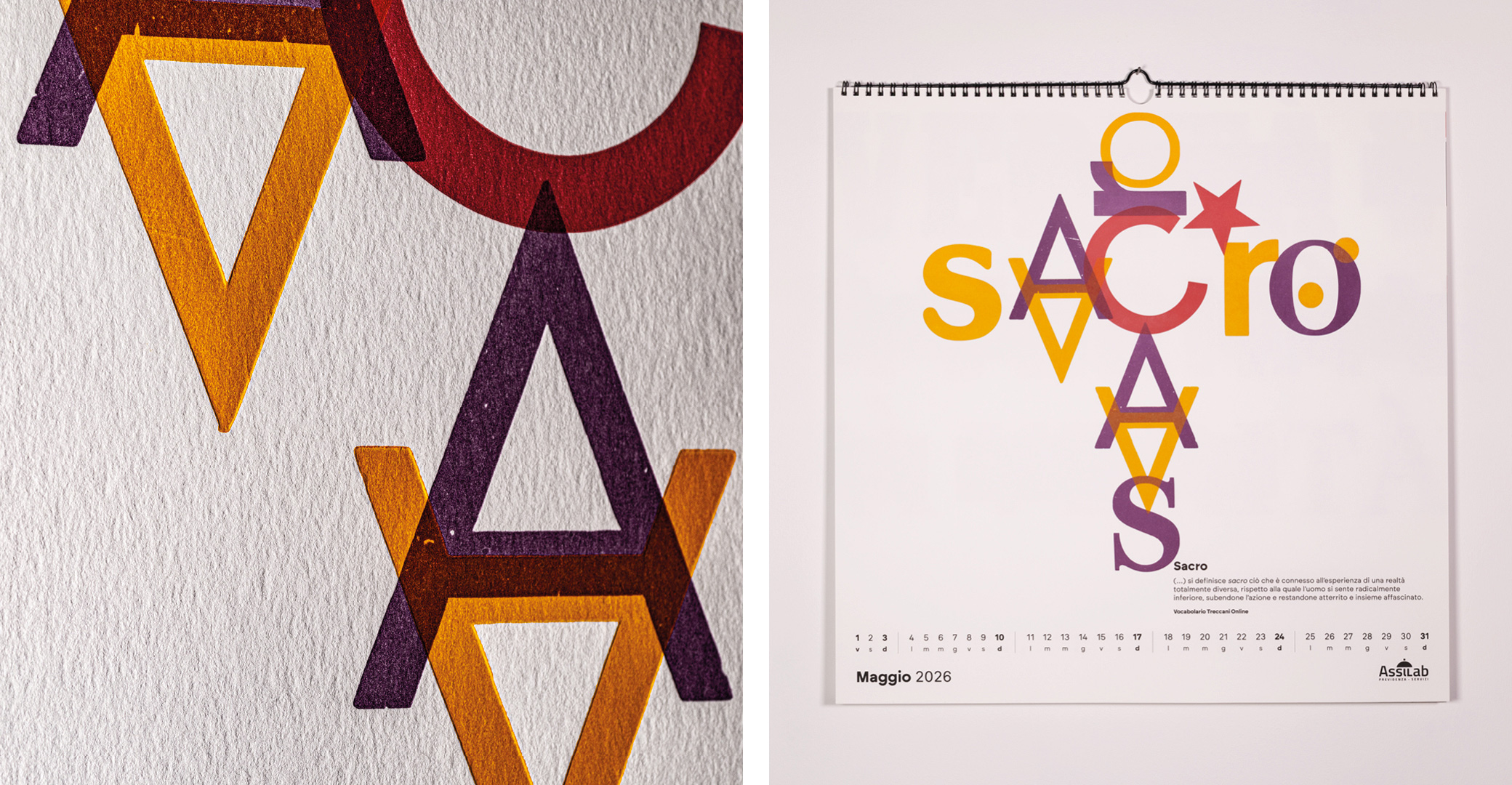
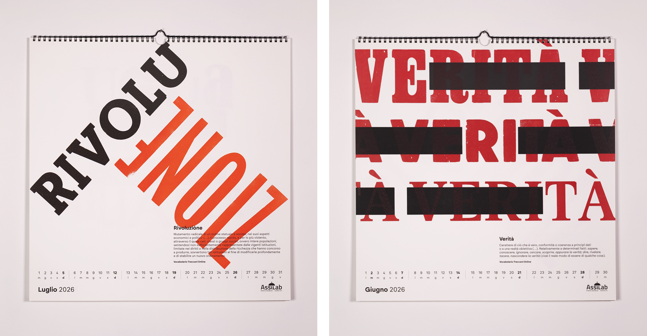
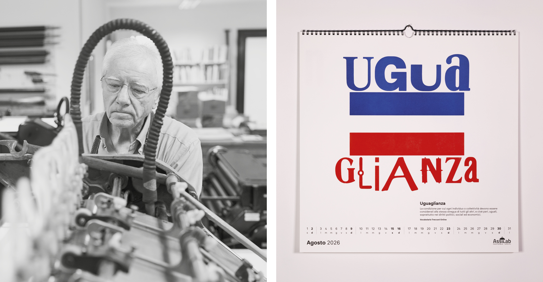
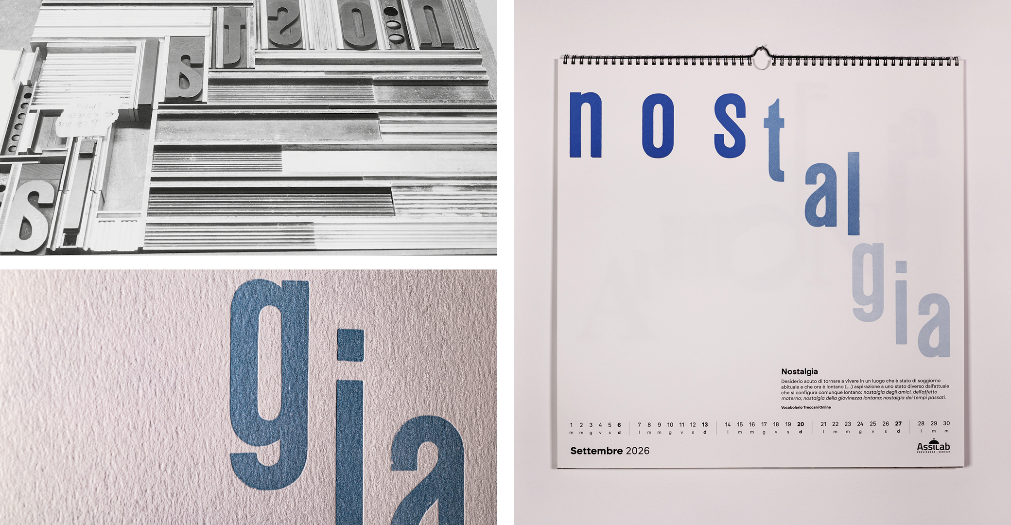
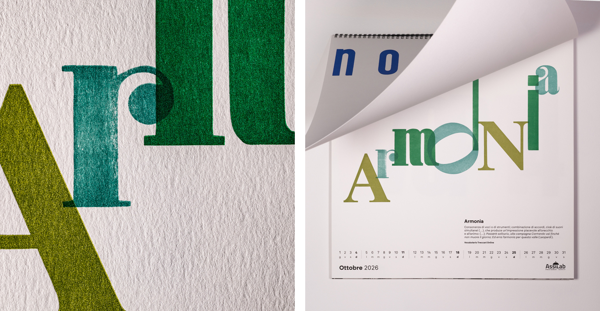
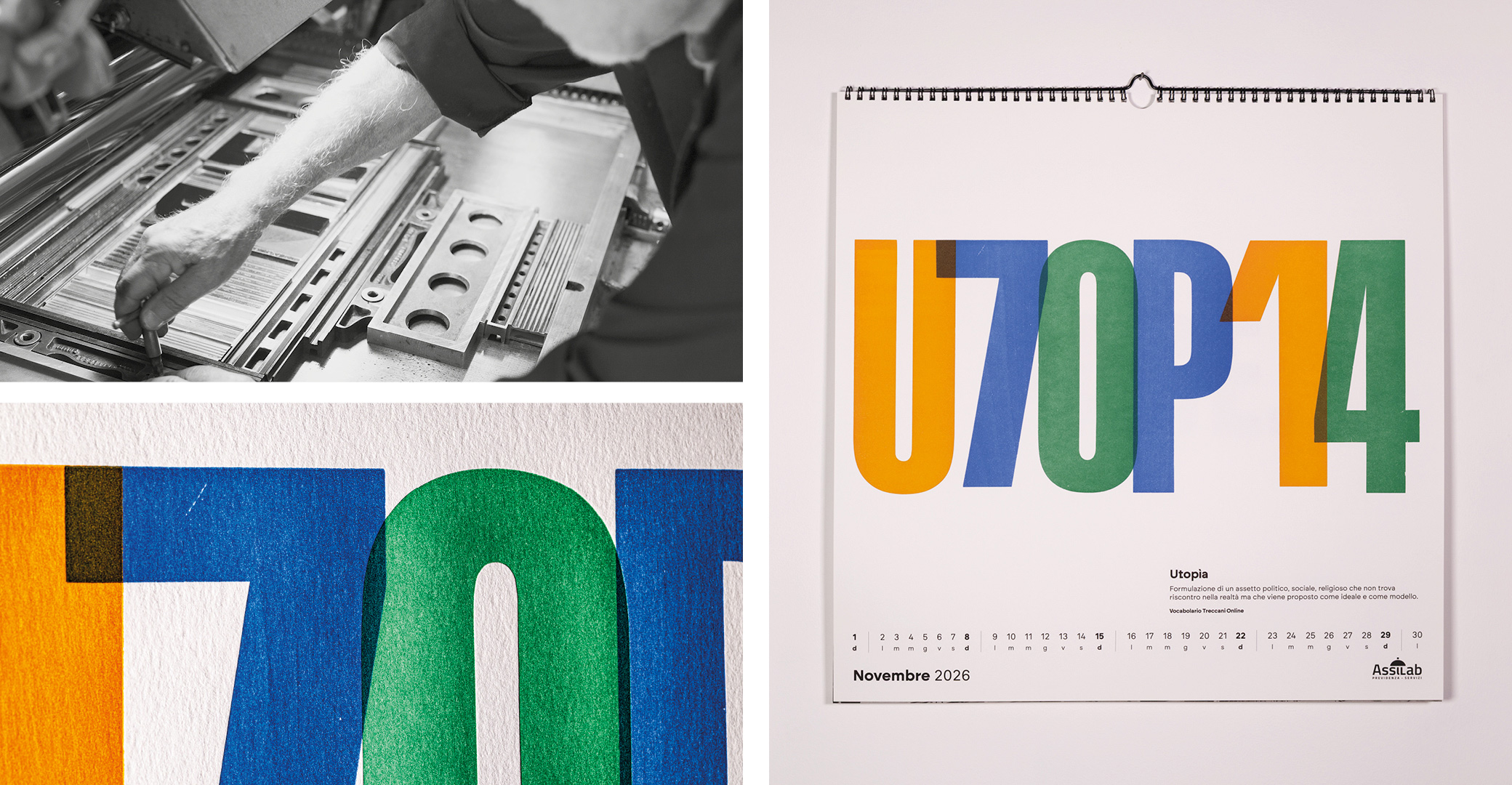
The concept is based on a rigorous design principle: the image arises from the word itself. Each panel is constructed by composing the typographic elements that compose the term. This way, typography is not just text: it becomes matter, sign, rhythm, space. The letters are not arranged to decorate, but designed as forms capable of translating meaning with an abstract and symbolic graphic synthesis. Color, weight, density, compositional tension, and controlled voids construct a unique system for each meaning.
The production process becomes the core of the project: the work was produced in collaboration with Tipoteca Italiana, using original wooden movable type, hundreds of years old. The printing was carried out by Tipoteca's master printers, among the very few still alive capable of mastering this technique and conveying its operational precision.
The design was carried out directly in the typesetting press, physically working with movable type and pushing the possibilities of letterpress to the limit: diagonal compositions, modularity of the sign, interlocking, overlapping, pressure variations, different heights, printing register, acceptance and control of imperfections as part of the language. The result is a slow and highly artisanal process, in which the design process coincides with the physical construction of the work and the meaning of the term examined for each plate.
To complete the project, each page features the official definition of the word, drawn from the Treccani Institut entries, thanks to a dedicated partnership. The inclusion of the definition is not only informative, but reinforces the core of the project: tracing the word back to its origins, clarifying its meaning, and making it the protagonist of a visual and cultural experience.
The calendar was printed in a limited edition of 500 copies, hand-numbered on the cover; 490 in Arabic numerals and a first edition of ten in Roman numerals.
Credits