A verbal identity built on contrast, for a city defined by balance
Maastricht [NL] is a city defined by contrast. Not as a problem to be solved, but as a force to be embraced. Metropolitan and intimate at once. Deeply historical, yet unmistakably modern. A place where highbrow and lowbrow culture do not compete, but coexist.
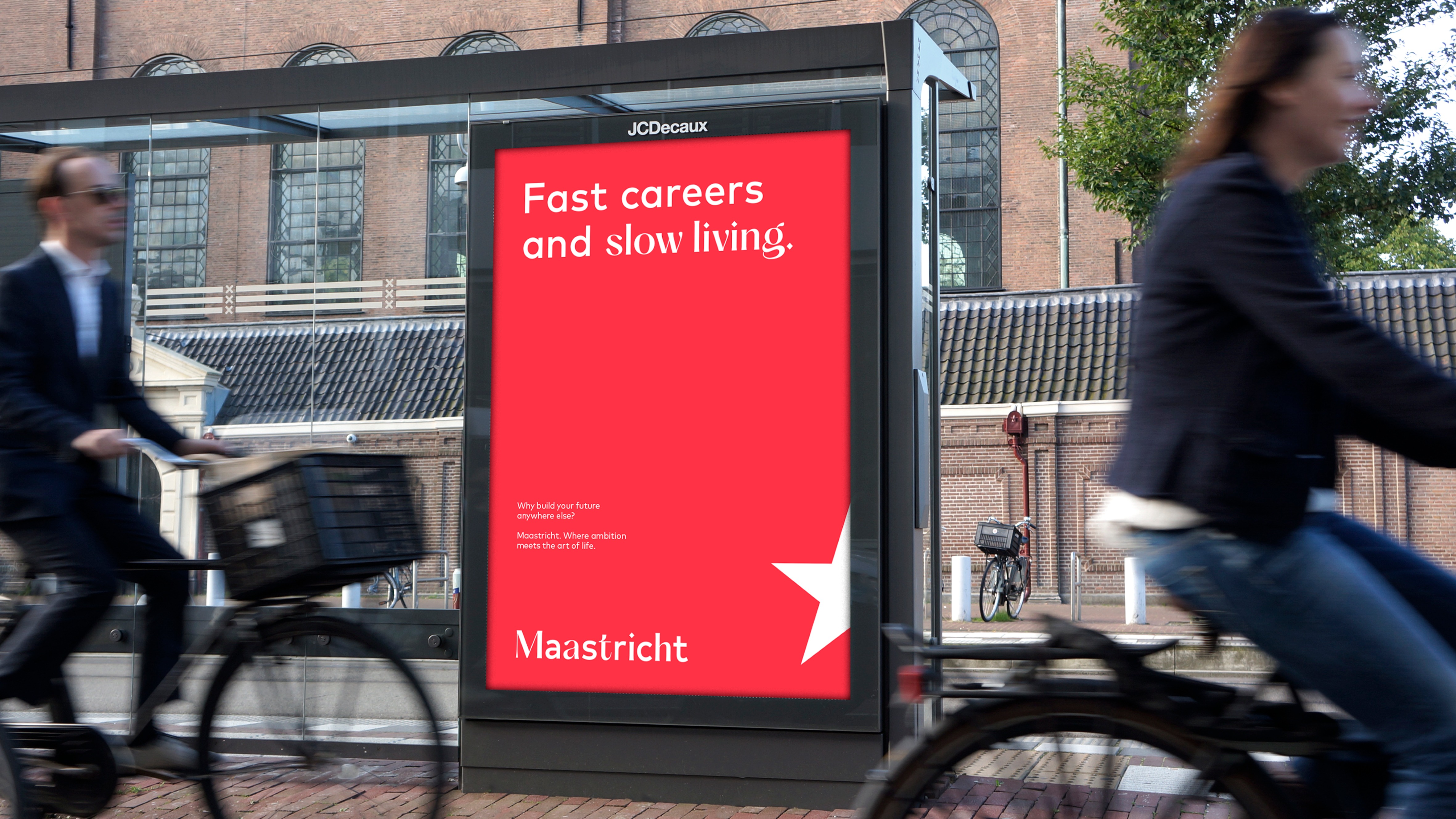
In conventional city branding, such complexity is often treated as a liability. Nuance is reduced, contradictions are smoothed out, and a singular narrative is forced in pursuit of clarity. For Maastricht, we rejected that logic. Instead of narrowing the story, we amplified it. The city’s dualities became the creative and strategic foundation of the brand.
This approach resulted in two complementary archetypes: the Mistress and the Heroine. Together, they express Maastricht’s distinctive character, seductive yet strong, refined yet raw. Their interplay runs throughout the entire brand system, from logo and visual identity to tone of voice and copy. Every element makes one thing tangible: in Maastricht, opposites do not dilute each other. They create balance. The copy concept becomes the verbal embodiment of that balance.
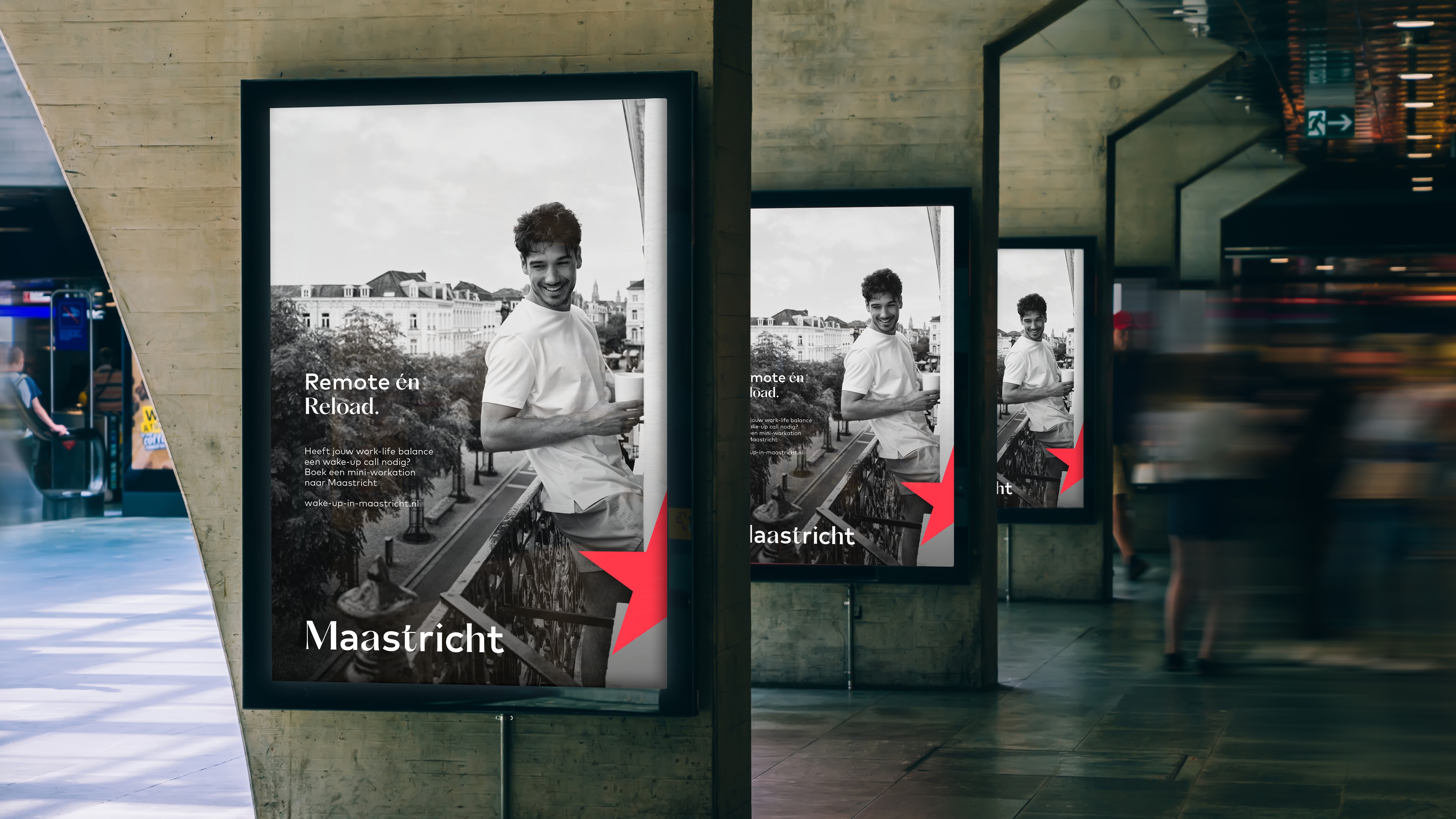
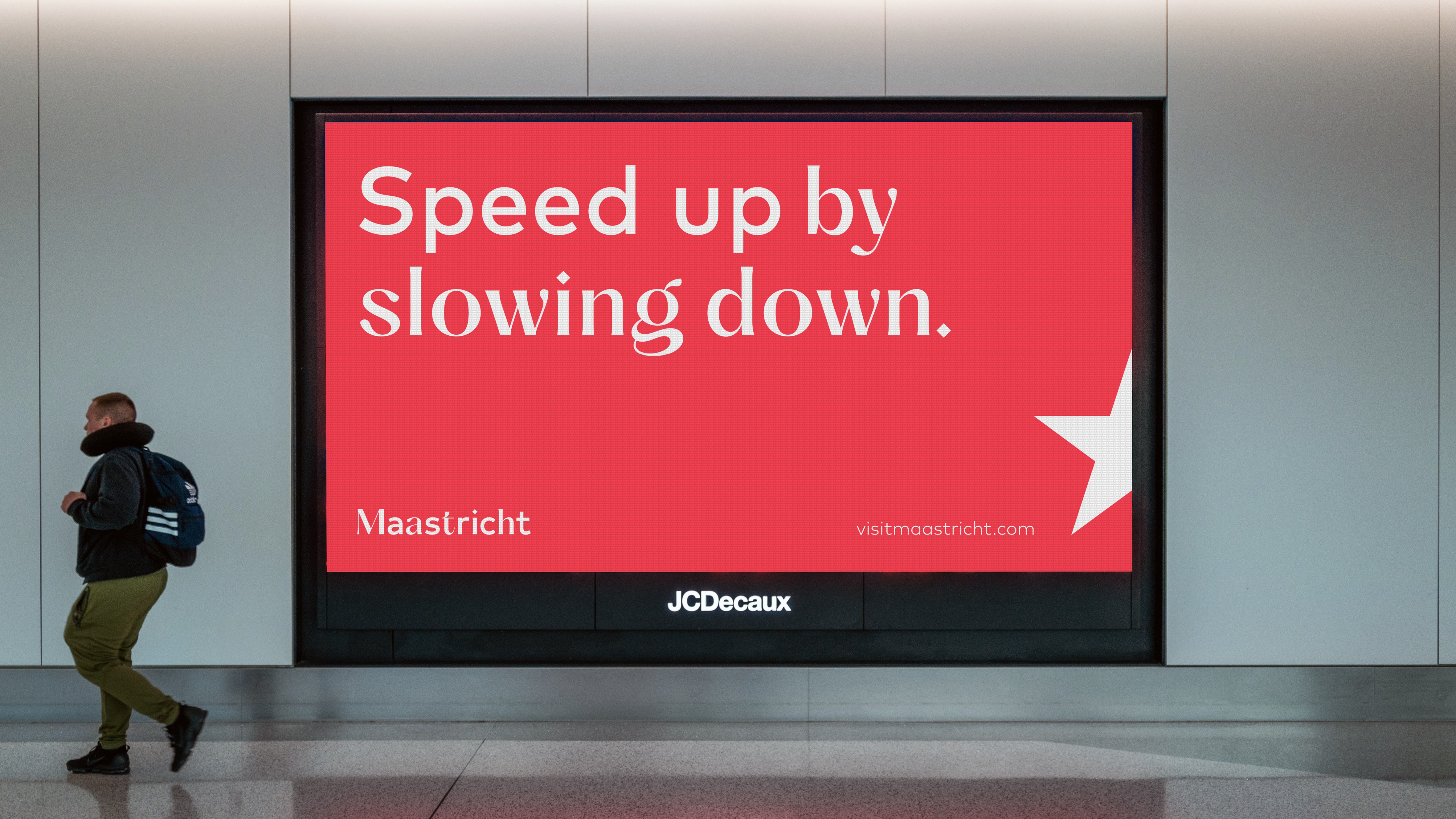
The copy concept plays a pivotal role within this system. It is not decorative, but strategic. It sharpens the positioning and functions as the unifying layer that ties the brand together. At its core lies a clear principle: every headline is built on contrast. Sometimes bold and explicit, at other times subtle and conceptual. By deliberately connecting opposing meanings, the copy mirrors the character of the city itself. This mechanism takes different forms.
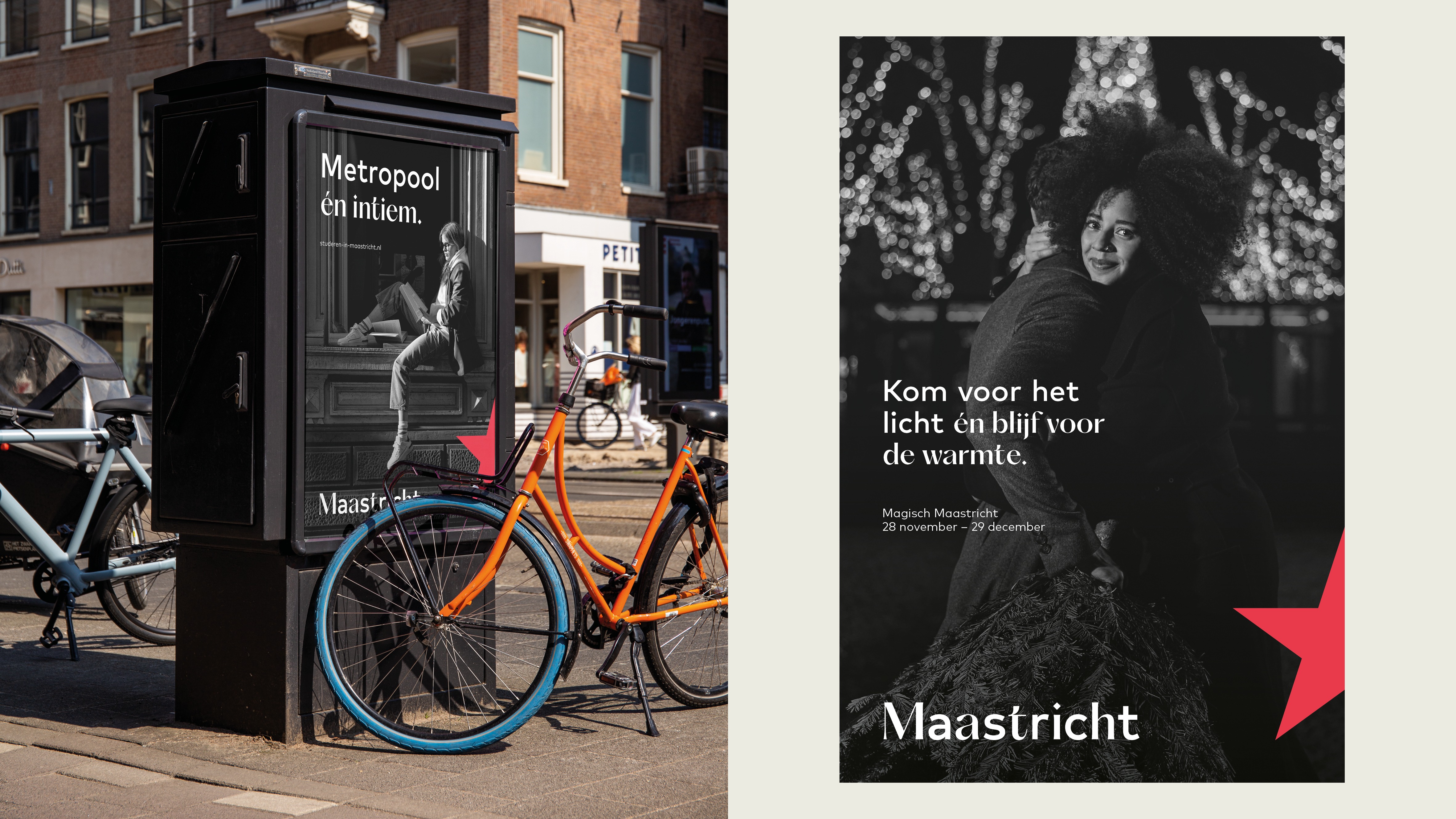
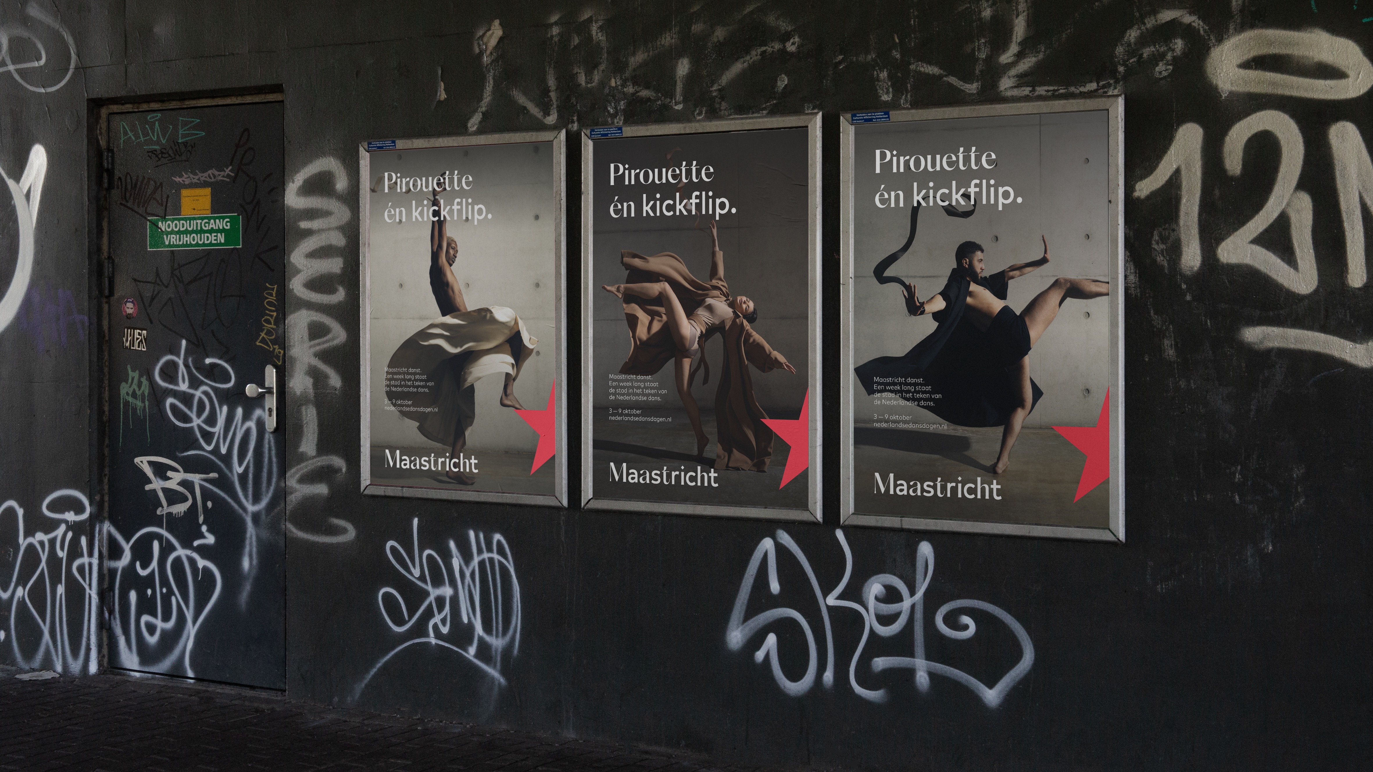
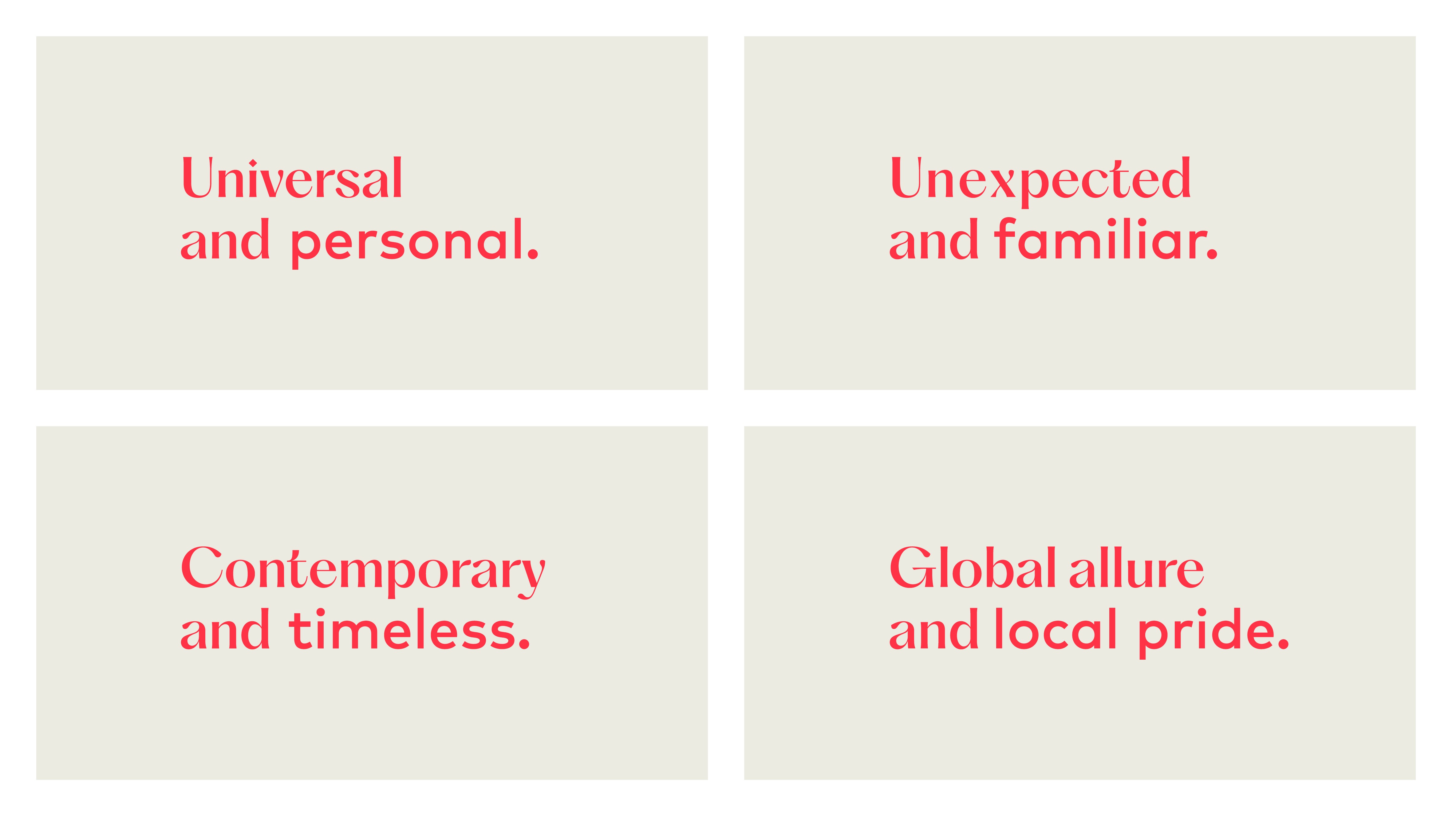
In its most direct expression, two words are paired and connected by “and” or “én” in Dutch. Placed side by side, they open up the spectrum between them, inviting interpretation and nuance.
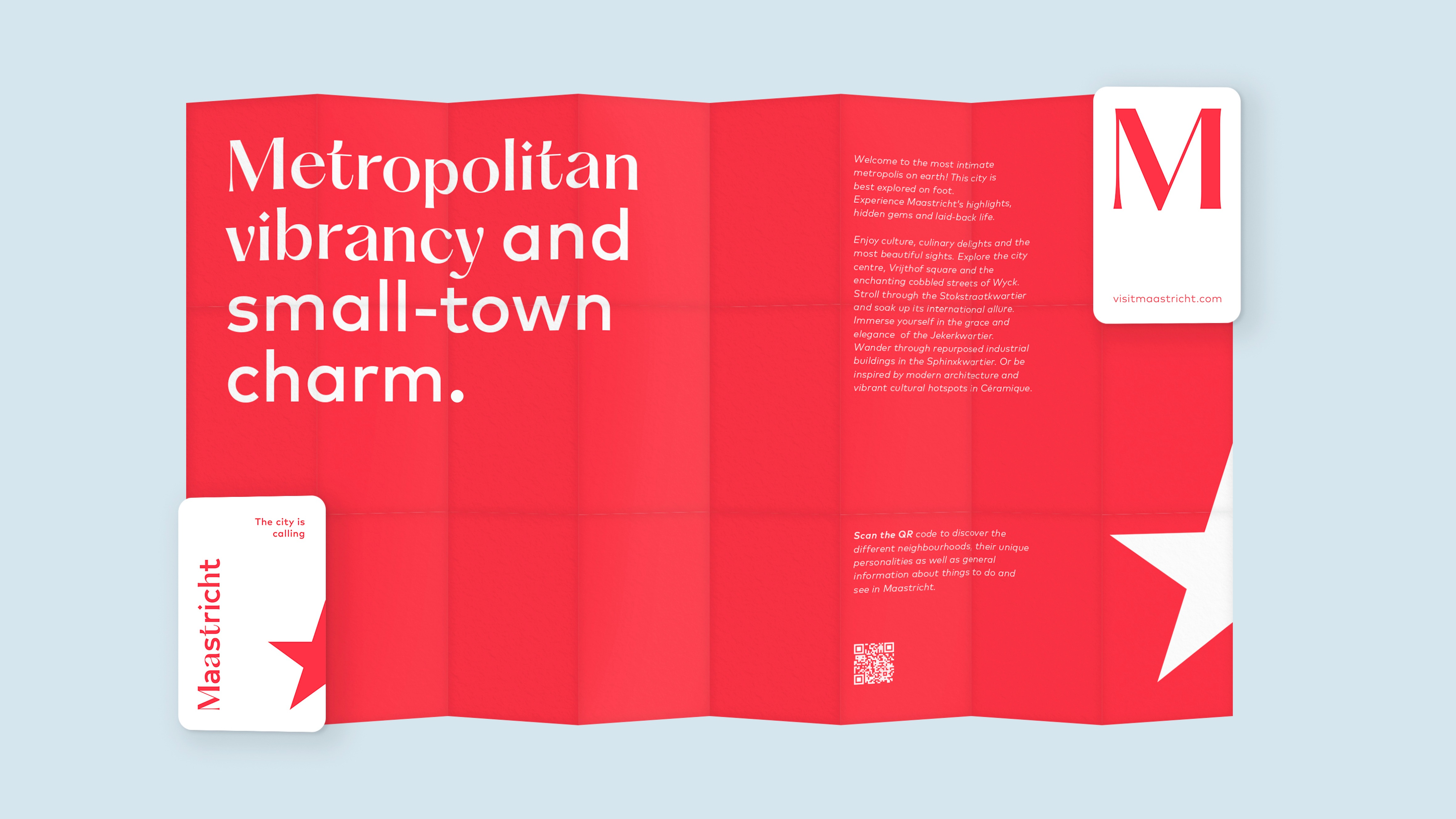
Metropolitan vibrancy and small-town charm.
Here, Maastricht’s defining tension is presented as coexistence rather than conflict. The meaning lies not only in the two extremes, but in everything between them.
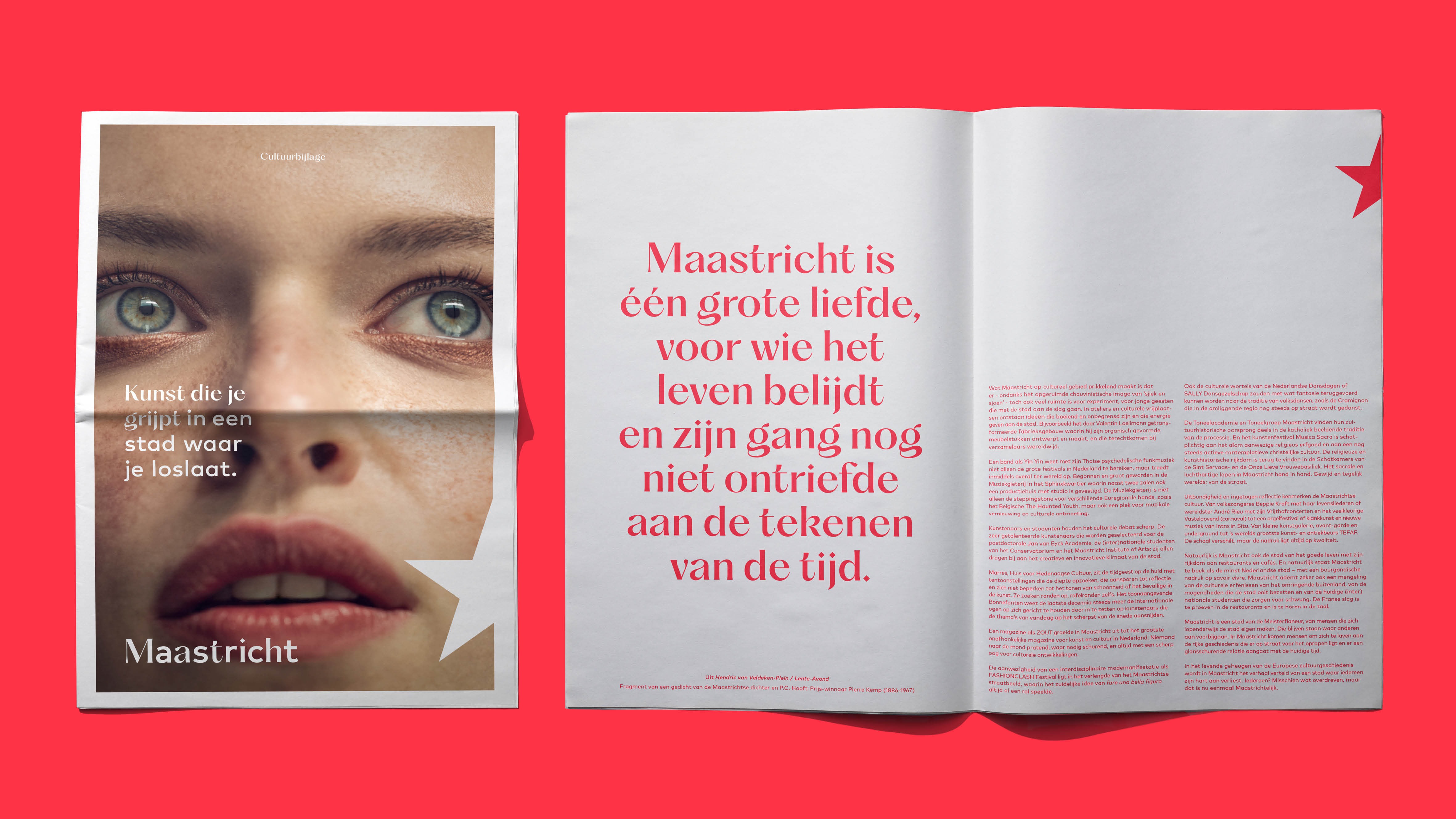
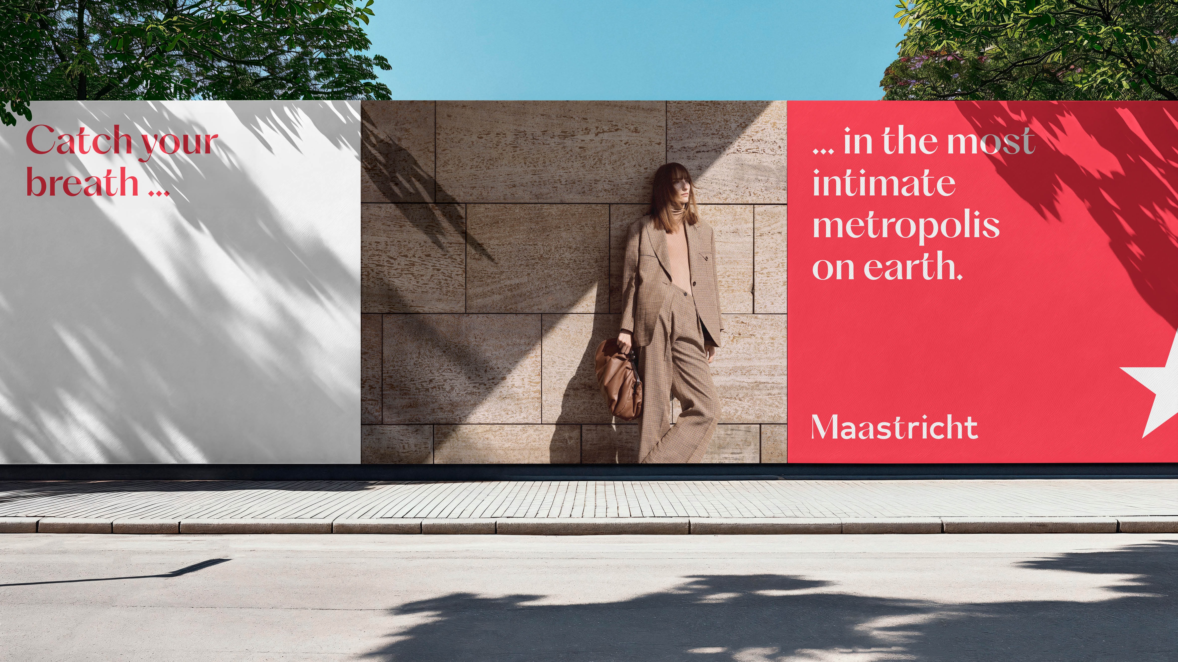
In other instances, the contrast unfolds within a single sentence:
Performances that silence you in a city that calls you.
Intensity and stillness exist simultaneously. The tension lies in the relationship between the clauses, mirroring the layered experience of the city.
Across strategic storytelling and tactical communication alike, the principle remains consistent: every line contains deliberate tension that reflects Maastricht itself.
Maastricht. Where every line holds two truths, just like the city itself.
Credits