Ach. Brito
Founded in 1918 in the heart of Porto, Ach. Brito is a Portuguese heritage brand whose products have become part of the country’s cultural identity. Renowned for its artisanal soap production and distinctive fragrances, the brand is equally recognized for the exceptional quality of its packaging design. From hand-painted labels to its historic lithography workshop, Ach. Brito has built a rich visual legacy that continues to inspire.
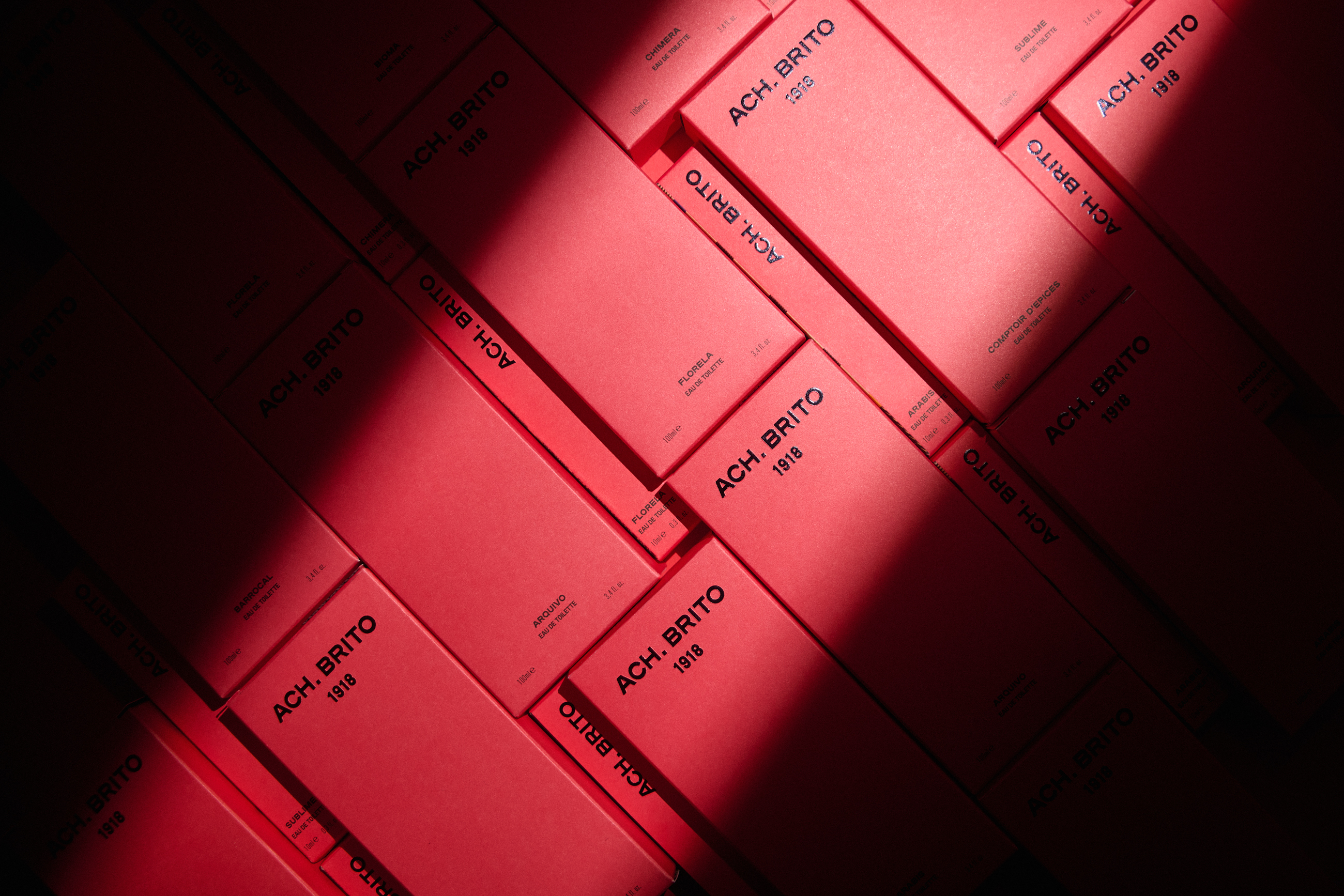
Within the scope of a comprehensive rebranding project — driven by the launch of a new premium line, Ach. Brito 1918 — both the Ach. Brito brand and the Ach. Brito 1918 packaging were designed to support a renewed brand positioning.
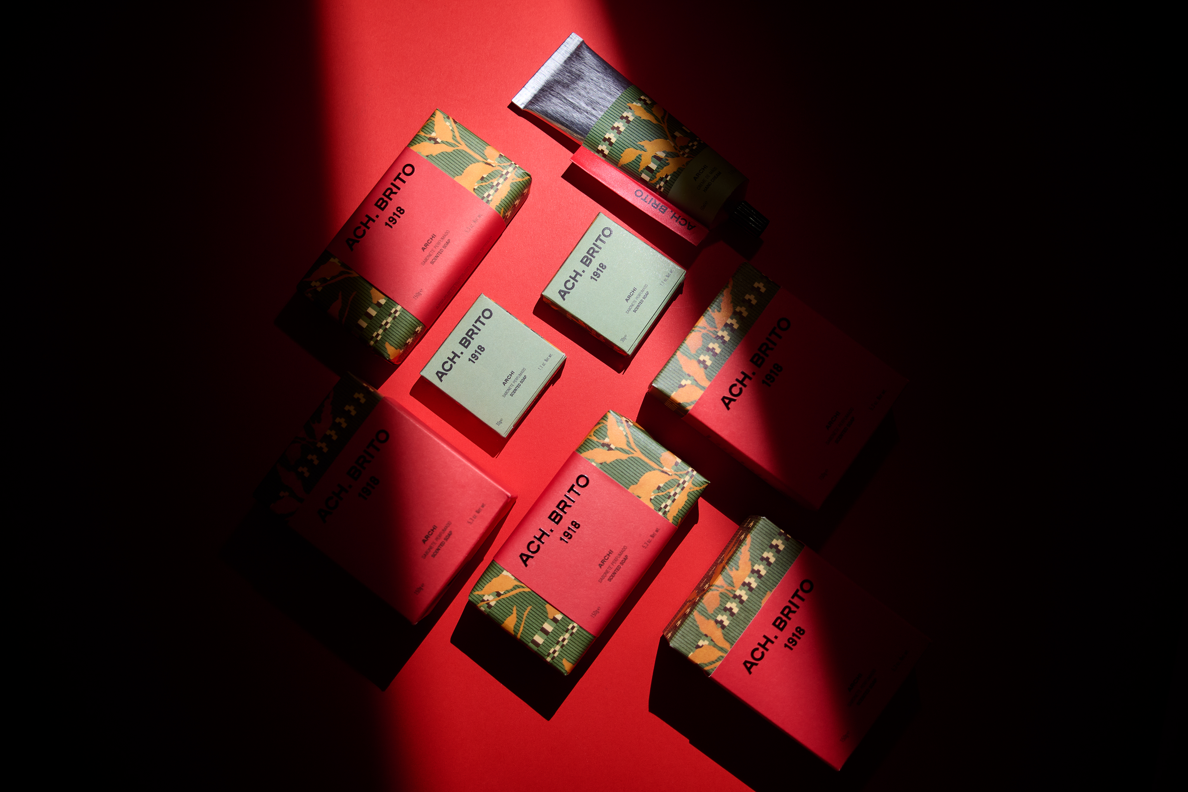
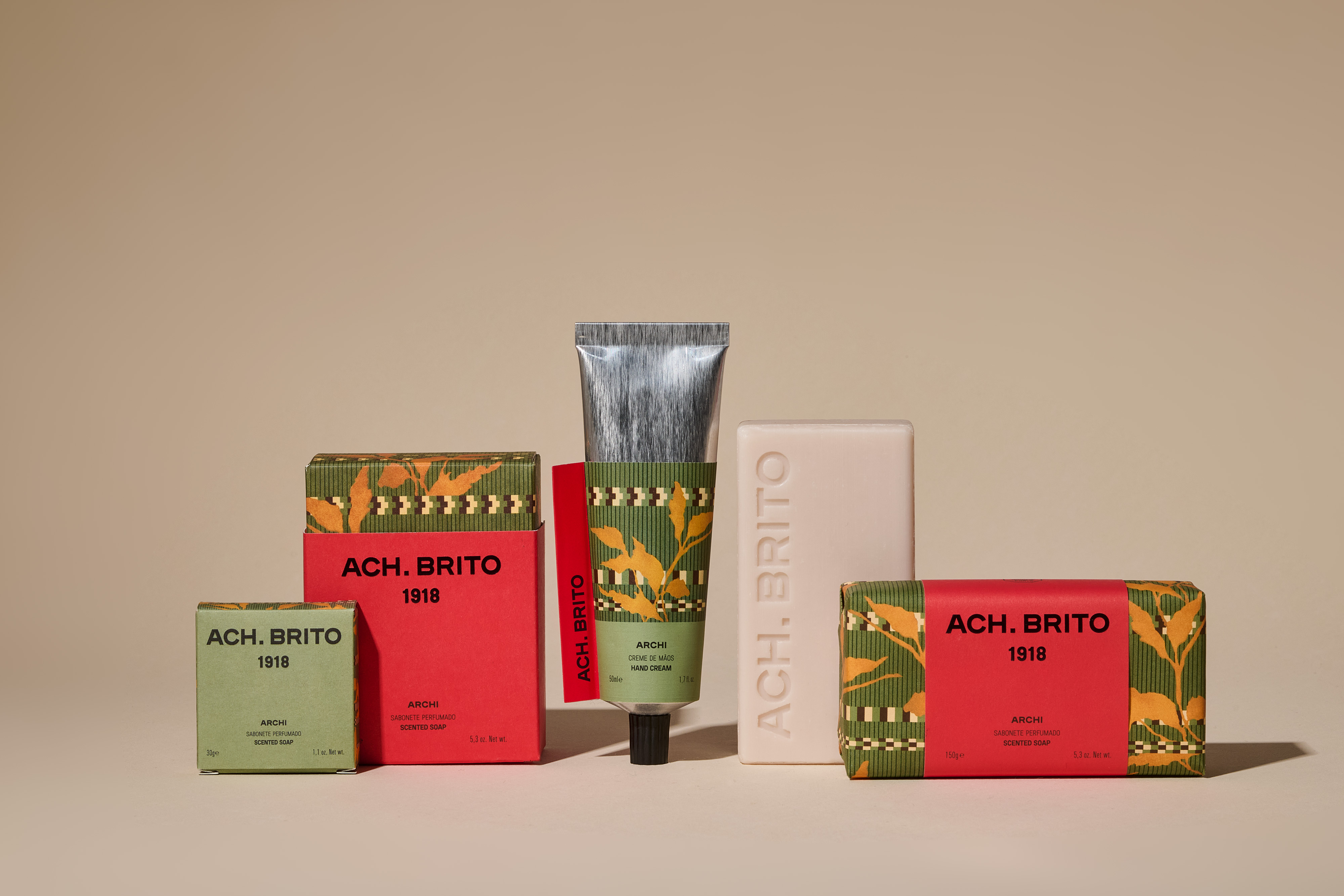
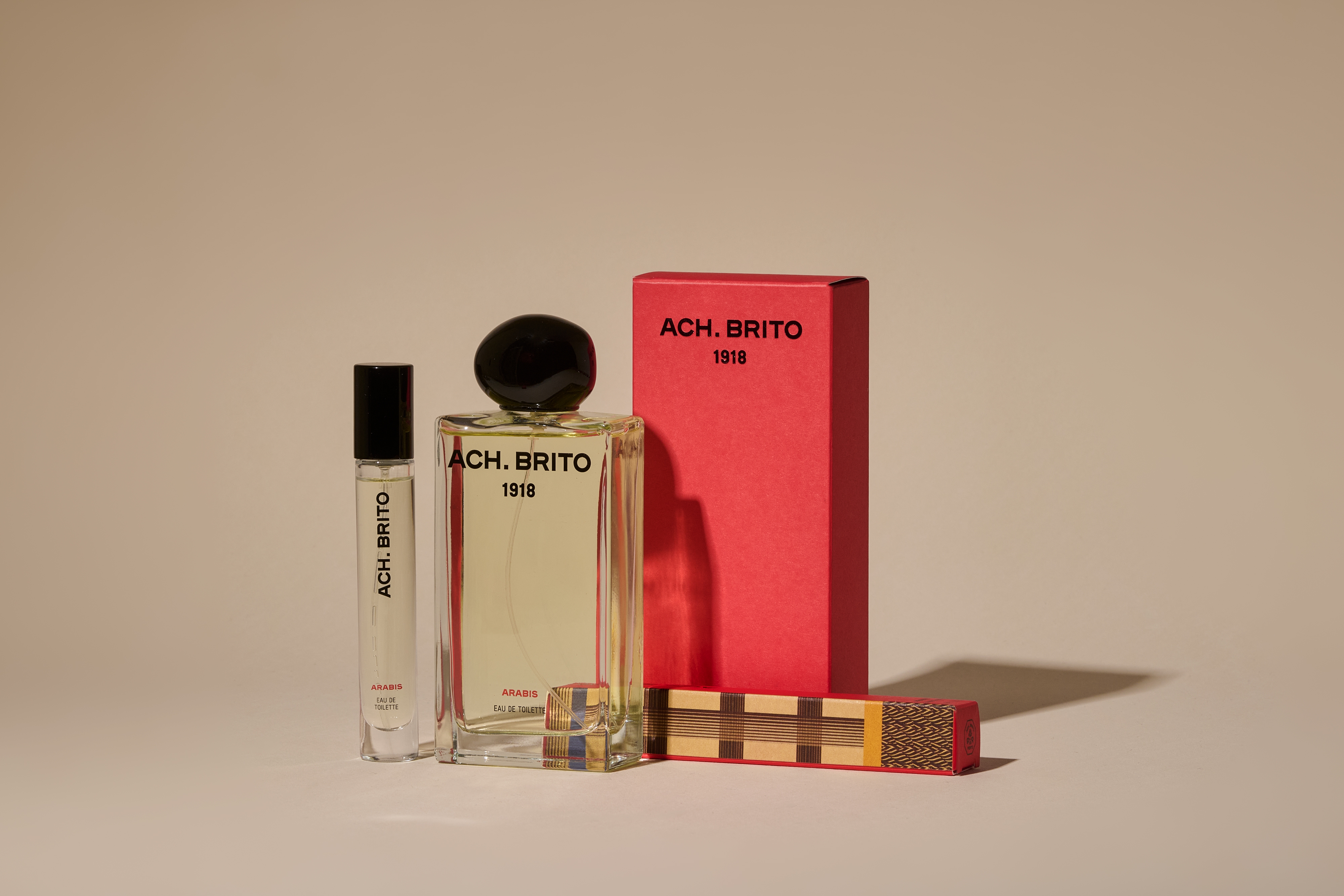
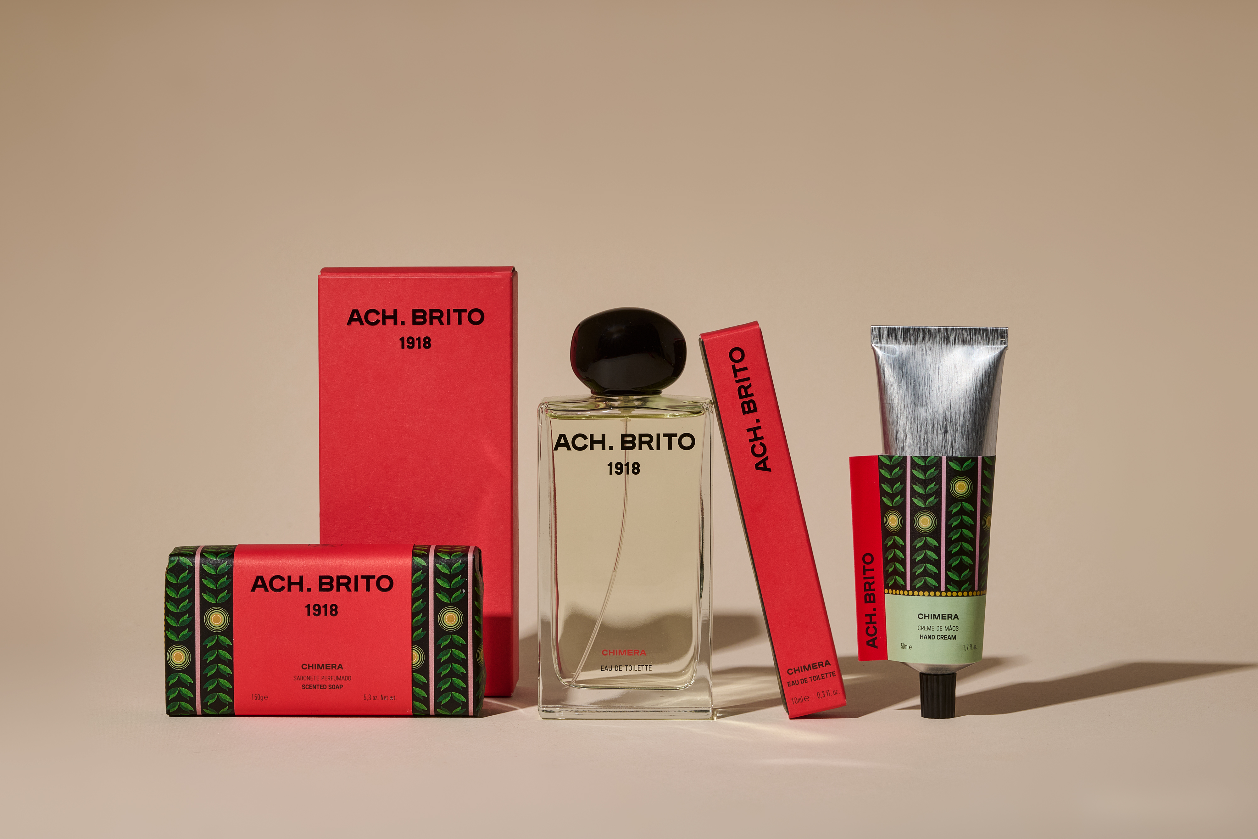
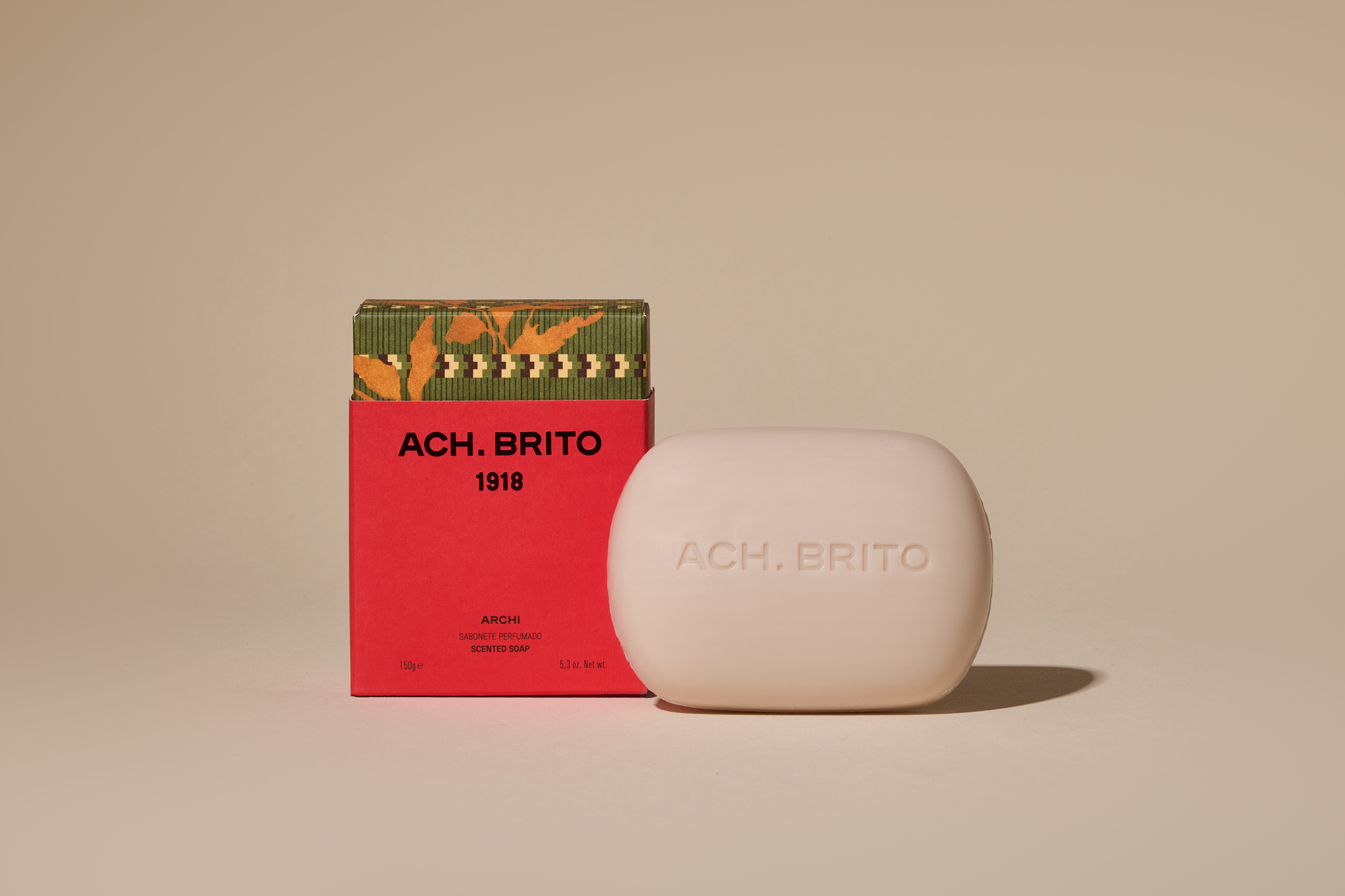
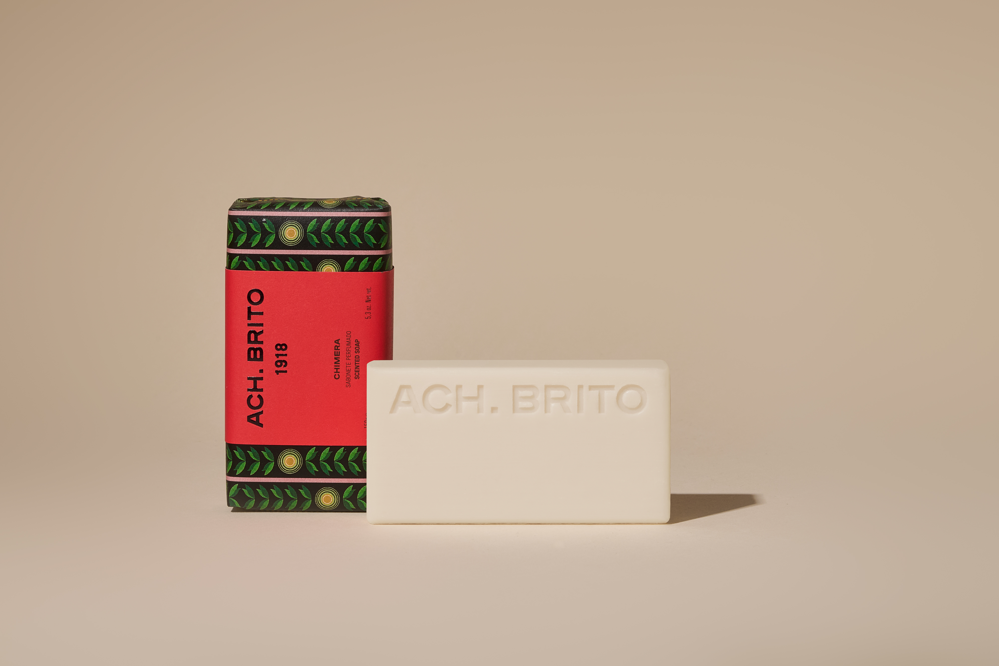
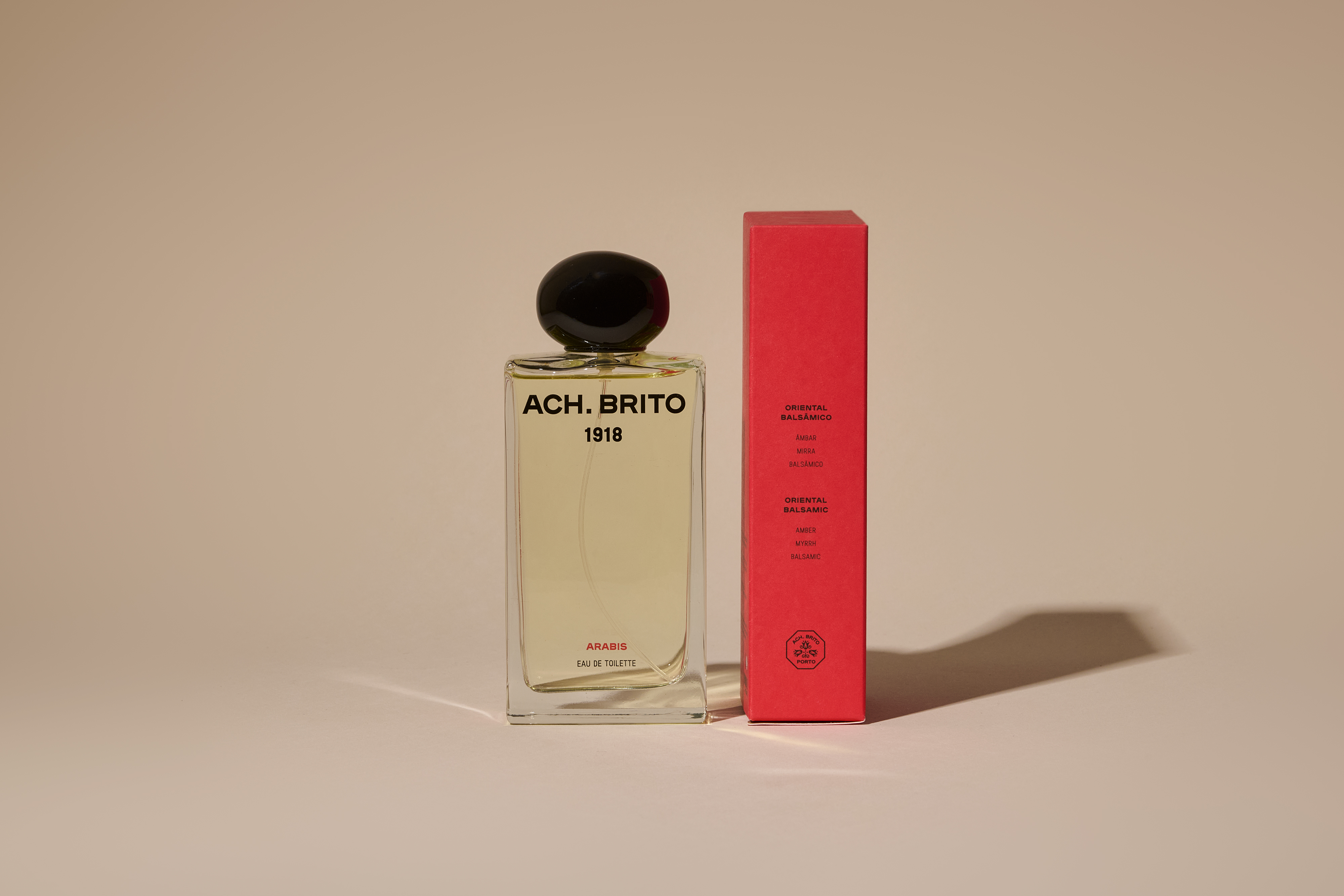
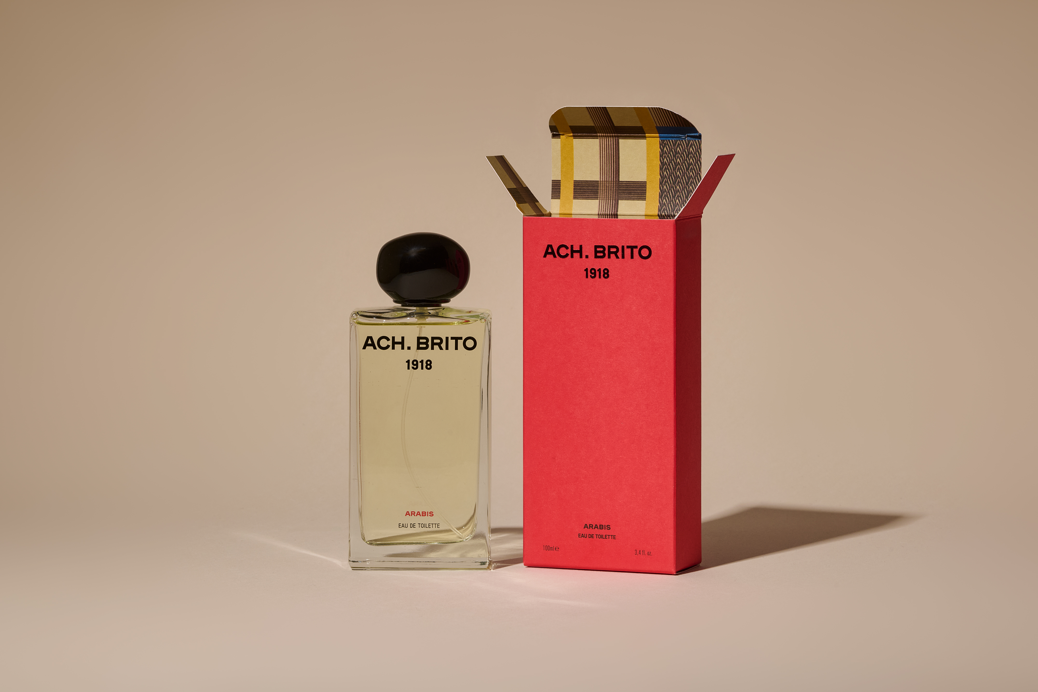
For the packaging of fragrances, soaps, hand creams, and candles, the new visual identity was developed through a deep engagement with the brand’s heritage, drawing from a century of archival materials that include patterns, shapes, and letterforms — a graphic archive that functions as a living visual treasury.
A structured system was defined for the application of heritage patterns across the packaging. Each fragrance reference is paired with a specific pattern, which appears either inside the paper boxes or wrapping the product itself, as in the case of the soap bars. This system ensures coherence while allowing variation, transforming heritage into a functional and contemporary design language.
Red was reaffirmed as the primary colour of the new visual identity. Long present throughout the brand’s history — in logos, packaging, and decorative patterns — it remains a powerful element of recognition, continuity, and emotional connection. In the new packaging system, red becomes the central unifying element, anchoring the renewed identity and harmonizing the diversity of references across the fragrances product line.
Honoring the Art Deco references within the brand’s archival pattern library, the candle packaging evokes one of Ach. Brito’s historical visual languages through a strong geometric and streamlined composition, translating heritage motifs into a contemporary graphic expression that reinforces the brand’s timelessness.
This project was developed in collaboration with Ach. Brito creative team.
Credits