Quinta dos Loivos
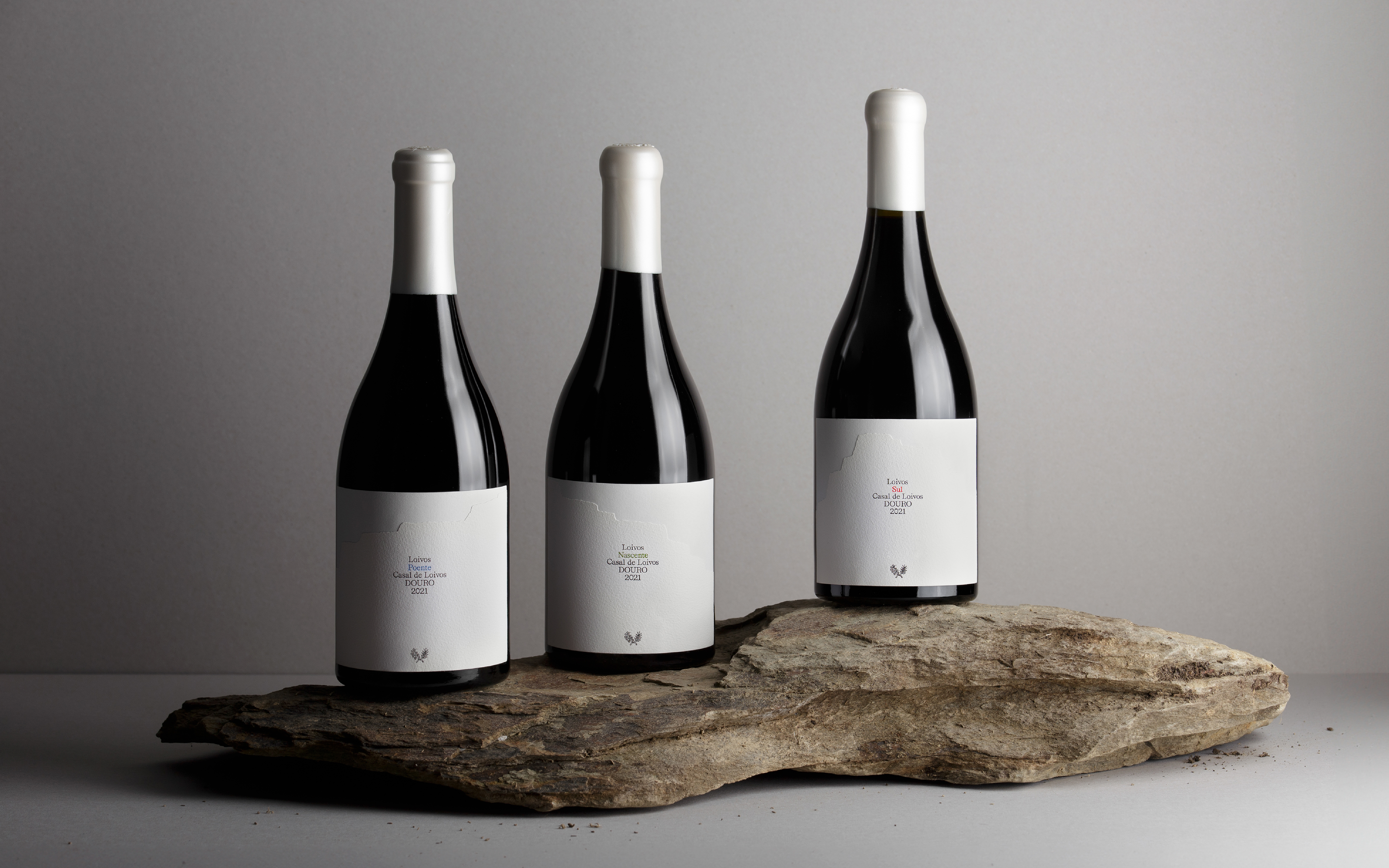
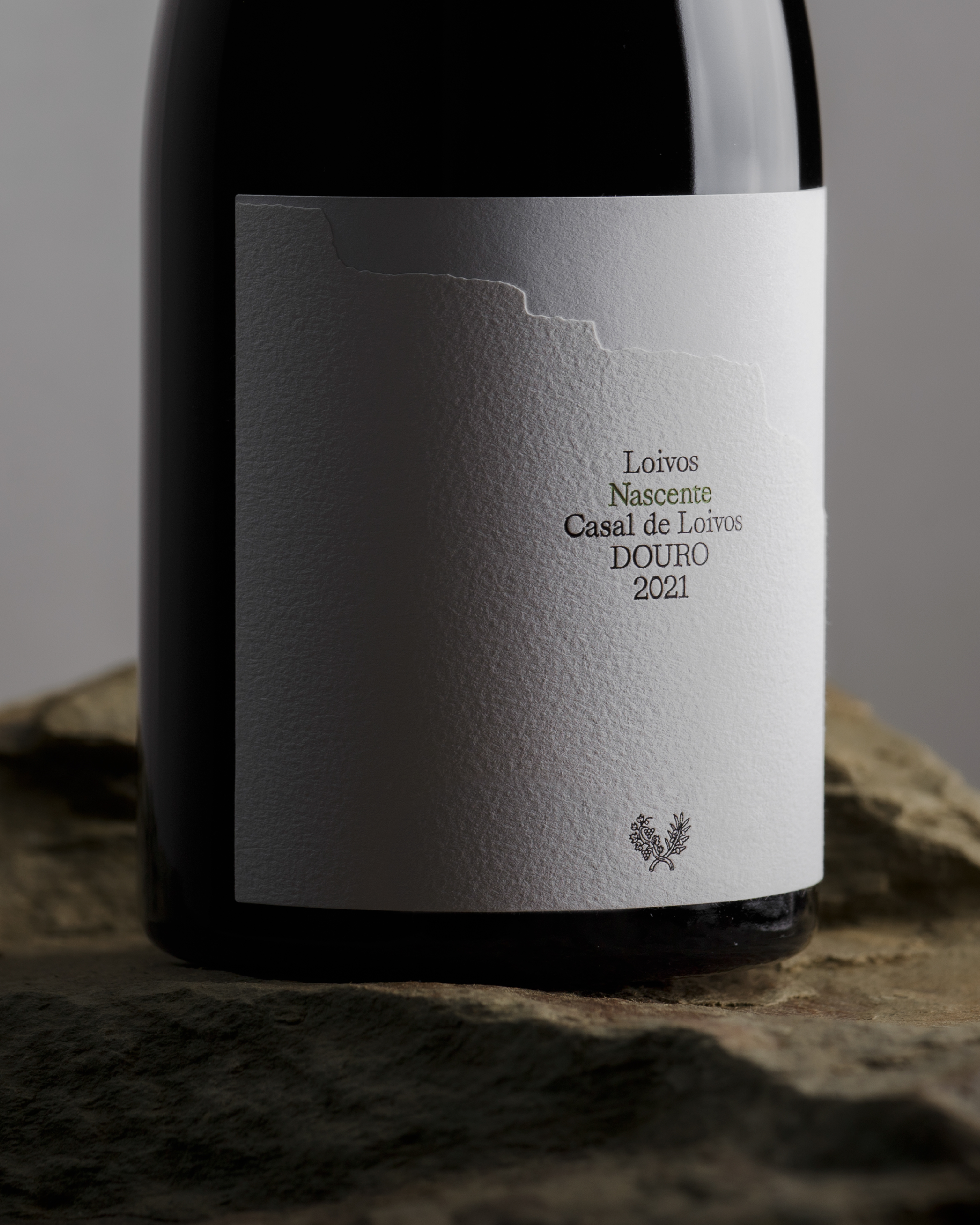
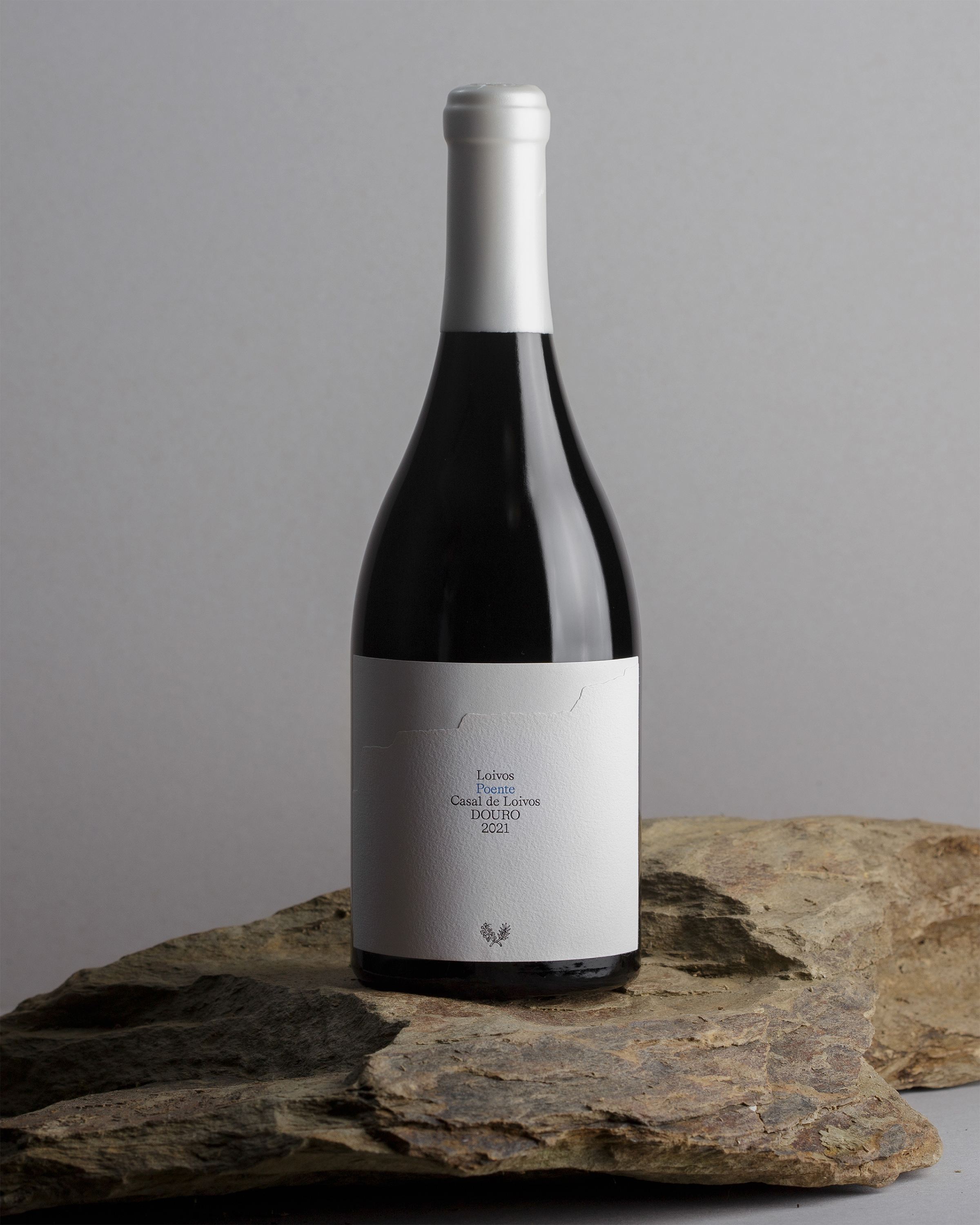
Quinta dos Loivos is an estate located in Casal de Loivos, at an altitude of 500 meters, overlooking a breathtaking view of the Douro Valley in northern Portugal. Its schist slopes face three distinct orientations, creating varied sun exposure that shapes different ripening profiles and, consequently, three complementary expressions of the same terroir.
Nascente (East), Poente (West), and Sul (South) are wines born from old vines, extreme conditions, and a process of careful, patient observation of the sun’s influence on grape maturation. Each wine expresses a distinct character, and together they form a triptych — a layered and coherent reflection of the Douro landscape and its natural rhythms.
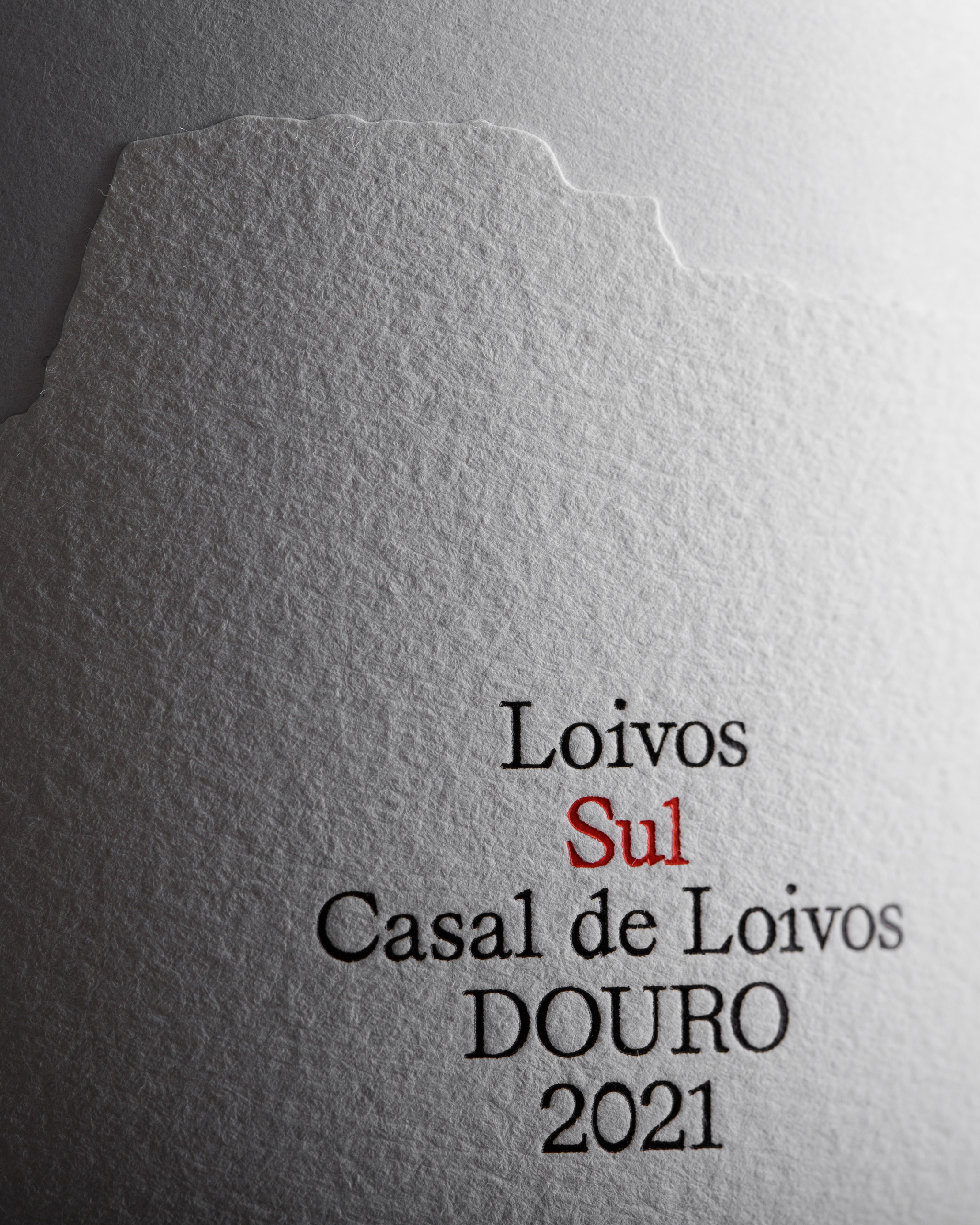
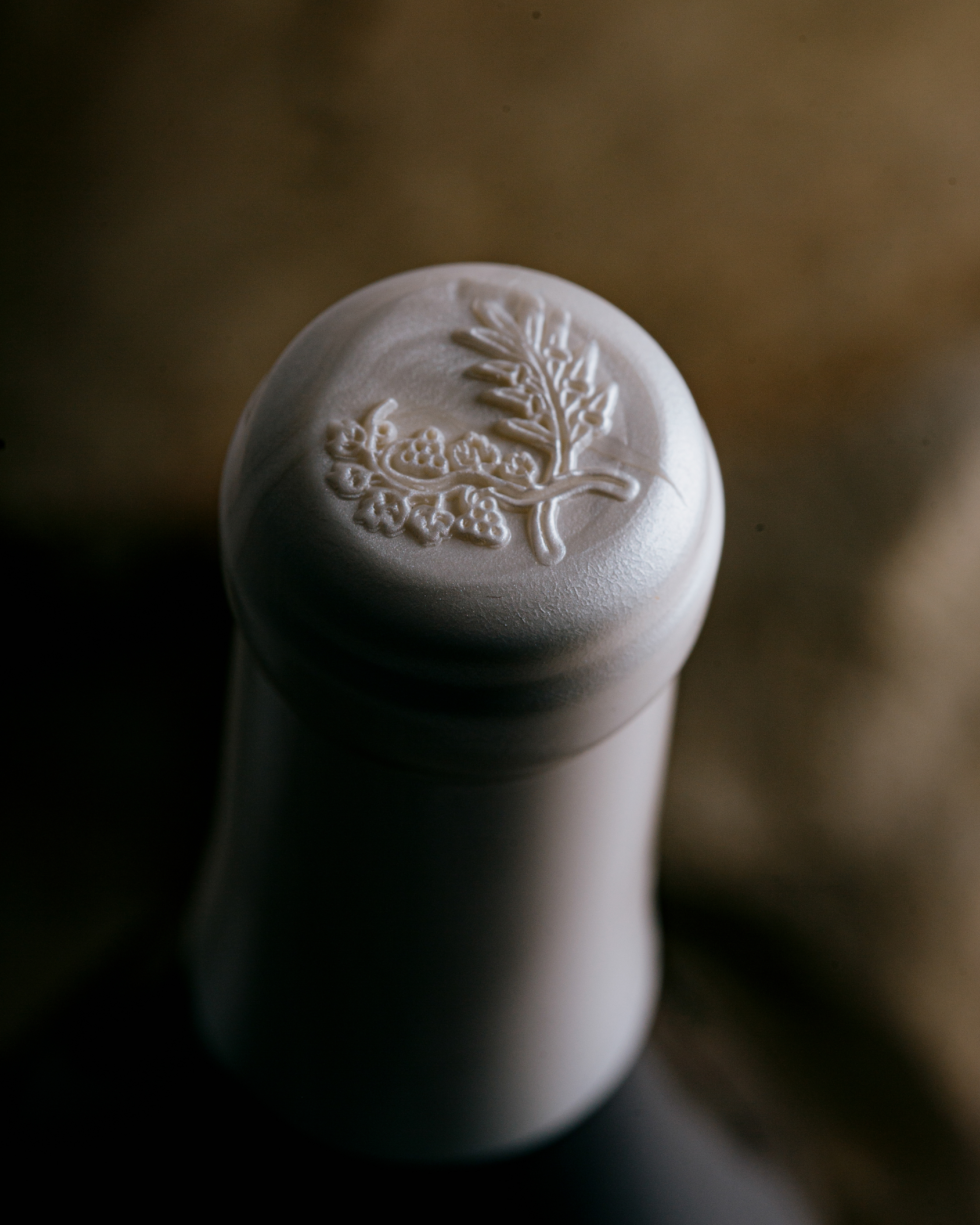
To honor this heritage, the label design places the land at the center of the narrative, highlighting the deep relationship between time and place experienced in Casal de Loivos. All information is presented in a quiet, sober, and centered composition on a white label. The label is composed of two papers: a textured upper layer, die-cut with the silhouette of a Douro Valley hillside, overlapping a smooth paper beneath. This layered construction reinforces the sense of landscape and depth. A subtle variation in the upper cut of the overlapping paper structure creates a visual system that affirms the familial relationship between the three wines, reinforcing unity through restrained differentiation. The typography is finished with hot foil stamping on each label, adding a refined tactile and luminous detail that elevates the overall composition.
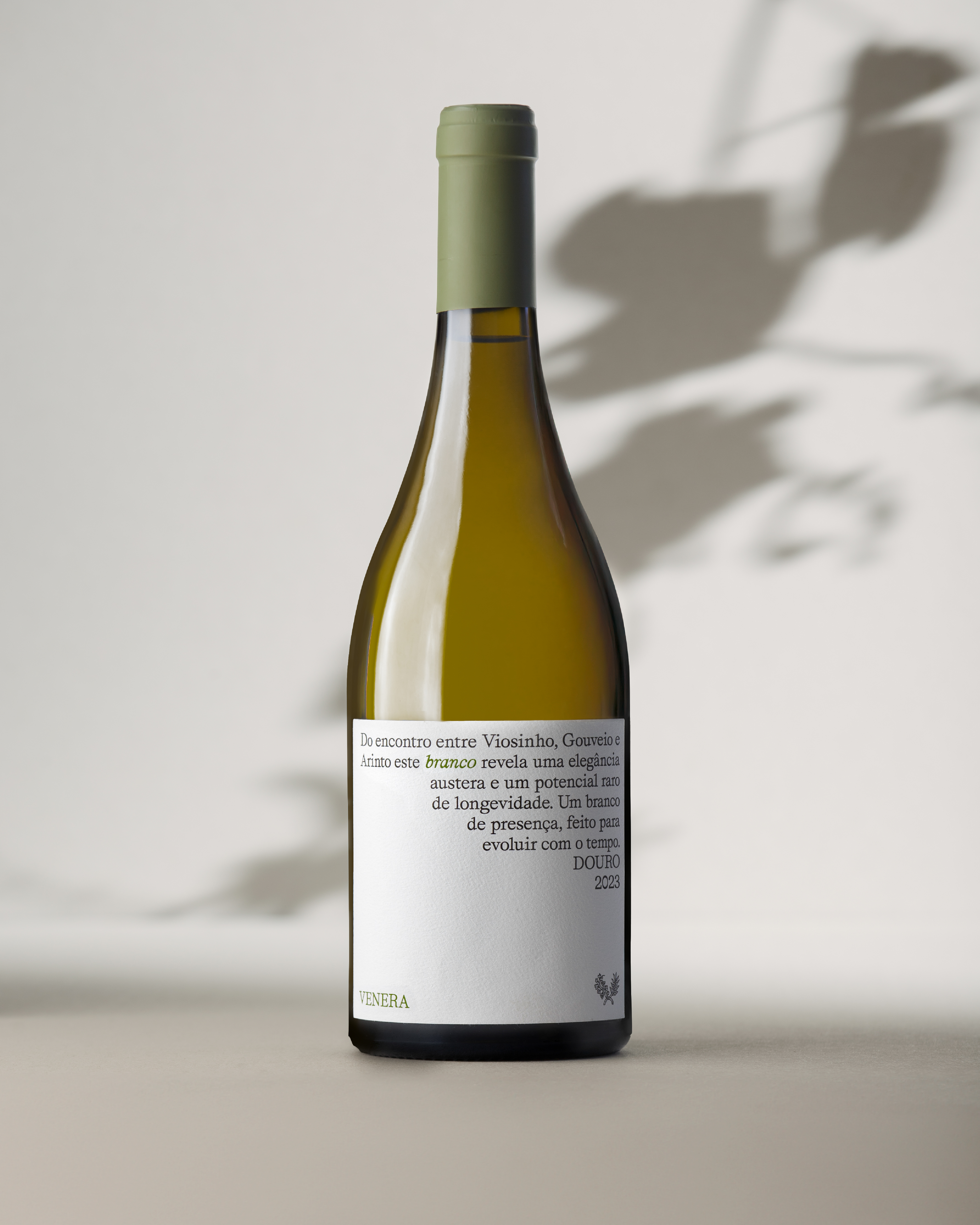
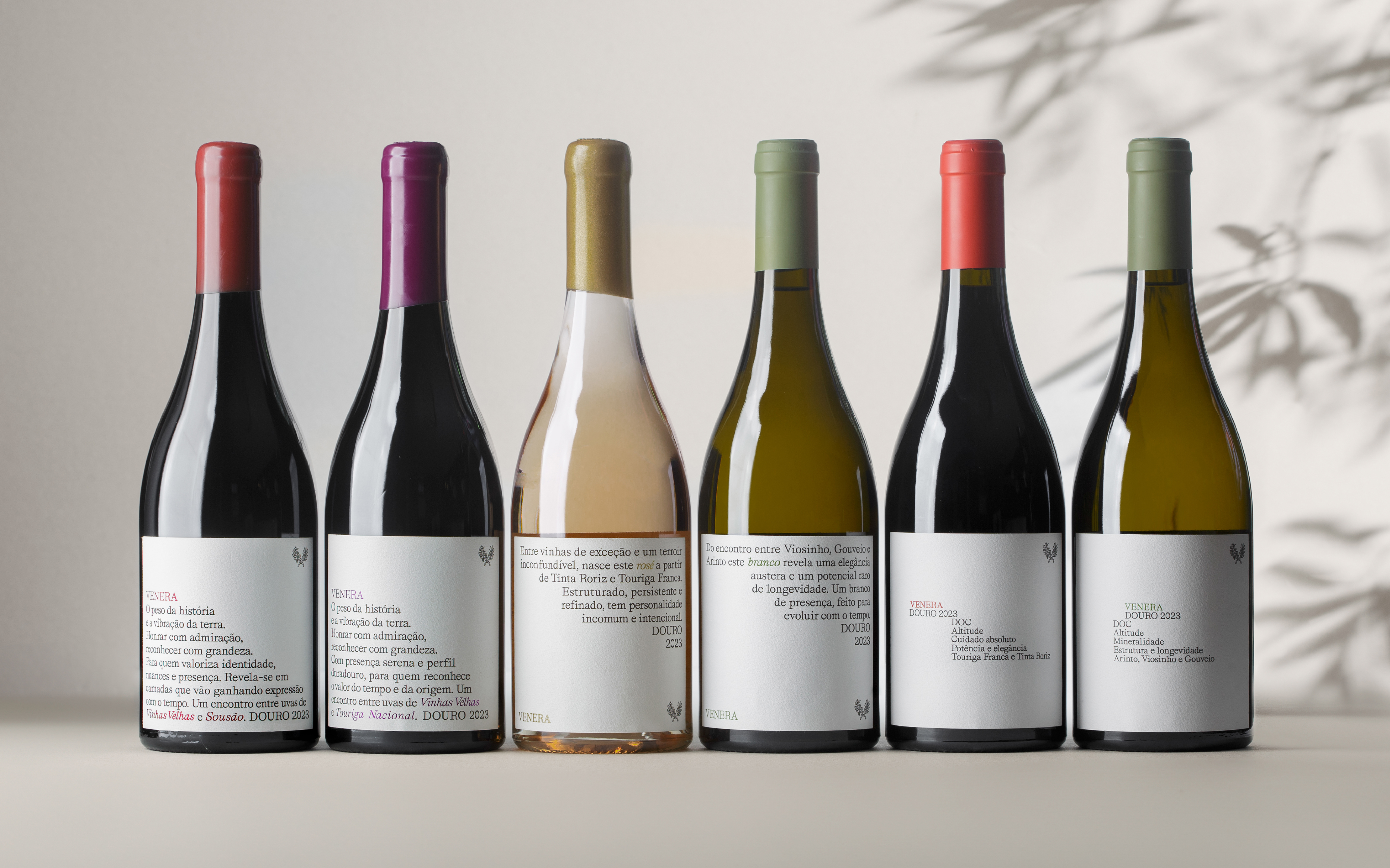
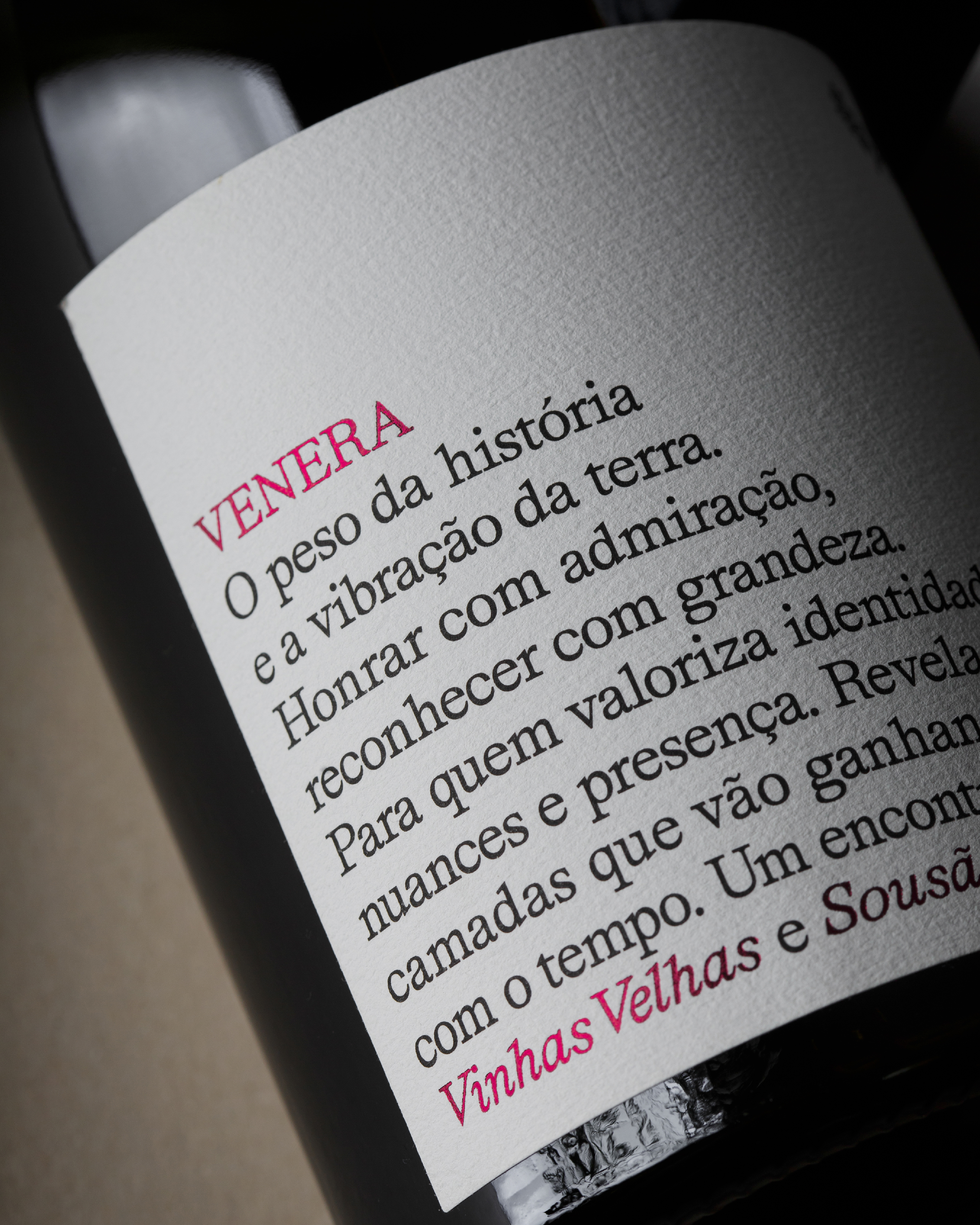
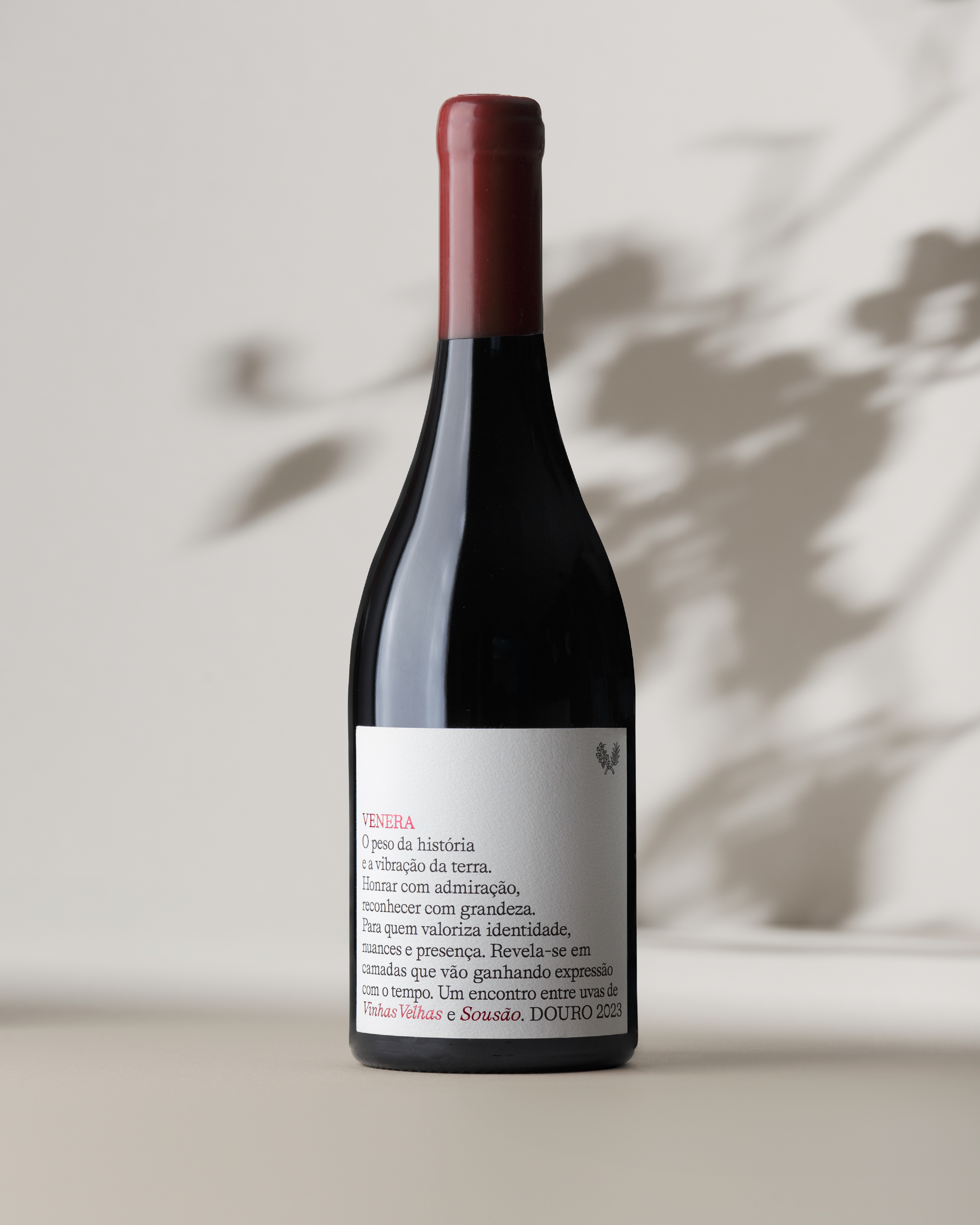
Venera, from the same estate, also pays tribute to old vines and native grape varieties of the Douro region, offering a range that includes Grande Reservas, Reservas, and Colheitas. As its grapes are not sourced exclusively from the estate, the visual identity was designed to establish clear differentiation while maintaining a shared DNA with Quinta dos Loivos.
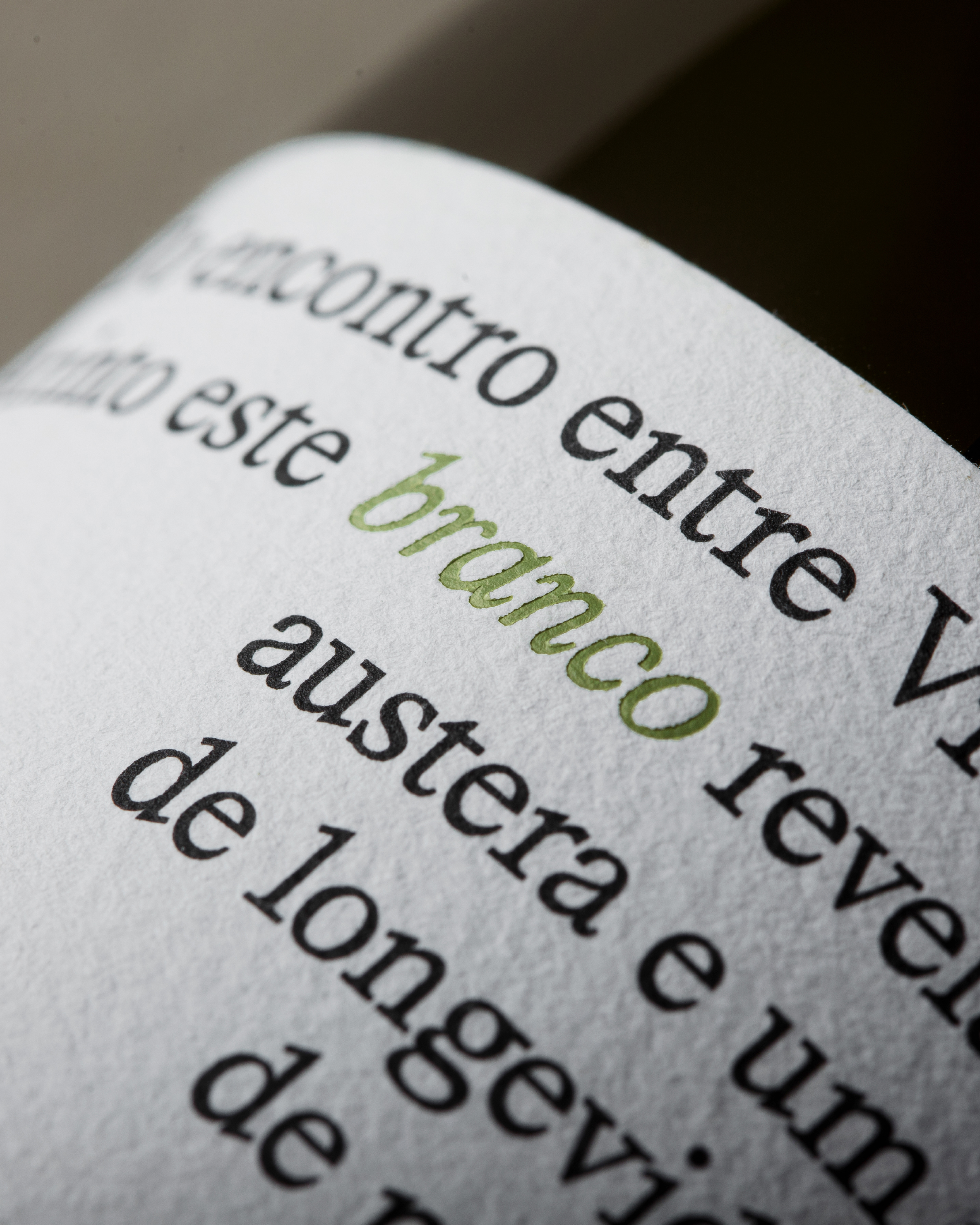
In Venera’s labels, typography becomes a primary expressive element, evoking the geometric rhythm of the Douro’s terraced slopes — a landscape best experienced from the viewpoint at Casal de Loivos — translating territory into typographic form.
Credits