Tomodomo
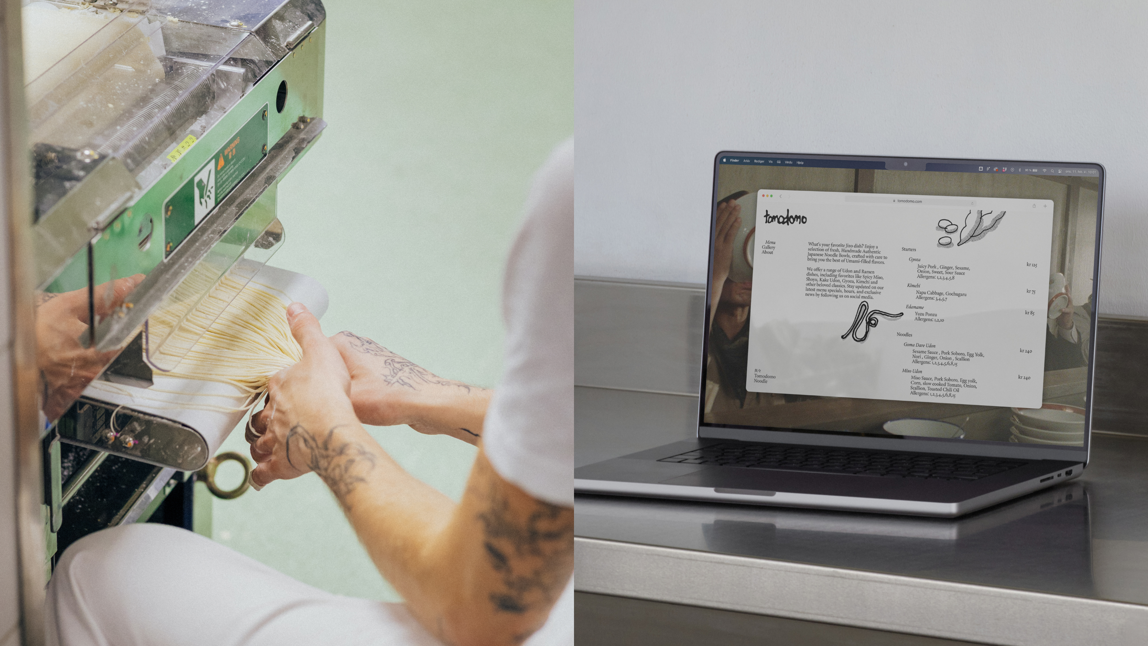
Tomodomo (formerly known as Jizo) is an Oslo based restaurant specialising in handmade Japanese noodles made from good quality local Scandinavian ingredients.
The founders wanted to distance themselves from the sterile, polished aesthetic of modern casual dining, opting instead for a direct, human touch that mirrors their artisanal craft and collaborative spirit.
To stand out in Oslo’s competitive restaurant market, the goal was to attract an audience that values authenticity over convenience through a personality that feels sophisticated yet charmingly and accessible. Because Tomodomo operates across shifting contexts, whether it be a permanent kitchen or temporary pop-up, it required the identity to be flexible across formats.
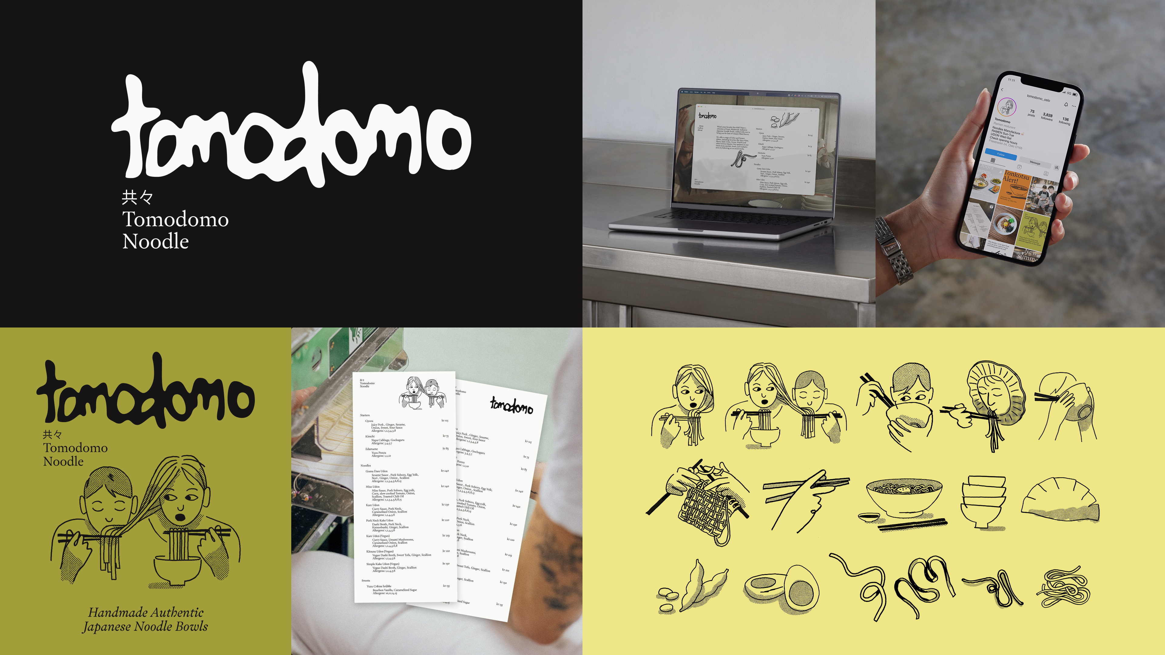
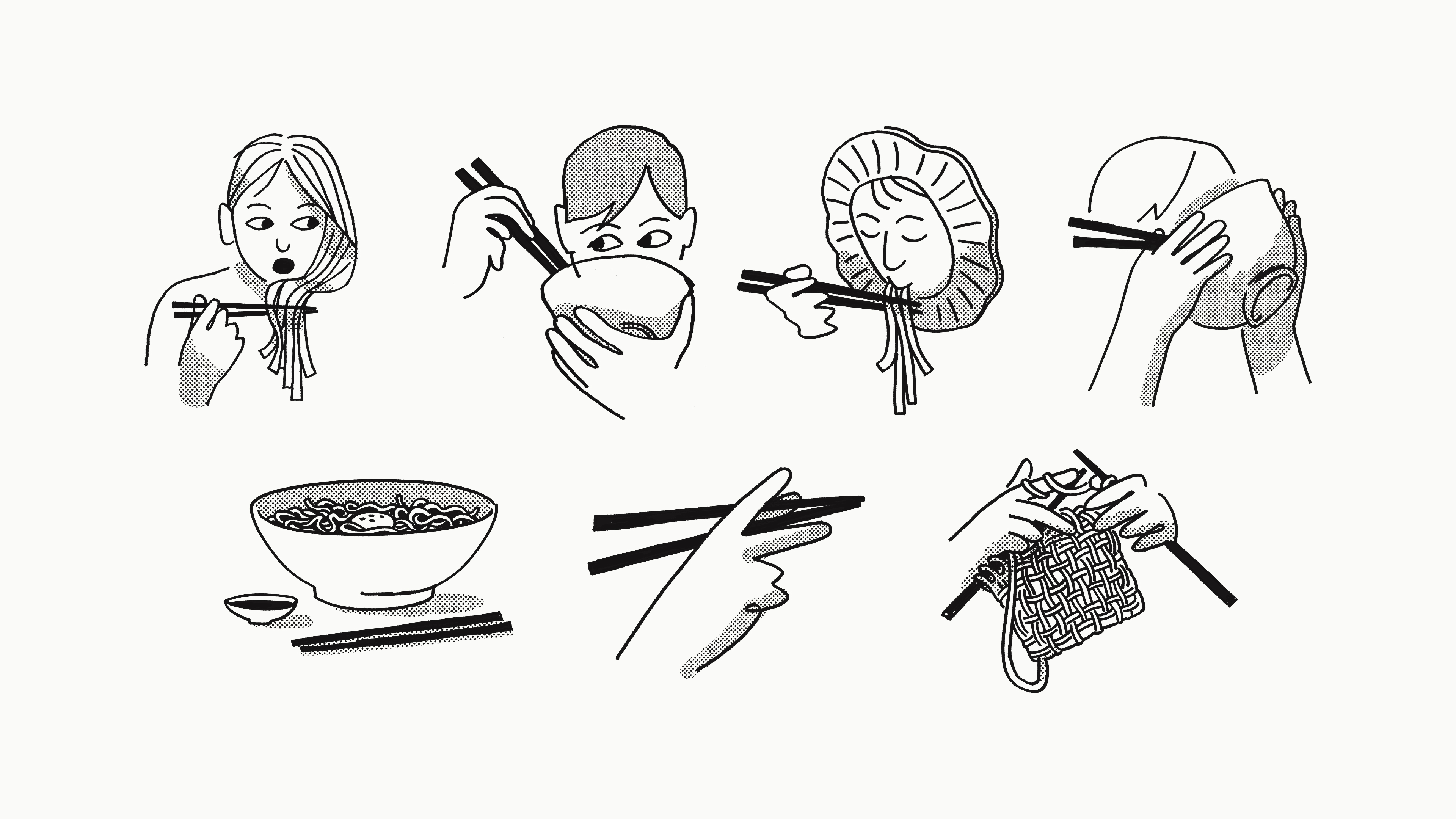
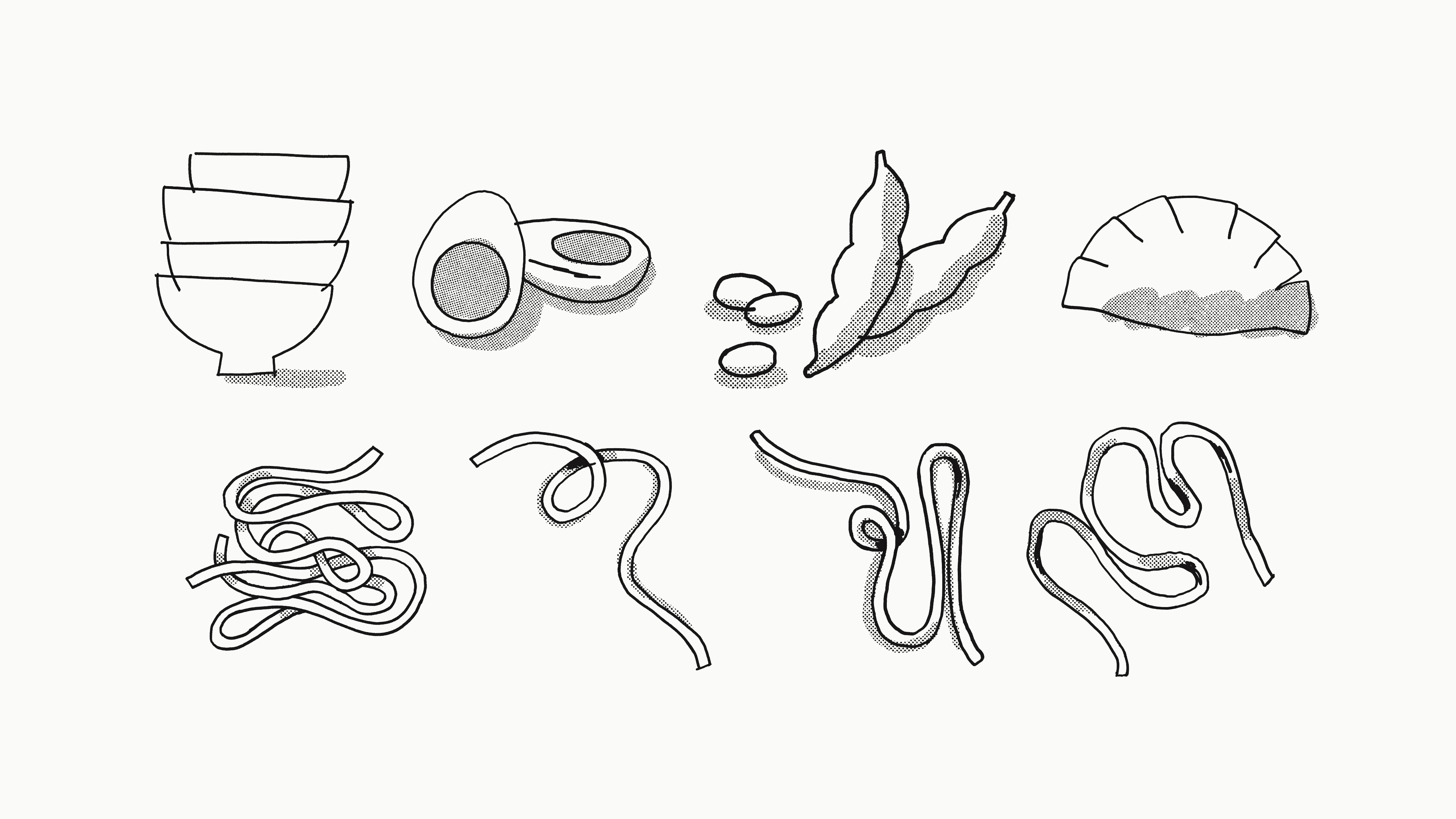
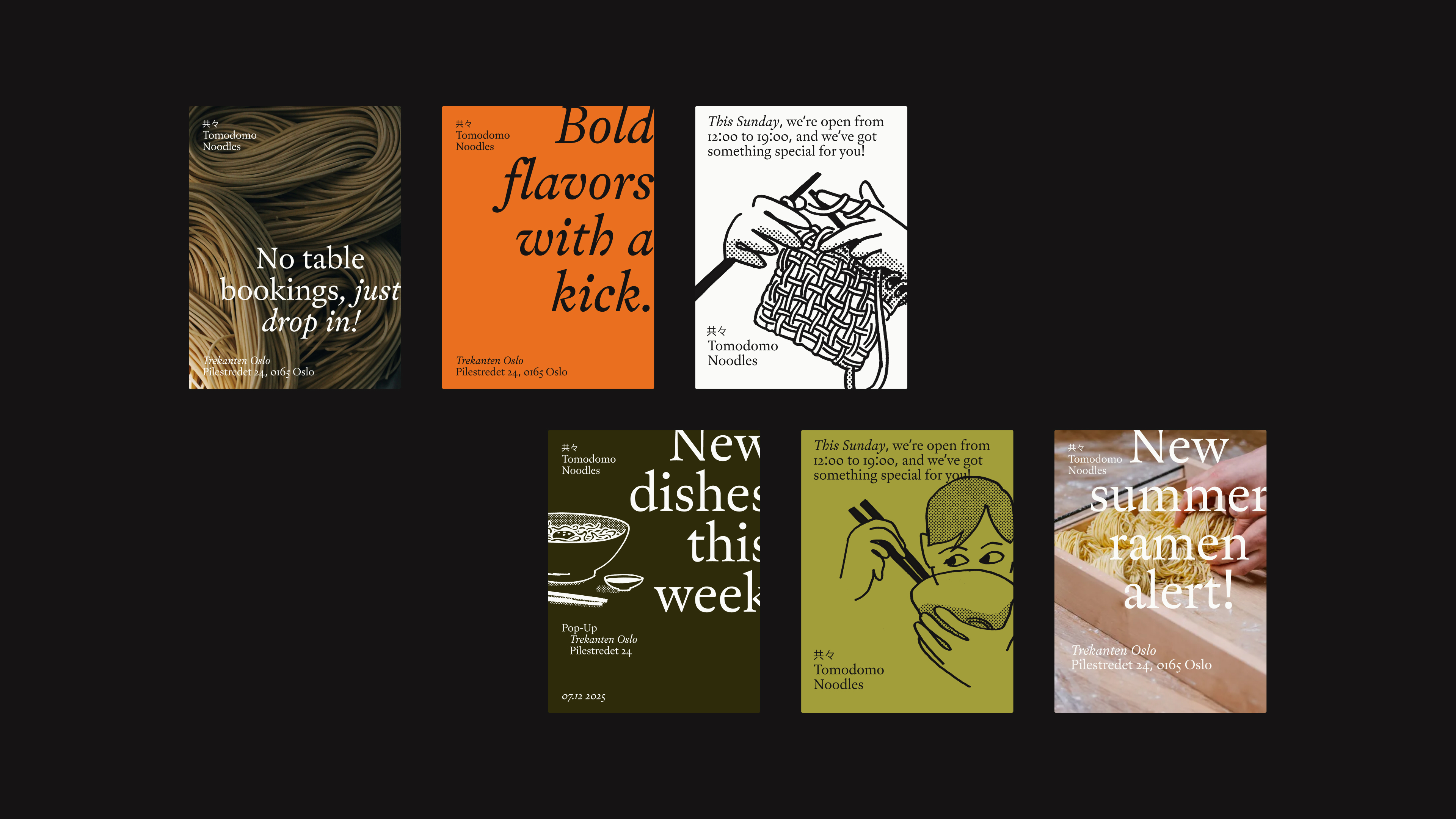
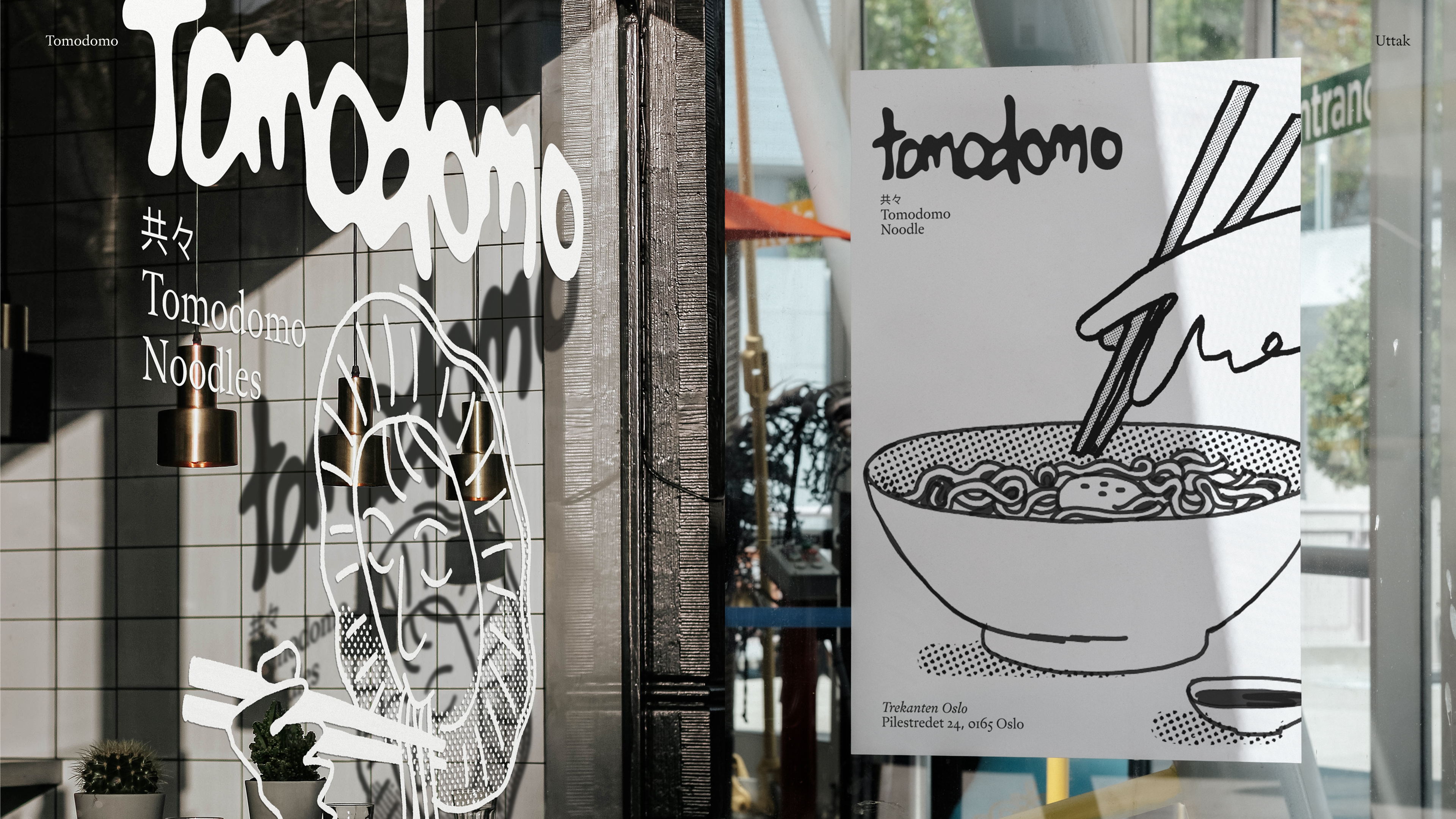
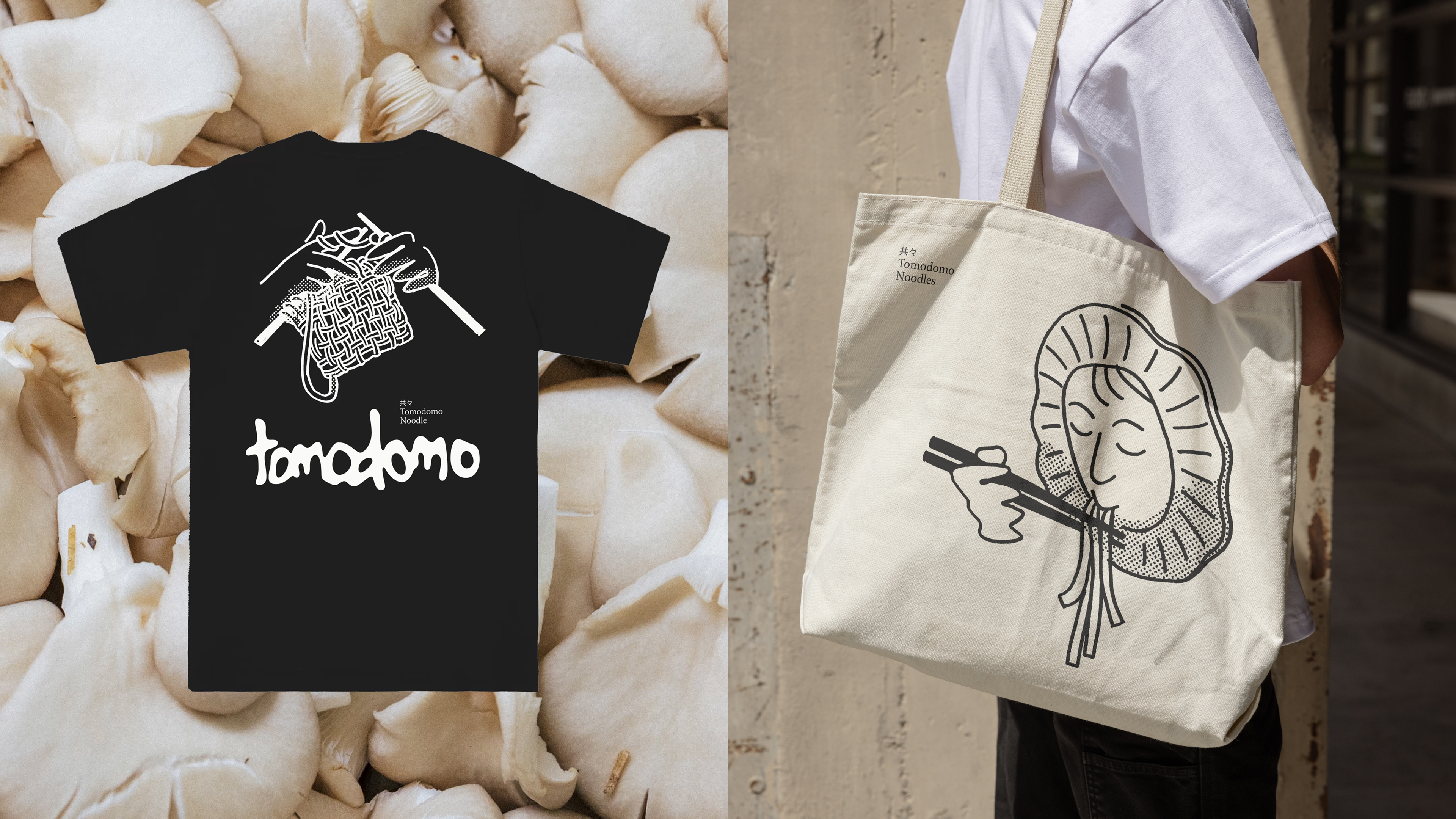
The solution centers around a bespoke hand-drawn illustration system as a primary identity marker. By illustrating scenes and ingredients from the Tomodomo universe, the boundary between brand communication and the actual craft of the kitchen dissolves. These illustrations scale seamlessly from social media icons to large-scale window installations, ensuring that the brand feels integrated rather than plastered on, even during collaborations with external partners.
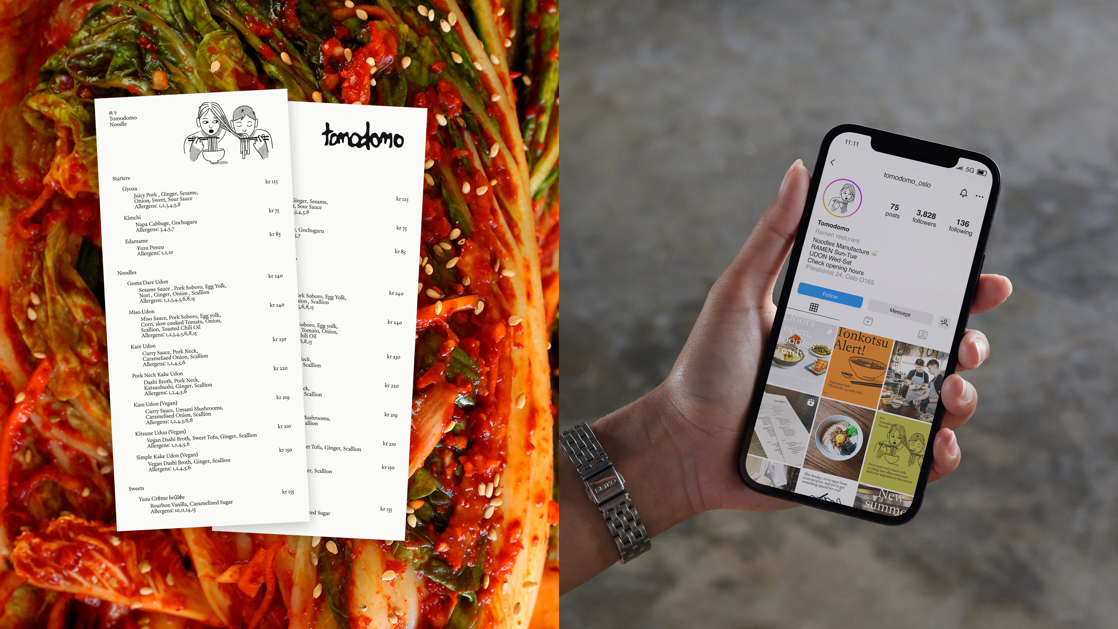
By putting weight on creating a set of bespoke illustrations to convey the human touch and artisanal craft at the core of the brand, it does not just become a visual expression. The illustration style is inspired by the tactile, irregular quality of newsprint, echoing the informal ambience of streetfood. Each hand-drawn line emphasises the raw integrity and passion the chefs pour into every bowl of ramen, soba or udon. The identity’s strength lies in the combination between elements. An organic logo resembling a broth stain, pairs with a classic typographic hierarchy for structure. Earthy colours inspired by East Asian ingredients highlight the food’s sensory appeal, whilst the bespoke illustrations lead a cohesive visual language where every distinct, edgy element harmonises.
As a semi-mobile concept, the visual system is designed to be user-friendly for the internal team, allowing them to apply illustrations and colours across various platforms without constant designer intervention.
To tie the entire philosophy together, the name was changed to Tomodomo, which translates to ‘being together with friends’ - the perfect atmosphere for enjoying a bowl of handcrafted noodles.
Ultimately, Tomodomos visual language serves as a natural extension of the craft, atmosphere, and philosophy behind the food.
Credits