Tipoteca web app
The world of typography is fascinating and multifaceted, and visitors to Tipoteca, the most important printing and type design museum based in Italy, often need guidance through the numerous technical terms, dates, and history of the materials on display. That’s why Tipoteca has decided to equip itself with a new digital tool, a free web app, that allows for a completely self-guided guided tour, thus also increasing accessibility and understanding of the museum experience.
This bilingual (Italian and English) tool enriches Tipoteca's digital ecosystem and is connected to the new signage, designed at the same time, now present in the Museum's rooms.
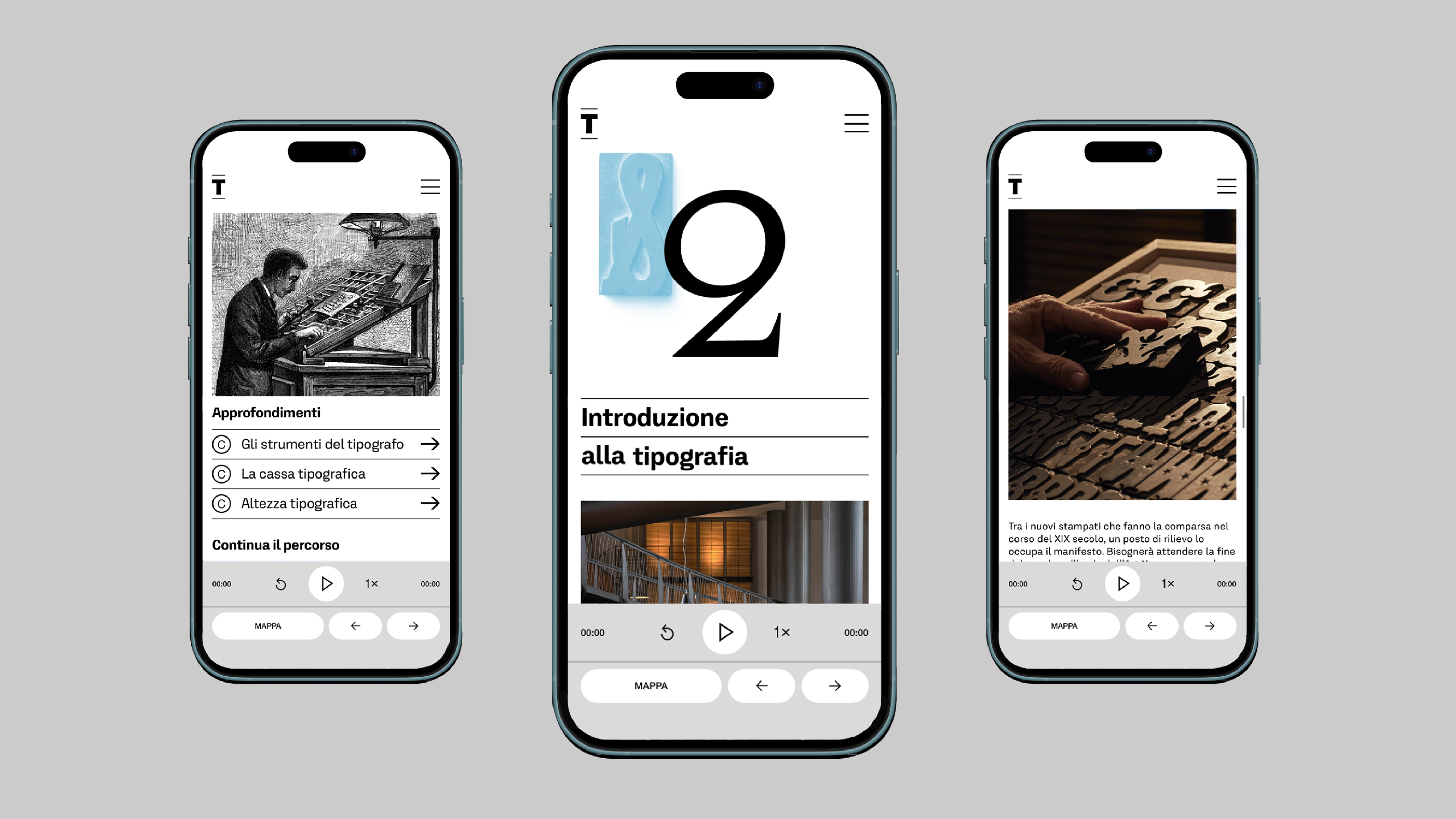
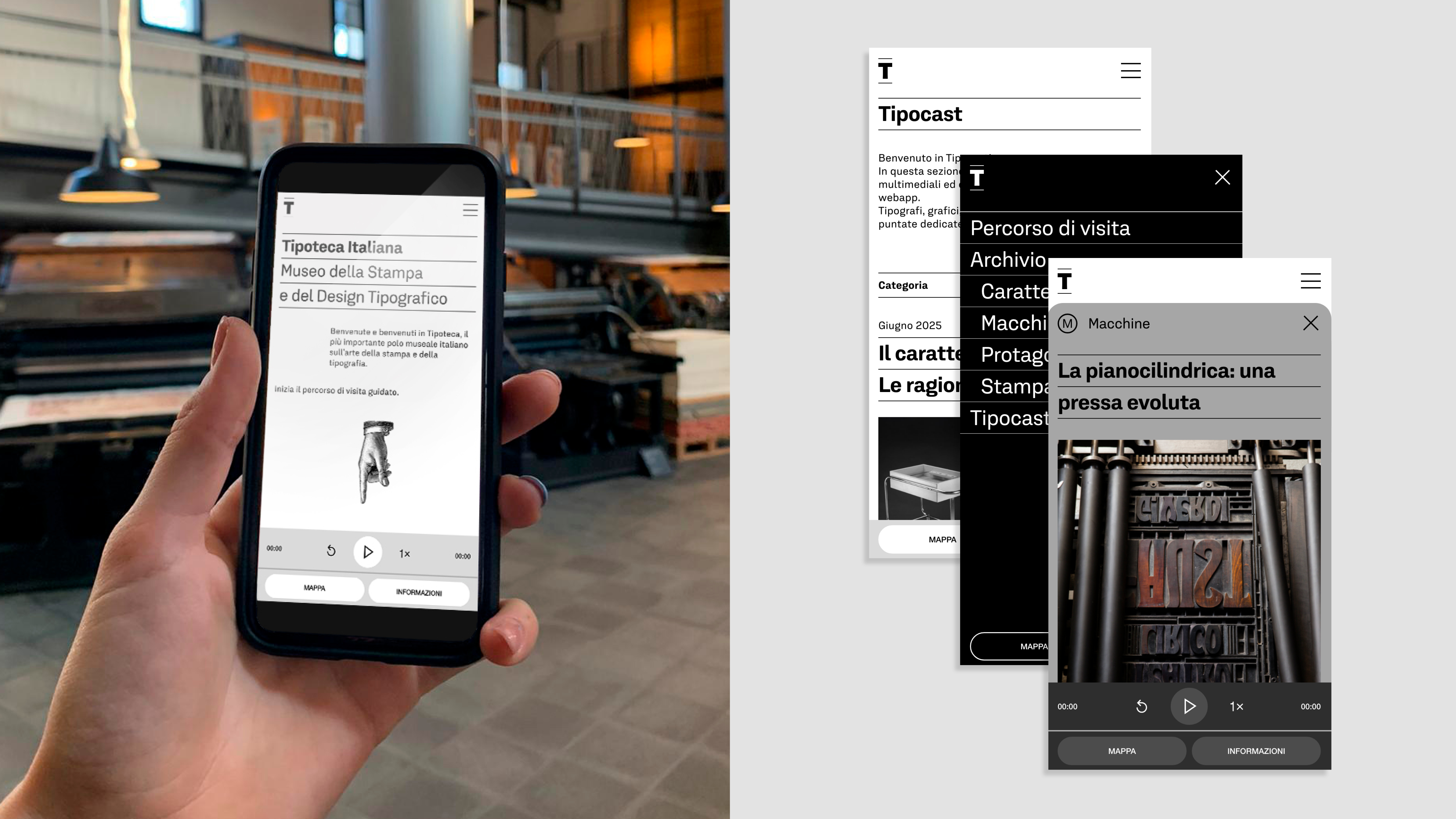
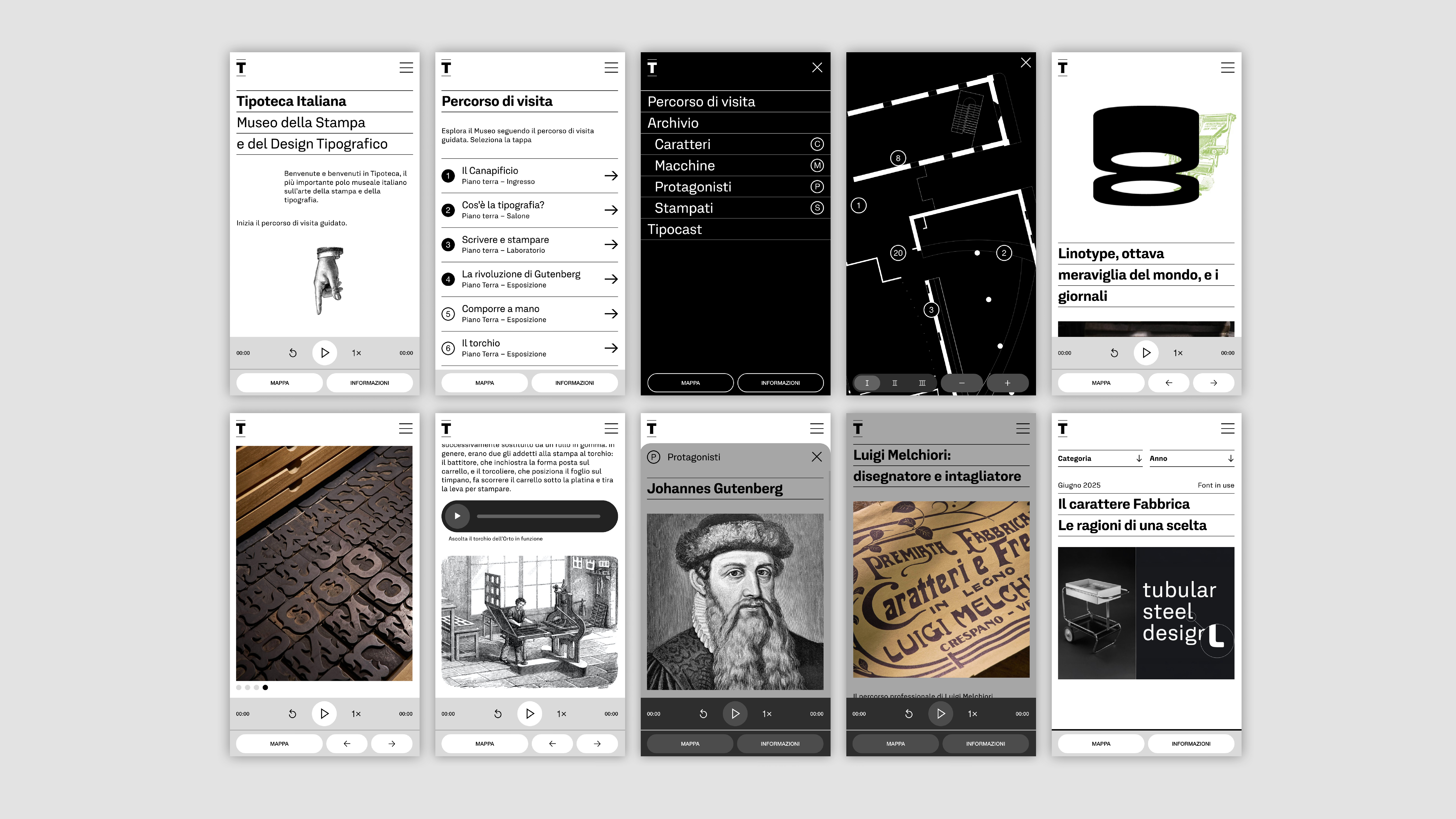
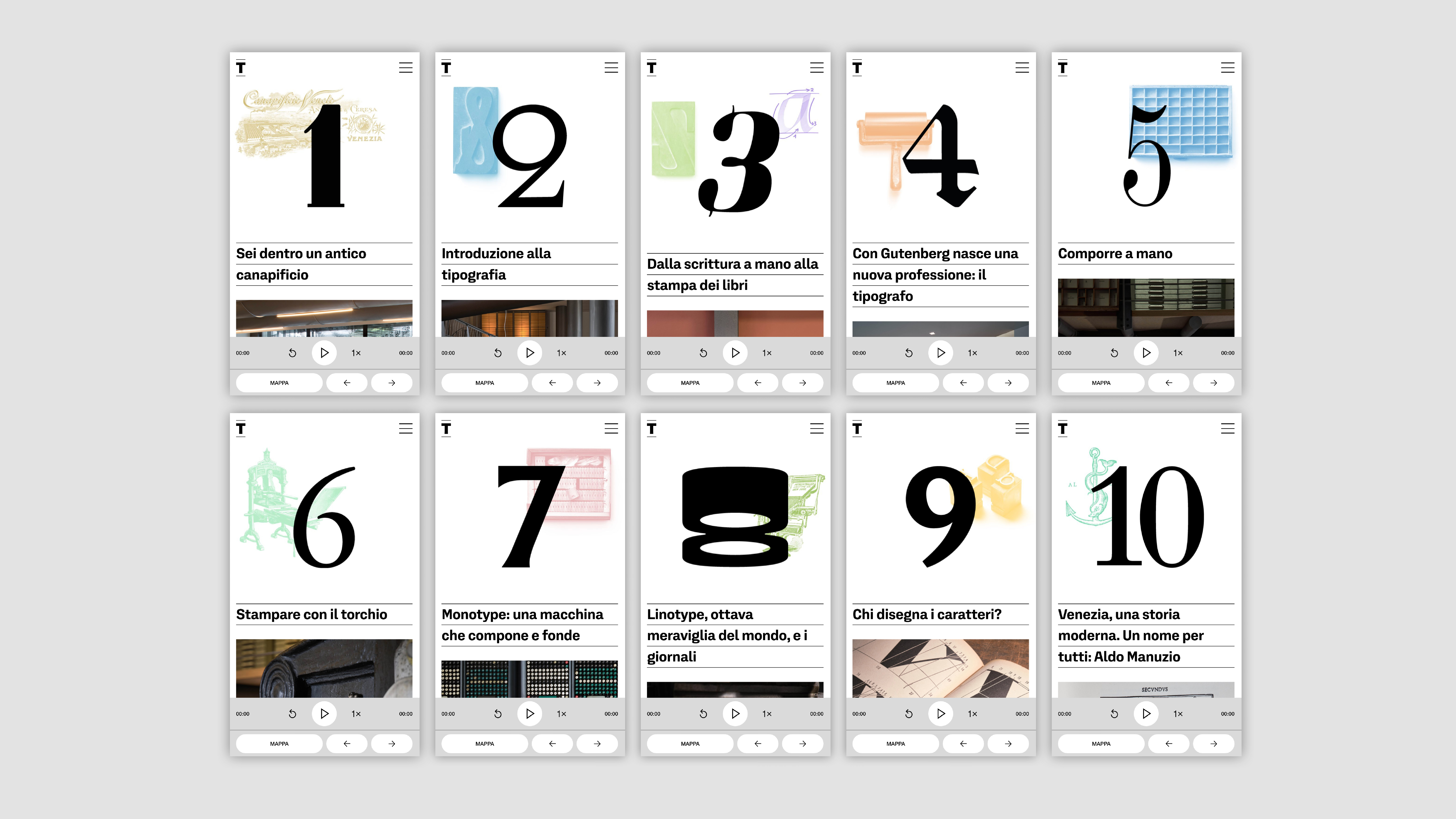
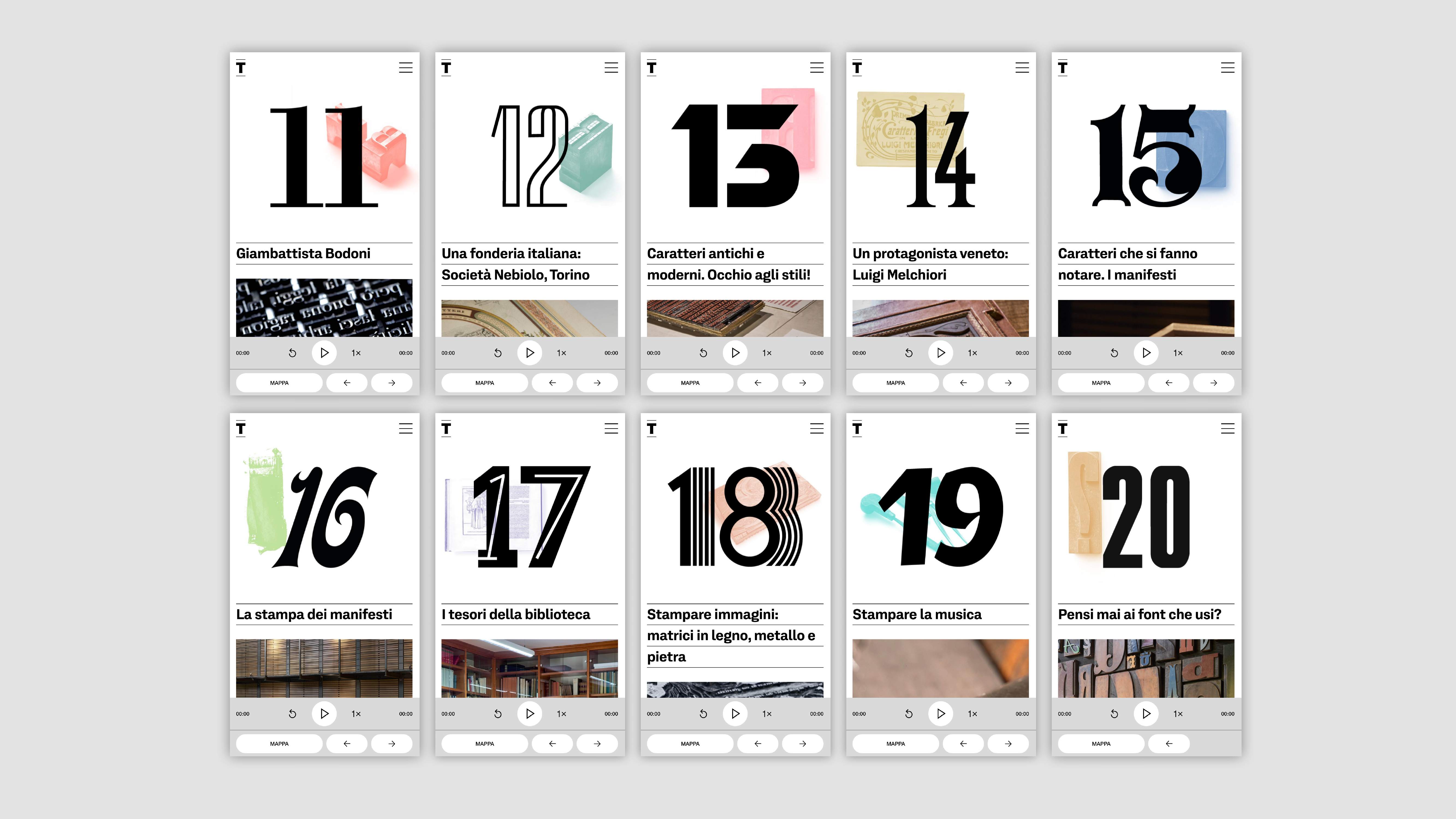
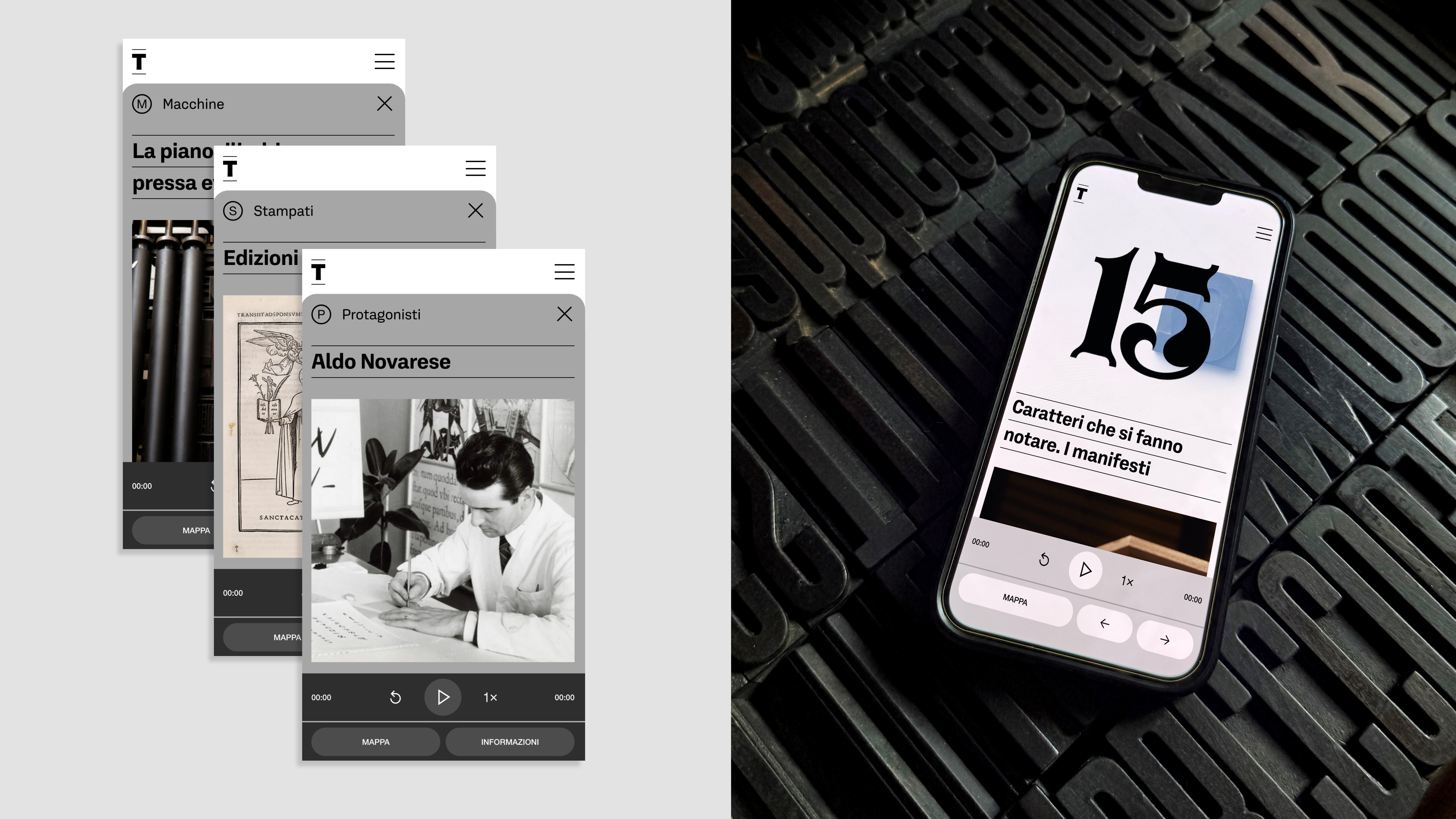
Designed as a multimedia guide to discover the exhibition through a 20-stop itinerary, the web app expands the visitor experience with audio tracks, texts, documents, printing press sounds, and in-depth texts, all accessible from your smartphone, ensuring complete user engagement. Each stop, which traces the history of Italian typography, features in-depth information on four different topics: Typefaces, key figures (typographers and type designers), printing presses, and paper documents (such as type specimens and historic printed materials). Many of these contents are not present on display but in the Museum archives, thus expanding the traditional visitor experience. Accessible both in the Museum for a self-guided tour or remotely, these insights allow for study and exploration of the world of typography even after the on-site visit.
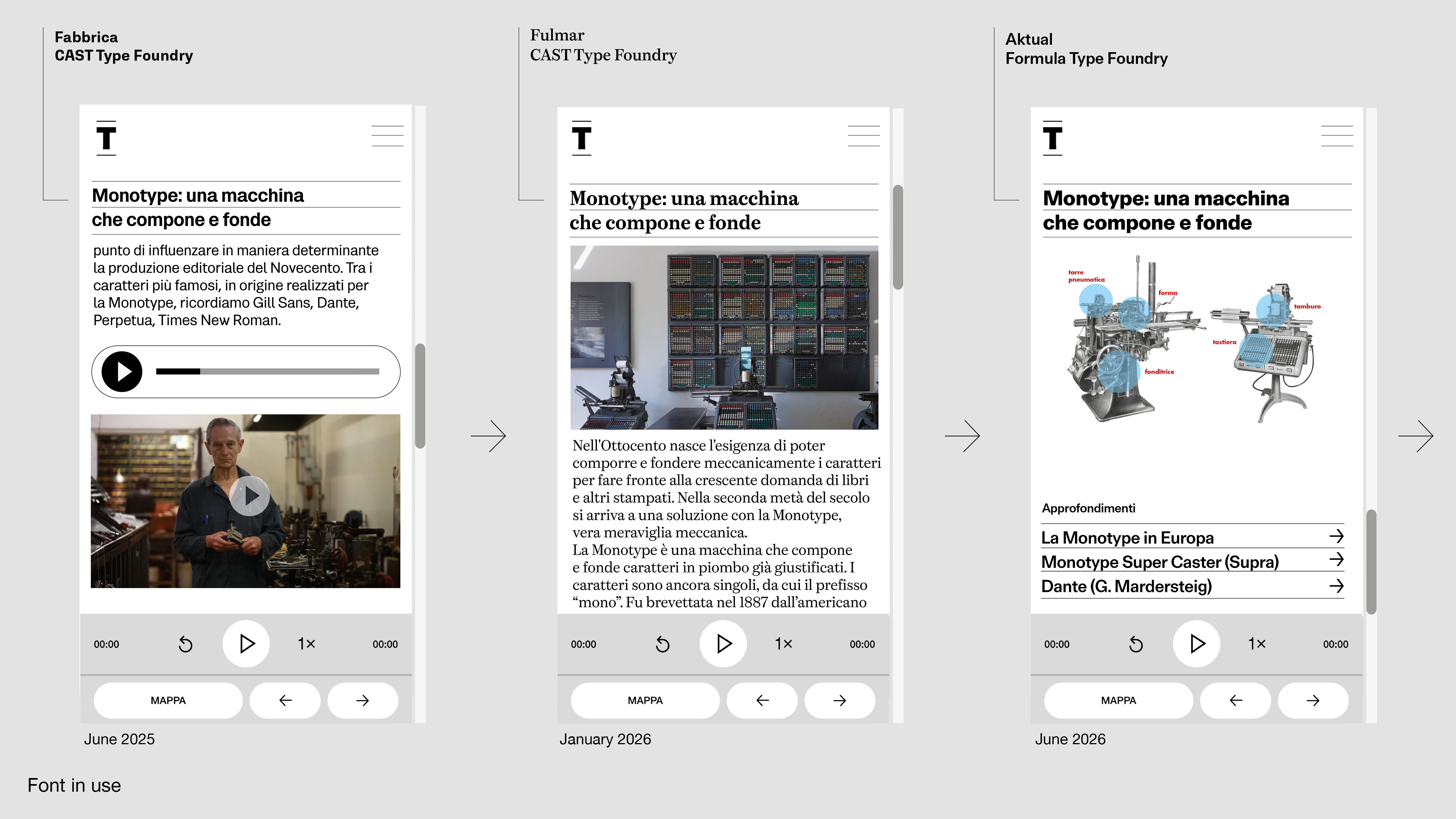
The web app project envisions the use, over time, of various typefaces designed for digital use and inspired by Italian typography, in collaboration with international foundries and designers. The typeface used throughout the web app will be updated as time passes. "Fabbrica" by Michele Patanè, created for the CAST digital foundry, was chosen for the launch. After six months, the entire site was updated with the "Fulmar" typeface by Leo Philp and new ones will come in the future.
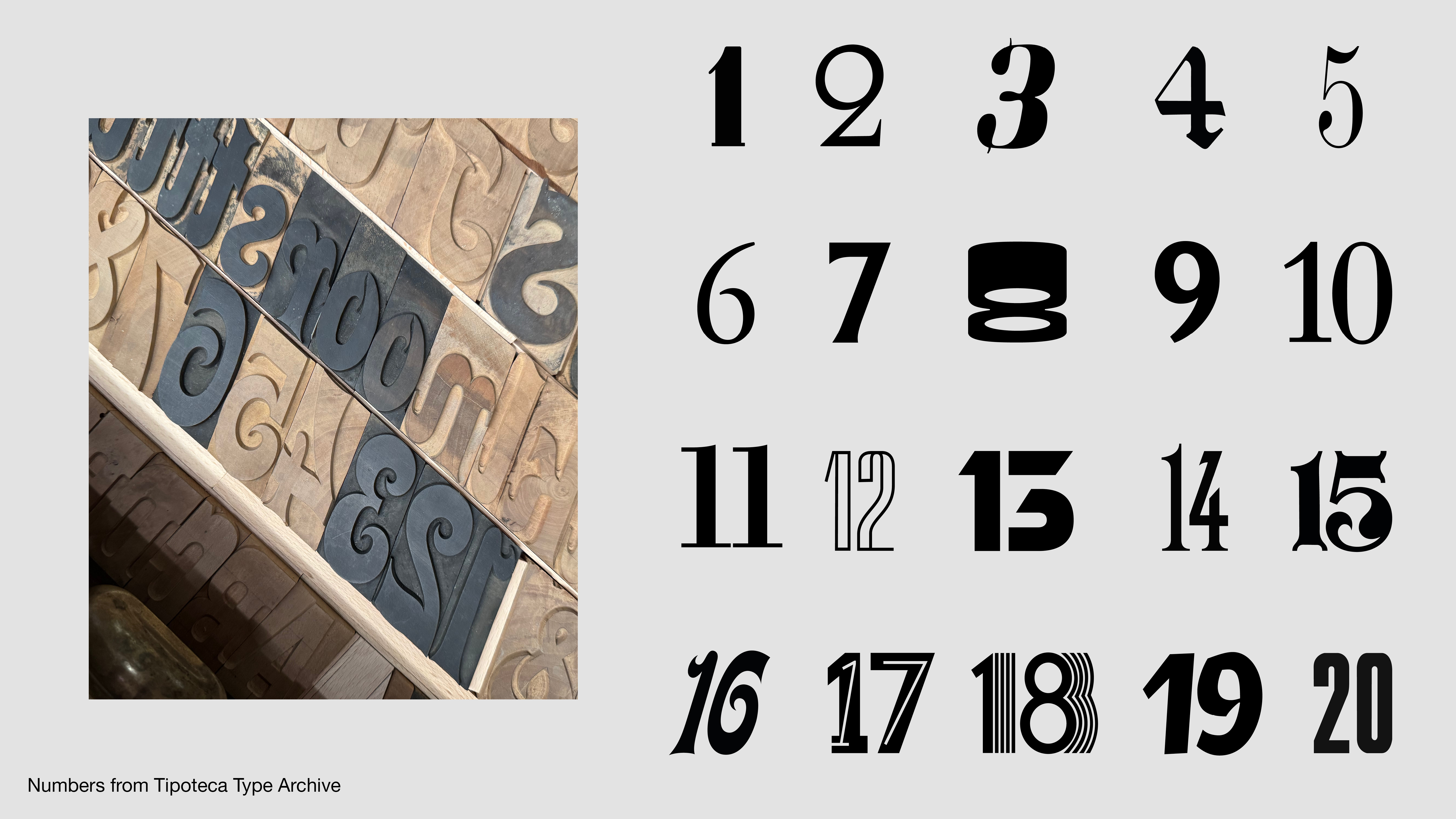
Each stop of the itinerary is also assigned a number, the typeface of which was chosen from Tipoteca's archive of original wood and metal typefaces and linked to the topic covered on the page.
There's no need to download an app to your device: since it was developed on the WordPress CMS, it can be navigated with the main browsers available on users' mobile devices (Google Chrome for Android or Safari for iOS).
Link: https://app.tipoteca.it/en/
Link: https://app.tipoteca.it/
Accessible only from smartphones; free access with registration.
Credits