Osland Company Logo
Since 1963, Osland has pioneered Norwegian aquaculture, cultivating and preserving one of the country’s oldest trout broodstocks. For more than 60 years, the company has refined selective breeding to develop trout defined by rapid growth, late maturation, and a silver, robust appearance. Today, Osland operates two distinct pedigree strains — the Osland strain and the Ilsvaag strain — representing generations of dedicated genetic development.
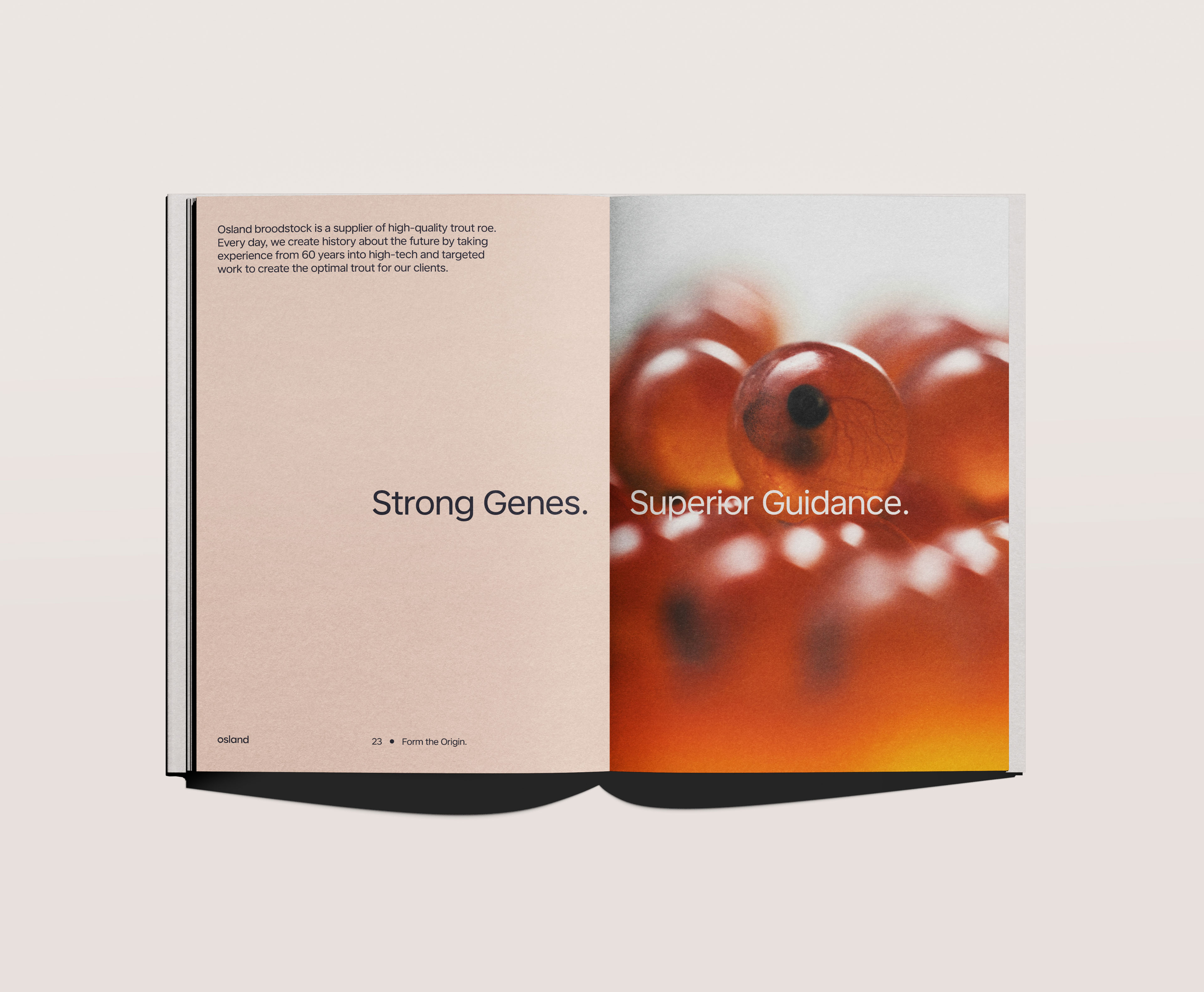
At the heart of the company’s work lies a simple truth: in aquaculture, everything begins with the roe. An egg is never just an egg. Within the smallest unit of DNA are the traits that determine how a fish will grow, perform, and taste. Osland’s breeding programme focuses on strengthening these traits through continuous innovation of the gene pool, creating fish that are resilient, efficient, and refined in quality. Strong genes, guided by deep expertise and modern facilities, ensure roe that is truly “best of breed.”
Quality is matched by responsibility. Osland maintains strict biosecurity and health standards, including routine testing for IPN, PD, and PRV3, QTL IPN availability, custom testing on request, and GLOBALG.A.P. certification. Sustainability underpins every stage of production. The company manages the full value chain locally — from roe to harvest — in the clear, oxygen-rich waters of the Sognefjord. Protecting the fjord environment, safeguarding seabed integrity, and optimising fish health are central commitments. In alignment with the UN Sustainable Development Goals, Osland strives to create lasting value for both community and ocean.
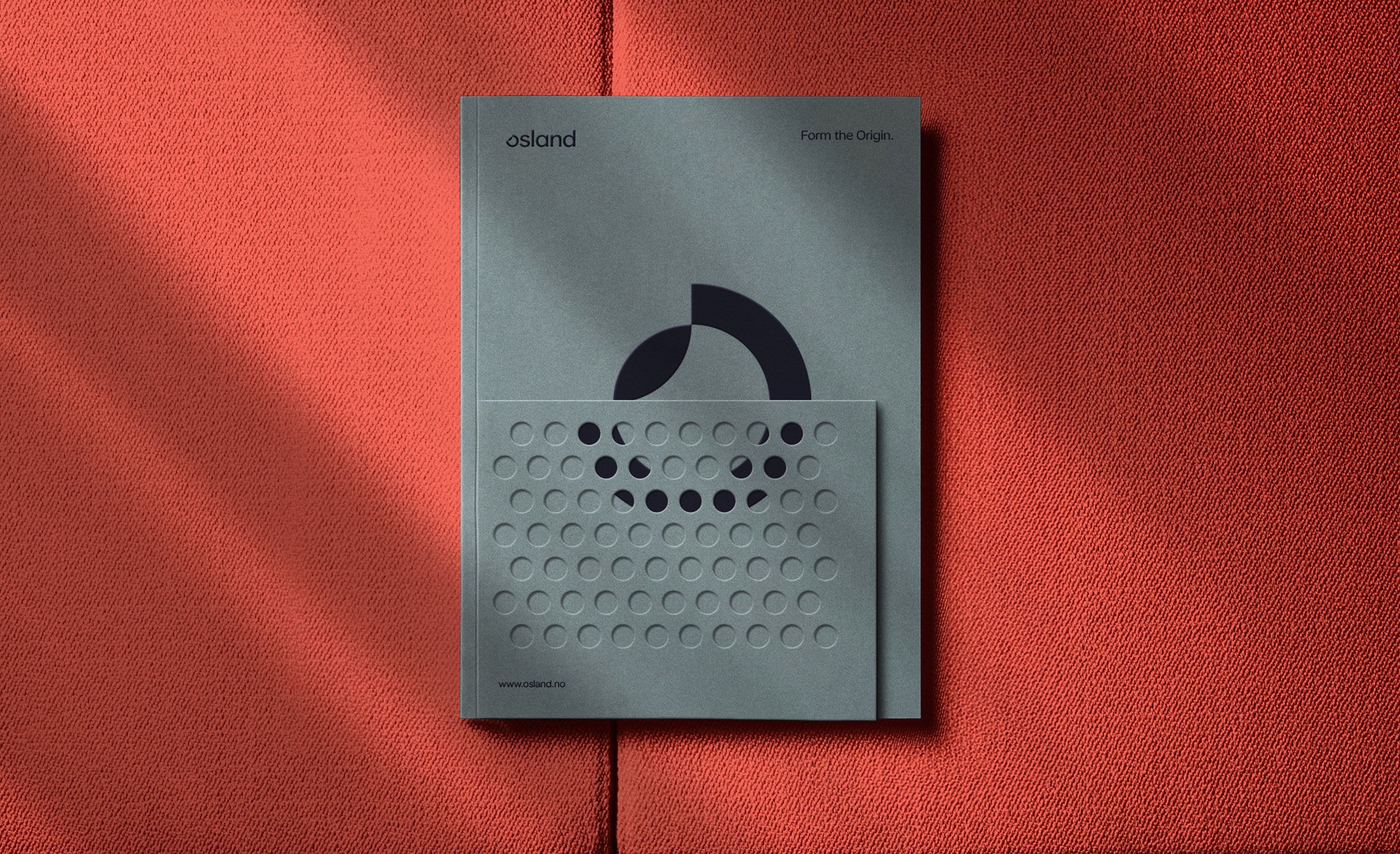
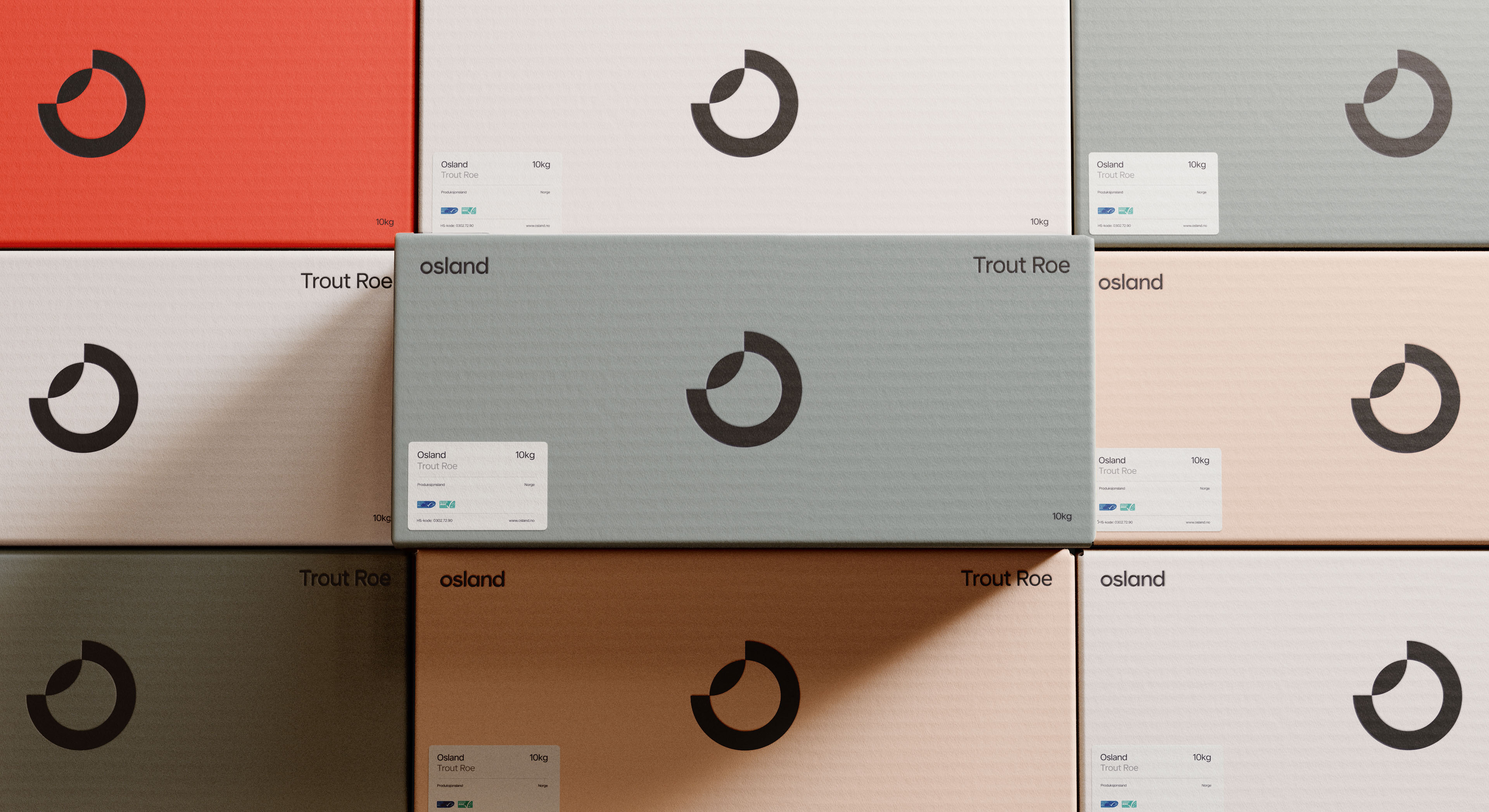
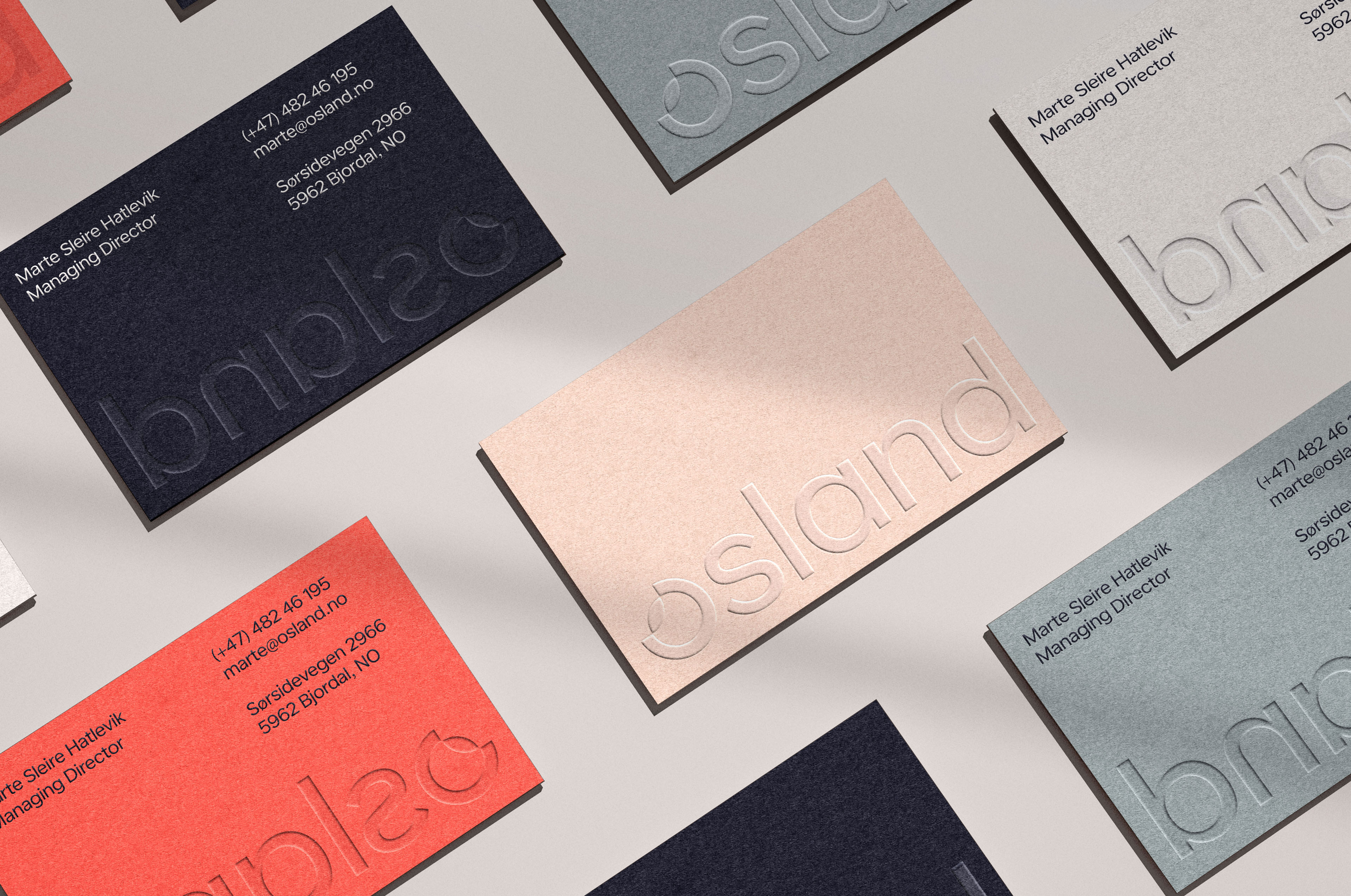
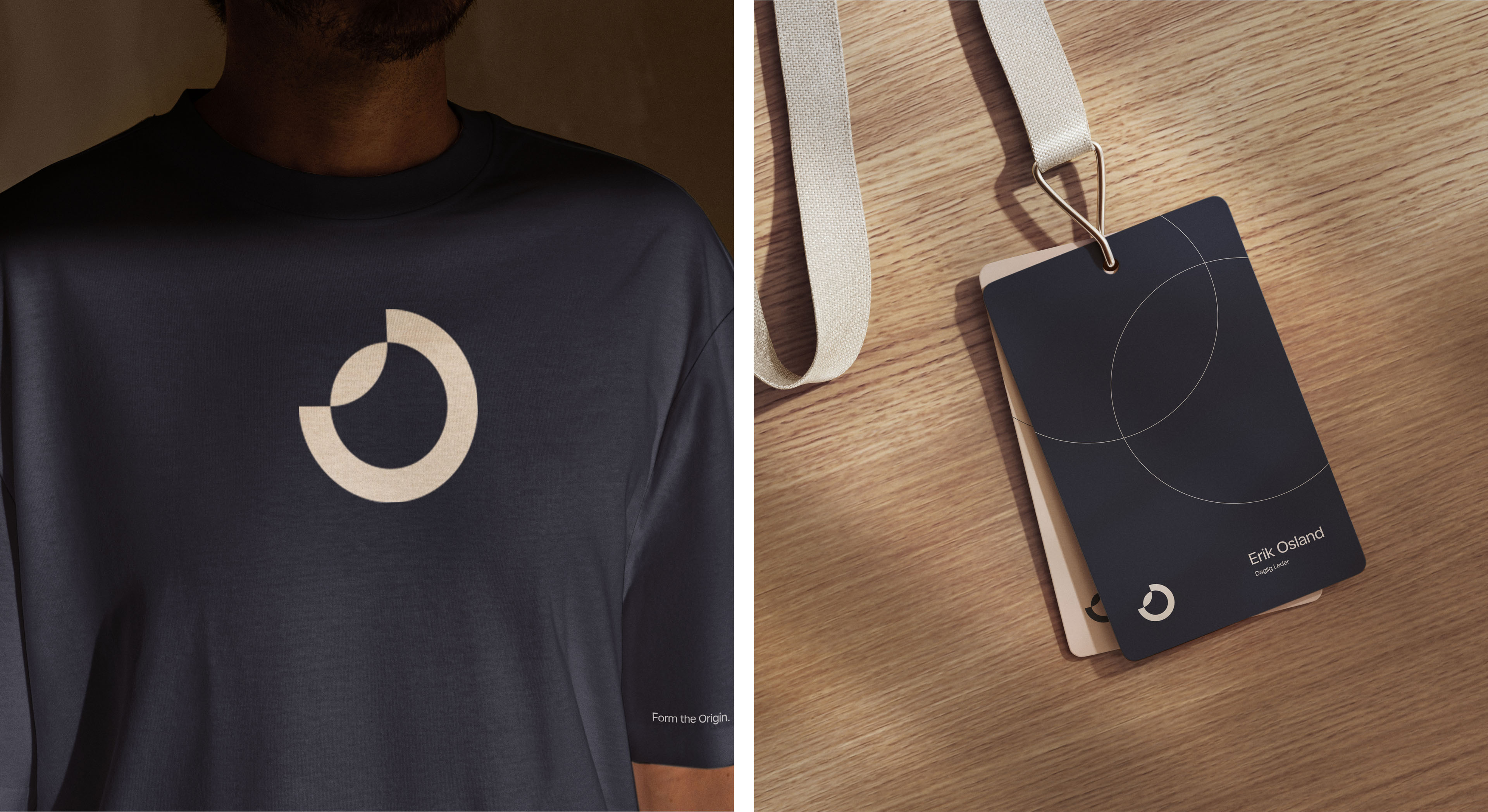
The brand identity translates this philosophy into form. The visual system is built around the circle — referencing the roe, the DNA coil, the fish’s silhouette, and the initial “O” of Osland. Circular shapes recur across the design language, linking micro and macro: the intimate world of genetics and the expansive geometry of sea pens.
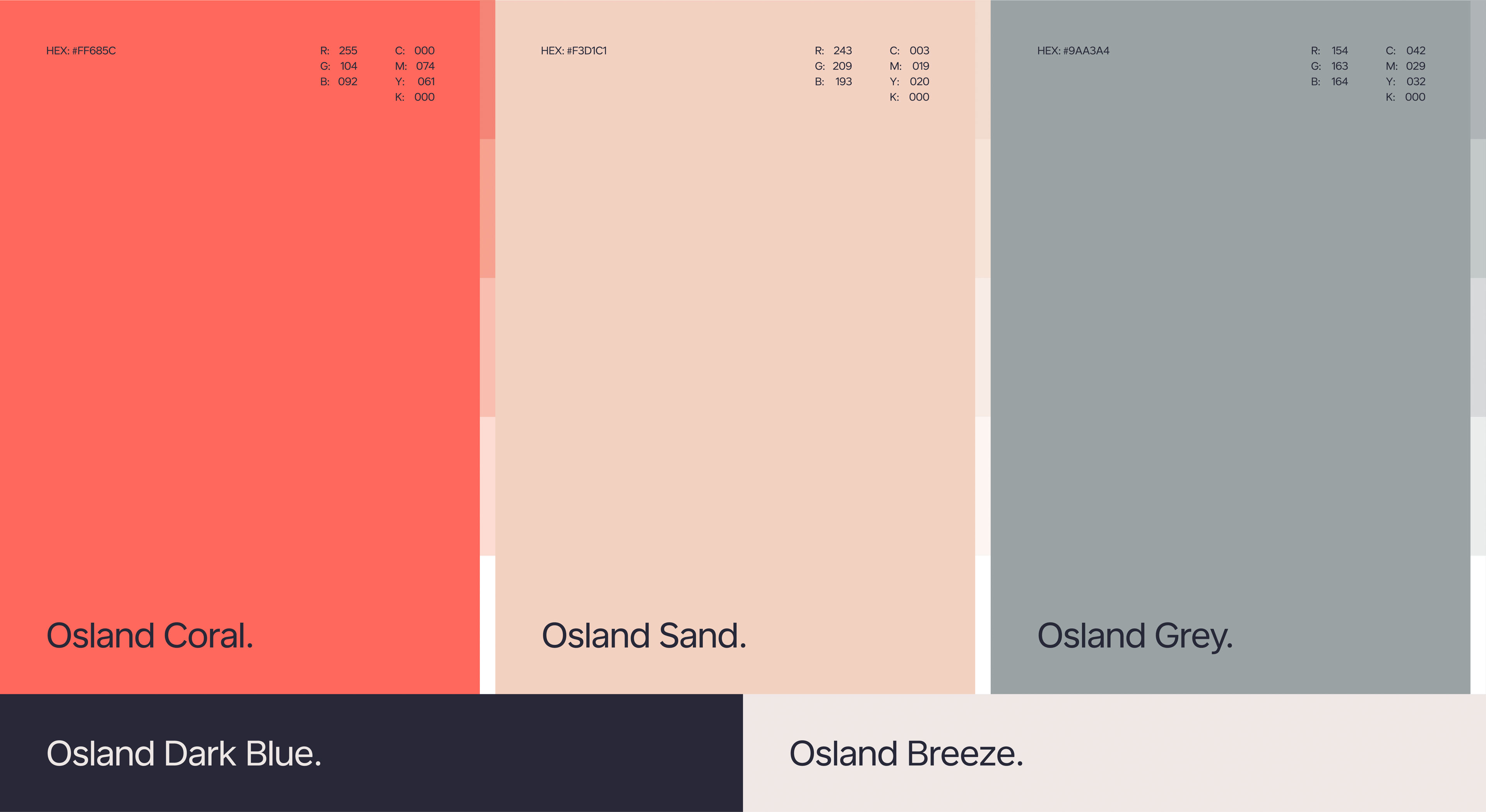
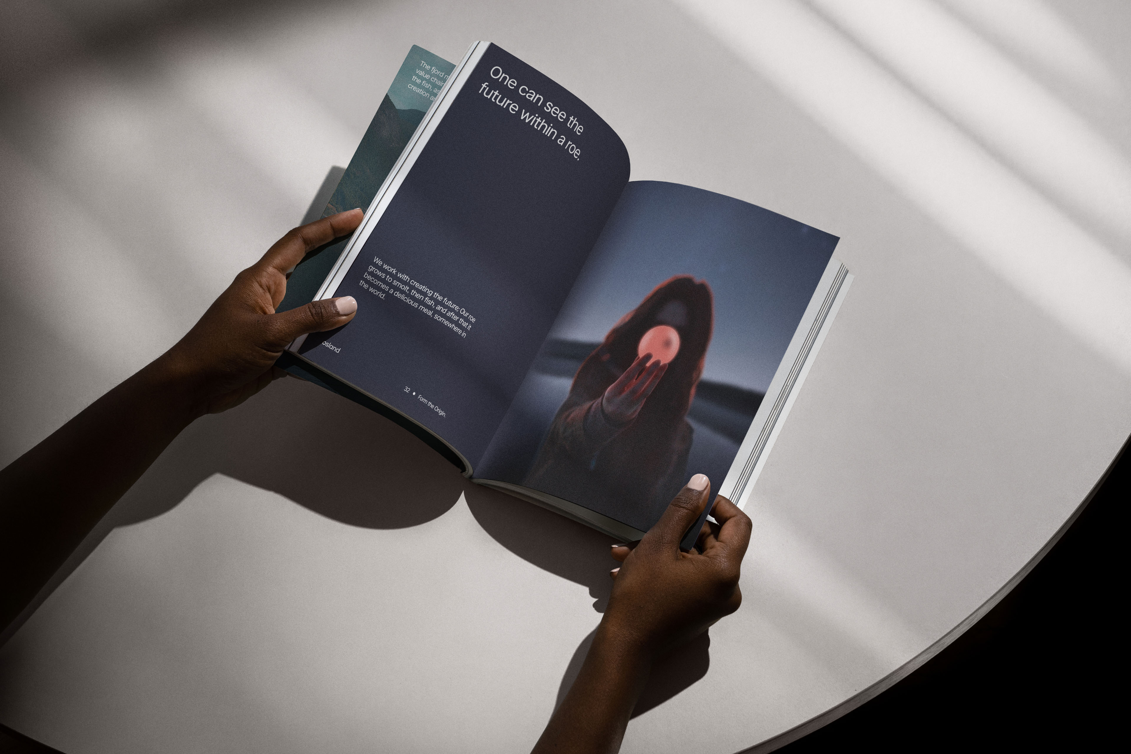
The colour palette reinforces this duality. Warm trout-pink and roe-red tones symbolise biology and vitality, set against cool marine blues reflecting the surrounding sea. Photography and grading enhance the tension between warmth and clarity — between life and environment.
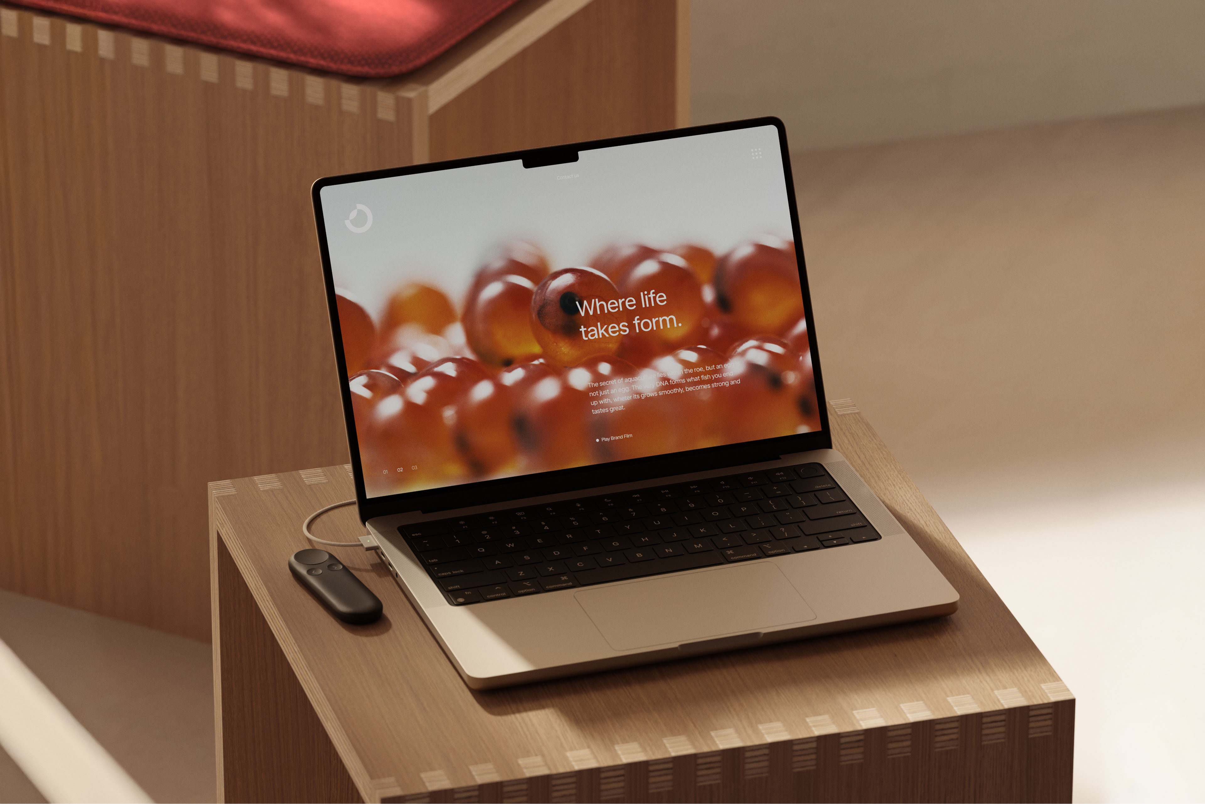
Conceptually, the identity is anchored in a subtle linguistic shift: “From” becomes “Form.” By altering a single letter, origin becomes transformation. “From Within” becomes “Form Within.” This deliberate nuance mirrors Osland’s core work — shaping the future through careful evolution of heritage. What we come from can be refined. Life can take new form.
Credits