Trata Sardines
A Familiar Taste, Reimagined
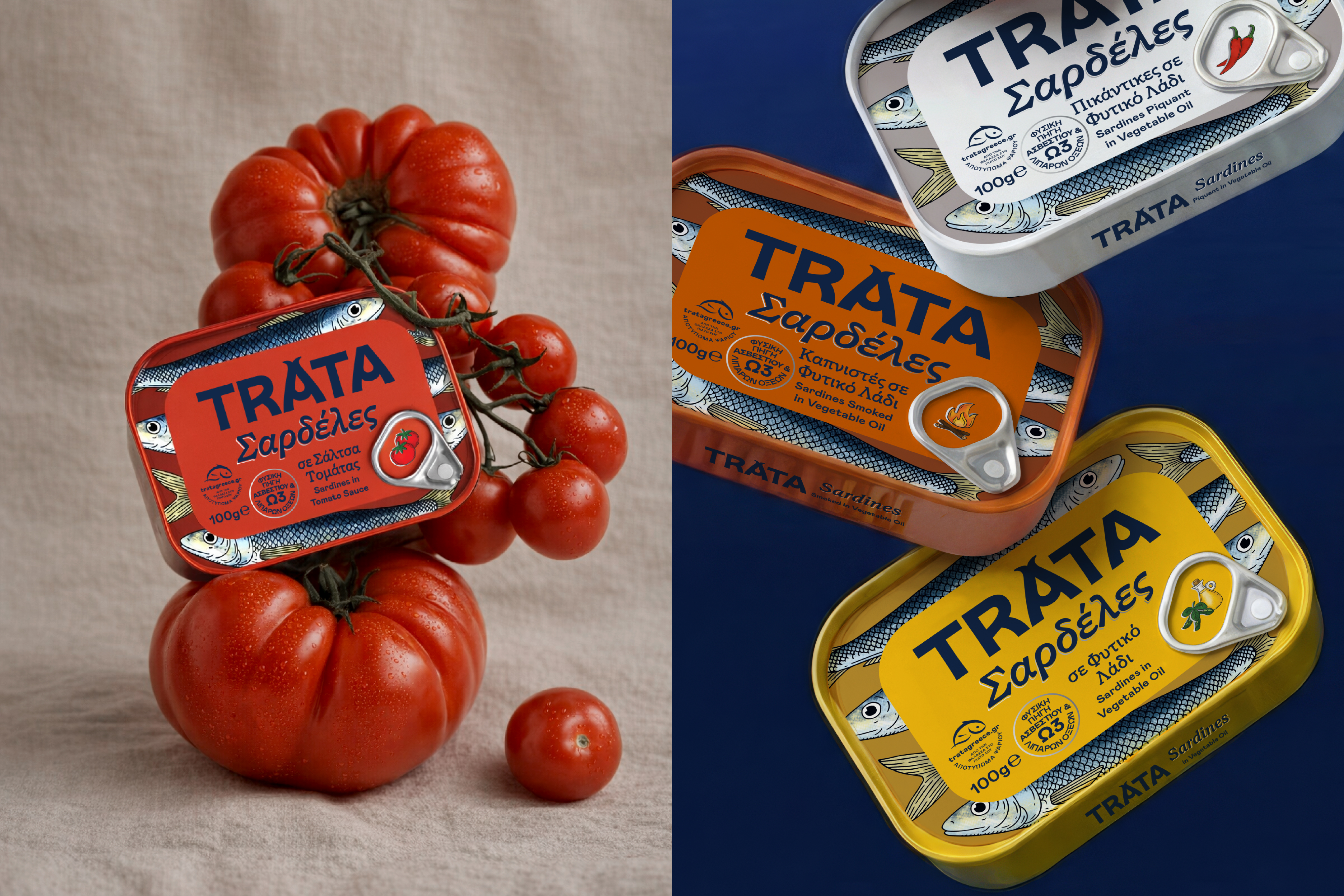
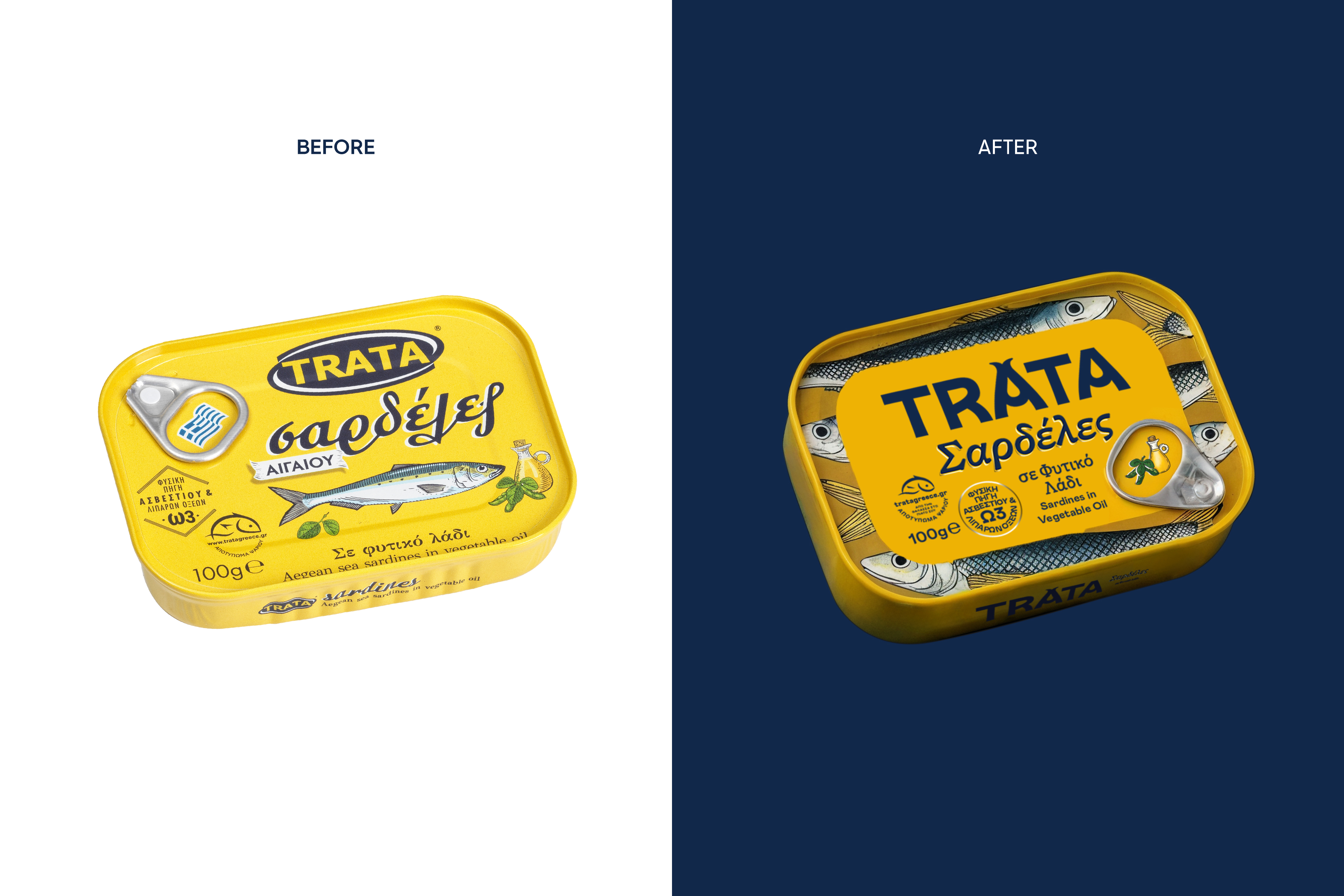
Some products don’t need reinvention — they need reverence. TRATA Sardines have lived in Greek kitchens for generations, a small tin carrying memory, ritual and everyday authenticity. Our task was not to redesign a package. It was to honor a ritual. To respect memory. And then, gently, to move it forward.
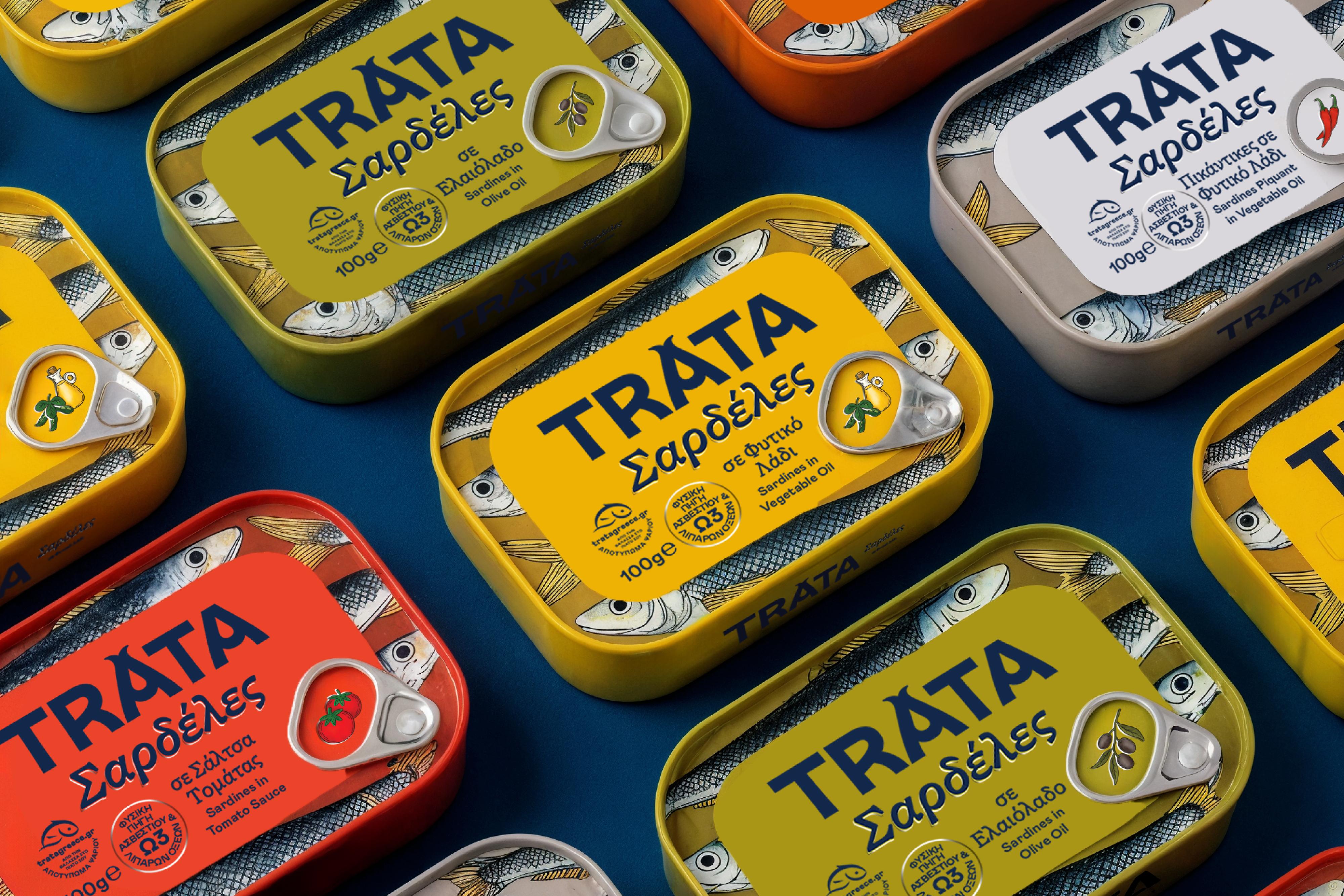
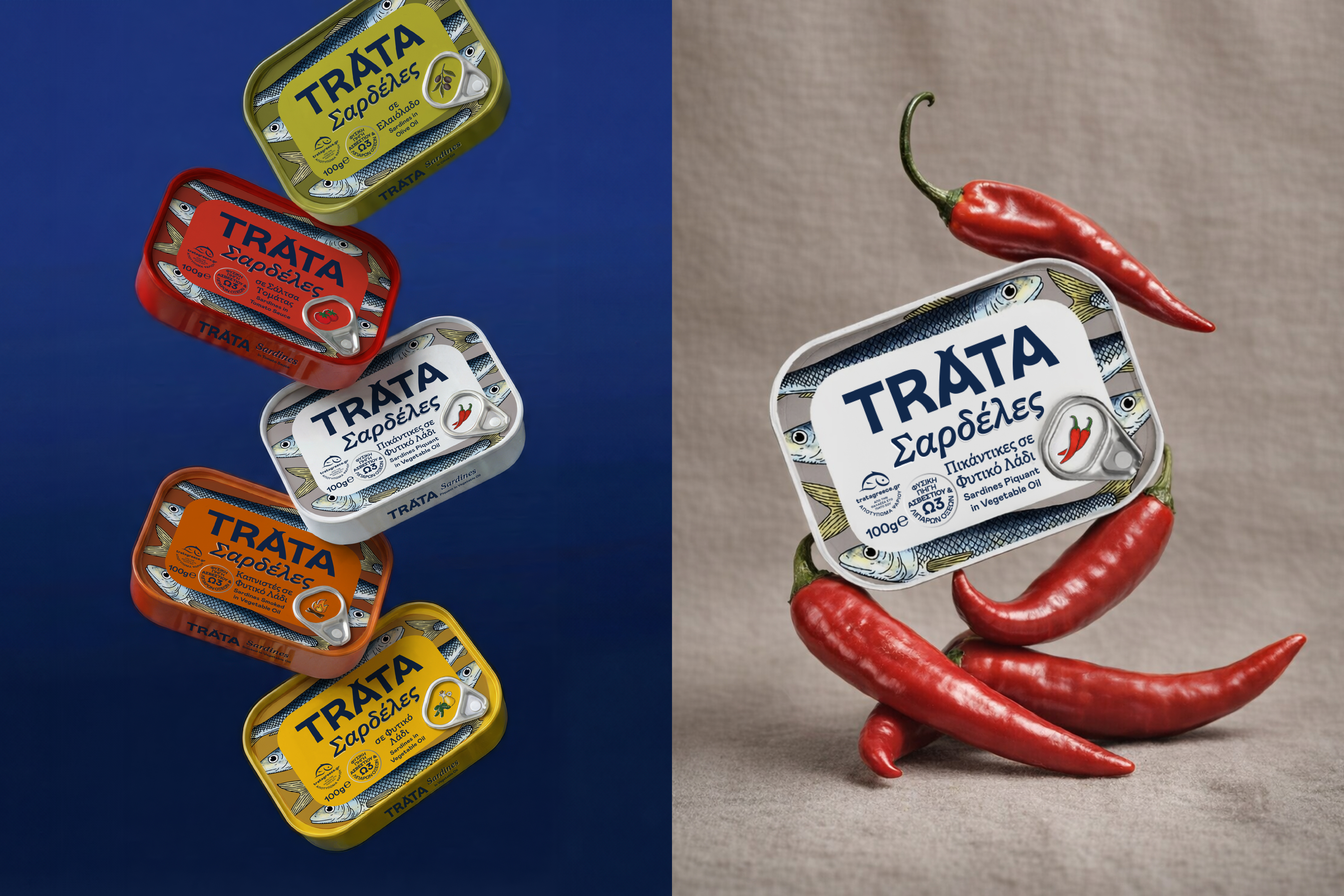
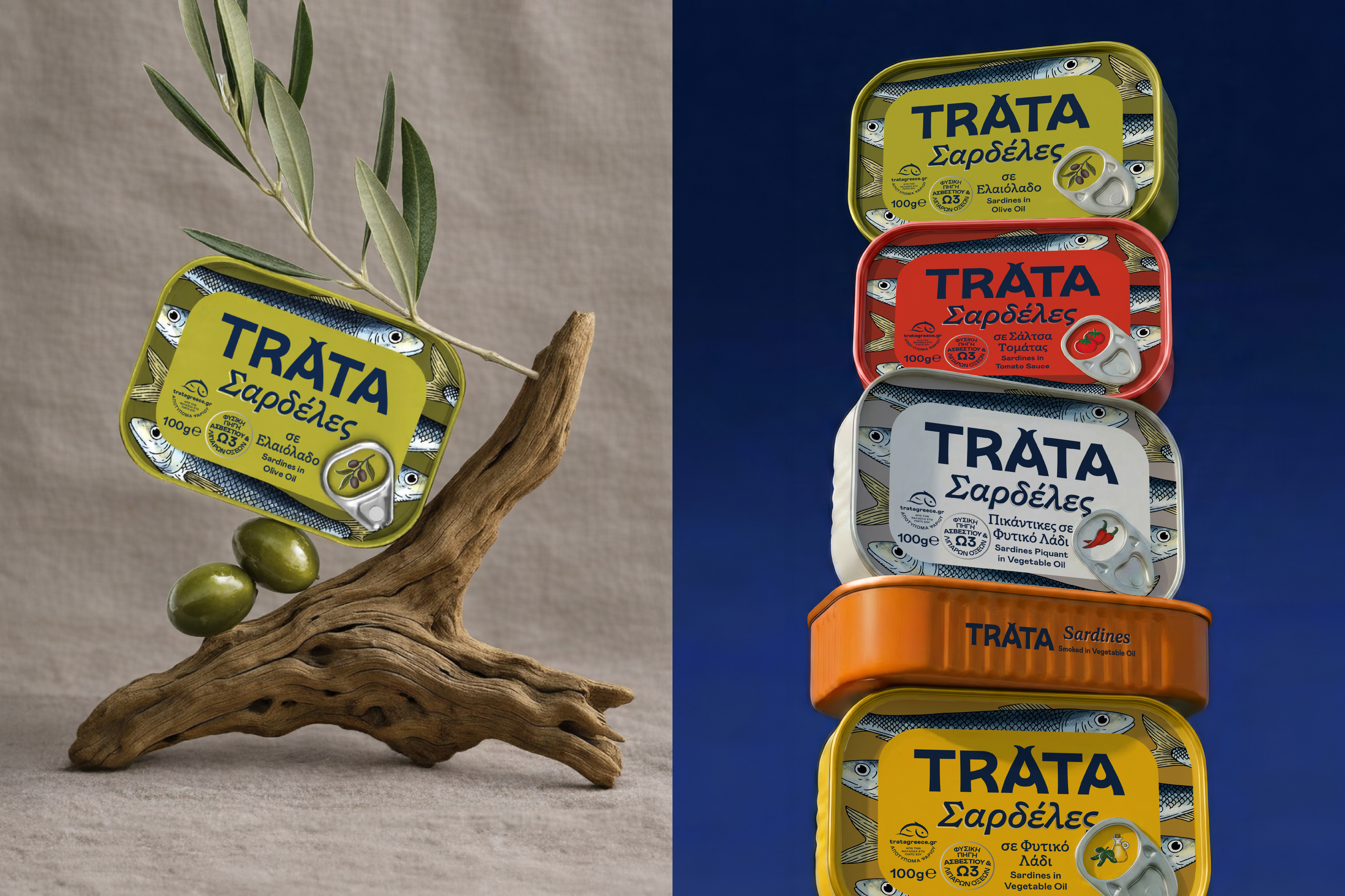
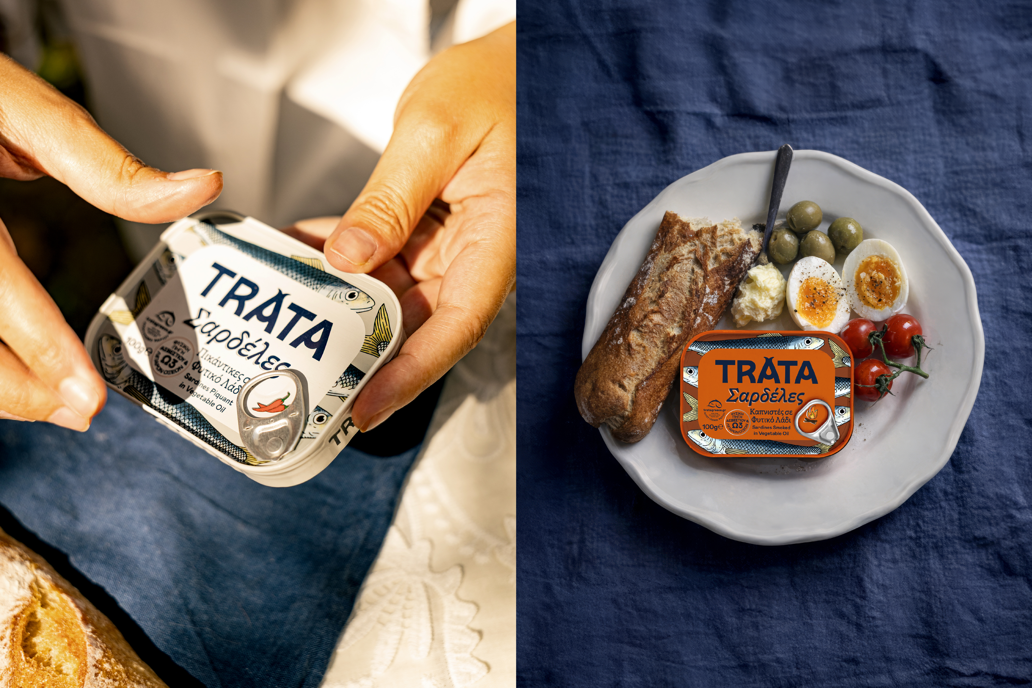
We reillustrated the sardine from the ground up — more expressive, more confident, more alive. Bolder lines, richer texture and a dynamic composition bring movement into what was once a more static space. The new illustration transforms the tin into a small canvas of the Aegean. The sardine is now the protagonist — prominent, proud and unmistakable.
Typography and secondary illustrations were elevated to match this renewed presence. A clearer hierarchy, refined letterforms and a cleaner structure create balance and breathing room, preserving the nostalgic warmth of the brand while expressing it with sharper confidence. The result is more illustrative, more curated and more distinctive. Where the old design felt familiar, the new one feels iconic.
Credits