Dyslexia
Designing for a Brain That Reads Differently
Dyslexia affects an estimated 5–15% of people. It is a lifelong reading and writing disorder that makes it difficult to quickly connect letters with sounds, read fluently, and accurately express thoughts in writing — despite normal intelligence. When not recognized early, dyslexia is often misinterpreted as laziness, lack of effort, or cognitive impairment. In Lithuania, until 2025, there was no organization representing people with dyslexia at a political and social level.
The newly established association needed more than a logo. It needed a visual identity that could communicate two seemingly contradictory things: the real struggle dyslexic individuals experience within rigid educational systems, and the strength and alternative pathways they develop to navigate them.
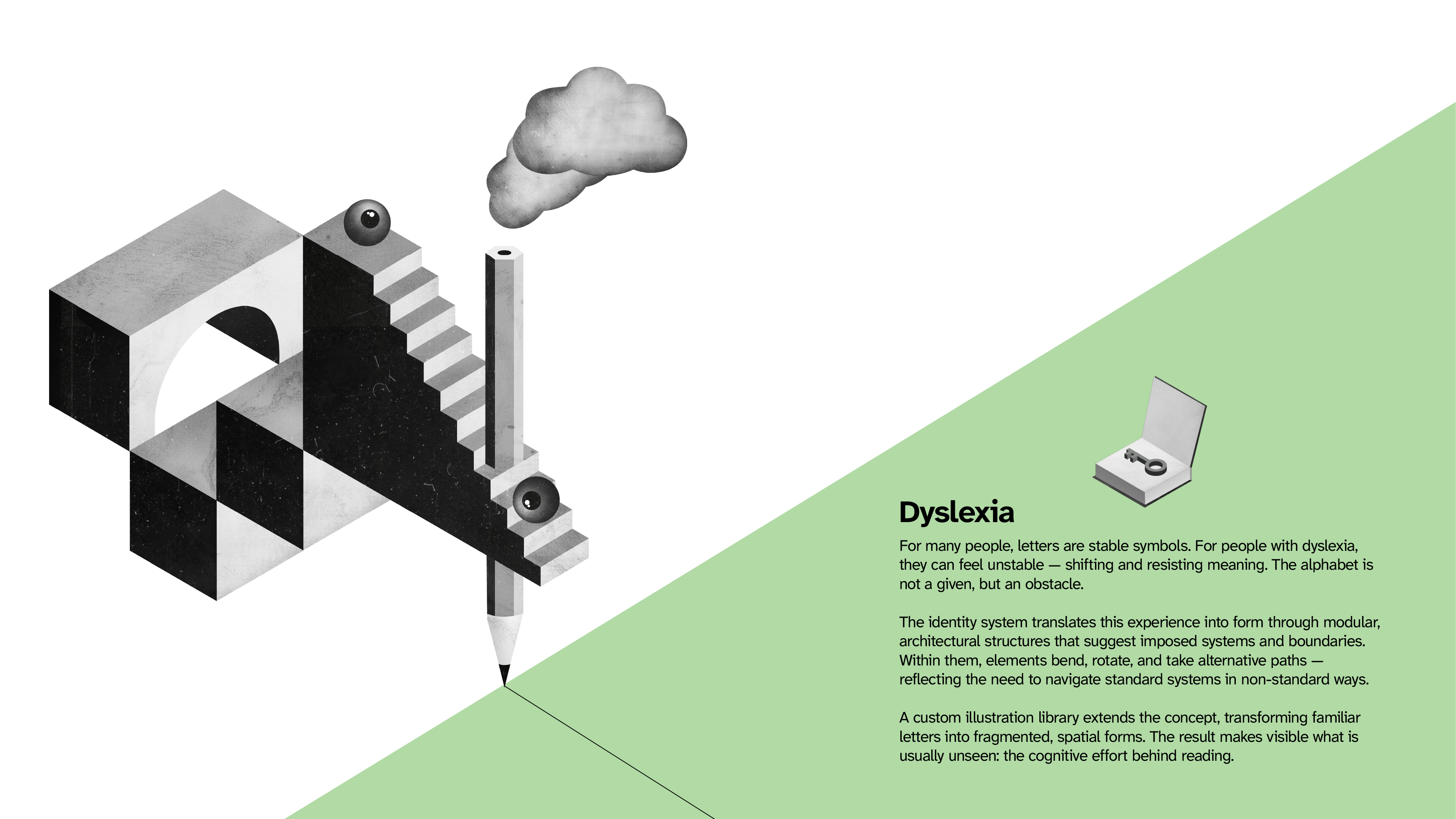
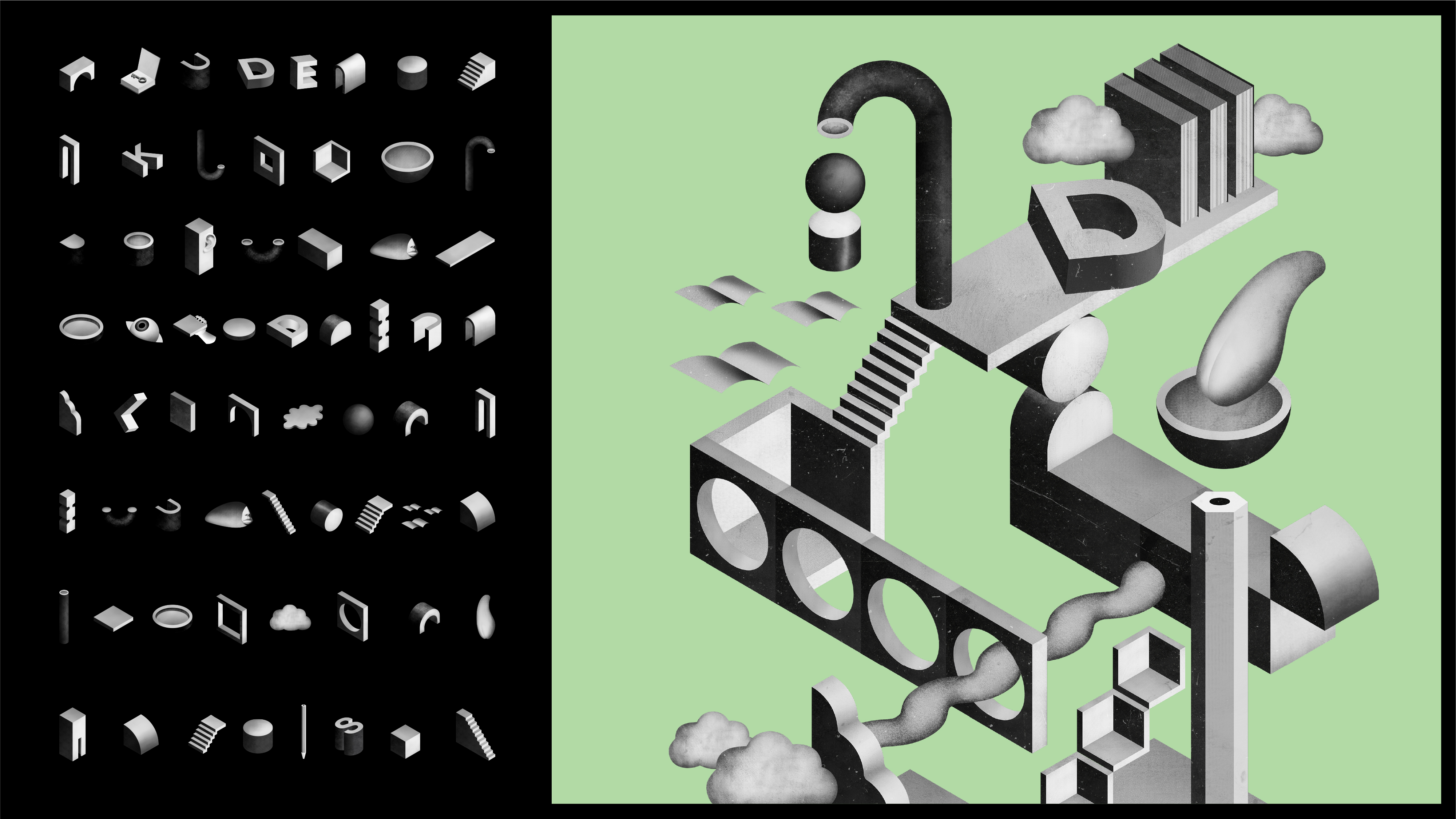
Our core insight was simple: for many people, letters are stable, neutral symbols. For people with dyslexia, they can feel unstable — shifting, jumping, resisting assembly into meaning. The alphabet is not a given. It is an obstacle.
The identity system translates this experience into form.
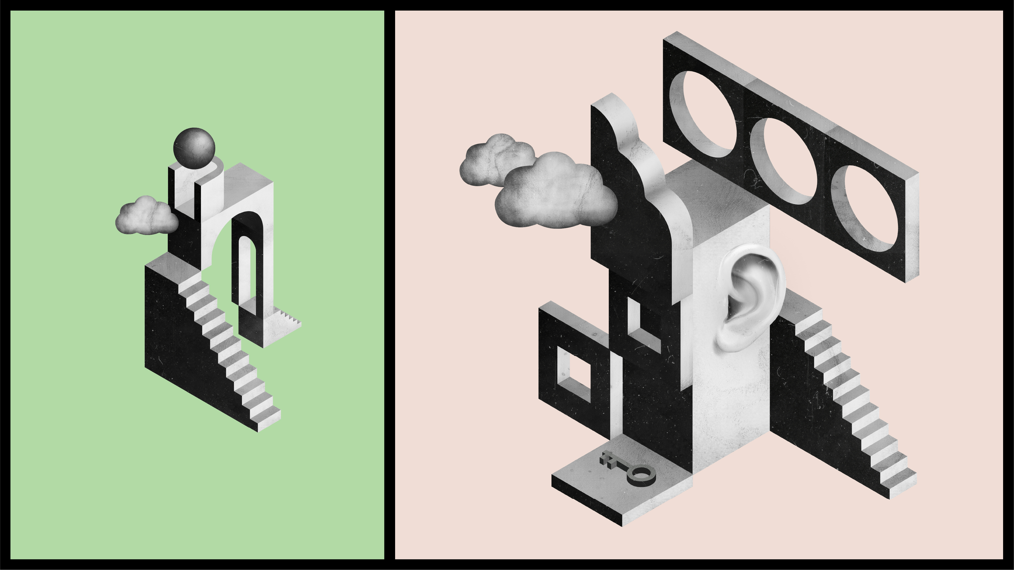
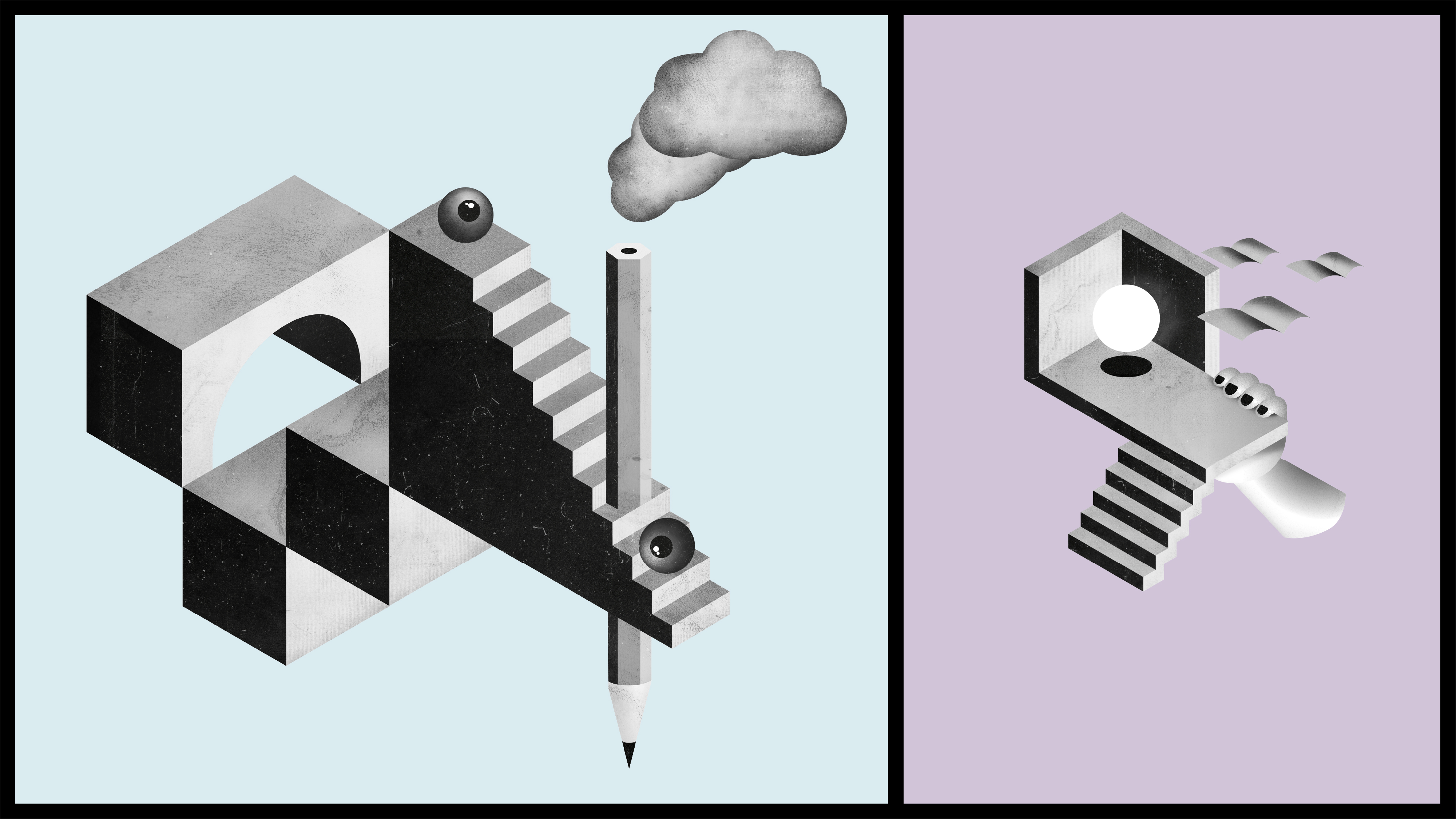
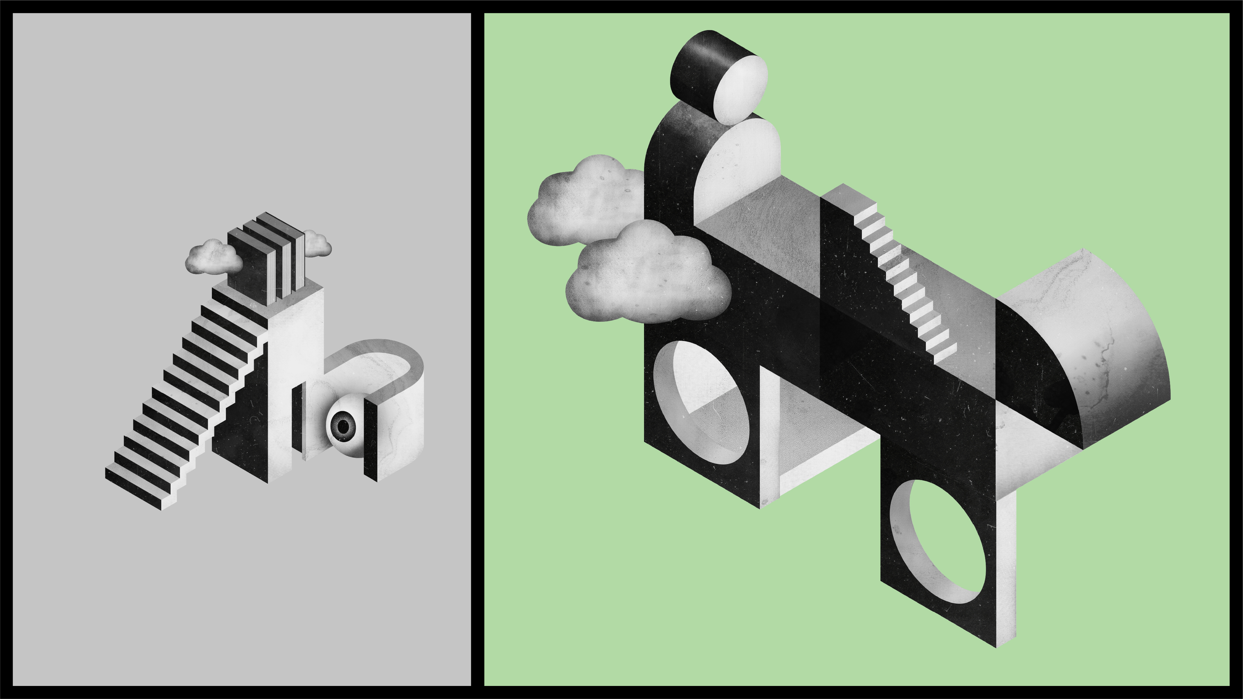
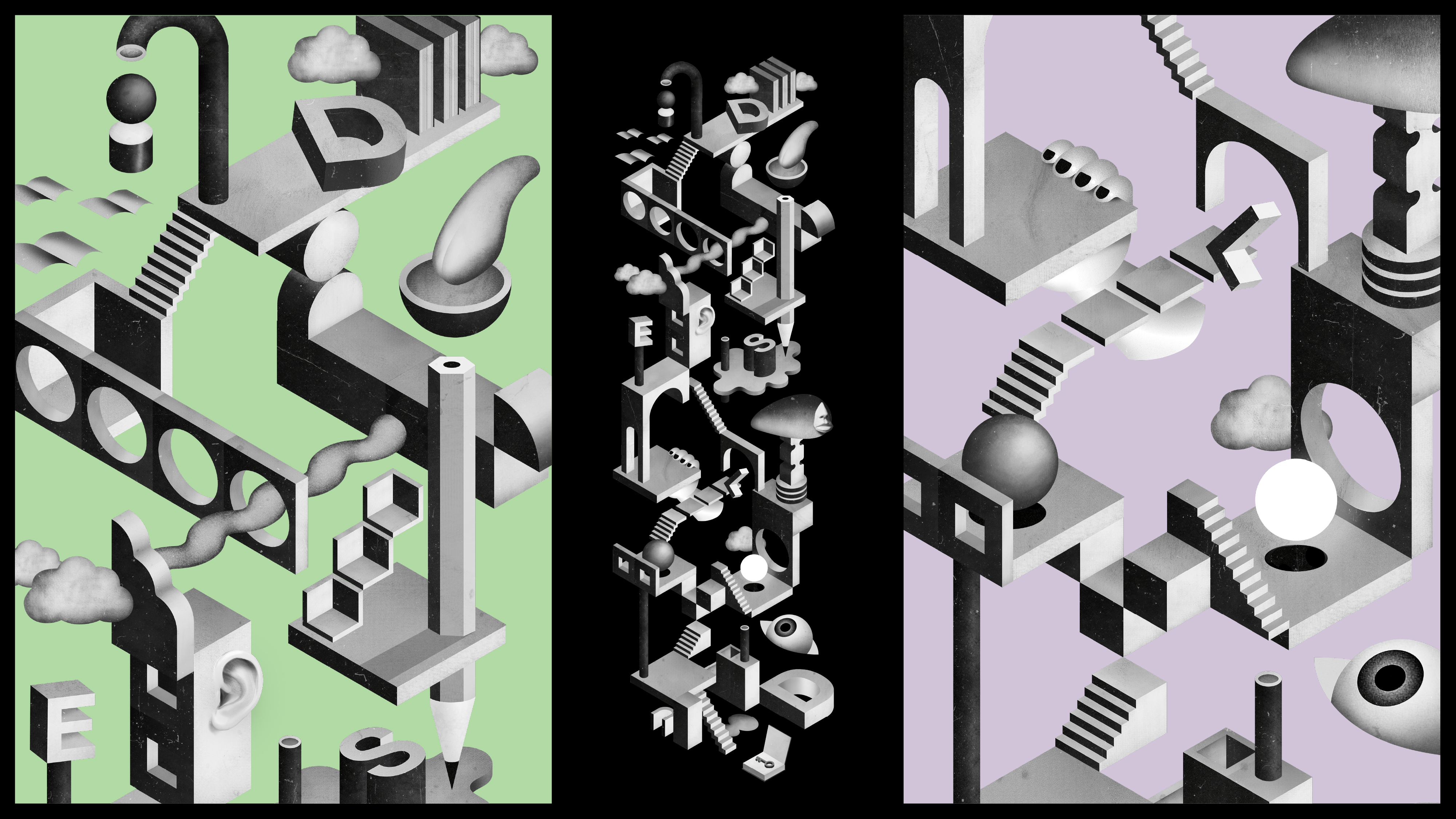
The logo and visual language are built on modular, architectural structures that suggest frames, systems, and imposed boundaries. Within and against these structures, elements bend, rotate, misalign, or take alternative routes — visually representing the need to find non-standard paths through standard systems.
Typography plays a crucial functional role. We use hyperlegible typefaces and a carefully calibrated color system to ensure improved readability and accessibility. The identity does not aestheticize difficulty — it actively reduces it.
A custom illustration library expands the concept further. Familiar letters transform into spatial, sculptural forms — fragmented, floating, layered. What appears obvious to some becomes dynamic and unstable to others. The illustrations make visible what is typically invisible: the cognitive effort behind reading.
The result is an identity that operates on two levels. At first glance, it is a refined, contemporary visual system. On closer inspection, it reveals tension, imbalance, and adaptation — mirroring the lived experience of dyslexia.
By making the struggle visible without stigmatizing it, the identity reframes dyslexia not as a deficit, but as a different way of navigating language and structure. It gives the association a clear, confident voice — and a visual system built not around limitation, but around rethinking the frame itself.
Credits